
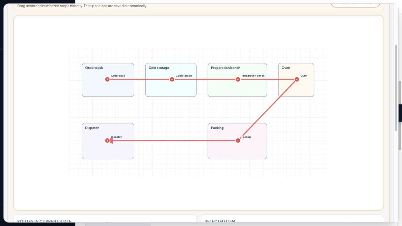
Movement waste is one of the most difficult forms of waste to debate because organisations rarely record it. Teams know that nurses walk between supply rooms, operators cross production cells and warehouse staff retrace routes, but the evidence often lives only in memory.
A spaghetti diagram changes that. It turns movement into a visible flow that a team can examine, challenge and improve.
The traditional approach, however, can introduce its own barrier. A practitioner may need to sketch a floor plan, trace paths by hand, estimate scale and then plot x and y coordinates to calculate distance. This measurement step is where many mapping efforts quietly stop.
Ci Flow takes a more practical approach: place the work areas, connect the movement path as it happens and record the measured distance directly. The result is a completed movement analysis without requiring practitioners to become coordinate analysts.
What a Spaghetti Diagram Makes Visible
A spaghetti diagram maps the actual movement of a person, product, material or document across a physical or service environment. It can reveal:
- Long travel distances
- Repeated returns to the same station
- Backtracking and unnecessary crossings
- Poorly positioned equipment or storage
- Queues created by shared work areas
- Layouts that have evolved incrementally rather than being deliberately designed
In Lean terms, the diagram focuses on motion, one of the eight forms of waste commonly summarised by the DOWNTIME acronym. The aim is not to criticise individual performance. The aim is to understand how the system influences movement.
A carefully drawn path can convert a general observation (“the team spends too much time walking”) into an operational question:
Which station, handoff, storage point or sequence is creating the travel?
How the Ci Flow Tool Works
The spaghetti diagram tool inside Ci Flow keeps the mapping process visual and direct.
You can:
- Place work areas such as machines, treatment rooms, storage points, desks, inspection stations or dispatch areas.
- Connect the actual movement path followed by a person, product or material.
- Record measured distance directly instead of calculating it from plotted coordinates.
- Review the completed movement analysis in the same project workspace as other improvement evidence.
This distinction matters. The practitioner can concentrate on observing the process and representing it accurately. The diagram remains useful to operators, supervisors, engineers and finance stakeholders because the distance is visible beside the route that produced it.
The tool sits alongside other improvement capabilities in Ci Flow, including value stream mapping and BPMN 2.0 process modelling. That allows teams to connect physical movement with process logic, information flow and project governance rather than treating the diagram as an isolated drawing.
Worked Example: A Nurse’s 4.8-Kilometre Shift
Consider a hospital ward where a registered nurse completes medication rounds, responds to patient requests, collects supplies and returns documentation to the central station.
The ward contains these main locations:
| Station | Approximate role |
|---|---|
| A | Central nurse station |
| B | Medication preparation room |
| C | Patient rooms |
| D | Clean supplies store |
| E | Equipment bay |
| F | Documentation and handover area |
During a representative shift, the nurse’s movement is traced from the central station to the medication room, across the patient rooms, back to the central station, then to the supplies store and equipment bay before returning to the patients.
The path includes multiple returns to Station A because documentation is completed centrally. The nurse also visits the clean supplies store several times because frequently used items are not located near the patient-care area.
A Ci Flow diagram can show the stations and the actual path in sequence. The practitioner then enters the measured movement distance for each leg. The completed analysis might look like this:
| Movement segment | Trips per shift | Distance per trip | Daily distance |
|---|---|---|---|
| Nurse station to medication room | 4 | 85 m | 340 m |
| Medication room to patient rooms | 8 | 210 m | 1,680 m |
| Patient rooms to nurse station | 6 | 170 m | 1,020 m |
| Nurse station to supplies store | 5 | 95 m | 475 m |
| Supplies store to patient rooms | 5 | 160 m | 800 m |
| Patient rooms to equipment bay | 3 | 110 m | 330 m |
| Equipment bay to nurse station | 3 | 85 m | 255 m |
| Other documented movement | – | – | 100 m |
| Total | – | – | 5,000 m |
A second observation on a slightly different shift produces a total of 4.8 kilometres. That figure is more powerful than the phrase “the ward requires a lot of walking” because it connects the route to a measurable operating burden.
The team may then test several countermeasures:
- Relocate high-use supplies closer to the patient-care area.
- Create a small point-of-use stock near the rooms.
- Move routine documentation access closer to the medication route.
- Re-sequence the medication round to reduce returns to the central station.
The diagram does not decide which solution to implement. It shows where the investigation should focus.

Why Recorded Distance Beats Estimated Distance
A recorded distance gives the improvement team a common language for discussing opportunity, cost and capacity.
The annual calculation is straightforward:
- 4.8 km per shift
- 240 shifts per year
- 1,152 km per year
At a walking pace of 1.4 metres per second:
- 1,152 km = 1,152,000 metres
- 1,152,000 ÷ 1.4 = 822,857 seconds
- 822,857 ÷ 3,600 = approximately 229 hours
That is roughly 28.6 eight-hour working days spent on travel annually for one role, before considering fatigue, interruptions, congestion or the effect on response time.
This calculation does not claim that every minute can be recovered. Some movement is necessary and value-adding. The purpose is to establish the size of the opportunity and evaluate countermeasures with discipline.
Once a distance figure sits on the diagram, the next question becomes practical:
- Can the supply point move 20 metres closer?
- Can two storage points be combined?
- Can the route be re-sequenced?
- Can documentation be completed at the point of care?
- Can a shared resource be positioned to reduce crossings?
If a layout change reduces the nurse’s average travel from 4.8 km to 3.1 km per shift, the difference is 1.7 km per shift. Across 240 shifts, that equals 408 km per year. At the same walking pace, the potential travel time represented is approximately 81 hours annually.
The team can then validate whether the reduction affects patient response time, replenishment reliability, documentation completion and staff workload.
Connect Movement to the Wider Analysis
A spaghetti diagram explains where movement occurs. It does not, by itself, explain the full process condition that creates it.
That is why it becomes more valuable when connected to other models.
A value stream map can show that the repeated trip to the supply room is associated with inventory policy, replenishment frequency or a stockout pattern. The physical route becomes evidence of a wider material-flow issue.
A BPMN 2.0 model can show the process logic behind the movement. For example, every patient request may trigger a return to the central station for approval before the nurse can access equipment. The diagram then links physical motion to a decision gateway or handoff.

Together, these tools help a team move from observation to root-cause analysis:
- Spaghetti diagram: Where is movement occurring?
- Value stream map: What material, information or delay condition is surrounding it?
- BPMN model: Which decision, handoff or process rule is driving the route?
- Improvement experiment: Which countermeasure can reduce the distance without creating a new constraint?
- Future-state verification: Does the revised route deliver a measurable gain?
This evidence-led approach aligns naturally with Lean Six Sigma training, where practitioners learn to connect waste identification with process data, root-cause analysis and control.
Four Rules for a Diagram That Leads to Action
1. Observe a Normal Shift
Do not map a showcase shift prepared for observation. Select a normal operating period that includes routine demand, interruptions and standard replenishment activity.
If the process varies significantly, map more than one shift and record the conditions.
2. Trace One Role or Product at a Time
A diagram can become difficult to interpret when every person and product family is plotted at once. Begin with one nurse, operator, order type or product family.
Add additional paths only when the first route is understood.
3. Measure Before Drawing Conclusions
Visual density is useful, but appearance alone is not enough. Record the distance, number of trips, revisits, crossings and relevant time conditions before selecting a countermeasure.
A short path repeated 40 times may deserve more attention than a long path completed once.
4. Re-draw After the Change
The future-state diagram is the proof. After relocating a station, combining storage points or changing the sequence, observe the process again under comparable conditions.
Compare:
- Total distance
- Number of trips
- Revisited locations
- Crossings
- Travel time
- Service or production outcomes
A countermeasure is stronger when it reduces motion while preserving quality, safety, throughput and customer responsiveness.
Who Benefits from a Digital Spaghetti Diagram?
This method is valuable for:
- Healthcare improvement teams examining staff, patient, medication and equipment movement
- Manufacturing supervisors improving cell layout, material presentation and operator travel
- Warehouse leaders studying pick paths, replenishment routes and dispatch flow
- Service operations teams mapping customer files, approvals and information handoffs
- Project leaders working in environments where the layout has grown through incremental changes
The common factor is not the industry. It is the presence of movement that has become familiar enough to escape measurement.
Draw the Route. Measure the Opportunity.
A spaghetti diagram should not be a decorative map at the end of a workshop. It should be working evidence that supports a better layout, a clearer process and a measurable operational result.
With Ci Flow, you can place work areas, draw the actual route and record the measured distance directly, without plotting x and y coordinates. You can then connect the finding to the wider project record, value stream map, BPMN model and improvement plan.
Draw your first spaghetti diagram free for 14 days at Ci Flow. No credit card is required, and example projects are included.
Kaizen. Kai-Care. Kai-Done. Lean Six Sigma