
In the realm of operational excellence, data serves as the compass that guides leadership toward informed decision-making. However, raw data alone is insufficient; it must be translated into a narrative that explains how a process is truly performing. This narrative is frequently referred to as the Voice of Process (VOP).
To fully appreciate the health of any business system, one must distinguish between what the customer expects: the Voice of the Customer (VOC): and what the process is actually capable of delivering. When these two voices are out of alignment, inefficiency, waste, and customer dissatisfaction inevitably follow. One of the most potent statistical tools used to listen to the VOP is the P Chart.
Whether you are pursuing a Lean Six Sigma certification or are simply tasked with improving a department's output, understanding what is a P chart is a foundational step in mastering quality control.
The Fundamental Purpose of the Voice of Process (VOP)
Before diving into the technical mechanics of control charts, it is essential to establish a conceptual understanding of the Voice of Process. In Lean Six Sigma methodology, the VOP is the statistical representation of the process's internal behavior. It ignores external desires and focuses strictly on what the current configuration of people, machines, and methods is producing.
The primary objective of monitoring the VOP is to determine stability. A stable process is predictable; it operates within a consistent range of variation. An unstable process, conversely, is a "black box" where results fluctuate wildly due to "special cause" variation: external factors like a broken machine, a new untrained employee, or a faulty batch of raw materials. To visualize this stability, practitioners rely on Statistical Process Control (SPC) charts, with the P chart being a primary choice for attribute data.

Technical Definition: What is a P Chart?
In the study of quality management, data is generally categorized into two types: continuous (variables) and discrete (attributes). A P chart is a type of control chart specifically designed for attribute data. More specifically, it tracks the proportion of nonconforming (defective) items in a measurement period.
The fundamental purpose of a P chart is to monitor the percentage of items that fail to meet a specific standard. In this binary scenario, an item is either "Good" or "Bad," "Pass" or "Fail," "Compliant" or "Non-compliant."
Key Characteristics of the P Chart:
- Binary Classification: It is used when items are categorized into one of two mutually exclusive categories.
- Variable Sample Sizes: Unlike the NP chart, the P chart is highly flexible because it can handle sub-groups of different sizes. For example, if you inspect 100 items on Monday and 150 items on Tuesday, the P chart adjusts the control limits accordingly.
- Proportional Plotting: The vertical axis (Y-axis) represents the fraction or percentage of defects (e.g., 0.05 or 5%).
To ensure your process remains within acceptable bounds, you must integrate these findings into a broader dashboard design for process control, allowing for real-time visibility into the VOP.
Anatomy of a P Chart: Understanding the Lines
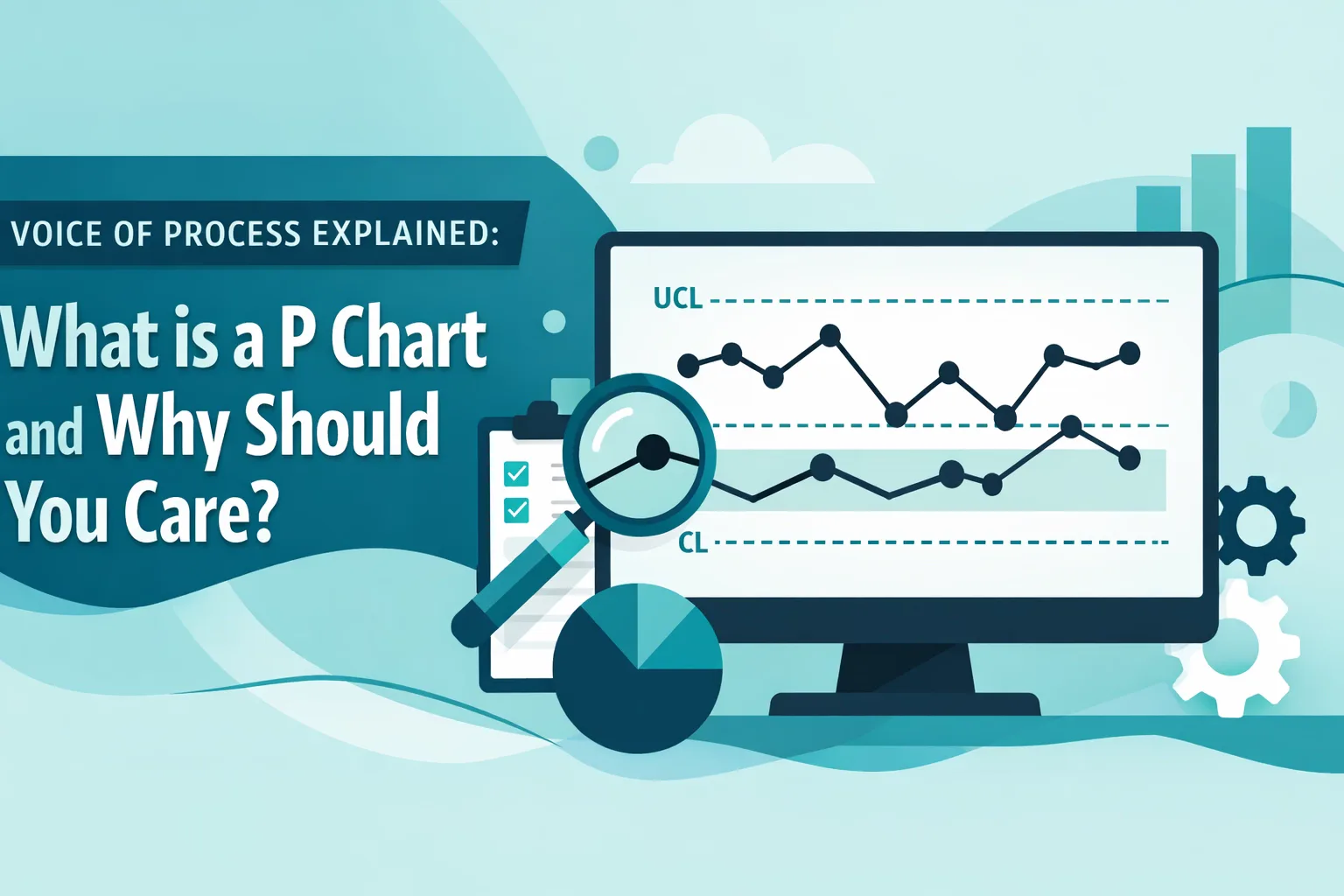
To effectively interpret a P chart, one must understand its three critical horizontal components:
- The Centerline (P-bar): This represents the average proportion of defects over a specified period. It serves as the baseline for the process's current capability.
- The Upper Control Limit (UCL): Usually calculated as three standard deviations above the centerline. This is the maximum expected variation for a stable process.
- The Lower Control Limit (LCL): Three standard deviations below the centerline. If the calculated LCL is less than zero, it is typically set to zero.
When you observe data points falling outside these limits, or specific patterns such as a "run" of seven consecutive points on one side of the centerline, the VOP is telling you that a significant change has occurred. This is a crucial aspect of outlier detection and treatment, as these points signal that the process has drifted from its standard state.
Why You Should Care: Practical Applications Across Industries
The P chart is not merely a theoretical exercise for statisticians; it is a pragmatic tool used daily in various high-stakes sectors. By monitoring the VOP, organizations can proactively address issues before they escalate into systemic failures.
1. Banking and Finance
In the financial sector, accuracy is paramount. A P chart might be used to track the proportion of loan applications containing errors or the percentage of transactions that failed to process correctly. For professionals in this niche, monitoring the VOP is a vital component of banking compliance, helping to identify regulatory reporting issues before they result in legal or financial penalties.
2. Healthcare
Hospitals use P charts to track patient safety metrics, such as the proportion of medication errors per 1,000 prescriptions filled. If the P chart shows an upward trend (approaching the UCL), the hospital administration knows they must investigate the root cause: perhaps a new software update or a staffing shortage: immediately.
3. Supply Chain and Logistics
In procurement, a P chart can track the proportion of late deliveries from a specific vendor. If the VOP indicates that a vendor is consistently exceeding the UCL for late arrivals, it provides data-backed evidence to resolve supplier performance issues and potentially renegotiate contracts or find a new partner.

How the P Chart Fits into the DMAIC Framework
For those enrolled in Lean Six Sigma training, the P chart is a staple of both the Measure and Control phases of the DMAIC (Define, Measure, Analyze, Improve, Control) cycle.
- Measure Phase: During the early stages of a project, a P chart is used to establish a baseline. It answers the question: "What is our current defect rate?" This is essential for calculating rework and scrap rates.
- Control Phase: Once improvements have been implemented, the P chart is the "watchdog." It ensures that the gains are sustained and that the process does not revert to its old, inefficient ways. It often works in tandem with warning limit applications to provide an early-warning system for operators.
Learning Through Reality: Case Studies and Dummy Data
At Lean 6 Sigma Hub, we believe that theory without application is stagnant. To truly master the VOP, practitioners need to work with messy, real-world data. This is why our Lean Six Sigma certification courses utilize end-to-end case studies featuring robust dummy data sets.
Our students don't just learn the formula for a P chart; they apply it to simulated scenarios, such as:
- Analyzing a hybrid workforce productivity dataset to determine the proportion of missed deadlines across remote teams.
- Identifying the VOP for a payment processing company to resolve transaction failures.
- Conducting a gap analysis by comparing the "target" defect rate with the actual P chart centerline.
Working with these datasets allows you to experience the "ah-ha" moment when the math reveals a hidden process bottleneck or a significant shift in quality that was previously invisible to the naked eye.

Strategic Benefits of Implementing P Charts
Implementing P charts as part of your standard operational procedure offers several strategic advantages:
- Objective Decision Making: It removes the emotion and guesswork from management meetings. You are no longer debating based on "gut feelings" but on the statistical Voice of the Process.
- Resource Optimization: By identifying when a process is actually "out of control," you avoid wasting time "fixing" a process that is merely experiencing normal, expected variation.
- Enhanced Process Capability: Consistent monitoring leads to higher process capability (Cp and Cpk), which translates directly to higher profitability and lower costs.
Conclusion: Taking the Next Step in Your Quality Journey
Understanding what is a P chart and how to interpret the Voice of Process is a transformative skill set for any professional. It moves you from a reactive state: where you are constantly "firefighting" problems: to a proactive state, where you are a steward of process stability and continuous improvement.
Whether you are aiming for your White, Yellow, Green, or Black Belt, mastering these statistical tools is non-negotiable for anyone serious about driving efficiency in 2026 and beyond.
Empower your career and your organization by mastering the data-driven strategies used by the world's most efficient companies. Enroll in our comprehensive Lean Six Sigma training today and gain access to our exclusive end-to-end case studies and expert-led certification programs. Visit Lean 6 Sigma Hub to start your journey.