In the realm of modern organizational management, the dashboard is often viewed as the "single source of truth." Leaders rely on these digital displays to steer the ship, making critical decisions based on green, amber, and red indicators. However, there is a fundamental danger in trusting a simplified interface: traditional dashboards often lie.
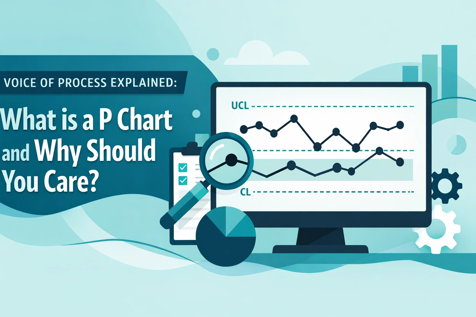
The fundamental purpose of any process monitoring system should be to reveal reality, yet most dashboards merely present a polished facade. They focus on the Voice of the Customer (VOC): what the customer wants: and the Voice of the Business (VOB): what the organization needs: while completely silencing the Voice of the Process (VOP). To truly understand why your performance fluctuates, you must look beyond the "Green" light and understand the statistical truth of how your process actually behaves.
The Illusion of the Average: Why Metrics Mislead
To fully appreciate why dashboards are deceptive, we must examine the concept of the Average (Mean). Most traditional reports provide a monthly or weekly mean of performance. While this offers a baseline, it is an aggregate that masks the most critical factor in process improvement: Variation.
In Lean Six Sigma, we understand that every process outcome is defined by the transfer function Y = f(x). Here, Y is the output, and x represents the critical inputs. A dashboard that only shows the average Y fails to account for how fluctuations in x create instability. This instability is categorized into two types:
- Common Cause Variation: The inherent "noise" in a stable system.
- Special Cause Variation: Unexpected fluctuations caused by a specific, identifiable event or shift.
When a dashboard shows a "Red" status, managers often react by "tampering" with the process. If that red light was merely common cause noise, this reaction actually increases variation and degrades performance. Without distinguishing between these causes, your dashboard is effectively lying about whether a real problem exists.

Beyond the Average: Harnessing the X-Bar Chart
The true Voice of the Process is heard through the application of statistical tools like the X-bar Chart. Unlike a static dashboard, an X-bar chart (often paired with an R chart to monitor range) plots data over time against statistically derived control limits. This allows practitioners to detect shifts, trends, and cycles that a simple monthly average would bury.
To deepen this analysis, professionals utilize the following tools:
- Box Plot: Used to visualize the five-number summary (minimum, first quartile, median, third quartile, maximum), revealing the spread, skewness, and outliers within a data set.
- Z-Score: By calculating how many standard deviations a data point is from the mean, we can compare distributions across different processes, providing a universal language for performance.
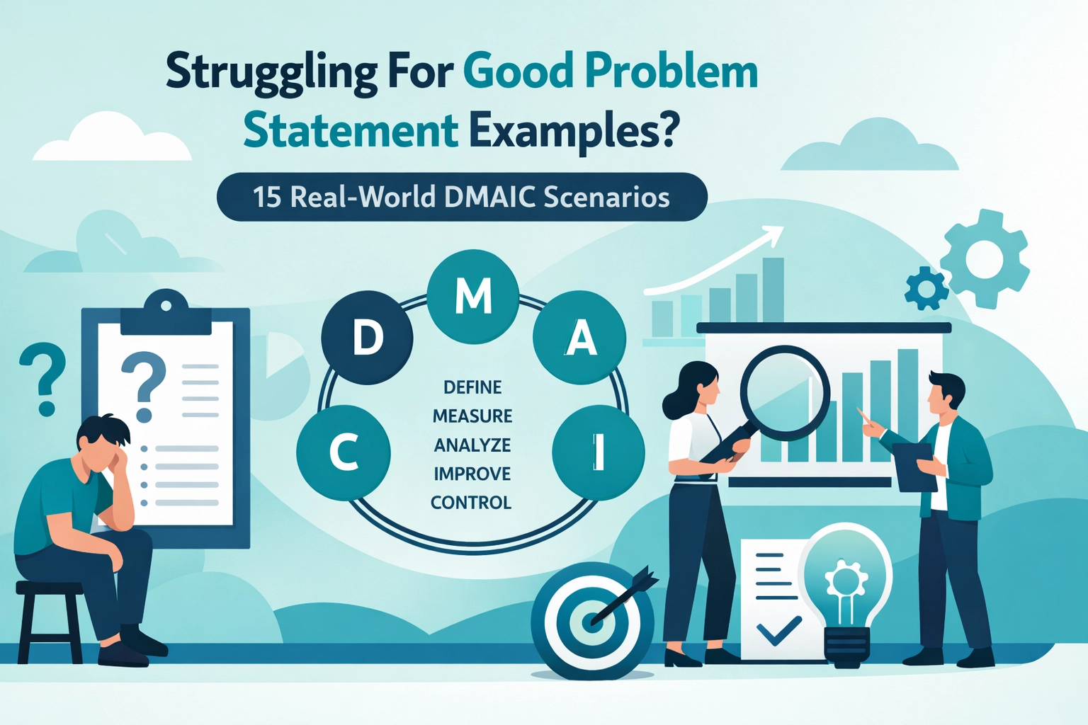
- ANOVA (Analysis of Variance): This is employed during the Analyse Phase (DMAIC) to determine if differences between three or more group means are statistically significant.
- Bartlett’s Test: Before performing an ANOVA, we use Bartlett’s Test to assess whether the variances of several groups are equal, ensuring our statistical conclusions are valid and free from Bias.
The Hidden Factory: Yield and Waste
Traditional dashboards often track "Units Produced," but they rarely account for the "Hidden Factory": the extra work required to fix defects. This is where Yield metrics become essential.
- First Pass Yield (FPY): Measures the percentage of units that go through the process without needing rework.
- Rolled Throughput Yield (RTY): Calculates the probability that a unit will pass through the entire multi-step process defect-free.
A dashboard might show high Throughput, but if your RTY is low, you are bleeding resources into Waste (Muda). In the Lean framework, we identify eight types of waste (DOWNTIME), including Waiting for materials, excess Work in Process (WIP), and overproduction.
To visualize this, we use Value Stream Mapping (VSM). A current state map identifies where value is added and where waste accumulates, while a future state map provides the roadmap for improvement. By using a Time Observation Sheet, practitioners record the actual time taken for each step, separating value-added work from non-value-added delays.

Structural Precision: Takt Time and Flow
A high-performing process is not just about speed; it is about rhythm. Takt Time: calculated by dividing available production time by customer demand: sets the pace for the entire Value Stream. When a process step cannot keep up with Takt Time, it becomes a Bottleneck.
According to the Theory of Constraints, a system is only as fast as its slowest link. By identifying and elevating the bottleneck, organizations can significantly increase overall flow. This requires a shift from "batch and queue" to "continuous flow," often supported by:
- Andon: Visual signaling systems that alert teams to problems in real-time.
- Autonomation (Jidoka): Intelligent automation that detects errors and stops the process immediately to prevent the propagation of defects.
- Zero Defects Philosophy: The commitment to doing things right the first time, as popularized by Philip Crosby.
Building the Capability: The Human Element
Transforming a "lying" dashboard into a high-fidelity control system requires a trained workforce. At Lean 6 Sigma Hub, we provide the structured training necessary to interpret complex Attribute Data and drive organizational change.
- White Belt: The entry-level certification that introduces the basics of DMAIC awareness. Start your journey here.
- Yellow Belt: Trained team members who understand fundamental tools and support larger projects. Take the Yellow Belt practice exam.
- Green Belt: Practitioners who lead smaller projects and apply data-driven decision-making. Prepare for Green Belt certification.
- Black Belt: Advanced leaders who manage complex, cross-functional projects and mentor others. Explore Black Belt resources.
Even in Agile environments, where flexibility is key, Lean Six Sigma provides the statistical rigor needed to ensure that "fast" doesn't become "reckless." Whether you are conducting a Break-Even Analysis to justify a new initiative or drafting a Business Case to secure leadership Approval, the data must be irrefutable.
Conclusion: Stop Guessing, Start Measuring
If your current dashboard doesn't show the Voice of the Process, you are managing by hope rather than by science. You are reacting to noise, missing real signals, and ignoring the hidden costs of variation.
To truly master your process, you must move beyond the superficial. You need to organize ideas with an Affinity Diagram, map your value stream, and utilize rigorous statistical testing to find the truth. Only then can you move your organization toward a state of predictable excellence.
Enroll in a professional Lean Six Sigma certification today to master the Voice of the Process and drive measurable results for your career and your company.