Ever felt like your business process was trying to tell you something, but you just couldn't catch the drift? In the world of quality management, we call that the "Voice of the Process" (VOP). It’s the internal heartbeat of your operations, and if you aren't listening, you’re likely leaving money on the table.
At Lean 6 Sigma Hub, we're all about making complex tools feel like common sense. Today, we’re breaking down one of the most essential tools in the Lean Six Sigma toolkit: the P Chart.
Whether you’re just starting your Lean Six Sigma White Belt online training or you’re a seasoned pro looking for a refresher, this guide will get you up to speed in no time.
What Exactly is a P Chart?
In the simplest terms, a P Chart (or Proportion Chart) is a type of control chart used to track the proportion of defective items in a process over time.
Think of it as a scoreboard for quality. Instead of measuring how heavy a part is or how long a phone call lasted (that’s "variable data"), a P Chart looks at "attribute data." This is the binary stuff:
- Did it pass or fail?
- Is the invoice correct or incorrect?
- Was the shipment on time or late?
The "P" stands for Proportion. It calculates the ratio of "bad" items to the total number of items inspected. Because it works with proportions, it’s incredibly flexible, you can use it even if your sample sizes change from day to day.
The "Voice of Process" (VOP) Connection
Before we dive into the mechanics, let's talk about why we use this thing. In Lean Six Sigma, we often contrast the "Voice of the Customer" (what the client wants) with the "Voice of the Process" (what the process is actually capable of doing).
A P Chart is the visual representation of the VOP. It tells you:
- Is the process stable? (Is it behaving predictably?)
- What is the average defect rate? (What can we expect on a normal day?)
- Is there a "Special Cause" at play? (Did something weird happen that we need to fix?)
If your P Chart shows a lot of points jumping outside the lines, your process is screaming for help. If it’s steady, the process is "in control," even if the defect rate is higher than you’d like. That’s a crucial distinction we teach in our Lean Six Sigma Yellow Belt online training.
When Should You Reach for a P Chart?
Not every problem needs a P Chart. You want to use this specific tool when you meet these three criteria:
1. You have Attribute Data
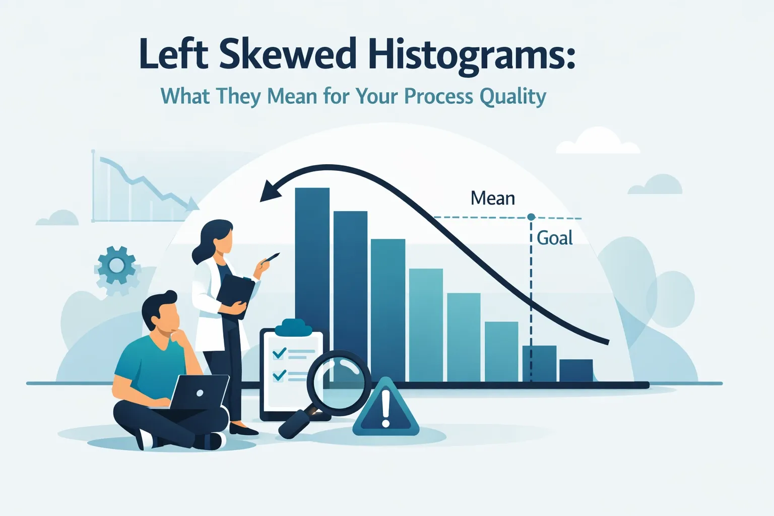
As mentioned, you aren't measuring inches or seconds. You’re counting occurrences. You’re looking at the number of defective units in a subgroup. If you find yourself looking at more complex data distributions, you might want to read up on left-skewed histograms to understand your data's behavior better.
2. You have "Defectives," not just "Defects"
There’s a subtle difference here. A "defect" is a single flaw (like a scratch on a car). A "defective" is the whole unit that fails to meet requirements (the whole car is rejected). P Charts track the defective units.
3. Your Sample Size Varies
This is the P Chart’s superpower. If you inspect 100 items on Monday and 500 items on Tuesday, a standard "NP Chart" won't work, but a P Chart handles it like a champ. It adjusts the control limits based on the sample size, keeping the "Voice of the Process" accurate regardless of volume.
Anatomy of a P Chart
If you were to look at a P Chart right now, you’d see three main lines:
- The Center Line (p-bar): This is your average proportion of defects. It represents the "norm" for your process.
- The Upper Control Limit (UCL): The "ceiling." If a data point goes above this, something went wrong (a special cause variation).
- The Lower Control Limit (LCL): The "floor." Interestingly, if a data point drops below this, it might mean your process suddenly got much better, and you should investigate why so you can replicate it!
To see how these metrics fit into a larger business strategy, check out our guide on dashboard design for process control.

How to Read the "Voice" (Interpretation)
Reading a P Chart is like listening to a radio. Most of the time, you just hear the music (Common Cause Variation). But occasionally, you get static or a break in the signal (Special Cause Variation).
- Out of Control: A point falls outside the UCL or LCL. This is a red flag. Something changed in the environment, maybe a new supplier, a broken machine, or a tired operator.
- Trends: Six or more points steadily increasing or decreasing. This tells you the process is drifting.
- Shifts: Eight or more points consistently on one side of the center line. This means your process "average" has moved.
When you spot these patterns, it's time to act. In a Lean Six Sigma hypothetical project, identifying these shifts is often the "aha!" moment that leads to massive savings.
Why This Matters in 2026
You might be wondering, "Does this old-school statistical stuff still matter with all the AI we have today?" The answer is a resounding yes. Even as we look at the future of hypothesis testing, the fundamental logic of the P Chart remains the gold standard for understanding process stability. AI can crunch the numbers faster, but the P Chart provides the visual context that humans need to make strategic decisions.
Real-World Example: The Call Center
Imagine Jvalin runs a customer support center. He wants to track the proportion of "unsatisfied" survey results.
- Monday: 100 surveys, 5 unsatisfied (P = 0.05)
- Tuesday: 150 surveys, 12 unsatisfied (P = 0.08)
- Wednesday: 90 surveys, 4 unsatisfied (P = 0.04)
By plotting these proportions on a P Chart, Jvalin can see if that jump to 0.08 on Tuesday was just a random fluctuation or if a specific event caused a spike in unhappy customers. If Tuesday's point hits the UCL, he knows he needs to investigate that specific day’s operations.
Taking the Next Step
Understanding a P Chart is a great first step, but it’s just one tool in a massive toolbox designed to make your business leaner and more profitable. If you’re ready to move beyond the basics, we have the resources to help you lead.
At Lean 6 Sigma Hub, we provide everything from Six Sigma flash cards for quick study to comprehensive Lean Six Sigma Black Belt online training for those ready to lead enterprise-wide change.
If you’re currently managing a project, don’t start from scratch. Grab our Project Charter Template to get your goals aligned from day one.

Summary: The 3-Minute Takeaway
- What is it? A control chart for proportions (Pass/Fail data).
- Why use it? To visualize the Voice of the Process and distinguish between "normal" variation and "problems."
- Best feature? It works with varying sample sizes.
- What does it tell you? If your process is stable or if you need to jump in and fix a "special cause" issue.
Process improvement doesn't have to be a headache. It's about finding the right tools to let your data speak for itself. Once you learn to hear the Voice of the Process through a P Chart, you’ll never look at your operations the same way again.
Ready to master the art of data-driven decision making? Join thousands of professionals and enrol in our Lean Six Sigma Green Belt online training today.