In the realm of organizational excellence, the ability to analyze data is only half the battle. The true differentiator for a high-performing Lean Six Sigma Black Belt or Master Black Belt is the ability to translate technical statistical outputs into a compelling narrative that resonates with executive leadership. While your software might generate hundreds of intricate charts, the boardroom requires clarity, speed, and a direct link to the bottom line.
To fully appreciate the impact of data visualization, one must understand that executives do not look for p-values or standard deviations; they look for risk, ROI, and reliability. This article explores the sophisticated art of telling a data story that secures buy-in, drives investment, and moves the needle on enterprise-level strategy.
The Fundamental Purpose of Data Storytelling
The core objective of visualizing Six Sigma data for a boardroom setting is to bridge the gap between the Voice of the Process (VOP) and the Voice of the Business (VOB). In many organizations, these two languages exist in silos. The practitioner speaks in "sigma levels" and "control limits," while the executive speaks in "EBITDA" and "market share."
Your role as a project leader is to act as the primary translator. By utilizing clear, descriptive visuals, you can transform a dense spreadsheet into a strategic roadmap. This is not about simplifying the science; it is about amplifying the insight.
The "Vital Few" Visuals for Executive Buy-In
While the Six Sigma toolkit is vast, only a handful of visualizations possess the "insider edge" needed to influence senior stakeholders. Focus your efforts on these three pillars of technical storytelling:
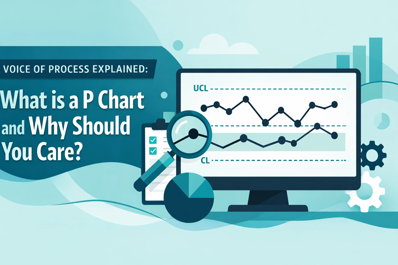
1. The Control Chart: Proving Stability and Impact
A Control Chart is perhaps the most powerful tool for demonstrating that a process change has actually worked. For the boardroom, strip away the technical clutter. Highlight the "Before" state and the "After" state with a clear vertical marker indicating the Countermeasure implementation.

2. The Pareto Chart: Justifying Resource Allocation
The Pareto Chart is the ultimate tool for executive decision-making. By applying the 80/20 Rule, you visually demonstrate that addressing the "vital few" causes will yield the greatest return on effort. Use this to justify why your team is ignoring the noise and focusing on the three critical failure modes that drive 80% of customer complaints.
3. The Histogram: Visualizing the Customer Experience
A Histogram allows you to show the distribution of your process relative to Critical to Quality (CTQ) requirements. By overlaying specification limits, you can show exactly how many units are "bleeding" money due to being out-of-spec.
Protocol for Building an Executive-Grade LSS Narrative
To ensure your presentation results in a "Yes," follow this logical structure:
- Define the Business Problem: Start with the metric they already care about. If the Cost of Poor Quality (COPQ) is draining $1.2M annually from the logistics budget, that is your opening slide.
- Establish the Magnitude: Use a Run Chart to show the trend. Is the problem getting worse? Is the variation becoming unpredictable?
- Identify the Root Cause: Introduce your Pareto analysis. Be assertive: "Our data proves that Supplier X and Shipping Lane Y are responsible for 75% of our late deliveries."
- Demonstrate the Improvement: Show the Before/After Control Chart. Point to the reduction in standard deviation.
- Calculate the ROI: End with the financial impact. "By stabilizing this process, we have realized a cost savings of $45,000 per month, projected to reach $540,000 annually."

Case Study: From Chaos to $2.4M Clarity
Consider a hypothetical manufacturing scenario where a Tier-1 automotive supplier was facing a 12% defect rate on a critical engine component. The technical team was drowning in Minitab reports, but the board was on the verge of canceling the project due to a perceived lack of progress.
The Lead Black Belt overhauled the reporting style. Instead of 40 slides of raw data, they presented three "Boardroom Ready" visuals:
- A Pareto Chart showing that 82% of defects were caused by thermal fluctuations in a single casting machine.
- A Control Chart showing that since the implementation of Poka-Yoke sensors, the process had entered a state of statistical control for 60 consecutive days.
- A Financial Summary showing that the First Pass Yield (FPY) had jumped from 88% to 99.4%, saving the organization $2.4M in scrap and rework costs.
The result? The board not only approved the project completion but funded the rollout of the solution across four other global plants.
Rules for "Boardroom Ready" Visuals
To maintain a high standard of professional communication, adhere to these guidelines:
- Conclusion First: Every slide title should be the conclusion (e.g., "Defects Reduced by 40%"), not the name of the chart (e.g., "Pareto Chart").
- Abolish the Noise: Remove gridlines, excessive tick marks, and redundant legends.
- Strategic Color Palette: Use teal and blue for "In Control" or "Target Met" and red strictly for "Out of Spec" or "High Risk."
- Annotate the Action: Use callouts to explain what changed. Do not make the board guess where the improvement happened.
- Ground Truth: Always ensure your Measurement System Analysis (MSA) is solid before presenting. If the board doubts the data quality, the story collapses.
Leveraging Professional Tools
While basic spreadsheets can generate charts, the elite practitioner uses professional templates and calculators to ensure accuracy and aesthetic consistency. At Lean 6 Sigma Hub, we provide a suite of tools designed to make your data boardroom-ready, including our Project Charter ROI Calculator and Voice of Customer Priority Matrix.
Data visualization is the final mile of the DMAIC journey. It is where your hard work in the Analyze and Improve phases is finally converted into organizational value. By mastering these storytelling techniques, you position yourself not just as a technician, but as a strategic asset to the leadership team.
To elevate your capability and master the art of enterprise-level influence, explore our CSSC-accredited Lean Six Sigma Black Belt Training or Master Black Belt Certification today.