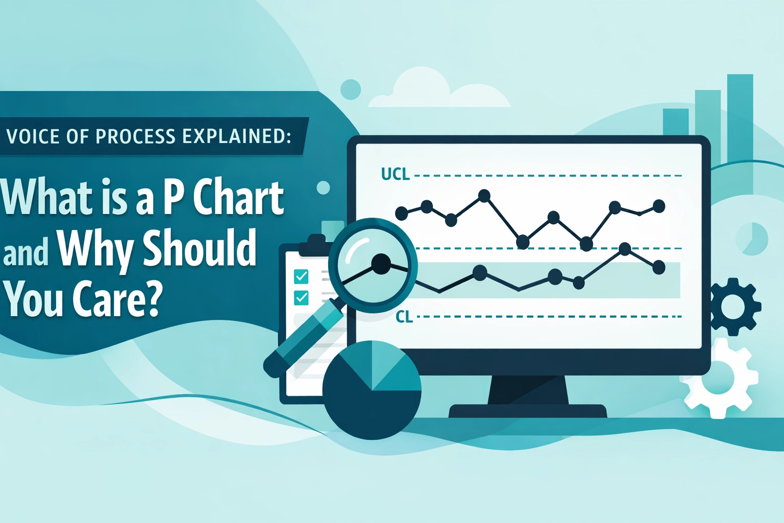
In the realm of process control, intuition is a liability and "gut feeling" is a recipe for catastrophic failure. If you are managing a process based on snapshots of data or isolated measurements, you aren't leading; you are reacting. To truly master operational excellence, you must learn to listen to the Voice of the Process.
The fundamental purpose of Statistical Process Control (SPC) is to distinguish between the background noise of daily operations and the genuine signals of a system in distress. At the heart of this discipline sits the most powerful diagnostic pair in the Lean Six Sigma toolkit: the X-bar and R Chart. Together, they form a dynamic duo that monitors both the central tendency and the internal stability of your process, ensuring that shifts are identified: and neutralized: long before they impact your customer or your bottom line.
Understanding the Components: Mean and Variation
To fully appreciate the synergy of these charts, we must first break down their individual roles. An X-bar and R chart is typically used when you are collecting continuous data (such as time, weight, or length) in small, Rational Subgroups: usually between 2 and 10 units per sample.
The X-bar Chart: Monitoring the Average
The X-bar Chart (or Mean Chart) tracks the average value of each subgroup over time. Its primary mission is to monitor the process central tendency. If your process mean begins to drift: perhaps due to tool wear, a change in raw materials, or a subtle shift in ambient temperature: the X-bar chart will reveal this trend. It tells you if your "target" is still where it's supposed to be.
The R Chart: Monitoring the Spread
The R Chart (or Range Chart) tracks the variation within each subgroup. It calculates the difference between the highest and lowest values in a sample set. While the X-bar chart looks at the big picture (the average), the R chart looks at the consistency. A process can have a perfect average but still be dangerously unstable if the range of its output is swinging wildly. In fact, standard SPC protocol dictates that you should always interpret the R chart first; if the variation isn't in control, the averages on the X-bar chart are statistically unreliable.

The Voice of the Process vs. The Voice of the Customer
One of the most common pitfalls for junior practitioners is confusing Control Limits with Specification Limits.
Specification Limits represent the Voice of the Customer (VOC): they are the boundaries of what the customer finds acceptable. The process doesn't care about these. The Voice of the Process (VOP), however, is revealed through Control Limits (UCL and LCL). These limits are calculated directly from your process data and represent the range of behavior you can statistically expect if the process is stable and affected only by Common Cause Variation.
When a data point breaches a Upper Control Limit (UCL) or a Lower Control Limit (LCL), the process is screaming. It is signaling a Special Cause Variation: an external factor that has compromised the system. By using X-bar and R charts, you aren't just checking if you're "within spec"; you're checking if the process is behaving normally. A process can be within customer specs but still be "out of control," which is a leading indicator of a future failure.
Practical Application: A Case Study in Precision
Let’s ground these concepts in a data-heavy scenario. Imagine you are overseeing a high-speed bottling line for a premium beverage manufacturer. Your target fill volume is 500ml. To monitor performance, you decide to use an X-bar and R chart, taking a subgroup of n=5 bottles every hour.
Step 1: Data Collection
Over 20 hours, you collect your samples. For the sake of this example, let’s look at the data for Hour 1:
- Sample 1: 500.2ml
- Sample 2: 499.8ml
- Sample 3: 500.1ml
- Sample 4: 499.9ml
- Sample 5: 500.0ml
Subgroup Mean ($\bar{X}$): 500.0ml
Subgroup Range ($R$): 0.4ml (500.2 – 499.8)
Step 2: Calculating Control Limits
After collecting data for 20 subgroups, you find the following:
- Grand Mean ($\bar{\bar{X}}$): 500.05ml
- Average Range ($\bar{R}$): 0.35ml
Using standard SPC constants for a subgroup size of n=5 ($A_2 = 0.577$, $D_3 = 0$, $D_4 = 2.114$), we calculate the limits:
R Chart Limits:
- CL (Center Line): 0.35ml
- UCL (Upper Control Limit): $D_4 \times \bar{R} = 2.114 \times 0.35 = \mathbf{0.74ml}$
- LCL (Lower Control Limit): $D_3 \times \bar{R} = 0 \times 0.35 = \mathbf{0ml}$
X-bar Chart Limits:
- CL (Center Line): 500.05ml
- UCL (Upper Control Limit): $\bar{\bar{X}} + (A_2 \times \bar{R}) = 500.05 + (0.577 \times 0.35) = \mathbf{500.25ml}$
- LCL (Lower Control Limit): $\bar{\bar{X}} – (A_2 \times \bar{R}) = 500.05 – (0.577 \times 0.35) = \mathbf{499.85ml}$
Step 3: Detecting the Shift
At Hour 21, the machine operator records a subgroup with a mean of 500.30ml. On its own, 500.30ml might seem acceptable: it's only 0.3ml off the target. However, because it exceeds our UCL of 500.25ml, the X-bar Chart triggers an immediate alarm. This is a shift in the process mean. Without this chart, you might have waited hours for the drift to become "obvious," by which time thousands of bottles would have been overfilled, leading to significant waste and lost profit.

Why the Duo is Non-Negotiable
Relying on one chart without the other is like flying a plane with only an altimeter and no speedometer.
Consider a scenario where the average remains a perfect 500ml, but the range jumps from 0.35ml to 1.50ml. Your X-bar chart would look fine, lulling you into a false sense of security. Meanwhile, your R chart would be spiking, warning you that the process is becoming inconsistent. This increased variation means that while the "average" bottle is correct, you are likely producing some bottles that are dangerously underfilled and others that are overfilled.
Only by monitoring both metrics can you ensure that your process is both accurate (on target) and precise (consistent).
Mastering the Metrics
Implementing X-bar and R charts is a hallmark of a mature Lean Six Sigma culture. It moves an organization away from the "firefighting" mentality and toward a proactive, data-driven state. Whether you are a Yellow Belt supporting a local project or a Black Belt leading a massive organizational change, these tools are your eyes and ears on the shop floor.
If you are ready to stop guessing and start controlling your outcomes, you need to dive deeper into the statistical foundations of process improvement. Understanding the nuances of Rational Subgrouping, Common Cause Variation, and the mathematical rigor behind control limits is what separates a technician from a leader.
To see how these principles apply in a broader context, you can explore our detailed Black Belt sample project or test your current knowledge with our Green Belt practice exam.

Take the Next Step in Your Career
The ability to interpret and act upon the Voice of the Process is one of the most highly valued skills in modern industry. From healthcare and finance to logistics and manufacturing, organizations are desperate for professionals who can reduce variation and guarantee stability.
At Lean 6 Sigma Hub, we provide the most practical, simulation-based training in the industry. Our courses are 100% online, self-paced, and accredited by the Council for Six Sigma Certification (CSSC). We don't just teach you the math; we teach you how to use it to drive real-world results.
Stop leaving your process to chance. Master the data, lead the change, and elevate your professional standing today.

Enroll in our Lean Six Sigma Certification programs now and transform your career.