

PART 5 · DMAIC, RUN TO ISO 13053 WITH LEAN
Chapter 13
Analyse
STANDARD ISO 13053
AIM Prove the real cause and show the headcount assumption is wrong, choosing from the full Analyse tool kit at the right depth, and leave the phase with a validated driver the Improve phase can act on.
Measure handed you a defensible baseline and an honest read on where the variation lives. It could not tell you why. Analyse names the causes, tests them against the data, and separates the driver that moves the CTQ from the noise that does not. The work is to prove the cause rather than assert it, to reach for a process view or a data view as the evidence warrants, and to hand Improve a driver that holds when someone challenges it.
13.1 What Analyse does
13.1.1 The purpose of the phase and what it must produce
Analyse turns a trustworthy baseline into a proven cause. Measure told you how the process performs and where the variation sits. It did not tell you why. That why is the whole work of the phase, and the phase is not done until you can point to a driver and show the evidence that it moves the CTQ.
Five things must leave the phase. A short list of candidate causes, drawn from the process and the data rather than from the room. Evidence that separates the driver from the noise. Each cause stated as a process flaw, not a person. The headcount assumption tested and settled, one way or the other. And a passed gate review. Figure 13.1 shows what comes in from Measure and what must go out to Improve.
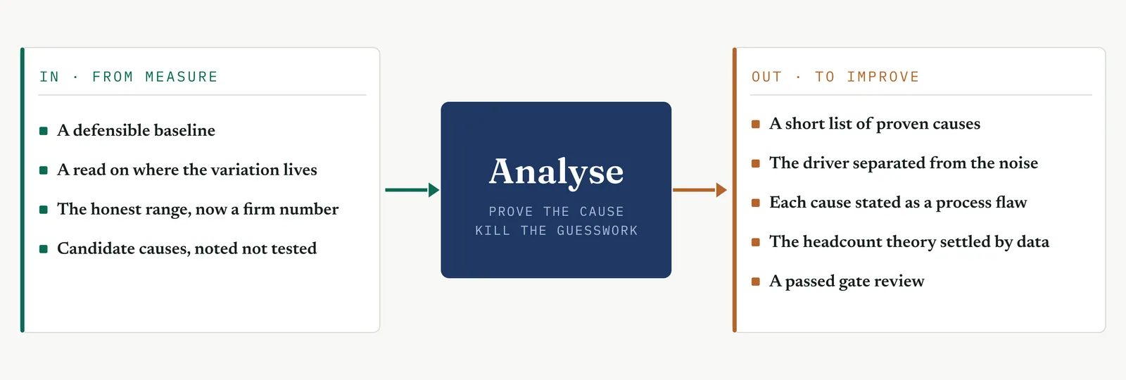
Read the word short in that first output. Analyse does not end with a long list of everything that might drive the delay. It ends with the few that do. The move from many candidates to the vital few is the discipline of the phase, and it is where most projects in an immature firm go soft. A team lists twenty plausible causes, agrees they all matter, and hands Improve a wish list. Improve then spreads its effort across all twenty and moves nothing. Your job is to arrive at the two or three that carry the problem, and to arrive with proof.
There is a difference between a cause you can name and a cause you can defend. Naming is cheap. Anyone in the meeting can name a cause, and most will. Defending means you have tested the claim against evidence and it survived. The gate review is where that difference shows. A named cause folds under the first hard question. A proven cause holds. You want to walk into the gate with the second kind.
State every cause as a process flaw, never as a person. This is not politeness. It is accuracy. The delay at Crestline does not live in Asha or in the account managers. It lives in a handoff with no owner and no clock. Frame the cause as the flaw in the process and you keep the finding true and the room able to hear it. Frame it as a person and you have started a fight you cannot win and lost the finding in the noise.
Notice what is not on that list. Solutions are not here. Fixes will suggest themselves as the cause comes clear, and you will note them, but designing and piloting the fix is the job of Improve. The pull to jump straight to the solution is strong, because a solution feels like progress and a proven cause feels like delay. Resist it. A fix aimed at an unproven cause is a guess with a budget. What Analyse owes Improve is a cause proven to move the CTQ, so the fix aims at something real rather than at the loudest theory in the room.
13.1.2 What changes when the cause is contested and the data is thin
In a mature plant the cause is a measurable variable and you settle it with a designed experiment. You change the input, you watch the output, you read the result. The immature firm gives you neither the variable nor the experiment. The cause is contested in a meeting, and the data is too thin for a clean test. That turns the phase from a statistical exercise into a mix of process reasoning and whatever testing the data will bear.
Someone in the room already knows the answer. In most firms the answer is more people, because more people is the fix that asks nothing of the process and nothing of the owner. At Crestline that someone is Martin, and the answer is headcount. The theory is not stupid. The teams are busy and the queue is long, so more hands looks obvious. The problem is that it is untested, and an untested theory that feels obvious is the most expensive kind, because it gets funded before it gets checked.
So the first job in Analyse is not to run a test. It is to turn every stated cause, the headcount theory included, into a claim the data can accept or reject. A claim you can test has a shape. If staffing drives the delay, then cases should slow when the team is short and speed when it is full. That is now a question the data can answer. Left as a feeling, headcount cannot be argued with. Turned into a claim, it can be checked, and a check is something a sponsor will accept where an opinion is not.
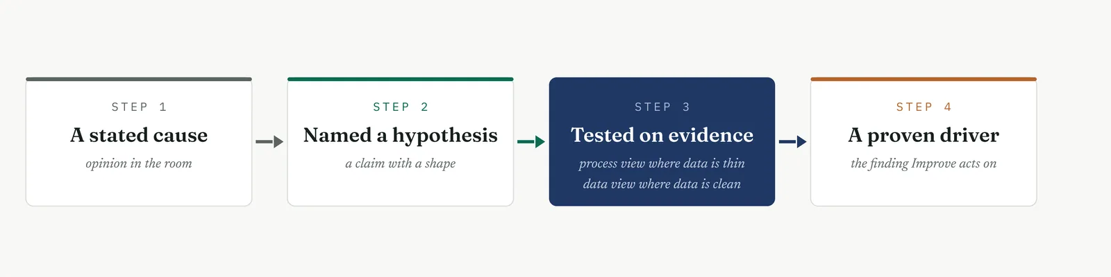
This is why the process view carries as much weight here as the data view. When the numbers cannot support a formal test, the process map, the waste count and the flow analysis still show where the time goes. A case that sits four days in a queue with no one working it does not need a hypothesis test to prove the loss. The map shows it. You lean on the view the evidence can carry. Where the data is clean, test it. Where the data is thin, prove the loss on the process and do not apologise for it. What you never do is let a thin dataset become a licence to guess.
At Crestline the contested cause is staffing and the data is thin, so you work both views. You hold the staffing theory still, name it as a hypothesis, and let the handoff data decide. You also walk the process and count the time lost between the three teams, because that loss is visible whether or not the sample is large enough for a formal test. By the end of the phase the two views agree, and the agreement is what makes the finding hard to wave away.
13.1.3 The ISO 13053 Analyse objectives and the mandatory minimum
ISO 13053 sets the Analyse objective plainly. Find the causes of the problem and confirm them with data, so the vital few drivers separate from the trivial many. The standard is explicit that a cause is not accepted until it is verified. Listing a cause is not proving it, and the phase closes on proof.
The standard walks the phase through three moves. First you surface the potential causes, using the process and the team to generate candidates rather than settling early on the first that sounds right. Then you rank those candidates, so effort goes to the ones that carry risk and not to the ones that are merely easy to name. Then you verify the few that matter against the CTQ, on the data where the data allows and on the process where it does not. Each move narrows the field, and the phase ends with a short, tested list.
The tools you run on every project, whatever the type, are the floor. Table 13.1 sets them out with what each must produce. Those five run every time. Everything else in the toolkit is chosen against the project in front of you, which is the work of 13.2 and 13.4.
Table 13.1 The Analyse floor, the five tools that run on every project and what each must produce.
| TOOL | WHAT IT MUST PRODUCE |
|---|---|
| CTQ characteristics, carried from Measure | The measured output every cause is tested against. |
| Process FMEA | A ranking of causes by risk, so effort goes to the vital few. |
| Verification against the data | Proof that a ranked cause actually moves the CTQ. |
| Six Sigma indicators, refreshed | The baseline restated on the proven cause. |
| Project review | A gate the sponsor signs before Improve begins. |
Hold the line on verification. The temptation in an immature firm is to treat a ranked cause as a proven one, because ranking feels like analysis and verification feels like more work. It is not the same thing. A cause can rank high on risk and still be wrong. The FMEA tells you where to look. The data tells you whether you were right. Skip the second step and you carry an assumption into Improve wearing the costume of a finding.
13.2 Choosing the tools for your project
13.2.1 The rule
Two tools are not negotiable. The process FMEA and the project review run on every Analyse project, whatever its shape. The rest of the kit you earn. A tool goes in because the evidence in front of you asks for it, not because it fills a page in the report.
Analyse tempts you harder than any phase, because it holds the heaviest machinery in the book. A regression and a designed experiment carry the look of proof, and that look is the danger. Aim either one at a process the firm cannot run as an experiment, or at a handful of dirty rows, and the answer comes back precise and wrong. The firm reads it, watches the method miss, and learns to trust the next project less. Weight is not rigour. Fit is. A five-why that lands the real cause beats a designed experiment that dresses up a guess.
The same test works when the data runs out. Thin data does not send the project home. It moves you off the statistical tools and onto the process ones, where the map and the waste count still carry the finding. So the question is never whether the project earns Analyse. It is what the evidence can bear, and which tools live at that level. Write the reason beside each choice as you make it. When the sponsor later asks why the designed experiment was left out, a reason already on the page reads as judgement, where a blank reads as a corner cut.
13.2.2 The three readings that settle most of the choice
The kit narrows fast once you take three readings of the project. Take them before you open the toolbox, in the order below, and most of the list falls out on its own. Figure 13.3 lays them side by side.
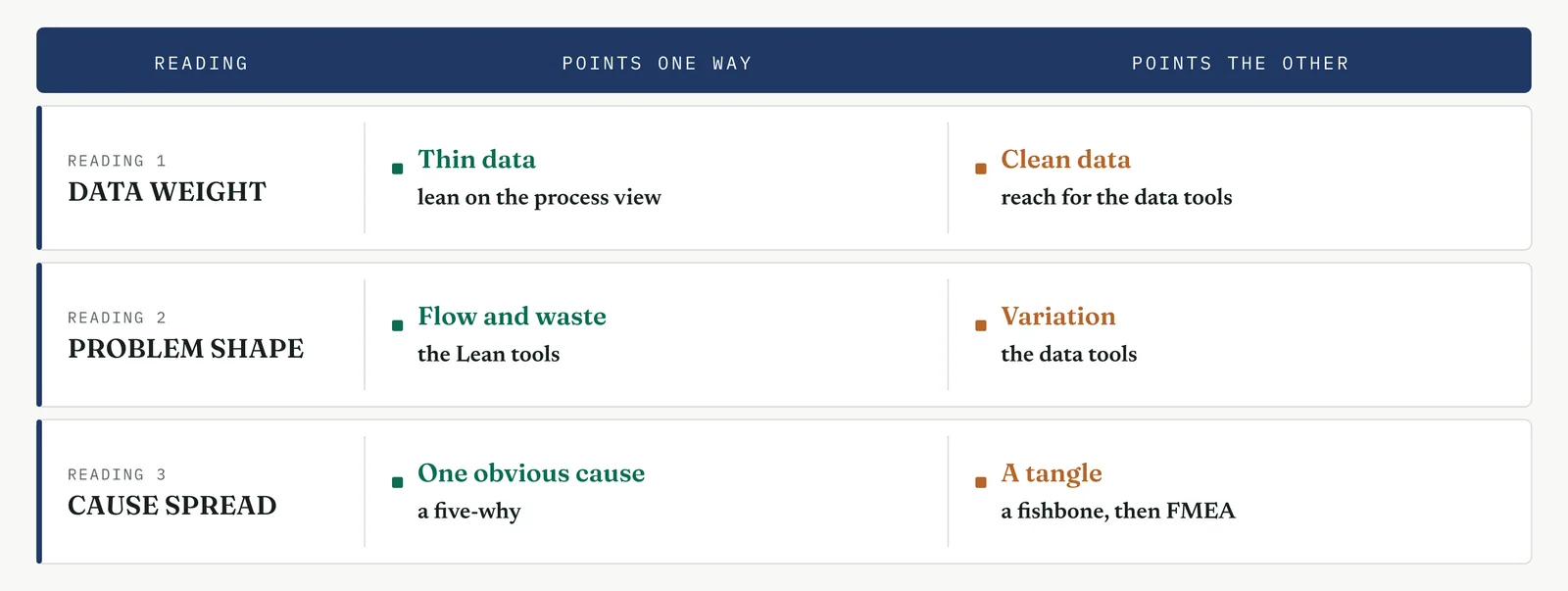
The first reading is the weight of your data. Clean, plentiful data lets you test. You can run a hypothesis test, fit a regression, compare groups with ANOVA, even design an experiment. Thin or dirty data cannot carry any of that, and forcing it produces a number that looks like proof and is not. Thin data sends you to the process view, where the map, the waste count and the flow analysis show where the time goes without asking the data to do work it cannot.
The second reading is the shape of the problem. A variation problem is one where an output swings and you hunt the variable that drives the swing. That is the home ground of the data tools. A flow and waste problem is one where time is lost between steps, in queues and handoffs and rework. That is the home ground of the Lean tools, waste analysis, value stream analysis and bottleneck analysis. Most delay problems in an immature firm are flow problems in a variation costume, so read this one carefully before you reach for a statistical test that has nothing to bite on.
The third reading is the spread of the causes. One obvious cause takes a five-why, run down to the flaw you can fix. A tangle of contested causes takes more. You lay them out on a fishbone so the whole team sees them at once, then rank them with a process FMEA so effort goes to the few that carry risk. The reading tells you how much machinery the causes deserve, so you neither crack one clear cause with a fishbone nor face twelve tangled ones with a single why.
13.2.3 The worked selection for Crestline
Read the Crestline project against the three readings and the kit chooses itself. The data is thin, 58 cases with no clean history, so the phase leans on the process view. The problem is flow and waste, delay across three handoffs, not a value swinging around a variable, so the Lean tools lead. The causes are contested and several, headcount against handoffs, so the fishbone and the FMEA both earn their place. Read that way, it runs the tools in Table 13.2. Hand the same three readings a data-rich variation project with a real case system and the answers flip. The Lean tools give ground to regression and a designed experiment, and the list comes out different. Reading the project first is what lets one toolkit serve both.
Table 13.2 The Crestline Analyse tool selection. The two mandatory tools plus the ones a thin-data flow problem calls for, and three the project does not.
| TOOL | ISO STATUS | RUN OR SKIP | WHY, FOR CRESTLINE |
|---|---|---|---|
| Process mapping for analysis | Recommended | Run | The Measure map showed the steps. Analyse marks where value is added and where it is not. |
| Waste analysis, the eight wastes quantified | Lean | Run | A flow problem, so name and size the waste sitting between the three desks. |
| Value stream analysis, current against ideal | Lean | Run | Sets the current flow against the ideal to expose the gap the delay hides in. |
| Bottleneck and flow analysis | Lean | Run | Finds the desk where cases stack, which is where the time is lost. |
| Cause and effect, Ishikawa | Recommended | Run | Lays out every candidate cause of the delay in one view before ranking. |
| Brainstorming | Suggested | Light | Feeds the fishbone. Kept short, the team already knows the ground. |
| Five-why | Suggested | Run | Drives the top handoff cause down to the flaw that can be fixed. |
| Process FMEA | Mandatory | Run | Always. Ranks the candidate causes by risk so effort goes to the vital few. |
| Scatter and Pareto plots | Suggested | Run | Pareto ranks the delay causes. Scatter checks whether staffing tracks delay. |
| Hypothesis testing | Recommended | Light | The sample is small, so test only the headcount claim and read the result with care. |
| Regression and correlation | Recommended | Light | Check whether team size explains resolution time. Expect a weak link. |
| ANOVA | Recommended | Skip | No grouping factor with enough clean data to compare. Not justified here. |
| Design of experiments | Recommended | Skip | The process cannot be run as an experiment and the data will not carry one. |
| Reliability | Recommended | Skip | Not a failure-over-time problem. Nothing to model. |
| Capability analysis | Recommended | Light | Report performance on the proven cause, not capability, the process is not stable. |
| Project review | Mandatory | Run | Always. The gate that closes the phase. |
The three skips in that table matter as much as the runs. ANOVA, a designed experiment and a reliability model are not weak tools. They are the wrong tools for a thin-data flow problem, and running them to look thorough would cost weeks and prove nothing. Choosing well is as much about what you put down as what you pick up.
13.2.4 The same kit on different ground
The three readings settle the problem. They do not settle the firm. The same delay, on two different firms, calls for a different opening move, because Analyse has to land with the people in the room as much as with the data on the page. Chapter 1 set out four grounds you walk onto. Each one bends the tool choice before the problem does. Figure 13.4 shows how.
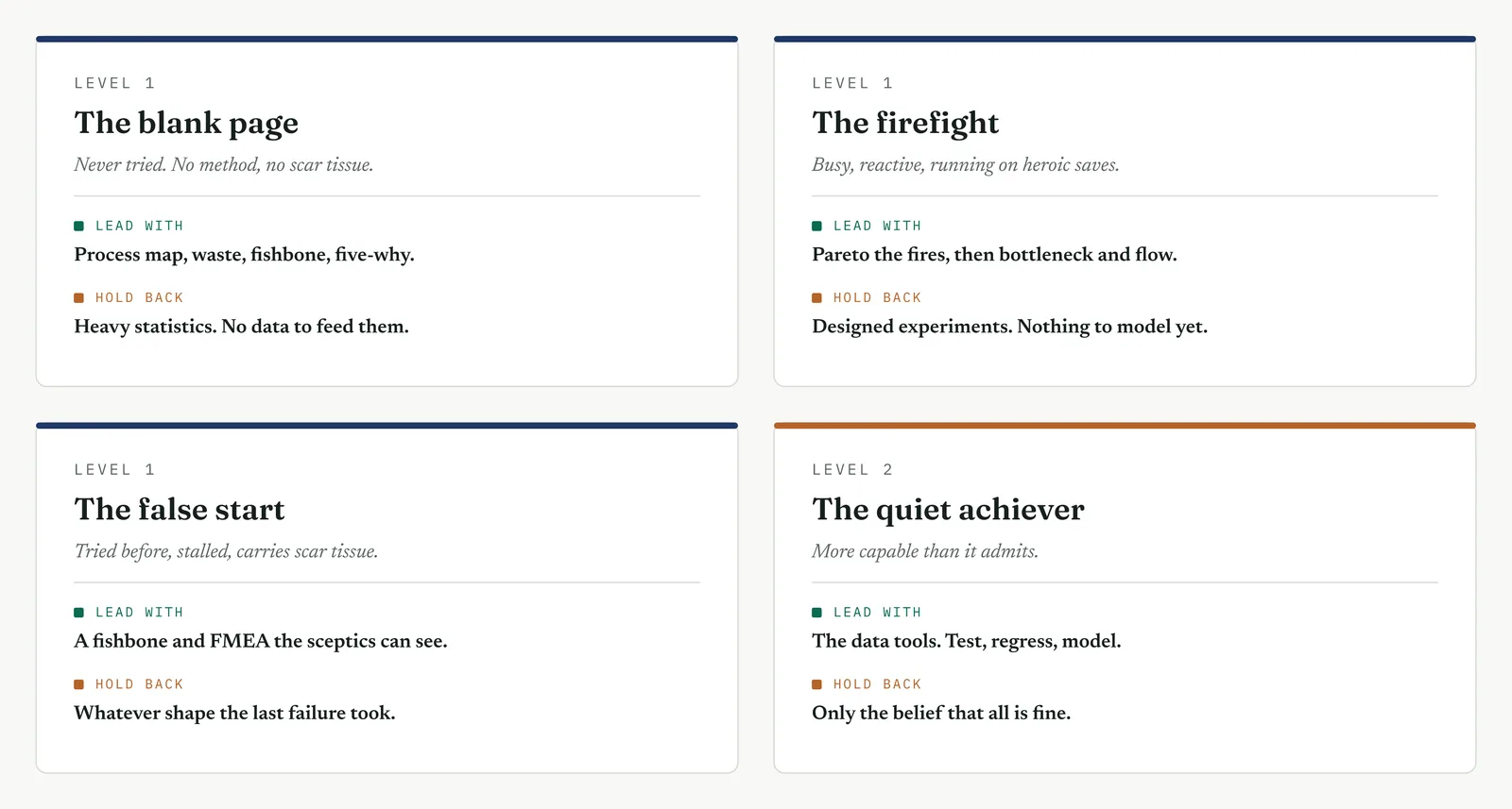
On a blank page the firm has never run improvement, so it carries no data and no cynicism. Lead with the process view, a map, a waste count, a plain fishbone and a five-why, and let the firm watch a proven cause take shape for the first time. The heavy statistics have nothing to feed on and no one ready to read them. Save them for a later project, once the firm has a measurement habit worth testing.
In a firefight the firm is loud, reactive and certain it already knows the answer. Rank the fires with a Pareto, find where the work stacks with a bottleneck and flow analysis, and run a tight five-why on the one fire that carries the cost. The pull here is to skip Analyse and keep fighting, because standing still to think feels like a luxury the firm cannot afford. Refuse it. Turn the loudest cause, which is almost always more people, into a claim you can test in an afternoon.
On a false start the firm has tried before and carries scar tissue. The proof has to be undeniable, because the room is half waiting for you to fail the way the last effort did. Build the fishbone and the FMEA with the sceptics in the room, so the finding is theirs as much as yours, and verify against whatever data exists however thin. Read the shape of the last failure before you pick a tool. If it drowned in workshops, bring numbers. If it drowned in analysis, be fast and decisive.
The quiet achiever is the one ground where the data tools lead. The capability is already there, usually unnamed, a tidy spreadsheet no one mentions, a team leader who runs a clean process by instinct. Test, regress and model where the data is clean, and carry a fuller FMEA than the other three grounds allow. The only real risk is complacency. The current numbers look acceptable, so no one digs, and Analyse becomes the place you show the firm the gap it has stopped seeing. Table 13.3 sets out why the kit shifts on each ground, and the trap that comes with it.
Table 13.3 Why the Analyse kit shifts across the four grounds, and the trap each ground sets.
| GROUND | WHY THE KIT SHIFTS | THE TRAP |
|---|---|---|
| The blank page | No data and no audience for statistics, so the process view does the proving. A cause the team can see for itself builds the method faster than any test result. | Reaching for heavy tools to look credible. Credibility here comes from a cause the room can see, not a number it cannot read. |
| The firefight | Everything is urgent and the data is thin, so you rank before you dig. Pareto and flow analysis find the fire worth fighting, and a five-why lands its cause. | Letting the room skip Analyse to keep fighting. Every stated cause, more people included, becomes a claim you test, not a reflex you fund. |
| The false start | The audience is primed to dismiss you, so the proof must be undeniable and the sceptics must help build it. Verify against whatever data exists. | Repeating the last failure. Read the scar first. If it was all workshops, bring data. If it was paralysis, be decisive. |
| The quiet achiever | The data and discipline exist, often unnamed, so the statistical tools finally earn their place, backed by the process view. | Complacency. The current numbers look fine, so no one digs. Analyse is where you show the gap the firm has stopped seeing. |
Read the ground first, then the problem. The three readings tell you which tools can carry the finding. The ground tells you which tools the firm can hear. A cause is only proven when both hold at once, when the evidence stands up and the room believes it.
13 · ANALYSE MOVEMENT ONE · SEE WHERE THE PROCESS LOSES
13.3 The toolkit, walked through the ISO Analyse steps
Sixteen tools, grouped into four movements that follow the shape of the phase. You see where the process loses, you surface the candidate causes, you test them against the data, then you confirm the driver and close. You will not run all sixteen on one project. You reach for the movement your problem sits in, and you choose within it using the three readings from 13.2. Every tool runs on the same seven stages. The trigger says when to reach for it. The build gives you the moves. Crestline shows it worked. Reading the result says what the output means. Four firms shows how the tool shifts across the grounds. Where it breaks lists the traps. And at the gate says what the tool lets you defend and what it feeds.
| MOVEMENT ONE See where the process loses |
Before you name a cause, you find where the time and the value go. These four tools read the process itself. They hold up whether or not the data is thick, which makes them the natural opening move in an immature firm, and every ground starts here.
13.3.1 Process mapping for analysis
Recommended ISO 13053 Factsheet 05
Purpose. Take the timed map you already have and mark where value is added and where it is not, so the wait separates from the work and the size of the loss becomes a number.
Stage 1. The trigger
The trigger
Measure drew the process and timed it. It did not judge it. You reach for value analysis on the map when you have the steps and the times, and you need to know which of them the client would pay for and which are pure loss. You reach for it when the process is busy but slow, when everyone is working and nothing is moving, or when a leader wants to add people to a process that is mostly waiting. It is a flow tool. On a variation problem, where the same step gives a different result each time, it earns less.
The tool produces one number and a split. The number is the share of the lead time that adds value. The split sorts the rest into waits, where the case sits, and loops, where work comes back. Effort and value are not the same thing, and this is the tool that tells them apart.
Stage 2. The build
The build
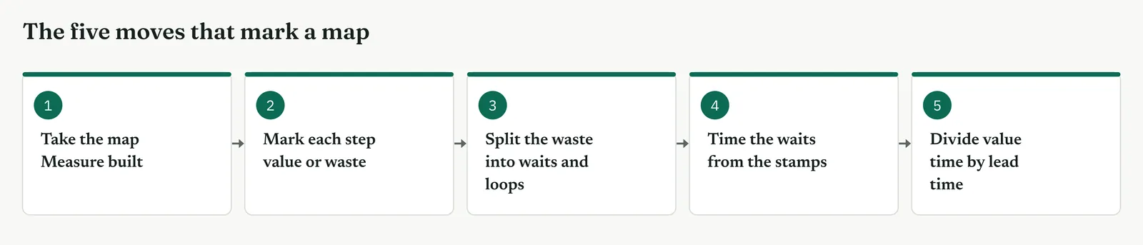
Take the map Measure built. Do not redraw it. Analyse marks the map you already have, it does not start a new one.
Mark every step value or waste. Judge from the client seat, not the doer seat. The client pays for the resolution, not for the case sitting in a queue.
Split the waste, do not just name it. A wait is a queue with no one working. A loop is work coming back. Mark each apart, because a wait and a loop need different fixes.
Time the waits from the stamps. The waits are the finding, so take them from the case system, not from what a handler remembers.
Divide value time by lead time. That ratio, the process cycle efficiency, is the single number the tool exists to produce.
| TIP Judge value from the client seat, not the doer seat. A careful review feels essential to the person who does it. Ask instead whether the client would pay for it, and the honest answer is often no. |
Stage 3. Crestline on the floor
Crestline on the floor
The Crestline map carried nine steps across the three desks. Marked against value, five were value and four were pure wait, and case handling hid a loop where rejected cases came back to be resolved again. The five value steps came to about eighty minutes of work. The four waits came to almost six days. Eighty minutes of value sat inside six days of elapsed time, and that gap is the whole shape of the problem.
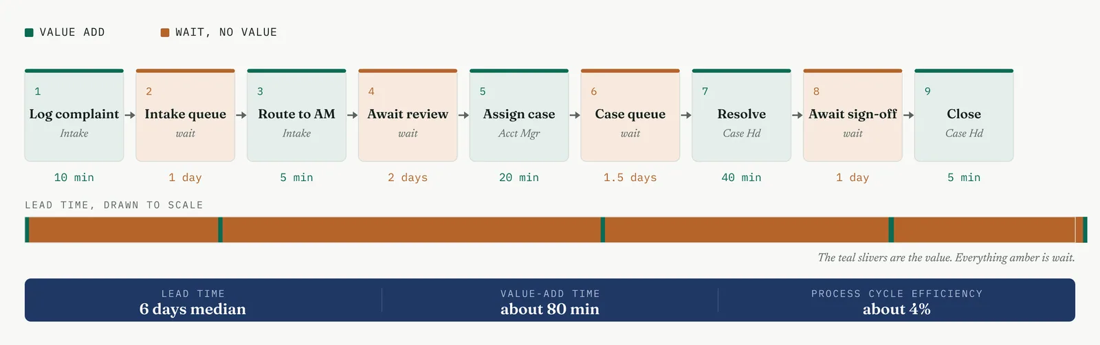
Written out, the marking looked like Template 13.1. Each step carried its desk, its mark, and the time seen on the floor. The value steps were minutes. The waits were days. And the single loop, a rejected case reopening, carried more time on its own than all five value steps combined.
Template 13.1. The Crestline step inventory. Every step with its desk, its mark, and the time seen on the floor.
| STEP | DESK | MARK | TIME OBSERVED |
|---|---|---|---|
| Log the complaint | Intake | VALUE | 10 min |
| Intake queue | Intake | WAIT | 1 day |
| Route to account manager | Intake | VALUE | 5 min |
| Await manager review | Account mgr | WAIT | 2 days |
| Assign to case handler | Account mgr | VALUE | 20 min |
| Case queue | Case handling | WAIT | 1.5 days |
| Resolve the complaint | Case handling | VALUE | 40 min |
| Await client sign-off | Case handling | WAIT | 1 day |
| Close and notify | Case handling | VALUE | 5 min |
| Reopen a rejected case, loop | Case handling | LOOP | up to 4 days |
The one line it produced. The work takes eighty minutes. The customer waits six days. The distance between eighty minutes and six days is the project.
Stage 4. Reading the result
Reading the result
Three readings settle what the marked map is telling you.
| STRONG | The value steps are few and short, the waits carry almost all of the lead time, and the loss is split into waits and loops that each point at a fix. The map has done its job. |
| WEAK | Most steps marked value, or waits recorded with no time against them. Value was judged from the doer seat, not the client seat, and the efficiency will come out flattering and false. |
| THE TELL | A process cycle efficiency in single figures, with the wait pooled in the handoffs between desks. That is a flow problem, and it sends Analyse to the gaps between teams, not inside them. |
Stage 5. Four firms, four moves
Four firms, four moves
The four grounds from Chapter 1 each change how you mark the map and how you defend the marks.
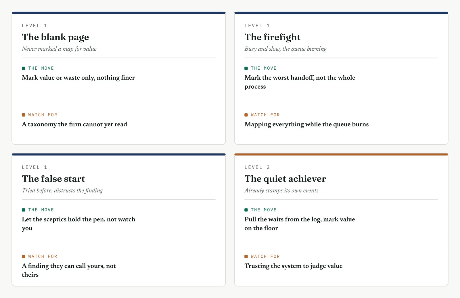
The blank page LEVEL 1
This firm has never looked at its process as value against waste. Keep the first pass simple and mark value or waste only, leaving the finer split of waits and loops for a second pass. One agreed marking shows the firm what the tool buys.
The firefight LEVEL 1
This firm has no patience for a whole-process analysis while the queue burns. Mark only the stretch where the delay pools, usually one handoff, and leave the rest. One marked handoff that exposes days of wait earns you the rest.
The false start LEVEL 1
A past effort produced an analysis nobody trusted. Mark the map with the sceptics holding the pen, not watching. When the account manager marks their own review as waste, the finding is theirs and cannot be dismissed as yours.
The quiet achiever LEVEL 2
This firm already stamps its events, so the waits are recorded. Pull the waits from the log, then mark value on the floor, because the system records the work but not whether it added value. You save the timing and keep the judgement.
Stage 6. Where it breaks
Where it breaks
1. Marking from the doer seat. Every step feels essential to the person who does it. Judge value from the client side, or every step comes out value and the map proves nothing.
2. Collapsing waits and loops into one word. A wait and a loop need different fixes. Keep them apart, or you lose the route to the cure.
3. Guessing the waits instead of timing them. The waits are the finding, so an estimated wait is a guessed finding. Take them from the timestamps.
4. Counting a rework loop once. A loop that fires on one case in five still carries its full time every time. Weight it by how often it fires, or you understate the loss.
5. Reporting an efficiency with no lead time beside it. The ratio alone invites the argument that you chose it. Show the value minutes and the elapsed days that made it.
Stage 7. At the gate
At the gate
What it lets you defend. The sponsor asks whether the delay comes from working too slowly or from waiting too long. The marked map answers waiting. Eighty minutes of work inside six days of elapsed time means more hands on the work cannot touch a number that lives in the waits. When a leader calls for headcount, you point at the map.
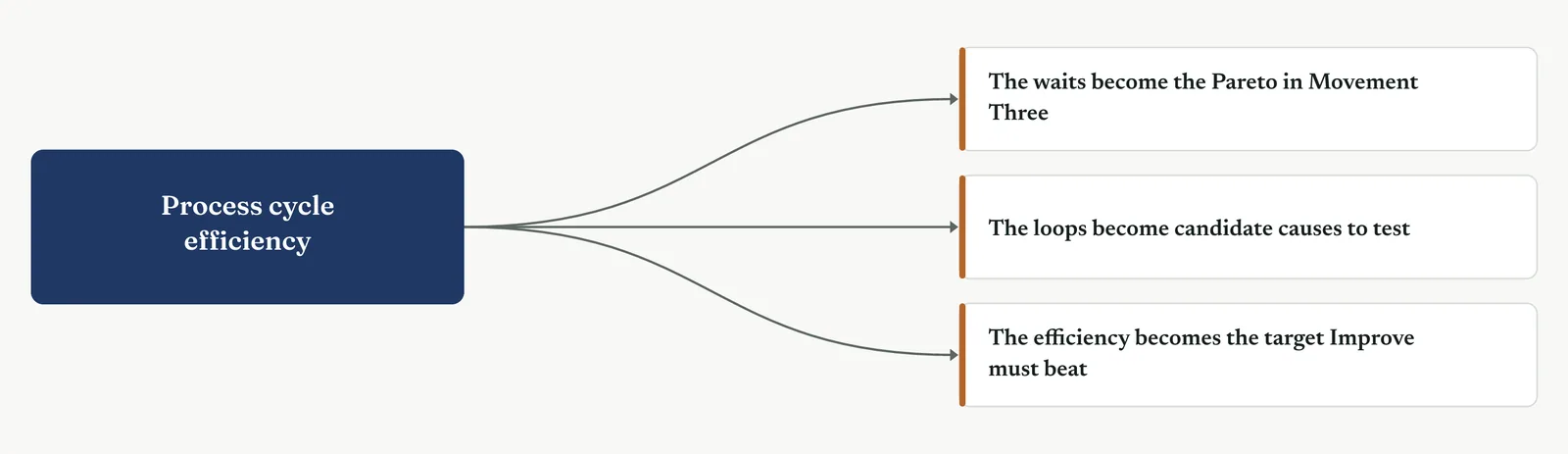
What it feeds. The waits become the Pareto in Movement Three, ranked by the time each carries. The loops become candidate causes for the cause and effect work. And the process cycle efficiency, near 4%, becomes the baseline the redesign has to beat.
13 · ANALYSE MOVEMENT ONE · SEE WHERE THE PROCESS LOSES
13.3.2 Waste analysis, the eight wastes quantified
Lean established practice
Purpose. Name the waste against the eight standard types and put a time or a cost on each, so the loss is sized rather than just felt.
Stage 1. The trigger
The trigger
You reach for waste analysis once the map has shown where the process loses and you need to name and size what is being lost. The map shows the case waits. Waste analysis says what kind of waste the waiting is and what it costs. You reach for it when the firm feels busy and wasteful but cannot say where the time goes, when you need to rank the losses before choosing which to attack, or when the data is too thin to test but the waste is there to observe. Like the map, it holds up on thin data, because most waste is seen on the floor, not pulled from a system.
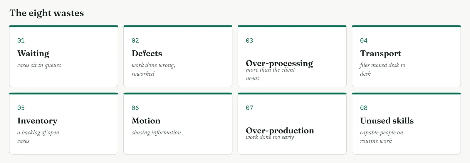
The tool produces a ranked, sized list. Eight named types, a number against each, sorted largest first. It turns a vague sense that the firm is wasteful into a short list of losses you can attack in order. Figure 13.9 sets out the eight types the sweep runs through.
Stage 2. The build
The build
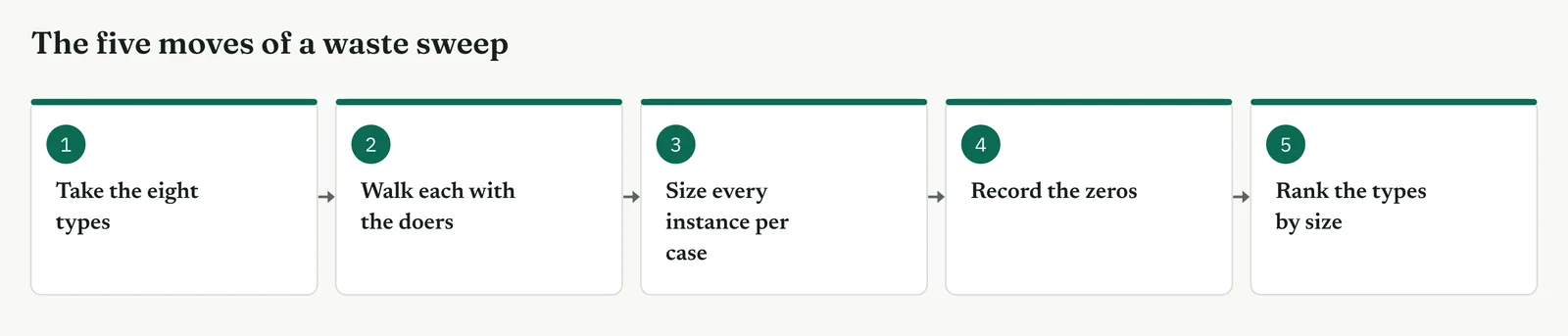
Take the eight types in turn. Waiting, defects, over-processing, transport, inventory, motion, over-production and unused skills. A checklist finds waste by category, not by whichever type springs to mind first.
Walk each type with the people who do the work. Ask them where it shows up, do not fill it in from a desk. The people on the floor see the waste you cannot.
Size every instance per case, not per year. The per-case figure is the one you multiply in front of the sponsor, and the one that survives when someone questions your volume.
Record the zeros. A firm with no over-production has none, so write none. A find forced into every box costs you the trust the sweep needs.
Rank the types by size. Carry the top two or three into the cause work, and leave the rest noted but parked. A sweep that ends with all eight equal has ranked nothing.
| TIP Size the waste per case, not per year. The per-case figure is the one you multiply in front of the sponsor, and it holds when the annual volume is questioned. |
Stage 3. Crestline on the floor
Crestline on the floor
Walked against the eight types, the Crestline process lost most to two. Waiting, cases sitting in queues between the three desks, ran to about five and a half of the six days. Defects, the eighteen in every hundred first responses that came back wrong and had to be reworked, added about a day each time they fired. Motion and transport were minutes. Over-production was absent, and the team wrote none. Unused skills showed once, a trained lead doing routine logging. Template 13.2 holds the worked sheet.
Template 13.2. The eight wastes walked against the Crestline complaint process, with what was found and the rough cost per case.
| WASTE TYPE | FOUND AT CRESTLINE | ROUGH COST PER CASE |
|---|---|---|
| Waiting | Cases queue between Intake, Account Managers and Case Handling | About 5.5 of the 6 days |
| Defects | 18 in 100 first responses wrong, then reworked | About 1 extra day when it fires |
| Over-processing | The same complaint detail logged twice on two systems | About 15 minutes |
| Transport | Files emailed desk to desk, re-attached at each hop | About 10 minutes |
| Motion | Chasing case status across three separate systems | About 20 minutes |
| Inventory | A standing backlog of open cases in the shared queue | Hides the true age of a case |
| Over-production | None found | Not present here |
| Unused skills | A trained lead handling routine logging | Judgement lost, not minutes |
The one line it produced. Two wastes carry the loss, waiting and rework, and both live in the handoffs between the three desks.
Stage 4. Reading the result
Reading the result
Three readings settle what the sweep is telling you.
| STRONG | Two or three types carry almost all of the loss, and the rest are small. A short, sized list is a ranked target for the cause work that follows. |
| WEAK | An even spread across all eight, or a find forced into every box. That usually means the walk was shallow, or the team was completing a form rather than reading the floor. |
| THE TELL | Waiting and defects at the top. That pairing is the signature of a broken handoff, where work stalls between owners and is passed on wrong. |
Stage 5. Four firms, four moves
Four firms, four moves
The four grounds from Chapter 1 each change where you aim the sweep and how you report it.
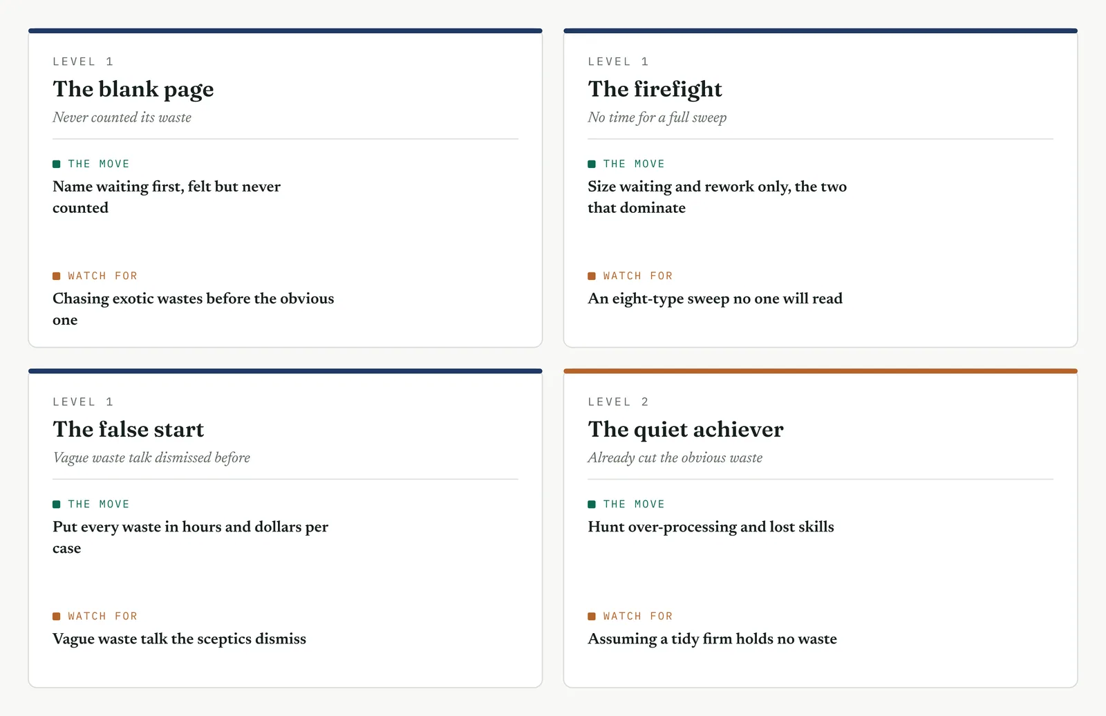
The blank page LEVEL 1
This firm has never counted its waste. Run the sweep on the one type it feels most, usually waiting, and put a number on it. One sized waste shows the firm that a feeling can become a figure.
The firefight LEVEL 1
This firm has no time for an eight-type sweep while the queue burns. Size waiting and rework, the two that dominate, and leave the other six for later. Two sized wastes carry the argument.
The false start LEVEL 1
A past effort talked about waste in vague terms nobody trusted. Put every waste in hours and dollars per case, so the sceptics argue with a number rather than a word.
The quiet achiever LEVEL 2
This firm has already cut the obvious waste. Hunt the subtle kinds, over-processing and unused skills, where a capable firm hides the loss it has left.
Stage 6. Where it breaks
Where it breaks
1. Forcing a find in every category. Some wastes are genuinely absent. Record the zero and move on.
2. Sizing waste per year instead of per case. The per-case figure is the one that survives scrutiny at the gate.
3. Counting waiting as one waste when it hides several. Separate the queue waits from the rework waits, because they need different fixes.
4. Reading the waste from a system, not the floor. The system records the work, not the waiting between it. Walk it.
5. Stopping at naming without sizing. A named waste is an opinion. A sized waste is a target.
Stage 7. At the gate
At the gate
What it lets you defend. The sponsor asks where the time goes. Waste analysis answers with a ranked, sized list, and puts waiting and rework at the top, which is exactly where more people cannot help. When a leader calls for headcount, you show the sized wastes and the plain fact that hands do nothing about a queue.
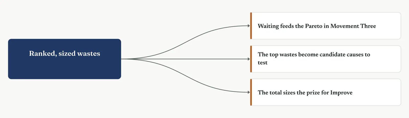
What it feeds. The ranked wastes feed the Pareto and the cause and effect work in the next movements. Waiting, sized here, becomes the first candidate cause to verify against the data.
13 · ANALYSE MOVEMENT ONE · SEE WHERE THE PROCESS LOSES
13.3.3 Value stream analysis, current against ideal
Lean established practice
Purpose. Set the current value stream against the ideal one, so the gap between how the work flows now and how it could flow becomes the target the redesign has to close.
Stage 1. The trigger
The trigger
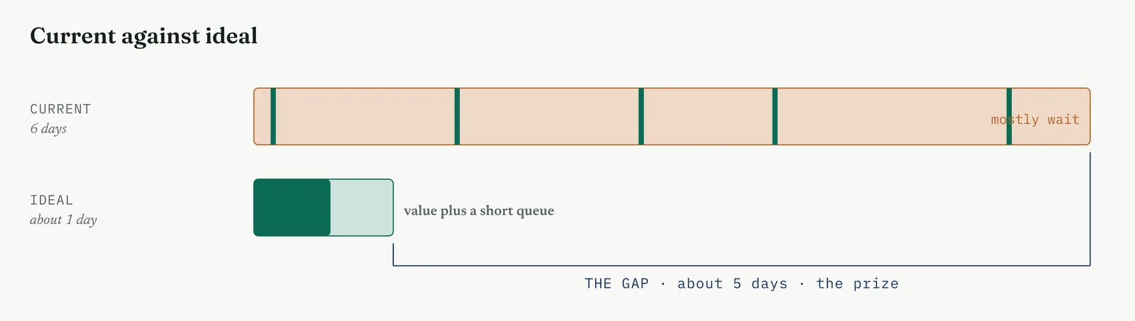
The map marked value and waste. Value stream analysis takes the next step and asks what the stream would look like with the waste gone. You reach for it when you have the current flow and need to show the sponsor the size of the prize, not just the size of the problem. It draws two streams together, the one that runs now and the one that could, and the distance between them is the improvement on offer.
Reach for it when the delay is spread across several steps rather than stuck in one, when you need to turn a waste count into a future-state target, or when the sponsor needs to see that the ideal is reachable rather than a fantasy. It is a flow tool, strongest when the problem is lead time. On a variation problem it has little to say.
Stage 2. The build
The build
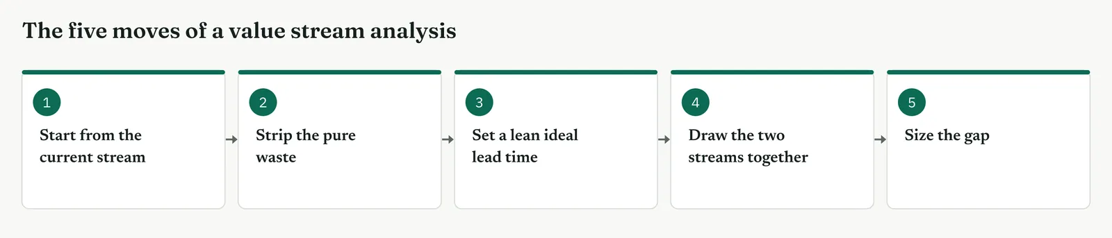
Start from the current stream. Use the timed map, not a fresh draft. The current state is what Measure already built, and redrawing it only adds error.
Strip the pure waste. Remove the waits and the loops the map marked, and leave the value steps untouched. You are removing the delay, not the work.
Set a lean ideal lead time. Sum the value time and a realistic minimum queue, not zero. The ideal is lean, not magic, and a queue of zero needs infinite capacity.
Draw the two streams together. Current above, ideal below, on the same scale, so the gap is visible at a glance rather than argued in a table.
Size the gap. The distance between the current and the ideal lead time is the prize. Put a number on it, because a gap without a number does not fund a project.
| TIP The ideal is not zero wait. A stream with no queue at all needs infinite capacity. Set the ideal at the minimum queue a sane process carries, or the target reads as a fantasy and the sponsor stops listening. |
Stage 3. Crestline on the floor
Crestline on the floor
The Crestline stream ran six days for eighty minutes of work. Stripped of the four waits and the rework loop, the value steps alone still took eighty minutes, but a realistic ideal carried a short queue at each desk, about half a day across the whole stream. The ideal lead time came to about one day against the current six. The gap, five days, was the prize, and it sat entirely in the waits the redesign would have to remove. Template 13.3 sets the two streams side by side.
Template 13.3. The Crestline stream, current against ideal, measure by measure. The gap sits entirely in the waits.
| MEASURE | CURRENT STREAM | IDEAL STREAM |
|---|---|---|
| Value time | About 80 minutes | About 80 minutes |
| Wait between desks | About 5.5 days | About half a day |
| Rework loop | Up to 4 days when it fires | Designed out |
| Lead time | About 6 days | About 1 day |
| Process cycle efficiency | About 4% | About 12% |
The one line it produced. The stream runs in six days. It could run in one. The five days between them is the project.
Stage 4. Reading the result
Reading the result
Three readings settle what the two streams are telling you.
| STRONG | The ideal is lean but reachable, and the gap is large enough to be worth a project yet small enough to be believed. The two streams sit on one scale, so the gap needs no explaining. |
| WEAK | An ideal of zero wait, which no one believes, or an ideal barely below current, which is not worth the effort. Either way the gap fails to fund the work. |
| THE TELL | A gap that sits almost entirely in the waits. That confirms the flow problem and sizes the redesign, because the fix is removing queues, not speeding hands. |
Stage 5. Four firms, four moves
Four firms, four moves
The four grounds from Chapter 1 each change how you set the ideal and how you defend it.
The blank page LEVEL 1
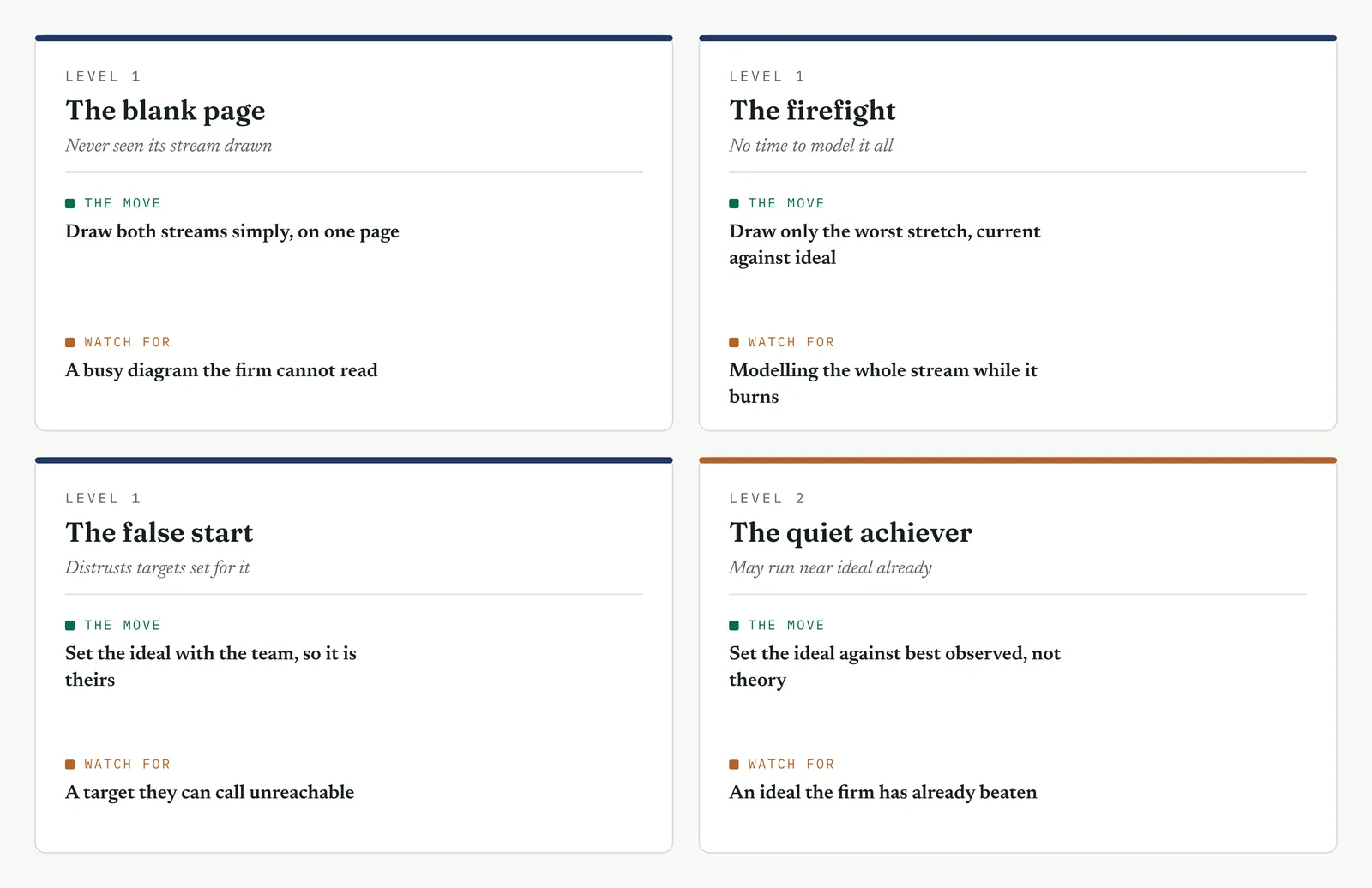
This firm has never seen its stream drawn, let alone an ideal. Draw both simply, one current and one ideal, on a single page. The gap between them is the argument, and it needs no more than two bars to make.
The firefight LEVEL 1
This firm has no time to model the whole stream while the queue burns. Draw only the worst stretch, current against ideal, and leave the rest. One stretch that shows days of removable wait earns you the standing to model the rest.
The false start LEVEL 1
A past effort set a target the team called unreachable and ignored. Set the ideal with the team in the room, so the future state is theirs. A target the team built cannot be dismissed as your fantasy.
The quiet achiever LEVEL 2
This firm may already run near ideal on some steps. Set the ideal against the best performance actually observed, not against theory, or you hand the firm a target it has already beaten and lose the room.
Stage 6. Where it breaks
Where it breaks
1. Setting the ideal at zero wait. A queue of zero needs infinite capacity. Set the ideal at the minimum queue a sane process carries, or the target is a fantasy.
2. Redrawing the current stream instead of using the timed map. A fresh draft adds error and invites argument. Start from what Measure already built.
3. Stripping value steps to make the ideal look better. You are removing delay, not work. Cut the waits and loops, and leave the value steps alone.
4. An ideal barely below current. A gap of hours does not fund a project. If the ideal sits close to current, the problem is not flow, and this is the wrong tool.
5. Sizing the gap without a number. Two streams and no figure is a picture, not a target. State the gap in days, and in cost if you can.
Stage 7. At the gate
At the gate
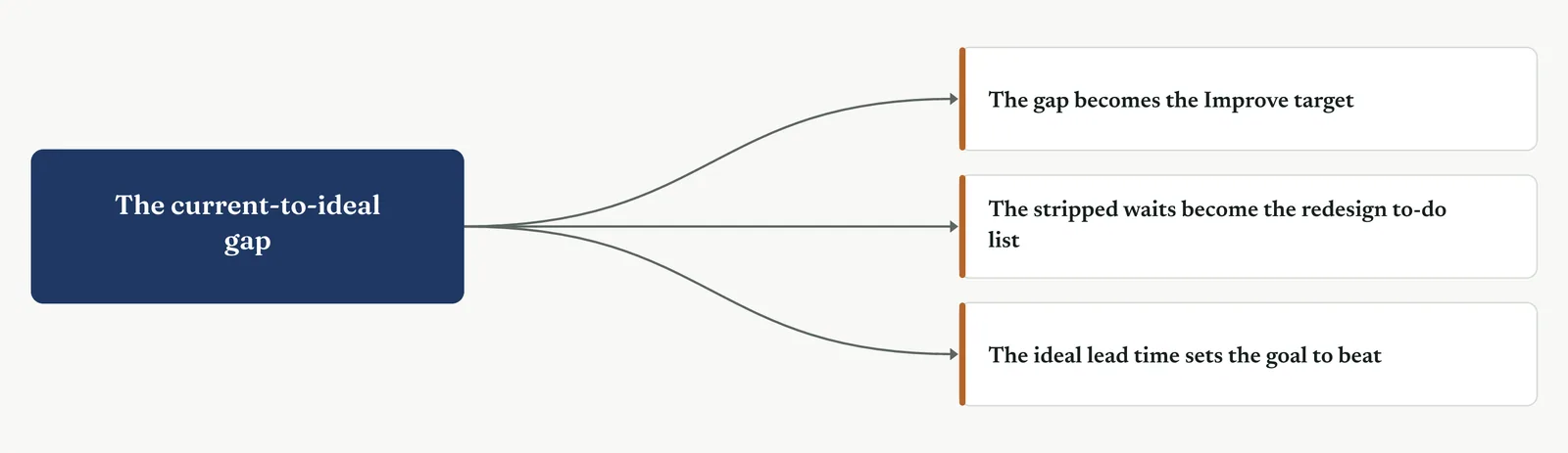
What it lets you defend. The sponsor asks whether the delay is fixable and how much is on offer. The two streams answer both at once. The ideal is reachable, drawn from the same process the firm already runs, and the gap is five days. That is a target no headcount request can match, because more hands do not remove a queue.
What it feeds. The gap becomes the target the Improve phase is measured against. The stripped waits become the redesign to-do list, each one a queue to remove. And the ideal lead time sets the number the new process has to beat.
13 · ANALYSE MOVEMENT ONE · SEE WHERE THE PROCESS LOSES
13.3.4 Bottleneck and flow analysis
Lean established practice
Purpose. Find the step where work stacks up faster than it clears, so the one desk that sets the pace of the whole stream is named and sized.
Stage 1. The trigger
The trigger
The value stream showed the delay sits in the waits. Bottleneck analysis asks which desk the waits pile up in front of. A bottleneck is the step whose capacity is below the demand on it, so work arrives faster than it leaves and a queue grows in front of it. You reach for it when the delay concentrates at one point rather than spreading evenly, when you need to name the constraint before you fix it, or when a leader wants to add people everywhere while the load sits on one desk.
The rule is old and it is hard. A stream can move only as fast as its slowest step. Speed up any step but the bottleneck and nothing changes, because the queue in front of the constraint is untouched. Find the bottleneck first, or you will spend the Improve phase making a step faster that was never the problem.
Stage 2. The build
The build
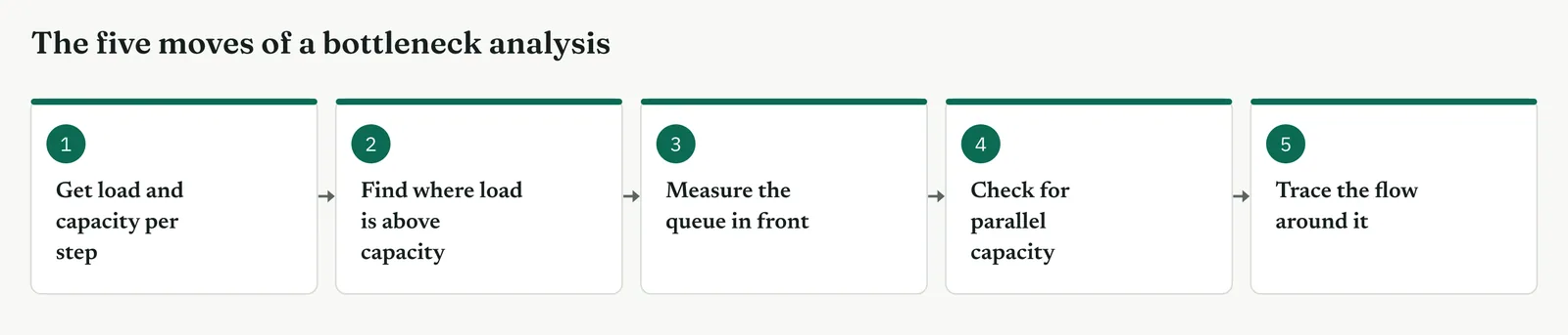
Get the load and the capacity of each step. Load is cases arriving per day. Capacity is cases the step can clear per day. You need both numbers, not a sense of how busy the desk feels.
Find where load runs above capacity. That step is the bottleneck, the one desk where the queue grows rather than clears. Everywhere else the queue holds steady.
Measure the queue in front of it. The length and the age of the queue size the constraint, not how hard the desk works. A busy desk with a steady queue is not behind.
Check for parallel capacity. A step is a constraint only if it cannot run more than one case at once. Count the handlers before you name it, because two handlers double the capacity.
Trace the flow around it. See how work moves upstream and downstream of the bottleneck, because a fix at the constraint ripples both ways and can move the queue rather than remove it.
| TIP Busy is not the same as bottleneck. Every desk feels busy. The bottleneck is the one where the queue grows day on day. Watch the queue, not the effort, and the constraint names itself. |
Stage 3. Crestline on the floor
Crestline on the floor
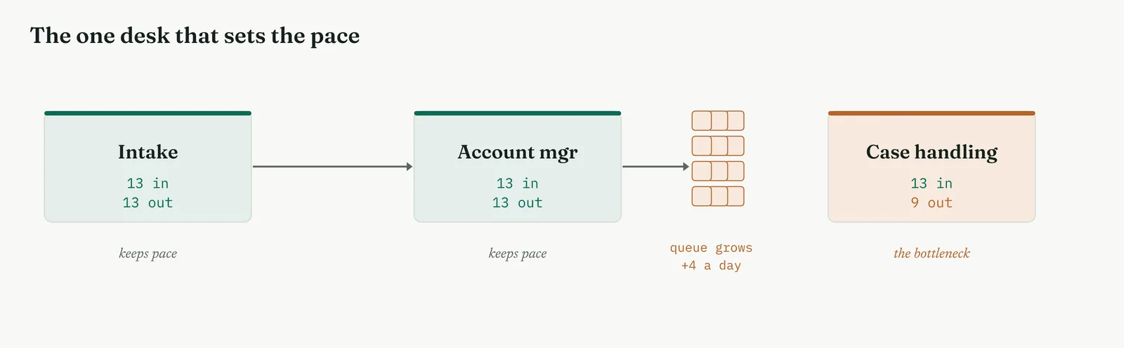
Across the three desks, intake cleared about thirteen cases a day against thirteen arriving, and the account managers kept pace too. Case handling cleared about nine a day against thirteen arriving, on a single handler taking forty-five minutes a case against a thirty-minute takt. The queue in front of case handling grew by about four cases a day, and that growing queue was the case queue wait the map had already found. Case handling was the bottleneck, and it was one handler deep. Template 13.4 sets the load against the capacity, desk by desk.
Template 13.4. The three Crestline desks, load against capacity per day. Only case handling clears fewer than arrive, so only its queue grows.
| DESK | LOAD PER DAY | CAPACITY PER DAY | QUEUE |
|---|---|---|---|
| Intake | 13 cases | 13 cases | Holds steady |
| Account managers | 13 cases | 13 cases | Holds steady |
| Case handling | 13 cases | 9 cases | Grows +4 a day |
The one line it produced. Two desks keep pace. One falls four cases behind a day. The queue in front of case handling is the delay.
Stage 4. Reading the result
Reading the result
Three readings settle what the load and capacity are telling you.
| STRONG | One step sits clearly above the rest in load against capacity, and the queue in front of it grows day on day. The constraint is named and sized, and the rest of the stream is cleared of blame. |
| WEAK | Every desk at or near capacity, which means the constraint is the whole stream, or the load and capacity were guessed. Re-measure across the demand range before you name one. |
| THE TELL | A queue that grows rather than clears in front of one step. A queue that holds steady is a buffer. A queue that grows is a bottleneck, and it is the only one worth fixing first. |
Stage 5. Four firms, four moves
Four firms, four moves
The four grounds from Chapter 1 each change how you find the constraint and how you defend it.
The blank page LEVEL 1
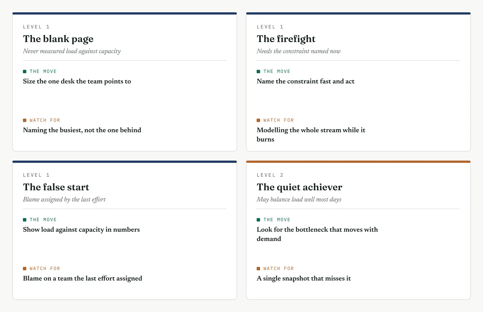
This firm has never measured load against capacity. Do it on the one desk the team already points to, and put the two numbers side by side. One sized constraint teaches the firm the rule that a stream moves only as fast as its slowest step.
The firefight LEVEL 1
In a firefight the constraint is usually obvious to everyone but unmeasured. Name it fast, size the queue in front of it, and act. Do not model the whole stream while the queue in front of the constraint keeps growing.
The false start LEVEL 1
A past effort blamed a team without measuring. Show load against capacity in numbers, so the constraint is a measurement the desk cannot argue with, not a verdict handed down. Numbers move the room where blame hardened it.
The quiet achiever LEVEL 2
This firm may already balance load well most of the time. Look for the intermittent bottleneck that appears only when demand peaks, not a fixed one. A snapshot on an average day will miss the constraint that bites on the busy one.
Stage 6. Where it breaks
Where it breaks
1. Naming the busiest desk as the bottleneck. Busy is not the same as behind. Watch the queue, and name the desk where it grows.
2. Counting capacity as one handler when the step runs in parallel. Two handlers double the capacity. Count the handlers before you call a step a constraint.
3. Measuring load on a quiet week. Load swings, so a quiet week hides the constraint. Measure across the demand range.
4. Fixing a step that is not the bottleneck. Speed up anything but the constraint and the stream does not move. The queue in front of the bottleneck is untouched.
5. Missing the bottleneck that moves. Some constraints shift with demand or with the mix of work. A single snapshot misses them, so watch across a fuller window.
Stage 7. At the gate
At the gate
What it lets you defend. The sponsor asks where to put the effort. Bottleneck analysis answers with one desk, case handling, and the growing queue in front of it. It closes off the plea to add people everywhere, because only the constraint sets the pace, and hands added anywhere else clear a queue that was never the problem.
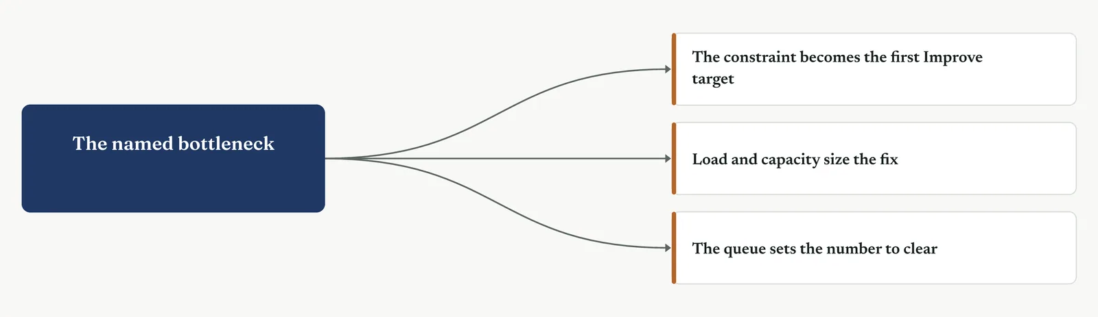
What it feeds. The named bottleneck becomes the first target of the Improve redesign. The load and capacity figures size whatever fix is chosen, a second handler, a faster process, or a smaller batch. And the growing queue sets the number the fix has to clear.
13 · ANALYSE MOVEMENT TWO · SURFACE THE CANDIDATE CAUSES
13.3.5 Cause and effect, the Ishikawa diagram
Recommended ISO 13053 Factsheet 09
Purpose. Lay out every candidate cause of the effect on one diagram, sorted by category, so the team sees the whole field of causes at once and picks the few worth testing.
Stage 1. The trigger
The trigger
Movement One found where the process loses. It did not say why. The cause and effect diagram, the fishbone, is where you turn the loss into a field of candidate causes. It puts the effect at the head and the possible causes on bones behind it, grouped by category, so nothing is missed and nothing is decided too early. It is the widest net in the phase, and the first tool in Movement Two for that reason.
You reach for it when the cause is contested and everyone has a theory, when you need every voice in the room on the wall before the argument narrows, or when you want to hold the loudest theory, usually headcount, next to every other candidate rather than let it win by volume. It is a divergent tool. It opens the field wide before the later tools close it.
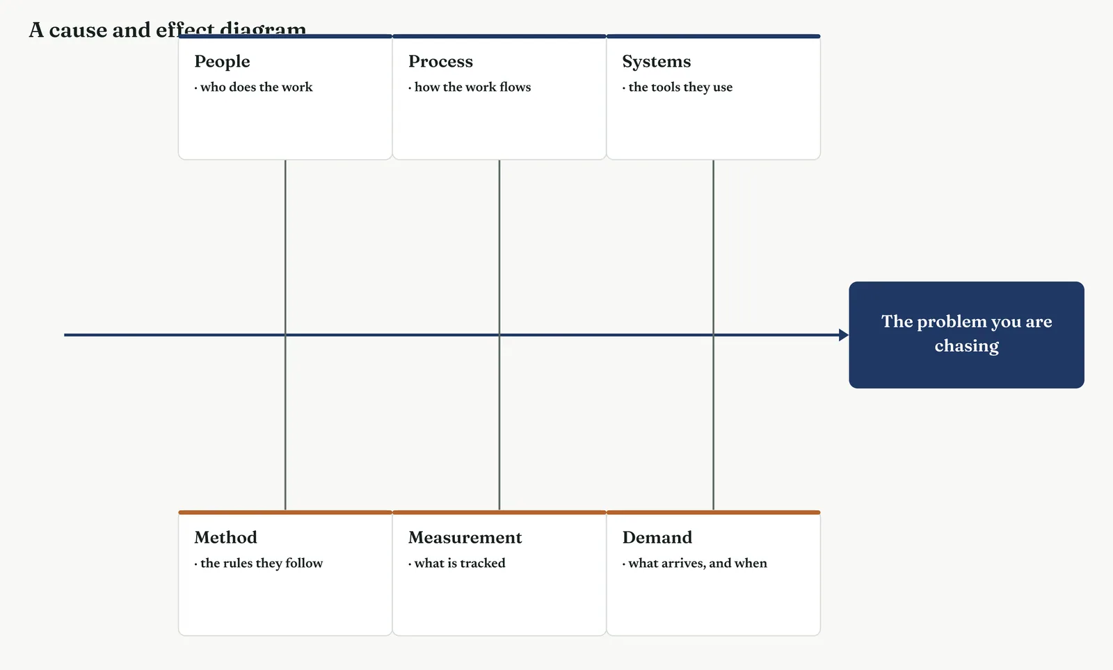
The fishbone does not prove anything. It is a map of what might be true, not what is. Its job is to make the field complete and visible, so the tests that follow aim at the right few. Treat a filled fishbone as a to-do list for verification, never as a finding. Figure 13.21 shows the empty frame you start from.
Stage 2. The build
The build
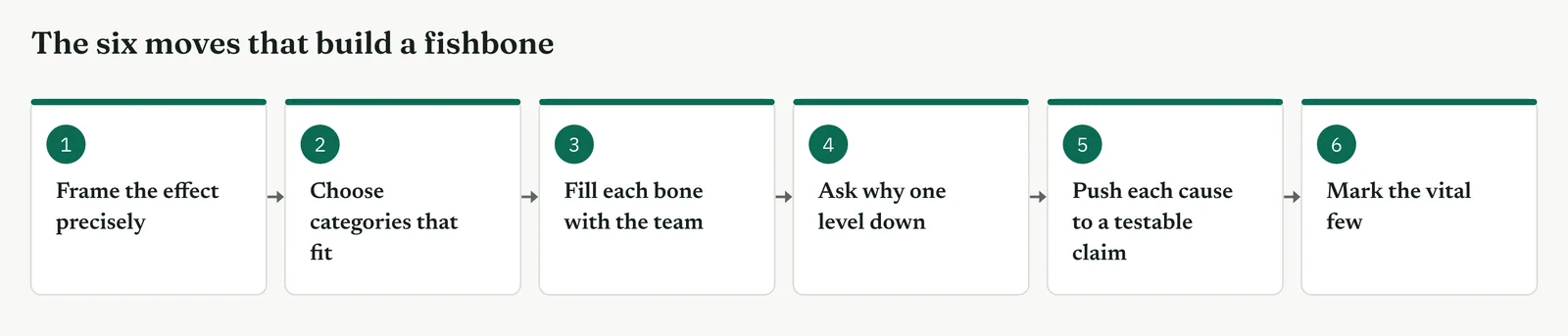
Frame the effect precisely. Write the problem at the head as a measured statement, complaint resolution takes six days against a two-day target, not cases are slow. A vague head grows a vague diagram.
Choose categories that fit the work. For a service process, People, Process, Systems, Measurement, Method and Demand read better than the factory six Ms. Pick the bones that fit, do not force the standard set.
Fill each bone with the team, not alone. Put the effect on the wall and let every desk run causes onto the bones. The account manager sees causes the belt cannot, and the argument between them is itself a finding.
Ask why one level down on each cause. A cause on a bone is often a symptom. Cases wait is not a cause. No one owns the handoff, so no one moves the case, is. Push each bone one level toward the flaw.
Push each cause to a testable claim. Turn every bone into something the data can accept or reject. Understaffing becomes, if staffing drives the delay, cases slow when the team is short. A cause you cannot test is a cause you cannot use.
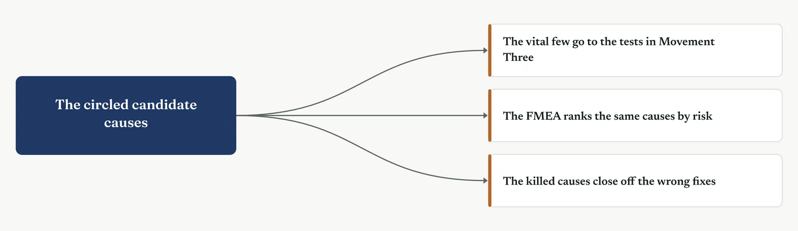
Mark the vital few. Circle the causes that are both most likely and most testable. Those go to Movement Three. The rest stay on the diagram, noted, not chased.
| TIP The fishbone is a divergent tool, so resist closing it early. The moment someone says it is obviously the staffing is the moment to add three more bones. Let the diagram get wide before you let it get narrow. |
Stage 3. Crestline on the floor
Crestline on the floor
The Crestline team built the fishbone with a person from each desk in the room. The head was the measured effect, six days against a two-day target. Six bones went up, and the causes filled in fast once the room saw that no theory was being ruled out. Figure 13.23 is the diagram they built.
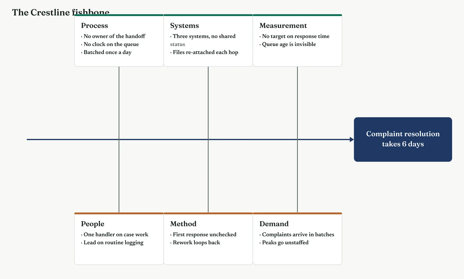
The Process bone carried the heaviest causes. No one owned the handoff between desks, no clock ran on the queue, and cases moved in a batch once a day. The Systems bone held three separate systems with no shared status, so a handler could not see where a case had been. Measurement showed no target on response time and no visibility of queue age. On the other side, People carried the headcount theory, one handler on case work, and the lead lost to routine logging. Method held the unchecked first response, the eighteen in a hundred that came back wrong, and the rework loop. Demand noted that complaints arrived in batches and peaks went unstaffed.
The team circled four causes as most likely and most testable. The unowned handoff, the queue with no clock, the single handler on case work, and the unchecked first response. The headcount theory stayed on the diagram, circled for test, because the honest move was to test it rather than dismiss it. Template 13.5 lists the causes by category and marks which went to verification and which were parked.
Template 13.5. The Crestline causes by category, with the four circled for test and the rest parked on the diagram.
| CATEGORY | CAUSE | DECISION |
|---|---|---|
| Process | No owner of the handoff | Test |
| Process | No clock on the queue | Test |
| Process | Cases batched once a day | Park |
| Systems | Three systems, no shared status | Park |
| Systems | Files re-attached at each hop | Park |
| Measurement | No target on response time | Park |
| Measurement | Queue age is invisible | Park |
| People | One handler on case work | Test |
| People | Lead lost to routine logging | Park |
| Method | First response unchecked, 18% wrong | Test |
| Method | Rework loops back | Park |
| Demand | Complaints arrive in batches | Park |
| Demand | Peaks go unstaffed | Park |
The one line it produced. Thirteen causes across six bones, four circled for test. The headcount theory is one of the four, and the data will decide it.
Stage 4. Reading the result
Reading the result
Three readings settle what the diagram is telling you.
| STRONG | Every category carries at least one cause, the heaviest bone is the one the process view already flagged, and the circled few are all testable. The diagram is complete and points somewhere. |
| WEAK | One bone carries everything, or the causes are symptoms rather than causes, or nothing is circled. A one-sided fishbone is a theory in disguise, and an uncircled one has not done its job. |
| THE TELL | The loudest theory sits on the diagram as one bone among many, not at the head. When headcount is one circled cause among four, the room has stopped letting it win by volume. |
Stage 5. Four firms, four moves
Four firms, four moves
The four grounds from Chapter 1 each change how you build the diagram and how you defend it.
The blank page LEVEL 1
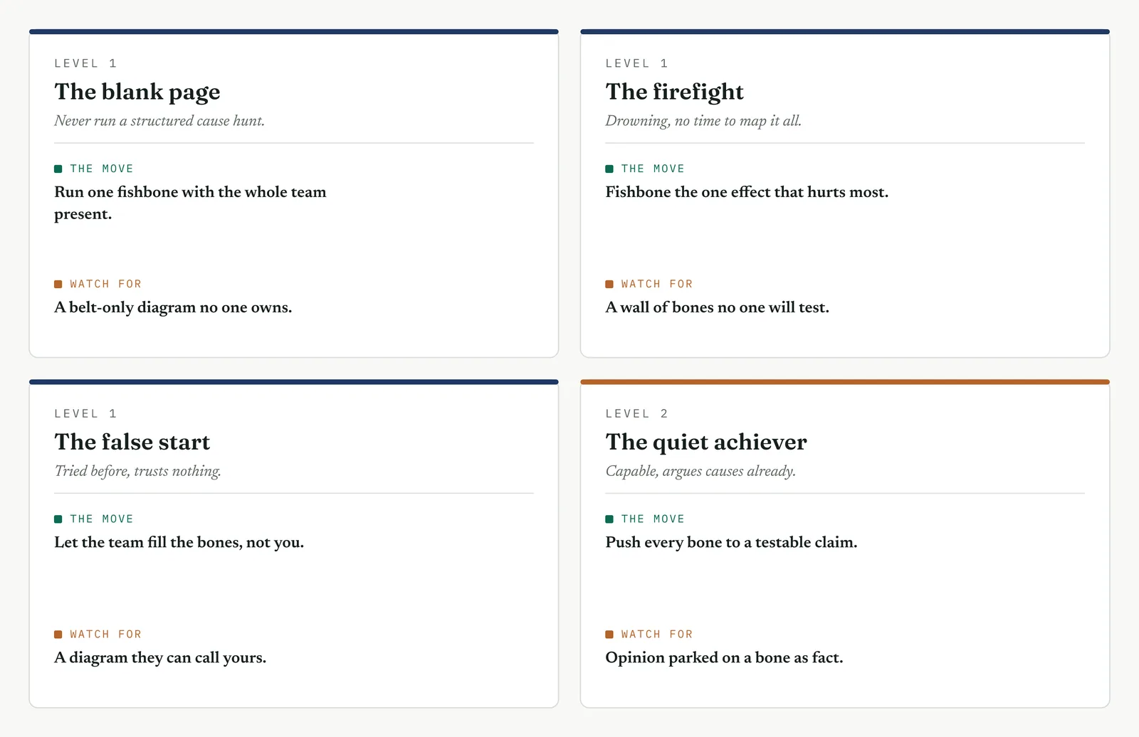
This firm has never run a structured cause hunt, and its instinct is to argue causes in a meeting until the loudest voice wins. Run one fishbone with the whole team in the room, and keep the categories to a simple six. Do not aim for a complete diagram on the first pass. The value on a blank page is not completeness, it is the first time the firm sees its causes laid out side by side with no blame attached to any of them. That one experience, causes on a wall instead of people in the dock, is what earns you the next project.
The firefight LEVEL 1
This firm is drowning, and it cannot stop to fishbone the whole operation while the queue keeps growing. Build one diagram on the single effect that hurts most, fill it fast in twenty minutes, and circle the two or three causes you can test this week. A focused fishbone that leads to one test beats a complete one that leads to a workshop. In a firefight, speed to a testable cause is worth more than coverage, because the firm judges you on whether the fire gets smaller, not on how thorough the diagram looked.
The false start LEVEL 1
This firm ran an improvement effort before that produced a fishbone the team quietly called the belt diagram, then ignored. The fix is ownership. Let the team fill the bones with their own hands and write their own words on the wall, not your tidy paraphrase of them. When a cause sits in the account manager language, the account manager defends it. Test the awkward causes in front of the whole team, and circle nothing the room has not agreed is worth testing. A diagram the team built is one they cannot later disown.
The quiet achiever LEVEL 2
This firm already argues about causes with some rigour, and its people can build a fishbone without much help. The risk is not a thin diagram, it is a plausible one that never gets tested. A capable firm parks a reasonable-sounding opinion on a bone and treats it as settled because it sounds right. Push every bone to a claim the data can accept or reject, and hold the room to verifying the circled few rather than adding a seventh category. The discipline you add here is not breadth, it is the insistence that a cause is not a cause until the data has had a chance to kill it.
Stage 6. Where it breaks
Where it breaks
1. Writing a vague effect at the head. Cases are slow grows a vague diagram. Put the measured problem at the head, with its target beside it.
2. Letting one bone carry everything. A fishbone with all the weight on one category is the loudest theory wearing a diagram. Fill every bone.
3. Recording symptoms as causes. Cases wait is a symptom. Push each bone one level down to the flaw that causes the wait.
4. Filling it alone. A belt-built fishbone misses the causes only the doers see. Build it with the team, or do not build it.
5. Circling nothing. A fishbone that ends with every cause equal has ranked nothing. Mark the vital few before you leave the room.
6. Treating the diagram as a finding. A filled fishbone is a list of maybes. Carry the circled few to a test, never straight to a fix.
7. Ruling the loud theory off the diagram. Dismissing headcount without testing it is the mirror of letting it win. Put it on a bone and circle it for test.
Stage 7. At the gate
At the gate
What it lets you defend. The sponsor asks whether you have weighed every cause or fixed on the first one. The fishbone answers with the whole field on one page, every category filled, and the loud theory sitting as one candidate among several. It shows the sponsor a search, not a hunch, and a search is what earns the room permission to test.
What it feeds. The circled causes become the candidates for Movement Three, where the data tests them. The fishbone also feeds the process FMEA, which ranks the same causes by risk before the tests run. And the causes left uncircled stay on record, so nothing is lost if the first tests come back empty.
13 · ANALYSE MOVEMENT TWO · SURFACE THE CANDIDATE CAUSES
13.3.6 Brainstorming
Suggested ISO 13053 Factsheet 10
Purpose. Generate the widest possible list of candidate causes fast, before judgement narrows it, so the fishbone and the tests that follow start from a full field rather than the first theory.
Stage 1. The trigger
The trigger
Brainstorming is the engine behind the fishbone. Where the fishbone sorts causes into categories, brainstorming produces the causes in the first place. You reach for it at the very start of Movement Two, when the room needs to get every idea out before anyone argues about which is right. It is pure divergence, and its only job is quantity and range.
You reach for it when the team defers to the loudest voice, when a few people dominate and the quiet ones who do the work stay silent, or when the first plausible cause threatens to close the search before it opens. A good brainstorm breaks the grip of the obvious answer and puts the causes only the doers know onto the table.
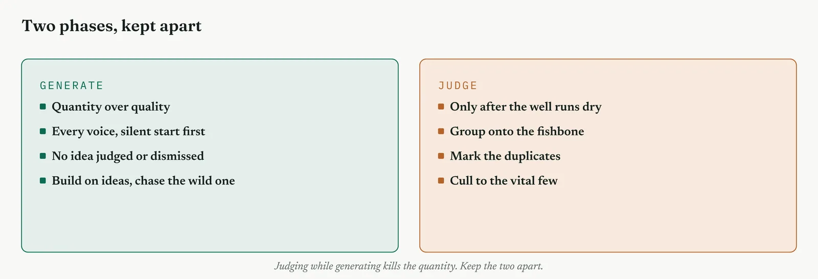
The rule that makes it work is one line. Keep generating apart from judging. The moment an idea is discussed, defended or dismissed, the flow stops and the quantity dies. Figure 13.26 sets out the two phases and the wall between them.
Stage 2. The build
The build
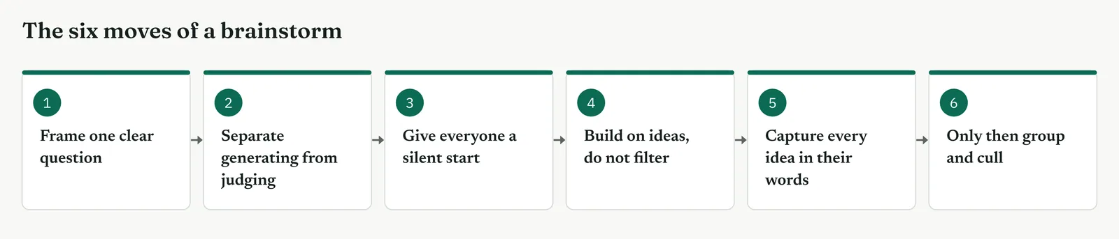
Frame one clear question. Ask what could make a complaint take six days, not how do we fix complaints. One effect, phrased as a question, keeps the room on causes rather than solutions.
Separate generating from judging. No idea is discussed, defended or dismissed while the list grows. Judgement kills quantity, so the two acts never share a minute.
Give everyone a silent start. Two minutes writing alone before anyone speaks, so the quiet people arrive with ideas the loud ones cannot talk over.
Build on ideas, do not filter them. One cause sparks another. Encourage the leap and record the wild one, because the wild idea often points at the real cause.
Capture every idea in the offerer words. Write what they said, not your tidy version. Ownership starts at the pen, and a paraphrase is already half a rejection.
Only then group and cull. When the well runs dry, sort the list onto the fishbone and mark the duplicates. Culling is a separate act, after generating, never during.
| TIP Start silent, not out loud. The first voice anchors the room, and the loudest voice anchors it hardest. Two quiet minutes on paper first, and the people who do the work arrive with causes the meeting would have talked over. |
Stage 3. Crestline on the floor
Crestline on the floor
The Crestline session ran twenty minutes with the three desks in the room. The question was framed as what could make a complaint take six days. A silent two minutes first put forty ideas on paper before a word was spoken, and the case handler, usually the quietest person in the room, offered the unowned handoff that became the heaviest cause on the fishbone. By the end the list held thirty-eight distinct causes, which grouped cleanly onto the six bones. Template 13.6 shows a slice of the raw list, before it was grouped, with who offered each idea.
Template 13.6. A slice of the Crestline brainstorm, raw and ungrouped. The heaviest causes came from across the room, not from one voice.
| IDEA, IN THEIR WORDS | OFFERED BY | LANDED ON |
|---|---|---|
| No one owns the case between desks | Case handler | Process |
| Cases only move once a day, in a batch | Intake | Process |
| Three systems, no one view of a case | Account mgr | Systems |
| We never set a target for a reply | Belt | Measurement |
| Half our first answers come back wrong | Case handler | Method |
| One person does all the case work | Team lead | People |
| Mondays bury us, no extra cover | Intake | Demand |
| Nobody knows how old the queue is | Account mgr | Measurement |
The one line it produced. Forty ideas in twenty minutes, thirty-eight distinct, and the heaviest cause came from the quietest person in the room.
Stage 4. Reading the result
Reading the result
Three readings settle whether the brainstorm did its job.
| STRONG | A long list with range across every category, a few wild ideas among them, and contributions spread across the whole room rather than concentrated in two voices. |
| WEAK | A short list, all from two people, all in one category. That is not a brainstorm, it is the loudest theory with witnesses, and it will fail the moment the data touches it. |
| THE TELL | The best cause came from someone who rarely speaks. When the quiet people surface causes the loud ones missed, the silent start earned its keep. |
Stage 5. Four firms, four moves
Four firms, four moves
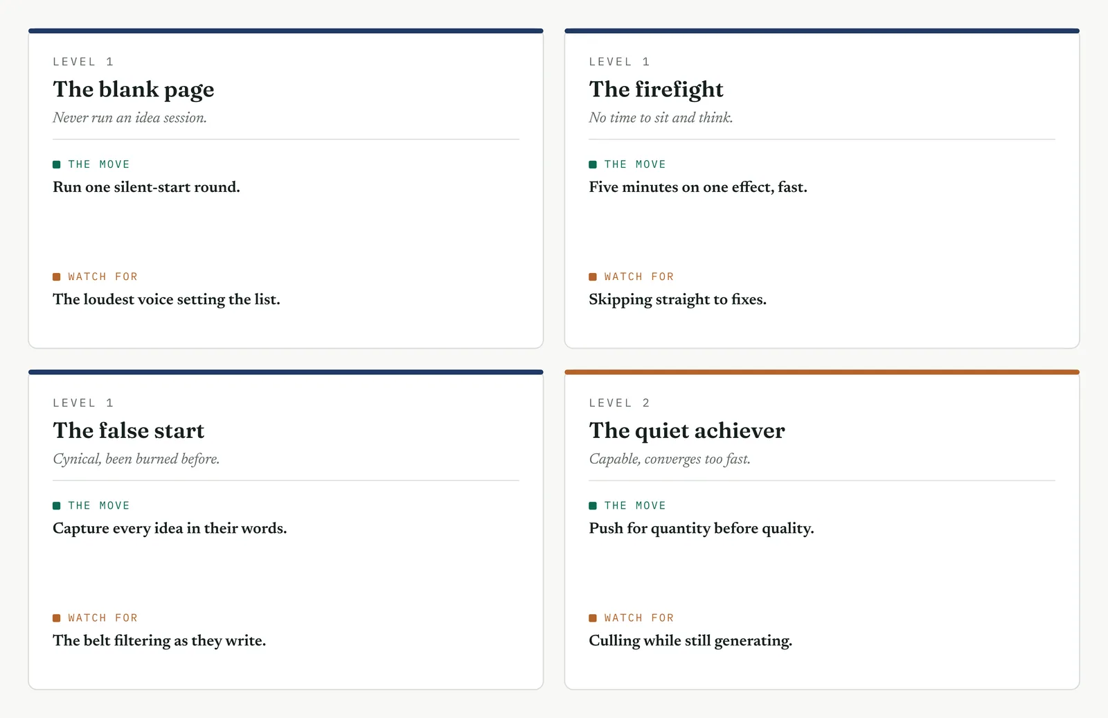
The four grounds from Chapter 1 each change how you run the session and how you protect it.
The blank page LEVEL 1
This firm has never run a structured idea session, and its meetings resolve by whoever talks longest. Run one round with a silent start, so the people who do the work put ideas on paper before the room can talk over them. Do not chase a perfect method. The point on a blank page is simply that everyone contributed and no one was judged, which is a new experience the firm will remember.
The firefight LEVEL 1
This firm cannot spare an hour to sit and think while the queue grows. Run a tight five-minute round on the single effect that hurts most, capture fast, and move. A short brainstorm that surfaces three testable causes beats a long one that never happens, and in a firefight the thing you are fighting for is momentum, not completeness.
The false start LEVEL 1
This firm sat through a past session where the facilitator wrote their own version of every idea, and the team stopped offering. Capture every idea in the offerer own words, on the wall, where they can see it recorded faithfully. When people watch their exact words go up unedited, they keep talking, and the list you get is theirs to defend later.
The quiet achiever LEVEL 2
This firm is capable and converges fast, which is the trap. Its people reach a sensible answer quickly and stop, so the wider field never opens. Push hard for quantity before anyone is allowed to judge, and hold the room past the first lull, because a capable team quits generating exactly when the non-obvious causes were about to surface.
Stage 6. Where it breaks
Where it breaks
1. Judging while generating. The first that will not work ends the flow. Separate the two acts and let the list grow untouched.
2. Starting out loud. The loud voices anchor the room before the quiet ones speak. Start with two silent minutes on paper.
3. Framing a solution question. How do we fix it narrows to the first fix. Ask what could cause it, and stay on causes.
4. Rewriting ideas as you capture them. Your paraphrase is not their idea. Write their words, and ownership stays with them.
5. Culling too early. A short clean list is a narrow one. Generate wide, and cull only after the well runs dry.
6. Stopping at the first lull. The best ideas often come after the obvious ones dry up. Push past the first silence before you close.
Stage 7. At the gate
At the gate
What it lets you defend. The sponsor asks whether the search was wide or narrow. A long, spread list from the whole room shows a wide one, and answers the charge that you fixed on the first theory before you had looked. It is the record that the field was opened before it was closed.
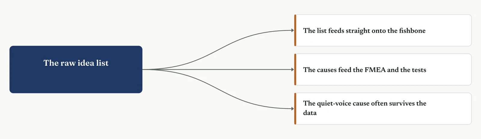
What it feeds. The list feeds straight onto the fishbone, where it is sorted and marked. The causes it surfaces feed the FMEA and the tests that follow. And the quiet-voice cause it brings out, the one the meeting would have missed, is often the very one the data goes on to confirm.
13 · ANALYSE MOVEMENT TWO · SURFACE THE CANDIDATE CAUSES
13.3.7 Five-why
Suggested ISO 13053 Factsheet 11
Purpose. Take one confirmed symptom and ask why in a chain until you reach a cause you can act on, so the fix aims at the root rather than the surface.
Stage 1. The trigger
The trigger
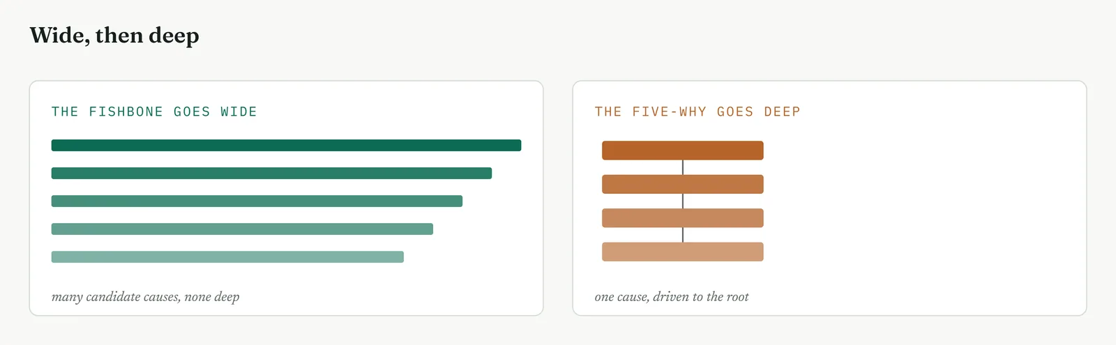
The fishbone spread the field wide. Five-why drives one line of it deep. Where the fishbone asks what could cause the effect, five-why asks why a single cause happens, and why that happens, down to the flaw you can actually change. You reach for it when you have one clear symptom and need to get past it to the root, when a fix keeps failing because it treated a symptom, or when the obvious cause is plainly not the end of the chain.
It is a convergent tool, the opposite of the brainstorm, and its danger is the opposite too. Where a brainstorm can close too early, a five-why can stop too shallow, at the first cause that feels like an answer. The discipline is to keep asking why until the answer is a process flaw someone owns, not a person and not an act of nature.
Stage 2. The build
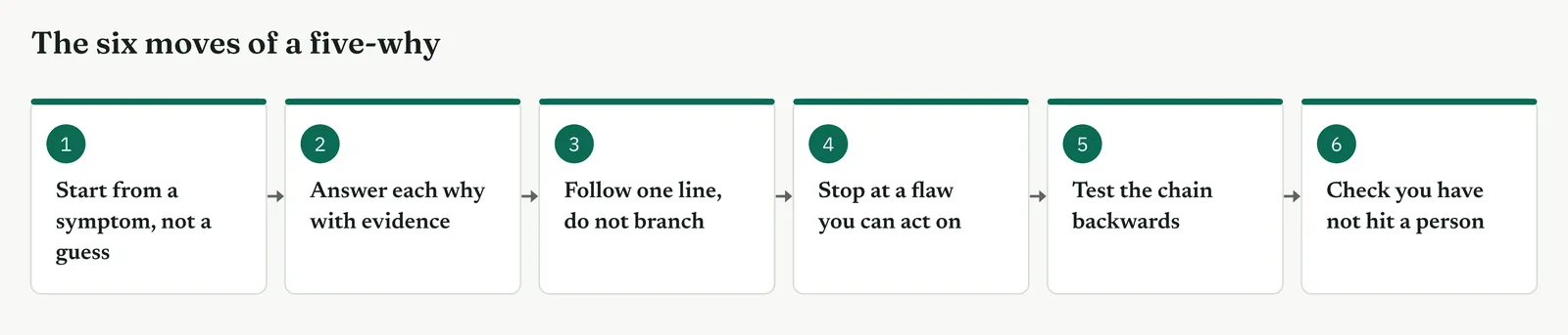
The build
Start from a symptom, not a guess. Begin with something observed and agreed, cases wait two days at the account manager, not the managers are slow. A chain built on a theory only proves the theory.
Answer each why with a cause you can evidence. Every why gets an answer the data or the floor supports, not a hunch. An unevidenced because turns the rest of the chain into fiction.
Follow one line, do not branch. A five-why is a chain, not a tree. If two causes both matter, run two chains rather than tangling them into one.
Stop at a flaw you can act on. The chain ends when the answer is a process cause you can change, not when you reach five. Five is a guide, not a rule.
Test the chain backwards. Read it upward: because of the root, this happens, which causes that. If the logic holds at every step, the chain is sound.
Check you have not hit a person. Because the handler is careless is a stop sign, not a root. Ask why the process let the error through, and keep going.
| TIP When a why lands on a person, you have found a symptom, not a root. Because someone made a mistake is where the analysis begins. Ask why the process allowed the mistake, and the chain starts moving toward something you can fix. |
Stage 3. Crestline on the floor
Crestline on the floor
The team ran a five-why on the case queue wait, the heaviest of the four circled causes. Each answer was checked against the floor before the next why was asked, so the chain carried evidence, not opinion. Figure 13.32 is the chain they built.
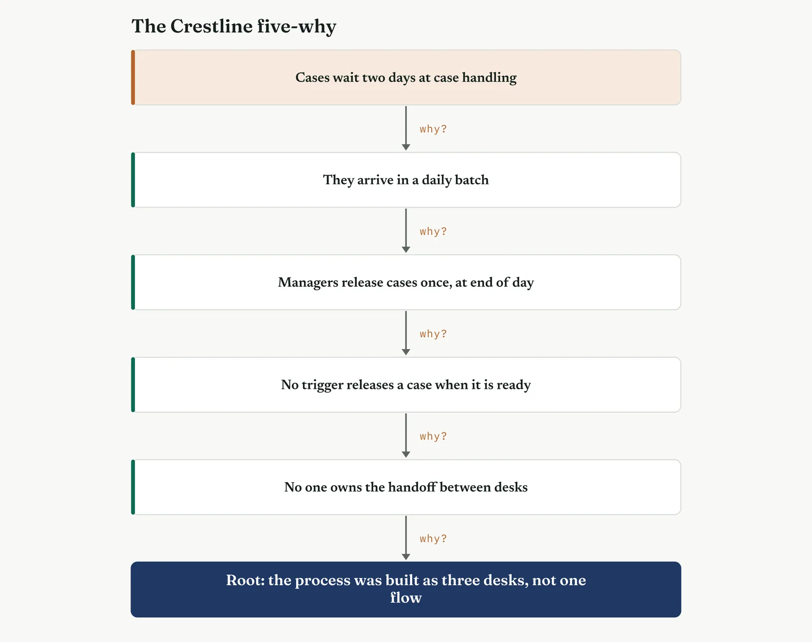
Why do cases wait two days before case handling. Because they arrive in a daily batch. Why a daily batch. Because the account managers release cases once, at the end of the day. Why once. Because there is no trigger to release a case the moment it is ready. Why no trigger. Because no one owns the handoff between the desks. Why no owner. Because the process was built as three separate desks, never designed as one flow. The root was structural, an unowned handoff, and it matched the heaviest bone on the fishbone.
The one line it produced. Five whys took the delay from cases are slow to no one owns the handoff. That root is a design choice, and a design choice can be changed.
Stage 4. Reading the result
Reading the result
Three readings settle whether the chain reached the root.
| STRONG | The chain ends at a process flaw someone can own and change, and it reads cleanly backwards, with each because evidenced rather than assumed. |
| WEAK | The chain ends at a person, at a truism, or at five whys whether or not the root was reached. A chain that stops at human error has not started. |
| THE TELL | The root, read forward, explains every symptom above it. When fixing the root would collapse the whole chain, you have found it. |
Stage 5. Four firms, four moves
Four firms, four moves
The four grounds from Chapter 1 each change how far you drive the chain and how you defend it.
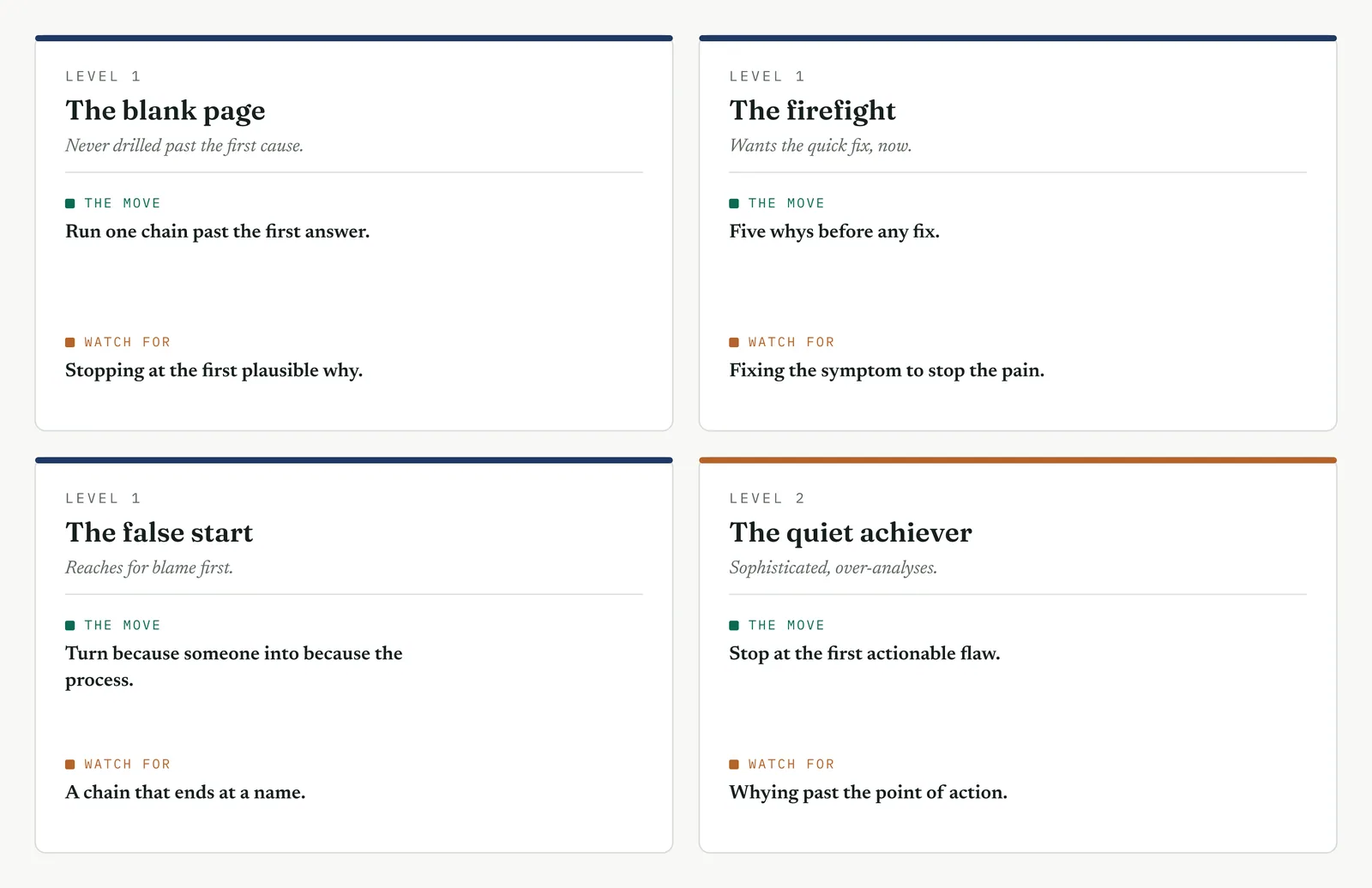
The blank page LEVEL 1
This firm has never drilled past the first cause, and its instinct is to accept the first answer that sounds reasonable and move on. Run one chain out loud in front of the team, and make a point of pushing past the answer that satisfies the room. The value on a blank page is the demonstration itself, that the first cause is almost never the root, and that one more why changes the fix entirely.
The firefight LEVEL 1
This firm wants the pain to stop now, so it fixes the symptom and moves to the next fire. Insist on five whys before any fix is agreed, even under pressure, because a symptom fix in a firefight simply moves the fire rather than putting it out. Ten minutes of why now saves the same fire returning next week under a different name.
The false start LEVEL 1
This firm reaches for blame first, and a past effort ended with a team carrying the fault while the process stayed broken. Turn every because someone into because the process let them, out loud, every time. When the chain ends at a design flaw rather than a name, the room can act on it, and no one leaves the session blamed.
The quiet achiever LEVEL 2
This firm is sophisticated and can over-analyse, driving the chain past the point of action into philosophy. Stop at the first flaw the firm can actually change, not the deepest cause you can name. A capable team can why its way to because the market is competitive, which is true and useless. The root you want is the last one you can fix.
Stage 6. Where it breaks
Where it breaks
1. Starting from a guess, not a symptom. A chain built on a theory proves the theory. Start from what is observed and agreed.
2. Branching into a tree. Five-why follows one line. If two causes matter, run two separate chains.
3. Stopping at a person. Human error is where the analysis begins, not ends. Ask why the process allowed it.
4. Counting to five. Five is a guide, not a target. Stop at the actionable flaw, whether that is three whys or seven.
5. Accepting an unevidenced because. Each answer needs the floor or the data behind it, or the chain is fiction dressed as logic.
6. Whying past the point of action. Keep going past the actionable root and you reach because the firm exists. Stop where you can act.
Stage 7. At the gate
At the gate
What it lets you defend. The sponsor asks whether the fix will hold or just move the problem along. The chain shows the fix aims at the root, so the symptom above it cannot return. It is the difference between treating a fever and curing the infection, and it is what stops the same delay reappearing two months after the project closes.
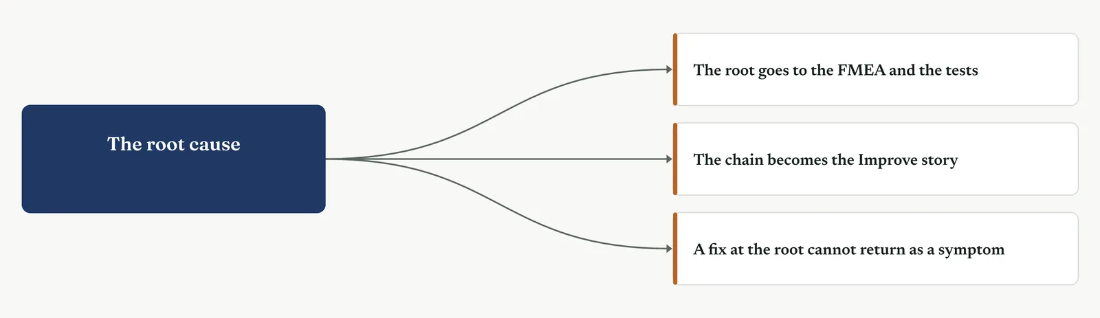
What it feeds. The root becomes the candidate the FMEA ranks and the tests confirm. The chain itself becomes the story the Improve phase tells, symptom down to root, so the redesign is understood rather than imposed, and the team that built the chain already knows why the fix is shaped the way it is.
13 · ANALYSE MOVEMENT TWO · SURFACE THE CANDIDATE CAUSES
13.3.8 Process FMEA
Mandatory ISO 13053 Factsheet 12
Purpose. Rank the candidate causes by the risk they carry, scoring each on how badly it hurts, how often it happens, and how likely you are to catch it, so effort in verification and Improve goes to the vital few.
Stage 1. The trigger
The trigger
The fishbone gave you a field of causes and circled a few. The five-why drove one to its root. The process FMEA ranks them all by risk, so you know which to test first and which to fix first. It is the bridge between surfacing causes and verifying them, and it is mandatory on every project for that reason. Where the fishbone asks what could go wrong, the FMEA asks how badly, how often, and would we even notice.
You reach for it once you have candidate causes and need to prioritise under constraint, when a sponsor asks why you are testing this cause and not that one, or when the loud theory needs to be scored against every other on the same scale rather than argued about. The score is not the truth, but it is a defensible order, and a defensible order is what the room has been missing.
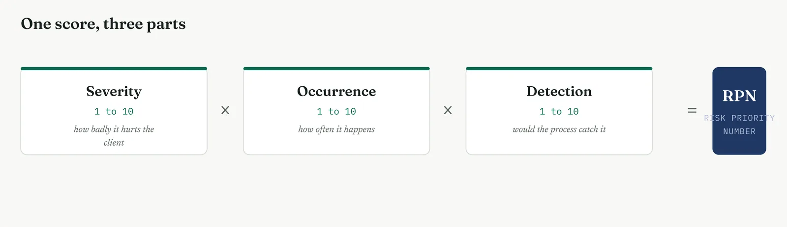
The FMEA scores three things and multiplies them. Severity, how much the failure hurts the client. Occurrence, how often it happens. Detection, how likely the current process is to catch it before it reaches the client, scored so that harder to catch is worse. The product is the risk priority number, and it sorts the causes. Figure 13.35 sets out the three parts.
Stage 2. The build
The build
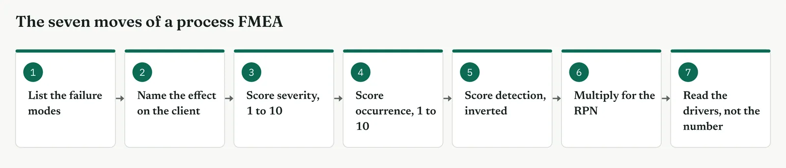
List the failure modes, not the causes yet. For each process step, ask how it can fail. The handoff can fail by losing the case, by delaying it, or by passing it on wrong.
Name the effect on the client for each. A lost case means a complaint never answered. A delayed case means the six-day wait. Score the effect from the client side, not the desk side.
Score severity, one to ten. Ten is harm the client cannot recover from, one is trivial. Anchor the scale with examples before the team scores, so ten means the same to everyone.
Score occurrence, one to ten. Use the data where you have it, the floor where you do not. Ten is happens constantly, one is almost never.
Score detection, one to ten, inverted. Ten means the process would not catch it, one means it always catches it. Harder to catch scores higher, because an undetected failure reaches the client.
Multiply for the RPN, then sort. Severity times occurrence times detection. Sort the list by the product, highest first, and the order writes itself.
Read the drivers of the score, not just the number. A high RPN driven by severity needs a different fix from one driven by poor detection. The three numbers behind the RPN tell you what kind of fix to reach for.
| TIP Detection scores backwards, and it trips everyone once. A failure the process always catches scores one, a failure nothing catches scores ten. The harder it is to see coming, the worse it is, because what you cannot detect reaches the client. Set that anchor out loud before the team scores, or half the RPNs come out upside down. |
Stage 3. Crestline on the floor
Crestline on the floor
The team scored the four circled causes and the process steps around them, anchoring each scale with an agreed example first. Template 13.7 is the FMEA they built, sorted by RPN.
Template 13.7. The Crestline process FMEA, four causes scored on the same three scales and sorted by risk priority number.
| STEP | FAILURE MODE | EFFECT ON CLIENT | SEV | OCC | DET | RPN |
|---|---|---|---|---|---|---|
| Handoff between desks | Case stalls, unowned | A six-day wait | 8 | 9 | 8 | 576 |
| Case queue | No clock, age unseen | Cases age unnoticed | 6 | 9 | 7 | 378 |
| First response | Sent wrong, unchecked | Rework, an extra day | 7 | 8 | 5 | 280 |
| Case work | One handler, slow clear | The queue grows daily | 4 | 7 | 4 | 112 |
The unowned handoff scored highest. Severity eight, because a lost or delayed case is the whole problem. Occurrence nine, because it happens on every case. Detection eight, because nothing in the process catches a stalled case until someone chases it. Its RPN, five hundred and seventy-six, sat far above the rest. The queue with no clock came next, high on occurrence and detection because an invisible queue ages unseen. The unchecked first response scored high on severity and occurrence but lower on detection, because rework does eventually catch it. And the single handler on case work, the headcount theory, landed fourth, high occurrence but low severity, because it slows cases rather than losing them.
The order the FMEA produced put the unowned handoff first and the headcount theory fourth, every cause scored on the same three scales. That order was the case for testing the handoff before the staffing, and it was a case Martin could argue with only by arguing the scores in front of the team, not by out-talking the belt in a meeting. Figure 13.37 shows the ranking.
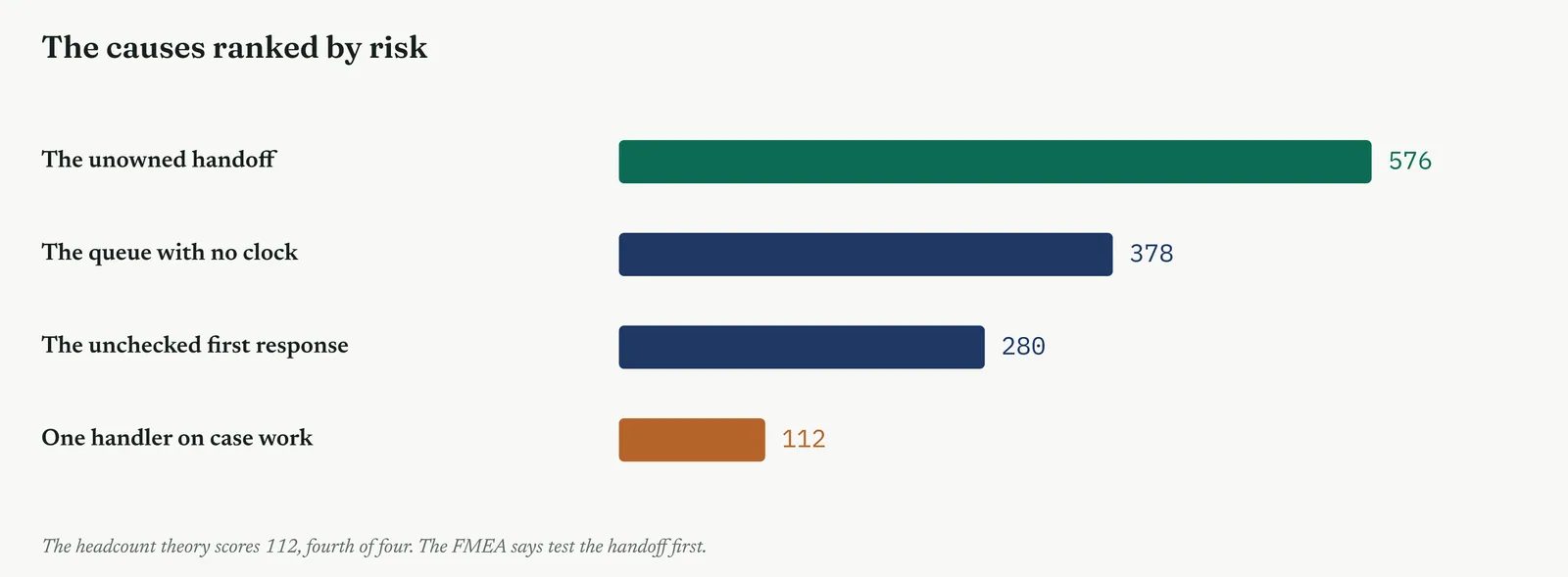
The one line it produced. Four causes, one scale, one order. The handoff scores 576, headcount scores 112. The FMEA says test the handoff first.
Stage 4. Reading the result
Reading the result
Three readings settle what the FMEA is telling you.
| STRONG | One or two causes sit clearly above the rest, and the top RPN is driven by high scores on all three parts, not one outlier. The order is clear and the drivers behind it are read. |
| WEAK | Every RPN close together, or all tens, or scores set without agreed anchors. An FMEA where everything is high has ranked nothing, and one scored without anchors is opinion with arithmetic attached. |
| THE TELL | The loud theory scores mid-pack. When headcount ranks fourth on the same scale that ranks the handoff first, the FMEA has done the job the meeting could not. |
Stage 5. Four firms, four moves
Four firms, four moves
The four grounds from Chapter 1 each change how much FMEA you run and how you defend the scores.
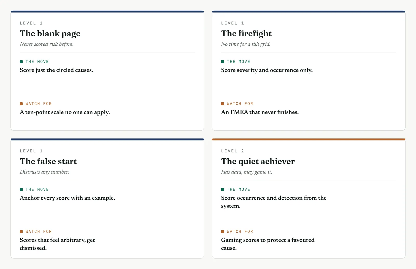
The blank page LEVEL 1
This firm has never scored risk, and a full ten-point scale will defeat it before it starts. Score only the circled causes, and collapse each scale to three anchors, low, medium and high, mapped to one, five and ten. The value on a blank page is not a precise RPN, it is the first time the firm ranks its problems by anything other than who shouted loudest.
The firefight LEVEL 1
This firm cannot sit through a full FMEA grid while the queue grows. Score severity and occurrence only, drop detection for now, and sort on the product of the two. A two-part score that ranks the top three causes this afternoon beats a three-part one that never gets finished, and you can add detection later if the order is close.
The false start LEVEL 1
This firm sat through a past scoring exercise whose numbers felt invented, and it stopped believing them. Anchor every score with a concrete example the whole team agrees, before anyone scores, and write the anchors on the wall. When a seven means the same thing to everyone in the room, the RPN is a shared judgement rather than the belt private opinion.
The quiet achiever LEVEL 2
This firm has the data to score occurrence and detection properly, and the sophistication to game them. Pull occurrence and detection from the system rather than from memory, and watch for scores quietly bent to protect a favoured cause or a favoured team. The discipline here is not rigour of method, which the firm has, but honesty of scoring, which capability makes easier to fake.
Stage 6. Where it breaks
Where it breaks
1. Scoring causes instead of failure modes. The FMEA scores how a step fails, not the cause behind it. List the failure modes first, then score.
2. Scoring without anchors. Ten means nothing until the team agrees what a ten looks like. Anchor every scale before anyone scores.
3. Reading detection the wrong way. A high detection score means hard to catch, which is worse. Invert it, or the RPN inverts with it.
4. Chasing the RPN number alone. Two causes with the same RPN can need opposite fixes. Read the three scores behind it.
5. Scoring everything a ten. A team that scores everything high has ranked nothing. Force a spread across the scale.
6. Scoring the favoured cause down. The point is an honest order, not a defence of the theory you walked in with. Score the loud one on the same scale as the rest.
7. Treating the RPN as proof. A high RPN says test this first, not this is the cause. The FMEA ranks, the data verifies.
Stage 7. At the gate
At the gate
What it lets you defend. The sponsor asks why you are testing the handoff and not the staffing. The FMEA answers with an order, every cause scored on the same three scales, the handoff first and the staffing fourth. It turns a contest of theories into a ranked list the sponsor can read, and it moves the argument from whose voice is loudest to whose score is wrong, which is a far harder thing to fake.
What it feeds. The top-ranked causes become the test plan for Movement Three, run in order. The RPN gives the Improve phase its starting priority, and the three scores behind each RPN hint at the kind of fix each cause needs. And because the FMEA is mandatory, it is the record the gate review checks before the phase can close.
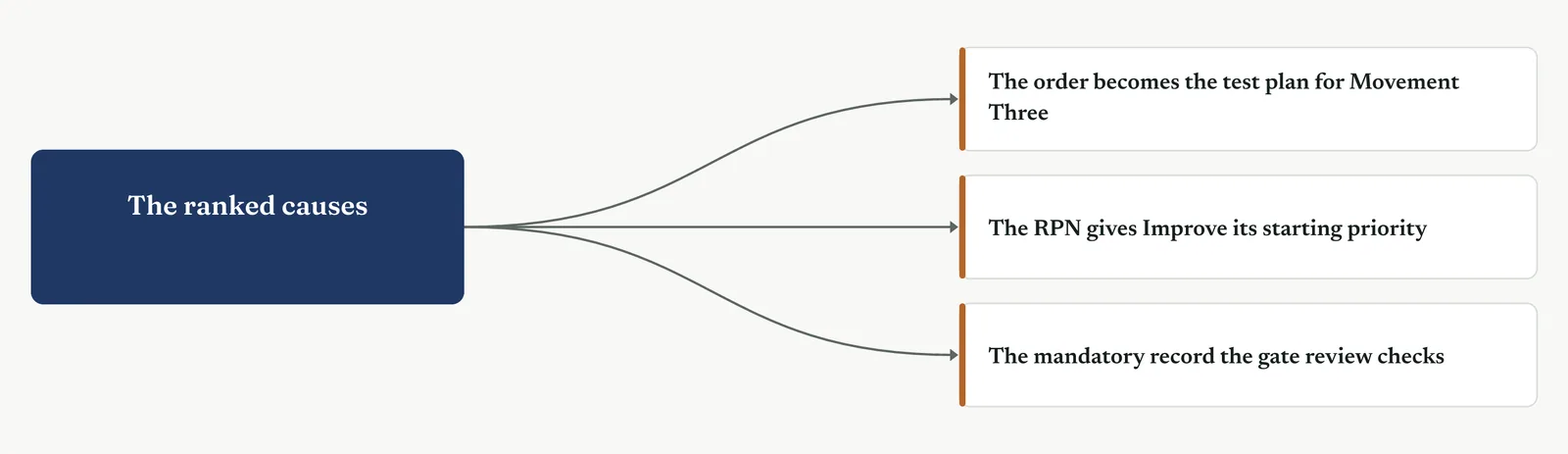
13 · ANALYSE MOVEMENT THREE · TEST THE CAUSES AGAINST THE DATA
13.3.9 Scatter and Pareto plots
Suggested ISO 13053 Factsheet 13
Purpose. Use two simple plots to start testing the causes against the data. Pareto to rank the causes by how much they carry, scatter to see whether one thing moves with another, before any formal test.
Stage 1. The trigger
The trigger
Movement Two surfaced the causes and ranked them by judgement in the FMEA. Movement Three tests them against the data, and these two plots are where it starts. The Pareto asks which causes carry most of the effect, sorting them so the vital few stand out from the trivial many. The scatter asks whether two things move together, so a suspected driver can be seen before it is tested. Both are pictures, not proofs, but a picture the whole room can read is often enough to settle an argument the FMEA only ranked.
You reach for the Pareto when you have counts of something, defects by type, delays by cause, complaints by category, and need to know where the mass sits. You reach for the scatter when you have paired numbers, staffing against delay, volume against error rate, and need to see whether a relationship is even there before you spend a test on it. They are the cheapest tools in Movement Three, and often the most persuasive.
Neither plot proves cause. A Pareto shows where the effect concentrates, not why. A scatter shows that two things move together, not that one drives the other. Treat both as the first look that tells you where to point the formal tests, and never as the finding itself. Figure 13.40 sets the two side by side.
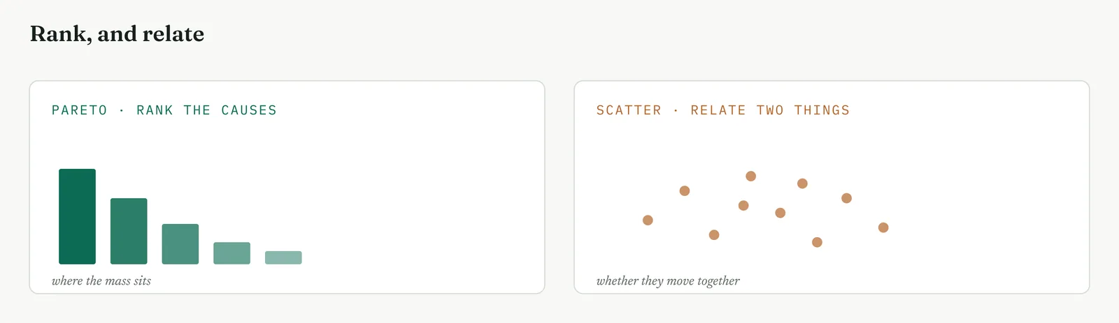
Stage 2. The build
The build
Count the effect by category. Tally the thing you care about, delay or defects, by the category that might drive it. Counts from the data, not estimates from the room.
Sort tallest first, and add the running total. Bars in descending order, with a cumulative line across the top. The vital few are wherever that line bends.
Cut where the line bends, not at eighty. The eighty-twenty is a rule of thumb, not a law. Draw the cut where the line flattens, wherever that falls.
Plot every paired point. For the scatter, one variable on each axis, one point per case. Do not connect them, do not average them, plot every point.
Read the shape, not a single point. A cloud with an upward slope is a relationship. A shapeless cloud is none. An outlier is a question, not the answer.
Beware the lurking third thing. Two things moving together may both be driven by a third. A relationship in a scatter is a lead, not a verdict.
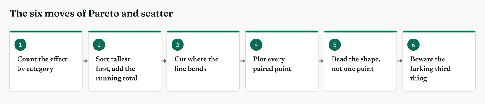
| TIP A Pareto with even bars is not a weak finding, it is the wrong category. If every bar is the same height, the thing you sorted by does not drive the effect. Change the cut and plot again before you conclude there is no vital few. |
Stage 3. Crestline on the floor
Crestline on the floor
The team built two plots. A Pareto of the delay by where it was lost, and a scatter of team size against resolution time for the days they had both numbers. Figure 13.42 is the Pareto.
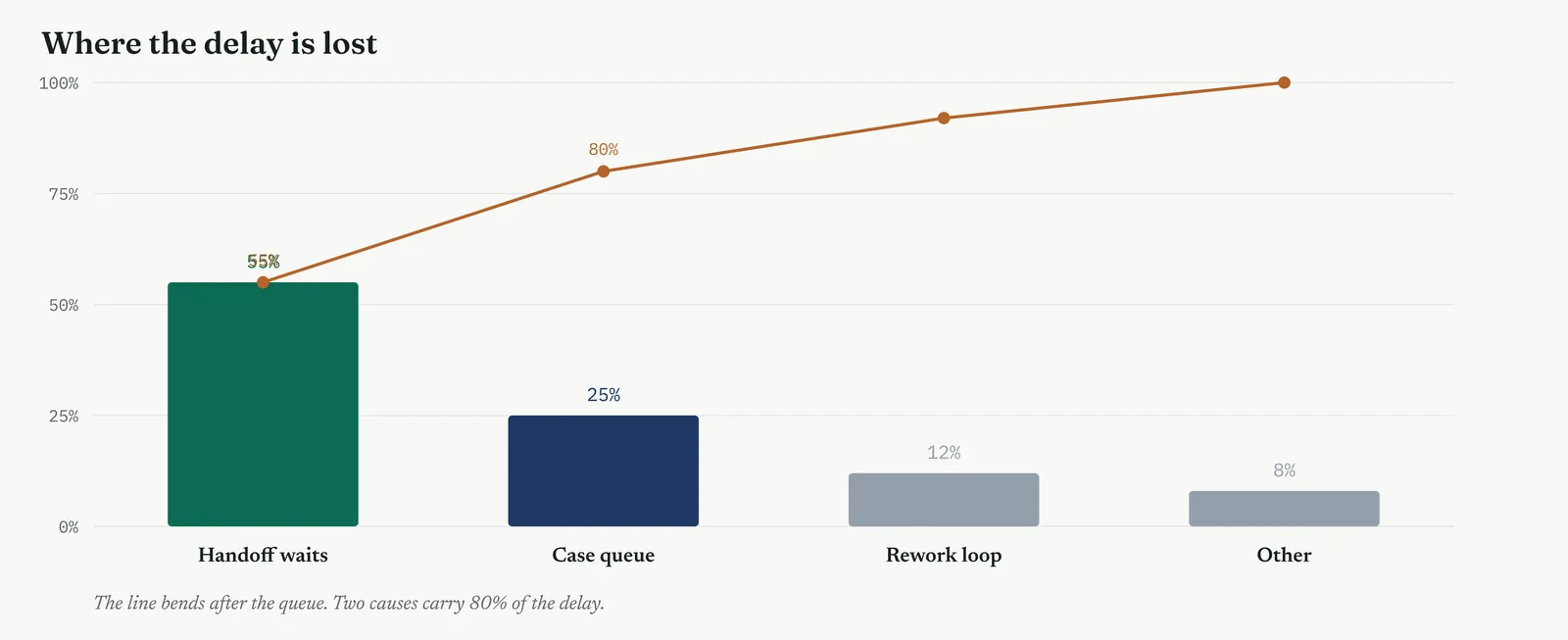
The Pareto put the handoff waits and the case queue together at about 80% of the delay, the same two causes the FMEA had ranked first. The cumulative line bent sharply after the second bar, and the rework loop and everything else made up a thin tail. Then the scatter told the other half of the story. Plotting team size against resolution time, the cloud had almost no slope at all. Busy days with a full team were as slow as quiet days with a short one. Figure 13.43 is that scatter, flat.
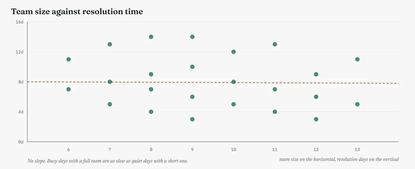
Two plots, two findings. The Pareto said the delay lived in the handoff and the queue. The scatter said staffing did not move with delay at all. Together they pointed the formal test straight at the handoff and, just as clearly, pointed it away from headcount, before a single hypothesis test had been run.
The one line it produced. The Pareto found where the delay lives. The scatter found where it does not. 80% in the handoff and the queue, and no slope at all against team size.
Stage 4. Reading the result
Reading the result
Three readings settle what the two plots are telling you.
| STRONG | The Pareto shows a clear bend, two or three categories carrying most of the mass and a long thin tail. The scatter shows a shape you can see, a slope or a flatness, and either one is a finding. |
| WEAK | A Pareto with even bars, or a scatter that is a shapeless blob. Even bars mean the category was wrong. A blob means no relationship, or the wrong pair plotted. |
| THE TELL | The plot settles the argument the FMEA only ranked. When the room looks at the flat scatter and stops talking about headcount, the picture has done its work. |
Stage 5. Four firms, four moves
Four firms, four moves
The four grounds from Chapter 1 each change which plot you reach for and how you present it.
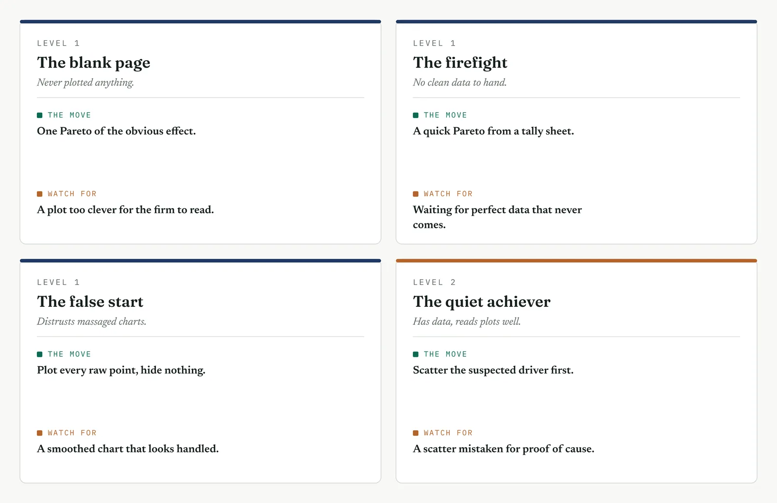
The blank page LEVEL 1
This firm has never plotted its problems, and a clever chart will lose the room. Build one Pareto of the most obvious effect, by hand on a whiteboard if that is what it takes, and let the firm see its causes ranked for the first time. The value is not the sophistication of the plot, it is the moment the firm stops arguing about which cause is biggest and simply reads it off the bars.
The firefight LEVEL 1
This firm has no clean historical data and no time to build a dataset. Run a quick Pareto from a tally sheet of this week counts, kept by the desks as cases come through. A rough Pareto from a week of honest tallies beats a perfect one that waits a month for data that never arrives, and in a firefight this week is the only week that counts.
The false start LEVEL 1
This firm sat through a past effort whose charts looked massaged, and it stopped trusting any of them. Plot the raw points, show every case, and hide nothing behind an average or a smoothed curve. A scatter of the actual points, outliers and all, reads as honest, where a clean fitted line reads as something you did to the data rather than found in it.
The quiet achiever LEVEL 2
This firm has the data to scatter any pair it likes, and the habit of reading a relationship as a cause. Use the scatter to decide which suspected drivers are worth a formal test, then run the test, because a capable firm quiet failure is to see a slope and declare the case closed without ever checking whether a third variable drives both.
Stage 6. Where it breaks
Where it breaks
1. A Pareto on the wrong category. If every bar is the same height, the category does not drive the effect. Try a different cut.
2. Forcing the eighty-twenty. The bend is where you cut, not at exactly eighty. Read the line, not the rule.
3. A scatter with too few points. A handful of points shows nothing. You need a cloud, not a sprinkle.
4. Reading a scatter as cause. Two things moving together is a lead. A third thing may drive both, so the test still has to run.
5. Averaging away the scatter. Plot every point. An average hides the spread that is often the finding.
6. Calling a picture a proof. Both plots point the test. Neither is the test. The data confirms, the plot only aims.
Stage 7. At the gate
At the gate
What it lets you defend. The sponsor asks where the delay concentrates and whether staffing is behind it. The Pareto answers the first with a ranked bar chart, the scatter answers the second with a flat cloud. Two pictures the sponsor reads in seconds do what an hour of argument could not, and they do it without asking the sponsor to trust a statistical test they cannot follow.
What it feeds. The Pareto vital few become the targets of the formal tests that follow. The scatter relationships, or their absence, tell those tests where to aim and where not to bother. The flat staffing scatter in particular feeds the hypothesis test that will close the headcount question for good.
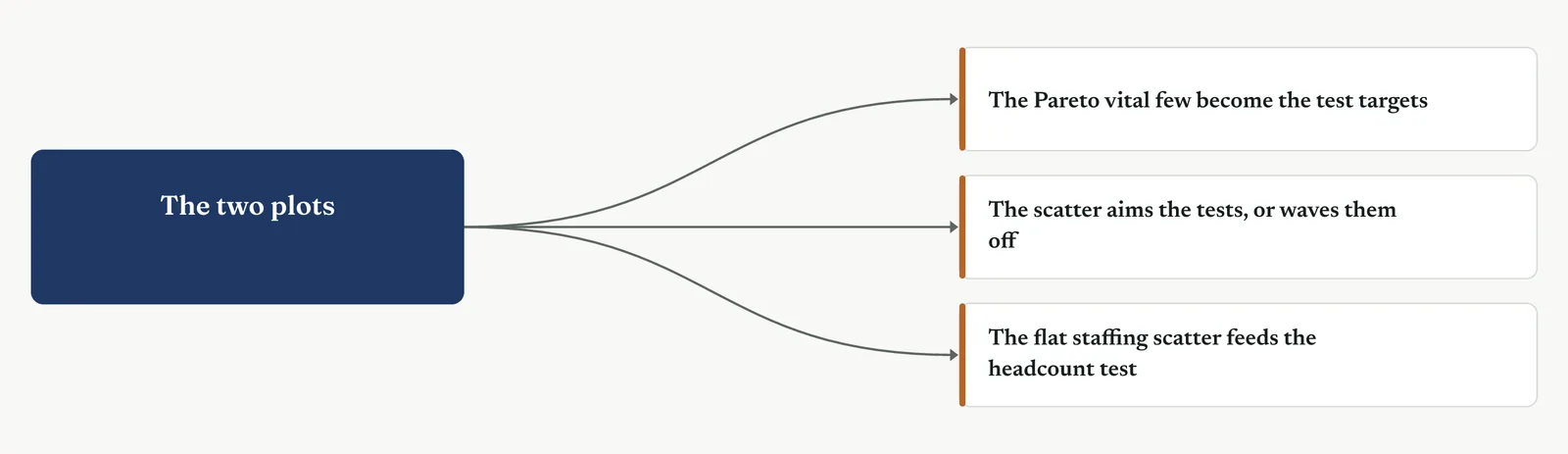
13 · ANALYSE MOVEMENT THREE · TEST THE CAUSES AGAINST THE DATA
13.3.10 Hypothesis testing
Recommended ISO 13053 Factsheet 14
Purpose. Turn a suspected cause into a claim the data can accept or reject, and run the test that says whether the pattern you see is real or just noise, so a cause is confirmed or killed on evidence rather than opinion. This is the core tool of Movement Three, and the one section in the chapter that runs the full family of tests.
Stage 1. The trigger
The trigger
The plots gave you a picture. Hypothesis testing tells you whether the picture is real. Where a scatter suggests a relationship and a Pareto suggests a concentration, a hypothesis test asks the harder question, could this pattern have happened by chance alone. You reach for it when a cause has to be confirmed or killed with more than a picture, when a sponsor will not act on a chart but will act on a test, or when the difference you are looking at is small enough that noise could explain it. It is the tool that turns a suspicion into a finding.
The logic runs backwards, and that trips everyone the first time. You do not set out to prove your cause. You assume there is no effect, the null hypothesis, and ask how likely the data would be if that null were true. The alternative hypothesis is what you actually suspect. If the data would be very unlikely under the null, you reject the null, and the alternative stands by elimination. The test never proves the alternative directly. It only makes the null implausible. Figure 13.46 shows the shape of the idea.
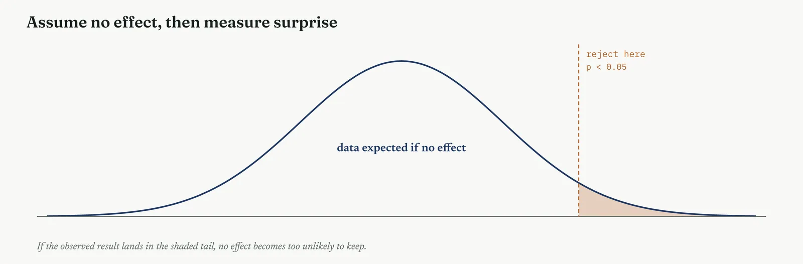
A hypothesis test produces one number, the p-value, and it is the most misread number in the whole method. The p-value is the probability of seeing data at least as extreme as yours if the null were true, that is, if there were no effect at all. A small p-value means your data would be surprising in a world with no effect, so a world with no effect becomes hard to believe. It is not the probability that your cause is real, and it is not the probability that the null is true. It is the chance of the data, given no effect, and holding that distinction is most of what separates a sound tester from a careless one.
The significance level, set in advance, is the line you draw for how surprising is surprising enough to act on. Five in a hundred, written 0.05, is the common line, and it means you accept a one-in-twenty risk of crying wolf. That risk has a name. A Type I error is a false alarm, rejecting a null that was actually true. Its mirror is the Type II error, a miss, keeping a null that was actually false and letting a real effect slip past. The significance level is your chosen risk of the false alarm. More data is how you cut the risk of the miss. Figure 13.47 lays the two out.
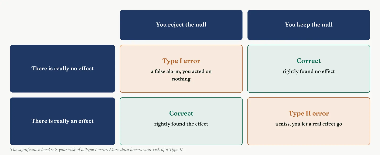
The reference distribution deserves a word, because it is what the p-value is read against. Every test has one, the shape the statistic would follow across many repeats if the null were true. The t-test uses the t-distribution, a bell a little heavier in the tails than the normal, which accounts for the extra uncertainty in small samples. The chi-square uses its own right-skewed distribution, ANOVA the F-distribution. You do not need to draw them, but you should know the p-value is always a position on one of these curves, the area beyond your observed statistic, the chance of landing at least that far out by luck alone.
The five-in-a-hundred line itself is a convention, not a law of nature, and it is worth knowing it was a choice. It trades the two errors against each other, loose enough to catch most real effects, strict enough to keep false alarms rare, and it stuck because it struck most fields as a reasonable balance. Nothing stops you choosing a stricter line where a false alarm would be costly, or a looser one in early exploration, so long as you choose it in advance and say so. The number is a dial you set on purpose, not a threshold handed down.
One more choice shapes the test before it runs. A two-tailed test asks whether two things differ at all, in either direction, and splits the risk across both tails of the distribution. A one-tailed test asks whether one thing is specifically greater, or specifically less, and puts all the risk on one side. A one-tailed test has more power to find an effect in the direction you named, but it is blind to a surprise in the other direction, and reaching for it only after the data leaned your way is a form of cheating. Default to two-tailed unless you have a reason, fixed in advance, to look only one way. Figure 13.48 shows the difference.
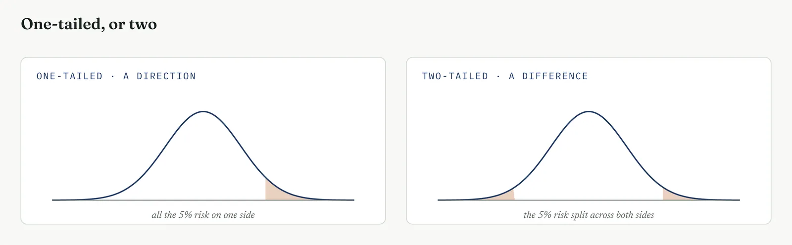
Tests also split into two families. Parametric tests, the t-test and ANOVA among them, assume the data follows a rough bell shape and compare averages. Non-parametric tests, such as Mann-Whitney, make no such assumption and compare ranks instead, which makes them the right choice when the data is skewed or has a long tail. Reaching for a parametric test on badly skewed data is one of the commonest ways to get a confident wrong answer, so the shape of the data is the first thing to check, before the test is even chosen.
Under the hood, a t-test turns the gap between two averages into a single number, the t-statistic, the difference in the means divided by the spread of the data and scaled by how much data you have. A large t means the gap is big relative to the noise around it. That statistic is then read against a reference distribution using the degrees of freedom, roughly the number of independent observations you have to work with, to produce the p-value. You will rarely compute this by hand, but knowing what the number is stops you treating the software output as magic, and stops you trusting a result built on three data points.
Alongside the p-value, most tests give a confidence interval, a range that would contain the true effect in 95 runs out of a hundred. A 95% interval for the staffing difference that runs from minus one day to plus one day, straddling zero, says the same thing the p-value did, no reliable effect. An interval that sits entirely above zero says the effect is real and hands you its likely size in the same breath. Where you can report an interval, do, because it carries more than a bare p-value ever will.
Significance and size are different questions, and the effect size answers the second. For two averages, a common measure is the standardised difference, the gap between the means expressed in units of the data spread. A standardised difference of 0.1 is trivial even when significant, one of 0.8 is large. Always pair the p-value with an effect size, because the test tells you an effect exists, and only the size tells you whether it is worth a project. A significant result with a tiny effect is the most common way a sound test leads to a pointless fix.
Before a test runs, its power is the chance it will find a real effect if one is there, the flip side of the Type II error. Power rises with the size of the effect, the size of the sample, and the significance level you allow. A test with too few observations can miss a real effect entirely and return a high p-value that means nothing more than not enough data. Estimating the sample you need in advance, from the smallest effect worth finding, is the discipline that separates a test that can answer the question from one that was doomed before the first number was collected.
So a test needs three things fixed before you run it. The claim, stated as a null and an alternative. The significance level, the false-alarm risk you will accept, and whether the test is one-tailed or two. And enough data that a real effect would actually show, which is the question of power, the flip side of the Type II error. Decide all three before you look at the result, or you will read the result to suit the answer you walked in wanting.
Stage 2. The build
The build
State the null and the alternative. The null is no effect, staffing does not change resolution time. The alternative is what you suspect. Write both before you touch the data.
Set the significance level and the tails first. Five in a hundred, one-tailed or two, fixed before the test, not after you have seen the p-value and know which side you would like it to fall.
Choose the test that fits the data. Two groups of a continuous measure, a t-test. Counts in categories, a chi-square. Three or more groups, an ANOVA. Skewed data, a rank test. Match the test to the data, never the data to the test.
Check the assumptions the test rests on. Most tests assume a shape, or equal spread, or independent observations. A test run on data that breaks its assumptions returns a confident wrong answer, which is worse than no answer.
Run it, and read p against your line. Below the line, reject the null, the effect is real. Above it, you have not shown an effect, which is not the same as proving there is none.
Report the size, not just the significance. A real effect can be tiny. Significance says the effect is there, the effect size says whether it is worth acting on. Report both, always, with a confidence interval where you can.
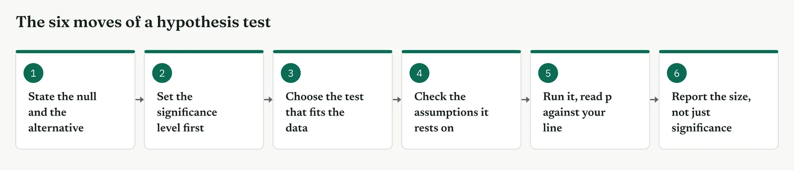
The third move, choosing the test, is the one that most often goes wrong, because the right question with the wrong test still gives the wrong answer. The test you reach for depends on three things, whether the measure is a number or a count, how many groups you compare, and whether the data is bell-shaped or skewed. Table 13.4 pairs the common tests with the data each one fits, and gives the Crestline question each answers. The rest of this section runs every one of them on Crestline in turn.
Table 13.4. The common tests and the data each one fits, with the Crestline question each answers.
| THE TEST | USE IT WHEN | A CRESTLINE QUESTION |
|---|---|---|
| Two-sample t-test | You compare the average of two independent groups, continuous data | Do full-staffed days resolve faster than short-staffed ones |
| Paired t-test | You compare before and after on the same units | Did resolution time fall after the handoff fix |
| One-way ANOVA | You compare the average across three or more groups | Do the three desks differ in handling time |
| Chi-square | You compare counts across categories | Do defects fall unevenly across the three desks |
| Two-proportion test | You compare two rates or proportions | Is the first-response error rate different between two teams |
| Mann-Whitney | You compare two groups but the data is skewed, not bell-shaped | Do complex cases take longer when the tail is long |
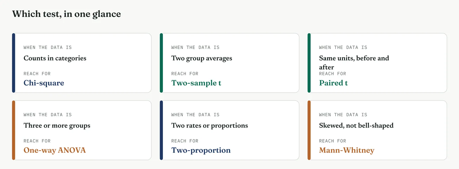
| TIP Set the line before you look. The one move that voids a test is choosing the significance level, the tails, or the test itself after you have seen the result. Decide the null, the line and the test in advance and write them down, and the p-value that comes back means something. Decide them after, and it means nothing, however small the number. |
Stage 3. Crestline on the floor
Crestline on the floor
Movement Two left four circled causes and a loud theory. Movement Three tests them, and Crestline ran the full family of tests to do it, one for each shape of question the project raised. Each test below states its null before the data, names the test that fits, and reads the verdict. Taken together they close the headcount question, convict the handoff, and size the causes the Improve phase will fix.
TEST 1
The two-sample t-test, the headcount question
What it is
The two-sample t-test compares the averages of two independent groups and asks whether they differ by more than chance would give. It turns the gap between the two means into a single number, the t-statistic, the difference scaled by the noise in the data, and reads that against the t-distribution to produce a p-value. It is the workhorse of hypothesis testing, the first test most projects reach for.
When to use it
Reach for it when you have two separate groups, a continuous measure such as time or cost, data that is roughly bell-shaped, and a question about whether the two averages differ. Two independent groups and one number each is the signature. If the groups are the same units measured twice, use the paired test instead. If there are three or more groups, use ANOVA.
The Crestline run
The question that had run through the whole project. Do full-staffed days resolve complaints faster than short-staffed ones. The measure is resolution time, a continuous number. The two groups, short-staffed days and full-staffed days, are independent. So the test that fits is a two-sample t-test, two-tailed, the line at five in a hundred, fixed before the data was split.
Null. Resolution time is the same whether the team is short or full. Alternative. A fuller team resolves complaints faster.
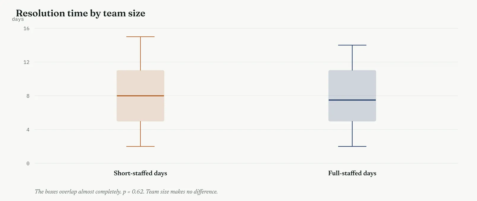
The p-value came back at 0.62, far above the line. The two boxes overlap almost entirely, their medians a few hours apart on a six-day process. The team could not reject the null. Full-staffed days resolved complaints no faster than short-staffed ones, and the headcount theory failed the test built from its own claim. This was the single most important result in the phase, because it was the one the sponsor had been waiting for.
It is worth being clear what this result does and does not say. It does not prove that staffing never matters anywhere. It says that across the range of team sizes Crestline actually ran, from short to full, resolution time did not move. Push the team far smaller than any real day and it surely would, but that is outside the data and outside the question the sponsor asked. The test answers the question at the staffing levels the firm actually uses, which is the only honest scope for it.
Template 13.9. the numbers behind the test.
| GROUP | n | MEAN days | SD |
|---|---|---|---|
| Short-staffed days | 22 | 8.1 | 3.4 |
| Full-staffed days | 20 | 7.6 | 3.2 |
Result. Difference in means 0.5 days, t = 0.50 on 40 degrees of freedom, p = 0.62. The 95% interval runs from minus 1.5 to plus 2.5 days, straddling zero, so no reliable effect.
Across the four firms
The blank page. This is the test to teach first. One clean two-group comparison on the question that matters, with the logic explained slowly, is how a firm new to testing learns that evidence can settle an argument the loudest voice used to win.
The firefight. Fast to run and fast to read. Use it on the single loudest theory, on whatever clean data already exists, confirm or kill it, and move. Do not wait a month for perfect data while the queue grows.
The false start. Write the null and the line on the wall before you split the data. When the result lands the far side of a line the room watched you draw, it cannot be dismissed as something you fished for after the fact.
The quiet achiever. Trivial for this firm to run, so the discipline is to report the effect size beside the p-value every time, and never to chase a gap that is significant but far too small to be worth a project.
The arithmetic, worked once by hand
The p-value is not a black box, and it is worth seeing once where it comes from before trusting a program to produce it. Take the staffing test. The two group averages were 8.1 and 7.6 days, a difference of half a day. The spread within each group, the standard deviation, was about 3.3 days, so the pooled standard error of the difference, the noise you would expect in that gap from sampling alone, worked out at about one day. The t-statistic is simply the difference divided by that standard error, 0.5 over 1.0, which gives 0.5. A t of 0.5 is small, the gap is half the size of its own noise.
That t is then read against the t-distribution on 40 degrees of freedom, roughly the two sample sizes added together and reduced by two. A t as small as 0.5 or smaller happens about 62 times in a hundred when there is no real effect at all, and that is the p-value, 0.62. The gap is well within what chance alone would throw up, so the null stands. Every other test in this section runs the same shape of logic under a different formula. A difference, a spread of counts, or a set of ranks is turned into a single statistic, and that statistic is read against the distribution it would follow if the null were true. You will run them in software, but doing the arithmetic once, by hand, turns the p-value from a verdict a program hands down into a number you can explain and defend in front of a sceptic.
TEST 2
The two-sample t-test again, the handoff
What it is
This is the two-sample t-test again, the same machinery as the staffing test, and it is worth being clear why the method runs the identical test twice rather than once. The first run cleared a suspect. This run convicts one. A test that only clears leaves a sceptic asking what you think the real cause is, and a test that only convicts leaves them asking why you are so sure it is not simply headcount after all. Running the same test, on the same scale and the same significance line, against both the loud theory and the true suspect answers both questions in one motion. The mechanics do not change from the staffing test. Two independent groups, the cases that crossed the unowned handoff and the cases that skipped it, one continuous measure in resolution time, and the same t-statistic read against the same distribution.
When to use it
Reach for a second, parallel run of the same test whenever you want a contrast rather than a lone result. Pairing a clearing test against a convicting test is a deliberate tactic, most useful when a loud theory has to be closed at the same moment a quieter cause is confirmed. It costs nothing beyond a second split of the same data, and it turns a single finding into a comparison, which is always harder for a sceptic to wave away than one number standing on its own.
The Crestline run
The same test, turned on the prime suspect. Do cases that cross the unowned handoff take longer than the few that skip it. Same measure, same two-group shape, so the same two-sample t-test, and the same line, set in advance.
Null. Crossing the handoff makes no difference to resolution time. Alternative. Cases that cross the handoff take longer.
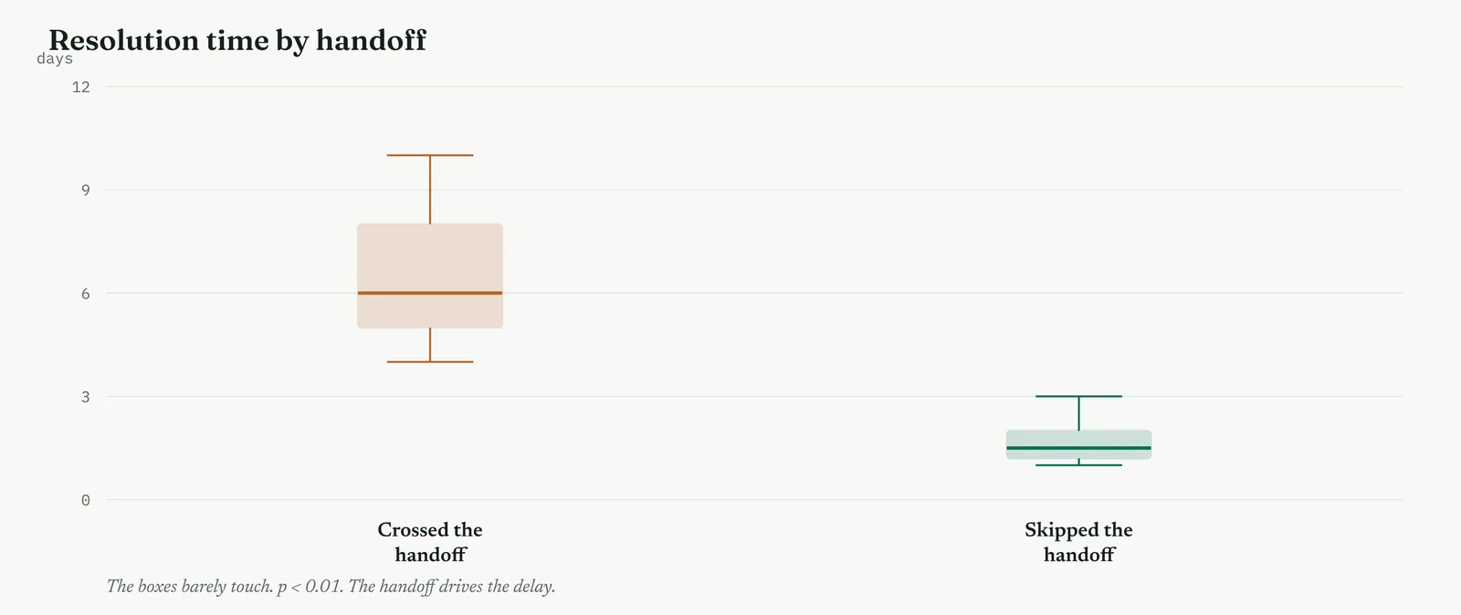
The p-value came back below one in a hundred, and the null fell. The two boxes barely touch. Cases that crossed the unowned handoff took around six days, cases that skipped it took under two. The same test that cleared staffing convicted the handoff, on the same scale and the same line, which is exactly why running both mattered. One test alone proves nothing about the other. Two tests, one clearing and one convicting, make the case.
The size of this effect is what makes it persuasive. A gap of four and a half days on a six-day process is not a subtle statistical finding, it is most of the problem. When an effect is this large the test almost becomes a formality, but running it still matters, because it converts what looks obvious on a chart into a number a sceptic cannot dismiss as your eye seeing what it wanted to see.
Template 13.10. the numbers behind the test.
| GROUP | n | MEAN days | SD |
|---|---|---|---|
| Crossed the handoff | 48 | 6.2 | 1.9 |
| Skipped the handoff | 10 | 1.6 | 0.8 |
Result. Difference 4.6 days, t = 7.4 on 56 degrees of freedom, p < 0.01. The 95% interval runs from 3.4 to 5.8 days, well clear of zero, a large effect.
Across the four firms
The blank page. The clearing test matters most here. A firm new to testing is moved far more by watching its own loud theory fall than by seeing a suspect confirmed, so lead with the result that clears staffing, then show the one that convicts the handoff.
The firefight. Run both halves in one sitting on the data you already hold. The contrast, one theory cleared and one convicted, lands faster in a busy room than a lone p-value that leaves the old theory still standing.
The false start. This pairing is a gift to a sceptical firm, because a test that clears the very theory you were accused of ignoring is the hardest result to call biased. Run the clearing test in full view before the convicting one.
The quiet achiever. The discipline is to pre-declare both tests together, so the result that spares staffing cannot be read as a fishing expedition that happened to land where you wanted.
TEST 3
The paired t-test, before and after a pilot
What it is
The paired t-test compares two measurements taken on the same units, before against after, or under two conditions. It first reduces each pair to a single number, the difference, then tests whether the average of those differences is different from zero. By working on the differences it strips out everything that varies between units, leaving only the change.
When to use it
Reach for it when the two sets of numbers are linked, the same cases measured twice, the same operators under two methods, the same machines before and after a change. The link is what matters. Pairing removes the between-unit noise, so a paired test finds a smaller effect on far less data than an unpaired one, which is why you never waste a pairing by running an ordinary two-sample test on linked data.
The Crestline run
Before committing to a redesign, the team piloted an owned handoff on ten live cases and timed each one before and after. Here the two groups are the same ten cases, so they are not independent, and an ordinary two-sample test would waste the pairing. The paired t-test compares each case against itself, which strips out how different cases are from one another and lets a smaller effect show.
Null. The fix makes no difference, each case resolves in the same time as before. Alternative. The fix lowers resolution time for the same cases.
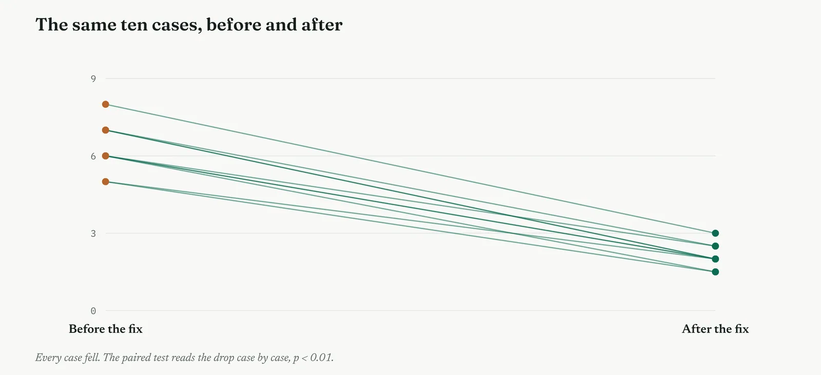
Every case fell, from around six days to around two, and the paired test returned p below one in a hundred. Pairing made the effect unmistakable. An unpaired test on the same numbers would have been muddied by the wide spread between cases, some simple and some complex, and might have blurred a fix that was in fact working on every single case. When the same units are measured twice, pairing is not optional, it is the whole point.
The pitfall here is the one that gives the paired test its whole reason to exist. Had the team run an ordinary two-sample test on the before and after numbers, the wide spread between cases, some simple and quick, some complex and slow, would have swamped the four-day drop, and the fix might have looked like noise. Pairing each case against itself removed that between-case spread entirely, leaving only the drop, which is why ten cases were enough to settle it.
Template 13.11. the numbers behind the test.
| MEASURE | VALUE |
|---|---|
| Mean resolution before | 6.3 days |
| Mean resolution after | 2.2 days |
| Mean drop per case | 4.1 days |
| SD of the drops | 0.9 days |
| Cases in the pilot | 10 |
Result. Mean drop 4.1 days, t = 14.4 on 9 degrees of freedom, p < 0.01. Pairing shrank the noise to the spread of the drops alone, which is why so few cases gave so clear a result.
Across the four firms
The blank page. The pilot-and-measure shape is intuitive even to a firm new to testing, so the paired test makes a good second lesson, once the plain two-group test has landed.
The firefight. A ten-case before-and-after pilot gives a fast, cheap answer without waiting months for data, which suits a firm that has to move this week.
The false start. Record the before numbers and the fix in advance, so no one can later claim the after numbers were cherry-picked from cases that would have improved anyway.
The quiet achiever. The temptation is to pair loosely, calling two merely similar groups a pair. Hold the line that a pair is the same unit measured twice, not two groups you wish were comparable.
TEST 4
One-way ANOVA, the three desks
What it is
One-way ANOVA compares the averages of three or more groups at once. Rather than testing each pair separately, it weighs the spread between the group averages against the spread within the groups, and asks whether the between-group spread is larger than the within-group noise can explain. One test, one significance level, any number of groups.
When to use it
Reach for it when you have three or more groups and a continuous measure, and you want to know whether any of them differ. The reason to prefer it over a run of t-tests is control of the false-alarm risk, which climbs with every extra pairwise comparison. ANOVA asks the whole question once, and when it finds a difference, a follow-up comparison tells you which group stands apart.
The Crestline run
Do the three desks differ in handling time, or is the spread just noise. Three groups now, not two, and a t-test compares only two at a time. Running three separate t-tests, intake against account, account against case handling, and the third pair, would inflate the false-alarm risk with every extra comparison. One-way ANOVA asks the whole question once, at one significance level.
Null. All three desks have the same average handling time. Alternative. At least one desk differs from the others.
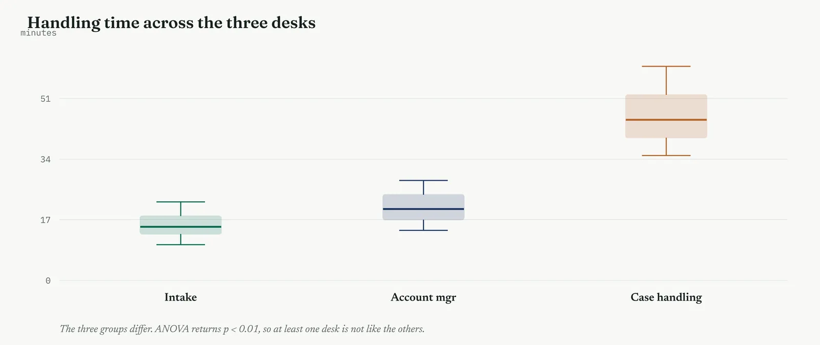
ANOVA returned p below one in a hundred, so at least one desk is not like the others. The box plot shows which, case handling far above intake and account managers, whose boxes sit close together. ANOVA tells you a difference exists somewhere among the groups. It does not tell you where, so a follow-up comparison isolates the desk that differs, which here confirmed what the eye already saw, that the bottleneck desk was also the slowest per case.
ANOVA answers whether any desk differs, not which one, and stopping at the overall result is the common error. A significant ANOVA followed by no follow-up leaves you knowing something differs without knowing what to fix. The team ran the follow-up comparison that isolated case handling, which is the step that turns a significant ANOVA from an interesting fact into an actionable finding.
Template 13.12. the numbers behind the test.
| DESK | n | MEAN min | SD |
|---|---|---|---|
| Intake | 40 | 15.4 | 3.1 |
| Account managers | 40 | 20.2 | 3.8 |
| Case handling | 40 | 45.6 | 6.2 |
Result. F = 61.3 on 2 and 117 degrees of freedom, p < 0.01. A follow-up comparison put case handling far above the other two, which sat close together.
Across the four firms
The blank page. Probably a step too far for a firm running its first tests. Settle the two-group questions first, and bring ANOVA in only once the idea of a test is understood.
The firefight. Useful when three teams or shifts are in the frame at once, because it settles them in a single test rather than a slow series of comparisons the firefight will not sit still for.
The false start. Declare in advance that a significant result will be followed by a named comparison, so the follow-up cannot look like hunting for the group you already wanted to blame.
The quiet achiever. The trap is running every follow-up comparison without correcting for how many you run. A capable team knows to tighten the line when it goes looking for which group differs.
TEST 5
Chi-square, defects by desk
What it is
The chi-square test works on counts, not averages. It compares the counts you observed across categories against the counts you would expect if the categories were unrelated, squares the gaps so they cannot cancel, scales each by its expected count, and sums them into a single statistic. A large total means the observed pattern sits far from what independence would give.
When to use it
Reach for it when both things you are comparing are categories and the data is counts, defects by desk, complaints by type, pass or fail by shift. Counts, not averages. It answers whether two categorical things are related, whether where a defect happens depends on which desk handled it. Its one quiet condition is that the expected count in each cell is not too small, usually at least five.
The Crestline run
Are defects spread evenly across the desks, or does one carry more than its share. The measure now is a count of defects, not an average, so the whole t-family is the wrong tool. The chi-square test compares the counts you observed against the counts chance would give if defects were independent of desk.
Null. Defects are independent of desk, each carries them in proportion to its volume. Alternative. Some desks carry more defects than their share.
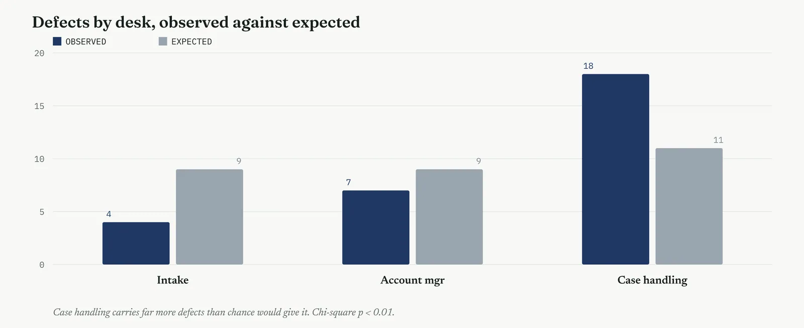
Case handling carried eighteen defects against an expected eleven, and intake far fewer than its share. Chi-square returned p below one in a hundred, so defects are not independent of desk. They pool where the rework loop lives, which tied the defect problem to the same desk the bottleneck and the ANOVA had already flagged. Three different tests, three different data shapes, all pointing at case handling.
The chi-square has a quiet requirement, that the expected count in each cell is not too small, usually at least five. With twenty-nine defects across three desks the expected counts cleared that bar, so the test was valid. Had defects been much rarer, the cells would have been too thin for the chi-square, and the team would have needed an exact test built for small counts instead.
Template 13.13. the numbers behind the test.
| DESK | OBSERVED | EXPECTED | CONTRIBUTION |
|---|---|---|---|
| Intake | 4 | 9.0 | 2.8 |
| Account managers | 7 | 9.0 | 0.4 |
| Case handling | 18 | 11.0 | 4.5 |
Result. Chi-square = 7.7 on 2 degrees of freedom, p < 0.01. Case handling contributes most of the total, so defects are not independent of desk.
Across the four firms
The blank page. The observed-against-expected idea is visual and teachable, so chi-square can land even early, especially when the counts already sit in a tally the firm keeps.
The firefight. Counts are usually the data a firefighting firm already has, so chi-square often runs on records that exist, with no new collection to wait for.
The false start. Fix the categories before you look at the counts. Redrawing category boundaries after seeing the data is a classic way to manufacture a significant result.
The quiet achiever. The discipline is watching the small cells. A capable team knows a chi-square on thin counts is invalid, and switches to an exact test rather than trusting a number the arithmetic cannot support.
TEST 6
The two-proportion test, two error rates
What it is
The two-proportion test compares two rates, the share of cases in each group that fall into a category, and asks whether the rates differ by more than chance. It is close kin to the chi-square on a two-by-two table, and it turns the gap between the two proportions into a z-statistic read against the normal distribution.
When to use it
Reach for it when you are comparing two rates or shares, an error rate between two teams, a pass rate between two methods, a conversion rate between two designs. The measure is a proportion, a count over a total, in each of two groups. It leans heavily on sample size, so small samples can make a large-looking gap meaningless.
The Crestline run
The FMEA had noted that one team sent more wrong first responses than another. Is that gap real, or could it be chance in a small sample. The measure is a proportion, an error rate, so the test that fits is a two-proportion test, comparing the two rates against the null that they are the same.
Null. Both teams have the same underlying first-response error rate. Alternative. The two teams have different error rates.
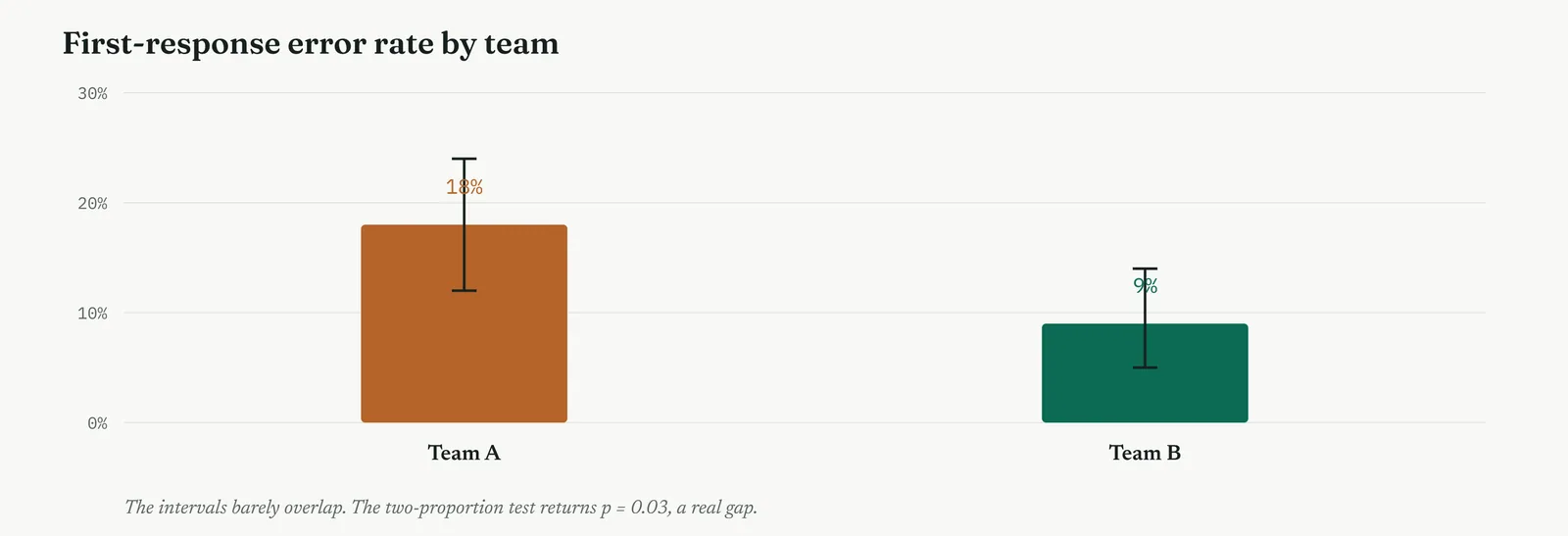
Team A ran at eighteen in a hundred, Team B at nine, and the two-proportion test returned p of 0.03, below the line. The confidence intervals barely overlap, which the plot shows at a glance. The gap is real, not the noise of a small sample, and it pointed at a training difference the Improve phase could close cheaply, without touching headcount at all.
A proportion test leans on sample size in a way that catches people out. With small samples, a gap that looks large in relative terms can still sit well within chance, because a handful of cases moves a rate a long way. Here both teams had over a hundred cases, so the nine-point gap was stable enough to clear the line, but the same nine points on twenty cases each would have proved nothing at all.
Template 13.14. the numbers behind the test.
| TEAM | CASES | ERRORS | RATE |
|---|---|---|---|
| Team A | 120 | 22 | 18% |
| Team B | 130 | 12 | 9% |
Result. The gap is 9 points, z = 2.1, p = 0.03. The 95% interval for the difference runs from 1 to 17 points, above zero, so the gap is real.
Across the four firms
The blank page. Rates are the language a firm new to testing already speaks, so a comparison of two error rates makes an approachable first or second test.
The firefight. Fast and cheap when the two rates are already tracked, which they often are, so the test confirms or kills a suspected difference within the hour.
The false start. State the two groups and the line before pulling the rates, so the comparison cannot be reframed after the fact to favour the answer someone wanted.
The quiet achiever. The trap is reading a gap in the rates as large without checking the sample behind it. A capable team always asks how many cases sit under each rate before it trusts the gap.
TEST 7
Mann-Whitney, when the data is skewed
What it is
The Mann-Whitney test compares two groups without assuming a bell shape. It pools all the values, ranks them from smallest to largest, and asks whether one group holds the higher ranks more than chance would give. Because it works on ranks rather than the values themselves, a few extreme cases cannot distort it, which is exactly what a t-test cannot promise.
When to use it
Reach for it when you would otherwise run a two-sample t-test but the data is skewed, has a long tail, or carries outliers you cannot dismiss, so the bell assumption breaks. Resolution times, costs and delays are often shaped this way. The rule is simple, check the shape first, and switch to the rank test the moment the bell cannot be trusted.
The Crestline run
Resolution time has a long tail. Most cases close quickly, a few drag on for weeks, so the distribution is not the rough bell a t-test assumes. Do complex cases take reliably longer than simple ones. Because the data is skewed, the honest test is the rank-based Mann-Whitney, which compares the two groups by rank rather than by average, so the long tail cannot distort it.
Null. Simple and complex cases follow the same distribution of resolution time. Alternative. Complex cases tend to take longer than simple ones.
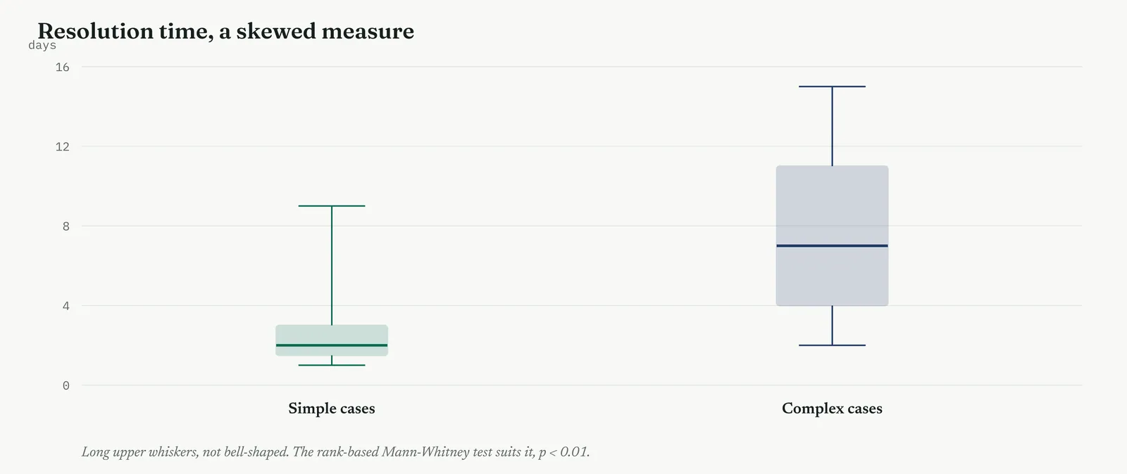
Mann-Whitney returned p below one in a hundred. Complex cases take reliably longer than simple ones, a finding a t-test might have blurred, because the outliers would have dragged its averages around and inflated its spread. When the data is skewed, the rank test is not a lesser option, it is the correct one, and reaching for a t-test out of habit would have been the confident wrong answer the assumptions warn against.
The rank test buys its robustness at a small price, a little less power to detect an effect when the data really is bell-shaped. On skewed data that trade is worth it many times over, because a t-test on a long tail can be badly misled by a few extreme cases. The rule of thumb is simple, use the parametric test when the shape allows it, and switch to the rank test the moment the tail says you cannot trust the bell.
Template 13.15. the numbers behind the test.
| GROUP | n | MEDIAN days | RANK SUM |
|---|---|---|---|
| Simple cases | 30 | 2.0 | 610 |
| Complex cases | 28 | 7.0 | 1121 |
Result. Mann-Whitney U = 145, p < 0.01. The test compares ranks, not values, so the long tail on the complex cases cannot distort the result.
Across the four firms
The blank page. Introduce it only after the t-test is understood, as the answer to a question the firm can now ask itself, what do we do when the data is not bell-shaped.
The firefight. Handy because messy, skewed data is exactly what a firefighting firm tends to have, and the rank test gives an honest answer without waiting for the data to behave.
The false start. Decide in advance that skewed data will get the rank test, so the choice of test cannot later look like a switch made only to reach a significant result.
The quiet achiever. The discipline is to actually look at the shape rather than defaulting to the t-test out of habit. A capable team checks every distribution and reaches for the rank test whenever the tail demands it.
Checking the assumptions before you trust the test
A test is only as trustworthy as the assumptions under it, and the t-test and ANOVA rest on three. The data in each group is roughly bell-shaped. The groups have a similar spread. And the observations are independent, one case telling you nothing about the next. Break any of the three and the p-value can be confidently wrong, so you check them before you trust the result, not after it has told you what you hoped to hear.
Normality you check by eye, with a histogram or a simple plot of the data against what a bell would predict. A gentle departure is survivable, because the t-test is fairly robust to it, but a long tail or a hard skew is not, and that is exactly when you switch to the rank-based Mann-Whitney, as Crestline did for resolution time. Equal spread you check by comparing the two standard deviations, and when they differ sharply you reach for the version of the t-test that does not assume they match. Independence is not a plot but a question about how the data was collected, and it is the assumption most often broken quietly, by measuring the same case twice and treating the two values as separate, which is the very error the paired test exists to avoid.
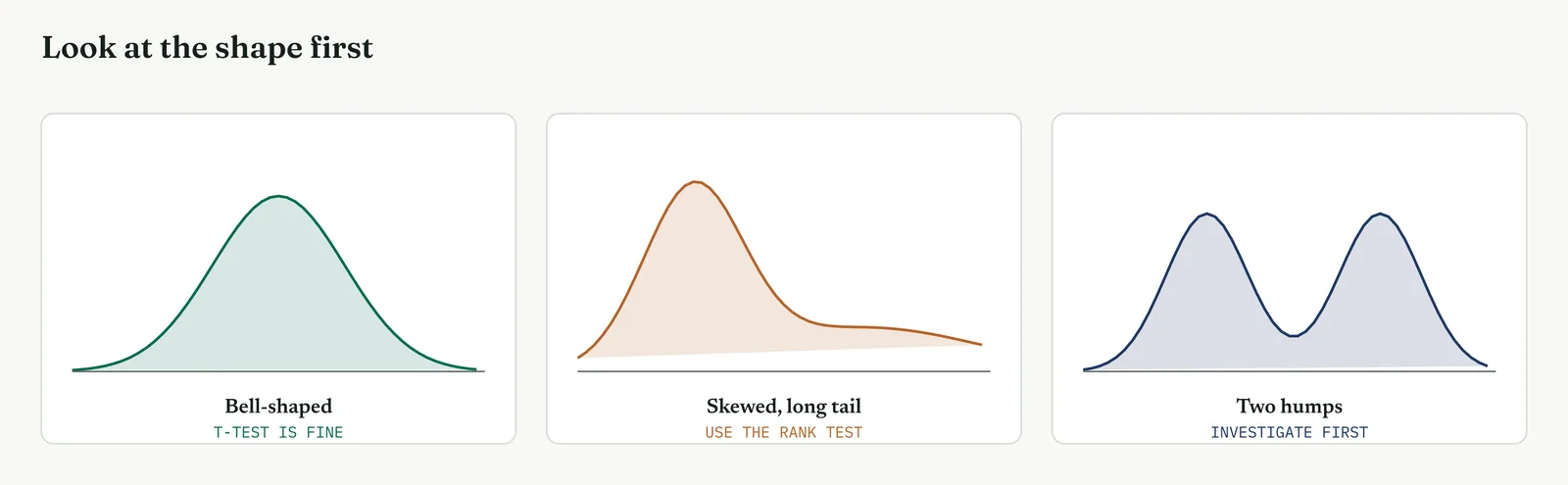
The habit to build is to look at the shape of the data before you choose the test, never to run the test first and hope the assumptions held. Crestline checked the resolution-time distribution, saw the long tail, and picked the rank test for it while keeping the t-test for the roughly bell-shaped comparisons. That one check, made in advance, is the difference between a test that answers the question and one that returns a confident number built on sand.
Effect size, confidence interval and power, worked
Significance told the team the handoff mattered. The effect size told them how much. The standardised difference, the gap in means divided by the pooled spread, came out at about 2.4 for the handoff, an effect so large the two groups barely overlap, against essentially zero for staffing. Reported side by side, 2.4 against nothing, the two effect sizes made the case more plainly than the p-values did, because a manager who glazes over at a p-value understands at once that one difference is enormous and the other is simply not there.
The confidence interval carried the same message with a range attached. For the handoff, the 95% interval on the difference ran from 3.4 to 5.8 days, a window sitting entirely above zero, which says the true effect is at least three and a half days and probably more. For staffing, the interval ran from minus 1.5 to plus 2.5 days, straddling zero, consistent with a small help, a small harm, or nothing at all. An interval that crosses zero and one that clears it by a wide margin tell the whole story without a single p-value spoken aloud.
Power is why the staffing result can be trusted rather than waved away as too little data. Before running, the team asked how many days they would need to detect a difference of one day if it truly existed, and found their forty-two days of records gave a good chance of catching an effect that size. So the high p-value was not the silence of a test too small to hear anything, it was a test with the power to find a one-day effect returning no effect. That distinction, between failing to find and being unable to find, is what let the team close the headcount question rather than merely park it for later.
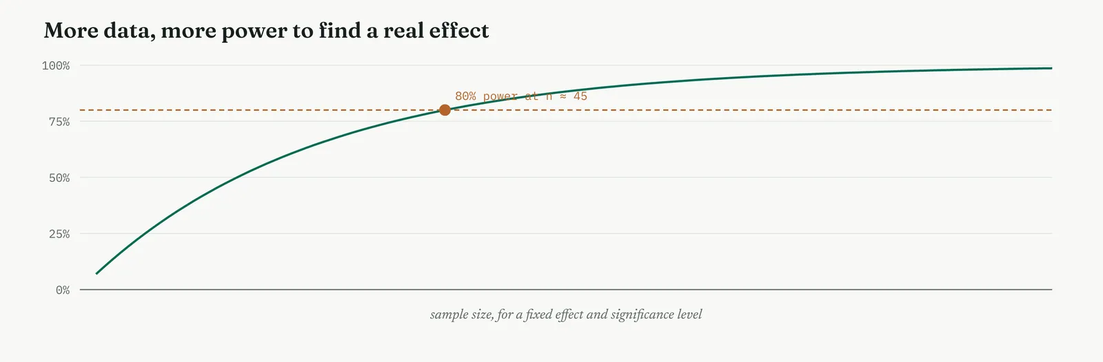
The chi-square arithmetic, worked
The chi-square runs a different arithmetic from the t-test, and it too is worth seeing once. For each desk you first work out the expected count, the defects it would carry if defects were spread in proportion to volume, which is the row total times the column total divided by the grand total. Case handling handled a third of the volume and the twenty-nine defects split evenly by volume would give it about eleven. It carried eighteen. For each cell you then take the gap between observed and expected, square it so the sign drops out, and divide by the expected count, which gives that cell contribution to the total. Case handling contributed about 4.5, intake about 2.8, the account managers very little.
Add the contributions across all the cells and you have the chi-square statistic, here about 7.7. That single number is read against the chi-square distribution on the degrees of freedom of the table, two for three desks, and a value of 7.7 or larger arises less than one time in a hundred when defects and desk are unrelated. So the null of independence falls. The logic is the same as the t-test even though the formula differs, a single statistic built from the data, read against the distribution it would follow if nothing were going on.
The p-value, four ways it is misread
The p-value is misread more often than any other number in the method, and four misreadings do most of the damage. The first is treating it as the probability that the null is true. It is not, it is the probability of the data assuming the null is true, which is a different conditional and a different number. The second is treating a p above the line as proof of no effect, when it is only a failure to find one, which can happen for want of data as easily as for want of an effect.
The third misreading is treating the size of the p-value as the size of the effect. A p of 0.001 does not mean a bigger effect than a p of 0.04, it means a clearer signal against chance, which a large sample can produce from a trivial effect. The fourth is treating a result just over the line as categorically different from one just under it. The line at five in a hundred is a convention, not a wall, and a p of 0.04 and a p of 0.06 are almost the same evidence, so read the p-value as a continuous measure of surprise, not a pass or fail stamp. Hold those four straight and you avoid most of the trouble the number causes.
Many tests, and the risk of a lucky one
There is a quiet trap in running the full family of tests the way this section has. Every test carries a one-in-twenty risk of a false alarm at the usual line, so run twenty tests on data with no real effects and you should expect one to come up significant by pure chance. A team that tests every cause against every measure until something crosses the line has not found an effect, it has found the lucky result the arithmetic guarantees.
The guard is to decide the tests in advance and keep the set small, or, when many comparisons are unavoidable, to tighten the line to account for them, dividing the significance level by the number of tests so the overall false-alarm risk stays where you meant it. Crestline ran a handful of pre-declared tests, each tied to a cause the FMEA had already ranked, rather than a sweep across every pairing it could form, which is why each result could be trusted on its own. The discipline is not to test less, it is to decide what you are testing before the data can tempt you.
Table 13.5. A quick reference for the terms, so the language of testing stays straight.
| TERM | WHAT IT MEANS |
|---|---|
| Null hypothesis | The claim of no effect, the thing you assume true and try to disprove |
| Alternative hypothesis | The effect you suspect, which stands if the null falls |
| p-value | The chance of data at least this extreme if the null were true |
| Significance level | The false-alarm risk you accept, set in advance, usually 0.05 |
| Type I error | A false alarm, rejecting a null that was true |
| Type II error | A miss, keeping a null that was false |
| Power | The chance of finding a real effect if one exists |
| Degrees of freedom | Roughly the independent observations the test has to work with |
| Effect size | How large the effect is, in units of the data spread |
| Confidence interval | The range the true effect would fall in 95 times out of a hundred |
One cause, end to end
It is worth walking a single test from start to finish, so the six moves are not just a list but a sequence you can run. Take the headcount question one more time, slowly. Move one, state the hypotheses. The null is that resolution time is the same on short and full days, the alternative that a fuller team is faster. Both are written down before anything else happens, in front of the sponsor if the sponsor is the sceptic. Move two, set the line. Five in a hundred, two-tailed, because the team is honestly asking whether staffing matters in either direction, not assuming it helps.
Move three, choose the test. The measure is resolution time in days, a continuous number, and there are two independent groups of days, so a two-sample t-test fits, and no other. Move four, check the assumptions. The team plots the two groups, sees roughly bell-shaped spreads of similar width, and confirms the days are independent of one another, so the plain t-test holds. Had the shapes been skewed, this is the point at which they would have switched to the rank test instead, before running anything.
Move five, run it and read the p-value. The test returns 0.62, far above the line, so the null is not rejected. Move six, report the size. The difference is half a day with a confidence interval from minus one and a half to plus two and a half days, straddling zero, and the effect size is essentially nil. The team then carries all of it back in plain words, full days were no faster than short days, the gap was well inside chance, and the test had the power to have found a real difference if one existed. That is the whole protocol, and every other test in the section is the same six moves with a different formula at move five.
The confidence interval, worked by hand
The interval is built from the same pieces as the test. You take the observed difference, half a day for staffing, and add and subtract a margin, which is the standard error of the difference multiplied by a value from the t-distribution for your confidence level, close to two for 95% on a sample this size. The standard error was about one day, so the margin is about two days, and the interval runs from the difference minus two to the difference plus two, from roughly minus one and a half to plus two and a half days.
Read it and the interval tells you more than the p-value alone. It says the data is consistent with staffing helping by up to two and a half days, harming by up to one and a half, or doing nothing, and since it spans zero, nothing cannot be ruled out. For the handoff the same arithmetic on a much larger difference and a tighter spread gave an interval from three and a half to five and three-quarter days, nowhere near zero, which is why that effect is called real and large in the same breath. The interval carries the verdict and the size together, which a bare p-value never does.
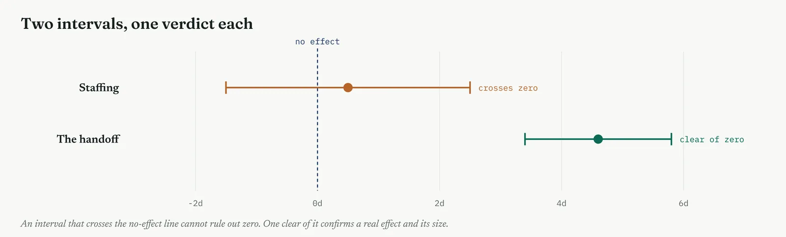
One-tailed and two-tailed, on the same data
The choice of tails changes the arithmetic, so it is worth seeing on real numbers. A two-tailed test splits the five in a hundred risk into two and a half in each tail, and asks only whether the two groups differ. A one-tailed test puts the whole five in a hundred in one tail and asks whether one group is specifically greater. For the same data, the one-tailed p-value is half the two-tailed one, which is exactly why reaching for a one-tailed test after seeing the result is cheating, it halves the p-value for free.
The honest use of a one-tailed test is rare and must be fixed in advance, when a result in the other direction would be meaningless or impossible to act on. Crestline used two-tailed tests throughout, because a finding that a fuller team was somehow slower, however unlikely, would have been worth knowing. The rule to carry is plain, default to two-tailed, and justify a one-tailed test in writing before the data if you ever use one, never after.
The paired test, worked by hand
The paired test is worth working through, because its arithmetic shows exactly why pairing is so powerful. Instead of comparing two group averages, you first reduce each pair to a single number, the drop from before to after. For the pilot, the ten drops clustered tightly around four days, with a spread, the standard deviation of the drops, of under a day. You then run a one-sample test on those drops, asking whether their average is different from zero.
The statistic is the mean drop divided by its own standard error, four divided by a small number, which gives a large t of over fourteen on nine degrees of freedom, and a p-value far below the line. The reason it is so decisive on only ten cases is that pairing threw away all the variation between cases and kept only the variation in the drop, which was tiny. An unpaired test would have carried the full spread of case complexity as noise, and buried the same four-day effect. The lesson is worth stating plainly, when the design lets you pair, pairing can turn a handful of observations into a decisive result.
Beyond these seven, the tests you will meet next
These seven cover most of what a service improvement will need, but they are not the whole family, and it helps to know what sits just beyond them. When the question is not whether two groups differ but how strongly one number drives another, the tool is correlation, and then regression, which is the next tool in this movement and which turns a relationship into an equation you can use to predict. The F-test that sits inside ANOVA appears again whenever you compare spreads rather than averages.
For every parametric test there is usually a non-parametric cousin for when the shape breaks, the signed-rank test for paired data, the Kruskal-Wallis test for three or more groups, each trading a little power for freedom from the bell assumption. You do not need them all at your fingertips. You need to know they exist, so that when a question arrives that the seven core tests do not fit, you reach for the right specialist rather than forcing the question into a test that does not suit it. Choosing the right test is the skill. The arithmetic, in the end, is what the software is for.
The ANOVA arithmetic, in brief
ANOVA earns its name, the analysis of variance, from how it works. It does not compare the three desk averages directly. Instead it compares two kinds of variation, the spread between the desk averages and the spread within each desk, and asks whether the between-desk spread is larger than the within-desk spread would explain. If the desks really are alike, the two spreads should be similar and their ratio near one. If a desk stands apart, the between-desk spread balloons and the ratio climbs.
That ratio is the F-statistic, and for Crestline it came out above sixty, enormous, because case handling sat so far above the other two that the between-desk spread dwarfed the within-desk noise. An F that large, read against the F-distribution on two and one hundred and seventeen degrees of freedom, gives a p-value far below the line. The elegance is that one test handles any number of groups at one significance level, which is why it replaces the tangle of pairwise t-tests that would otherwise inflate the false-alarm risk.
Reading a test output, line by line
Software hands back a block of numbers, and a belt should be able to read every line of it rather than hunting for the p-value alone. The test name and its settings come first, confirming you ran what you meant to, a two-sample t-test, two-tailed. Then the group summaries, the two means and their sample sizes, which you sanity-check against what you expected. Then the test statistic and its degrees of freedom, the t and the df, which together locate you on the reference distribution.
Then the p-value, read against the line you fixed in advance. Then, and this is the line most people skip, the confidence interval on the difference, which tells you the size and direction of the effect the data supports. A disciplined reading takes all of it in, confirms the test was the right one, checks the means make sense, notes the effect size from the interval, and only then reads the p-value as the last piece rather than the first. Reading the output in that order is what stops a wrong test or a nonsensical mean slipping through behind a satisfying p-value.
A checklist before you run a test
Before any test, a short pass down this checklist catches most of the errors in Stage 6 before they happen.
1. The hypotheses are written down. Null and alternative, in plain words, before the data is touched.
2. The line and the tails are fixed. The significance level and one or two tails, chosen in advance and recorded.
3. The test matches the data. Number or count, two groups or more, paired or independent, bell-shaped or skewed.
4. The assumptions are checked. Shape, spread and independence looked at before the test, not after.
5. The sample is large enough. Enough data to find the smallest effect worth finding, checked for power.
6. The effect size will be reported. A plan to give the size and a confidence interval, not the p-value alone.
7. The result will be reported whichever way it falls. No re-running, no re-slicing, no moving the line after the number arrives.
Reporting the result, a worked write-up
The last skill is turning the test into something a sponsor reads in one breath. A good write-up has four parts and no arithmetic. The claim, in plain words. The finding, whether the claim held. The evidence, the plain-language reason. And the confidence, why the finding can be trusted. For the headcount question it read like this. We tested whether a fuller team resolves complaints faster. It does not. Across forty-two days, full-staffed days were no faster than short-staffed ones, and the difference was well within what chance alone produces. The test had the power to find a one-day improvement had one existed, and it found none, so we can close the staffing question rather than leave it open.
Notice what the write-up leaves out. No t-statistic, no degrees of freedom, no mention of the null. Those belong in an appendix a doubter can check, not in the sentence the sponsor acts on. The write-up carries the claim, the verdict, the reason and the confidence, and it carries them in the order a decision-maker needs them. A belt who can run the test but cannot write this paragraph has done half the job, because a finding the sponsor cannot repeat back is a finding that will not survive the first challenge in a meeting the belt is not in.
When the test and the plot disagree
Now and then the test and the picture point different ways, and how you handle the clash separates a careful belt from a careless one. A plot shows two groups that look plainly different, yet the test returns a p-value above the line. Or two groups that look alike return a significant result. Neither is a paradox, and neither is a licence to pick whichever answer you preferred walking in.
A clear-looking difference that fails the test usually means too little data, the eye reads a gap the sample is too small to confirm, and the honest move is to say the difference is suggestive but unproven, and gather more. A tiny-looking difference that passes usually means a very large sample, which can make a trivial gap significant, and the honest move is to report the effect size and say the difference is real but too small to matter. In both cases the resolution is the same, read the p-value, the effect size and the sample together, never one alone. The plot shows you the shape, the test weighs it against chance, and the effect size says whether it is worth acting on. A belt who reads all three at once is rarely fooled by either the picture or the number.
Template 13.8. The seven Crestline tests on one sheet, each claim stated as a null before the data, the test used, and the verdict.
| CLAIM TESTED | TEST | P | VERDICT |
|---|---|---|---|
| Staffing drives the delay | Two-sample t | 0.62 | Null holds, no effect |
| The handoff drives the delay | Two-sample t | < 0.01 | Null rejected, real |
| The pilot fix lowers time | Paired t | < 0.01 | Null rejected, real |
| The three desks differ | One-way ANOVA | < 0.01 | Null rejected, real |
| Defects depend on desk | Chi-square | < 0.01 | Null rejected, real |
| Team error rates differ | Two-proportion | 0.03 | Null rejected, real |
| Complex cases take longer | Mann-Whitney | < 0.01 | Null rejected, real |
The one line it produced. Seven tests, one scale of proof. Staffing holds the null at 0.62. Everything else falls below the line. The headcount question is closed, and the handoff is convicted six ways.
Stage 4. Reading the result
Reading the result
Three readings settle what any of these tests is telling you.
| STRONG | A p-value clearly on one side of a line you set in advance, on data that met the assumptions of the test, reported with the effect size and a confidence interval beside it. |
| WEAK | A p-value read after the line was moved, a test whose assumptions were broken, or significance reported with no effect size. A significant p on a tiny effect is real and useless. |
| THE TELL | The test kills a loud theory or confirms a quiet one. When the p-value settles what the room argued about, the test earned its place. |
Three cautions sit under those readings. The first is that a high p-value is not proof of no effect. Failing to reject the null means the data did not show an effect, which can happen because there is none, or because you lacked the data to see it. Absence of evidence is not evidence of absence, and the honest report of the staffing result says we could not show that staffing matters, not staffing definitely does not. The second is to separate statistical from practical significance. A difference can clear the line and still be far too small to bother fixing, so the effect size, not the p-value, decides whether a real effect is worth acting on. The third is to report a confidence interval wherever you can, because the interval shows the whole range of effect sizes the data is consistent with, and a wide interval straddling zero tells you more than a bare p-value ever will.
There is a fourth caution worth stating on its own, because it is the one that closes the headcount argument. A result you failed to reject is only as strong as the power behind it. A high p-value from a tiny, underpowered test says almost nothing, while a high p-value from a well-powered test, one that could have found a difference worth caring about, is real evidence that the difference is not there. The staffing test was the second kind. It had the data to catch a one-day effect and did not, which is why the team could say staffing does not drive the delay rather than the weaker we could not tell.
The last habit of reading is to carry the result back in plain words, not statistics. The sponsor does not need the t-statistic or the degrees of freedom. The sponsor needs to hear that full-staffed days were no faster than short-staffed ones, that the difference was well within what chance alone produces, and that the test had the power to have found a real gap if one existed. State the finding, the plain-language reason, and the confidence, and leave the arithmetic in the appendix where a doubter can check it.
Stage 5. Four firms, four moves
Four firms, four moves
The four grounds from Chapter 1 change how much testing you run, which test you can defend, and how you carry the result back to the room. This is the tool where the ground matters most, because a test the firm cannot follow is a test the firm will not trust, however sound the arithmetic behind it.
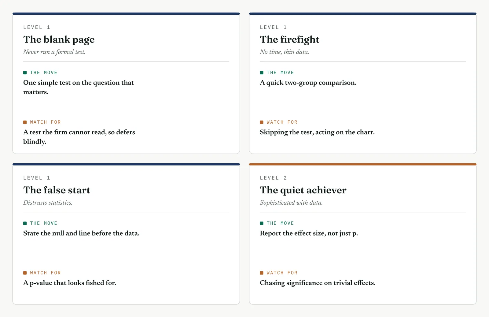
The blank page LEVEL 1
This firm has never run a formal test, and a p-value means nothing to it yet. Run one simple two-group test on the single question that matters most, and spend more time explaining the null out loud than running the arithmetic. Say plainly what no effect would look like, then show the data landing far from it. The value on a blank page is not the statistic itself, it is the firm learning, once, that a contested claim can be settled by evidence rather than by whoever is most senior in the room. Get that one lesson to land and the next test is easy. Reach for ANOVA or a rank test here and you lose the room before the number arrives.
The firefight LEVEL 1
This firm has thin data and no patience, and it will act on the chart alone if you let it. Run a fast two-group comparison on the loudest theory, enough to confirm or kill it, and no more. Do not build a seven-test battery the firefight will never sit still for, and do not wait a month for clean data while the queue grows. A single pre-declared test that closes the headcount argument this week is worth more than a perfect analysis plan next quarter, because in a firefight the currency is momentum, and a theory killed on evidence buys room to breathe that a chart never will.
The false start LEVEL 1
This firm watched a past effort produce a p-value that looked fished for, and it trusts none of them now. The whole game here is visible pre-commitment. State the null, the significance line, the tails and the test in front of the team, and write them all on the wall before you touch the data. When the result lands the far side of a line the room saw you draw, it cannot be dismissed as something you engineered after the fact. Run the test once, report it whichever way it falls, and resist the urge to slice the data a second way if the first result disappoints, because the sceptics are watching for exactly that move.
The quiet achiever LEVEL 2
This firm can run tests all day and has the data to over-test, which is its particular danger. Its failure is not crude, it is sophisticated: chasing significance on effects too small to matter, and slicing the data until something crosses the line by chance. Report the effect size and a confidence interval beside every p-value, and hold the discipline of a small set of pre-declared tests rather than a fishing expedition across twenty. Remind the room that with enough comparisons, something always comes up significant, and that a capable team can find a result to support almost any theory if it looks for long enough. Here the discipline you add is not method, which the firm has, but restraint, which capability erodes.
Stage 6. Where it breaks
Where it breaks
1. Setting the significance level after seeing the p-value. Move the line to fit the result and the test proves nothing. Set it first, and write it down.
2. Switching to a one-tailed test to drop the p-value. Choosing the tails after the data leaned your way is fishing with extra steps. Fix the tails in advance.
3. Testing until something is significant. Run enough tests and one comes up significant by chance. Decide the tests before you run them, or correct for the many.
4. Ignoring the assumptions. A t-test on skewed data gives a confident wrong answer. Check the shape, and switch to a rank test when the bell breaks.
5. Reading a high p-value as proof of no effect. Failing to reject the null is not proving it. You may simply have lacked the data to see a real effect.
6. Reporting significance without size. A significant tiny effect is real and pointless. Give the effect size and a confidence interval beside the p-value.
7. Confusing statistical and practical significance. A difference can clear the line and still be too small to fix. Significance is not importance.
8. Running an unpaired test on paired data. When the same units are measured twice, pairing removes the noise between them. Waste it and a real effect can vanish.
9. Running many t-tests instead of one ANOVA. Every extra comparison inflates the false-alarm risk. Three or more groups, ask the question once.
10. Treating p as the chance the cause is real. It is not. It is the chance of the data under no effect. The distinction changes what the number is allowed to say.
11. Choosing a one-tailed test after the fact. It halves the p-value for free. Fix the tails in advance, in writing, or use two-tailed.
12. Trusting a chi-square on tiny cell counts. Expected counts below about five break the test. Use an exact test for small counts.
13. Reporting a result without its power. A high p-value from an underpowered test says nothing. Say what effect the test could have found.
Stage 7. At the gate
At the gate
What it lets you defend. The sponsor asks whether you are sure staffing is not the cause. The test answers with a number set against a line drawn in advance. Staffing at p 0.62 is not a hunch that headcount is innocent, it is a test that failed to convict it, run on the sponsor own theory and on the sponsor own data. And it does not stand alone. Six further tests, each on a different shape of question, all fall the other way and all point at the process rather than the people. It is the strongest close the phase can give the headcount argument, and one Martin can reopen only by attacking the method in front of the people who watched it run.
What it feeds. The confirmed causes become the drivers the Improve phase fixes. The killed causes are struck from the list with a test behind the striking, so they do not return under a new name three months on. The effect sizes you recorded feed the sizing of the fix, and the pilot result feeds the confidence that the redesign will work at scale. The tests themselves become the evidence the gate review stands on when it decides the phase is done.
One caution belongs at the gate. A phase that closes on a single test is fragile, because any one test can mislead. The strength of the Crestline close is not one p-value but a pattern, seven tests across different shapes of question, one clearing the loud theory and six convicting the process, each pre-declared and each reported whichever way it fell. That pattern is far harder to argue with than any single number, and it is the pattern, not the arithmetic, that the sponsor should be shown.
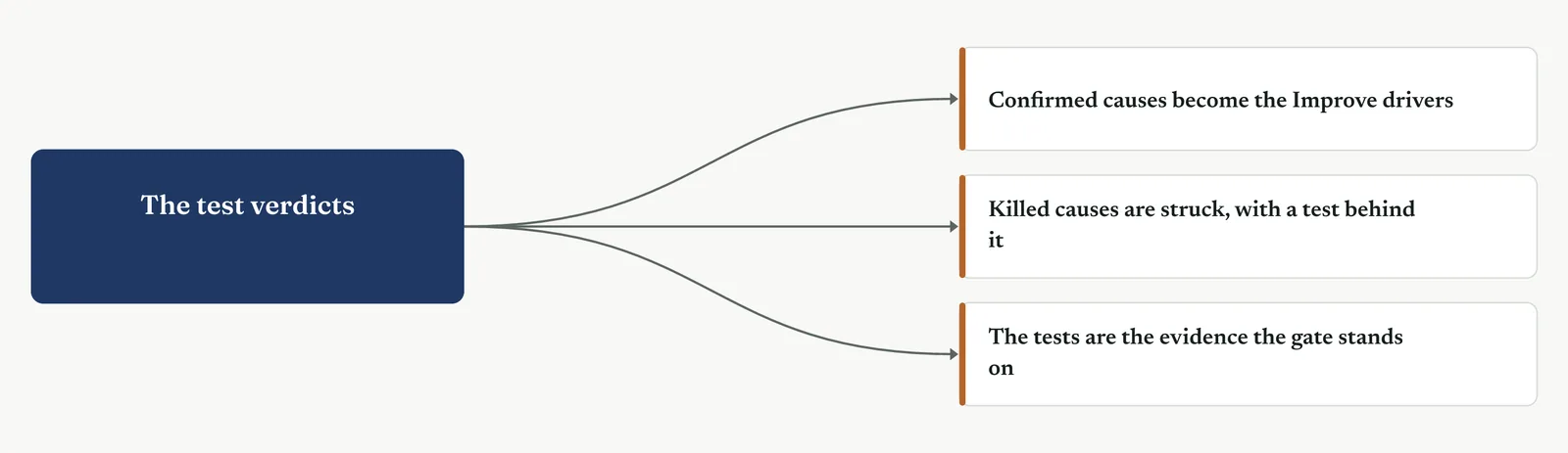
13 · ANALYSE MOVEMENT THREE · TEST THE CAUSES AGAINST THE DATA
13.3.11 Regression and correlation
Recommended ISO 13053 Factsheet 15
Purpose. Measure how strongly one thing drives another, fit the equation that captures the link, and use it to size a cause and predict a gain. Where a hypothesis test says whether an effect is real, regression says how large it is and lets you weigh several causes against one another at once. This is the tool that turns a confirmed cause into a number the Improve phase can act on.
Stage 1. The trigger
The trigger
Hypothesis testing told you whether a difference was real. Regression tells you how large it is. Where a test returns a verdict, real or not, a regression returns a rule, an equation that says how much the outcome moves for each unit of the driver, and lets you predict the outcome for a driver value you have not yet seen. You reach for it when a confirmed cause has to be sized, when several causes are tangled together and you need to know which one is actually doing the work, or when you want to estimate the gain a fix will buy before you commit to it. It is the tool that turns a cause into a quantity.
Start with correlation, the simplest measure of a link. Correlation is a single number, running from minus one to plus one, for how tightly two measures move together. Near plus one, they rise together in near-lockstep. Near minus one, one rises as the other falls. Near zero, there is no straight-line link at all. The common measure, Pearson correlation, written r, captures only straight-line relationships, and it never tells you which variable drives which. It is the quick screen you run before fitting anything. Figure 13.62 shows what different strengths look like.
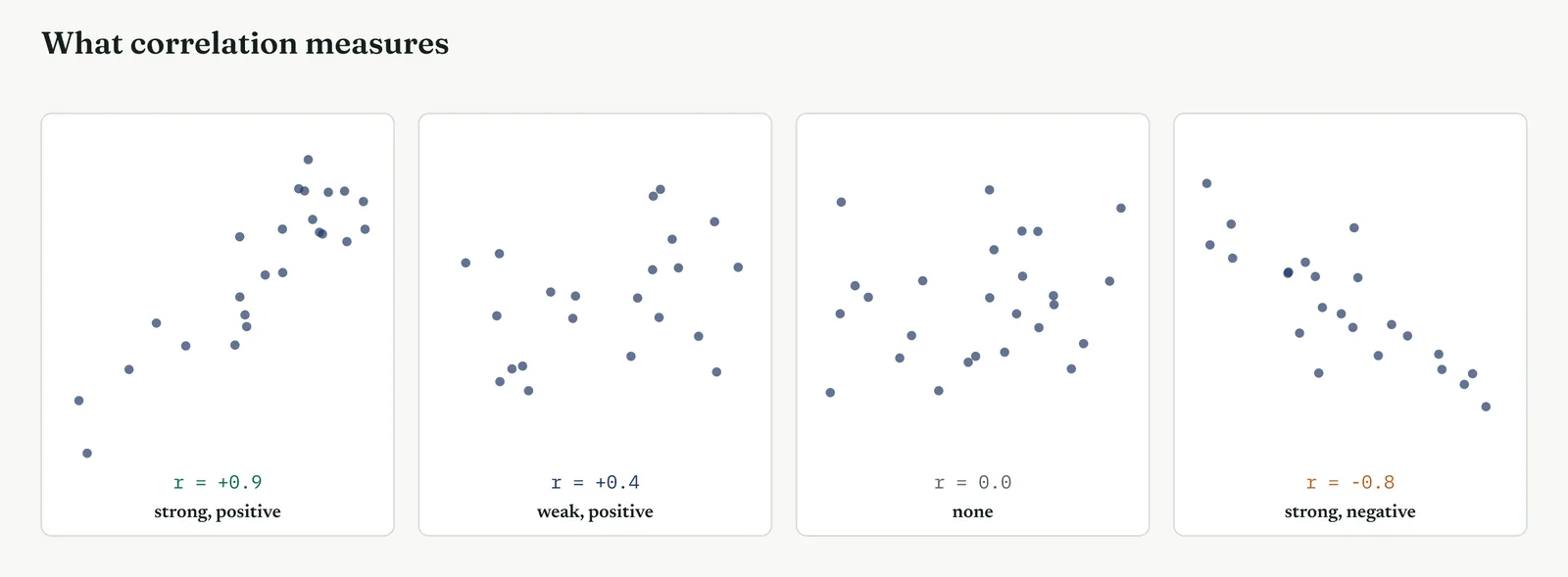
Where correlation gives strength, regression gives the rule. Regression fits the straight line that best summarises how the outcome changes with the driver, and returns two numbers that matter. The slope is how much the outcome moves for each unit of the driver, the finding you usually came for. The intercept is where the line starts, the outcome when the driver is zero. The line is chosen to make the total of the squared gaps between the points and the line as small as possible, which is why the method is often called least squares. Figure 13.63 shows a line drawn through a cloud, with the gaps it minimises.
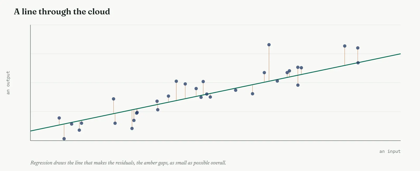
A fitted line is not automatically a good line, and two things tell you how well it fits. R-squared is the share of the spread in the outcome that the line explains, from zero, the line explains nothing, to one, the line explains all of it. An R-squared of 0.72 means the driver accounts for 72% of the variation in the outcome, leaving 28% to everything else. The residuals are what the line missed, the gaps between each point and the line, and their pattern is the deeper test. A good model leaves residuals that are a shapeless cloud around zero. Any shape left in them, a curve or a fan, is signal the model failed to capture, and a warning that the straight line was the wrong choice.
The one warning that matters most has nothing to do with arithmetic. Correlation is not cause. Two measures can move together because one drives the other, or because a third thing drives both, or by pure coincidence in a small sample. A regression will happily fit a line to any of these, and the equation looks equally convincing in every case. Establishing cause needs more than a fit, it needs a mechanism you can explain, a test that rules out the alternatives, and ideally a change that moves the outcome when you move the driver. Figure 13.64 shows the trap, two measures that rise together only because a third drives them both.
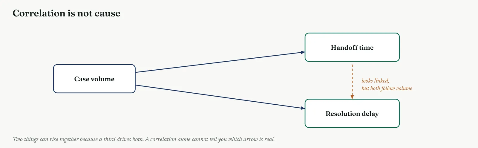
Regression rests on a few assumptions, and a model that breaks them can mislead with great confidence. The relationship should be roughly a straight line, which you check by looking at the scatter before you fit. The spread of the residuals should be roughly even across the range, not fanning out as the driver grows. The observations should be independent of one another. And the residuals should be roughly bell-shaped. When the relationship curves, a rank measure or a transformed model suits it better. When the outcome is a yes or no rather than a number, ordinary regression will not do at all, and logistic regression takes its place. The shape of the data chooses the model, as it chose the test in the section before.
One distinction shapes everything that follows. A simple regression has one driver. A multiple regression has several, and it does something a simple one cannot, it reports the effect of each driver with the others held constant. This is its power, because real causes are tangled. If busy days carry both higher volume and longer handoffs, a simple regression cannot tell their effects apart, but a multiple regression can, giving each its own coefficient as though the others were frozen. It is the honest way to ask whether a suspect still matters once its fellow travellers are accounted for.
So a regression needs three things thought through before you trust it. The shape, checked from the scatter and confirmed in the residuals, so the model you fit matches the link that is there. The drivers, chosen in advance for a reason, not dredged from a pile of variables until the fit looks good. And the range, the span of data the model was built on, beyond which any prediction is a guess. Settle those three and the equation is a tool. Skip them and it is a confident fiction.
Stage 2. The build
The build
Plot the two variables and look before you fit. The scatter tells you the shape, straight or curved, tight or loose, and whether an outlier is about to drag the whole line. Never fit a model to numbers you have not first seen as a picture.
Measure the correlation, strength and direction. A single number for how tightly the two move together. Near zero, stop, there is nothing to model. Strong, and a regression will pay off.
Fit the line, or the model. One driver, a simple regression. Several tangled drivers, a multiple regression that holds the others constant. A yes or no outcome, logistic regression.
Read the fit, R-squared and the residuals. R-squared says how much you explained. The residual plot says whether the shape was right. A high R-squared with patterned residuals is a warning, not a win.
Check the assumptions the model rests on. A straight-line link, even spread, independent points, bell-shaped residuals. A model that breaks these returns a confident wrong answer.
Report the effect, its size and its uncertainty. The slope with its confidence interval, the R-squared, and the range the model holds within. Predict only inside the data, and say so.
The third move, choosing the model, is the one that most often goes wrong, because the right question with the wrong model gives a confident wrong answer. The model you reach for depends on what you are asking, whether you want the strength of a link or the rule behind it, whether you have one driver or several, whether the link is straight or curved, and whether the outcome is a number or a yes or no. Table 13.6 pairs the common methods with the question each one answers, and Figure 13.66 is the same guidance at a glance. The rest of this section runs every one of them on Crestline.
Table 13.6. The common methods and the question each one answers, with the Crestline use of each.
| THE METHOD | USE IT WHEN | A CRESTLINE USE |
|---|---|---|
| Correlation (r) | You want the strength of a straight-line link between two numbers | How tightly handoff time tracks resolution delay |
| Simple regression | You want the rule, the outcome predicted from one driver | How many days of delay each day of handoff adds |
| Multiple regression | You want each driver weighed with the others held constant | Whether staffing moves delay once the real drivers are accounted for |
| Rank correlation | The link is monotonic but curved, or the data is skewed | A driver that climbs steadily but not in a straight line |
| Logistic regression | The outcome is a yes or no, and you want its probability | What drives the chance of a first-response defect |
| R-squared, residuals | You want to judge how well any fitted model fits | Whether the handoff line is a good model or a rough one |
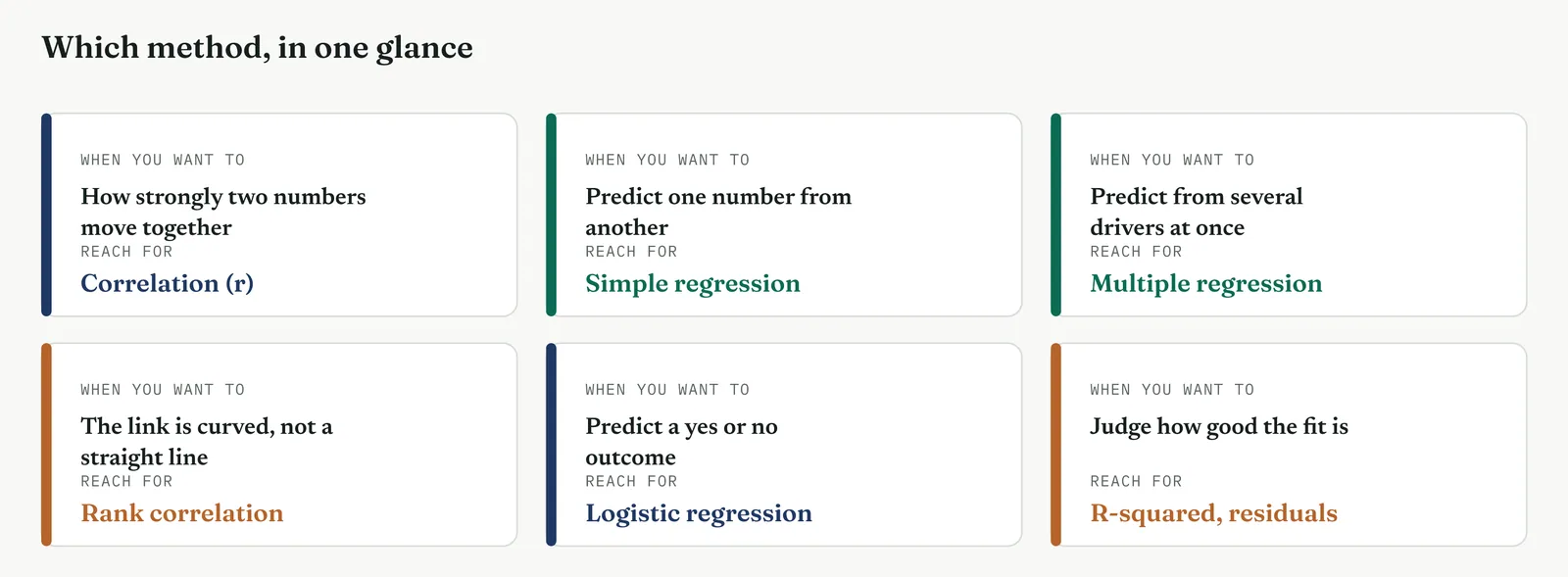
| TIP Look before you fit. The one move that saves the most grief is plotting the two variables before you compute anything. The scatter shows a curve a correlation would hide, an outlier a slope would chase, and a fan a straight line cannot handle. A model fitted to numbers you have not seen as a picture is a model you cannot defend. |
Stage 3. Crestline on the floor
Crestline on the floor
Movement Three had confirmed the handoff and cleared staffing with the tests. Regression now sizes what the tests confirmed, and weighs the drivers against one another to see which truly does the work. Crestline ran the full family, from a first correlation through a multiple model and on to prediction, and each method below sets out what it is, when to reach for it, and how it ran on the floor.
METHOD 1
Correlation, the strength of the link
What it is
Correlation measures how tightly two numbers move together, on a scale from minus one to plus one. Near plus one they rise together almost in lockstep, near minus one one rises as the other falls, and near zero there is no straight-line link at all. The common measure, Pearson correlation, written r, captures only straight-line relationships, and it says nothing about which variable drives which. It is a strength meter, not a cause meter, and it is the first thing to compute when you suspect two measures are related.
When to use it
Reach for correlation when you have two continuous measures and want a single number for how strongly they track each other, before you fit any model. It is the quick screen that says whether a relationship is worth pursuing. A near-zero correlation says do not bother fitting a line. A strong one says a regression will pay off. Hold its two limits in mind throughout, it sees only straight lines, so it will understate a curved link, and it never proves cause.
The Crestline run
The project suspected that the time a case spent in the unowned handoff drove its total resolution delay. Plotting handoff time against delay gave the cloud in Figure 13.67, and the correlation came back at r of 0.85, strong and positive. Cases that sat longer in the handoff took longer overall, and the link was tight enough to be worth modelling. It did not yet prove the handoff caused the delay, but it earned the handoff a regression, and it set the two weakest suspects, staffing among them, well down the list.
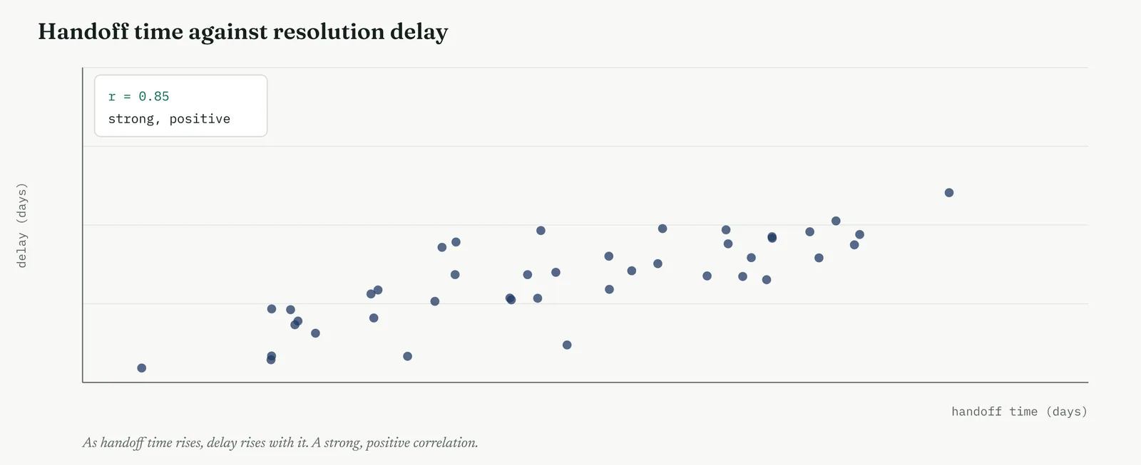
Template 13.16. the numbers behind it.
| DRIVER, AGAINST DELAY | CORRELATION r |
|---|---|
| Handoff time | 0.85 |
| Case complexity | 0.55 |
| Case volume | 0.40 |
| Staffing level | 0.05 |
Result. Handoff time tracks delay far more tightly than any other driver. Staffing barely moves with it at all, at r of 0.05, the first quantified sign the headcount theory was empty.
Across the four firms
The blank page. One correlation on the strongest pair, read straight off the scatter, is the gentlest way in. Show the cloud, name the number, and let the picture carry the point before any equation appears.
The firefight. A single r on data you already hold, computed in minutes, tells you fast whether a suspected link is worth chasing or a dead end to drop, without waiting on a model.
The false start. Report every correlation you ran, not only the strong one, so no one can accuse you of showing the single pair that happened to suit your story.
The quiet achiever. The danger is a correlation matrix full of numbers, some strong by chance alone. Pre-name the pairs that matter and resist fishing the matrix for whatever crosses a threshold.
METHOD 2
Simple linear regression, the equation
What it is
Regression fits the straight line that best summarises how one number changes with another, and returns two numbers that matter. The slope is how much the outcome moves for each unit of the driver, the finding you usually came for. The intercept is where the line starts, the outcome when the driver is zero. Where correlation gives strength, regression gives the rule, an equation you can read, defend and use to predict. The line is the one that makes the total of the squared gaps between the points and the line as small as possible.
When to use it
Reach for simple regression when a correlation has shown a straight-line link worth modelling and you want the rule behind it, how much delay each day of handoff buys. Use it when there is one clear driver and one outcome, both continuous, and the scatter looks straight. When several drivers are in play at once, and they usually are, move to multiple regression, which holds the others constant rather than blaming one for the work of all.
The Crestline run
Fitting a line to the handoff-and-delay cloud gave the equation in Figure 13.68, delay equals 1.2 plus 0.9 times handoff time. The slope of 0.9 was the finding that mattered. Every extra day a case spent in the handoff added about nine-tenths of a day to its total resolution. That put a number on the cost of the unowned middle, and it let the team say what removing the handoff would be worth, not merely that it would help. A slope is a currency, and this one priced the handoff.
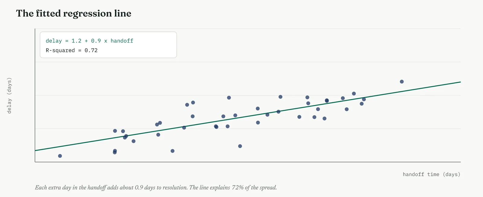
Template 13.17. the numbers behind it.
| TERM | ESTIMATE | STD ERROR | p |
|---|---|---|---|
| Slope, handoff time | 0.90 | 0.09 | < 0.01 |
| Intercept | 1.20 | 0.35 | < 0.01 |
Result. The slope of 0.90 is far larger than its standard error, so it is firmly different from zero, p below one in a hundred. Each day of handoff costs about nine-tenths of a day of delay.
Across the four firms
The blank page. Fit one line, on the one relationship that matters, and read the slope out loud as a sentence, each day here costs that much there. The equation is a step, so take it slowly and only once.
The firefight. A single slope puts a price on the loudest cause fast, which is exactly what a busy room needs to justify a fix. Skip the model diagnostics only if you must, and say that you did.
The false start. Name the one driver before you fit, and report the slope whether it is large or small. A slope reported honestly, even a disappointing one, rebuilds the trust a fished result destroyed.
The quiet achiever. The trap is fitting a simple line when several drivers are entangled, and reading its slope as the whole story. Move to a multiple model before you quote a coefficient as the effect.
METHOD 3
Reading the fit, R-squared and residuals
What it is
A fitted line is not automatically a good line, and two things tell you how well it fits. R-squared is the share of the spread in the outcome that the line explains, from zero to one. The residuals are what the line missed, the gap between each point and the line, and their pattern is the deeper test. A good model leaves residuals that are a shapeless cloud around zero. A curve, or a fan that widens across the range, is signal the line failed to capture, and a sign the straight line was the wrong shape.
When to use it
Read the fit every time you fit a model, and never skip the residuals. R-squared alone can flatter a bad model, because a straight line through curved data can still explain much of the spread while missing the shape entirely. The residual plot is the honest check. A high R-squared with patterned residuals is a warning that a better model is hiding in the pattern you ignored, not a certificate that the job is done.
The Crestline run
The handoff model returned an R-squared of 0.72, so handoff time alone explained nearly three-quarters of the spread in resolution delay, a strong fit for a single driver. The residual plot, the left panel of Figure 13.69, was a shapeless cloud, which said the straight line was the right shape and no obvious driver had been left out. Had the residuals curved, as in the right panel, the team would have known a straight line was too simple, and reached for a different model before trusting a single number of it.
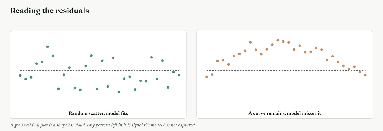
Template 13.18. the numbers behind it.
| FIT MEASURE | VALUE |
|---|---|
| R-squared | 0.72 |
| Adjusted R-squared | 0.71 |
| Residual pattern | none, a shapeless cloud |
| Largest residual | 2.1 days |
Result. Nearly three-quarters of the spread explained by one driver, with residuals showing no leftover shape. The straight line was the right model for this link.
Across the four firms
The blank page. Teach R-squared as a share out of a hundred, how much of the spread the line accounts for, and show the residual cloud as the picture of what is left. Two ideas, kept simple.
The firefight. A quick R-squared tells a busy room how much of the problem one driver explains, which is often enough to decide whether the fix is worth it, even without a full diagnostic pass.
The false start. Report R-squared honestly, including the part left unexplained, and show the residual plot. Hiding a weak fit behind a strong-sounding number is exactly the move a burned firm is watching for.
The quiet achiever. The trap is chasing R-squared upward by adding variables, which always lifts it, whether or not they matter. Watch the adjusted figure and the residuals, not the raw R-squared alone.
METHOD 4
Multiple regression, the drivers weighed together
What it is
Multiple regression fits several drivers at once and reports the effect of each with the others held constant. This is its power. It separates tangled causes. If busy days carry both higher volume and longer handoffs, a simple regression cannot tell their effects apart, but a multiple regression can, giving each its own coefficient as though the others were frozen. It is the tool that settles which of several correlated suspects is actually doing the work, and which is only along for the ride.
When to use it
Reach for multiple regression when more than one driver is plausible and they may be entangled, which is nearly always. Use it to ask whether a suspect still matters once the others are accounted for. It is the most honest answer to a theory that survives on correlation alone, because it can hold the real drivers constant and ask whether the suspect, on its own, moves anything. For Crestline it was the tool built to bury the headcount theory once and for all.
The Crestline run
The team fitted delay against four drivers at once, handoff time, case complexity, case volume, and staffing level. The coefficients are in Figure 13.70 and Template 13.19. Handoff time held its large, significant effect. Complexity and volume mattered too, less. Staffing came back at minus 0.05 and not significant, which means that once handoff, complexity and volume were accounted for, the staffing level did nothing to resolution delay. The headcount theory, cornered by the hypothesis tests, was buried by the regression. It could not survive being weighed beside the drivers that were real.
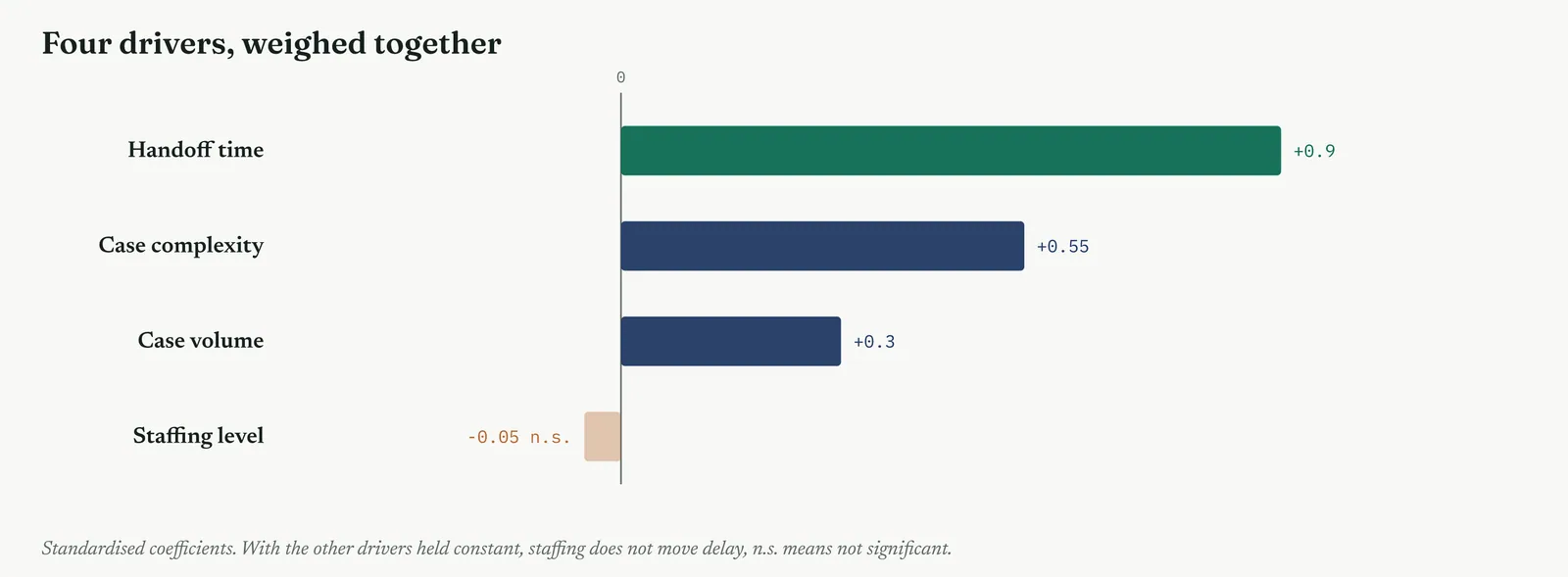
Template 13.19. the numbers behind it.
| DRIVER | COEFFICIENT | p | VERDICT |
|---|---|---|---|
| Handoff time | +0.90 | < 0.01 | strong driver |
| Case complexity | +0.55 | < 0.01 | real driver |
| Case volume | +0.30 | 0.02 | minor driver |
| Staffing level | -0.05 | 0.71 | n.s., no effect |
Result. Held beside the real drivers, staffing carries a coefficient near zero and a p of 0.71. The headcount theory does not survive a multiple regression. The handoff does, larger than all the rest.
Across the four firms
The blank page. Almost certainly a step too far for a firm running its first models. Settle the single-driver questions first, and bring a multiple model in only once one line has been understood.
The firefight. Reach for it only when a loud theory rests on a correlation the firm will not drop. One multiple model that holds the real drivers constant can end an argument a stack of scatters cannot.
The false start. Name every driver before you fit, and report them all, the ones that mattered and the one that did not. A model that clears the very suspect you were accused of protecting is the hardest to call rigged.
The quiet achiever. The traps here are subtle, entering drivers that are near-copies of each other, or adding so many that the model fits noise. Keep the drivers few, chosen and distinct, and watch for it.
METHOD 5
Rank correlation, when the link is not straight
What it is
Pearson correlation and ordinary regression assume the link is a straight line. When it is not, when the outcome rises with the driver but along a curve, rank correlation, Spearman, measures the strength of the climb without assuming its shape. It works on the ranks of the values rather than the values themselves, so it captures any steady, one-directional relationship, straight or curved, and it shrugs off the outliers that would drag an ordinary correlation around.
When to use it
Reach for rank correlation when the scatter shows a clear but curved relationship, or when the data is skewed or carries outliers that a straight-line measure would mishandle. If a curve is obvious in the plot, Pearson will understate the link and Spearman will read it honestly. As with every method here, look at the scatter first, and let its shape choose the measure rather than reaching for Pearson out of habit.
The Crestline run
One relationship in the data climbed steadily but curved, flattening at the top, as in Figure 13.71. Pearson read it at 0.71, held back by the bend. Spearman, working on ranks, read it at 0.94, the honest strength of a link that was real but not straight. Reporting the Pearson figure alone would have understated a driver the team needed to size, and might have pushed a genuine cause down the list behind weaker but straighter ones.
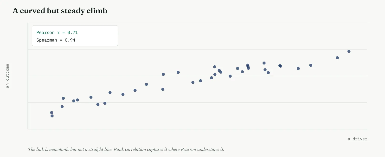
Template 13.20. the numbers behind it.
| MEASURE | VALUE |
|---|---|
| Pearson r, straight-line | 0.71 |
| Spearman, rank-based | 0.94 |
| Shape of the link | monotonic, curved |
Result. The link is strong but not straight. The rank measure captures it, the straight-line measure understates it. On a curved relationship, Spearman is the honest number.
Across the four firms
The blank page. Introduce it only when a scatter plainly curves, as the answer to a question the firm can now see for itself, the line is not straight, so what do we measure instead.
The firefight. Useful because real service data is often skewed and bent, and the rank measure gives an honest strength without the firm having to straighten the data first.
The false start. Decide from the scatter, in the open, that a curved link gets the rank measure, so the choice cannot later look like a switch made to reach a stronger number.
The quiet achiever. The discipline is to look at the shape rather than defaulting to Pearson, and to report both measures when they disagree, so the curve is visible and not quietly smoothed away.
METHOD 6
Logistic regression, predicting a yes or no
What it is
When the outcome is not a number but a yes or no, whether a case had a first-response defect, whether a customer was lost, ordinary regression will not do. Logistic regression fits an S-shaped curve that returns a probability between zero and one for the outcome, given the drivers. It answers how the chance of the outcome changes as a driver moves, rather than how much of a number the driver adds. The S-shape keeps the prediction sensibly between nought and certain, where a straight line would run past both.
When to use it
Reach for logistic regression when what you are predicting is a category, usually a yes or no, and you want the probability of it. Defect or clean, pass or fail, retained or lost. The drivers can be numbers or categories, but the outcome is binary. It is the regression to reach for whenever the thing you care about is an event that either happens or does not, and you want to know what raises or lowers its odds.
The Crestline run
The team asked what drove the chance of a first-response defect. Logistic regression against handoff exposure and handler training gave the curve in Figure 13.72. The probability of a defect climbed sharply once a case crossed a threshold of handoff exposure, and fell where the handler had been trained. It let the team say not merely that defects clustered, but how the chance of one rose and fell with the two drivers they could actually change, which turned a pattern into a lever.
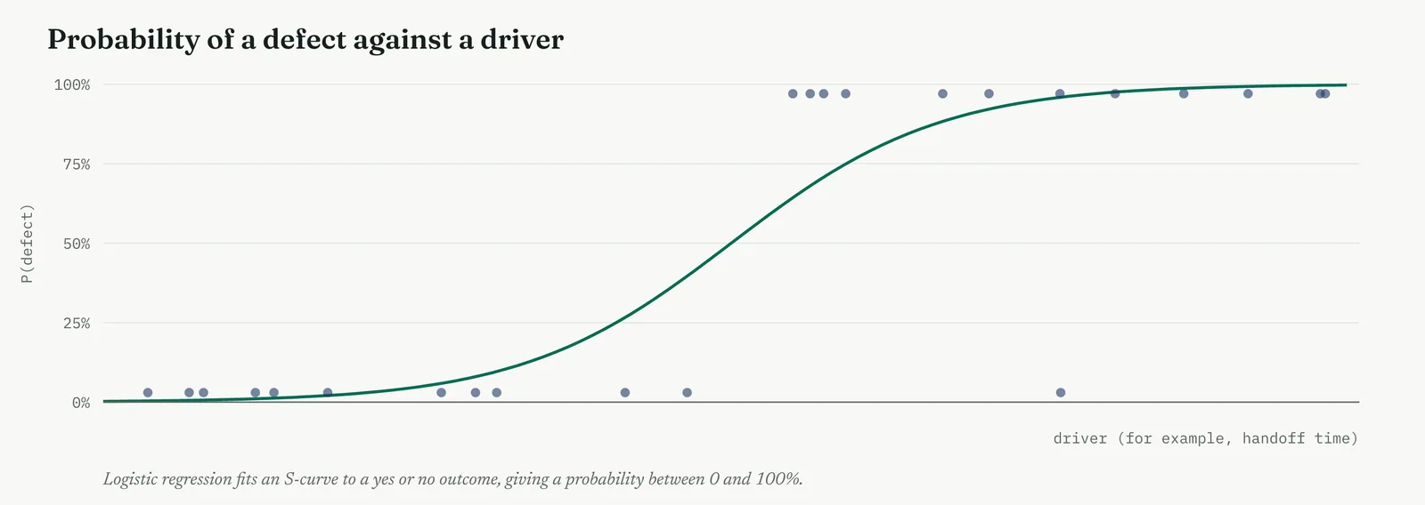
Template 13.21. the numbers behind it.
| DRIVER OF A DEFECT | EFFECT ON THE ODDS |
|---|---|
| Handoff exposure | raises the odds sharply |
| Handler trained | lowers the odds |
| Model fit, pseudo R-squared | 0.38 |
Result. The chance of a defect is not fixed, it moves with drivers the team controls. Cut handoff exposure and train the handler, and the odds of a defect fall.
Across the four firms
The blank page. Probably beyond a firm new to models, but the S-curve itself is intuitive, the chance of a fault climbing as exposure grows. Show the picture even if the fitting stays with a specialist.
The firefight. Reach for it when the outcome that hurts is a yes or no, a defect or a lost case, and the firm needs to know which lever moves the odds most, fast.
The false start. State the outcome and the drivers before fitting, and report the direction of each honestly. A model that names a driver the firm can change is a model it can act on and trust.
The quiet achiever. The trap is over-reading a coefficient on the odds scale, which is easy to misquote. Report the direction and the size in plain terms, and check the fit before leaning on the probabilities.
METHOD 7
Prediction with the model, and its limit
What it is
Once a model fits, it predicts, giving the likely outcome for a driver value you feed it. But a prediction is only as trustworthy as the data behind it. Inside the range of the data the model was built on, the prediction carries a known band of uncertainty, wider at the edges, tighter in the middle. Outside that range, in extrapolation, the model is a guess dressed as an answer, because nothing in the data says the line keeps its shape out there.
When to use it
Use the model to predict when you want to estimate the gain a fix will buy, or the outcome under a changed driver. Report the prediction with its uncertainty band, never as a bare point, and hold the hard rule, predict only within the range of the data you fitted. The moment you predict beyond it, say so plainly, because extrapolation is where models mislead with the most confidence and the least warning.
The Crestline run
The team used the handoff model to estimate the gain from cutting handoff time. Inside the data, from around one to six days of handoff, the model predicted delay reliably, with the band in Figure 13.73. Predicting the effect of removing the handoff entirely, at zero, sat right at the edge of the data and was flagged as such. Pushing further, to handoff times the process had never produced, fell in the amber zone, where the team refused to trust the number and said so to the sponsor rather than quoting a figure it could not stand behind.
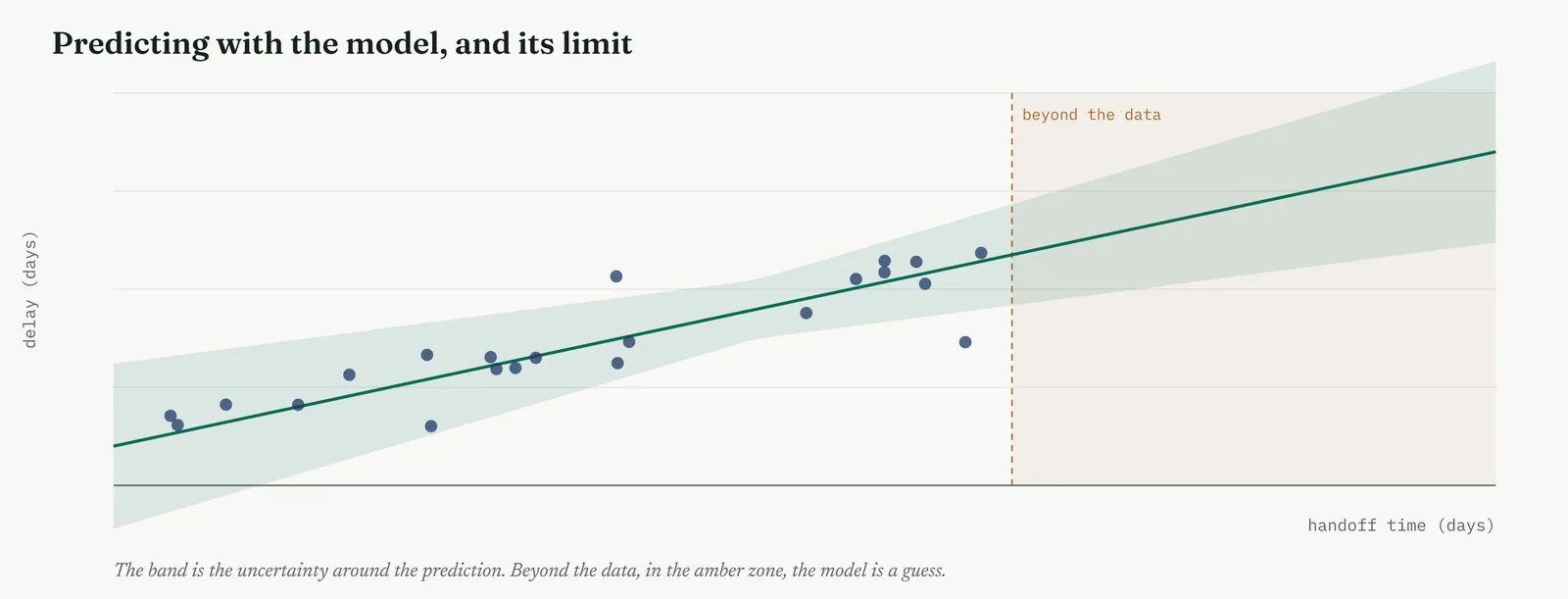
Template 13.22. the numbers behind it.
| PREDICTION | STANDING |
|---|---|
| Delay at 3 days handoff | reliable, inside the data |
| Delay at removing the handoff | edge of the data, flagged |
| Delay far beyond any seen | refused, extrapolation |
Result. A model predicts safely only across the range it was built on. Inside the data it is a tool, beyond it a guess, and the honest report says which is which.
Across the four firms
The blank page. Teach the one rule that matters, predict inside the data, not beyond it, and show the amber zone as the place the model stops knowing. That single caution prevents most misuse.
The firefight. A quick prediction of the gain a fix will buy helps a busy room decide whether to act, as long as the estimate stays inside the data and carries its band.
The false start. Report the uncertainty band, not a lone point, and refuse to quote an extrapolated figure. A firm burned once trusts a range it can see far more than a single confident number.
The quiet achiever. The trap is a capable team predicting confidently beyond the data because the model runs. Hold the range discipline, and flag every prediction that steps outside it.
The correlation coefficient, worked by hand
The correlation is worth computing once, so the number is not a black box. For each case you take how far its handoff time sits from the average handoff time, and how far its delay sits from the average delay. Multiply those two gaps together for each case, and add the products across all the cases. When long-handoff cases also tend to be long-delay cases, the products are mostly positive and the total is large and positive. You then scale that total by the spread in each measure, which pins the result between minus one and plus one, and out comes r. For the handoff and delay, the products were overwhelmingly positive and the scaled total landed at 0.85.
The scaling is what makes r comparable across different measures, because it strips out the units. A correlation of 0.85 between handoff days and delay days means the same thing as a correlation of 0.85 between two measures in entirely different units, both are a tight, positive, straight-line link. That is the value of the coefficient, one number, always on the same scale, that you can read the same way every time, and set beside the correlations of the other drivers to rank them.
The regression line, worked by hand
The slope of the line comes from the same pieces as the correlation. It is the correlation between the two measures, scaled up by how much the outcome varies relative to the driver. Where the correlation is a pure number, the slope carries the units, days of delay for each day of handoff, which is why the slope, not the correlation, is what you quote to a sponsor. For the handoff, the arithmetic gave a slope of 0.9, nine-tenths of a day of delay for every day of handoff.
The intercept then falls out by forcing the line through the point of the two averages. Once you have the slope, the intercept is the average delay minus the slope times the average handoff, which for Crestline gave 1.2 days, the delay the model expects for a case with no handoff time at all. Together the slope and intercept are the whole equation, delay equals 1.2 plus 0.9 times handoff, and every prediction the model makes is just that line read at a chosen handoff value.
R-squared, worked, and what it does not tell you
R-squared has a clean meaning worth seeing plainly. Take the spread of the delays around their average, the total variation you are trying to explain. Now take the spread of the residuals, the variation the line failed to explain. R-squared is one minus the second divided by the first, the fraction of the original spread the line accounts for. For the handoff model, the residual spread was about 28% of the original, so the line explained the other 72%, and R-squared was 0.72.
What R-squared does not tell you is whether the model is the right shape, whether a driver is missing, or whether a prediction beyond the data can be trusted. A curved relationship can post a high R-squared while the residuals betray the curve the line ignored. And R-squared always rises when you add a variable, useful or not, which is why the adjusted figure, which penalises extra variables, is the honest one to watch in a multiple model. R-squared is a measure of explained spread, no more, and it is never on its own a certificate of a good model.
Reading a coefficient table, line by line
A regression output is a table, and a belt should read every column of it. The first column names the driver. The second gives its coefficient, the effect on the outcome for each unit of that driver, with the others held constant. The third gives the standard error, the noise around that estimate, and a coefficient much larger than its standard error is one you can trust. The fourth gives the p-value, whether the driver differs from zero by more than chance, and often a confidence interval for the coefficient beside it.
The disciplined read runs across the row, not down to the p-value alone. A driver with a large coefficient, a small standard error, a p below the line, and an interval clear of zero is a real, sized effect. A driver with a coefficient near zero and a p well above the line, as staffing was, is one the model has cleared. Reading the whole row is what stops a large but uncertain coefficient being quoted as fact, and a small but precise one being dismissed as nothing.
Checking the assumptions of a regression
Four assumptions carry a regression, and each has a check. The link should be roughly straight, which the scatter and the residual plot show, a curve in either means the straight line is wrong. The residuals should have even spread across the range, not fan out as the driver grows, which a residual plot reveals at a glance. The observations should be independent, which is a question about how the data was gathered, not a plot. And the residuals should be roughly bell-shaped, which a simple plot of their distribution confirms.
When an assumption breaks, the fix is usually to change the model rather than force the data. A curve calls for a transformed driver or a rank method. A fanning spread calls for a model that allows the noise to grow. Dependence between observations, the same case counted twice, calls for a method built for it. The habit is the same as it was for the tests, look at the shape before you trust the number, because a regression on data that breaks its assumptions returns an equation as confident as any, and as wrong.
Correlation, causation and the third variable
The deepest trap in this whole tool is reading a fitted line as proof of cause. A strong correlation and a clean regression are consistent with the driver causing the outcome, but they are equally consistent with the outcome causing the driver, or with a third variable driving both. Figure 13.64 showed the shape of it, two measures rising together only because case volume drove them both. A regression cannot tell these apart, because the arithmetic is identical in every case.
What lifts a correlation towards cause is everything the arithmetic cannot supply. A mechanism you can explain, why the handoff would lengthen delay, is the first. A test that rules out the obvious alternatives is the second, which is why the multiple regression, holding volume and complexity constant, mattered so much, it closed off the third-variable escape for staffing and for the handoff alike. And the strongest evidence of all is a change, moving the driver and watching the outcome move, which is what the Improve phase will do. Regression sizes a suspected cause. It does not, on its own, convict one.
Beyond these, the models you will meet next
These methods cover most of what a service improvement needs, but the family runs wider, and it helps to know what sits just beyond them. When you want to test a driver by deliberately changing it rather than watching it vary, the tool is design of experiments, the next movement of this chapter, which turns regression from an observer into an experiment. When the data is a sequence over time, time-series methods handle the way one period leans on the last. When the outcome has more than two categories, extensions of logistic regression handle the several outcomes at once.
You do not need them all at your fingertips. You need to know they exist, so that when a question arrives that correlation and regression do not fit, a designed change, a trend over time, a many-way outcome, you reach for the right specialist rather than forcing the question into a straight line. Choosing the right model is the skill. The fitting, as ever, is what the software is for.
Reporting a model, a worked write-up
The last skill is turning the model into something a sponsor reads in one breath, with no arithmetic in it. A good write-up has four parts. The finding, in plain words. The size, the slope as a sentence. The confidence, how well the model fits and how sure the effect is. And the limit, where the model can and cannot be trusted. For the handoff it read like this. The time a case spends in the unowned handoff drives its total delay. Each extra day in the handoff adds about nine-tenths of a day to resolution. The relationship is strong, explaining nearly three-quarters of the spread, and it holds across the range we see day to day. We can trust it to size the fix, but not to predict handoff times the process has never produced.
Notice what the write-up leaves out. No least-squares, no standard errors, no talk of residuals. Those belong in an appendix a doubter can check, not in the sentence the sponsor acts on. The write-up carries the finding, the size, the confidence and the limit, in the order a decision-maker needs them. A belt who can fit the model but cannot write this paragraph has done half the job, because a model the sponsor cannot repeat back is a model that will not survive the first hard question in a room the belt is not in.
Table 13.7. A quick reference for the terms, so the language of regression stays straight.
| TERM | WHAT IT MEANS |
|---|---|
| Correlation (r) | How tightly two numbers move together, from minus one to plus one |
| Regression | The line or model that predicts an outcome from one or more drivers |
| Slope | How much the outcome moves for each unit of the driver |
| Intercept | The outcome the model expects when the driver is zero |
| R-squared | The share of the spread in the outcome the model explains |
| Residual | The gap between an observed point and the line |
| Coefficient | The effect of a driver in a model, others held constant |
| Extrapolation | Predicting beyond the range of the data, where the model is a guess |
| Confounder | A third variable driving both others, faking a link between them |
| Logistic regression | A regression for a yes or no outcome, giving a probability |
The same driver, two ways
It is worth seeing what a multiple regression actually does to a coefficient, because the shift from a simple model to a multiple one is the whole point of the method. Fitted on its own, case volume carried a healthy slope, and busy days looked slower. But volume and handoff time rose together, because busy days also produced longer handoffs. When both went into one model, volume kept only the part of its effect that handoff did not already explain, and its coefficient shrank. The handoff, by contrast, barely moved, because its effect was real and not borrowed from anything else.
That shrinkage is confounding made visible. A driver that looks strong alone can fade once a correlated cause is held constant, and a driver that holds its coefficient across both models has earned its place. Reading the two side by side, the simple slope and the multiple coefficient, is how you tell a real driver from one that was only keeping company with the real one. It is also why quoting a simple slope as the effect, when other drivers are in play, overstates it, and why the headcount theory could only be settled by the multiple model, not the simple one.
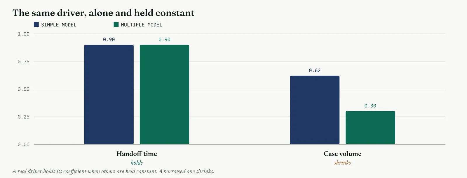
Does the model as a whole matter
Beside the p-value on each driver sits a p-value for the whole model, from an F-test that asks whether the drivers together explain more of the outcome than nothing at all would. A model can have no single standout driver yet still matter overall, or, more often, a strong overall fit rests on one or two drivers doing the real work. For the handoff model the overall F-test was decisive, the drivers together explained far more than chance, which is the first box to tick before reading any single coefficient.
The order of reading is overall first, then each driver. If the whole model fails its F-test, the individual coefficients are not worth interpreting, because the model has not shown it explains anything at all. If it passes, you read the drivers one by one, knowing the model as a whole has earned the reading. Skipping the overall test and diving straight to the coefficient you hoped for is how a model that explains nothing still produces a number that someone, somewhere, goes on to quote.
When the model surprises you
Now and then the regression contradicts what the room expected, and how you handle it separates a careful belt from a careless one. A driver everyone was sure mattered comes back near zero. A driver no one suspected carries a real coefficient. Neither is a reason to refit until the model agrees with the room, and neither is proof that the model is right and the room wrong. The result is a finding to interrogate, not a verdict to accept or delete on how well it flatters the theory people walked in with.
A strong prior belief that fails in the model usually means one of two things, the belief was wrong, or a confounder is masking a real effect, and the honest next step is to look for the confounder, not to delete the inconvenient result. A surprise driver that appears means either a real effect worth chasing or a confounder faking one, and again the move is to investigate, not to celebrate. A belt who refits the model until its numbers agree with the meeting has stopped doing analysis and started doing decoration, and the staffing result, unwelcome to the headcount camp but solid under every check, is exactly the kind of surprise you keep rather than smooth away.
Predicting the gain, worked
The point of sizing a driver is to price a fix, so it is worth walking the prediction through in numbers. The model was delay equals 1.2 plus 0.9 times handoff time. A typical case sat with about five days of handoff, giving a predicted delay of 1.2 plus 0.9 times five, about 5.7 days, which matched what the process actually delivered. Remove the unowned handoff so that a case carries only a day of necessary handover, and the model predicts 1.2 plus 0.9 times one, about 2.1 days. The difference, some 3.6 days a case, is the gain the fix would buy, and it came straight from the slope.
Two cautions travel with that number. The first is the range, the prediction at one day of handoff sits inside the data and can be trusted, while a prediction at zero sits at its edge and was flagged as such. The second is that the model sizes the gain but does not guarantee it, because the prediction assumes removing the handoff changes nothing else, which the Improve phase must confirm rather than assume. Still, a predicted saving of three and a half days a case, built from a slope the data supports, is exactly the kind of number that moves a sponsor from interested to committed, and it is a far stronger case than a promise that the fix will help.
Stage 4. Reading the result
Reading the result
Three readings settle what a regression is telling you.
| STRONG | A strong correlation confirmed by a well-fitting regression, drivers separated by a multiple model, residuals checked, and predictions kept inside the range of the data. |
| WEAK | A correlation read as cause, an R-squared trusted without a residual check, a coefficient quoted from a model with entangled drivers, or a prediction pushed beyond the data. |
| THE TELL | The model kills a loud driver or puts a number on a real one. When the equation prices a cause the room argued about, it has earned its place. |
Four cautions sit under those readings. The first, and the largest, is that correlation is not cause, so a strong fit sizes a suspect but never convicts one, and the language of a report should say drives or is associated with, not proves. The second is that R-squared alone is not a verdict on the model, because a high figure can sit on top of patterned residuals that betray a missing shape, so the residual plot is read every time. The third is that a coefficient means little without its context, its standard error, its p-value, and the other drivers it was weighed against, a large coefficient from a lone simple regression can vanish once the real drivers are held constant. The fourth is the range, that a model is a tool inside the data it was built on and a guess beyond it, and the honest report draws that line for the reader rather than letting a confident extrapolation stand.
Stage 5. Four firms, four moves
Four firms, four moves
The four grounds from Chapter 1 change how far you take a regression, which model you can defend, and how you carry the equation back to the room. This is a tool where a little capability is dangerous, because a fitted line looks authoritative whether or not it means anything, so the ground decides how much of the machinery you should trust the firm to read.
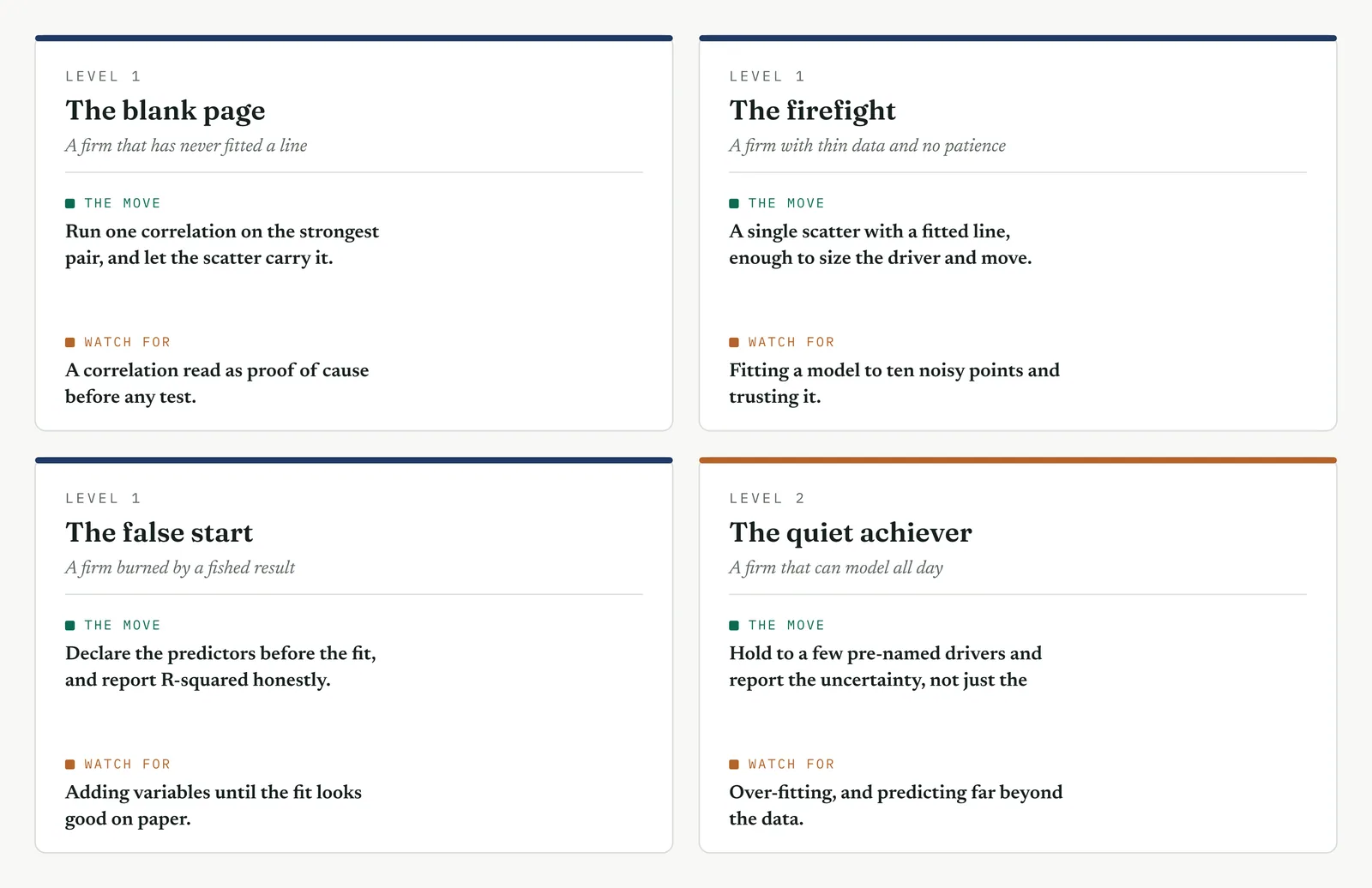
The blank page LEVEL 1
This firm has never fitted a line, and an equation carries no weight with it yet. Run one correlation on the strongest pair, show the scatter, and let the picture do the persuading before any number appears. If a regression follows, keep it to one driver and read the slope out loud as a plain sentence, each day here costs that much there. The value on a blank page is not the model, it is the firm learning, once, that a relationship it argued about can be measured and priced. Reach for a multiple model or a logistic curve here and you lose the room before the coefficient lands.
The firefight LEVEL 1
This firm has thin, messy data and no patience, and it will act on a single chart if you let it. Run a fast correlation and, if it holds, one simple regression to price the loudest cause, enough to justify the fix and no more. Do not build a four-driver model the firefight will never sit still to read, and do not wait for clean data while the queue grows. A slope that puts a number on the handoff this week is worth more than a perfect model next quarter, because in a firefight the currency is a decision made now, and a priced cause buys one where a scatter alone will not.
The false start LEVEL 1
This firm watched a past effort produce a model that looked fished, variables added until the fit flattered the story, and it trusts none of them now. The whole game here is pre-commitment and full disclosure. Name the drivers before you fit, report every one whether it mattered or not, and show the R-squared honestly including the part left unexplained. When a model clears the very suspect the firm was accused of protecting, as the multiple regression cleared staffing, that is the most persuasive result you can produce, because it cannot be read as the answer you wanted. Resist adding one more variable to lift the fit, because the sceptics are watching for exactly that.
The quiet achiever LEVEL 2
This firm can fit models all day and has the data to over-fit, which is its particular danger. Its failures are sophisticated, chasing R-squared upward by piling in variables, entering drivers that are near-copies of one another, reading a correlation as cause because the line is clean, and predicting confidently beyond the data because the model runs. Hold it to a small set of pre-named, distinct drivers, watch the adjusted R-squared and the residuals rather than the raw fit, and enforce the range discipline on every prediction. Here the discipline you add is not method, which the firm has in abundance, but restraint, the refusal to let a capable model say more than the data supports.
Stage 6. Where it breaks
Where it breaks
1. Reading correlation as cause. A fit sizes a suspect, it does not convict one. Say drives or is associated with, never proves, until a mechanism and a test back it.
2. Trusting R-squared without the residual plot. A high figure can sit on a curve the line ignored. Read the residuals every time, a shapeless cloud or nothing.
3. Fitting a straight line to a curve. The scatter shows the bend before you fit. A curved link needs a transform or a rank method, not a forced line.
4. Extrapolating beyond the data. A model is a guess outside its range. Predict inside the data, and flag anything past its edge.
5. Over-fitting, too many drivers for the data. Enough variables will fit noise perfectly and predict nothing. Keep the drivers few, named and distinct.
6. Omitting a confounder. A third variable driving both fakes a link. Ask what else moves both before you believe the coefficient.
7. Quoting a coefficient without its significance. A large but uncertain coefficient is not a finding. Read the standard error and the p-value across the row.
8. Ignoring skew and outliers. A single extreme point can swing a slope. Look at the scatter, and switch to a rank method when the tail demands it.
9. Predicting a yes or no with ordinary regression. A straight line runs past zero and one. A binary outcome needs logistic regression, which stays a probability.
10. Reading a big coefficient as a big effect. Coefficients on different scales are not comparable. Standardise them before you rank the drivers by size.
Stage 7. At the gate
At the gate
What it lets you defend. The sponsor asks how much the handoff is really costing, and whether staffing might still be part of it. The regression answers both with numbers. The handoff carries a slope of about nine-tenths of a day of delay for each day in the unowned middle, and a model that explains nearly three-quarters of the spread. Staffing, weighed in the same model beside the real drivers, carries a coefficient near zero and a p of 0.71, cleared not by assertion but by being held constant against the causes that mattered. It is the strongest close the phase can give the headcount argument, because the theory does not merely fail a test, it fails to move the outcome even when the model gives it every chance to.
What it feeds. The slopes become the sizing the Improve phase works from, how much delay each day of handoff buys, and therefore how much a fix that removes the handoff is worth. The coefficients rank the drivers, so the phase fixes the largest first. The prediction, kept inside the data, estimates the gain before the change is made, which lets the sponsor weigh the fix against its cost. And the cleared drivers, staffing among them, are struck from the list with a model behind the striking, so they do not return under a new name once the project is under way.
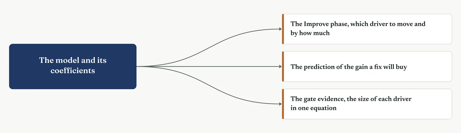
13 · ANALYSE MOVEMENT THREE · TEST THE CAUSES AGAINST THE DATA
13.3.12 Analysis of variance
Recommended ISO 13053 Factsheet 16
Purpose. Analysis of variance lets you compare the averages of three or more groups in a single test, so you can tell whether they truly differ or only appear to, and it lets you weigh two factors at the same time to see whether they combine. Where a t-test can hold up only two groups against each other, this test holds up as many as you have without inflating the risk of a false alarm, and where regression weighs drivers that are numbers, this weighs drivers that are groups. It is the tool that settles which desk, which category, or which factor carries the difference, and it is the one that closes Movement Three.
Stage 1. The trigger
The trigger
The hypothesis test compared two groups. Real problems rarely have only two. Crestline had three desks, and the question was not whether one pair differed but whether the desks differed at all, and if so, which. Analysis of variance, ANOVA, answers that in one test. You reach for it when you compare the average of a measure across three or more groups, when you want to know whether a grouping factor explains any of the spread in an outcome, or when two factors are in play at once and you suspect they combine. It is the natural next tool after the t-test, built for the many-group world the t-test cannot handle.
The obvious alternative, running a separate t-test on every pair, is exactly the trap ANOVA exists to avoid. Each t-test carries a one-in-twenty risk of a false alarm at the usual line. Run one test and that risk is 5%. Run three, and the chance that at least one raises a false alarm climbs above 14%. Run ten, and it passes 40%. The more pairs you test, the more likely you are to find a difference that is not there, and to act on noise. Figure 13.77 shows the climb. ANOVA asks the whole question once, at the risk you chose, and only then, if it finds something, do you look at the pairs.
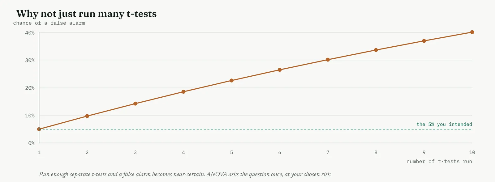
The engine of ANOVA is a comparison of two kinds of spread, and the name says it plainly, it analyses variance. The spread between the group means, how far the desks sit from one another, is the signal. The spread within each group, how much the cases scatter around their own desk average, is the noise. If the between-group spread is large against the within-group spread, the groups really differ. If the within-group spread swamps it, the differences are just noise dressed as a pattern. Figure 13.78 shows this on the Crestline desks as an individual value plot, the graph the test opens with, every case a dot, every desk mean a bar, and the two spreads marked so you can see which one wins.
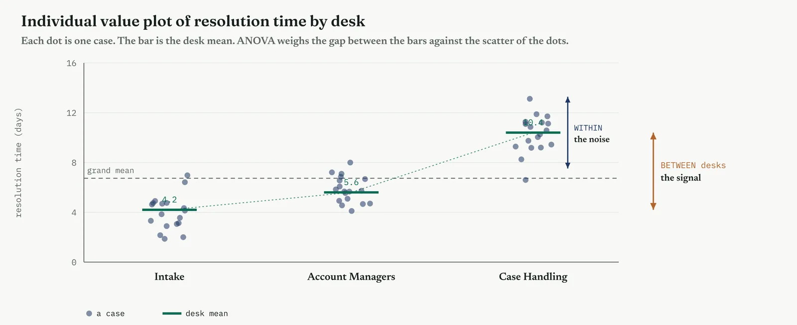
That comparison becomes a single number, the F-ratio. F is the between-group variation divided by the within-group variation, each adjusted for how many groups and how much data feed it. An F near one says the between-group spread is no bigger than the noise, so no real difference. An F well above one says the groups differ by more than noise can explain. The F is then read against its reference distribution to give a p-value, the same way a t-statistic was, and the same 5% line decides. Large F, small p, real difference.
Underneath the F sits a tidy piece of bookkeeping, the partition of the total variation. Take all the spread in the outcome, every case against the grand average, and ANOVA splits it cleanly into two parts, the part explained by which group a case belongs to, and the part left unexplained within the groups. Figure 13.79 shows the split. This is the same idea as R-squared in regression, the share of the spread a factor accounts for, and it is why ANOVA and regression are, underneath, the same machine wearing different clothes.
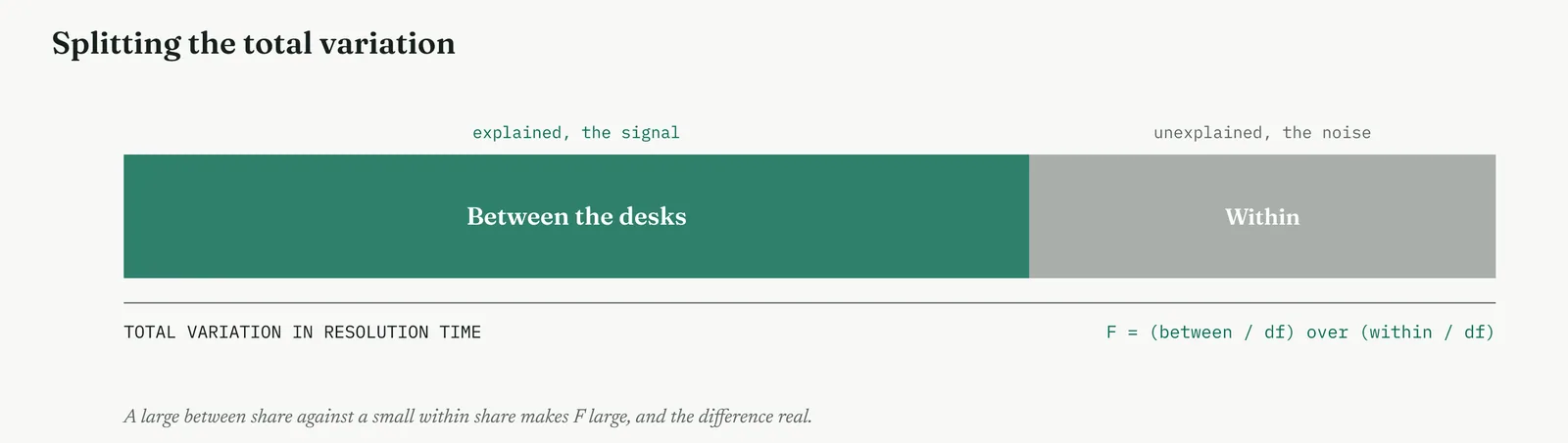
ANOVA comes in more than one shape. One-way ANOVA has a single grouping factor, the three desks. Two-way ANOVA has two factors at once, say the desk and the case complexity, and it does something a one-way cannot. It asks not only whether each factor matters on its own, its main effect, but whether the two combine, an interaction. An interaction means the effect of one factor depends on the level of the other, complexity hurting one desk far more than another. Interactions are where the real insight often hides, and they are invisible to any test that looks at one factor at a time.
Like every test, ANOVA rests on assumptions, and a run that breaks them can mislead. The groups should have roughly equal spread, the assumption of equal variance, which a Levene test checks. The residuals should be roughly bell-shaped. The observations should be independent. When the spreads are badly unequal, a Welch ANOVA handles it. When the data is skewed rather than bell-shaped, the rank-based Kruskal-Wallis test takes over, the ANOVA counterpart of the Mann-Whitney. As always, the shape of the data is checked before the test is trusted, not after.
Significance is not the whole story here either. A significant F says the groups differ, but the effect size says how much of the spread the grouping actually explains. The common measure, eta-squared, is the between-group share of the total variation, the same number the partition produced, read as a fraction. A factor can be significant yet explain almost nothing, which is common with large samples. Report the F, its p, and the eta-squared together, because only the last tells you whether the factor is worth a project. So an ANOVA needs the groups named, the assumptions checked, and the effect size read, all decided before the result is used to argue anything.
Stage 2. The build
The build
Name the groups and the single outcome you will compare. You need three or more groups and one continuous measure to compare across them, and you should write those groups down before you look at the data, so that the question you ask is never quietly shaped by the answer you were hoping to find.
Check that the groups share a similar spread. Analysis of variance assumes that every group varies by roughly the same amount, so take a moment to look, or run a Levene test, and confirm that they do. When one group is far more scattered than the rest, move to a Welch ANOVA or a rank test rather than press on regardless.
Run the test, and read F against its p-value. You are asking a single question at the significance line you fixed in advance. When F sits well above one and the p-value is small, at least one group genuinely differs from the others, although the test cannot yet tell you which one it is.
If F is significant, run a post-hoc test to find the pair. The ANOVA has told you only that a difference exists somewhere among the groups. A post-hoc test, such as Tukey, now tells you which groups actually differ, and it does so while holding the false-alarm risk in check across every comparison you make.
Add a second factor whenever one is genuinely in play. A two-way ANOVA lets you read two factors at the same time, along with the interaction between them, and you should never interpret a main effect on its own until you have checked whether an interaction is hiding beneath it.
Report the effect size, not the F-ratio alone. Eta-squared tells you how much of the variation the factor actually explains, and you need it because a result can be statistically significant while explaining almost nothing at all. Always report the two of them together.
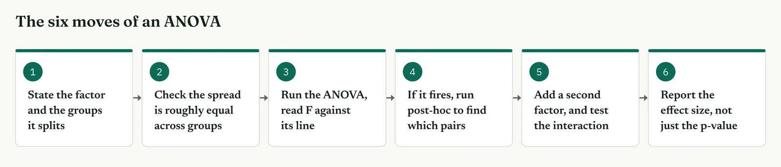
Choosing the right form of ANOVA follows the same logic as choosing any test, from the shape of the question and the shape of the data. One factor or two. Equal spreads or unequal. Bell-shaped or skewed. And, once a difference is found, which pair carries it. Table 13.8 pairs the common forms with the question each answers, and Figure 13.81 is the same at a glance. The rest of this section runs the family on Crestline, from the first one-way test through the two-way interaction that finally explains the bottleneck.
Table 13.8. The forms of analysis of variance and the question each one answers.
| THE FORM | USE IT WHEN | A CRESTLINE QUESTION |
|---|---|---|
| One-way ANOVA | You compare one measure across three or more groups | Do the three desks differ in resolution time |
| Post-hoc, Tukey | ANOVA found a difference and you need which pair | Is Case Handling slower than both the others, or just one |
| Two-way ANOVA | Two grouping factors act at once | Do desk and case complexity both drive time, and combine |
| Interaction test | You suspect one factor changes the effect of another | Does complexity cost Case Handling more than the other desks |
| Welch ANOVA | The groups have very unequal spread | Compare desks when one varies far more than the rest |
| Kruskal-Wallis | The data is skewed, not bell-shaped | Compare desks on a measure with a long tail |
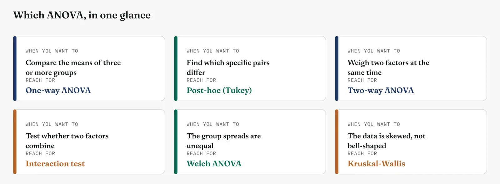
| TIP One test, then the pairs. The discipline that keeps ANOVA honest is running the single overall test first, and only looking at individual pairs through a post-hoc test that controls the risk. Diving straight into pairwise t-tests, or picking the pair that looks biggest and testing only that, reintroduces the very false-alarm problem ANOVA was built to remove. Overall first, pairs second, always in that order. |
Stage 3. Crestline on the floor
Crestline on the floor
The tests in the section before had shown the handoff mattered and staffing did not. ANOVA turned to the three desks, because the resolution times plainly differed between them and the project needed to know whether that difference was real, which desk carried it, and whether it was the desk itself or something acting through it. Crestline ran the family, from a first one-way test to a two-way model that read desk and complexity together, and each method below sets out what it is, when to reach for it, and how it ran.
METHOD 1
One-way ANOVA, comparing the groups
What it is
One-way ANOVA compares the average of one measure across three or more groups, and returns a single verdict on whether the groups differ at all. It weighs the spread between the group means against the spread within the groups, and turns that ratio into the F-statistic and a p-value. It is the direct extension of the two-sample t-test to many groups, asking the whole question in one test rather than pair by pair, and it is almost always the first ANOVA you run.
When to use it
Reach for one-way ANOVA when you have one grouping factor with three or more levels and one continuous outcome, and you want to know whether the groups differ. Three machines, four shifts, five branches, the three Crestline desks. It answers the existence question, is there a difference, cleanly and once. What it does not tell you is which groups differ, which is the job of the post-hoc test that follows, so treat the one-way result as the gate you must pass before looking at any pair.
The Crestline run
The team compared resolution time across the three desks, the box plots in Figure 13.82. Intake and Account Managers sat low and close. Case Handling sat far above both, its whole box lifted clear of the others. The one-way ANOVA returned an F of about 30 against a p below one in a hundred, so the desks differed by far more than noise could explain. The difference the box plots suggested was real. What the test could not yet say was whether Case Handling differed from both the others or only appeared to, which sent the team to the post-hoc.
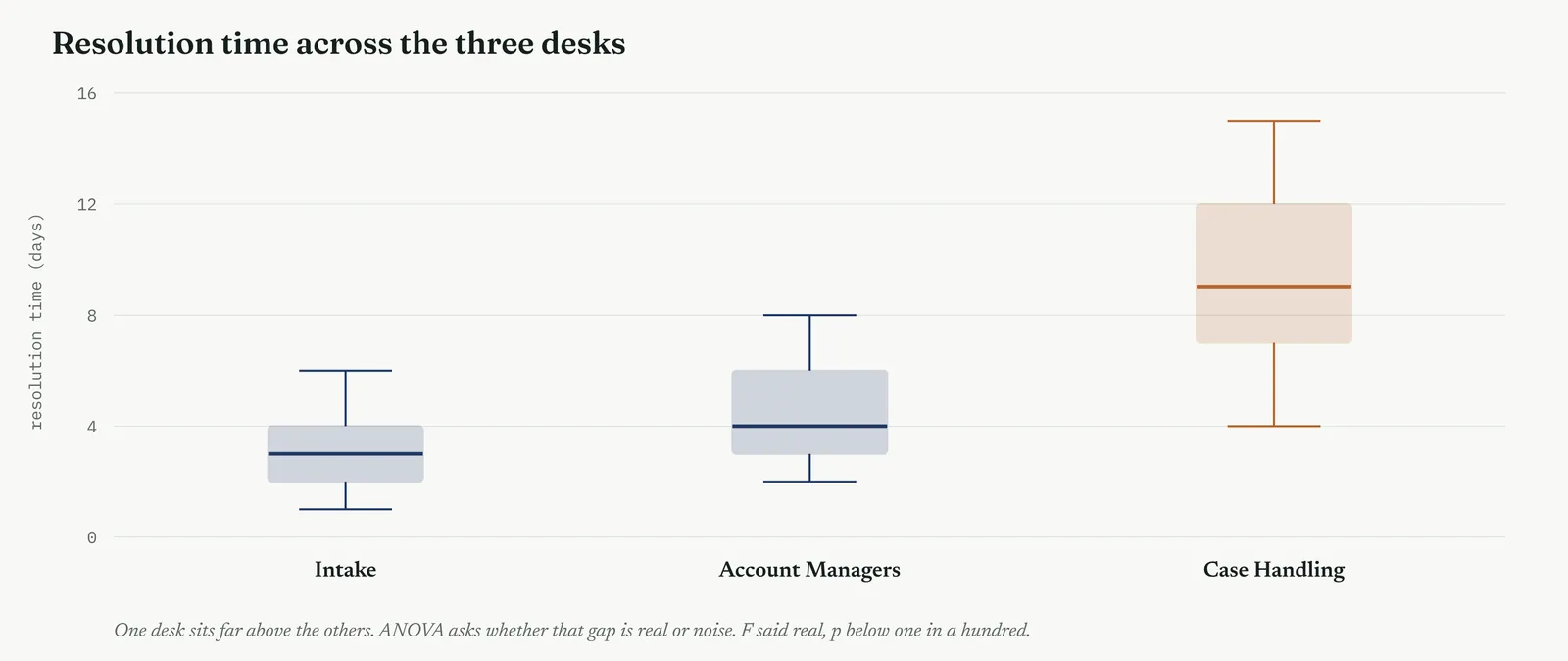
Read the column heads before the numbers, because every ANOVA table carries the same six and this is the first you meet. SOURCE names where the variation comes from, between the desks, within them, and the total of the two. SS is the sum of squares, the raw variation each source accounts for. df is the degrees of freedom, the count of independent pieces of information behind that source, the number of groups less one for the between row, the cases less the number of groups for the within. MS is the mean square, the sum of squares divided by its degrees of freedom, a variation per piece of information. F is the F-ratio, the between mean square divided by the within, the signal set against the noise. And p is the p-value, the chance of an F this large if the desks were truly the same. Read the row across, not the p alone.
Template 13.23. the numbers behind it.
| SOURCE | SS | df | MS | F | p |
|---|---|---|---|---|---|
| Between desks | 675 | 2 | 337 | 30.1 | < 0.01 |
| Within desks | 623 | 55 | 11.3 | ||
| Total | 1298 | 57 |
Result. The between-desk variation is far larger, case for case, than the variation within the desks. F of 30, p below one in a hundred. At least one desk truly differs.
Across the four firms
The blank page. One ANOVA on three groups, shown as box plots first, teaches the firm that a visible gap can be tested rather than argued. Keep it to the single overall verdict, real or not.
The firefight. A fast one-way test confirms in minutes whether the desk that looks slowest really is, which stops a busy room acting on a gap that noise alone produced.
The false start. Name the groups and the outcome before the test, and report the single F honestly. One clean overall test rebuilds trust that a pile of cherry-picked comparisons destroyed.
The quiet achiever. The trap here is treating the overall F as the finish. It is only the gate. A capable firm reads it, then moves straight to the post-hoc and the effect size rather than declaring victory on F alone.
METHOD 2
The F-ratio, the engine underneath
What it is
The F-ratio is the number the whole test turns on, and it repays understanding rather than trusting. It is the mean square between the groups divided by the mean square within them, where a mean square is a sum of squared deviations divided by its degrees of freedom. The between mean square measures how far the group means sit from the grand mean. The within mean square measures how far the cases sit from their own group mean, the noise. Their ratio is F, and F near one means the signal is no bigger than the noise.
When to use it
You compute F every time you run an ANOVA, so this is less a method to choose than a number to read with your eyes open. Knowing what F is made of stops two mistakes. It stops you trusting a large F built on tiny samples, where the degrees of freedom are too few to mean much, and it stops you dismissing a modest F that sits on a mountain of data. Read F alongside its degrees of freedom and its p, never as a bare figure, and the test stops being a black box.
The Crestline run
For the desks, the between-desk sum of squares was 675 across two degrees of freedom, giving a between mean square of 337. The within-desk sum of squares was 623 across fifty-five degrees of freedom, giving a within mean square of 11.3. F was 337 divided by 11.3, about 30. In plain words, the average case sat about thirty times further from the grand mean because of which desk it was on than it did from the ordinary scatter within a desk. That is not a gap noise produces, and the partition in Figure 13.79 showed the same thing as a picture.
Template 13.24. the numbers behind it.
| PIECE OF THE F-RATIO | VALUE | MEANING |
|---|---|---|
| Mean square between | 337 | the signal, desk to desk |
| Mean square within | 11.3 | the noise, case to case |
| F, their ratio | 30.1 | signal thirty times the noise |
Result. F is a signal-to-noise ratio. At thirty to one, the desk a case lands on matters far more than the ordinary scatter between cases. The difference is structural, not random.
Across the four firms
The blank page. Skip the arithmetic and teach the idea, F is signal over noise, a big F means the groups differ by more than the ordinary scatter. The picture in the concept figure carries it.
The firefight. Rarely worth unpacking by hand in a firefight. Read the F and the p the software gives, and move, as long as the samples behind them are not tiny.
The false start. Showing the partition, how the total spread splits into explained and unexplained, is a powerful way to prove to a doubtful room that the result is not a trick of arithmetic.
The quiet achiever. The discipline is watching the degrees of freedom behind the F, so a large ratio built on a handful of points is not mistaken for a strong result. A capable firm reads the whole line.
METHOD 3
Post-hoc comparisons, finding the pair
What it is
A significant ANOVA says at least one group differs, but not which. A post-hoc test finds the pairs that actually differ, and does it while controlling the false-alarm risk that running many separate comparisons would inflate. The common choice, Tukey, tests every pair and adjusts the threshold so that the overall risk across all the comparisons stays at your chosen line. It gives, for each pair, a difference and a confidence interval, and a pair whose interval clears zero is a real difference.
When to use it
Reach for a post-hoc test only after a one-way ANOVA has found a significant difference, and always in that order. Running post-hoc comparisons without a significant overall test, or reaching straight for the pair that looks biggest, throws away the very risk control that makes the exercise honest. Once the overall test has passed, the post-hoc tells you where the difference lives, which is what the Improve phase needs, the specific group to fix.
The Crestline run
With the overall test passed, Tukey compared the three pairs, shown in Figure 13.83. Case Handling against Intake, and Case Handling against Account Managers, both had intervals clear of zero, real differences of several days. Account Managers against Intake straddled zero, no reliable difference. The reading was sharp. The bottleneck was one desk, Case Handling, slower than both the others, while the two front desks did not differ from each other. The project had its target, and it was not a general staffing shortage across the floor but one desk that stood apart.
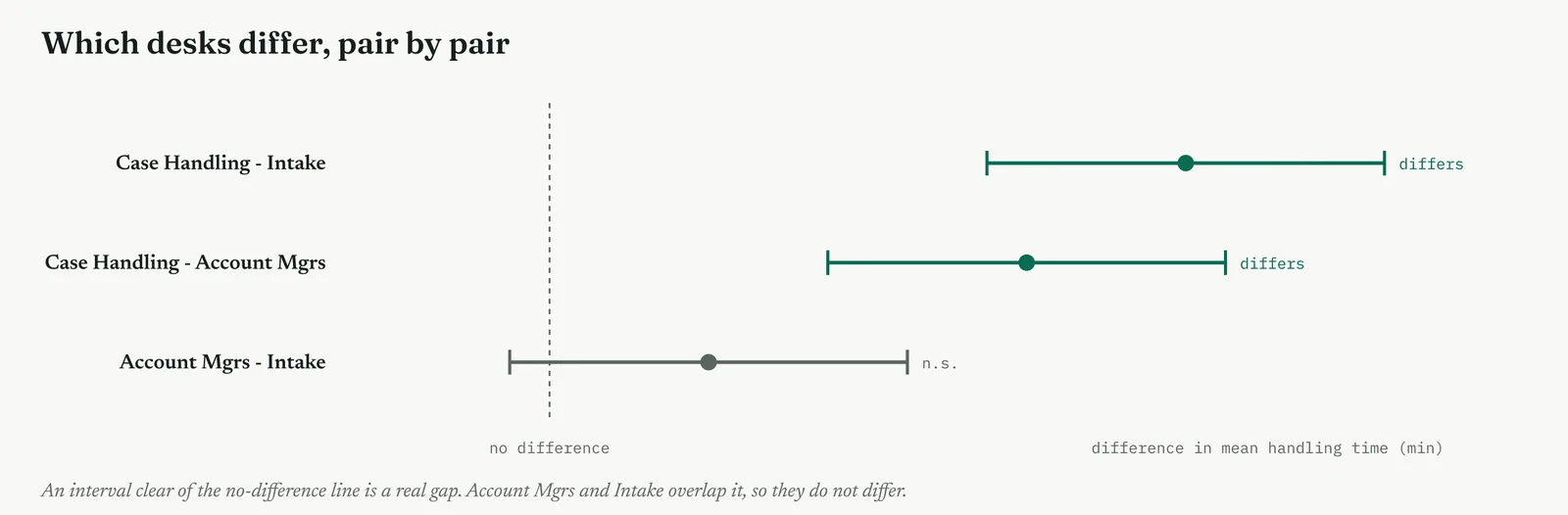
Template 13.25. the numbers behind it.
| PAIR | DIFFERENCE | 95% INTERVAL | VERDICT |
|---|---|---|---|
| Case Handling vs Intake | 4.6 days | 2.9 to 5.9 | differs |
| Case Handling vs Acct Mgrs | 3.1 days | 1.4 to 4.8 | differs |
| Acct Mgrs vs Intake | 0.9 days | -0.6 to 2.4 | n.s. |
Result. One desk carries the whole difference. Case Handling is slower than both the others, the front two are alike. The target is a single desk, not the floor.
Across the four firms
The blank page. Introduce post-hoc only once the firm has grasped the overall test, as the answer to the obvious next question, we know they differ, but which. Keep to one clear pairwise picture.
The firefight. Useful because it points straight at the group to fix, which a busy room can act on at once, rather than a vague finding that the desks differ somehow.
The false start. This is the guardrail a burned firm needs, the built-in risk control that stops the analyst testing every pair until one crosses the line. Show that the threshold was adjusted, in the open.
The quiet achiever. The trap for a capable firm is skipping the overall test and running post-hoc comparisons directly, or choosing a lenient adjustment. Hold the order, overall first, and a proper correction.
METHOD 4
Two-way ANOVA, two factors at once
What it is
Two-way ANOVA reads two grouping factors in a single model, and reports three things, the main effect of each factor on its own, and the interaction between them. The main effect of a factor is its influence averaged across the other. The interaction is whether the effect of one factor depends on the level of the other. It is the tool for a world where more than one grouping matters at once, and where the two may not act independently, which is most real processes.
When to use it
Reach for two-way ANOVA when two grouping factors are both plausibly in play, and especially when you suspect they combine. Desk and case complexity. Machine and shift. Branch and product line. Use it in place of two separate one-way tests, because two separate tests can never reveal an interaction, and an interaction is often the finding that matters most. If the two factors truly act alone, the two-way model will show that too, with a flat interaction.
The Crestline run
The team read desk and case complexity together. Both main effects were significant, so each mattered on its own, and the interaction was significant too. Figure 13.84 shows why it mattered. Moving from simple to complex cases lifted every desk, but it lifted Case Handling far more steeply than the others. The lines fan apart rather than running parallel, which is the signature of an interaction. Complexity did not cost every desk the same. It cost Case Handling most, because that desk was where complex cases stalled in the unowned handoff.
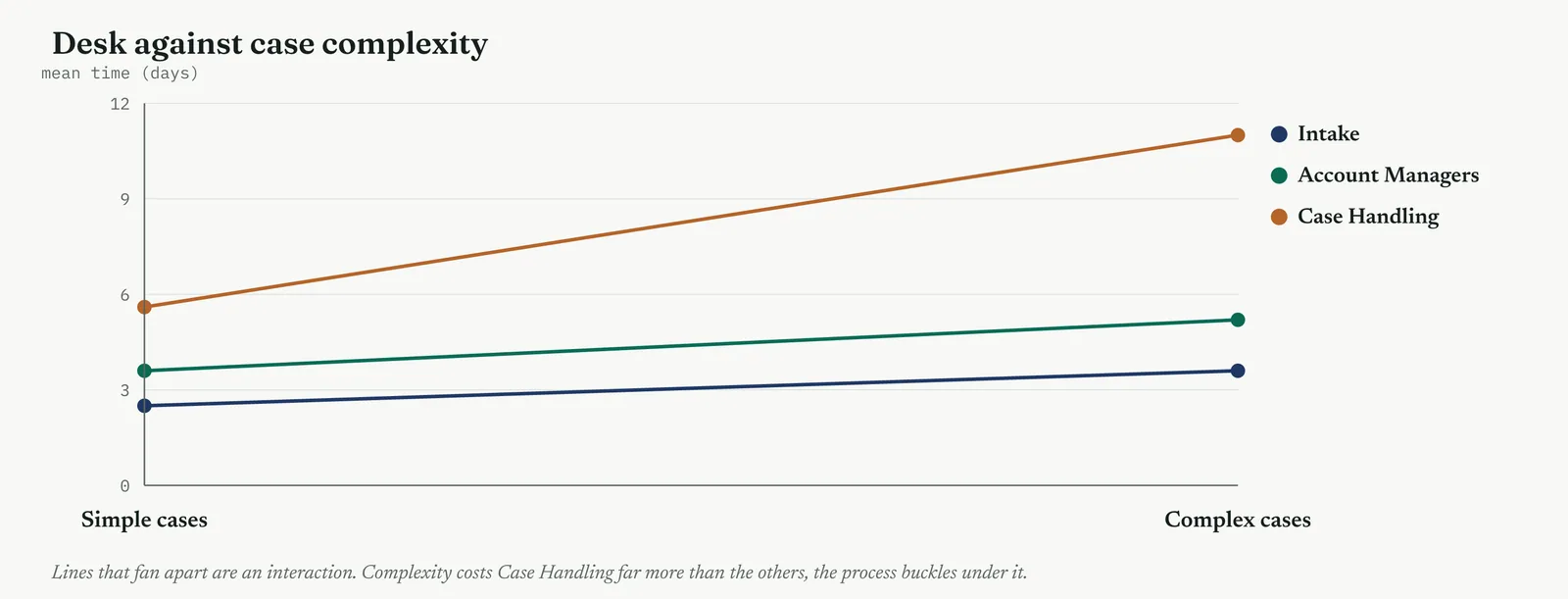
Template 13.26. the numbers behind it.
| SOURCE | F | p | VERDICT |
|---|---|---|---|
| Desk | 30.1 | < 0.01 | strong main effect |
| Case complexity | 12.4 | < 0.01 | real main effect |
| Desk x complexity | 6.8 | < 0.01 | interaction present |
| Staffing level | 0.4 | 0.67 | n.s., no effect |
Result. Desk and complexity both matter, and they combine. Staffing, entered as a fourth factor, moves nothing. The bottleneck is a desk whose process buckles under complex cases, not a shortage of people.
Across the four firms
The blank page. Almost always a step too far for a firm running its first comparisons. Settle the one-way questions first, and bring a second factor in only once a single factor is understood.
The firefight. Reach for it only when a one-factor answer plainly misses something the room can see, complex cases hurting one desk far more. One two-way model can explain what two one-way tests cannot.
The false start. Name both factors before the model, and report the interaction whether it appears or not. A model that reads two factors honestly is harder to accuse of finding only what suited the story.
The quiet achiever. The trap is reading the main effects and stopping, while an interaction hides beneath them. A capable firm always checks the interaction before interpreting either main effect on its own.
METHOD 5
Interaction, the effect that hides
What it is
An interaction means the effect of one factor depends on the level of another, and it is the single most valuable thing a two-way ANOVA reveals. Read as main effects alone, two factors look independent, each adding its own fixed amount. An interaction says they are not independent, that one factor amplifies or mutes the other. On an interaction plot, no interaction shows as parallel lines, and an interaction shows as lines that fan, cross, or diverge. The steeper the fan, the stronger the interaction.
When to use it
You read the interaction every time you run a two-way ANOVA, before you read either main effect, because an interaction changes what a main effect means. When complexity hurts one desk far more than another, saying complexity adds two days on average is misleading, because it adds almost nothing to one desk and a great deal to another. The average hides the truth. Reach for the interaction plot whenever two factors are in a model, and let it tell you whether the main effects can be read plainly or must be qualified.
The Crestline run
The interaction between desk and complexity was the finding that reframed the project. A one-way test had shown Case Handling was slow. The interaction showed why. Case Handling was not uniformly slow. It was slow on complex cases, and roughly comparable to the others on simple ones, because complex cases were the ones that fell into the unowned handoff and sat there. Template 13.27 lays out the means. The gap between the desks on simple cases was small. On complex cases it was large. The lever was not the desk in general but the way complex cases were handed to it, which pointed the fix straight at the handoff rather than at the desk headcount.
Template 13.27. the numbers behind it.
| DESK | SIMPLE CASES | COMPLEX CASES |
|---|---|---|
| Intake | 2.5 days | 3.6 days |
| Account Managers | 3.6 days | 5.2 days |
| Case Handling | 5.6 days | 11.0 days |
Result. On simple cases the desks are close. On complex cases Case Handling pulls far ahead. The desk is not slow in general, it is slow on the complex cases that stall in the handoff.
Across the four firms
The blank page. Beyond a first-comparison firm, but the picture of fanning lines is intuitive and worth showing even where the model stays with a specialist, because it teaches that averages can mislead.
The firefight. Reach for it when an average clearly hides something, one desk fine on easy work and drowning on hard. The interaction names the real problem faster than a stack of separate figures.
The false start. An interaction that reframes the problem, from the desk is slow to the handoff is slow, is exactly the honest, specific finding that rebuilds trust, because it survives being checked.
The quiet achiever. The discipline is to read the interaction first and qualify the main effects by it, never quoting an average effect that an interaction has already made misleading.
METHOD 6
Checking the assumptions, and the fallback
What it is
ANOVA rests on three assumptions, and a run that breaks them returns a confident wrong answer. The groups should share a roughly equal spread, which a Levene test checks directly. The residuals should be roughly bell-shaped. The observations should be independent. When the equal-spread assumption fails, a Welch ANOVA, which does not require it, takes over. When the data is skewed rather than bell-shaped, the rank-based Kruskal-Wallis test replaces the ordinary ANOVA, comparing the groups on ranks rather than averages, exactly as Mann-Whitney did for two groups.
When to use it
Check the assumptions every time, before you trust an F. The equal-spread check matters most, because ANOVA is sensitive to badly unequal spreads, especially when the groups are also of different sizes. Look at the box plots first, a glance shows whether one group scatters far more than the rest, and confirm with Levene where it is close. Reserve the fallbacks for when the checks fail, but reach for them without hesitation when they do, because forcing an ordinary ANOVA onto data that breaks its assumptions is a fast route to a wrong finding.
The Crestline run
The team checked before they trusted. The desks did differ in spread, Case Handling scattering more than the front two, as the wider box in Figure 13.82 had already hinted, and Figure 13.85 shows the general shape of the check. Levene flagged the unequal spread, so the team confirmed the desk result with a Welch ANOVA, which agreed, the difference held. One skewed measure with a long tail was compared with Kruskal-Wallis rather than the ordinary test, and it too agreed. The findings survived the proper checks, which is what let the team stand behind them at the gate rather than hope no one asked.
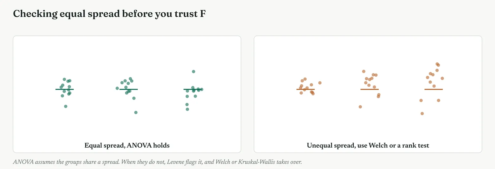
Template 13.28. the numbers behind it.
| ASSUMPTION CHECK | OUTCOME |
|---|---|
| Levene, equal spread | flagged, spreads unequal |
| Action taken | confirmed with Welch ANOVA |
| Skewed measure | confirmed with Kruskal-Wallis |
| Findings after checks | held, the desk difference is real |
Result. The result survived the checks. Where an assumption failed, the fallback agreed with the original. A finding that holds under Welch and Kruskal-Wallis is one you can defend.
Across the four firms
The blank page. Teach the one check that matters most, do the groups scatter alike, read straight off the box plots. The formal tests can wait until the firm is steadier.
The firefight. A glance at the box plots is often enough to spot a badly unequal spread. Reach for the rank fallback quickly when the data is plainly skewed, rather than forcing the bell-shaped test.
The false start. Showing that the finding survived a Welch and a Kruskal-Wallis check is powerful proof to a doubtful room that the result is not an artefact of a broken assumption.
The quiet achiever. The discipline is running the checks even when the result looks clean, because a capable firm with plenty of data can produce a significant F that a broken assumption has quietly inflated.
METHOD 7
Effect size, blocking, and the staffing factor
What it is
A significant F says a difference exists. The effect size says how much of the spread the factor explains, and for ANOVA the common measure is eta-squared, the between-group share of the total variation, read as a fraction from zero to one. Alongside it sits blocking, a design move rather than a read, where you group the data by a nuisance variable, the week or the shift, so its variation is stripped out and the factor you care about stands clearer. Both serve the same end, separating the signal that matters from the noise around it.
When to use it
Report an effect size every time, because significance without it can send a project chasing a factor that explains almost nothing. Use blocking when a known nuisance variable adds noise you can identify but not remove, so the design accounts for it rather than letting it swamp the effect. And use ANOVA with a factor you expect to matter little, such as staffing, precisely to size how little, because a near-zero eta-squared on staffing is stronger evidence than its absence from the model.
The Crestline run
The effect sizes ranked the factors the project should fix, in Figure 13.86 and Template 13.29. Which desk a case landed on explained about half the spread in resolution time. Case complexity explained a fifth, the interaction a further tenth. Staffing level, entered as a factor for exactly this purpose, explained about 1%, and its box plots in Figure 13.87 overlapped almost entirely across short, normal and full-staffed days. This was the headcount theory measured, not merely tested. Staffing did not explain the spread. The desk and the way complex cases reached it did. The project blocked on week to strip out the noise of quiet and busy periods, and the ranking held.
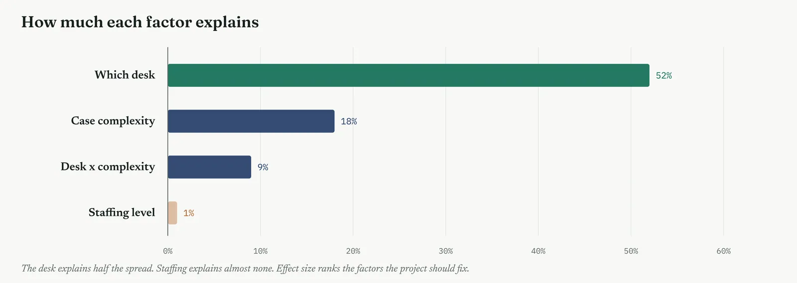
Template 13.29. the numbers behind it.
| FACTOR | ETA-SQUARED | VERDICT |
|---|---|---|
| Which desk | 52% | the factor to fix |
| Case complexity | 18% | a real driver |
| Desk x complexity | 9% | the lever, the handoff |
| Staffing level | 1% | explains almost nothing |
Result. The factors rank cleanly. The desk and its handling of complex cases explain most of the spread. Staffing explains about 1%, the headcount theory sized and closed.
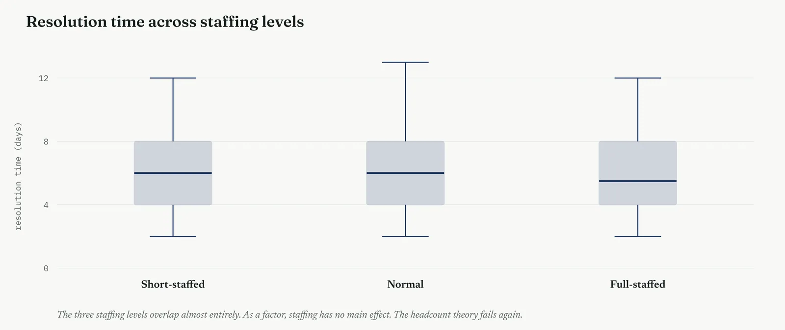
Across the four firms
The blank page. Teach eta-squared as a share out of a hundred, how much of the spread the grouping explains, and leave blocking for later. One honest effect size beats a significant result read as large.
The firefight. A quick effect size stops a busy room chasing a factor that is significant but trivial. Reach for it to rank what to fix first, even without the formal blocking design.
The false start. Sizing the discredited factor, staffing, at about 1% is the most persuasive close of all, because it does not merely fail to appear, it is measured and found to explain almost nothing.
The quiet achiever. The discipline is always pairing the F with the eta-squared, and using blocking to strip nuisance variation, so a capable firm never mistakes a significant factor for an important one.
The F-ratio, worked by hand
The F is worth building once, so the software output stops being magic. You start with three sums of squares. The total sum of squares is every case measured against the grand mean, squared and added, the whole spread you are trying to explain. The between-group sum of squares is each group mean measured against the grand mean, weighted by the group size, the part the grouping explains. The within-group sum of squares is each case measured against its own group mean, the part left over. The between and the within add up to the total, which is the partition made arithmetic.
Each sum of squares is then divided by its degrees of freedom to give a mean square, which is just an average squared deviation. The between degrees of freedom is the number of groups minus one, two for the three desks. The within is the total cases minus the number of groups, fifty-five for fifty-eight cases across three desks. The between mean square, 337, divided by the within mean square, 11.3, gives the F of about thirty. Every ANOVA table you will ever read is these same few pieces, and reading it is just following them across the row.
Reading the ANOVA table, line by line
An ANOVA table has a row for each source of variation and a fixed set of columns, and a belt reads every one. The source column names where the variation comes from, between the groups, within them, and the total. The sum of squares column gives the raw variation from each source. The degrees of freedom column gives the independent pieces of information behind each. The mean square is the sum of squares divided by its degrees of freedom. And the F and its p, on the between row, are the verdict.
The disciplined read runs across the between row and checks it against the within. A large between mean square against a small within mean square is a large F, and a small p. But you also glance at the degrees of freedom, because a striking F built on two or three cases per group is not the same as one built on twenty, and the table shows you which you have. Reading the whole table, not just the p at the end, is what stops a thin, lucky result being quoted with the same confidence as a solid one.
Why not many t-tests, the arithmetic
The case for ANOVA over a pile of t-tests is worth seeing in numbers, because it is the whole reason the tool exists. A single test at the 5% line has a 95% chance of not raising a false alarm. Two independent tests both stay quiet with a chance of 0.95 times 0.95, about 90%, so the chance that at least one cries wolf is already 10%. Three tests, and the quiet chance is 0.95 cubed, about 86%, so the false-alarm chance is 14%. The pattern is one minus 0.95 raised to the number of tests, and it climbs fast, as Figure 13.77 showed.
Comparing three groups pair by pair is three tests. Comparing five groups is ten. By ten tests the chance of at least one false alarm is above 40%, which means a difference found that way is as likely to be noise as signal. ANOVA asks the single question, do any of these groups differ, once, at the 5% you chose, and only then does a properly corrected post-hoc look at the pairs. The arithmetic is the argument. It is not that many t-tests are untidy, it is that they are wrong.
The staffing factor, the headcount question closed
It is worth drawing together how ANOVA finished the headcount theory, because it did it three ways in one tool. Entered as a grouping factor on its own, staffing level produced overlapping box plots and no significant difference, the desks resolved cases at much the same speed whether short-staffed, normal, or full. Entered into the two-way model beside desk and complexity, staffing carried an F of 0.4 and a p of 0.67, no main effect and no interaction. And measured for effect size, staffing explained about 1% of the spread against the desk at over half.
Each angle on its own would have been enough to doubt the theory. Together they close it. The hypothesis tests had shown staffing did not move resolution time. The regression had shown its coefficient was near zero once the real drivers were held constant. ANOVA now showed it explained almost none of the spread, and that the real structure was a desk whose process failed on complex cases. Three tools, three angles, one verdict. Martin can be answered not with an opinion but with a stack of evidence, and the project can spend its effort on the handoff, where the variation actually lives.
Effect size, worked, and why it matters
Eta-squared is the simplest effect size to build, because the partition already produced it. It is the between-group sum of squares divided by the total sum of squares, the share of all the spread that the grouping explains. For the desks, 675 divided by 1298 is about 0.52, so the desk explains 52% of the variation in resolution time. That is the same number the partition figure showed as a bar, read now as a fraction, and it is directly comparable to R-squared from a regression, the two being the same quantity in different tools.
Why it matters is that significance and size answer different questions, and a large sample can make a trivial difference significant. A factor can post a tiny p and an eta-squared of 0.01, meaning the difference is real but explains almost nothing, which is exactly what staffing did. Quoting the significant p without the eta-squared would have let staffing back into the story as a real factor, when its effect size showed it explained one part in a hundred. Always pair the F with the eta-squared, because the F tells you the difference exists and only the eta-squared tells you whether it is worth a project.
Reporting an analysis of variance, a worked write-up
The last skill is turning the table into a sentence a sponsor acts on. A good write-up carries the finding, the specifics, the size, and the check, in that order. For the desks it read like this. The three desks differ in resolution time, and the difference is real, not chance. Case Handling is slower than both front desks by three to five days a case, while the two front desks are alike. The desk explains about half the variation in resolution time, and staffing explains about one part in a hundred. The finding held under checks for unequal spread and skew.
Notice what the write-up leaves out. No sums of squares, no mean squares, no degrees of freedom. Those belong in the table an appendix carries for a doubter to check, not in the sentence the sponsor reads. The write-up carries the difference, where it lives, how large it is, and that it survived the checks, in the order a decision needs them. A belt who can run the ANOVA but cannot write this paragraph has done half the job, because a table no one can read back is a table that changes no minds.
Table 13.9. A quick reference for the terms, so the language of analysis of variance stays straight.
| TERM | WHAT IT MEANS |
|---|---|
| ANOVA | A test comparing the averages of three or more groups at once |
| F-ratio (F) | The between-group variation divided by the within-group variation |
| p-value (p) | The chance of an F this large if the groups were truly the same |
| Between-group variation | The spread of the group means around the grand mean, the signal |
| Within-group variation | The spread of cases around their own group mean, the noise |
| Sum of squares (SS) | The raw variation from a source, deviations squared and summed |
| Mean square (MS) | A sum of squares divided by its degrees of freedom |
| Degrees of freedom (df) | The independent pieces of information behind a sum of squares |
| Post-hoc test | A follow-up that finds which pairs differ, risk controlled |
| Main effect | The influence of one factor, averaged across the other |
| Interaction | When the effect of one factor depends on the level of another |
| Eta-squared | The share of the total spread a factor explains, the effect size |
| Kruskal-Wallis | The rank-based ANOVA, for skewed data |
Stage 4. Reading the result
Reading the result
Three readings settle what an analysis of variance is telling you.
| STRONG | You have a significant overall F, you have followed it with a post-hoc test that names the pair that differs, you read any interaction before you read the main effects, you tested the assumptions the model rests on, and you reported an effect size beside the p-value. |
| WEAK | You ran a pile of separate t-tests instead of one test, or you tested only the pair that caught your eye, or you read a main effect while an interaction hid beneath it, or you quoted an F with no effect size at all. |
| THE TELL | The test names the group that carries the difference and measures the factor that does not. When it points your project at a single desk and closes a theory in the same breath, you know it has earned its place. |
Four cautions sit under those readings. The first is order, that the overall test comes before any pairwise look, and a post-hoc with proper risk control comes before any claim about a pair, because reaching straight for the biggest-looking gap reintroduces the false-alarm problem ANOVA was built to remove. The second is the interaction, that in any two-factor model it is read first, because a main effect quoted while an interaction sits beneath it can be flatly misleading, an average that describes none of the groups well. The third is the assumptions, that unequal spread and skew are checked and the fallbacks reached for when they fail, since ANOVA is sensitive to both and a broken assumption inflates the F. The fourth is size against significance, that a significant factor explaining 1% of the spread is not a finding to act on, so the eta-squared is reported beside the p every time, and a factor is judged by how much it explains, not merely by whether it reached the line.
Stage 5. Four firms, four moves
Four firms, four moves
The four grounds from Chapter 1 change how far you take an analysis of variance, and where its danger sits. This is a tool whose simplest form is within reach of any firm that can compute an average, and whose richer forms, the two-way model and the interaction, reward a firm that can hold two ideas at once. The ground decides how much of that range you should open up.
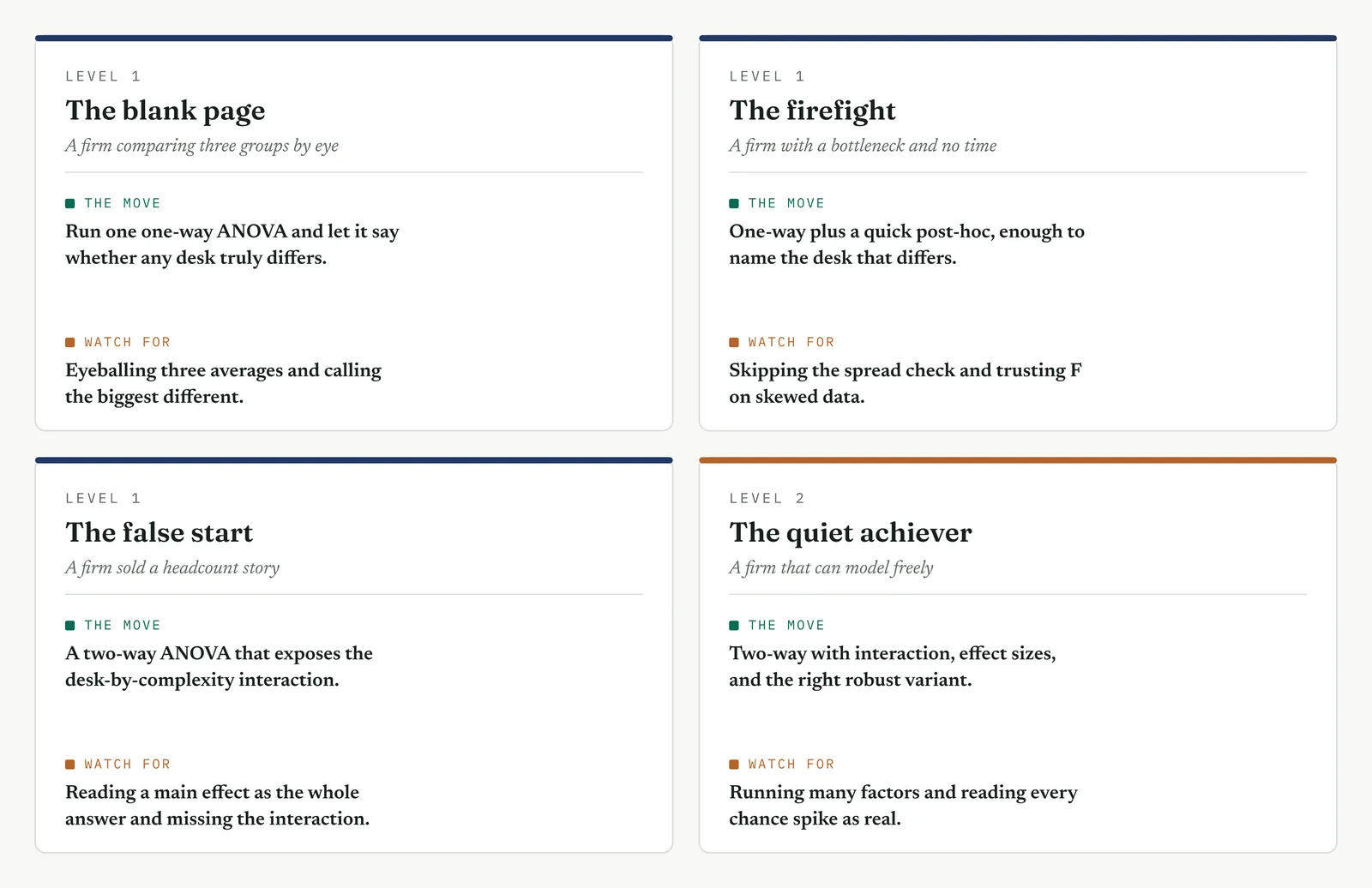
The blank page LEVEL 1
This firm compares groups by eye, and a difference in the averages settles arguments by whoever argues hardest. Run one one-way ANOVA on three groups, show it as box plots first, and let the firm see that a visible gap can be tested rather than asserted. Keep to the single overall verdict, real or not, and if it is real, one clean post-hoc to name the pair. The value on a blank page is not the model, it is the firm learning once that a difference between groups is a thing you can measure and stand behind. Reach for a two-way model or an interaction here and you lose the room before the F lands.
The firefight LEVEL 1
This firm is drowning in comparisons, often a pile of separate t-tests run pair by pair, collecting false alarms without knowing it. The move is to replace the pile with one ANOVA at the chosen risk, which is both faster and honest, and to reach for the post-hoc only when the overall test passes. Do not build a two-way model the firefight will not sit still to read, and do not wait on perfect data. A single overall test that names the slow desk this week is worth more than an elegant model next quarter, because the currency here is a decision made now, on evidence rather than on whoever shouted last.
The false start LEVEL 1
This firm watched a past effort test every pair until one crossed the line, and it trusts no comparison now. The whole game is order and disclosure. Declare the groups before the test, run the single overall ANOVA, and only then a post-hoc whose risk control you show in the open. When the test points at one desk and clears the rest, and when a factor the firm was told mattered, staffing, is sized at almost nothing rather than merely left out, that is the most persuasive result you can produce, because it cannot be read as the answer you went looking for. Resist testing one more pair to find the difference someone wanted.
The quiet achiever LEVEL 2
This firm can run a two-way model in its sleep, and its dangers are the sophisticated ones. Reading main effects while an interaction hides beneath them. Skipping the overall test to run post-hoc comparisons directly. Trusting a significant F built on data that breaks the equal-spread assumption. Quoting significance without an effect size, so a trivial factor rides in on a small p. Hold it to the disciplines the capability makes easy to skip, the interaction read first, the assumptions checked even when the result looks clean, the eta-squared reported beside every F. Here what you add is not method, which the firm has, but the restraint to let the model say only what the data supports.
Stage 6. Where it breaks
Where it breaks
1. Do not run a stack of t-tests in place of one ANOVA. Every extra pair you test lifts the chance of a false alarm, so ask the question once, at the line you set, and then use a corrected post-hoc test to find the pair that differs.
2. Never skip the overall test. Post-hoc comparisons mean nothing until a significant overall F has cleared the way for them, so run the overall test first and the pairwise comparisons second, always in that order.
3. Do not simply test the pair that looks the biggest. Testing only the gap that caught your eye is the multiple-comparison trap wearing a disguise, so test every pair with the risk properly controlled instead.
4. Do not read a main effect over a hidden interaction. An average effect can describe none of the groups it averages, so read the interaction first and let it qualify how you read the main effects.
5. Do not ignore unequal spread. Analysis of variance is sensitive to badly unequal variances, so check them with a Levene test and switch to a Welch ANOVA when the spreads pull apart.
6. Do not force ANOVA onto skewed data. A long tail breaks the bell shape that the test assumes, so turn to a Kruskal-Wallis test on the ranks whenever the data is badly skewed.
7. Never quote F without an effect size. A significant factor can still explain almost nothing, so report eta-squared beside the p-value and judge the result by how much it actually explains.
8. Do not confuse significant with important. A large enough sample will make even a trivial difference significant, and the size of the effect is the question that the p-value can never answer for you.
9. Take care when the groups are very different in size. Badly unbalanced groups strain the assumptions the test rests on, so note the imbalance openly and lean harder on the checks and the fallbacks.
10. Do not treat the grand mean as the story. The average across every group hides the between-group structure that matters, and that spread, not the single number at the centre, is the whole point of the test.
Stage 7. At the gate
At the gate
What it lets you defend. The sponsor asks whether the desks really differ, which one carries the problem, and whether it is a staffing matter after all. ANOVA answers all three with numbers. The desks differ by far more than chance, F of thirty, p below one in a hundred. The post-hoc names Case Handling as the one desk that stands apart, slower than both the others while the front two are alike. And the two-way model, reading desk and complexity together, shows the difference is an interaction, complex cases stalling at that one desk, while staffing entered as a factor carries an F of 0.4 and explains about 1% of the spread. It is the third independent close of the headcount theory, and the one that also hands the project its exact target.
What it feeds. The ranked factors become the order the Improve phase works in, the desk and its handling of complex cases first, staffing struck from the list with an effect size behind the striking. The interaction points the fix at the handoff rather than the desk in general, which sharpens the change from add people to fix the way complex cases reach this desk. The effect sizes size the prize, how much of the spread each factor explains, so the phase knows how much a fix can recover. And the checks, Welch and Kruskal-Wallis agreeing, are the evidence the gate stands on, a finding that survived every proper test rather than one that hoped not to be questioned.
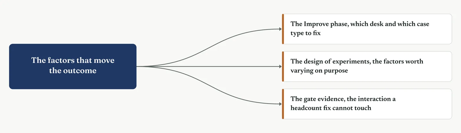
13 · ANALYSE MOVEMENT FOUR · CONFIRM THE DRIVER AND CLOSE
13.3.13 Design of experiments
Recommended ISO 13053 Factsheet 17
Purpose. Design of experiments is the tool for proving which factors actually cause a change. Instead of drawing a cause from data the process happened to produce, you test the factors directly. You set each one to a chosen level, run the combinations, and measure the effect on the response. Because you control the settings, the change you see can be traced to the factor you changed. Use it to confirm the driver the rest of Analyse pointed to. It is the first tool of Movement Four.
Stage 1. The trigger
The trigger
Use a designed experiment when observation has taken the analysis as far as it can and you need to confirm a cause rather than infer it. Everything in Analyse so far has worked from data the process produced on its own. That data can point to a likely driver, but it cannot prove one, because in observed data the candidate causes move together and cannot be separated after the fact. A designed experiment separates them. You decide which factors to test, set them deliberately, run the combinations in a controlled order, and measure the response. Any change you then see belongs to the factor you changed.
The natural first instinct is to test one factor at a time. You hold everything fixed, change a single factor, record the result, then move to the next. It is a common approach, but it has two weaknesses. It uses a separate run for every change, so it gathers little information for the effort. And it never sets two factors to their high levels together, so it cannot detect an interaction between them. Figure 13.90 shows the difference. One-factor-at-a-time testing covers a thin path through the possible settings, while a factorial covers every combination.
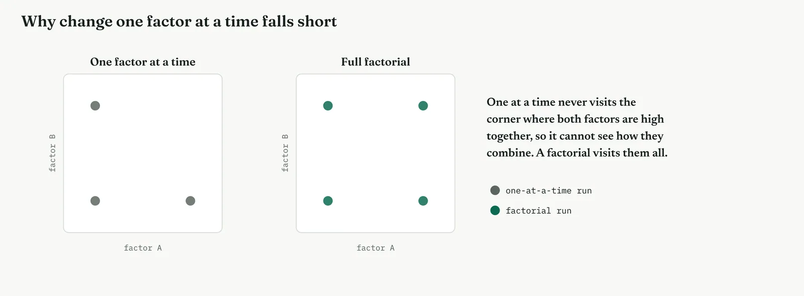
A designed experiment tests several factors together, in a planned pattern, so that each factor is tested across the full range of the others. This is a factorial design, and it offers two advantages. Each factor is estimated from every run, so you learn more from fewer cases. And because the design sets factors high together on purpose, it measures how they interact. This is why the ANOVA in the previous section could only suggest an interaction while a designed experiment can confirm one. The ANOVA read an interaction in data the process produced on its own. A designed experiment creates the interaction and measures it.
Three terms recur through this section. A factor is a variable you set deliberately, at two or more levels, such as whether a case is routed to a specialist. An effect is the change in the response when a factor moves from its low level to its high level. An interaction is present when the effect of one factor depends on the level of another. A designed experiment estimates all three, and it separates the real effects from the variation that noise alone would produce.
One rule protects the whole method, and it is the step most often skipped. Randomise the order of the runs. If you run the combinations in a fixed sequence, any factor that changes in step with something drifting over time, a warming machine, a tiring team, a lengthening queue, will absorb that drift into its measured effect. Randomising the order prevents this, so that a trend over time cannot be mistaken for the effect of a factor. An experiment that is not randomised cannot be trusted, however carefully it is analysed afterward.
It is worth being precise about what makes this tool different from everything before it in the chapter, because the difference is the whole reason it sits at the end. Every earlier tool takes the process as given. It maps what happens, counts what goes wrong, or analyses the numbers the process produced. This tool does not take the process as given. It changes the process on purpose and watches the result. That single shift, from observing to intervening, is what moves a finding from likely to proven, and it is why the designed experiment is the strongest evidence Analyse can produce.
The shift also explains the discipline the tool demands. When you only observe, carelessness costs you accuracy. When you intervene, carelessness costs you the truth, because a badly run experiment can manufacture an effect that was never there and dress it in the authority of a controlled trial. That is a worse outcome than no experiment at all. So the rules that follow, randomise, replicate, check, and confirm, are not bureaucracy. They are what keep the power of intervention from becoming the power to fool yourself.
Stage 2. The build
The build
Name the factors to test and the response to measure. Decide which factors you will vary and the single response you will measure, and record them before the first run. The clarity of the experiment depends on the clarity of this decision.
Choose the design to match the number of factors. With a few factors and enough runs, use a full factorial to test every combination. With many factors and few runs, use a fractional factorial to screen them, which recovers the main effects at the cost of some higher-order detail.
Randomise the order, then run every combination. Run the combinations in a random order, so that any drift over time cannot be read as a factor effect. Run the full set, not only the combinations you expect to succeed.
Identify the real effects before estimating their size. Use a Pareto chart and a normal plot of the effects to separate the factors that genuinely moved the response from those that varied only with noise. Act on the real effects alone.
Read the interactions before the main effects. An interaction can change the meaning of a main effect, so examine how the factors combine before you interpret any factor on its own.
Confirm the chosen settings with fresh runs. Treat the recommended settings as a prediction until you test them. Run a small set of new cases at those settings and check that the result matches the prediction before carrying it into Improve.
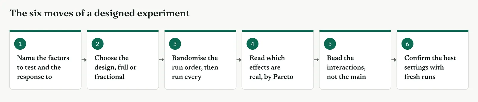
The design you choose depends on how many factors you are testing and what you need to learn about them. Use a full factorial for a few factors when you can run every combination, because it measures every main effect and interaction cleanly. Use a fractional factorial for many factors and few runs, because it screens for the important ones and gives up only the higher-order interactions. Use a response surface design when the factors are numbers and you want the best settings rather than the largest effects. Table 13.10 pairs each design with the question it answers, and Figure 13.92 shows the same guidance at a glance.
Table 13.10. The common designs and the question each one answers, with the Crestline use of each.
| THE DESIGN | USE IT WHEN | A CRESTLINE USE |
|---|---|---|
| Full factorial | You have a few factors and can run every combination | Test routing, training and staffing together on complex cases |
| Fractional factorial | You have many factors and few runs to spare | Screen a long list of suspected drivers down to the vital few |
| Response surface | The factors are numbers and you want the best settings | Tune a continuous setting once the vital few are known |
| Confirmation run | You have chosen the best settings and must prove them | Show the routed and trained combination holds on fresh cases |
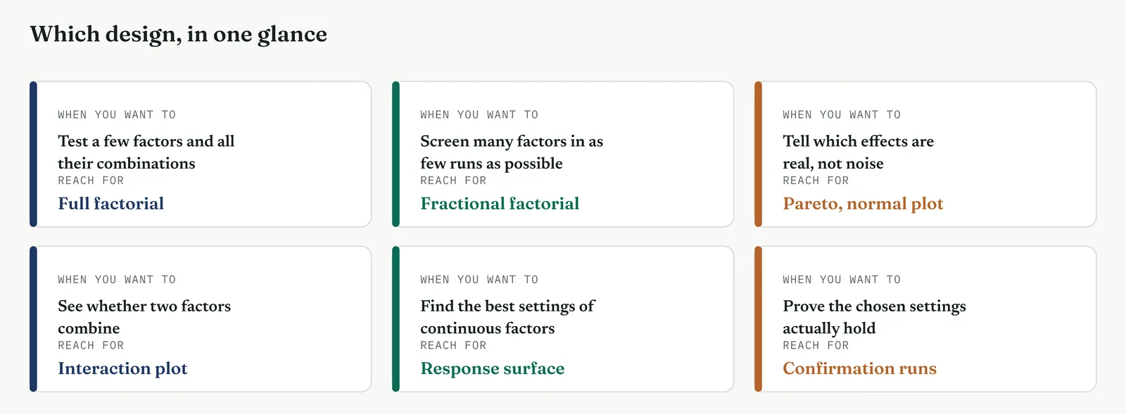
| TIP Randomising the run order is the single step that most often decides whether an experiment can be trusted. If the combinations are run in a fixed sequence, any drift over time attaches itself to whichever factor changed in step with it, and the analysis cannot remove it afterward. Randomising costs only a moment of planning, and it protects every result the experiment produces. Treat it as mandatory, not optional. |
Stage 3. Crestline on the floor
Crestline on the floor
The ANOVA had shown, in observed data, that Case Handling struggled with complex cases, and it had indicated that routing and training were the likely levers. Because the data was observed, the cause was suspected rather than proven, and the headcount argument could still be made. Crestline settled the question with a designed experiment. The team tested three factors on complex cases and measured the effect of each. Each section below states what part of the method it covers, when to use it, and how it ran on the floor.
SECTION 1
One factor at a time, and why it will not do
What it is
One-factor-at-a-time testing changes a single factor while holding the others fixed, records the result, then repeats for the next factor. It is not a designed experiment. It cannot detect interactions, because it never sets two factors to their high levels together, and it uses a separate run for each change, so it is inefficient. Understanding these limits is the starting point for the method.
When to use it
Use it only when a full or fractional factorial is not available to you. A single-factor check is occasionally all that circumstances allow, and it is better than acting on opinion. When you use it, recognise what you give up, which is any measurement of how the factors combine and any efficiency in the runs you spend.
The Crestline run
The team had already tried this approach. They added a person to the Case Handling desk for two weeks, saw little change, and set staffing aside, which proved correct. They then tried routing on its own, saw a clear improvement, and concluded that routing was the full answer, which proved incorrect. Routing alone helped, but routing combined with training helped considerably more. One-factor-at-a-time testing could not have shown this, because it never ran the two together.
Across the four firms
The blank page. For a firm that has never run a trial, a single honest one-factor test is still an improvement on changing things by opinion, provided you are clear that it cannot detect combinations. Use it to establish the habit, then move to a factorial.
The firefight. A firefight often allows only a single change, watched closely. That is a reasonable use, provided the one factor you find is not mistaken for the only factor at work.
The false start. A firm with a failed past effort will recall a one-at-a-time test that missed the real driver. Stating that limit plainly, and moving to a factorial, is part of rebuilding its trust.
The quiet achiever. A capable firm has little reason to test one factor at a time when a factorial costs little more and reveals far more. If it does so from habit, that habit is worth correcting.
SECTION 2
The factorial design, all factors at once
What it is
A factorial design tests several factors together by running every combination of their levels. Three factors, each set high or low, produce eight combinations, and running all eight is a full factorial. Each factor is tested across the full range of the others, so every run contributes to every effect, and the design sets factors high together, which is where interactions appear. Where one-factor-at-a-time testing covers a thin path, a factorial covers the whole space.
When to use it
Use a full factorial when you have a small number of factors, up to four or five, and can run every combination at least once. It is the cleanest design available, because no effects are confounded and every main effect and interaction is measured on its own. When the number of factors grows beyond what the runs can support, move to a fractional design. For a handful of factors and a process you can run a few dozen times, the full factorial is the correct first choice.
The Crestline run
The team chose three factors, each of which someone had proposed as the answer. Routing was whether a complex case went to a specialist handler or stayed in the general queue. Training was whether the handler had completed the short course. Staffing was whether an extra person was added to the desk, and it was included in the design specifically so the headcount theory would be tested rather than assumed away. All eight combinations were run, several times each, in a randomised order. Figure 13.93 shows the mean resolution time at each corner, and Template 13.30 lists the runs.
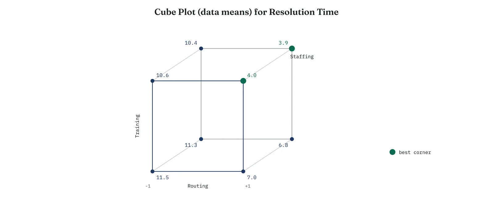
Template 13.30. the numbers behind it.
| RUN | ROUTING | TRAINING | STAFFING | DAYS |
|---|---|---|---|---|
| 1 | No | No | No | 11.5 |
| 2 | Yes | No | No | 7.0 |
| 3 | No | Yes | No | 10.6 |
| 4 | Yes | Yes | No | 4.0 |
| 5 | No | No | Yes | 11.3 |
| 6 | Yes | No | Yes | 6.8 |
| 7 | No | Yes | Yes | 10.4 |
| 8 | Yes | Yes | Yes | 3.9 |
Result. The two fastest runs, at 4.0 and 3.9 days, are both routed and trained. The two slowest, at 11.5 and 11.3, are neither. In each staffing pair, run 1 against run 5 for example, the two values barely differ.
Across the four firms
The blank page. Begin with the smallest real factorial, two factors and four runs, so the idea of testing combinations is established before the arithmetic grows. One small design teaches more than an explanation.
The firefight. A compact factorial can be run inside a busy fortnight if the factors are kept few and the runs short, and it settles a question that weeks of argument could not.
The false start. Record the full design before any run, with every combination listed, so the result cannot later be described as the one arrangement that suited the story.
The quiet achiever. This firm can run full factorials routinely, and should. Its tendency is to reach for elaborate designs when a clean three-factor design would answer the question in front of it.
SECTION 3
Main effects, which factors move the outcome
What it is
The main effect of a factor is the change in the response when the factor moves from its low level to its high level, averaged across the other factors. You read it from a main effects plot, which draws a line for each factor between its two levels. A steep line is a large effect. A flat line is a factor with no effect. Because a factorial estimates each line from every run rather than from a single pair, the lines are reliable.
When to use it
Read the main effects plot first, as the initial summary of what the experiment found, but not as the final word. It shows at a glance which factors are worth attention and which can be set aside, in a form anyone can follow. Its limitation is that a main effect is an average across the other factors, so when an interaction is present the average can mislead. For that reason the interaction plot always follows it.
The Crestline run
The main effects plot, Figure 13.94, made the result clear. The routing line dropped steeply, from about eleven days when cases were not routed to about six when they were. The training line dropped moderately. The staffing line was flat, at almost the same height at both levels. Adding a person changed the average resolution time by about a fifth of a day, a difference within the noise. The question that two weeks of argument had not resolved was resolved by one chart.
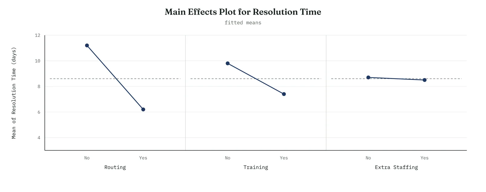
Template 13.31. the numbers behind it.
| FACTOR | MAIN EFFECT ON DAYS |
|---|---|
| Routing | -5.0, a large improvement |
| Training | -2.5, a real improvement |
| Extra staffing | -0.2, no effect |
Result. Routing and training each reduced resolution time substantially. Extra staffing, the factor the headcount theory rested on, changed the average by about a fifth of a day, which is no measurable effect.
Across the four firms
The blank page. The main effects plot is the first picture to show a firm new to the method, because the contrast between a steep line and a flat one makes the idea of an effect clear without a figure to interpret.
The firefight. A main effects plot tells a busy team which lever to use first, which is the decision a firefight needs, and it draws that decision from runs the firm can trust.
The false start. Show every factor line, including the flat ones, so the firm can see that the ineffective factor was tested honestly and not dropped to favour the others.
The quiet achiever. The discipline for a capable firm is to withhold action on the main effects alone, however clear they appear, until the interaction plot confirms that no combination overturns them.
SECTION 4
Interactions, the effect confirmed
What it is
An interaction is present when the effect of one factor depends on the level of another. Training may help little on its own but a great deal once cases are also routed, because the handler who uses the training is the one who receives the routed case. You read it from an interaction plot, which draws a line for each level of one factor across the levels of the other. Parallel lines mean the factors act independently. Lines that diverge or cross mean the factors combine, and that combination is a finding a main effect cannot express.
When to use it
Read the interaction on every factorial, and read it before the main effects. This is the effect that observation can only suggest and a designed experiment can confirm, because the experiment runs the combination that reveals it. When an interaction is present, it changes the recommendation, because the factors must be set together rather than one at a time, and it often points to a fix that is cheaper and more precise than a broad change.
The Crestline run
The interaction between routing and training, in Figure 13.95, was the central result. When cases were not routed, training reduced resolution time only slightly, because a trained handler in the general queue could not apply what they had learned. When cases were routed, training reduced it by a further three days, because the handler receiving the routed case could now use the training. The lines diverged widely, and the interaction was strongly significant. This was the effect the ANOVA had suggested in observed data, now confirmed by an experiment that created the combination and measured its effect.
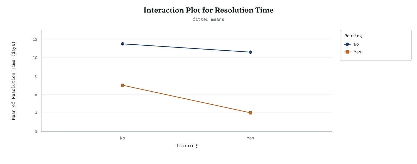
Template 13.32. the numbers behind it.
| CONDITION | NOT TRAINED | TRAINED |
|---|---|---|
| Not routed | 11.5 days | 10.6 days |
| Routed | 7.0 days | 4.0 days |
Result. Training saves about one day when cases are not routed, and about three days when they are. The two factors are worth more together than the sum of their separate effects. That difference is the interaction.
Across the four firms
The blank page. Show the interaction plot only once the firm can read a main effects plot, and let the diverging lines carry the idea, because a picture of two factors combining is easier to grasp than a definition.
The firefight. The interaction prevents a firefight from applying a partial fix. When it shows that two inexpensive changes together outperform either alone, the firm stops spending on the wrong single lever.
The false start. Present the interaction plot openly. A firm that was once given a simple explanation will trust a picture of the combined effect sooner than a single figure.
The quiet achiever. The risk for a capable firm is to over-interpret a small interaction that barely clears the noise, or to miss a real one because the main effects look orderly. Read the plot and the significance together before acting.
SECTION 5
Telling the real effects from the noise
What it is
Not every effect a factorial reports is real. In a small experiment, chance alone gives some factors a little apparent movement, and you need a way to separate the genuine effects from that variation. Two plots do this. A Pareto chart of the effects ranks them by size and draws a significance line, so that any effect past the line is real and any effect short of it is noise. A normal plot of the effects places them against the pattern that pure noise would produce, so that effects on the line are noise and effects off it are real. Together they prevent you from acting on an estimate that only appears large.
When to use it
Use both plots on every experiment, before quoting any effect as a finding. They guard against the most common error in the method, which is to treat a large estimate as a real one. The Pareto is the quicker read and the easier to present. The normal plot is the more searching, because it judges every effect against the shape of noise itself. Read them together, and act only on the effects that both identify as real.
The Crestline run
The Pareto chart, Figure 13.96, was clear. Three bars cleared the significance line, routing, training, and the interaction between them. Every other bar, including staffing and its interactions, fell short of the line and could not be distinguished from noise. The normal plot, Figure 13.97, gave the same result from the other direction. Routing, training and their interaction fell well off the reference line, marking them real, while staffing and the small interactions lay along it, where pure noise would place them. Two plots, constructed differently, agreed, and both placed staffing among the noise.
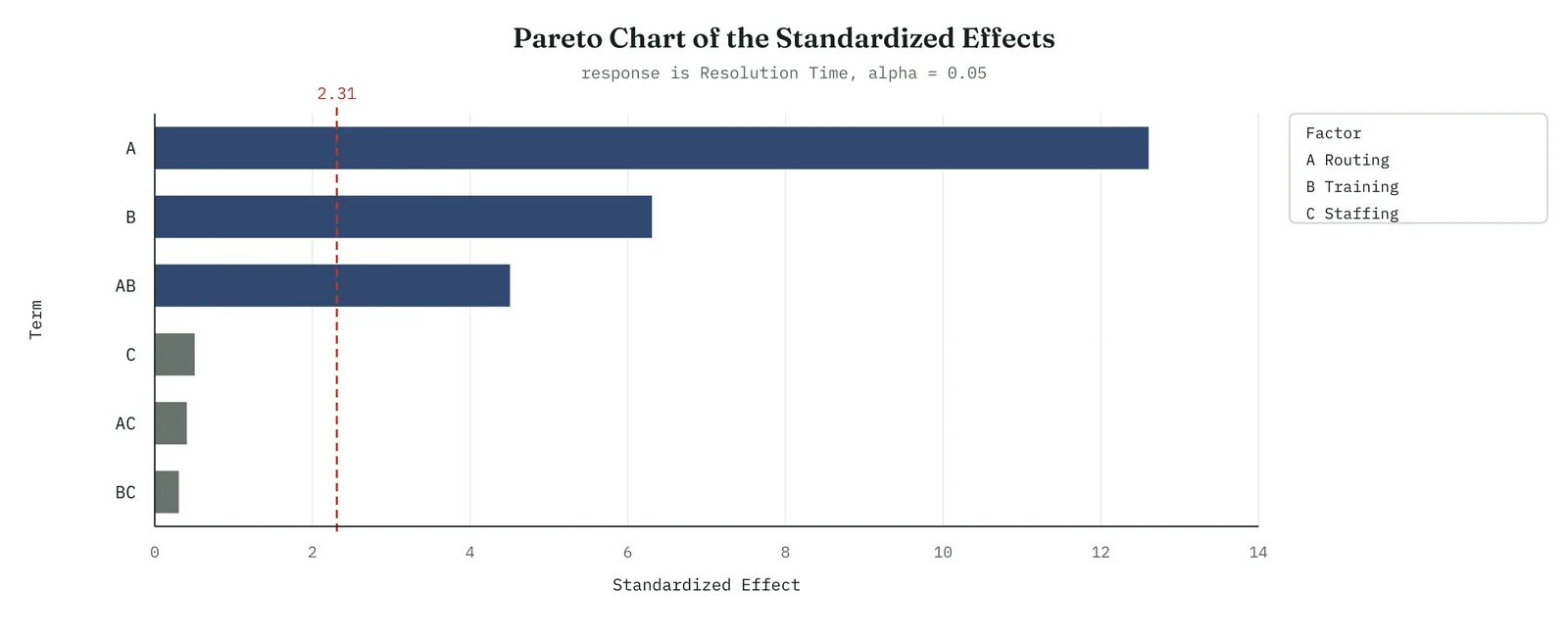
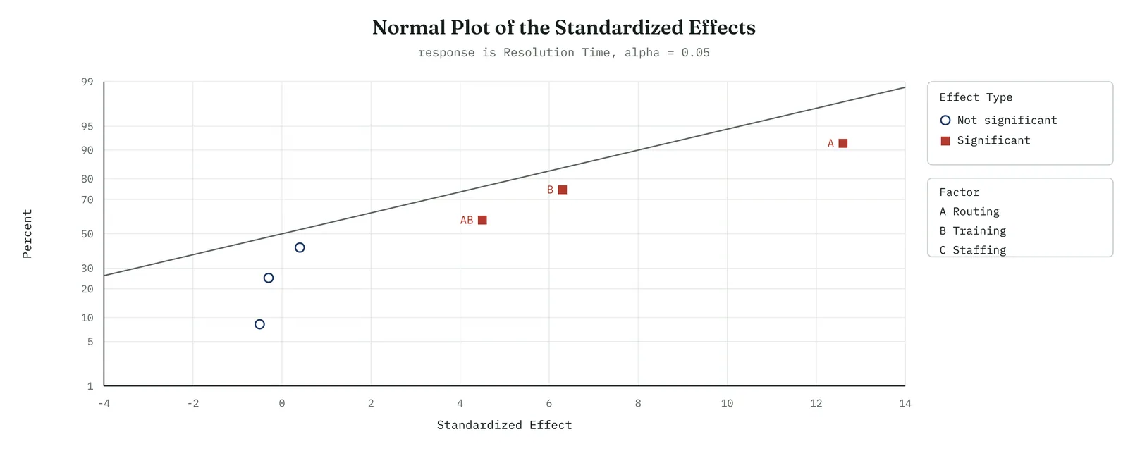
Across the four firms
The blank page. The Pareto is the plot to teach first, because a bar that clears a line is a single idea a firm can hold at once. Introduce the normal plot once the Pareto is familiar.
The firefight. A Pareto of the effects tells a busy team which findings are solid enough to act on and which to set aside, which prevents it from acting on a result that chance produced.
The false start. Show both plots and let them agree in the open, because a firm that once trusted a fished result will accept two separate checks sooner than one confident claim.
The quiet achiever. The discipline is to run both plots even when an effect looks obviously large, because the occasion on which the check is skipped is the occasion on which noise is mistaken for signal.
SECTION 6
Fractional factorials, screening the many
What it is
When the number of factors grows, a full factorial grows with it, and the runs soon exceed what any process can spare. Seven factors would need a hundred and twenty-eight runs for a single replicate. A fractional factorial runs a chosen part of the full design, often a half or a quarter, and still recovers the main effects and the important interactions. The cost is that some effects become confounded, tangled together so that one cannot be told from another. A well-chosen design confounds only the effects you are least likely to need, and allows you to separate them later if required.
When to use it
Use a fractional design when you have many candidate factors and want to reduce them to the important few before studying any in depth. It is an efficient first pass across a long list of suspected factors, run to find the two or three that matter so that a fuller design can then focus on them. Treat it as a screen, not a conclusion, because it identifies the important factors rather than describing them fully, and follow it with a fuller design on the factors that survive.
The Crestline run
Crestline had begun with more than three suspected factors. Besides routing, training and staffing, the team had listed the case template, the time of day a case arrived, and whether a supervisor reviewed it. Six factors would have required sixty-four runs for a full design, more than the fortnight allowed. The team ran a fractional design first, sixteen runs, across all six. It showed routing, training and the template carrying real effects, and the other three, staffing among them, lying flat. The team then ran the full three-factor experiment on the factors that mattered most, which is the experiment described in the earlier sections.
Template 13.33. the numbers behind it.
| SCREENING RESULT | FACTOR |
|---|---|
| Carried a real effect | Routing, training, case template |
| Lay flat, screened out | Staffing, time of day, supervisor review |
| Runs used | 16, against 64 for the full design |
Result. A fractional design tested six factors in sixteen runs and identified the three that mattered. Staffing was screened out before the full experiment began, and did not return to it.
Across the four firms
The blank page. Fractional designs are a step beyond a firm running its first experiments. Note that they exist for cases with many factors, and leave them until full factorials are familiar.
The firefight. A fractional screen suits a firefight with many suspected factors and few runs, because it reduces the long list to the important few quickly, before time and patience run out.
The false start. Declare the full list of factors and the screening design before running, so the surviving factors do not appear chosen and the screened-out factors do not appear suppressed.
The quiet achiever. This firm is the most able to design a clever fraction and the most at risk of confounding an effect it needs. Choose the fraction carefully, and know which effects it tangles together.
SECTION 7
Confirmation, and tuning the numbers
What it is
An experiment ends with a confirmation. The model recommends a set of best settings, often a combination you did not run many times, and a confirmation run tests those settings on fresh cases to check that the predicted result holds. Beyond confirmation, when the factors are numbers rather than yes-or-no choices, a response surface design maps the response across the settings and locates the best point between the levels you tested. Confirmation proves the result. Response surface designs refine it.
When to use it
Always confirm before carrying a result into Improve. The confirmation run is inexpensive, and it is the difference between a prediction and a proof. Use a response surface design only when the important factors are continuous and the gain from fine tuning is worth the additional runs, which for many service problems it is not, because the factors are choices rather than settings. Know that the tool exists, and use it when the factors are numbers you can set anywhere in a range.
The Crestline run
The experiment predicted that routing and training together would bring complex cases in at about four days, against the eleven they had been taking. The team ran twelve fresh complex cases at those settings, routed to trained handlers, and measured them. Every case fell inside the predicted band, as Figure 13.98 shows, and the average was just under four days. The gain was confirmed on cases the experiment had not seen. Crestline factors were all yes-or-no choices, so the response surface in Figure 13.99 did not apply. The team recorded it as the tool to use if a continuous setting ever entered the problem.
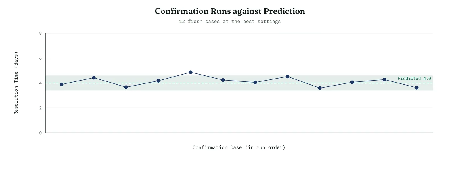
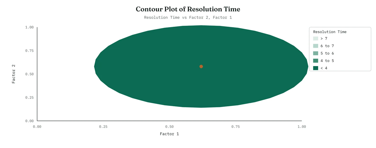
Across the four firms
The blank page. Teach the confirmation run as the standard end of any experiment, the step that checks the predicted gain on new cases. It is the simplest discipline here and the one most worth establishing.
The firefight. A short confirmation run lets a firefight act with confidence, because it turns a predicted gain into a measured one before any resources are committed.
The false start. Confirm openly, on fresh cases the firm can observe, because a result measured on new work is the hardest for a doubting firm to dismiss.
The quiet achiever. The risk for a capable firm is to trust a clean model and skip the confirmation, which is the occasion on which the process surprises it. Confirm every time, however sound the analysis appears.
Reading a designed experiment, start to finish
The steps of a designed experiment run in a fixed order, and the order is part of the method. You begin with the design, the list of factors and the combinations you will run, recorded before anything happens. You randomise the run order, so that time cannot be mistaken for a factor. You run every combination, replicated where possible, and record the response for each. You then read the results in a set order. Read first which effects are real, using the Pareto and the normal plot, so that no attention is spent on noise. Read next the interactions, because a real interaction changes how everything else is read. Read the main effects last, qualified by any interaction beneath them. Finish with a confirmation run, which proves the chosen settings on fresh cases.
Reading the results in this order guards against the common errors. Read the main effects first, and a factor that looks clear can lead you past an interaction that would have changed the recommendation. Skip the reality check, and you act on a number that chance produced. Skip the confirmation, and you commit to a gain the process will not deliver. The order is not a formality. It reflects the ways experiments have failed when their results were read in the wrong sequence.
Why a designed experiment can confirm a cause
This is the point that separates a designed experiment from every observational tool. When you observe a process, you take the conditions it happens to produce, and those conditions arrive tangled together. Busy days bring more volume, longer handoffs, and more tired staff at once, so when resolution time rises you cannot say with certainty which of them caused it. A regression can hold some of them constant, but only the ones you measured, and an unmeasured factor may be driving both a measured factor and the response. That is the limit of observation.
A designed experiment removes the limit by setting the factors itself. Because you decide, at random, which cases are routed and which are not, nothing else is tied to routing by design. The routed and unrouted cases are alike in every other respect, on average, because you assigned them. So when the routed cases resolve faster, routing is the cause, and not a hidden factor that travels with it, because random assignment breaks any such link. This is why a designed experiment confirms a cause where observation can only suggest one. The comparison is constructed rather than found.
The headcount theory, put to the sharpest test
Every tool in this chapter has addressed the headcount theory from a different angle, and this one closes it most decisively. The earlier tools showed, in observed data, that staffing did not track resolution time, that it carried no weight in a regression, and that the problem lived in a desk-by-complexity combination. Each result was strong, and each left the same objection, that the observed data might be hiding something. The designed experiment removes that objection. Staffing was not excluded from the experiment. It was built into it. An extra person was added on half the runs and withheld on the other half, at random, and the response was measured.
Adding a person changed resolution time by about a fifth of a day, an effect that both the Pareto and the normal plot placed within the noise. This is a different kind of result from the earlier ones. It is not that staffing failed to correlate, or that it lost its weight beside stronger factors. It is that when staffing was deliberately increased, in a trial designed to give it every opportunity to show an effect, it produced none, while routing and training together more than halved the resolution time. A theory can survive a weak correlation. It cannot survive being tested directly in a controlled trial and producing no effect.
Reporting a designed experiment
The final step is to state the experiment in a form a sponsor can act on, without the design notation. A clear report carries four things in order. The finding, in plain terms. The size, as a plain difference. The proof, that it was a controlled trial and was confirmed. The limit, what the experiment does and does not settle. For Crestline the report read as follows. Three changes were tested on complex cases in a controlled trial, routing them to specialists, training the handlers, and adding staff. Routing and training together reduced resolution time from about eleven days to about four, and the two work far better together than either alone. Adding staff had no effect. The four-day result was confirmed on twelve fresh cases. The trial settles the cause, because the changes were set deliberately rather than observed, and it applies to complex cases, where the problem was found.
The report omits the factors and levels, the cube, the confounding, and the normal plot. Those belong in an appendix a reviewer can check, not in the statement the sponsor acts on. The report carries the finding, the size, the proof, and the limit, in the order a decision maker needs them, and it states that the changes were set deliberately, which is the basis for trusting the result. A practitioner who can run the experiment but cannot write this report has done only half the work, because the report is what carries the result into the next decision.
Table 13.11. A quick reference for the terms, so the language of designed experiments stays consistent.
| TERM | WHAT IT MEANS |
|---|---|
| Factor | A variable you deliberately set, at two or more levels |
| Level | One setting of a factor, such as routed or not routed |
| Run | One case observed at a chosen combination of levels |
| Full factorial | A design that runs every combination of the factor levels |
| Fractional factorial | A design that runs a chosen part of the full set, to screen many factors |
| Main effect | The change in the response when a factor moves from low to high |
| Interaction | When the effect of one factor depends on the level of another |
| Randomisation | Running the combinations in random order, so time cannot fake an effect |
| Confirmation run | Fresh cases run at the best settings to prove the predicted gain |
| Response surface | A design for continuous factors that locates the best settings |
| Coded units | Factor levels expressed as minus one and plus one, for a common scale |
| Generator | The rule that defines a fractional design, such as D equals ABC |
| Confounding | When two effects are tied together so they cannot be told apart |
| Resolution | How far a fractional design keeps effects clear of one another |
| Blocking | Grouping runs by a nuisance condition and removing it in the analysis |
| Centre point | A run with every factor set halfway, used to check for curvature |
| Power | The chance an experiment detects an effect that is really there |
| Screening | A first, rough experiment to reduce many factors to the vital few |
The mechanics in full
The sections above showed how to run and read a designed experiment. This part opens the machinery beneath them, for the reader who wants to know what the software is doing and to defend the result when it is questioned. None of it is needed to run a simple factorial. All of it helps you run a better one, and explain it with confidence when a sceptic asks how you know.
Coding the factors, and why
Before the software analyses an experiment, it converts every factor to the same scale, minus one for the low level and plus one for the high level. This is called coding. It matters for two reasons. It puts every factor on a common footing, so their effects can be compared directly even when one is measured in minutes and another in degrees. And it centres the design, which keeps the arithmetic of the effects clean and removes a false correlation that raw units can introduce between a factor and an interaction.
You set the levels in real units, no routing and routing, or one hundred and sixty degrees and one hundred and eighty. The software codes them to minus one and plus one, runs the analysis in coded units, and reports the effects. If you want the model in real units, it converts back. The practical point is that a coded coefficient of a given size means the same importance whatever the factor, which is exactly what lets a main effects plot or a Pareto compare factors on one scale.
Calculating an effect by hand
The effect of a factor is the average response at its high level minus the average at its low level, and you can compute it by hand from a table of signs. For each run, write plus or minus for each factor according to its level. For an interaction, multiply the signs of the two factors. To find the effect of a term, add the responses where its sign is plus, subtract the responses where its sign is minus, and divide by the number of plus runs. The interaction effect comes out the same way, from the multiplied signs.
Template 13.34. the numbers behind it.
| RUN | ROUTING A | TRAINING B | A x B | DAYS |
|---|---|---|---|---|
| 1 | - | - | + | 11.5 |
| 2 | + | - | - | 7.0 |
| 3 | - | + | - | 10.6 |
| 4 | + | + | + | 4.0 |
| 5 | - | - | + | 11.3 |
| 6 | + | - | - | 6.8 |
| 7 | - | + | - | 10.4 |
| 8 | + | + | + | 3.9 |
Result. Working the routing column by hand, the four plus runs average 5.4 days and the four minus runs average 11.0 days, so the routing effect is about minus 5.5 days. That is the same figure the software reported and the main effects plot drew. The sign table is where all three come from.
The model behind the experiment
A designed experiment fits a regression model, and it is worth seeing its shape. The response equals a constant, plus a coefficient for each main effect multiplied by its coded factor, plus a coefficient for each interaction multiplied by the product of its factors. For the three Crestline factors, resolution time equals the overall average, plus a routing term, plus a training term, plus a term for routing multiplied by training, and so on. Each coefficient is half the effect, because moving a coded factor from minus one to plus one is a change of two.
This is the same regression you met earlier, with coded factors as the predictors and interactions as products of them. Analysis of variance and design of experiments are two faces of that one model. Seeing this connects the whole movement together. The scatter and correlation, the regression, the ANOVA, and now the designed experiment are all reading the same kind of model, from data of increasing quality, ending with data you produced on purpose.
The analysis of variance table of an experiment
The software reports the experiment as an analysis of variance table, the same shape you met in the ANOVA section. Each factor and interaction gets a line, with its sum of squares, its degrees of freedom, its mean square, its F-ratio and its p-value. You read it the same way. A large F with a small p is a real effect. The residual line at the bottom is the noise the model did not explain, and it is the yardstick every effect is measured against.
Template 13.35. the numbers behind it.
| SOURCE | F | p | READING |
|---|---|---|---|
| Routing | 158 | < 0.01 | real |
| Training | 40 | < 0.01 | real |
| Routing x Training | 20 | < 0.01 | real |
| Staffing | 0.3 | 0.61 | none |
Result. Reading the table and reading the Pareto give the same verdict, because the Pareto is built from these same F-ratios, ranked. Routing, training and their interaction are real. Staffing sits in the noise, its F below one and its p well above the line.
Checking the residuals
Every fitted model leaves residuals, the gaps between what it predicted and what actually happened, and their pattern is the test of whether the model can be trusted. The software draws four residual plots together, in Figure 13.102. The normal probability plot should show the residuals falling roughly on a straight line, which says they are bell-shaped. The plot of residuals against the fitted values should be a shapeless cloud, with no funnel and no curve. The histogram should look roughly symmetric. And the plot of residuals against run order should show no drift, which confirms that nothing changed steadily through the experiment.
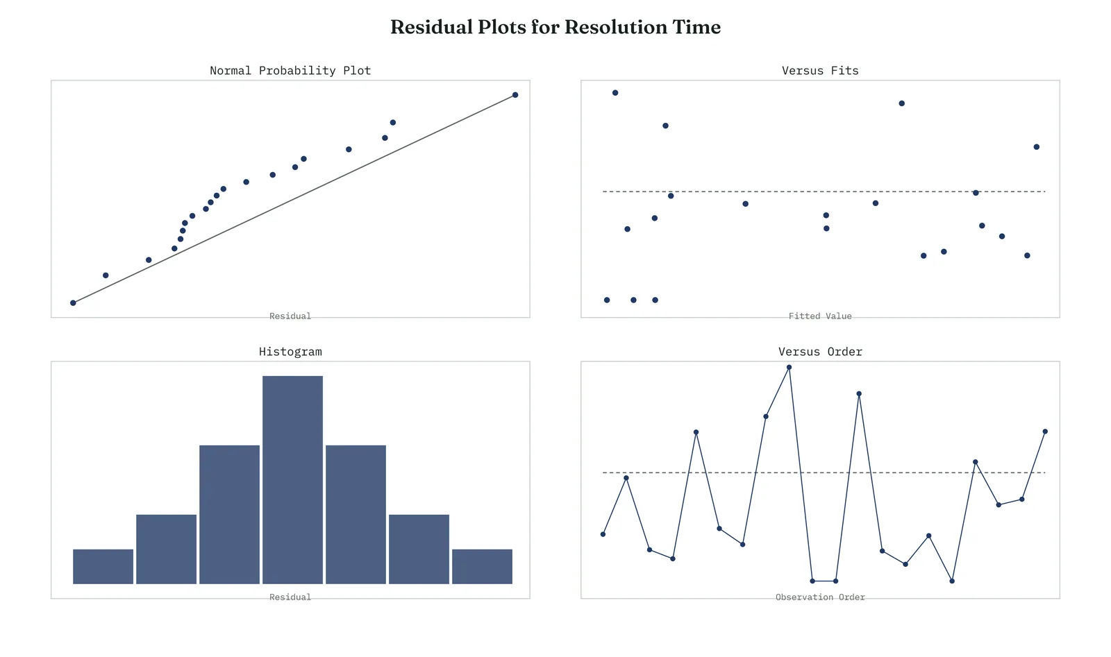
For the Crestline experiment the four plots were clean. The residuals sat on the line, scattered without pattern against the fitted values, formed a roughly symmetric histogram, and showed no trend across the run order, which confirmed that the randomisation had held and no drift had crept in. Only with the residuals checked did the team trust the effects. A model with patterned residuals can post large effects and still be wrong, so this check is never the one to skip.
Replication, and how many runs
A single run at each combination tells you the response there, but nothing about the noise around it, so you cannot judge whether an effect is larger than chance. Replication solves this by running each combination more than once, which gives a direct measure of the variation and lets the analysis separate signal from noise. Replication means repeating the whole run, resetting the factors each time. It is not the same as measuring one run twice, which captures only measurement noise and is called repetition. The distinction matters, because only true replication captures the run-to-run variation the effects must be judged against.
How many runs you need depends on how small an effect you must detect and how noisy the process is. A small effect in a noisy process needs many runs. A large effect in a clean one needs few. The formal answer comes from a power calculation, which a later part covers, but the working rule is simple. More replication buys more power to detect small effects, at a roughly linear cost in runs.
Centre points and curvature
A two-level factorial assumes the response changes in a straight line between the low and high levels of each factor. Often it does. Not always. A centre point checks it. A centre point is a run with every factor set halfway between its levels. If the response there falls on the line between the corners, the straight-line assumption holds. If it sits well above or below that line, the response is curved, and a two-level design cannot capture the bend. Adding a few centre points is cheap insurance, and when they reveal curvature, they are the signal to move to a response surface design that can model it.
Blocking, when you cannot run it all at once
Sometimes you cannot run every combination under the same conditions. The experiment spans two days, or two batches of material, or two operators, and that difference could contaminate the results. Blocking handles it. You divide the runs into blocks, each block run under uniform conditions, and arrange the design so the block-to-block difference is separated from the effects you care about. The analysis then removes the block variation before it estimates the factors, so a difference between Monday and Tuesday cannot be mistaken for a factor effect. Blocking is how you run a valid experiment when the world will not hold still long enough to run it in one sitting.
Design resolution and confounding
When you use a fractional factorial to save runs, you pay for it in confounding, and the amount is described by the resolution of the design. The higher the resolution, the more effects you can separate, and the more runs it costs. Choose the resolution to match how much you need to untangle, and always know, before you run, which effects your design has tied together.
Table 13.12. Design resolution, and what each level confounds together.
| RESOLUTION | WHAT IT CONFOUNDS |
|---|---|
| Resolution III | Main effects are confounded with two-factor interactions, so a main effect you trust may be an interaction in disguise |
| Resolution IV | Main effects are clear of two-factor interactions, but the two-factor interactions are confounded with one another |
| Resolution V | Main effects and two-factor interactions are all clear of one another, close to a full factorial |
Power, and the number of runs
Power is the chance that an experiment will detect an effect that is really there. An underpowered experiment can run cleanly and still miss a real effect, simply because it had too few runs to see it against the noise. Before you run, a power calculation tells you how many runs you need to have a good chance, usually 80% or more, of detecting an effect of the size you care about. Figure 13.103 shows the shape of it. Power rises with the number of runs, steeply at first, then levelling off.
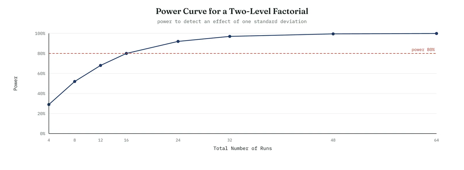
The practical use is twofold. It lets you choose the number of runs deliberately, rather than run whatever fits and hope. And it lets you read a null result honestly. If an experiment finds nothing, the power calculation tells you whether it had the power to have found something, which is the difference between the effect is not there and we could not have seen it if it were.
The sequential strategy of experimentation
Experienced practitioners rarely try to answer everything in one experiment. They run a sequence, each experiment informing the next, and this is the single most important habit in the whole method. The strategy has three stages, in Figure 13.104. First you screen, with a fractional design, to reduce a long list of candidate factors to the vital few. Then you characterise, with a full factorial on the survivors, to measure their effects and interactions cleanly. Then, if the factors are continuous and you want the best settings, you optimise, with a response surface design.
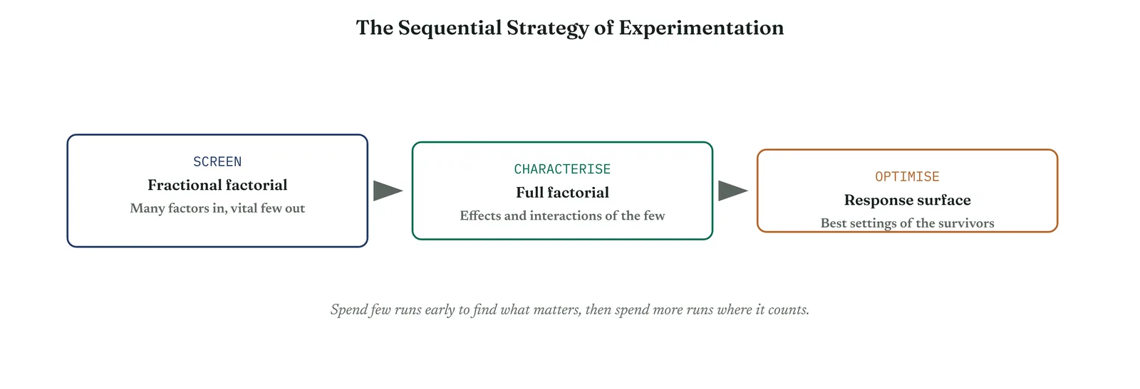
Between characterising and optimising sits a technique worth naming, steepest ascent. When a factorial shows which direction improves the response, you take a short series of runs in that direction, stepping the factors together, until the response stops improving. That points you at the region of the best settings, where a response surface design then maps the surface and finds the optimum. Figure 13.105 shows a central composite design, the common response surface design, with its factorial corners, its axial points that reach beyond them, and its centre points that measure curvature and noise.
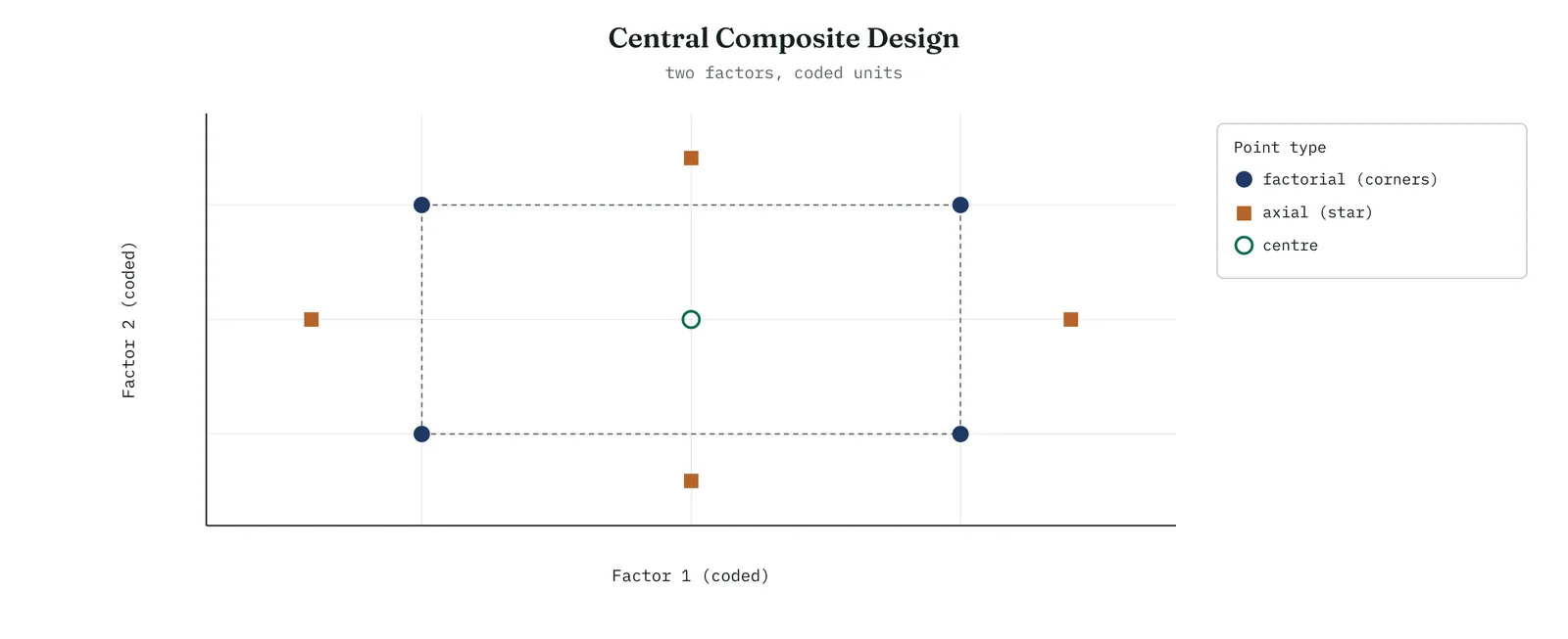
The lesson of the sequential strategy is to resist the urge to design one large, perfect experiment. A big design run before you know which factors matter spends most of its runs on factors that do not. A cheap, rough screen first tells you where to spend, and the sequence as a whole reaches a better answer with fewer total runs than any single grand experiment. Plan to run several small experiments, not one big one.
Where design of experiments earns its place
Design of experiments began in agriculture and was refined in manufacturing, but its logic applies anywhere you can change something and measure a result. The Crestline service problem is one example among many. Below are the settings where the method earns its place most often, with the kind of question it answers in each. The point is not the industry. It is that wherever several factors act at once and may interact, a designed experiment beats changing one thing at a time.
Marketing and growth
Marketing is the setting where experimentation is most alive, though it is rarely called design of experiments. An email campaign has a subject line, a send time, an offer, and a layout, and testing them one at a time wastes audience and misses how they combine. A factorial tests them together. Figure 13.106 shows a simple email campaign with three factors, where the subject line and the offer both lift the click rate and the send time does not. The same logic runs pricing tests, landing-page design, and advertising creative. What marketing often lacks is randomisation and confounding control, which is exactly what the method supplies.
Manufacturing and operations
Manufacturing is where the method was sharpened, and where it still pays best. A moulding process has temperature, pressure, hold time, and material, and the yield depends on all of them and on their interactions. A factorial finds the settings that raise yield and cut defects in a few dozen runs, where trial and error would take months. The same applies to any process with dials, chemical reactions, machining, assembly, packaging. If the process has settings you can change and an output you can measure, it can be improved by design rather than by the operator with the longest memory.
Product development and research
Developing a product means choosing among design parameters, and a designed experiment turns that choice from opinion into evidence. A food formulation balances several ingredients against taste and shelf life. A device design trades weight against strength against cost. Testing the parameters together, rather than one at a time, finds the best combination and reveals which trade-offs are real. Robust design, a branch of the method, goes further, choosing settings that hold up against the variation the user will impose, so the product performs well not only in the laboratory but in the world.
Service and the back office
The Crestline problem is the service case. Resolution time, error rates, handling time, and satisfaction all depend on factors a service can change, routing, staffing, scripts, training, and systems. Because service processes feel less controllable than machines, teams assume they cannot be experimented on, and fall back on opinion. They can. A designed experiment on a call centre, a claims process, or a back office runs the same way as one on a machine, and it settles arguments that would otherwise run for years, as it settled the headcount argument at Crestline.
Software and digital products
Software teams run experiments constantly, under the name A/B testing, but usually one change at a time. A designed experiment lets them test several features together and see the interactions that one-at-a-time testing misses, at the cost of more careful analysis. The caution is that online experiments carry their own traps, novelty effects, network effects, and users who see more than one variant, so the classical design must be adapted. But the core idea, change deliberately and measure, is the same, and the discipline of confounding and power applies just as hard.
Supply chain and logistics
Routing, inventory policy, batch size, and supplier choice interact in ways no single change reveals. A designed experiment, run on real operations or on a simulation, finds the policy that balances cost, speed, and reliability. Simulation deserves a note. When running the real process is too slow or too risky, you can run the experiment on a validated model of it, which lets you test many combinations cheaply, then confirm the best few in reality. This makes the method reach processes that could never be experimented on directly.
Agriculture, pharmaceuticals, and the origins
The method was born in agriculture, where a season is a single run and none can be wasted, which forced the discipline of getting the most from few runs. It is now central to pharmaceutical development, where designed experiments optimise formulations and processes under a regulatory scrutiny that demands exactly the kind of proof the method provides. These fields are worth knowing because they are where the technique is most mature, and their habits, blocking, replication, and rigorous confirmation, are the ones the rest of us borrow.
Policy, people, and organisations
Governments and organisations increasingly test a policy before rolling it out, running a controlled trial of an intervention against a control. A designed experiment extends this to several policy levers at once. The ethics are sharper here, because the subjects are people, so consent, fairness, and the reversibility of any harm all matter, and are covered below. But the logic holds. A pilot that changes several things at once and lacks a control cannot tell you what worked. A designed pilot can.
The common thread
Across every one of these, the same conditions make the method pay. Several factors act at once. They may interact. Changing one at a time is slow and blind. And you can change the factors deliberately and measure the result. Wherever those four hold, a designed experiment beats the alternatives, and the alternatives are usually opinion, one-at-a-time testing, or an observational study that cannot prove cause. The industry is incidental. The structure of the problem is what decides whether the tool fits.
Why so few teams use it, and how to change that
Design of experiments is the most powerful tool in this chapter and the least used. The reasons are rarely technical. They are habits, fears, and misunderstandings, and each has a plain answer. If you want to bring the method into an organisation that does not use it, you will meet these objections, so it is worth having the answers ready.
The mathematics looks hard
The most common barrier is the belief that the method demands heavy statistics. It does not, not to use it. The software does the arithmetic, the effects, the analysis of variance, the plots. What you need is not the mathematics but the thinking, choosing the factors, setting the levels, randomising, and reading the output, all of which this section has covered. Teach the thinking, let the software carry the sums, and the barrier falls.
We cannot experiment here
Many teams believe their process cannot be experimented on, because it is live, or regulated, or serves real customers. Some genuinely cannot, but far fewer than claim it. A small, blocked, reversible experiment on a slice of the process is usually possible, and a simulation is possible almost always. The belief that experimentation is impossible is itself usually untested, and testing it is the first experiment worth running.
We already have the data
Teams sitting on large datasets ask why they should run an experiment when they can analyse what they already hold. The answer is the ceiling of observation. Existing data can show associations and size them, but it cannot prove cause, because the factors in it move together and cannot be separated after the fact. When the question is which change will actually improve the outcome, only an experiment answers it. The data you have tells you where to look. The experiment tells you what to do.
The one-at-a-time habit
The instinct to change one thing at a time is deep, because it feels careful and fair. It is neither, when factors interact. Breaking the habit means showing, once, a case where two factors together beat either alone, which one-at-a-time testing could never have found. The Crestline interaction between routing and training is exactly such a case. A single clear demonstration usually does more than any amount of argument.
Fear of disrupting operations
The fear that an experiment will disrupt the business is reasonable, and the answer is to design for it. Keep the levels within safe bounds. Block for the shifts and batches you cannot control. Run a small design first. Randomise so that no single condition runs long enough to cause lasting harm. A well-designed experiment disturbs the process less than the months of uncontrolled tinkering it replaces.
No software and no skills
The last barrier is practical, no tool and no one who knows how to use it. The tools are widely available, and the skill is a short course, not a degree. The way in is to start with one small factorial, on a real problem, with whatever help you can find, and let the result make the case for the next. Capability grows on the back of one visible win, not on a training plan alone.
Getting the sponsor to say yes
Beyond the objections sits the sponsor, who must approve the runs, the disruption, and the cost. The case to a sponsor is not statistical. It is that a designed experiment answers a question the organisation has argued about for months, at a known cost, with proof rather than opinion. Frame it as a small, bounded investment that ends a dispute, name the cost in runs and time, and promise a confirmation before anything is rolled out. Sponsors fund certainty, and a designed experiment sells exactly that.
The ethics of experimenting
When the experiment touches people, customers or staff, ethics matter as much as method. Three questions guide it. Could a subject be harmed by the levels you are testing, and if so, are those levels within bounds you would accept yourself. Do the subjects need to know, and to consent, which depends on the risk and the setting. And is the experiment fair, or does it hand some people a worse experience for the sake of the study. Most service and process experiments clear these easily, because the levels are ordinary operating choices. But asking the questions is part of the method, not an afterthought, and an experiment that ignores them is a liability however clean its statistics.
Planning an experiment, step by step
The whole method comes together in a plan, and it is worth setting out as a sequence you can follow. Work through these steps in order before a single run, and record your answers as you go. The experiment is only as good as the planning behind it, and most failed experiments failed here, in the planning, not in the analysis.
Table 13.13. A planning sequence for a designed experiment, to work through before the first run.
| STEP | WHAT TO DECIDE |
|---|---|
| 1 Define the response | State the single outcome you will measure, and how, in units you can trust |
| 2 Choose the factors | List the factors you can change and might matter, and select the few you will test |
| 3 Set the levels | Fix a low and a high level for each, bold enough to move the response, safe enough to run |
| 4 Choose the design | Full factorial for a few factors, fractional to screen many, response surface to optimise |
| 5 Decide replication | Choose how many times to repeat each run, from the power you need |
| 6 Randomise and block | Randomise the run order, and block for any condition you cannot hold steady |
| 7 Run and record | Run every combination in the randomised order, and record the response and the conditions |
| 8 Analyse | Separate the real effects from noise, read the interactions, then the main effects |
| 9 Check the model | Read the residuals, and confirm the assumptions hold |
| 10 Confirm | Run fresh cases at the best settings, and check the result matches the prediction |
Notice how little of the plan is arithmetic. Nine of the ten steps are judgement, about what to measure, what to change, how far to change it, and how to run it without fooling yourself. That is the real content of the method, and it is why a practitioner who can think through this plan is worth more than one who can only drive the software. The software analyses. The plan is where the experiment is won or lost.
A second experiment, worked from start to finish
To show that the method transfers, here is a second experiment in full, from a different world. A manufacturer of moulded plastic parts ran a defect rate of about 6%, and years of adjustment by experienced operators had not shifted it. Each operator had a theory, and each theory named a different setting. The team ran a designed experiment to settle it.
They chose three factors, each a setting the machine could hold. Temperature, low or high. Pressure, low or high. Cooling time, low or high. The response was the defect rate, measured over a fixed batch at each setting. Eight combinations, a full factorial, each run three times in a randomised order, made twenty-four runs in a single afternoon.
The main effects plot, Figure 13.107, showed temperature as the dominant factor, dropping the defect rate from about 8% at the low setting to about 3% at the high. Pressure mattered moderately. Cooling time was nearly flat, which retired one operator theory on the spot.
The main effects were not the whole story. The interaction plot, Figure 13.108, showed that temperature and pressure combined. At low pressure, raising the temperature helped only a little. At high pressure, raising the temperature cut the defect rate sharply, to under 2%. The best result came from high temperature and high pressure together, a combination no operator had settled on, because each had been changing one setting at a time.
Template 13.36. the numbers behind it.
| TERM | EFFECT ON DEFECT RATE |
|---|---|
| Temperature | -5.1%, dominant |
| Pressure | -1.7%, moderate |
| Cooling time | -0.5%, none |
| Temperature x Pressure | -2.3%, real |
Result. High temperature and high pressure together took the defect rate under 2%, a third of where it began. The team confirmed it on a fresh batch and held it. The experiment took an afternoon and twenty-four runs.
Years of one-at-a-time adjustment had not found the answer, because the answer lived in a combination, and one-at-a-time testing cannot see combinations. This is the same lesson the Crestline experiment taught, in a different industry, which is the point. The method does not care whether the factors are machine settings or service choices. It cares only that you can set them and measure the result.
The family of designs
The designs used in this section are the common ones, but the family is larger, and it helps to know the members by name so you can reach for the right one. Table 13.14 lists them with the number of runs and the situation each fits. You do not need to master them all. You need to recognise which one a problem calls for, and to know that a specialist design exists when the standard ones do not fit.
Table 13.14. The family of designs, the runs each takes, and the situation it fits.
| DESIGN | RUNS | USE IT FOR |
|---|---|---|
| Full factorial | two to the power of the factors | A few factors, every effect and interaction, cleanly |
| Fractional factorial | a half, a quarter, or less | Many factors, screening for the vital few |
| Plackett-Burman | as few as twelve | Screening many factors when only main effects are wanted |
| Central composite | factorial, star and centre points | Optimising continuous factors, with curvature modelled |
| Box-Behnken | fewer than a central composite | Optimising when extreme corner settings are unsafe |
| Taguchi arrays | compact orthogonal arrays | Robust design against outside variation |
Design of experiments against the alternatives
It helps to see the method beside the alternatives it replaces, because each alternative is right in some setting and wrong in others. Table 13.15 sets them out. The point is not that a designed experiment is always best. It is that when several factors act and may interact, and you can change them and measure the result, nothing else proves as much for the runs it spends.
Table 13.15. Design of experiments beside the alternatives, and the limit of each.
| APPROACH | WHAT IT DOES | ITS LIMIT |
|---|---|---|
| One at a time | Changes one factor, holds the rest | Blind to interactions, wasteful of runs |
| A/B test | Compares one change against a control | One factor per test, misses combinations |
| Observational study | Analyses data the process produced | Shows association, cannot prove cause |
| Simulation | Runs the experiment on a model | Only as good as the model behind it |
| Designed experiment | Sets factors, runs combinations, measures | Needs the ability to change and measure |
Read across the table and the case is clear. The one-at-a-time approach and the A/B test both change too little at once. The observational study cannot reach cause. The simulation depends on a model you must trust. The designed experiment is the only one that changes several factors deliberately, sees their interactions, and proves cause, and it is available whenever you can set the factors and measure the outcome. Where you cannot, simulation is the fallback, and where the model itself is uncertain, a small real experiment validates it.
Reading the output, a full walkthrough
When you run a designed experiment in software, the output arrives as a page of tables and plots, and it helps to walk through it once in order. First comes the table of effects and coefficients, each factor and interaction with its estimated effect, its coefficient, and a p-value. Read down it for the p-values, and mark the terms below your line as real. Next comes the analysis of variance table, which gives the same verdict through F-ratios and confirms the model as a whole explains more than noise. Then the model summary, with the R-squared telling you how much of the variation the model explains, and the adjusted R-squared guarding against crediting noise.
After the numbers come the plots. The Pareto and the normal plot of the effects show which terms are real, and should agree with the p-values you marked. The main effects and interaction plots show the direction and size of each real effect, and the interaction plots are read first. The residual plots confirm the model holds. And if you asked for it, the software gives the best settings and a prediction of the response there, which is what you carry to the confirmation run. Read in that order, the page tells a single story, which terms matter, how much, in which direction, whether the model can be trusted, and what to do next. A practitioner who can walk a sponsor through that page in plain words has mastered the tool.
A fractional factorial, worked
The fractional design was described earlier as running part of the full set. It is worth seeing how it is built, because the construction is what decides what gets confounded. Take four factors, A, B, C, and D. A full factorial would need sixteen runs. A half fraction runs eight, and the whole trick is in how you choose which eight.
You start with a full factorial in three of the factors, A, B, and C, which is eight runs. Then you set the fourth factor, D, equal to the product of the other three, so on each run D takes the sign of A times B times C. This rule is the design generator, written D equals ABC, and it fills in the fourth factor without adding a single run. The price is that D is now confounded with the three-way interaction ABC, and by the same arithmetic every main effect is confounded with a three-way interaction, and every two-factor interaction with another two-factor interaction. That is a Resolution Four design.
Template 13.37. the numbers behind it.
| RUN | A | B | C | D = ABC |
|---|---|---|---|---|
| 1 | - | - | - | - |
| 2 | + | - | - | + |
| 3 | - | + | - | + |
| 4 | + | + | - | - |
| 5 | - | - | + | + |
| 6 | + | - | + | - |
| 7 | - | + | + | - |
| 8 | + | + | + | + |
Result. Eight runs cover four factors. The fourth column was not run freely, it was set to the product of the first three, which is what confounds D with the ABC interaction and halves the runs.
Reading the result, you trust the main effects, because they are confounded only with three-way interactions, which are almost always negligible. You treat the two-factor interactions with care, because each is tangled with another, and if one matters you may need a few more runs to separate them. This is the everyday trade of the fractional design, half the runs for a small and known ambiguity in the higher interactions, and in a screen it is almost always worth it.
Choosing and trusting the response
An experiment is only as good as the response it measures, and choosing that response well is the first real decision. A good response is a number, on a continuous scale where possible, because a number carries far more information than a pass-or-fail count and needs far fewer runs to move. It should be close to what you actually care about, the defect rate rather than a proxy for it, the resolution time rather than a survey score. And it should be measured the same way every run, by the same method, so that a change in the response means a change in the process and not a change in how you looked at it.
Before you trust a response, check the measurement itself. If two people measuring the same part get different numbers, or the same part measured twice reads differently, then part of every effect you see is measurement noise, not process change. This is the province of measurement systems analysis, met in the Measure phase, and it applies here with force. A designed experiment built on a shaky measure will chase the wobble in the gauge rather than the truth in the process. Fix the measure first.
When the outcome you care about is genuinely a count or a category, a defect or not, retained or lost, the experiment still runs, but you need more data at each combination to see an effect through the coarser measure, and the analysis shifts to the logistic form met in the regression section. Where you can find a continuous response that tracks the categorical one, prefer it, because it will find the answer in far fewer runs.
Turning effects into action
An experiment produces effects in coded units, and turning them into a decision takes two more steps. First, translate the effect into real units and into money. An effect of minus five days on resolution time, across the volume of complex cases, is a number of case-days saved, which converts to a cost. An effect of minus 5% on a defect rate, across annual volume, is a number of parts saved, which converts to a margin. The sponsor acts on the money, not the coded coefficient, so do the conversion for them.
Second, decide the settings, and this is where the experiment earns its keep. The best combination the experiment found becomes the recommended setting, but temper it with what the interaction plots and the response surface show about how sharp the optimum is. A flat optimum, where the response barely changes near the best point, gives you room to choose the setting on cost or convenience. A sharp optimum, where the response worsens quickly on either side, means you must hold the setting tightly, which becomes a control requirement for the next phase. The experiment does not only find the best settings. It tells you how carefully they must be held, which is half of what Control needs to know.
Case vignettes from the field
A few short cases, drawn from the kinds of problem the method solves, show its range. The numbers are illustrative, but the shapes are real.
A call centre
A call centre could not lift its first-call resolution. A factorial tested the script, the routing, and the callback policy together. Script and routing interacted, a better script helped only on calls routed to the right team, and the pair together lifted resolution by a fifth. Neither change alone had shown in the year of one-at-a-time trials before it, because the year of trials never ran the two together.
A bakery
A bakery fought inconsistent loaf height. A factorial on flour blend, proving time, and oven temperature found that proving time and temperature interacted, and that the flour blend, long blamed, did nothing at all. Fixing the two settings that mattered steadied the height and ended a running dispute with the flour supplier.
An online store
An online store tested its checkout. Rather than the usual one-at-a-time A/B tests, a factorial varied the number of steps, the guest-checkout option, and the payment choices together. The guest option and the step count interacted, fewer steps helped far more when guest checkout was on, and the combination lifted completed purchases where the single tests had stalled for months.
A hospital clinic
A clinic tried to cut patient waiting. A factorial on appointment spacing, staffing pattern, and check-in method found that the check-in method, the cheapest change of the three, carried a large effect, while extra staffing, the expensive change everyone had assumed was needed, did not. The experiment redirected the budget away from hiring and toward the front desk.
In every case the same pattern repeats. Several factors, an interaction that one-at-a-time testing had missed, and a cheap change that mattered beside an expensive one that did not. That pattern is why the method pays, and why the tool deserves a place in every improvement kit, service or industrial. It is also, once again, the Crestline story, a cheap fix that worked and an expensive one that did not, found only because the factors were tested together.
A short history, and why it matters
The method has a history worth a paragraph, because it explains the shape of the tool. It was invented in the nineteen twenties by a statistician working on agricultural trials, where a single run took a whole growing season and none could be wasted. That constraint forced the two ideas at the centre of the method, testing several factors at once to get the most from each run, and randomising to keep the season-to-season variation from forging a result. From agriculture it moved into industry after the war, where it was refined for chemical and manufacturing processes, and where response surface methods were added to optimise continuous settings. Later it became a pillar of the quality movement, and a branch of it, robust design, was developed to choose settings that hold up against the variation a product meets in use.
The history matters for two reasons. First, it tells you the method is mature, proven across a century and every kind of process, not a passing technique. Second, it explains why the discipline is so strict about randomisation, replication, and confirmation. Those rules were not invented in comfort. They were forced by settings where a wasted run cost a season or a batch, and they carry that hard-won caution into every experiment you run, however cheap your runs may now be.
Common questions, answered
A few questions come up every time the method is taught, and answering them plainly removes most of the hesitation that keeps teams from using it.
How many runs do I need?
Enough to see the smallest effect you care about through the noise. For a first factorial with three or four factors, eight to sixteen runs, replicated once or twice, is a common starting point. The power calculation gives the exact answer, but the honest rule is to run a small design first, learn from it, and run more only if it leaves you unsure.
What if I can only change one factor at a time in practice?
Some processes truly allow only one change between settled periods. You can still run a factorial across those periods, treating each as a run, as long as you randomise the order and block for anything that drifts between them. What you cannot do is change one factor, judge it, and move on, because that is one-at-a-time testing and it is blind to interactions.
What if a factor cannot be set precisely?
Set it as close to the target level as you can and record what you actually achieved. The analysis can use the real levels rather than the intended ones. A factor you can nudge but not fix exactly is still testable, as long as you measure where it landed on each run.
Can I add a factor once the experiment has started?
No. Adding a factor partway breaks the balance of the design and confounds the new factor with the run order. If you realise a factor is missing, finish the current design, then run a new one that includes it. Plan the factors fully before the first run.
What if the confirmation run fails?
It is telling you something real, so do not ignore it. Either the model missed an interaction, or a factor you did not control shifted between the experiment and the confirmation, or the best settings were misread. Investigate before you roll anything out. A failed confirmation caught in a handful of runs has just saved you from a failed rollout.
How many levels should each factor have?
Two, to start. A two-level factorial finds which factors matter and how they interact, cheaply. Add a third level, or move to a response surface, only when centre points show curvature or when you are optimising continuous settings. Starting with more than two levels spends runs before you know they are warranted.
What about factors I cannot control but that affect the result?
These are noise factors, and you handle them in one of three ways. Hold them constant if you can. Block for them if you can group runs by their level. Or randomise across them, so their variation spreads evenly and does not attach to a factor. Robust design goes further and chooses settings that perform well across the noise, but for a first experiment, blocking and randomisation are enough.
Do I need special software?
You need software to build the design and analyse it, but not an expensive one. Several tools do it, and the analysis is standard. What you do not need is to compute the effects by hand, though seeing it done once, as earlier in this section, builds the confidence to trust what the software returns.
How is this different from A/B testing?
An A/B test is a designed experiment with one factor at two levels. It is a special case, not a different thing. The method here generalises it to several factors at once, which lets you see interactions an A/B test cannot, and to fractional designs, which let you screen many factors together. If you run A/B tests, you already run designed experiments. This extends what you can ask of them.
What if two factors cannot both be set high at once?
That is a constraint, and the design must respect it. You drop the forbidden combinations and use a design that fits the allowed region, which the software can build. The analysis is a little more involved, but the principle holds. Never run a combination that is unsafe or impossible just to complete a tidy design.
The method on one page
The whole method, in brief, for the wall above your desk. Decide the one response you will measure, and check the measure is sound. Choose the few factors worth testing, and set a low and a high level for each. Pick a full factorial for a few factors, a fractional design to screen many. Randomise the run order, block for what you cannot hold, and replicate for power. Run every combination, and record the response. Read the real effects from the Pareto and the normal plot, the interactions before the main effects, and check the residuals. Find the best settings, and confirm them on fresh cases before you commit. Then translate the result into money and into settings for Control to hold. That is the whole of it, and every step is judgement except the arithmetic, which the software carries.
Running the experiment on the floor
Planning an experiment is one thing, running it on a live floor is another, and a few practical habits separate a clean run from a wasted one. Before the runs, prepare a data sheet with a row for every run in its randomised order, a column for each factor set to its level, and a column for the response, so that nothing is recorded from memory. Assign one person to own the run order and to hold it, because the most common floor failure is someone running the easy combinations first and the awkward ones last, which quietly reintroduces the very order effect that randomisation was meant to remove.
During the runs, hold the conditions you are not testing as steady as you can, and record any that move despite you, a change of shift, a new batch of material, a machine reset, because these are the things you will block or check for if the residuals later look wrong. Reset the factors fully between runs, even when the next run shares a level, so that each run is a genuine setting and not a leftover. And measure the response the same way every time, by the same method and ideally the same person, so that measurement drift does not masquerade as an effect.
After the runs, and before any analysis, look at the raw responses in run order. A drift across the sheet, or a wild value, is easier to catch here than to diagnose later. A single impossible reading is usually a recording error worth chasing down before it distorts an effect. Only once the sheet looks sound do you hand it to the software. The discipline on the floor is what makes the analysis trustworthy, and no amount of clever analysis rescues a run that was recorded carelessly.
Sizing the gain, a worked calculation
A sponsor acts on money, so the last calculation an experiment needs is the one that turns an effect into a number the business recognises. Take the Crestline result. The experiment cut the resolution time of complex cases from about eleven days to about four, a saving of seven days a case. The firm handled about forty complex cases a week, so the weekly saving was about two hundred and eighty case-days. If a case held open costs the firm a known amount per day, in staff attention, in customer goodwill, and in the risk of escalation, that figure converts directly to money.
Do the same for the cost side. The fix, routing complex cases to trained handlers, cost the training time of a few handlers and a change to the routing rule, both one-off or small. Set the recurring saving against the one-off cost and the payback is a matter of weeks, not years, which is the number that moves a sponsor. Notice that the experiment supplied the effect, seven days a case, but the sizing needed one input the experiment did not give, the cost of a case-day, which comes from the business. The practitioner joins the two. An effect without a cost is a curiosity. An effect priced against the business is a decision.
Why interactions are the heart of the method
If the method had only one justification, it would be interactions. Everything else it does, estimating effects, screening factors, optimising settings, could in principle be approached other ways. The one thing no observational study and no one-at-a-time test can reliably deliver is a clean measure of how factors combine, and interactions are where the real behaviour of a process usually hides. A factor that looks weak on its own can be powerful in the right combination, and a factor that looks strong can be irrelevant once another is set correctly.
This is why the interaction plot is read before the main effects, and why the whole design is built to set factors high together. Consider what a main effect actually averages. The main effect of training at Crestline averaged its small benefit when cases were not routed with its large benefit when they were, producing a middling number that described neither situation. Only the interaction told the true story, that training is close to worthless in the wrong queue and valuable in the right one. The recommendation, route and train together, came from the interaction, not from either main effect.
The practical lesson is to expect interactions, not to be surprised by them. In most real processes the important factors interact, because processes are systems and their parts affect one another. A method that assumes factors act independently, as one-at-a-time testing does, is assuming away the very structure that makes the process hard. Design of experiments assumes the opposite, that factors combine, and builds to measure it. That assumption is why it works where simpler approaches fail.
Defending the experiment to a sceptic
Sooner or later someone challenges the experiment, and the strength of the method is that every challenge has a clean answer built into how it was run. If they say the result was chance, you point to the p-values and to the confirmation run on fresh cases. If they say something else caused the change, you point to the randomisation, which severed every other factor from the one you set. If they say the finding will not hold in practice, you point to the confirmation, which already showed it holding on cases the experiment had not seen. If they say the experiment missed a factor, you agree that it tested only the factors named, and offer to run another that includes theirs.
This is the quiet strength of a designed experiment as evidence. It is not that it cannot be questioned, but that its answers to the obvious questions were built in before the first run, by the randomising, the replication, the reality check, and the confirmation. An observational study has no such answers, which is why its findings are argued over for years. A well-run experiment ends the argument, not because people trust the practitioner, but because the design closed the escapes in advance. In a hard meeting, that is worth more than any amount of eloquence.
The three principles that make it work
Underneath the designs and the plots sit three principles, and every rule in this section descends from one of them. They are worth naming, because once you understand them you can adapt the method to a situation no template covers.
Randomisation
Randomisation is running the combinations in a random order. Its job is to protect against anything that changes over time, or that you did not think to control. By scattering the runs, it spreads any such influence evenly across the factors, so none of them absorbs it as a false effect. Randomisation is what lets you claim cause, because it breaks the link between your factors and every lurking variable you did not measure. It is the first principle, and the one never to skip.
Replication
Replication is running each combination more than once. Its job is to measure the noise, so that you can judge whether an effect is larger than the ordinary run-to-run variation. Without replication you have no ruler against which to measure an effect, and a difference of any size could be chance. Replication also sharpens the estimates, because an average of several runs is steadier than a single one. It is the second principle, and it is what turns a set of readings into evidence.
Local control, or blocking
Local control, usually called blocking, is grouping the runs that share a condition you cannot hold constant, and removing that condition from the effects in the analysis. Its job is to keep a known nuisance, a shift, a batch, a day, from clouding the result. Where randomisation defends against the unknown, blocking defends against the known but uncontrollable. It is the third principle, and it is what lets a valid experiment run in an imperfect world.
Every design in this section is these three principles arranged for a situation. A full factorial is a complete structure, replicated and run in random order. A blocked design adds local control. A fractional design trades some of the structure for fewer runs. Learn the three principles and the designs stop being templates to memorise and become tools you can shape to the problem in front of you.
When not to use it
A guide that only sells its tool is not a guide, so it is worth being clear about when a designed experiment is the wrong choice. Do not reach for it when a single, simple question can be answered by observation you already hold, because an experiment then spends runs to prove what the data already shows. Do not reach for it when you genuinely cannot change the factors, because the method needs you to set them, and a factor you can only watch belongs to regression, not to design. Do not reach for it when the cost or risk of a run is so high that even a small design is unaffordable, unless a simulation can stand in for the real process.
And do not reach for the full machinery when a single factor is truly the only thing in question and it interacts with nothing, because then a simple before-and-after comparison, properly controlled, will do. These cases are rarer than they seem, because factors usually do interact, but they exist. The skill is not to run an experiment for its own sake. It is to recognise the situation the method fits, several changeable factors that may combine, and to use a simpler approach when that situation does not hold. A practitioner who runs a designed experiment on a one-factor question has misjudged the tool as surely as one who changes six factors by opinion.
From the experiment to Control
An experiment does not end the improvement, it feeds the phases that follow, and knowing what it hands forward makes it more useful. To Improve it gives the settings that produce the gain, ready to be built into the process. To Control it gives two things a control plan needs. First, the factors that must be held steady, because the experiment proved they drive the outcome, so they become the things to monitor. Second, how tightly each must be held, which the shape of the response near the optimum tells you, a sharp optimum demanding a tight tolerance, a flat one allowing a looser one.
This is a handoff worth making explicit, because a gain that is proven and then not held is a gain lost. The experiment that found the best settings for the moulding process also identified temperature and pressure as the factors to monitor, and showed that temperature had to be held closely while pressure had a little room. Those two findings seed the control plan directly. The experiment, in other words, does not only improve the process. It tells the next phase exactly what to watch and how closely, which is why a well-run experiment is worth far more than the single answer it returns.
A note on more than two levels
This section has used two-level factors throughout, low and high, because two levels are where you start and where most of the value lies. But factors can have more levels, and two situations call for them. When a factor is a category with several options, three suppliers, four scripts, five machines, it has as many levels as options, and a general factorial handles it, at the cost of more runs. When a continuous factor may curve, a third level in the middle lets you detect and model the curve, which is the centre-point and response-surface territory met earlier.
The caution is that levels multiply runs quickly. Three factors at three levels each is twenty-seven combinations, against eight for two levels, so you add levels only when you need them. The working practice is to start with two levels to find which factors matter and how they interact, then add levels to the few that survive, and only where a category or a curve requires it. As with everything in the method, spend your runs where they earn their place, and not before.
A worked effects table, read line by line
The heart of the software output is the table of effects and coefficients, and reading one line by line removes the last of the mystery. Template 13.38 shows it for the Crestline experiment. Each row is a term, a factor or an interaction. The effect column is the change in the response from the low to the high level. The coefficient is half the effect, the number that goes into the model. The column marked T is the effect divided by its standard error, how many standard errors the effect stands away from zero. And the p column is the chance of seeing an effect that large if the true effect were zero.
Template 13.38. the numbers behind it.
| TERM | EFFECT | COEF | T | p |
|---|---|---|---|---|
| Routing | -5.5 | -2.75 | -12.6 | 0.000 |
| Training | -2.7 | -1.35 | -6.3 | 0.000 |
| Routing x Training | -2.0 | -1.00 | -4.5 | 0.001 |
| Staffing | -0.2 | -0.10 | -0.5 | 0.612 |
Result. Read the p column first. Routing, training and their interaction read zero to three places, far below any reasonable line, so all three are real. Staffing reads 0.6, well above the line, so it is noise. Then read the effect column for size and direction. In four lines the table gives the whole result.
The effect column then tells you size and direction. Routing cuts five and a half days, training two and a half, the interaction two more, all improvements. Staffing moves nothing. This one table is where the Pareto, the normal plot, and the main effects plot all come from, each a different picture of these same numbers. Learn to read this table in plain words and you can read any designed experiment, and explain it to anyone.
Common mistakes, and how they show up
Experiments fail in recognisable ways, and learning the symptoms lets you catch a problem before it reaches a sponsor. A few of the common ones, with how they appear and what they mean.
An effect that will not replicate
You find a large effect, act on it, and it vanishes when you try again. The usual cause is that the first experiment was not randomised, so a drift over time was read as a factor, or that it was too small to separate the effect from noise and you acted on a lucky reading. The fix is randomisation and replication, the first two principles, which is exactly why they are principles.
A main effect that misleads
You quote the average effect of a factor and the process does not behave as promised. The usual cause is an unread interaction, so the average described no real condition. The symptom is a main effect that looks clear while the interaction plot shows diverging lines. The fix is to read the interaction first, always, and to let it qualify every main effect beneath it.
A model that fits but predicts badly
The analysis looks clean, the effects are significant, and yet the confirmation run misses. The usual cause is curvature the two-level design could not see, or a factor that shifted between the experiment and the confirmation. The symptom often shows in the residuals, a curve against the fitted values, or in centre points that sit off the line. The fix is centre points to detect curvature and a response surface to model it.
An experiment that finds nothing
Every effect reads as noise, and you conclude the factors do not matter. Sometimes that is true, but check the power first. An underpowered experiment finds nothing because it was too small to see anything, not because there was nothing there. The symptom is wide standard errors and few runs. The fix is to size the experiment before running it, so that a null result means the effect is absent, not merely invisible.
In every case the diagnosis runs the same way. A surprising or fragile result points back to a principle that was skipped, randomisation, replication, reading the interaction, checking the residuals, or sizing for power. The method is self-correcting in this sense. When it fails, it usually fails loudly, and the failure names the principle you neglected. That is why the principles are worth learning as principles, and not merely as steps to follow.
The economics of experimentation
A designed experiment costs runs, and runs cost time and money, so it is fair to ask when the method pays. The answer is a simple comparison. On one side sits the cost of the experiment, the number of runs times the cost of a run, plus the planning time. On the other sits the value of the answer, which is the gain from getting the settings right, multiplied by how long that gain persists, less what you would have spent finding the answer another way. For most real problems the value dwarfs the cost, because the experiment is small, a few dozen runs, and the gain runs for years.
The comparison also tells you when not to run one. If the process runs cheaply and a wrong setting costs little, trial and error may be cheaper than a designed experiment, and that is a fair choice. If a single run is ruinously expensive, a simulation may be the only affordable route. But the common case, a process where settings matter, runs are affordable, and the current settings were never proven, is exactly where the method pays best, and it is far more common than teams assume. The reason so few experiments are run is rarely that they would not pay. It is that no one costed the alternative, months of tinkering, against the price of a clean answer.
Building the capability in a team
A single experiment is a project. A team that can run experiments is a capability, and building that capability follows a pattern worth knowing. It starts with one project, on a real problem that matters, run by someone learning the method with support. The first experiment should be small and likely to succeed, a clean factorial on a problem where a result is probable, because the point of the first one is to produce a visible win that makes the case for the next. A first experiment that is too ambitious and fails teaches the organisation the wrong lesson.
From that first win, the capability grows by apprenticeship more than by training. The person who ran the first experiment helps with the second, and mentors the third, and within a few projects a team has several people who can plan, run, and read an experiment without help. The tools and the statistics can be taught in a short course, but the judgement, choosing factors, setting levels, reading interactions, cannot, and it grows only by doing. An organisation that wants the capability should therefore plan for a sequence of real projects with mentoring, not a training programme alone, because the method is learned in the running of it.
Where this tool sits in the movement
It is worth closing by placing the tool in the movement it belongs to. Analyse spends its length narrowing from a broad problem to a proven cause. The early movements map the process and surface the candidates. The middle movement tests those candidates against the data the process produced, sizing them with regression and separating them with analysis of variance. Those tools take the analysis as far as observed data can, which is to a strong and tested association, but not quite to proof. The designed experiment closes the last gap. By setting the suspected driver on purpose and watching the outcome follow, it turns the strongest association observation can offer into a cause established by intervention.
That is why it caps the movement. Everything before it pointed at the driver. This tool proves it, and in proving it, hands the project a settled cause and a set of settings ready to build on. When the experiment confirms what the observational tools suggested, as it did at Crestline, the analysis is complete and the argument is over. The project leaves Analyse not with a likely story but with a proven one, and with the exact settings the next phase needs. That is the strongest close Analyse can reach, and it is the reason the tool earns its place at the end of the chapter.
A pre-run checklist
Before the first run, a short checklist catches the errors that are cheap to fix now and expensive to fix later. Run through Table 13.16 and do not start until every line has an answer.
Table 13.16. A pre-run checklist, to clear before the first combination.
| CHECK | ASK |
|---|---|
| Response | Is the response a number I can measure the same way every time? |
| Measurement | Have I confirmed the measure is repeatable, and not adding its own noise? |
| Factors | Have I listed every factor that might matter, and chosen the few to test? |
| Levels | Are the low and high levels bold enough to move the response and safe to run? |
| Design | Does the design fit the number of factors and the runs I can afford? |
| Randomisation | Is the run order randomised, and does one person own it? |
| Blocking | Have I blocked for any condition I cannot hold steady? |
| Replication | Have I enough replication for the power I need? |
| Data sheet | Is there a sheet with every run, its levels, and a place for the response? |
| Confirmation | Have I planned the confirmation run before I begin? |
None of these is difficult, and every one of them is a place experiments fail. The checklist is the cheapest insurance in the method, a few minutes against a wasted set of runs. Experienced practitioners run it every time, not because they forget, but because the one time they skip it is the time it would have caught something.
The experiment as the turning point of a project
It is worth stepping back to see what the experiment does to a project as a whole. Before it, the project has a strong case and an open argument. The measurements are in, the analysis points to a driver, but the sponsor can still ask whether the analysis is right, and the owner of the disputed factor can still defend it. The project is persuasive but not settled. The experiment settles it. After a clean, confirmed experiment there is no argument left to have, because the factor was set on purpose and the outcome followed, and everyone in the room saw the confirmation land on fresh cases.
That is why the experiment is so often the turning point. At Crestline, the months of argument about headcount ended not with the regression or the analysis of variance, strong as they were, but with the experiment that added staff on purpose and watched nothing happen, while routing and training halved the time. The argument had survived every observational finding. It did not survive the trial. A project that reaches this point has done the hard work of Analyse, and it crosses into Improve carrying not a theory to test but a proven cause and a set of settings to build. That is the difference the tool makes, and it is why it is worth the runs it costs.
Stage 4. Reading the result
Reading the result
Three readings settle what a designed experiment is telling you.
| STRONG | The factors and the design were fixed before any run. The order was randomised. The real effects were separated from noise with a Pareto and a normal plot. The interactions were read before the main effects. And the chosen settings were confirmed on fresh cases. |
| WEAK | Factors were tested one at a time, or the combinations were run in a fixed order, or a main effect was read while an interaction overturned it, or the model was trusted without a confirmation run. |
| THE TELL | A designed experiment proves a factor by setting it deliberately and measuring the response. When a factor added on purpose produces no effect while another halves the outcome, the question is settled. |
Four cautions apply. Randomise the run order, because a fixed order lets a drift over time be read as a factor, and no later analysis can remove it. Check which effects are real, because a small experiment always gives some factors a little movement, and the Pareto and the normal plot are what prevent you acting on noise. Read the interaction before the main effects, because it can change what a main effect means, so a main effect quoted over a real interaction misleads. And confirm the settings, because the recommendation is a prediction until fresh cases prove it, and the confirmation run is the step not to skip.
Stage 5. Four firms, four moves
Four firms, four moves
The four grounds from Chapter 1 change how far you take a designed experiment, which design you can defend, and whether the firm will act on an interaction. The simplest form, a small two-factor trial, suits any ground willing to plan. The fuller forms suit only firms that can carry them. The ground decides how much of the method to bring.
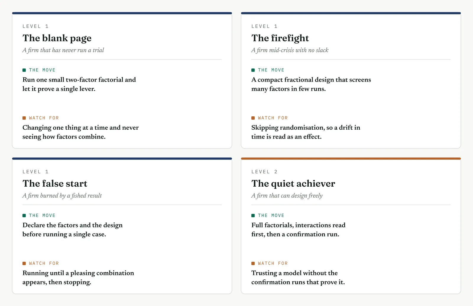
The blank page LEVEL 1
This firm has never run a controlled trial, and the idea that a cause can be proven by setting it deliberately is new to it. Begin with the smallest real experiment, two factors at two levels, four runs, and let it prove a single lever cleanly. Show the cube plot and the main effects plot, and let the firm see the difference between changing things by opinion and changing them by design. Do not move to three factors, or to a fraction, until the first small trial has been understood. The value here is not the sophistication of the design. It is the firm learning, once, that a cause can be proven rather than argued, and that randomising the run order is what makes the proof hold.
The firefight LEVEL 1
This firm has an urgent problem and little patience, and it will act on the first plausible answer. A designed experiment can seem slow, so keep it small and quick, a compact factorial run inside the time the situation allows, and use a fractional screen when the suspected factors are many. The step that cannot be cut is randomisation, because a firefight is exactly the setting in which conditions drift, queues lengthen and staff tire, and an unrandomised trial will read that drift as a result. A small, randomised, confirmed experiment that settles the real lever now is worth more than a full design the firefight will not wait for.
The false start LEVEL 1
This firm saw a past effort change several things at once, claim a result it could not prove, and lose the gain within a quarter. It now trusts no experiment. The requirement here is proof in the open. Declare the factors and the design before any run, so nothing appears chosen afterward. Randomise where the firm can see it done. Show the Pareto and the normal plot, so the real effects and the noise are visible to all. And confirm the result on fresh cases, because a firm that was given an unproven claim will accept a gain measured on new work sooner than a chart. The experiment that clears the very factor the firm was told to fund, as this one cleared staffing, is the most persuasive result you can present.
The quiet achiever LEVEL 2
This firm can design any experiment and has the discipline to run it, which makes its errors the subtle ones. It reaches for an elaborate design when a clean one would answer the question. It confounds an effect it later needs, because the fraction saved a few runs. It reads a clear main effect and skips the interaction, or trusts a clean model and skips the confirmation, because the analysis looks too good to question. Hold it to the plain sequence, the smallest design that answers the question, the interaction read before the main effects, and the confirmation run taken every time. What you add here is not method, which the firm has, but the restraint to keep the design as simple as the question requires, and the discipline to confirm what appears certain.
Stage 6. Where it breaks
Where it breaks
1. Do not test one factor at a time. Testing a single factor while holding the others fixed cannot reveal interactions, and it gathers less information per run. Test the factors together in a factorial.
2. Do not skip randomising the run order. A fixed run order lets a drift over time be absorbed into a factor effect. Randomise the order, so that time cannot be mistaken for a cause.
3. Do not read a main effect over an interaction. When two factors interact, the average effect of one may describe none of the conditions you ran. Read the interaction first, and interpret the main effects in light of it.
4. Do not treat a large effect as a proven one. A large estimate can still be noise in a small experiment. Use the normal plot and the Pareto to confirm an effect is real before acting on its size.
5. Do not test more factors than the runs support. Too many factors for the available runs confounds their effects, so they cannot be told apart. Screen first, then study the factors that survive.
6. Do not skip the confirmation run. The experiment predicts a result at settings you may not have run directly. Confirm those settings on fresh cases before committing to the gain.
7. Do not run an experiment you cannot control. If conditions vary freely during the runs, the design cannot separate the signal from the disturbance. Hold the process steady, or block for the factor you cannot hold.
8. Do not extrapolate beyond the levels tested. A factorial describes the response between the levels you set, not beyond them. Predictions outside that range are not supported by the experiment.
9. Do not omit replication. A single run at each combination gives no measure of the noise. Replicate where possible, so each effect can be judged against the variation around it.
10. Do not treat a screening design as final. A fractional design identifies the factors worth studying, it does not describe them fully. Follow a screen with a fuller design on the factors that matter.
11. Do not change the levels partway through. If you widen or shift a factor level once the runs have begun, the design is broken and the effects are no longer clean. Fix the levels before you start, and hold them.
12. Do not analyse before the runs are complete. Reading early results and stopping when they please you is the experimental form of fishing. Run the full design, then analyse it.
13. Do not let a factor track the run order. Running all the low settings first and the high settings later ties the factor to time. Randomise, so the two cannot be confused.
14. Do not ignore a curved response. When centre points show curvature, a two-level design cannot model it. Move to a response surface rather than force a straight line through a bend.
15. Do not measure the response loosely. A noisy or inconsistent measure hides real effects behind measurement variation. Fix how you measure before you run a single combination.
16. Do not roll out before the confirmation holds. If the confirmation run misses the prediction, something is wrong with the model or the settings. Find it before you commit, not after.
Stage 7. At the gate
At the gate
What it lets you defend. The sponsor asks the strongest form of the question. Not whether staffing correlates with delay, which the earlier tools answered, but whether adding people would in fact improve the outcome. The experiment answers it directly, because that is what it tested. On half the runs, chosen at random, an extra person was added to the desk, and on the other half none was. Adding the person changed resolution time by about a fifth of a day, an effect both plots placed within the noise. Routing complex cases to trained handlers reduced the time from about eleven days to about four, confirmed on twelve fresh cases. This is the strongest close the phase can give the headcount theory, because the theory was not dismissed. It was tested directly, given its own factor in a controlled trial, and it produced no effect.
What it feeds. The experiment gives the Improve phase a set of exact settings proven to produce the gain, routing complex cases to trained handlers, with a confirmed target of about four days. It gives the Control phase the factors to hold steady once set, the routing rule and the training standard, so that the gain does not erode. And it gives the gate a cause established by a controlled trial rather than an association drawn from observation, which is the difference between believing a fix will work and having shown that it does. The driver the movement pointed to is confirmed, and the project can close Analyse and move to building the fix.
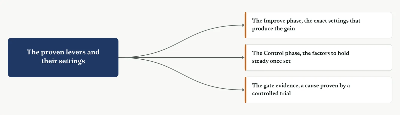
13 · ANALYSE MOVEMENT FOUR · CONFIRM THE DRIVER AND CLOSE
13.3.14 Reliability and the Weibull analysis
Suggested ISO 13053
Purpose. Reliability analysis is the tool for understanding how a time-to-event behaves, whether the event is a part failing or a case resolving. Instead of summarising the durations with an average, you fit a distribution to them, usually the Weibull, and read the shape of the risk over time. From it you learn the chance the event has happened by a given day, and whether the rate of the event is rising, falling, or steady. Use it when the thing you care about is a time until something happens, and an average hides more than it shows.
Stage 1. The trigger
The trigger
Use a reliability analysis when your data is a set of times until something happens, and you need to understand the pattern of those times rather than their average. A time-to-event is a common and awkward kind of data. Resolution times, times between failures, times until a customer leaves, times to recover. It is awkward because the average of such times is nearly always misleading. The durations are skewed, so a few long ones pull the mean above the typical case, and some of the events have not happened yet, cases still open, parts still running, which an average cannot handle at all.
Those unfinished cases are the first thing this tool handles that a simple average cannot. A case still open when you look is a censored observation. You do not know its final duration, only that it is longer than the age it has reached so far. Dropping it would throw away the very cases that matter most, the long ones, and would bias the result toward the quick ones. Reliability analysis keeps them, using what they tell you, that the duration exceeds a known figure, without pretending to know its exact value.
The tool fits a distribution to the durations, and the usual choice is the Weibull, because it can take many shapes and describes time-to-event data well. From the fit you read two things a mean cannot give you. The whole distribution, so you can state the chance a case is resolved by any day you choose. And the shape of the risk over time, whether the rate at which cases resolve is rising, steady, or falling, which turns out to name the mechanism behind the delay.
That shape is carried in a single number, the shape parameter, and it is the heart of the method. A shape below one means the rate falls over time, so the longer a case has been open the less likely it is to resolve soon. A shape near one means the rate is steady, so resolution is equally likely at any age. A shape above one means the rate rises, so cases become more likely to resolve as they age. These three patterns are the three regions of the bathtub curve, and which one you are in tells you what kind of problem you have.
Stage 2. The build
The build
Frame the event and start the clock. Define the event precisely, the moment a case counts as resolved, and the moment its clock starts. A duration is only as clean as the two events that bound it.
Keep the still-open cases as censored. Do not drop the cases that have not yet resolved. Record each as censored at its current age, so the long tail is not thrown away with them.
Fit a distribution, usually the Weibull. Fit the Weibull to the durations, and check the fit on the probability plot before you trust it. A distribution that does not fit reads a false shape.
Read the shape to name the pattern. Read the shape parameter. Below one is a falling rate, near one is steady, above one is rising. The shape names the mechanism behind the delay.
Read the survival and hazard curves. Read the survival curve for the chance a case is still open at each day, and the hazard curve for how the rate changes as a case ages.
Compare the pattern across groups. Fit the distribution separately by group, by desk or by complexity, and see whether the pattern differs. A different shape points to a different mechanism.
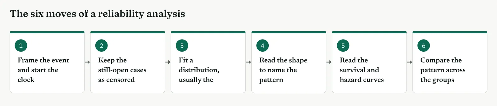
Which view you read depends on the question you are asking. To check that a distribution fits, read the probability plot. To name the pattern, read the shape parameter. To state the chance a case is still open at a given day, read the survival curve. To see how the rate changes as a case ages, read the hazard curve. To compare groups, fit each separately and lay the survival curves side by side. Figure 13.110 pairs each question with its view.
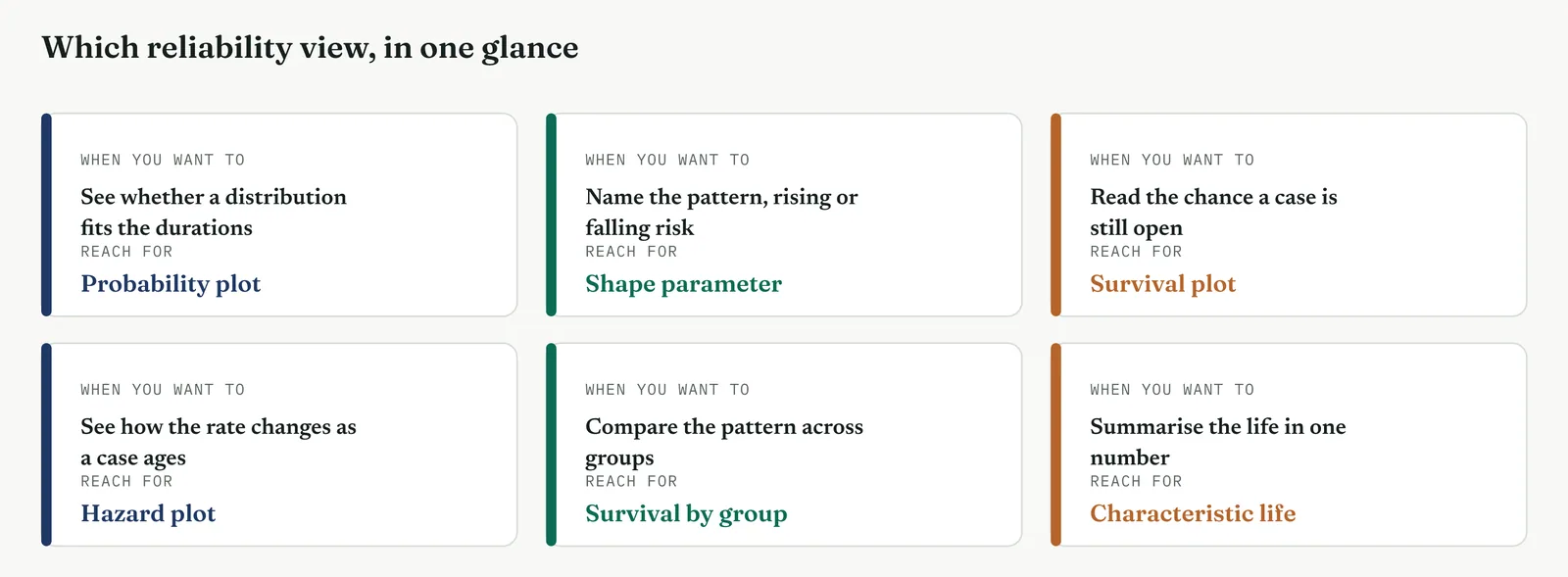
Table 13.17. The shape parameter, the pattern of the rate, and what each usually means.
| SHAPE | THE RATE | WHAT IT USUALLY MEANS |
|---|---|---|
| Below one | Falls as the case ages | Cases stall, they get stuck and forgotten |
| Near one | Steady at any age | Cases resolve at random, a queue or a capacity limit |
| Above one | Rises as the case ages | Cases resolve against a schedule or a deadline |
| TIP Never drop the cases that are still open. They are the longest cases you have, and they carry the tail the whole analysis is about. Recorded as censored at their current age, they strengthen the fit. Dropped, they bias every result toward the quick cases and hide the very problem you are looking for. The handling of censored cases is the discipline that separates a reliability analysis from an average of the cases that happened to finish. |
Stage 3. Crestline on the floor
Crestline on the floor
The measure and the earlier analysis had shown that complex cases ran long, with a median around six days and a tail stretching past a fortnight. What none of it had shown was the shape of that tail, whether the long cases were simply waiting in a queue for a free handler, or stalling, stuck and forgotten. The two look the same in an average, and they call for opposite fixes. A reliability analysis told them apart. Each section below states what part of the method it covers, when to use it, and how it ran on the floor.
SECTION 1
The time-to-event, and the cases still open
What it is
A time-to-event is the duration from a defined start to a defined event. For Crestline it is the days from a case opening to the case resolving. The awkwardness is that at any moment some cases have not resolved yet, and these are censored, known only to exceed their current age. Reliability analysis is the branch of the method built to handle durations with censored cases in them, which is exactly what a service backlog is.
When to use it
Use it whenever the outcome you care about is a duration and some of those durations are unfinished, or the finished ones are skewed enough that an average misleads. That covers most backlogs, most failure data, and most times-to-event in a service. When every case is finished and the durations are symmetric, a simple summary will do. When they are not, which is the common case, this tool is the honest one.
The Crestline run
The team pulled the fifty-eight sampled cases and, crucially, kept the ones still open, recording each as censored at its age on the day of the pull. Nine of the fifty-eight were still open, several of them well past a fortnight. Averaging the forty-nine finished cases would have reported a tidy figure and buried the nine that were the whole problem. Keeping them as censored is what let the analysis see the tail for what it was.
Across the four firms
The blank page. For a firm new to this, the one idea to land is that an unfinished case is data, not a gap. Teach it to record open cases as censored, and half the value of the method is already in reach.
The firefight. A firefight is tempted to analyse only the finished cases, because they are to hand. That is exactly the bias to avoid, because the unfinished cases are the crisis. Keep them in.
The false start. A firm burned by a tidy average that hid a tail will trust this tool once it sees the open cases kept in the open, not quietly dropped to make the number look better.
The quiet achiever. A capable firm knows about censoring, and its risk is the subtler kind, censoring that is not random, where the open cases differ systematically from the closed ones. Check that before trusting the fit.
SECTION 2
Fitting the distribution, and the probability plot
What it is
Fitting a distribution means finding the Weibull that best describes the durations, which is summarised by two numbers, a shape and a scale. The probability plot is how you check the fit. It plots the durations on axes chosen so that a good Weibull fit falls on a straight line. Points that hug the line confirm the Weibull describes the data. Points that bend away from it warn you the distribution is wrong, and that any shape you read from it will mislead.
When to use it
Fit and check before you read anything else, because every later reading depends on the fit being sound. The histogram with the fitted curve, in Figure 13.111, is the first look, showing the shape of the durations and the curve laid over them. The probability plot, in Figure 13.112, is the formal check. Read them together, and only once the points sit on the line do you trust the shape and scale the fit reports.
The Crestline run
The histogram showed the familiar shape of a service backlog, a mass of quick cases and a long thin tail of slow ones. The fitted Weibull followed it closely. The probability plot confirmed it, the points sitting along the line across the full range, including the tail, so the Weibull was a fair description. The fit reported a shape of about eight tenths and a scale, the characteristic life, of about eight and a half days. The shape below one was the finding, and the probability plot was what let the team trust it.
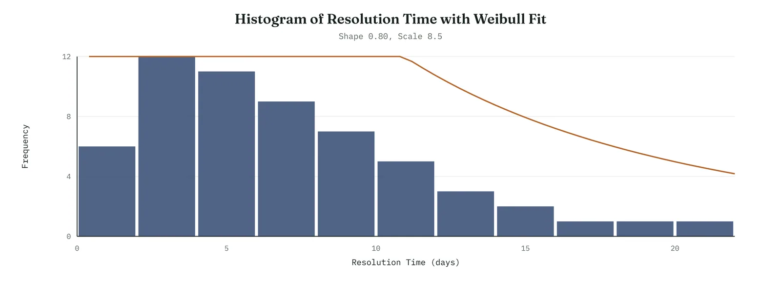
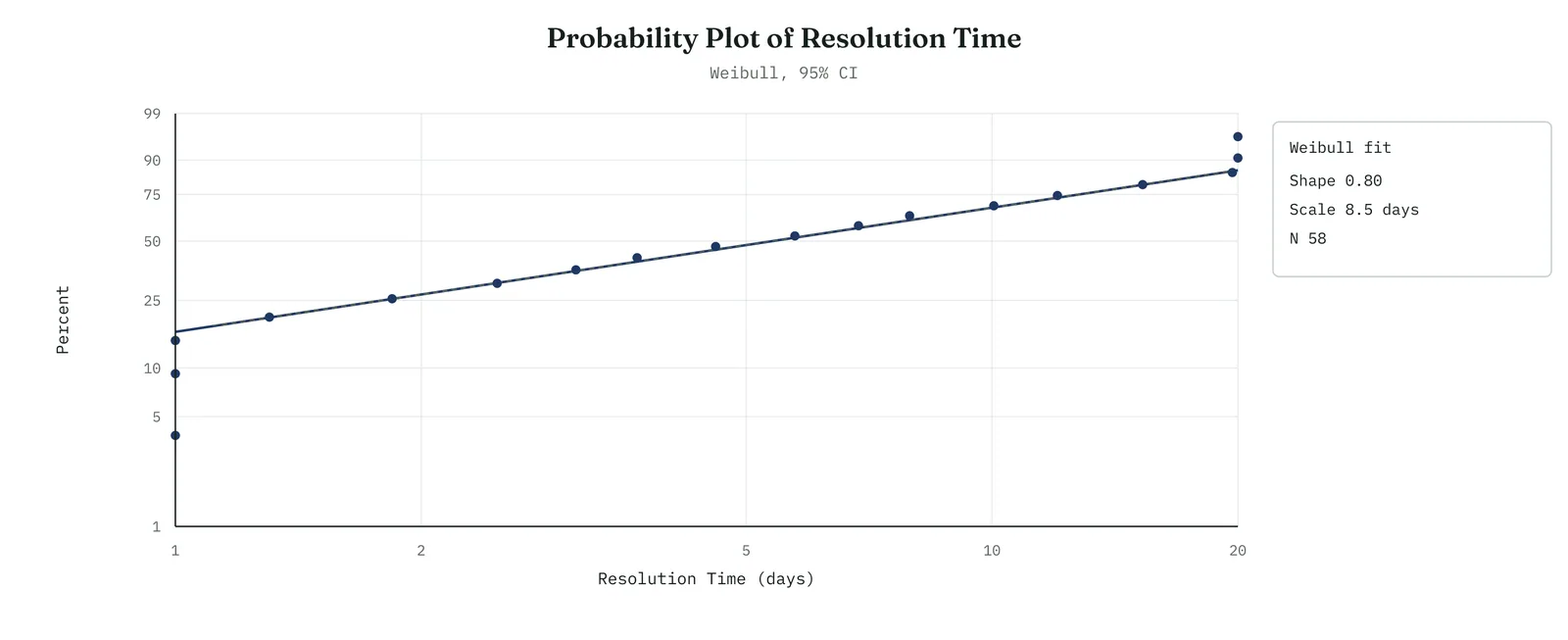
Across the four firms
The blank page. Show the histogram first, because a shape with a tail is a picture anyone can read. Bring in the probability plot only once the idea of a fitted distribution has landed.
The firefight. The probability plot is a quick check a busy team can make before acting, one glance to see whether the distribution fits, which stops it reading a shape from a distribution that does not.
The false start. Show the probability plot in the open. A firm once given a shape from a poor fit will trust a shape far sooner when it can see the points sitting on the line.
The quiet achiever. The discipline is to check the fit even when the histogram looks obviously Weibull, because the tail is where fits fail, and the tail is the part that matters most here.
SECTION 3
The shape parameter, and the hazard
What it is
The shape parameter is the single number that names the pattern of the risk over time, and the hazard curve is its picture. The hazard is the rate at which open cases resolve at each age. When the shape is below one the hazard falls, so an older case is less likely to resolve soon than a younger one. When the shape is near one the hazard is flat. When it is above one the hazard rises. The three patterns are the three regions of the bathtub curve, and each names a different kind of problem.
When to use it
Read the shape and the hazard whenever you need to know not just how long things take, but why. This is the reading that turns a description of durations into a diagnosis. A falling hazard says cases stall. A flat hazard says cases queue. A rising hazard says cases resolve on a deadline. Each points at a different fix, and telling them apart is the main reason to run the analysis at all.
The Crestline run
The shape was about eight tenths, below one, so the hazard fell as a case aged. Figure 13.113 shows it, the rate of resolution high in the first days and dropping steadily after. Figure 13.114 places the finding on the bathtub curve, in the falling region. The reading was blunt. Crestline complex cases did not resolve at a steady rate while waiting in a queue. They resolved quickly if caught early and stalled if not, the older ones drifting with almost no chance of resolving on any given day. The long tail was not a queue. It was cases falling into a hole.
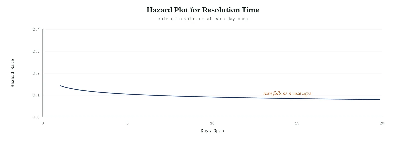
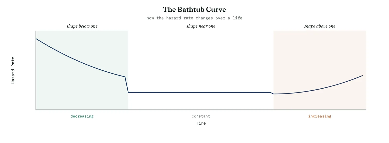
Across the four firms
The blank page. The shape parameter is the one number to teach here. Below one, near one, above one, and what each means. A firm that can read the shape can diagnose a duration.
The firefight. The shape names the mechanism in a single figure, which is exactly what a firefight needs, a fast read of whether it faces a stall or a queue before it commits to a fix.
The false start. Show the hazard curve, because a falling rate is a picture that explains the tail a firm had blamed on volume. Seeing the rate drop with age reframes the whole problem.
The quiet achiever. The trap is to read a shape from too few cases, where the estimate is unstable. Report the shape with its confidence interval, and do not over-read a small difference from one.
SECTION 4
The survival curve, and the tail
What it is
The survival curve is the chance a case is still open at each day. It starts at one hundred per cent on day zero and falls toward zero as cases resolve. Its shape tells you at a glance how quickly the backlog clears and how long the tail runs. Where an average gives one number, the survival curve gives the whole story, the chance a case is still open at three days, at a week, at a fortnight, which is what a service actually needs to promise a customer.
When to use it
Read the survival curve when you need to state or set a promise about how long something takes. It is the natural home of a service level, because a service level is a point on it, the day by which some chosen share of cases has resolved. It also exposes the tail plainly, the flat stretch at the bottom where a stubborn few cases remain open long after the rest have cleared, which is the part of the problem an average hides most completely.
The Crestline run
The survival curve, Figure 13.115, made the tail visible. Half the cases resolved within about six days, matching the known median. But the curve did not fall to zero after that. It flattened into a long tail, a stubborn share still open at a fortnight and beyond, exactly the censored cases the analysis had kept. The reading matched the hazard. Cases either cleared early or joined a tail that barely moved, and the tail was where the customer pain and the escalations lived. An average of six days had described almost none of this.
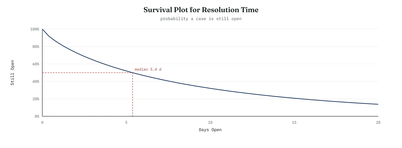
Across the four firms
The blank page. The survival curve is the most intuitive picture in the method, the chance a case is still open over time. Use it to show a firm that a duration is a curve, not a single number.
The firefight. The survival curve turns straight into a service level, the day by which most cases clear, which gives a firefight a target it can act on now.
The false start. Show the survival curve to a firm that was handed an average, and the flat tail at the bottom makes the case for itself, the cases the average had erased.
The quiet achiever. The discipline is to read the tail, not just the median, because a firm proud of a good median can be carrying a bad tail, and the tail is where the failures sit.
SECTION 5
Comparing the pattern across groups
What it is
Comparing groups means fitting the distribution separately within each group and laying the results side by side, to see whether the pattern differs. Two groups can share a similar average and yet have entirely different shapes, one queuing and one stalling, which calls for different fixes. Fitting each and comparing the survival curves and shapes is how you tell a difference of degree from a difference of kind.
When to use it
Compare groups whenever you suspect the mechanism differs across them, by desk, by complexity, by channel, by product. It is the reading that connects reliability back to the rest of Analyse, because a difference in shape between groups is a candidate cause, the same way a difference in mean was in the analysis of variance. When the groups differ, the comparison tells you where to aim the fix.
The Crestline run
The team split the cases by complexity and fitted each, in Figure 13.116. Simple cases had a shape above one and a short scale, a rising hazard and a quick, tidy clearance, cases resolving on a rhythm and few left in the tail. Complex cases had a shape well below one and a long scale, the falling hazard and the long tail. The two were not the same problem at different sizes. They were different mechanisms. Simple cases queued and cleared. Complex cases stalled. That difference is what named the fix, and it is what the next argument turned on.
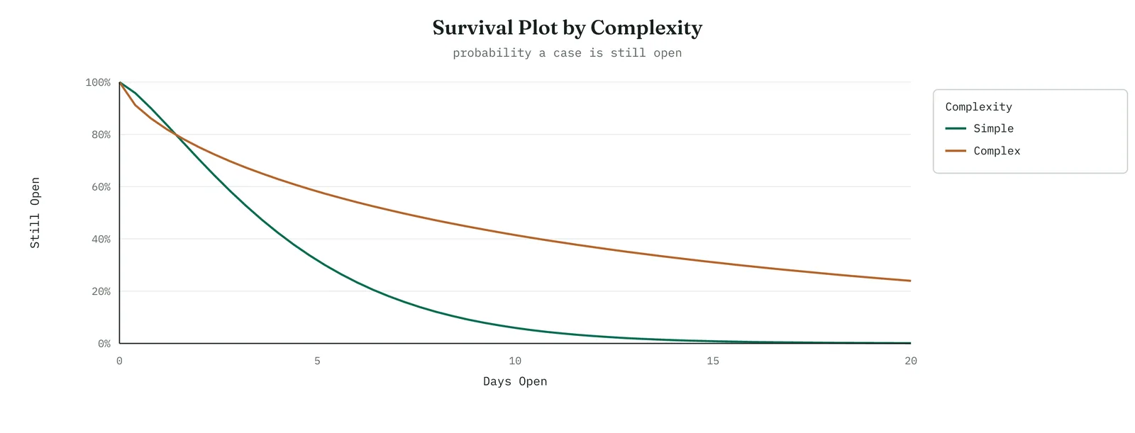
Across the four firms
The blank page. Comparing two groups is a natural next step once a firm can read one survival curve. Lay two side by side, and the idea that groups can fail differently lands at once.
The firefight. The comparison tells a firefight where to aim, which group carries the bad pattern, so it does not spread a fix evenly across cases that do not need it.
The false start. Show the two curves together, because a firm that treated all cases alike can see, in one picture, that it had been solving two different problems as though they were one.
The quiet achiever. The trap is to compare groups too small to fit reliably. Check that each group has enough cases, with the tail included, before reading a difference between their shapes.
SECTION 6
Summarising the life, and the reliability of the fix
What it is
When you need a single number, the method offers better ones than the mean. The characteristic life, the Weibull scale, is the age by which about sixty-three per cent of cases have resolved, a stable summary that is not thrown off by the tail. A chosen percentile, the day by which ninety per cent resolve, is another, and it speaks directly to a service level. And once a fix is in, the same method measures its reliability, the time until a resolved case comes back, which is the durability of the improvement.
When to use it
Use a summary measure when a curve is too much for the audience and a single, honest number is needed, and choose the characteristic life or a percentile over the mean, because they survive the tail. Use the reliability-of-the-fix reading later, in Control, to check that the improvement holds, by watching the time until reopened cases recur. A fix that resolves cases quickly but sees them return has not held, and only a time-to-recurrence reading catches that.
The Crestline run
The team reported the characteristic life, about eight and a half days, and the ninetieth percentile, well past a fortnight, rather than the mean, because those numbers carried the tail the mean had hidden. They also noted the measure to watch once the fix was in, the time until a resolved complex case was reopened, which would tell them whether the fix had truly cleared cases or merely closed them early. That reading belonged to Control, but naming it now meant Control would have it ready.
Across the four firms
The blank page. Teach the characteristic life as the honest single number, the one that survives the tail. It is a small step up from the median and a large step up from the mean.
The firefight. A single robust number, the characteristic life or a percentile, is what a firefight can carry into a meeting, standing for the whole distribution without the mean lie.
The false start. Offer a firm the characteristic life in place of the mean it was misled by, and show how the tail moves the mean but not the characteristic life. The contrast rebuilds trust in the number.
The quiet achiever. The discipline is to carry the reliability-of-the-fix reading into Control, because a capable firm can improve a duration and still lose the gain to recurrence it never measured.
Why the shape settles the headcount question
This is where the reliability analysis closes the argument the whole chapter has been closing, and it does so from an angle none of the earlier tools reached. The headcount theory holds that complex cases run long because the desk is short of people, so the cases wait in a queue for a free handler, and more handlers would clear the queue faster. That theory makes a specific prediction about the shape. A queue for capacity produces a roughly steady hazard, a shape near one, because a case waiting in a queue is about as likely to be picked up on its tenth day as on its third. The mechanism the theory names has a signature, and the signature is a flat hazard.
The data showed a shape well below one, a falling hazard. That is not the signature of a queue. It is the signature of stalling, cases that get picked up quickly or not at all, and that once stalled drift with almost no chance of resolving on any given day. Adding people to a stalling process does not help, because a stalled case is not waiting for a free handler, it is waiting for someone to notice it again, and an extra handler with no trigger to revisit old cases will work the fresh ones just as the others do. The reliability analysis therefore says what the regression and the experiment said, that the answer is not more people, but it says it in the language of mechanism. The tail is a stall, not a queue, and headcount does not fix a stall.
Reporting a reliability finding
The finding travels to a sponsor as a sentence, not a distribution, so it is worth setting the sentence out. Carry four things. The pattern, in plain words. The evidence, in one number. The consequence, for the fix. And the limit, of what it settles. For Crestline it read like this. Complex cases do not queue and clear, they stall, the rate of resolution falls the longer a case stays open. We know this because the durations fit a Weibull with a shape below one, a falling hazard, confirmed on the probability plot and holding when the open cases are included. This means more handlers will not clear the tail, because a stalled case is not waiting for capacity. It settles the mechanism of the delay for complex cases, and points the fix at catching stalls early rather than adding people.
The report leaves out the scale, the censoring method, and the probability plot, which belong in an appendix a reviewer can check. It carries the pattern, the evidence, the consequence, and the limit, in the order a decision maker needs them. A practitioner who can fit the Weibull but cannot write this sentence has done half the job, because the sentence is what turns a shape parameter into a decision about headcount.
The mechanics in brief
The sections above are enough to run and read a reliability analysis. This part opens the machinery a little, for the reader who wants to know how the fit is made and how to defend it. None of it is needed to read a survival curve, but it helps you trust one, and answer the questions a careful reviewer will ask.
How the fit is estimated
There are two ways to fit the distribution, and it helps to know which your software used. The older way is to plot the points on the probability paper and fit a line through them, which is median-rank regression, easy to see but awkward with censored cases. The modern default is maximum likelihood, which finds the shape and scale that make the observed durations, censored cases included, most probable. Maximum likelihood handles censoring properly and is the one to prefer when open cases are in the data, which for a backlog they always are. Whichever is used, ask for the confidence interval on the shape, because a shape of eight tenths with an interval from six tenths to one is a different finding from one with an interval from seven tenths to nine tenths.
Checking the fit
The probability plot is the first check, read by eye, points on the line or bending off it. The formal check is a goodness-of-fit statistic, usually the Anderson-Darling, a single number where smaller is better, that measures how far the points stray from the line. And when you are unsure which distribution to use, a distribution identification plot fits several at once, the Weibull, the lognormal, the exponential, and others, and reports which fits best by that statistic. Run it when the Weibull is in doubt, and let the fit statistics, not a guess, choose the distribution.
The exponential, the special case
A shape of exactly one is worth naming, because it is a distribution in its own right, the exponential. A constant hazard means the event is equally likely at any age, and the process has no memory, so a case is no more or less likely to resolve for having waited. This is the model of purely random events, a queue with no ageing, and it is the dividing line between the falling hazard of a stall and the rising hazard of wear. When a shape comes out near one, the exponential may be the honest description, and it is the baseline the other two patterns are read against.
When the Weibull will not fit
The Weibull is flexible, but it is not universal, and sometimes the points bend off the line however you fit them. Two common alternatives cover most of the rest. The lognormal often fits durations that are the product of many small effects, such as repair times, and its hazard rises then falls. And a threshold, the three-parameter Weibull, fits data where nothing can happen before some minimum time, such as a case that cannot resolve in under a day, by shifting the whole distribution to start at that threshold. When the two-parameter Weibull will not fit, try these before forcing a poor line, because a shape read from a distribution that does not fit is a false diagnosis.
The kinds of censoring
Censoring is central enough to the method to be worth naming its kinds. Right censoring is the common one, a case still open when you look, known only to exceed its current age. Left censoring is the opposite, an event known to have happened before you started watching, so its exact time is unknown. Interval censoring falls between, where you know the event happened between two checks but not exactly when, common when a process is inspected periodically rather than watched continuously. All three are handled by the same methods, provided the censoring is non-informative, meaning the reason a case is censored has nothing to do with its eventual duration. When cases stay open precisely because they are the hard ones, that condition is broken and the fit is biased, which is the one censoring trap to watch.
A second case, equipment that wears out
The Crestline case showed a falling hazard, a stall. It helps to see the opposite, because it is where reliability analysis began and where the language of the method comes from. A maintenance team tracked the time between failures of a pump. They fitted a Weibull and found a shape well above one, about two and a half, a rising hazard. Figure 13.119 shows it, the rate of failure low when the pump is new and climbing as it ages. This is wear-out, the right-hand region of the bathtub, and it names a completely different problem from a stall.
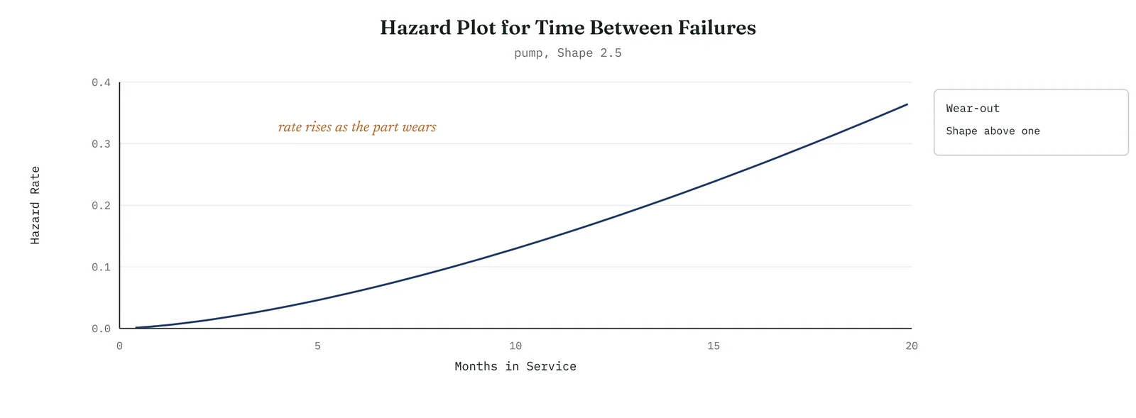
The reading led straight to a decision the Crestline case could not offer. Because the hazard rises with age, a failure becomes more likely the longer the pump runs, so replacing it on a schedule, before the hazard climbs too high, prevents failures that waiting would not. The shape told the team not only that the pump wears out but when to service it, at the age where the rising hazard crosses the cost of a planned replacement. A falling hazard, as at Crestline, gives no such schedule, because an old case is no more likely to fail than a fresh one, so there preventive action means catching stalls, not timing replacements. Same method, opposite shape, opposite fix.
Reliability measures in a failure context
When the event is a failure rather than a resolution, the method carries a set of standard measures worth knowing, because a maintenance or quality audience will expect them. Table 13.18 lists the common ones. Each is a summary of the same distribution the survival and hazard curves describe, chosen for the decision at hand, a maintenance interval, a warranty reserve, an availability target.
Table 13.18. The common reliability measures, and what each one is.
| MEASURE | WHAT IT IS |
|---|---|
| MTBF | Mean time between failures, for an item that is repaired |
| MTTF | Mean time to failure, for an item that is not repaired |
| MTTR | Mean time to repair, the average time to restore service |
| Availability | The share of time the item is working, uptime over total time |
| B10 life | The age by which ten per cent of items have failed |
| Failure rate | The rate of failures per unit of time, which is the hazard |
A caution carries over from the service case. The mean time measures, MTBF and MTTF, are averages, and they mislead in exactly the way the mean resolution time did, when the distribution is skewed or the hazard is not constant. Quote them where the hazard is roughly constant, near a shape of one, and prefer a percentile, such as the B10 life, where it is not. The measure should fit the shape, not the habit.
Where reliability analysis earns its place
The method reaches any setting where the thing you care about is a time until an event and some of those times are unfinished. A few of the common ones show its range.
Equipment and maintenance
The original home of the method. Time between failures, wear-out, and the maintenance schedule that a rising hazard justifies. The shape tells you whether to run to failure, a flat or falling hazard, or to replace on a schedule, a rising one, which turns maintenance from a guess into a calculation.
Warranty and product life
The B10 life and the survival curve size a warranty reserve and predict field returns. A shape above one warns of wear-out failures arriving as the fleet ages, which a warranty must be priced to cover, and which a firm ignores at the cost of a reserve it did not set aside.
Customer churn and retention
The time a customer stays is a duration with censoring, the current customers being right-censored at their present tenure. A survival curve of the relationship shows retention over time, and a falling hazard of churn says early departures dominate, which points the fix at onboarding rather than at long-term loyalty.
Medical and clinical
Survival analysis is the same method under another name, the time until a clinical event, with patients still living as censored cases. The survival curve and the comparison of groups, treatment against control, are the staple of the field, and they are the same curves used here, which is worth knowing because the medical literature is where the techniques are most refined.
Service and incident response
The Crestline case. Resolution times, times to restore a service, backlog clearance, all durations with open cases, all read the same way, for the tail and the shape rather than the mean. This is the setting most improvement projects meet, and the one where the method is most often overlooked because the data does not look like failure data.
The common thread
In every one, the same conditions hold. The outcome is a time until an event. Some of those times are unfinished. And an average would hide the tail or the shape that matters. Wherever those hold, reliability analysis is the honest tool, whatever the field happens to call it.
Reading the reliability output
The software returns a page, and reading it in order removes the mystery. First comes the estimation summary, the shape and the scale with their confidence intervals, and the method used, maximum likelihood or median rank. Read the shape first, and its interval, because the shape names the pattern and the interval tells you how firmly. Then the goodness-of-fit line, the Anderson-Darling statistic, which you read against the alternatives rather than on its own, smaller being the better fit. Then a table of percentiles, the age by which each share of cases has resolved, which is where you read the median, the characteristic life, and any service level you care about.
After the numbers come the plots, and they should agree with them. The probability plot confirms the fit the statistic scored. The survival curve draws the percentile table as a line. The hazard curve draws the shape as a rising, flat, or falling rate. Read in this order, the page tells one story, whether the distribution fits, what pattern the shape names, and what the durations are at any point you choose. A practitioner who can walk a sponsor through that page in plain words, the shape, the fit, the tail, and what each means for the fix, has read the analysis, not merely run it.
Common mistakes, and how they show up
Reliability analyses fail in recognisable ways, and the symptoms point back to the discipline that was skipped.
A shape that changes when you add the open cases
You fit the finished cases, read a shape, then add the censored ones and the shape moves. The cause is that the open cases were dropped in the first fit, biasing it toward the quick cases. The fix is to keep the censored cases from the start, and the symptom is the very sensitivity that reveals the error.
A tidy fit that predicts the tail badly
The probability plot looks fine in the body but the points curl away in the tail, and the survival curve then misreads how many cases remain open late. The cause is a distribution that fits the common cases but not the rare long ones, which are the ones that matter here. The fix is to check the tail of the probability plot specifically, and to try a threshold or a different distribution when it bends.
A shape read as a mechanism it does not prove
You find a falling hazard and declare a stall, or a rising one and declare wear-out, and act on it, and the fix does not land. The cause is treating the shape as proof of a mechanism rather than a signature consistent with one. The fix is to treat the shape as a candidate cause, strong but not settled, and to confirm the mechanism before committing, the same caution every observational tool in this chapter carries.
A difference between groups that is noise
Two groups show different shapes, you split the fix between them, and the difference does not hold on fresh data. The cause is groups too small to fit stably, whose shapes carry wide intervals that overlap. The fix is to check the confidence intervals on the shapes before reading a difference, and to gather more cases where they are thin.
As with the designed experiment, the failures name the principle. Keep the censored cases, check the fit including the tail, treat the shape as a candidate and not a verdict, and read a group difference only when the intervals allow it. The method is honest when these hold and misleading when they do not, and the symptoms above are how it tells you which.
Stage 4. Reading the result
Reading the result
Three readings settle what a reliability analysis is telling you.
| STRONG | The still-open cases were kept as censored. The Weibull fit was checked on the probability plot before it was read. The shape was reported with its uncertainty. And the survival and hazard curves were read for the tail and the pattern, not just the median. |
| WEAK | The open cases were dropped, or the shape was read from a distribution that did not fit, or the mean was reported as though it described the durations, or a difference in shape was read from groups too small to fit. |
| THE TELL | The shape parameter names the mechanism. A falling hazard is a stall, a flat hazard is a queue, a rising hazard is a deadline, and each calls for a different fix, which an average could never have told apart. |
Four cautions sit under those readings. Keep the censored cases, because dropping them biases everything toward the quick cases and hides the tail. Check the fit before reading the shape, because a shape from a poor fit is a false diagnosis. Report the shape with its uncertainty, because a shape read from few cases is unstable and a small difference from one may be noise. And read the tail, not just the median, because the median can look healthy while the tail carries the failures that matter.
Stage 5. Four firms, four moves
Four firms, four moves
The four grounds from Chapter 1 change how far you take a reliability analysis, and whether the firm will act on a shape or fall back on an average. The simplest form, one Weibull fitted to one set of durations with the open cases kept in, suits any ground willing to look past the mean. The fuller forms, comparing groups and tracking recurrence, belong where the firm can carry them. The ground decides how much of the method to bring.
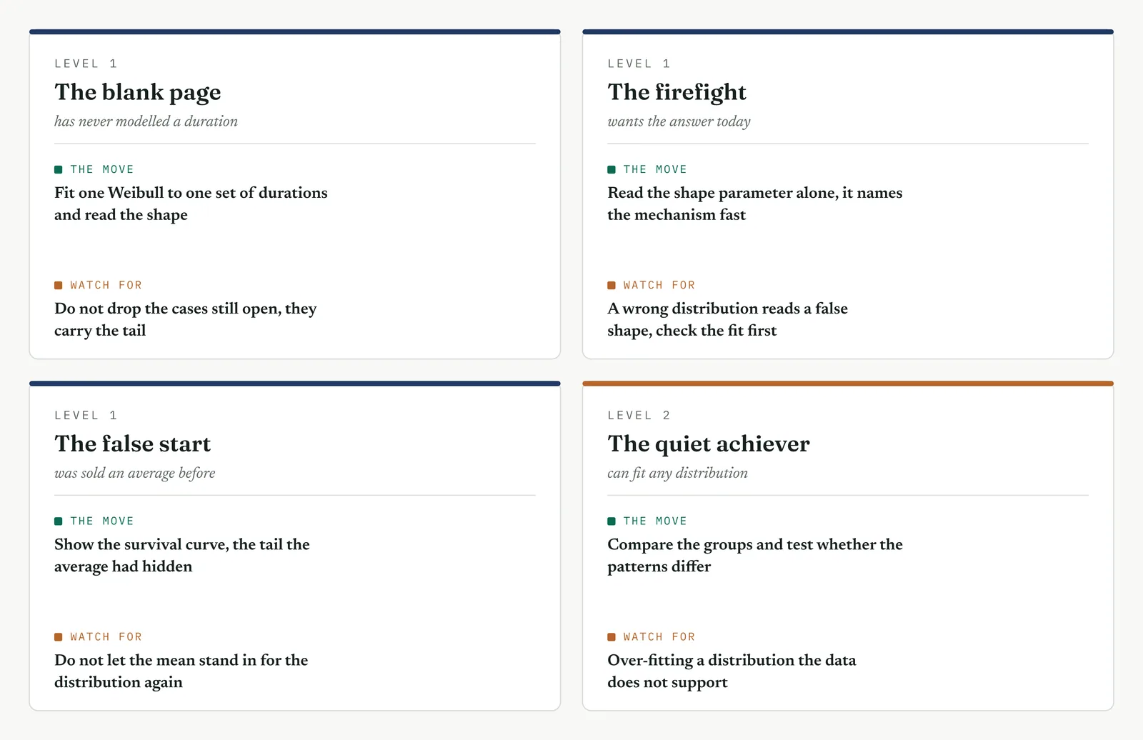
The blank page LEVEL 1
This firm has never modelled a duration, and reports the average of the cases that happened to finish. Start it with one Weibull, fitted to one set of durations, with the open cases kept in as censored. Show the histogram, then the survival curve, and let the firm see that a duration is a shape with a tail, not a single number. Do not reach for group comparisons or recurrence until the first fit has landed. The value here is not a sophisticated model. It is the firm learning, once, that the average of the finished cases was hiding the tail that was the whole problem, and that the unfinished cases were the ones it most needed to keep.
The firefight LEVEL 1
This firm has a backlog on fire and wants to know where to point the hose. The reliability analysis answers it fast, because the shape parameter alone names the mechanism, a stall or a queue, in a single number read from a single fit. Keep it to that, one fit, the shape, the survival curve, and act on the pattern. The one corner not to cut is the fit check, because a shape read from a distribution that does not fit sends the firefight at the wrong problem, and a firefight cannot afford a wrong turn. A quick, checked fit that names the mechanism this week beats a fuller study the crisis will not wait for.
The false start LEVEL 1
This firm was handed a tidy average once, acted on it, and found the tail it hid. It distrusts single numbers now, which is the right instinct pointed the wrong way, because the answer is not to abandon numbers but to use ones that carry the tail. Show the open cases kept in, not dropped. Show the survival curve with its flat tail. Show the characteristic life beside the mean, and how the tail moves one and not the other. A firm burned by a hidden tail will trust a method that puts the tail in the open, and the reliability analysis is exactly that method, provided you show your working.
The quiet achiever LEVEL 2
This firm can fit any distribution and read any curve, which makes its errors the subtle ones. It fits a Weibull where the data is not Weibull and reads a false shape. It compares groups too small to fit and reads a difference that is noise. It censors on a rule that is not random, so the open cases differ systematically from the closed ones and bias the fit. Hold it to the checks, the probability plot before the shape, the confidence interval on every shape, enough cases in every group, and censoring that does not depend on the outcome. What you add here is not method, which the firm has, but the discipline to distrust a clean fit until it has passed the checks that a clean fit can still fail.
Stage 6. Where it breaks
Where it breaks
1. Do not drop the cases still open. The unfinished cases are the longest ones, and they carry the tail. Record them as censored at their current age, never discard them.
2. Do not read a shape from a distribution that does not fit. A shape parameter is only meaningful if the distribution describes the data. Check the probability plot before you read the shape, every time.
3. Do not report the mean of skewed durations. A few long cases pull the mean above the typical case, so it describes neither. Report the median, the characteristic life, or a percentile instead.
4. Do not over-read a shape near one. A shape close to one, within its confidence interval, may be a steady hazard. Do not diagnose a stall or a wear-out from a difference that is noise.
5. Do not compare groups too small to fit. A Weibull fitted to a handful of cases has a wide, unstable shape. Confirm each group has enough cases, tail included, before reading a difference.
6. Do not censor on the outcome. If the cases still open differ systematically from those that closed, the censoring is not random and it biases the fit. Check that what stays open does not depend on the result.
7. Do not force the Weibull on data it does not suit. Some durations follow a lognormal or another distribution. If the Weibull will not fit, try another rather than accept a poor line.
8. Do not read a duration as a cause on its own. A shape names a mechanism, it does not prove what drives it. Treat the pattern as a candidate cause to test, not a settled one.
9. Do not confuse the characteristic life with the mean. The characteristic life is the sixty-third percentile, not the average. Report which number you are quoting, so no one reads one as the other.
10. Do not stop at resolution when recurrence matters. A case closed early that reopens was not resolved. Where recurrence matters, measure the time until a case comes back, not only the time to close it.
Stage 7. At the gate
At the gate
What it lets you defend. The sponsor asks whether the long cases are a matter of capacity, which more people would clear, or something else. The reliability analysis answers it in the language of mechanism. The durations of complex cases fit a Weibull with a shape below one, a falling hazard, which is the signature of stalling, not of a queue. A case resolves quickly if caught early, and once it stalls the rate of resolution drops toward nothing, so it drifts in the tail. This is why more handlers would not clear that tail, because a stalled case is not waiting for a free handler, it is waiting to be noticed again. The finding agrees with the regression and the experiment, and adds to them the mechanism, the tail is a stall, and headcount does not fix a stall.
What it feeds. The analysis hands Improve a sharpened target, not merely to speed complex cases but to catch them before they stall, which points the fix at a trigger to revisit ageing cases rather than at added capacity. It hands Control the measures to hold, the characteristic life and the tail percentile in place of the misleading mean, and the time-to-recurrence that will show whether the fix truly clears cases or only closes them. And it hands the gate a diagnosis of the delay, a falling hazard, that no average could have produced, which is the difference between knowing cases run long and knowing why. With the mechanism named, the project can close Analyse and carry a fix aimed at the real fault into Improve.
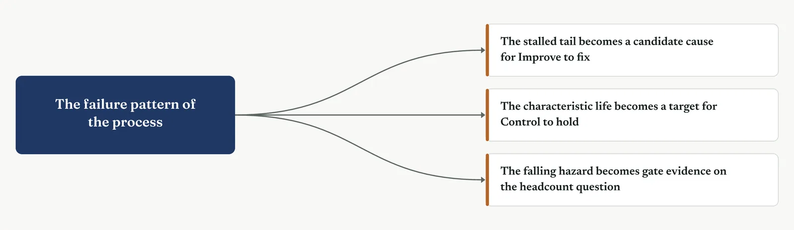
13 · ANALYSE MOVEMENT FOUR · CONFIRM THE DRIVER AND CLOSE
13.3.15 Capability analysis
Recommended ISO 13053
Purpose. Capability analysis is the tool for comparing what your process actually does against what the customer requires. You set the voice of the customer as a specification, and the voice of the process as the spread and centre of the data, and you measure the distance between them. From it you learn whether the process can meet the specification at all, whether it is missing because it is too spread or because it is off-centre, and what defect rate and sigma level that gap implies. Use it when you have a specification and need to state, in one honest figure, how far the process falls short of it.
Stage 1. The trigger
The trigger
Use a capability analysis when you have a specification the customer sets and you need to say how well the process meets it. A capability study answers a question an average cannot. Not what the process does on a typical day, but how much of what it does falls outside what the customer will accept. That question needs two inputs, the specification and the distribution of the process, and it compares them directly.
The specification is the voice of the customer, a limit or a pair of limits, an upper limit the process must stay under, a lower limit it must stay above, or both. The distribution is the voice of the process, its spread and its centre, read from the data. Capability is the relationship between the two, and it is carried in a small set of indices and, more usefully, in a defect rate and a sigma level anyone can act on.
The reason the tool earns a place at the end of Analyse is that it turns the whole analysis into one baseline figure, the sigma level of the process as it stands, against which every later improvement is measured. It also settles a question that runs through the chapter, whether a shortfall is a matter of spread, the process too variable, or of centre, the process aimed at the wrong place, because the two look the same in an average and call for different fixes.
One caution belongs at the front, because it is the most common way a capability study goes wrong. The usual indices assume the data is bell-shaped. When it is not, and durations rarely are, the indices mislead, and you must either transform the data or use a capability analysis built for the actual distribution. The reliability analysis already showed the Crestline resolution times were skewed, which is exactly the case where a naive capability study reads a false number.
Stage 2. The build
The build
State the specification the customer sets. Write the limit or limits the customer requires, in the units of the process. Capability has no meaning without a specification, because it is a comparison against one.
Check the shape, normal or not. Look at the distribution before you index it. If it is skewed, the ordinary indices mislead, and you must transform the data or use a non-normal analysis.
Read the spread against the tolerance. Compare the width of the process to the width of the tolerance. This is the potential, Cp or Pp, what the process could do if perfectly centred.
Read the centring, not just the spread. Compare the process centre to the nearer limit. This is the actual, Cpk or Ppk, which falls below the potential whenever the process is off-centre.
Split the within from the overall. Read the short-term spread, within subgroups, against the long-term spread, overall. The gap between them measures how much the process drifts over time.
Report the defect rate and the sigma. Convert the capability to a defect rate and a sigma level, the figures a sponsor acts on, and the baseline the project will be measured against.
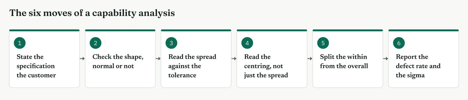
Which view you read depends on the question. To ask whether the spread fits the tolerance, read Cp or Pp. To ask whether the process hits the target, read Cpk or Ppk. To check the data is normal enough to index, read the probability plot. To see how the process drifts, read within against overall. To turn it all into a number a sponsor acts on, read the PPM and the sigma. Figure 13.121 pairs each question with its view.
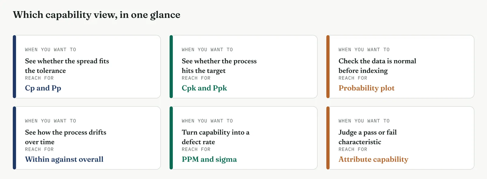
Table 13.19. The four capability indices, what each compares, and the spread it uses.
| INDEX | WHAT IT READS | THE SPREAD IT USES |
|---|---|---|
| Cp | Potential, the spread against the tolerance, if centred | Short-term, within subgroups |
| Cpk | Actual, the spread and the centre together | Short-term, within subgroups |
| Pp | Potential over the long run | Overall, the whole data |
| Ppk | Actual over the long run, spread and centre | Overall, the whole data |
| TIP Read Cpk, not Cp, when you can read only one. Cp is the potential, what the process could do if you centred it perfectly, and a process can post a healthy Cp while missing the specification badly because it is off-centre. Cpk carries both the spread and the centre in one number, so it cannot flatter a process the way Cp can. When a report shows a good Cp and a poor Cpk, the message is precise. The process is capable in principle and failing in practice, and the fault is aim, not spread. |
Stage 3. Crestline on the floor
Crestline on the floor
Crestline had never compared its resolution process to a specification. It reported an average and argued about it. The capability analysis set the customer requirement against the actual distribution and produced the one figure the project had lacked, a baseline that said, in a number, how far the process fell short and why. Each section states what part of the method it covers, when to use it, and how it ran on the floor.
SECTION 1
The specification, and the two voices
What it is
A capability analysis compares two voices. The voice of the customer is the specification, the limit the process must meet. The voice of the process is the distribution of the data, its spread and centre. Capability is the distance between them, and it has no meaning until the specification is stated, because there is nothing to be capable against.
When to use it
Set the specification whenever a customer requirement exists, explicit or implied, and you need to measure against it. Where no specification exists, the first task is to agree one, because without it capability cannot be read. A process is not capable or incapable in itself, only capable or incapable of meeting a stated requirement.
The Crestline run
The customer requirement was a resolution within five working days, the service level the firm had promised and rarely examined. That became the upper specification limit. There was no lower limit, because a fast resolution is never a fault. The voice of the process was the distribution of resolution times, which the measure and the reliability analysis had already described, a skewed spread with a median near six days and a long tail. Setting the five-day limit against that distribution was the whole of the comparison, and it was one the firm had never made.
Across the four firms
The blank page. The one idea to land is that capability is a comparison, not a property. Teach the firm to state a specification first, and the rest of the method follows from it.
The firefight. A firefight often has an implied specification, a service level everyone quotes but no one measures against. Name it, set it as the limit, and the capability falls out at once.
The false start. A firm that argued about an average will see the point of a specification quickly, because the specification is the thing the average was silently being compared to all along.
The quiet achiever. The risk here is a specification set by habit rather than by the customer. Check that the limit is the real requirement, not an internal target that drifted into use.
SECTION 2
Checking the shape before you index
What it is
The ordinary capability indices assume the data is bell-shaped, because they measure spread in standard deviations from a centre. When the data is skewed, that assumption fails, and the indices read a false capability, usually a worse one, because the symmetric measure is thrown by the tail. Checking the shape first, on a histogram and a probability plot, is what tells you whether the ordinary indices can be trusted or whether you must use a different method.
When to use it
Check the shape every time, before you read a single index, because the whole analysis rests on it. Figure 13.122 is the normal capability report, and Figure 13.123 is the honest non-normal one, and the difference between them is the point. When the histogram is skewed and the points bend off the normal line, the non-normal report is the one to read, and the normal one is a warning, not a result.
The Crestline run
The normal capability report, Figure 13.122, laid a symmetric bell over the skewed data, and it fitted badly, the curve reaching left of zero where no case can fall and missing the long right tail entirely. It reported a Ppk well below zero and a defect rate above six hundred thousand per million, numbers driven by a mean the tail had inflated. The honest reading came from the non-normal report, Figure 13.123, which fitted the Weibull the reliability analysis had already found. It reported the observed defect rate directly, about fifty-two per cent of cases past the five-day limit, roughly five hundred and twenty thousand per million. Both said the process was grossly incapable, but only the non-normal report said it with a number the firm could defend.
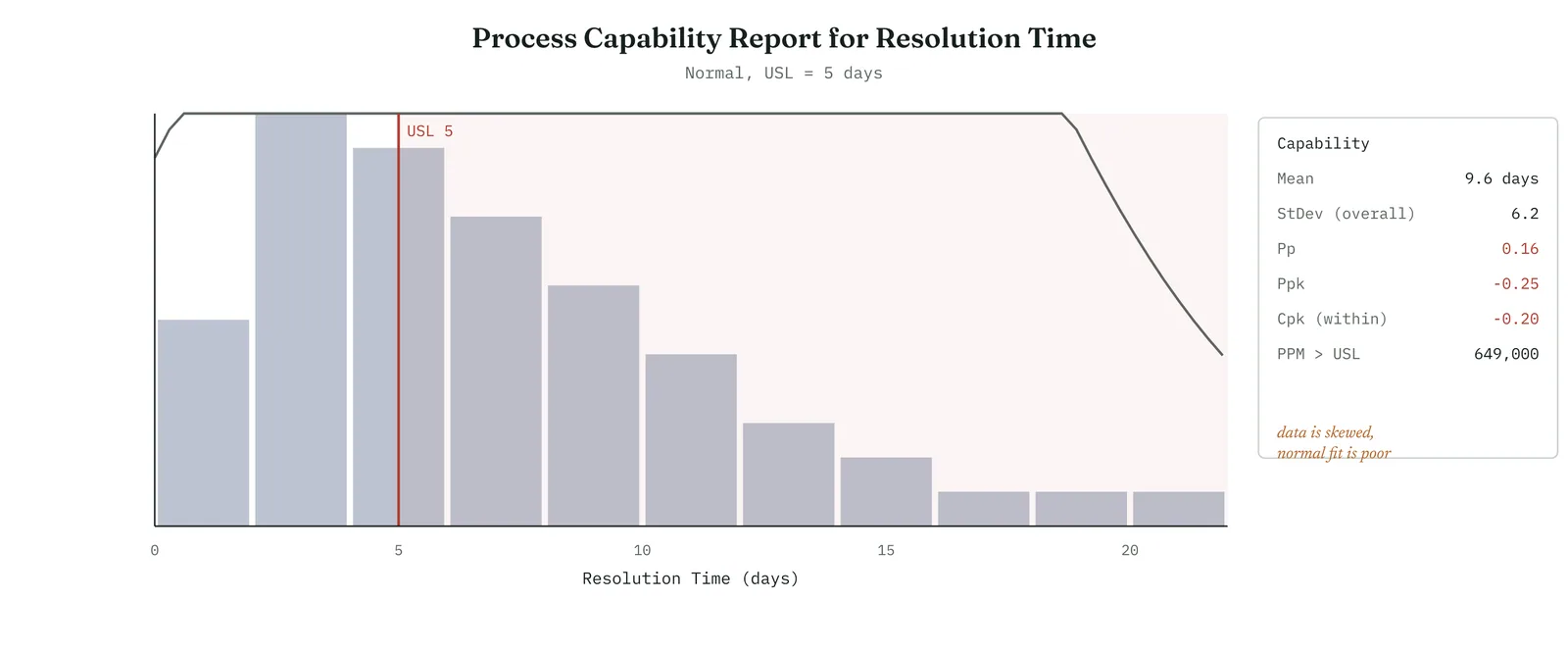
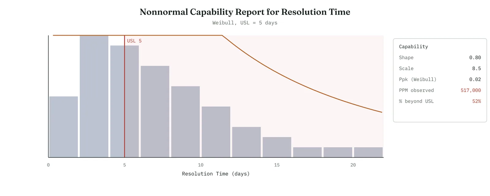
Across the four firms
The blank page. Teach the shape check as the first step, not a refinement. A firm that indexes without checking the shape will trust a false number, and never know it.
The firefight. The shape check is one glance at a histogram, cheap enough for any firefight, and it stops the crisis acting on a capability the skew has distorted.
The false start. Show both reports side by side. A firm handed a confident but wrong index once will trust the non-normal reading when it can see, in the histogram, why the normal one failed.
The quiet achiever. The trap is the subtle one, indexing skewed data with the normal method because the software offered it by default. Hold the firm to checking every characteristic, not only the ones it suspects.
SECTION 3
Spread against tolerance, and centring
What it is
Capability has two parts, and separating them is the tool at its most useful. Spread is how wide the process is against how wide the tolerance is, the potential, Cp. Centring is where the process sits against the limit, the actual, Cpk. A process can fail on either. Too wide to fit the tolerance however you aim it, or narrow enough but aimed past the limit. Figure 13.124 shows the two, a centred process that fits, and one of the same width aimed off-centre so its tail crosses the limit.
When to use it
Read both whenever you need to know not just that a process misses, but why, because the two failures call for different fixes. A spread failure is a consistency problem, reduce the variation. A centring failure is a targeting problem, move the aim. Reading Cp beside Cpk tells them apart in two numbers, and it is the reading that turns a capability study into a direction for the fix.
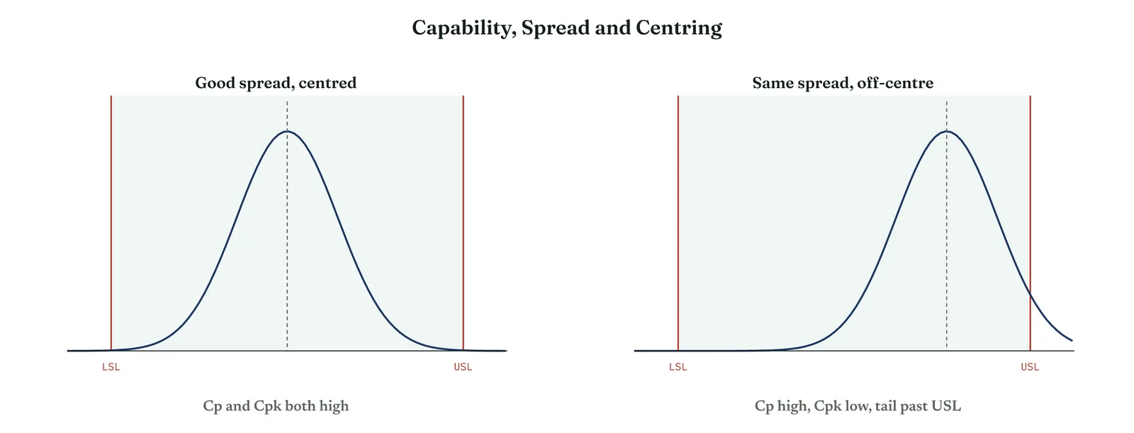
The Crestline run
Crestline failed on both counts, which the two numbers made plain. The spread of resolution times was far wider than the five-day tolerance allowed, so even a perfectly centred process could not have fitted, the potential itself was poor. And the centre sat above the limit, the bulk of the distribution past five days, so the actual was worse still. This was not a process that would meet the specification if only it were aimed better. It was one that had to become both narrower and earlier to meet it at all, which named the fix as reducing variation and catching cases early, not as any single adjustment.
Across the four firms
The blank page. Cp and Cpk together are the first real diagnosis a firm can make. Teach the pair, spread and centre, and the firm can say not just that it misses but which fault it has.
The firefight. The two numbers point the fix fast. A firefight that knows whether it faces a spread problem or a centring problem does not waste its one move on the wrong one.
The false start. Show Cpk beside Cp, because a firm shown a healthy Cp once and then failing will see, in the gap, the centring the single index had hidden.
The quiet achiever. The discipline is to read both even when one looks fine, because a good Cp with a poor Cpk is a centring fault a firm proud of its consistency can easily miss.
SECTION 4
Short-term and long-term
What it is
A process has two spreads, and the gap between them matters. The short-term spread, within subgroups, is how the process varies at its best, over a short run where nothing has drifted. The long-term spread, overall, is how it varies across the whole period, drift included. The short-term indices, Cp and Cpk, use the first. The long-term indices, Pp and Ppk, use the second. When the two agree, the process is stable. When the long-term is much worse, the process drifts, and the drift is a separate problem from the spread.
When to use it
Split the two whenever you need to tell an unstable process from a merely wide one, because they call for different work. A process with good short-term capability and poor long-term capability is capable when stable and failing because it will not stay put, which is a control problem, not a capability one. Figure 13.125 shows the gap, the narrow within curve and the wide overall curve, both against the limit.
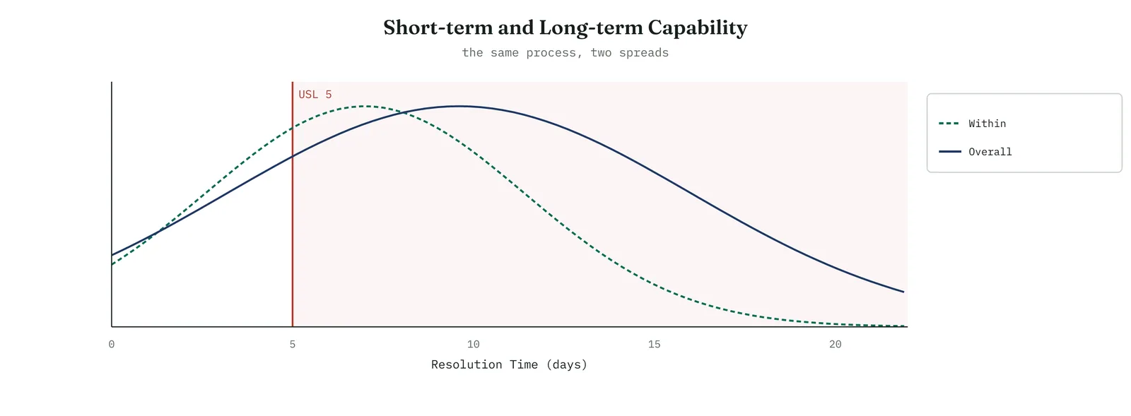
The Crestline run
The within and overall spreads both failed the limit, but the overall was worse, the gap between them a sign the process drifted week to week as well as running wide. That gap carried a message for later, that part of the problem was instability, cases handled well in a good week and badly in a bad one, which Control would have to hold even after Improve narrowed the spread. Naming the gap now meant the project knew it faced two jobs, a capability job to narrow the process and a stability job to keep it narrow.
Across the four firms
The blank page. The within and overall idea is a step up. Introduce it once the firm reads Cpk comfortably, and frame it simply, the best the process does against the whole of what it does.
The firefight. The gap tells a firefight whether its problem is width or drift, which decides whether the fix is to tighten the process or to steady it, two different weeks of work.
The false start. Show the two curves together, because a firm that improved a process once and lost the gain will recognise the drift in the overall curve as the thing that undid it.
The quiet achiever. The trap is a healthy short-term index hiding a drifting long-term one. Hold the firm to reading both, because the within figure alone can flatter a process that will not hold.
SECTION 5
The defect rate and the sigma level
What it is
The most useful output of a capability study is not an index but a defect rate and a sigma level, because those are the figures anyone can act on. The defect rate is the share of the process that falls outside the specification, expressed as parts per million. The sigma level is the same information on a scale where higher is better, running from one, very poor, to six, near perfect. Figure 13.126 shows how the two connect, the defect rate falling steeply as the sigma level rises.
When to use it
Convert to a defect rate and a sigma level whenever you report to anyone outside the analysis, because an index means little to a sponsor while a defect rate and a sigma level mean everything. They are also the baseline the project is measured against, the before figure that the after must beat, which is why the capability study belongs at the close of Analyse, setting the mark the whole improvement will be judged by.
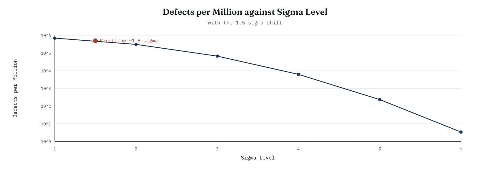
The Crestline run
The process resolved about half its cases past the five-day limit, a defect rate near five hundred thousand per million, which places it at about one and a half sigma, the figure the measure had reported and the capability study now confirmed against a specification. That became the baseline. Whatever Improve did, it would be measured against one and a half sigma and five hundred thousand defects per million, and the size of the prize was the distance from there to a process that met its own service level.
Across the four firms
The blank page. The sigma level is the number to leave a firm with, because it needs no statistics to read, higher is better, and it turns a distribution into a single honest figure.
The firefight. A defect rate and a sigma level are what a firefight carries into a meeting, the whole capability in two numbers a room can act on without a lecture.
The false start. Offer the sigma level as the baseline, and the firm that distrusted a shifting average has a fixed mark instead, one the improvement will visibly move.
The quiet achiever. The discipline is to state whether the sigma is short-term or long-term, because a firm reporting to two places must not quote a flattering short-term figure as though it were the whole.
Why capability settles the headcount question
The capability study closes the headcount argument from the angle the whole tool is built on, the two voices. Capability is the relationship between the voice of the customer, the five-day limit, and the voice of the process, the spread and centre of the resolution times. The process misses the limit because its distribution is both too wide and centred beyond it. That is a statement about the shape of the distribution, and it is worth asking what adding handlers would do to that shape.
The answer is almost nothing. More handlers increase throughput, how many cases the desk can process in a period, but capability is not about throughput. It is about the spread and centre of the time each case takes. Adding people does not make the resolution-time distribution narrower, because the variation comes from how cases are handled, routed, and stalled, not from how many hands are free. And it does not move the centre below five days, because the long cases are stalled, not queued, as the reliability analysis showed. Only reducing the variation, handling cases more consistently, and shifting the centre, catching cases before they stall, improve the capability. Headcount moves neither. The capability study therefore says, in the language of the two voices, what the whole chapter has said, that the gap to the specification is a matter of spread and centre, and headcount changes neither.
Reporting a capability finding
The finding travels to a sponsor as a baseline and a diagnosis, and it is worth setting out the shape of the report. Carry four things. The baseline, in a defect rate and a sigma level. The diagnosis, whether the fault is spread or centre. The caution, that the data was skewed and the honest reading is the non-normal one. And the prize, the distance from the baseline to a capable process. For Crestline it read like this. The process meets its five-day service level about half the time, a defect rate near five hundred thousand per million, about one and a half sigma. It misses on both counts, too wide to fit the limit and centred beyond it, so the fix must both narrow the process and bring it earlier. The reading uses the non-normal capability, because the durations are skewed, and a normal analysis would misstate the number.
The report leaves the indices, the within and overall detail, and the probability plot in an appendix a reviewer can check. It carries the baseline, the diagnosis, the caution, and the prize, in the order a sponsor needs them. A practitioner who can compute Cpk but cannot state the baseline and the prize in two sentences has done half the job, because the sentence is what turns a capability index into a case for the project.
The mechanics in brief
The sections above are enough to run and read a capability study. This part opens the arithmetic, for the reader who wants to defend the numbers when a reviewer asks where they came from.
The four indices, in one place
The indices are ratios of two widths. Cp is the tolerance width divided by six standard deviations of the process, so it asks how many process widths fit inside the tolerance, a Cp of one meaning they just fit, a Cp of two meaning the tolerance is twice as wide as it needs to be. Cpk takes the distance from the process centre to the nearer limit and divides it by three standard deviations, so it falls below Cp whenever the centre is not in the middle. Pp and Ppk are the same two calculations using the overall, long-term standard deviation in place of the within, short-term one. Four indices, two questions, spread and centre, asked at two time scales.
The sigma level, and the shift
The sigma level is the number of standard deviations between the process centre and the nearer limit, which is closely related to Cpk, a Cpk of one being about three sigma. Reported sigma levels usually carry a convention, the one and a half sigma shift, which adds one and a half to the long-term figure to give a short-term one, on the reasoning that a process drifts by about that much over time. The convention matters mainly when you compare figures, because a short-term sigma and a long-term sigma of the same process differ by that shift. State which you are quoting, so no one reads one as the other.
Attribute capability
Not every characteristic is a measurement. When the outcome is a pass or a fail, a case correct or not, there is no spread to index, and capability is read directly from the defect rate. The first-response accuracy at Crestline was such a characteristic, about eighty-two per cent correct, so about eighteen per cent defective, which converts to a defect rate and a sigma level the same way a measured characteristic does. Attribute capability has no Cp or Cpk, because there is no distribution to fit, but it has a defect rate and a sigma level, and those are what you report.
When the data is not normal
Skewed data is the common case for durations, and there are two honest ways to handle it. The first is to transform the data, applying a function such as a logarithm that makes the distribution roughly bell-shaped, indexing the transformed data, and reporting the result. The second is to fit the actual distribution, a Weibull or a lognormal, and read the capability from it directly, which is what the non-normal report does. Either is defensible. What is not defensible is indexing skewed data with the normal method and reporting the result as though the shape did not matter, because that reads a false capability, usually a worse one, driven by a mean the tail has moved. Check the shape, and when it is skewed, transform or fit, but do not pretend.
Where capability analysis earns its place
The tool reaches any process with a specification and a measurable output, which is most of them.
Manufacturing and quality
The original home. A dimension against its tolerance, a fill weight against its limits, a purity against its minimum. Capability is the standard language of a quality system, and Cpk is often a contractual requirement, a supplier obliged to demonstrate a capability before a part is accepted.
Service and operations
A resolution time against a service level, a wait against a target, an error rate against a threshold. The Crestline case is this kind, and it is the setting where capability is most often overlooked, because a service does not think of itself as having a tolerance, though its service level is exactly that.
Transactions and finance
A settlement time against a deadline, an invoice accuracy against a standard, a processing time against a promise. Any process with a committed level of service has a specification, and any such process can be measured for how well it meets it.
The common thread
In every one, a specification exists, the process output can be measured, and the question is how much of the output falls outside the limit. Wherever those hold, capability analysis states the answer in one figure, and gives the project its baseline.
Common mistakes, and how they show up
Capability studies fail in recognisable ways, and the symptoms point back to the step that was skipped.
An index read from skewed data
The report shows a confident Cpk, but the histogram is plainly skewed. The cause is indexing non-normal data with the normal method. The symptom is a normal curve that fits the bars badly, reaching past the physical limits of the data. The fix is to transform or fit the actual distribution before reading any index.
A good Cp mistaken for a capable process
A firm reports a healthy Cp and believes it is meeting the specification, while defects keep arriving. The cause is reading the potential, spread only, and ignoring the centre. The symptom is a Cp far above the Cpk. The fix is to read Cpk, which carries the centre the Cp left out.
A short-term figure quoted as the whole
The reported sigma looks respectable, but the process misses far more often than it implies. The cause is quoting the within, short-term figure while the process drifts, so the overall is much worse. The symptom is a large gap between Cpk and Ppk. The fix is to report the overall figure, or both, and to name the drift as a separate problem.
A specification set by habit
The capability looks poor, but the limit turns out to be an internal target, not the customer requirement. The cause is indexing against the wrong specification. The symptom is a limit no one can trace to a customer. The fix is to confirm the specification is the real requirement before reading capability against it.
As with every observational tool in this chapter, the failures name the discipline. Check the shape, read the centre and not only the spread, quote the long-term figure or both, and confirm the specification. The capability study is honest when these hold, and flattering or false when they do not.
A capability calculation, worked
Working one capability by hand removes the mystery from the indices, so here is a simple two-sided case from start to finish. A dimension has a lower limit of nine point nine zero and an upper limit of ten point one zero, a tolerance width of nought point two zero. The process runs with a mean of ten point zero zero and a standard deviation of nought point zero two two. From those four numbers every index follows.
Start with the spread. Six standard deviations is nought point one three two, and the tolerance is nought point two zero, so Cp is the tolerance divided by six standard deviations, about one point five. The process is half as wide again narrower than it needs to be. Now the centring. The mean sits exactly in the middle, so the distance to each limit is nought point one zero, and Cpk is that distance divided by three standard deviations, about one point five as well. Because the process is centred, Cp and Cpk agree. Had the mean sat nearer one limit, Cpk would have fallen below Cp by exactly the amount of the offset, which is how the pair reveals a centring fault.
Template 13.39. the arithmetic of a capability, step by step.
| STEP | THE ARITHMETIC |
|---|---|
| Tolerance width | 10.10 minus 9.90 equals 0.20 |
| Six standard deviations | 6 times 0.022 equals 0.132 |
| Cp | 0.20 divided by 0.132 equals about 1.5 |
| Distance to nearer limit | 0.10 |
| Cpk | 0.10 divided by 0.066 equals about 1.5 |
| Defect rate | about 7 per million, roughly 5 sigma |
Result. A Cp and a Cpk of one and a half describe a capable, centred process, a defect rate of a few per million. The same arithmetic on Crestline, with the mean beyond the single limit, gives a negative index, the sign of a process whose centre sits on the wrong side of the specification.
Reading the capability report
The software returns a single page, and reading it in order settles what it says. At the top sits the histogram with the specification limits drawn on it and one or two fitted curves laid over the bars, which is the first thing to read, because a curve that fits the bars badly warns you the indices below are suspect. Down the side sit the numbers in two blocks. The potential, or within, block carries Cp and Cpk, the process at its short-term best. The overall block carries Pp and Ppk, the process across the whole period. Read the two blocks against each other, because a large gap between them is drift, a separate problem from the spread.
Beneath the indices sit the performance figures, the parts per million outside the limits, given as observed, the actual count, and as expected, what the fitted distribution predicts. When the two agree, the fit is sound. When they diverge, the distribution does not describe the data, and the observed figure is the honest one. Read the page in that order, the fit, the potential, the overall, the defect rate, and it tells one story, whether the process can meet the specification, whether it is failing on spread or centre, whether it drifts, and what defect rate it runs at. A practitioner who can walk a sponsor through that page in plain words has read the study, not merely run it.
A second case, a dimension that passes
The Crestline case is a process that fails. It helps to see one that passes, both to calibrate the numbers and to show that the same study reports good news as clearly as bad. A machine shop measured the diameter of a turned shaft against a two-sided tolerance, a lower limit of nine point nine zero and an upper of ten point one zero. Figure 13.129 shows the report. The histogram sits centred between the limits, narrow, with room to spare on each side, and the fitted normal curve follows the bars closely, so the indices can be trusted.
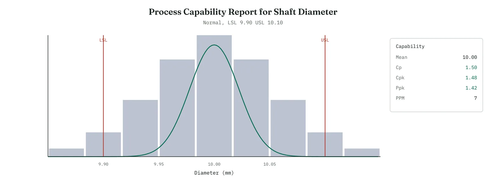
The indices read a Cp and a Cpk of about one and a half, and a defect rate of a few parts per million, roughly five sigma. The reading is the mirror of Crestline. The process is narrow enough to fit the tolerance with margin, and centred, so both the potential and the actual are healthy, and the within and overall figures agree, so it does not drift. This is what a capable process looks like, and setting it beside the Crestline report makes the Crestline failure legible, a distribution too wide for its tolerance and centred beyond it, against one that fits with room and sits on target. The same study, the same numbers, opposite verdicts, which is exactly what a baseline measure should be able to deliver.
The sigma table
The sigma level and the defect rate are two views of the same thing, and the mapping between them is worth carrying, because a sponsor will ask what a given sigma means in defects and what a given defect rate means in sigma. Table 13.20 gives the common points, with the one and a half sigma shift already built in, which is the usual convention in reported figures. Read it as a ladder. Each step up in sigma cuts the defect rate by roughly an order of magnitude, and the steps get harder as you climb, which is why the move from three to four sigma transforms a process and the move from five to six is a long campaign.
Table 13.20. The sigma level, the defect rate it implies, and the yield, with the shift built in.
| SIGMA | DEFECTS PER MILLION | YIELD |
|---|---|---|
| 1 | 690,000 | 31% |
| 2 | 308,000 | 69% |
| 3 | 66,800 | 93.3% |
| 4 | 6,210 | 99.38% |
| 5 | 233 | 99.977% |
| 6 | 3.4 | 99.99966% |
Crestline, near one and a half sigma, sits below the bottom of the useful part of the table, a process failing about half the time. The point of the table for a project is not the exact figure but the distance it makes visible. Moving Crestline from one and a half sigma to three would take it from half its cases failing to fewer than one in ten, a transformation, and moving it to four would make the failure rare. The table turns the abstract goal of improvement into a concrete ladder, and the capability study says which rung the process stands on.
One-sided and two-sided specifications
Specifications come in two kinds, and the capability reads a little differently for each. A two-sided specification has both a lower and an upper limit, and the process must stay between them, as the shaft diameter did. Here Cp is meaningful, because there is a tolerance width to compare the spread against, and Cpk takes the nearer of the two limits. A one-sided specification has a single limit, an upper limit the process must stay under, or a lower limit it must stay above, as the Crestline five-day service level was. Here there is no tolerance width and so no Cp, only a Cpk against the single limit, and the defect rate is the share of the process on the wrong side of it.
The distinction matters when you report, because quoting a Cp for a one-sided characteristic is a category error, there being no tolerance for it to describe. For Crestline the honest figures were the Cpk against the five-day limit and the defect rate beyond it, not a Cp, which had no meaning. Know which kind of specification you have before you choose the indices, and do not report an index the specification cannot support.
Capability as the project baseline
The reason capability closes Analyse rather than sitting earlier is that it produces the one number the whole project is measured against, the baseline. Analyse ends with a proven cause and a sized gap, and the capability study puts a figure on that gap, the sigma level of the process as it stands. Everything Improve does is then measured as movement from that figure, and the capability study is run again at the end, on the improved process, to show the movement in the same terms. The before and the after are the same measurement, which is what makes the improvement provable rather than merely asserted.
This is also why capability returns in Control. A baseline is not only a starting point but a line to hold, and Control watches the capability over time to confirm the improved process does not drift back. The within-overall gap the study reported is the early warning, the sign that a process capable at its best is failing to stay there. Capability, in other words, is not a single measurement taken once. It is the common currency of the whole project, the figure that states the problem at the close of Analyse, proves the gain at the close of Improve, and guards it through Control.
Stage 4. Reading the result
Reading the result
Three readings settle what a capability analysis is telling you.
| STRONG | The specification is the real customer requirement. The shape was checked and a non-normal method used where the data was skewed. Both the spread and the centre were read, and the short-term and long-term figures were reported, with the result carried as a defect rate and a sigma level. |
| WEAK | The data was skewed and indexed with the normal method anyway, or only Cp was read so a centring fault was missed, or a flattering short-term figure was quoted as the whole, or the specification was an internal target rather than the customer requirement. |
| THE TELL | Cp beside Cpk names the fault. A good Cp with a poor Cpk is a centring problem, an off-centre process. A poor Cp is a spread problem, a process too wide for the tolerance however it is aimed. Each points at a different fix. |
Four cautions sit under those readings. Check the shape before indexing, because a normal index on skewed data is a false number. Read the centre as well as the spread, because a good Cp can hide a bad aim. Report the long-term figure or both, because a short-term index can flatter a drifting process. And confirm the specification, because a capability is only as meaningful as the limit it is measured against.
Stage 5. Four firms, four moves
Four firms, four moves
The four grounds change how far you take a capability study and which of its numbers a firm can act on. The simplest form, one Cpk against one specification with the shape checked, suits any ground with a requirement to measure against. The fuller forms, the within-overall split and the non-normal fit, belong where the firm can carry them. The ground decides how much of the method to bring.
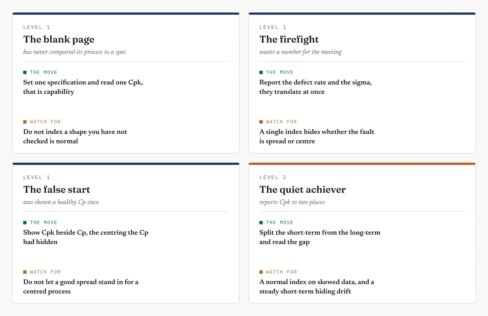
The blank page LEVEL 1
This firm has never compared its process to a specification. Start it with one, a single limit the customer requires, and one Cpk read against it, with the shape checked first. Show the histogram against the limit, so the firm sees capability as a picture before it is a number. Do not reach for the within-overall split or the non-normal fit until the first comparison has landed. The value here is not a sophisticated study. It is the firm learning, once, that its process has a voice and the customer has a voice, and that capability is the measurable distance between them, which it had never thought to measure.
The firefight LEVEL 1
This firm has a process visibly missing its service level and wants the size of the gap. The capability study gives it fast, as a defect rate and a sigma level read against the stated limit. Keep it to that, one specification, the shape checked, the defect rate and the sigma, and act. The corner not to cut is the shape check, because a defect rate read from a normal index on skewed data sends the firefight at a number that is wrong, and a crisis cannot afford a wrong baseline. A quick, honest capability this week beats a full six-index study the crisis will not wait for.
The false start LEVEL 1
This firm was shown a healthy index once, believed it was meeting the specification, and found the defects arriving anyway. It distrusts capability numbers now, which is the right instinct aimed at the wrong target, because the fault was reading Cp for Cpk, potential for actual. Show it Cpk beside Cp, and the centring the Cp had hidden. Show it the histogram against the limit, so the defects are visible, not inferred. A firm burned by a flattering index will trust a method that reads the centre as well as the spread, and shows the misses in a picture rather than asserting a number.
The quiet achiever LEVEL 2
This firm reports Cpk to two places and runs a capable-looking process, which makes its errors the subtle ones. It indexes a skewed characteristic with the normal method because the software offered it. It quotes a healthy short-term figure while the process drifts, the long-term far worse. It sets a limit by internal habit that is not the customer requirement. Hold it to the checks, the shape before the index, the overall figure beside the within, the specification traced to the customer. What you add here is not method, which the firm has, but the discipline to distrust a clean Cpk until it has passed the checks a clean Cpk can still fail.
Stage 6. Where it breaks
Where it breaks
1. Do not index data you have not checked for shape. The ordinary indices assume a bell shape. On skewed data they read a false capability. Check the histogram and probability plot before you index.
2. Do not read Cp without Cpk. Cp is the potential, spread only, and it flatters an off-centre process. Read Cpk, which carries the centre, whenever you can read only one.
3. Do not quote a short-term figure as the whole. The within figure is the best the process does. If it drifts, the overall is worse. Report the overall, or both, and name the drift.
4. Do not accept a specification you cannot trace to the customer. Capability against an internal target is not capability against the requirement. Confirm the limit is the real one before you measure against it.
5. Do not report an index to a sponsor. An index means little outside the analysis. Convert it to a defect rate and a sigma level, the figures a sponsor can act on.
6. Do not index an unstable process. A process out of control has no single capability, because it is not one process but many. Bring it into control before you index it, or the number describes nothing.
7. Do not confuse the mean with the centre of skewed data. On a skewed distribution the mean is pulled by the tail and sits away from the typical case. Use the method built for the shape, not the mean, to read the centre.
8. Do not treat a good capability as a finished job. A capable process can still drift out of capability. Capability is a baseline to hold, which is Control work, not a result to file and forget.
9. Do not index too few data. A capability read from a handful of cases has a wide uncertainty. Gather enough data, tail included, before you quote a number to a decision.
10. Do not ignore an attribute characteristic because it has no index. A pass or fail outcome has no Cp, but it has a defect rate and a sigma level. Report those, and do not leave the characteristic unmeasured.
Stage 7. At the gate
At the gate
What it lets you defend. The sponsor asks how far the process falls short of what the customer requires, and why. The capability analysis answers it in one baseline. The process meets its five-day service level about half the time, a defect rate near five hundred thousand per million, about one and a half sigma. It misses on both counts, too wide to fit the limit and centred beyond it, read from a non-normal analysis because the durations are skewed. This is why more handlers would not close the gap, because capability is the spread and centre of the resolution-time distribution against the limit, and headcount changes neither. The finding agrees with the regression, the experiment, and the reliability analysis, and adds to them the one figure the project had lacked, a baseline against which the improvement will be measured.
What it feeds. The analysis hands Improve the size of the prize, the distance from one and a half sigma to a process that meets its own service level, and the diagnosis that the fix must both narrow the process and bring it earlier. It hands Control the baseline to hold and the within-overall gap that names the stability job, the drift that will undo the gain if it is not kept in check. And it hands the gate the sigma level as the mark the whole project is judged against, the before figure the after must beat. With the baseline set, the analysis is complete, and the project crosses into Improve knowing not only what to fix but how far it has to move the number.
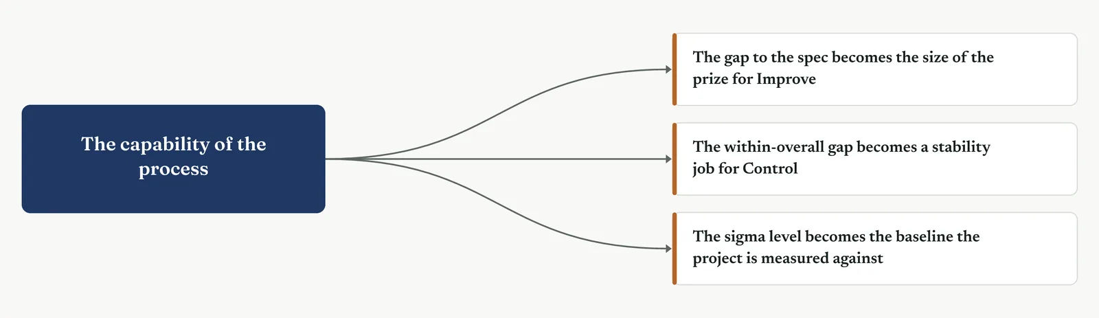
13 · ANALYSE MOVEMENT FOUR · CONFIRM THE DRIVER AND CLOSE
13.3.16 Project review, the phase gate
Mandatory ISO 13053
Purpose. The project review is the tool for deciding, at the close of a phase, whether the work is sound enough to go on. You bring the phase to a stop, lay out what it proved, and let the sponsor decide whether the project proceeds, proceeds with conditions, or returns for more work. Use it at the end of every phase, and treat it as a real decision point rather than a status update, because it is the moment the organisation commits, or declines to commit, the resources of the next phase.
Stage 1. The trigger
The trigger
Hold a project review at the end of every phase, and hold the Analyse review when the analysis is complete, the cause is established, and the project is ready to ask for the resources of Improve. The review is a gate, a point at which the project must earn the right to continue. That is its whole purpose, and it is what separates it from the status meetings that happen along the way.
A status meeting reports progress and continues. A gate stops the work, examines what it has produced, and takes a decision, go on, go on with conditions, or go back. The difference matters, because a project that never faces a gate never has to prove its case, and drifts from phase to phase on momentum rather than evidence. The gate is where momentum is checked against proof, and where a project that has not proved its case is caught before it spends the next phase building on a weak one.
For the Analyse gate in particular, the question is precise. Has the project proved the cause, or only proposed one. Everything in this chapter has been building toward an answer that will hold at this gate, and the review is where the answer is tested, in front of the sponsor, against the sponsor doubts. A cause that survives the gate is a cause the project can build on. One that does not is a cause that would have failed in Improve instead, at far greater cost.
Stage 2. The build
The build
Restate the problem and the goal. Open with the problem as Define framed it and the goal the project set, so the gate judges the analysis against the question it was meant to answer.
Lay out the proven cause and its evidence. Present the cause and the evidence that proves it, the stack of tools that converge on it, so the gate can see the proof, not just the claim.
Show the causes you ruled out. Show the competing explanations you tested and closed, so the gate sees the alternatives were faced, not ignored, which is what makes the chosen cause credible.
State the baseline and the size of the prize. Give the capability baseline and the gap to the target, in a defect rate and in money, so the gate knows what the improvement is worth.
Confirm the team is ready to improve. Confirm the people, the time, the access, and the sponsor commitment that Improve will need, so a go is a go that can be acted on.
Take the decision, and record it. Have the sponsor decide, go, conditional go, or no-go, and record the decision, its conditions, and its reasons, so the turn is on the record.
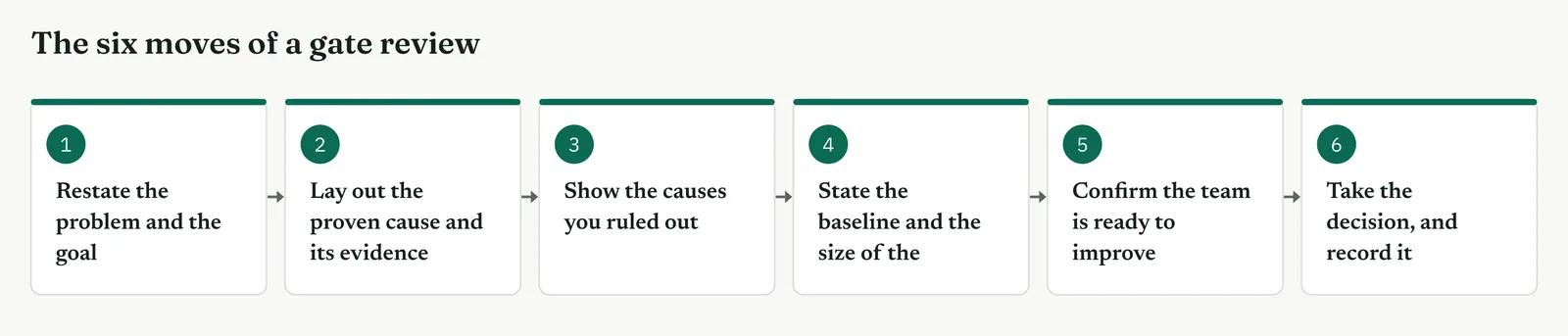
What the gate looks at depends on the question it is answering. To judge whether the cause is proven, it reads the evidence stack. To judge whether the alternative was ruled out, it reads the rejected causes. To judge whether there is a baseline, it reads the capability figure. To judge readiness, it reads the resource and commitment check. And to take the decision, it weighs all four into a go, a conditional go, or a no-go. Figure 13.131 pairs each check with what the gate looks at.
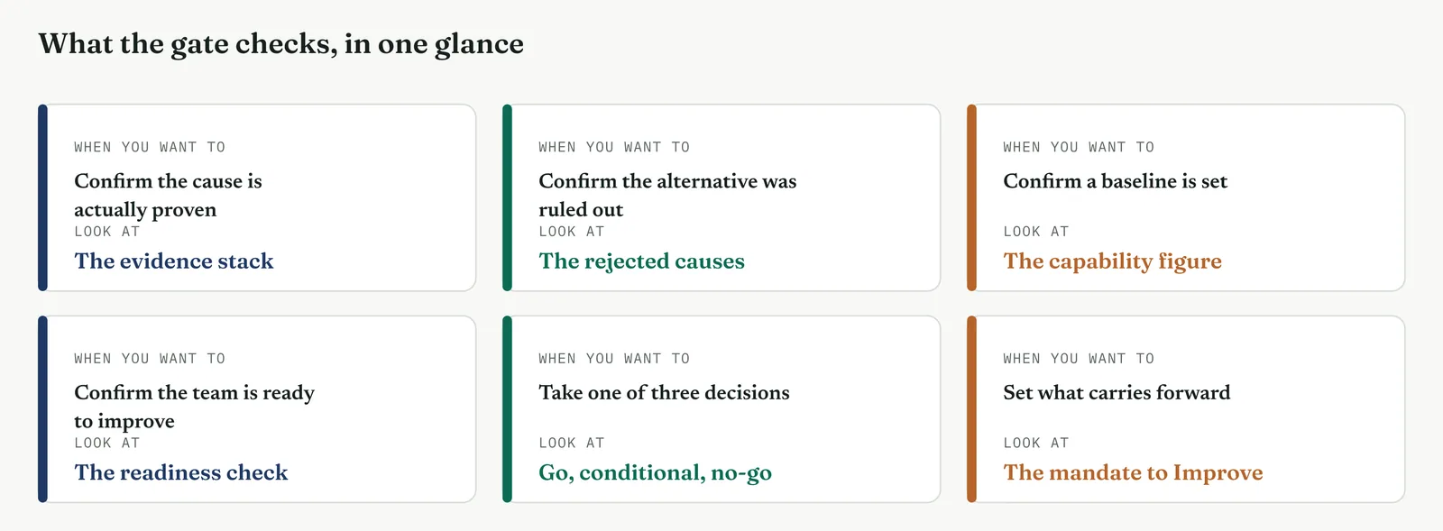
Table 13.21. The criteria an Analyse gate confirms before it lets a project proceed.
| CRITERION | WHAT THE GATE CONFIRMS |
|---|---|
| Cause proven | The root cause is established, by data or by experiment, not asserted |
| Alternatives ruled out | The competing explanations were tested and closed, not ignored |
| Baseline set | The process capability is measured, a sigma level to improve from |
| Prize sized | The gap from baseline to target is stated in money or in sigma |
| Team ready | The people, the time, and the access for Improve are in place |
| Risks named | The known risks to the fix are on the table, not buried |
| TIP A gate that can only say go is not a gate. The single thing that makes a review real is a sponsor who could say no and would be backed for it. If the decision is a foregone conclusion, the review is theatre, and its only effect is to teach the team that evidence does not matter because the project proceeds regardless. Give the sponsor a genuine no-go, with the evidence to use it and the authority to make it stick, or do not call the meeting a gate. |
Stage 3. Crestline on the floor
Crestline on the floor
Renu called the Analyse review for the complaint-resolution project six weeks after Measure closed. The room held the sponsor, the process owner Geoff, the lead Asha who had run most of the analysis, and Martin, who had argued for more headcount since before the project began. The review had one question to settle, whether the cause was proven, and it examined that question in the order below. Each section states what the review looks at, when it matters, and how it ran on the floor.
SECTION 1
The problem and the goal, restated
What it is
The review opens by restating the problem as Define framed it and the goal the project set. This anchors everything that follows, because the analysis is only good if it answers the question the project was chartered to answer. A review that does not restate the problem risks judging the analysis against a question that drifted during the work.
When to use it
Always open here, however familiar the problem, because the gate exists partly to catch drift. A project that quietly changed the problem it was solving, or the goal it was aiming at, is caught at the moment the original framing is read back and the analysis is measured against it rather than against where the work wandered.
The Crestline run
Asha restated it plainly. The problem was that complaint resolution took too long and failed too often, a median of six days against a five-day service level and a first-response accuracy of eighty-two per cent. The goal was to find and prove the cause, so Improve could fix the right thing. The restatement mattered because it named what the review was for, not to agree a fix, but to decide whether the cause was proven, which kept the meeting from sliding into the solution argument too early.
Across the four firms
The blank page. Restating the problem is a discipline a new firm learns here. Teach it to open every review with the chartered problem, so the analysis is judged against the right question.
The firefight. Even a firefight benefits from the thirty seconds of restatement, because a crisis is exactly where the problem being solved drifts from the problem that was chartered.
The false start. A firm whose last project solved the wrong problem will value the restatement most, because it is the check that would have caught the drift the first time.
The quiet achiever. The risk for a capable firm is treating the restatement as a formality to rush. Read it properly, because a subtle drift in a sophisticated project is the hardest kind to catch.
SECTION 2
The proven cause, and its evidence
What it is
The heart of the review is the cause and the evidence that proves it. A single tool rarely proves a cause on its own. What proves it is a stack of tools that converge, each closing off a different way the conclusion could be wrong, so that together they leave one explanation standing. The review reads that stack, not to admire the analysis, but to satisfy itself that the convergence is real and the cause is proven rather than merely favoured.
When to use it
Present the evidence as a stack whenever a cause matters enough to be gated, because a stack is far harder to dismiss than any single result. Figure 13.132 is the stack for Crestline, each tool of the chapter and the piece of evidence it added, converging on one cause. The review reads down it and asks, at each line, whether the evidence holds, and reads across it to see that every tool points the same way.
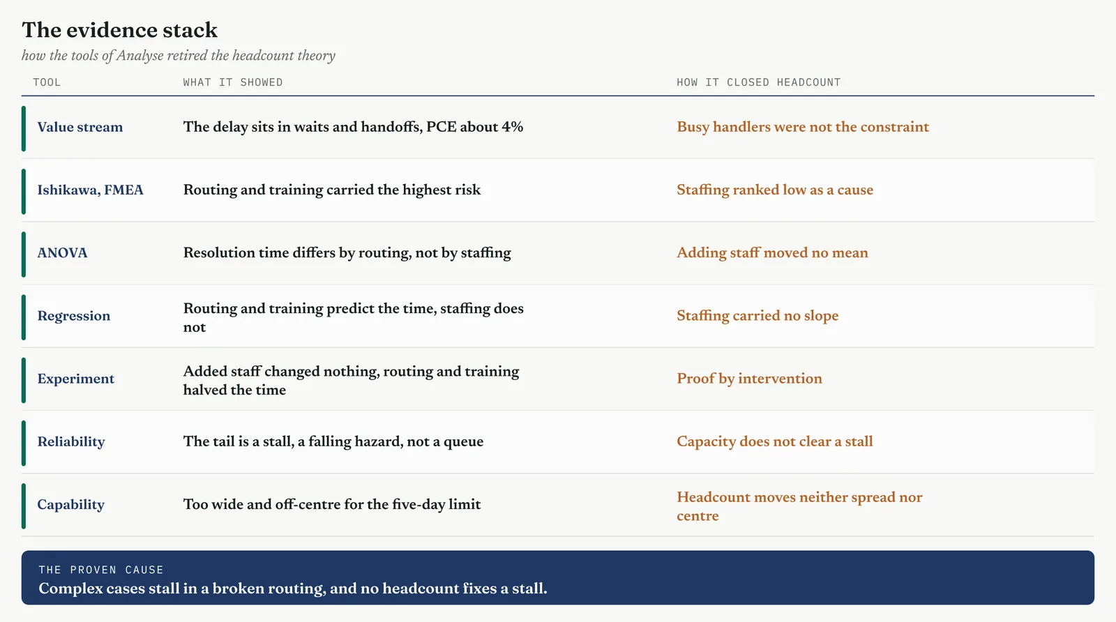
The Crestline run
Asha walked the stack. The value stream showed the delay sat in waits and handoffs, not in busy handlers. The Ishikawa and the failure mode analysis ranked routing and training high and staffing low. The analysis of variance and the regression found resolution time driven by routing and training, not by staffing level. The designed experiment proved it by intervention, adding staff changed nothing while routing and training halved the time. The reliability analysis showed the tail was a stall, a falling hazard, not a queue. And the capability study set the baseline, a process too wide and off-centre for the five-day limit. Seven tools, one conclusion. Complex cases stall in a broken routing, and no amount of headcount fixes a stall. The convergence was the proof, and the review could see it was real.
Across the four firms
The blank page. Teach the stack as the shape of proof. A new firm that learns to converge several tools on one cause has learned the central habit of a credible analysis.
The firefight. A firefight can present a shorter stack, three tools rather than seven, but the shape is the same, and even three converging results prove far more than one.
The false start. Show the stack in full, because a firm whose last cause was overturned will trust a conclusion that several independent tools reached, where one alone had failed it.
The quiet achiever. The discipline is to present the stack honestly, including the tool that half agreed, not to curate it into a false unanimity a sharp sponsor will distrust.
SECTION 3
The causes ruled out
What it is
A proven cause is only half the case. The other half is the causes ruled out, the competing explanations that were tested and closed. A cause is credible not only because the evidence points to it but because the alternatives were faced and found wanting. A review that hears only the winning cause, with no account of what was considered and rejected, is right to be suspicious, because it cannot tell a proven cause from a favoured one.
When to use it
Present the rejected causes whenever a strong alternative existed, and especially when someone in the room championed it, because closing it in the open is what turns an opponent into a supporter, or at least removes the ground they would otherwise fight from. The rejected cause is not a footnote. It is the part of the case that answers the question the sceptic is about to ask.
The Crestline run
The alternative was Martin headcount theory, that complex cases ran long because the desk was short of people. Asha did not skip it. She showed how each tool had closed it. The staffing factor ranked low in the risk analysis, carried no slope in the regression, moved no mean in the analysis of variance, and changed nothing in the experiment when tested directly. The reliability analysis explained why, the tail was a stall, and a stalled case is not waiting for a free handler. The headcount theory was not ignored or dismissed. It was tested more thoroughly than the winning cause, and it failed every test. Presenting it that way was what let the review close it for good.
Across the four firms
The blank page. Teach a new firm that ruling out the alternative is part of proving the cause, not an optional courtesy. A case with no rejected alternative is a case with a hole in it.
The firefight. A firefight must at least name the obvious alternative and why it was closed, because the loudest alternative is exactly the one the room will raise if the review does not.
The false start. A firm burned by a cause that was really a coincidence will value the rejected causes most, because that is the section that would have caught the coincidence.
The quiet achiever. The trap for a capable firm is to rule out alternatives too lightly, on a single test. Close the strong alternative as thoroughly as you proved the cause, or it will return.
SECTION 4
The baseline, and the size of the prize
What it is
The review needs to know what the improvement is worth, and that is the baseline and the prize. The baseline is where the process stands now, the capability and sigma level the last tool established. The prize is the distance from there to the target, stated in a defect rate and in money. Together they tell the sponsor what is being bought with the resources of Improve, which is the information a resource decision actually turns on.
When to use it
State the baseline and the prize at every gate that asks for resources, because a sponsor funds a return, not an analysis. A review that proves a cause but cannot say what fixing it is worth has given the sponsor half of what a decision needs. The prize is what converts a sound analysis into a fundable project.
The Crestline run
The baseline was the capability figure, about one and a half sigma, the process meeting its five-day service level about half the time. The prize was the distance from there to a process that met the level reliably, which Asha sized in the currency the firm understood, the case-days saved across the volume of complex cases and the cost those days carried in staff attention and lost goodwill. She did not overstate it. She gave a range and named the assumption behind it. The sponsor could see what the improvement was worth, which was the number the funding decision rested on.
Across the four firms
The blank page. Teach a new firm to bring a baseline and a prize to every gate, because a cause without a value is not yet a case for spending money.
The firefight. A firefight can size the prize roughly, a range rather than a figure, but it must bring one, because even a crisis needs to know the fix is worth the disruption.
The false start. A firm whose last project overpromised will value an honest, ranged prize, and the sponsor will trust the smaller claim that comes with its assumptions shown.
The quiet achiever. The discipline is to have finance check the sizing before the gate, so a capable firm does not present a prize the numbers cannot support when tested.
SECTION 5
The readiness to improve, and the decision
What it is
The last thing the review confirms is readiness, whether the people, the time, the access, and the sponsor commitment for Improve are actually in place, so that a go is a go that can be acted on. Then it takes the decision, one of three, and this is the point of the whole meeting. Go, proceed to Improve unchanged. Conditional go, proceed with named conditions and dates. No-go, return for more work with a clear account of what is missing. Figure 13.133 sets out the three.
When to use it
Confirm readiness before every go, because a project waved through without the resources to act is a project that stalls in the next phase, and the gate that waved it through takes the blame. And take a real decision at every gate, recorded with its reasons, because an unrecorded decision is one the organisation will relitigate, and a decision with no reasons is one no one can learn from.
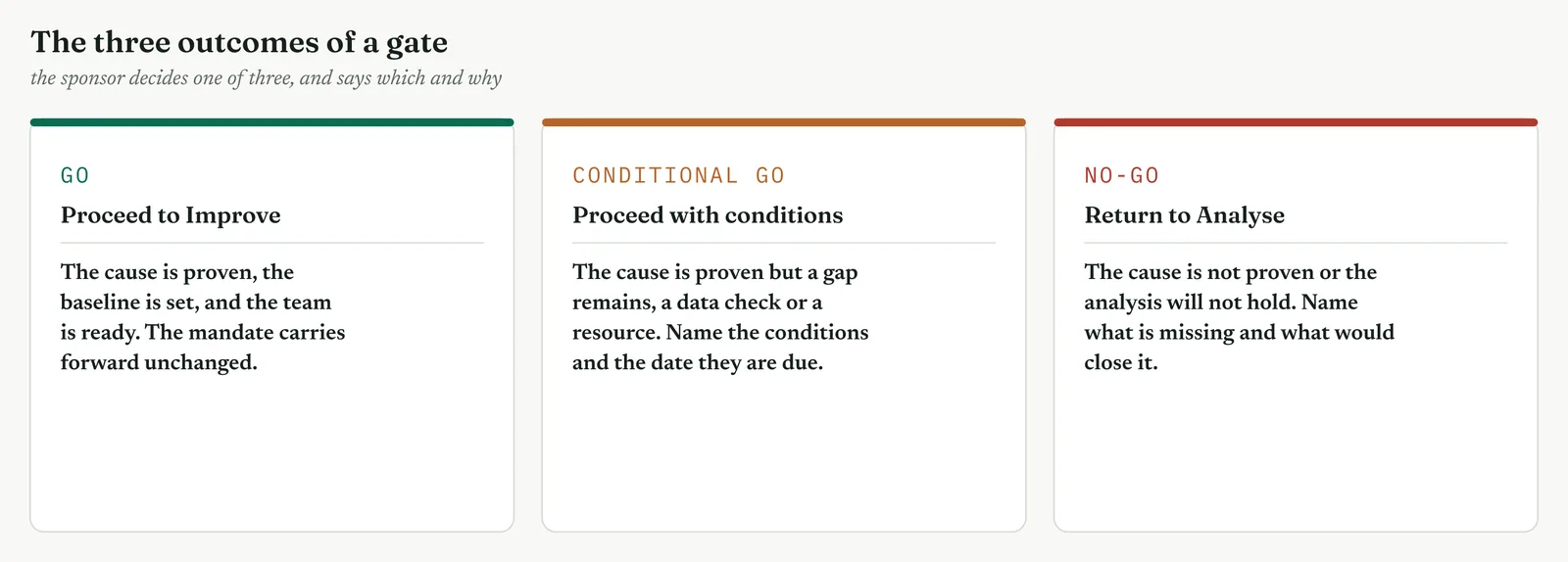
The Crestline run
Renu confirmed the readiness. Asha had the time, Geoff would give access to the routing rules, and Renu committed her own authority to any change that crossed the three desks. Then she decided. It was a conditional go. The project would proceed to Improve, on the condition that the fix was piloted on one stream of complex cases and confirmed before any wider rollout, and that finance signed off the sizing within the fortnight. She recorded the decision, the conditions, and the reasons, including the closing of the headcount theory, so that the turn was on the record and would not be reopened. The gate had done its work. The cause was proven, the alternative was closed, the prize was sized, and the project carried a mandate into Improve.
Across the four firms
The blank page. Teach a new firm that the decision is the point of the gate, and that recording it, with reasons, is what makes the gate worth holding at all.
The firefight. A firefight can take the decision in minutes, but it must take one, and record it, because the record of why you turned is what a crisis most often loses.
The false start. A firm whose gates rubber-stamped will value the conditional go, the outcome that lets a project proceed while naming what still has to be closed.
The quiet achiever. The discipline is to use the no-go when it is warranted, because a capable firm that never turns a project back has a gate that is not really deciding anything.
The Crestline gate, and Martin last stand
It is worth recounting the moment the headcount theory finally closed, because it is the moment the whole chapter has been building toward, and it did not close the way an argument usually does. Martin had championed more people since before the project began, and he made his case one last time at the gate. The desk was overloaded, he said, and any analysis that did not end in more handlers had missed the obvious. A year earlier that argument would have carried the room, because it was intuitive and no one had the evidence to answer it.
Asha did not argue with him. She returned to the stack. Staffing had been tested more thoroughly than any other factor, precisely because it was the favoured explanation, and it had failed every test. It ranked low as a cause, carried no slope, moved no mean, and, most tellingly, changed nothing in the experiment when handlers were actually added. And the reliability analysis had shown why, the long cases were not queuing for a free handler, they were stalling, and a stalled case does not resolve faster because someone else is free. Martin was not overruled by authority. He was answered by evidence he could not dispute, because the project had gone looking for exactly the proof his theory would have needed and had not found it. Renu closed it in the record, not as a theory rejected but as one tested and disproved, which is the only way an intuitive theory stays closed.
The lesson of the moment is that a gate is where analysis earns its keep. The months of work in this chapter had one purpose at this table, to answer, with evidence, a question that opinion could not settle. The evidence held, the theory closed, and the project turned toward the right fix. Had the analysis been thinner, the gate would have exposed it, and the project would have gone into Improve building more capacity that would not have helped. That is the value of the gate, and the value of the analysis that survives it.
Writing the gate decision
The decision leaves the room as a short written record, and its shape matters, because it is what the organisation will refer to when the question is reopened, as it usually is. Carry five things. The decision itself, go, conditional go, or no-go, in one word. The cause the gate accepted, in one sentence. The alternatives it closed, named, so they are not reopened as though never considered. The conditions, if any, each with a date and an owner. And the reasons, briefly, so a later reader understands not just what was decided but why. For Crestline the record read as a conditional go, on the proven cause that complex cases stall in a broken routing, with the headcount theory recorded as tested and disproved, subject to a piloted confirmation and a finance sign-off within the fortnight, because the cause was proven but the fix was not yet.
The record leaves out the detail of the analysis, which lives in the storyboard behind it, and carries only what a decision needs. A practitioner who can run the analysis but cannot write this record has left the gate half done, because an unrecorded decision is one the organisation forgets it made, and a project whose gate is forgotten is one that gets to refight every settled argument.
What a gate is, and is not
The word review invites confusion with the many other meetings a project holds, so it is worth being exact. A gate is not a status update, which reports progress and continues without a decision. It is not a working session, where the team does the analysis, because by the gate the analysis is done. It is not a presentation, whose measure is whether it went well. A gate is a decision point, and its measure is whether a decision was taken, recorded, and could have gone the other way. Everything about how it is run follows from that. The evidence is laid out so it can be judged, the sponsor is given a real choice, and the outcome is recorded as a decision, not as minutes.
The discipline this imposes is uncomfortable, which is why gates are so often watered down into status updates. A real gate can turn a project back, in front of the team that worked on it, which no one enjoys. But a programme whose gates never turn anything back is a programme with no gates, only checkpoints that projects pass through on momentum. The occasional no-go, or the more common conditional go, is the sign that the gate is working, that evidence is being weighed and sometimes found wanting. A gate that only ever says go has stopped deciding anything.
Who sits at the gate
A gate needs the right people, and too few is as bad as too many. Table 13.22 sets out the roles. The one that cannot be missing is the sponsor, because the sponsor holds the authority the gate exists to exercise, and a gate without the decision maker is a rehearsal. The others each bring something the decision needs, and a gate that lacks one of them is deciding with a gap.
Table 13.22. The roles at a gate, and what each one brings to the decision.
| ROLE | WHAT THEY BRING |
|---|---|
| Sponsor | The authority to decide, and to commit the next phase resources |
| Champion | The link to the wider programme, and to other sponsors |
| Process owner | The knowledge of the process, and the duty to live with the fix |
| Belt | The analysis, and an honest account of what it does and does not prove |
| Finance | The check on the sizing, so the prize the gate funds is real |
The storyboard
Behind every gate sits a storyboard, the one-page account of the project so far, and it is worth naming because it is what the gate reads from. A storyboard tells the project as a story, the problem, the measure, the analysis, the cause, the baseline, and the prize, in a form a sponsor can take in at a glance and a reviewer can check in depth. It is not a slide deck built for the meeting and discarded after. It is a living record of the project that grows through the phases, and the gate reads the Analyse chapter of it. A project with a good storyboard arrives at every gate ready, because the account the gate needs is the account the project has been keeping all along.
The discipline of the storyboard is honesty. It carries the tool that half agreed as well as the ones that agreed, the assumption behind the prize as well as the prize, the risk to the fix as well as the fix. A storyboard curated to look good is one that will fail at the gate the moment a sharp sponsor probes the gap between the story and the evidence. Kept honestly, it is the single most useful document a project has, the thing that makes the gate a reading rather than a performance.
Gates across the phases
The Analyse gate is one of a series, and it helps to see the whole set, because each gate confirms a different thing and the series as a whole is what keeps a project honest from end to end. Table 13.23 lists them. The shape of each is the same, a decision taken on evidence and recorded, but the question each answers is particular to its phase. Read together, they are the spine of the method governance, the points at which a project must prove it has earned the right to go on.
Table 13.23. The gate at each phase, and the question it confirms.
| GATE | WHAT IT CONFIRMS |
|---|---|
| Recognise | The problem is real and worth solving |
| Define | The problem is framed, scoped, and sponsored |
| Measure | The process is measured and the baseline is trustworthy |
| Analyse | The cause is proven and the alternatives ruled out |
| Improve | The fix works and is confirmed |
| Control | The gain is held and handed to the owner |
| Sustain | The capability endures beyond the project |
The Analyse gate sits at the hinge of the series. Before it, the project has been understanding the problem. After it, the project builds the fix. The gate is where the organisation decides that the understanding is sound enough to build on, and it is the last cheap place to catch an error, because an unproven cause caught here costs a return to Analyse, while the same error caught in Improve costs a fix that does not work and a rollout that does harm. That is why the Analyse gate is mandatory, and why it is worth the discipline of a real decision.
Common mistakes at the gate
Gates fail in recognisable ways, and the symptoms point back to what was skipped.
The gate that cannot say no
The review runs, the project proceeds, and everyone knew it would before the meeting began. The cause is a sponsor with no real authority to turn the project back, or a culture in which a no-go is treated as a failure rather than a decision. The symptom is a gate that has never turned anything back. The fix is to give the sponsor a genuine choice and to treat a no-go as the gate working, not failing.
The status update in gate clothing
The meeting reviews progress, discusses next steps, and ends without a recorded decision. The cause is confusing a gate with a status meeting. The symptom is that no one can say afterward what was decided. The fix is to end every gate with a decision, in one word, recorded with its reasons.
The curated storyboard
The presentation is polished, the story is clean, and the analysis beneath it is thin. The cause is a storyboard built to impress rather than to inform. The symptom is a case that looks strong until a sharp question opens a gap. The fix is to test the evidence at the gate, not just receive it, and to keep the storyboard honest so there is no gap to open.
The alternative never faced
The winning cause is presented well, but the obvious competing explanation is never mentioned. The cause is a case built to advocate rather than to prove. The symptom is a room that accepts the cause until someone raises the alternative, and then cannot tell whether it was considered. The fix is to present the rejected causes as part of the case, so the gate sees the alternatives were faced.
As with every tool in this chapter, the failures name the discipline. Give a real choice, take a recorded decision, keep the storyboard honest, and face the alternative. A gate that does these is the cheapest insurance a project has. One that does not is a checkpoint pretending to be a gate.
Preparing for the gate
A gate is won before the meeting, in the preparation, and the belt who arrives ready is rarely surprised. Three habits prepare a gate. First, assemble the storyboard, the one-page account of the project, so the evidence is in a form the sponsor can read and a reviewer can check, and so nothing has to be recalled from memory in the room. Second, rehearse the hard questions, especially the one the champion of the rejected cause will ask, because the answer to that question is the case, and it should be ready rather than improvised. Third, pre-brief the sponsor, so the decision is not sprung on them cold.
The pre-brief deserves a word, because it is often mistaken for rigging the gate. It is not. A sponsor who first meets the evidence in the room, with the team watching, is a sponsor forced to react rather than decide, and a reactive sponsor defaults to the safe option, which is usually to defer. A pre-brief lets the sponsor absorb the evidence, form questions, and arrive ready to decide. The decision is still theirs, still real, still able to go either way. What the pre-brief removes is the surprise, and surprise is the enemy of a good decision, not its guarantee.
The same rule protects the team. A belt who lets the sponsor raise, for the first time, an objection the team could have addressed has failed to prepare, not been caught out. The objections a gate will raise are nearly always foreseeable, the alternative cause, the sizing assumption, the readiness gap. Foreseeing them and addressing them in the storyboard is the work, and a gate that produces no surprise is a gate that was prepared, which is exactly what you want. The rule is no surprises at the gate, for the sponsor or for the team, because a gate is a decision, and decisions are better made with warning than without.
The close of Analyse
This gate is the last tool in Analyse, so it is worth standing back to see what the phase has done. Analyse began with a problem and a suspected cause, and it spent four movements turning the one into the other. The first movement mapped the process and found where it lost time and value, the waits and handoffs the average had hidden. The second surfaced the candidate causes, the fishbone and the failure modes that named what might be driving the loss. The third tested those candidates against the data the process had already produced, the scatter, the regression, the analysis of variance, sizing and separating them. And the fourth confirmed the driver and closed, the experiment proving it by intervention, the reliability and capability studies naming the mechanism and setting the baseline.
The gate is where those four movements are weighed as one. A single tool from any movement would not have carried the argument. The map alone is a description, the fishbone alone is a list of suspects, the regression alone is an association, the experiment alone is one result. What carries the argument is the four movements together, converging, each closing a way the conclusion could be wrong, until one cause stands proven and the alternatives are closed. That convergence is what the gate reads, and it is why Analyse is built as a sequence of movements rather than a single test. The phase is a case being assembled, and the gate is where the case is heard.
For Crestline the case held. The headcount theory that had run the argument for a year was tested and disproved, the real cause proven, the baseline set, and the project turned toward the right fix with a mandate to build it. That is what Analyse is for, not to produce analysis, but to produce a proven cause a sponsor will fund the fixing of. With the gate passed, the chapter closes, and the project crosses into Improve to build the remedy the analysis has earned.
Stage 4. Reading the result
Reading the result
Three readings settle whether a gate did its work.
| STRONG | The cause was presented as a stack of converging evidence, the strong alternative was shown tested and closed, a baseline and a sized prize were on the table, the sponsor had a real choice, and the decision was recorded with its conditions and reasons. |
| WEAK | A single result stood in for proof, the obvious alternative was never faced, no baseline or prize was given, the outcome was never in doubt, or the meeting ended with no recorded decision. |
| THE TELL | Whether the gate could have said no. A review that could only ever approve is a status update in gate clothing. A review that gave the sponsor a real choice, and recorded the choice made, is a gate. |
Four cautions sit under those readings. Present the cause as a stack, not a single result, because one tool rarely proves a cause. Face the strong alternative in the open, because closing it is what makes the cause credible. Bring a baseline and a prize, because a sponsor funds a return. And record the decision with its reasons, because an unrecorded decision is one the organisation will relitigate.
Stage 5. Four firms, four moves
Four firms, four moves
The four grounds change how heavy a gate a firm can carry and, more importantly, whether it treats the gate as a real decision. The lightest form, a short review that states the cause, the baseline, and the decision, suits any ground willing to take a genuine decision. The fuller forms, the tested alternative and the honest storyboard, belong where the firm can carry them. The ground decides the weight, but not whether the decision is real, which every ground must get right.
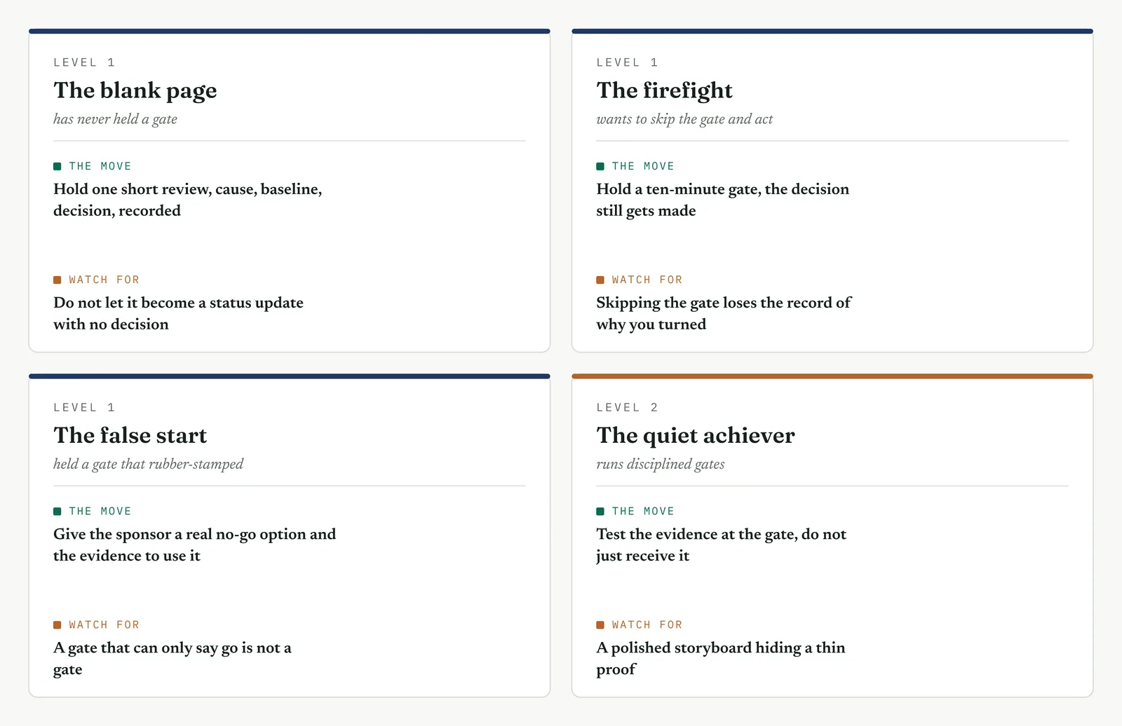
The blank page LEVEL 1
This firm has never held a gate, and moves from phase to phase on momentum. Start it with one short review, the cause, the baseline, and a recorded decision, and above all with the idea that the decision could be no. Keep it light, thirty minutes and one page, but keep the decision real. Do not let it collapse into a status update, which is the failure mode a firm new to gates falls into, because a status update is the meeting it already knows how to hold. The value here is not a heavy governance process. It is the firm learning, once, that a project can be asked to prove its case before it is allowed to go on, and that the asking is what keeps the analysis honest.
The firefight LEVEL 1
This firm wants to skip the gate and act, because the crisis feels too urgent for a meeting. Hold the gate anyway, and make it ten minutes. The cause in a sentence, the alternative closed, the decision recorded. The corner not to cut is the record, because a firefight that turns without recording why will refight the same argument the moment the crisis eases and someone asks why more people were not hired. A ten-minute gate that leaves a record beats a skipped gate that leaves the decision to memory, which in a crisis is no record at all.
The false start LEVEL 1
This firm held a gate once and it rubber-stamped, so it has learned that gates are theatre. The repair is to give the sponsor a real no-go and the evidence to use it, and to hold, visibly, one gate that turns a weak project back or attaches real conditions to a strong one. A firm that has only seen gates approve will not believe a gate is real until it sees one bite. Show it the conditional go, the outcome that proceeds while naming what is unproven, because that is the gate deciding something, and it is the thing the rubber-stamp never did.
The quiet achiever LEVEL 2
This firm runs disciplined gates with polished storyboards, which makes its risk the subtle one, a gate that receives evidence rather than testing it. A clean presentation can carry a thin proof past a sponsor who is admiring the storyboard rather than probing it. Hold the firm to testing the evidence at the gate, to reading the tool that half agreed, to asking where the prize sizing came from, to closing the alternative properly. What you add here is not process, which the firm has, but the habit of a gate that interrogates, so that a well-made case still has to be a true one, and the polish never stands in for the proof.
Stage 6. Where it breaks
Where it breaks
1. Do not hold a gate that cannot say no. A review whose outcome is certain before it starts is theatre. Give the sponsor a real choice, or do not call it a gate.
2. Do not end without a recorded decision. A gate that produces minutes but no decision has not gated anything. End with a decision, in one word, recorded with its reasons.
3. Do not present a cause without the alternative. A cause with no rejected alternative looks advocated, not proven. Show the strong competing explanation tested and closed.
4. Do not bring a cause without a prize. A sponsor funds a return, not an analysis. Bring the baseline and the sized gap, or the gate cannot judge whether the fix is worth it.
5. Do not confuse a gate with a status update. A status update reports and continues. A gate stops, judges, and decides. Do not run one and call it the other.
6. Do not wave a project through without readiness. A go without the people, time, and access for the next phase is a project that stalls. Confirm readiness before you confirm the go.
7. Do not curate the storyboard. A story built to impress hides the gap a sharp question will find. Keep the storyboard honest, including the tool that half agreed.
8. Do not skip the gate under pressure. The urgent project is the one that most needs the record of why it turned. Hold a short gate rather than no gate.
9. Do not let the loudest voice decide. The gate decides on evidence, not on who argues hardest. Answer the strong opinion with the stack, not with a louder opinion.
10. Do not reopen a recorded decision without cause. A decision taken on evidence and recorded stands until new evidence appears. Do not relitigate a closed gate on the same facts.
Stage 7. The mandate forward
The mandate forward
What the gate settles. The sponsor asks the one question the whole chapter was built to answer, whether the cause is proven or only proposed. The gate settles it. The cause is proven, by a stack of tools that converge, complex cases stall in a broken routing, and the headcount theory that would have sent the fix in the wrong direction was tested more thoroughly than the winning cause and disproved. The baseline is set, about one and a half sigma, and the prize is sized. The decision is a conditional go, recorded with its reasons, and the project carries a proven cause and a mandate into Improve. This is the close of Analyse, the point at which understanding becomes the licence to build.
What it feeds. The gate hands Improve three things. The proven cause, which becomes the problem Improve builds its fix against, no longer a theory to test but a fault to remedy. The baseline, which becomes the mark Improve must beat, the before figure the after will be measured against at the next gate. And the mandate, the sponsor authority to change the process across the three desks, without which Improve could analyse a fix but never make it. With those three carried forward, the project leaves Analyse complete. The problem is understood, the cause is proven, the alternative is closed, and the work of building the fix can begin on solid ground.
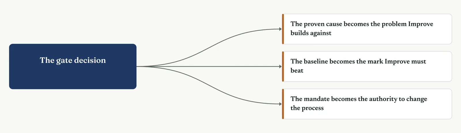
13.4 Choosing tools by project type
The toolkit holds sixteen tools. No project uses all of them, and reaching for the wrong ones wastes the phase. The choice is driven by the problem in front of you, not by preference or by the tool you happen to know best. This section sets out how to choose, by asking what the data will bear, which family of tool the problem calls for, what kind of problem you actually have, and how far the weight of evidence lets you push each tool.
13.4.1 When a statistical test is justified and when it is not
A statistical test earns its place only when the data can carry it. It needs enough clean observations, a measured output, and a question sharp enough to state as a hypothesis. When those hold, a test settles a contested cause with a rigour no opinion can match. When they do not, a test run anyway returns a number with no weight behind it, a result from a sample too small or too dirty to mean anything, and that false rigour is worse than none, because it dresses a guess in the authority of a proof.
Table 13.24 sets out the conditions on both sides. Read them before you reach for a test, because the cost of a test that should not have been run is not only the wasted effort. It is a finding the gate accepts and Improve builds on, which turns out to rest on nothing.
Table 13.24 When a statistical test earns its place, and when it misleads.
| TEST EARNS ITS PLACE WHEN | TEST MISLEADS WHEN |
|---|---|
| There are enough clean observations to see an effect | There are too few, or too dirty, to see past the noise |
| The output is measured, not judged | The output is a category or an opinion dressed as a number |
| The claim is sharp enough to state as a hypothesis | The question is vague, or it shifts as you test it |
| The process held still while the data was gathered | The process changed under the data, so the sample is mixed |
At Crestline the data is thin, so a formal test on the whole resolution time is fragile, the sample too small to see past the noise. But narrower claims can still be tested where the data allows. The handoff timings carry enough to test, even where the overall figure does not. You test what the data can bear and prove the rest on the process, and the skill is telling the two apart rather than forcing a test the data cannot support.
13.4.2 Process analysis versus data analysis
Two families of tool sit in the Analyse kit, and they answer different questions. Process analysis, the map, the waste count, the value stream, the flow, reads where the work loses time and value. Data analysis, the tests, the regression, the analysis of variance, the experiment, reads what in the numbers drives the output. One walks the process. The other interrogates the data. Most projects need both, but the balance shifts with the problem, and knowing which should lead is half the work of choosing.
Table 13.25 Process analysis and data analysis, what each reads and when it leads.
| PROCESS ANALYSIS | DATA ANALYSIS |
|---|---|
| Reads where the work loses time and value | Reads what in the numbers drives the output |
| Works on thin data, needs the process visible | Needs enough clean data to carry a test |
| The map, the waste count, the value stream, the flow | The hypothesis test, the regression, the ANOVA, the experiment |
| Leads when the problem is flow or waste | Leads when the problem is variation |
The immature firm usually hands you a process problem on thin data, so process analysis leads and data analysis confirms where it can. The mature plant hands you a variation problem on rich data, so data analysis leads and the process view frames the test. Read which you have before you reach for a tool, because leading with the wrong family spends the phase on the wrong question and arrives at the gate with the wrong kind of proof.
13.4.3 Variation problem versus flow and waste problem
The single most useful question at the start of Analyse is what kind of problem you have. A variation problem is one where the same step gives a different result each time, a spread you must narrow. A flow and waste problem is one where the work moves too slowly or loses value between steps, a delay you must remove. The two sound alike in a complaint about slowness, but they call for different tools and different proof, and reading them wrong sends the whole phase astray. Figure 13.136 puts the question and its two answers side by side.
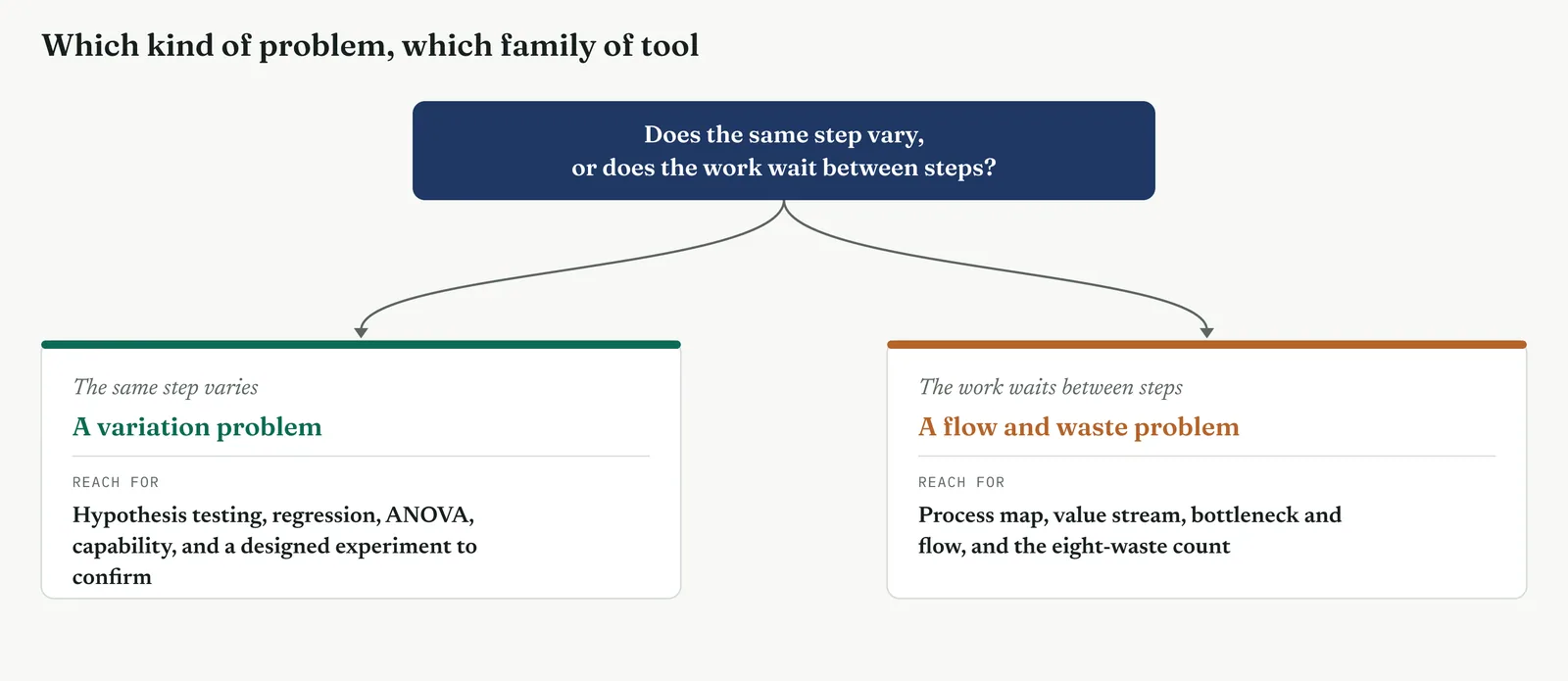
Table 13.26 carries the routing further, from the kind of problem to the tools that fit it.
Table 13.26 The problem you have, and the tools to reach for.
| THE PROBLEM | REACH FOR |
|---|---|
| Variation, the same step spreads | Hypothesis testing, regression, ANOVA, capability, a designed experiment |
| Flow, the work waits between steps | Process map, value stream analysis, bottleneck and flow |
| Waste, value is lost in the doing | Waste analysis, value stream analysis |
| A contested cause on thin data | The process map, plus a targeted test where the data allows |
Crestline is a flow and waste problem wearing the costume of a capacity problem. The same step does not vary wildly. The work waits, in the handoffs between the three teams that no one owns and no clock measures. So the Lean tools lead, the map and the value stream showing the loss, and the data tools confirm that staffing does not drive it. Had you read it as a variation problem and led with a designed experiment, you would have spent the phase testing the wrong thing, and proved at great effort something beside the point.
13.4.4 Letting the data weight decide the tool
The last rule ties the others together. Let the weight of the data decide how far you push each tool. Where the data is rich and clean, push the data tools hard, test, model, and prove the cause statistically. Where the data is thin, lean on the process view and use the data only to confirm what the process already shows. Figure 13.137 sets the spectrum out. Do not let a thin dataset stop the analysis, and do not let a rich one seduce you into testing what the process has already answered.
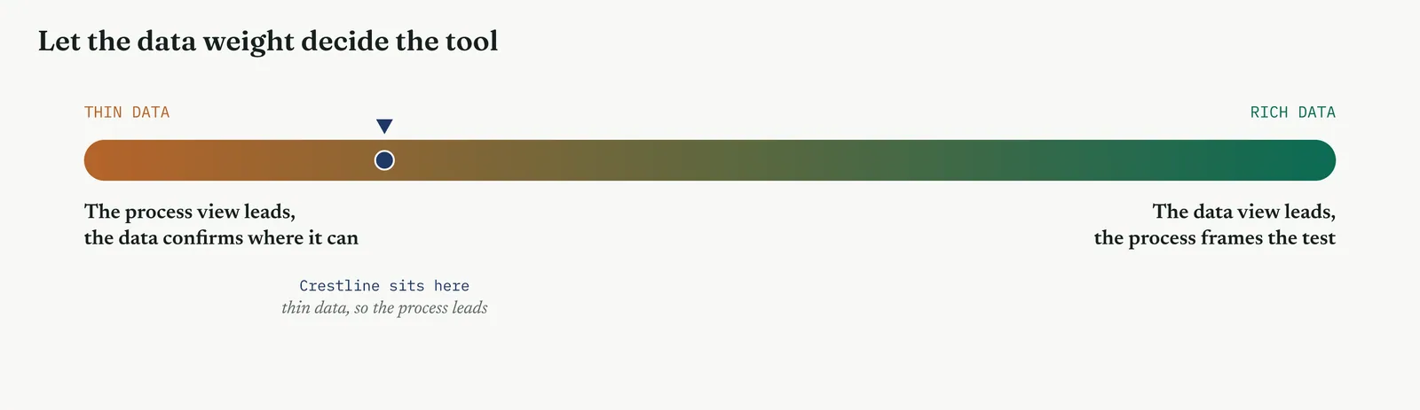
This is the judgement the phase turns on, and it is why two skilled belts can analyse the same problem with different tools and both be right. The tool is chosen against the data in front of you, not against a preference or a certificate on the wall. At Crestline the data weight is light, so the process view leads and the data confirms. In a data-rich plant the same complaint might be settled by a single regression. Read the weight, choose the tool, and let the evidence, not the habit, decide.
13.5 Scenarios
The rules in 13.4 come alive in the choosing. Five scenarios show the same judgement in different lights, the same problem handled two ways by the data, the depth matched to the problem, the order set by the kind of trouble, the framing that keeps a room on side, and the trap of a heavy tool reached for too soon. Figure 13.138 sets them out, and the sections that follow walk each one.
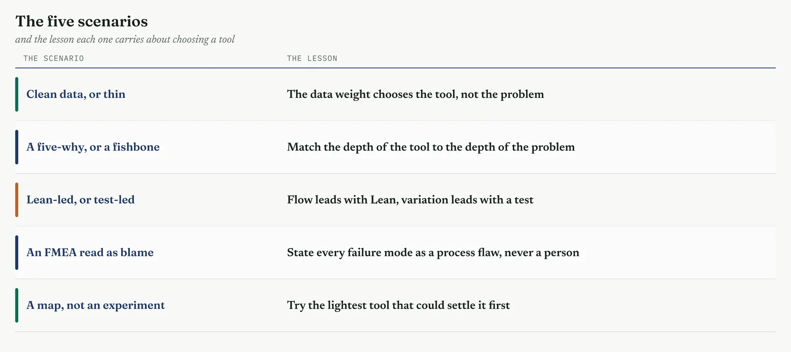
13.5.1 Hypothesis testing on clean data, and process analysis on thin data
Two firms face the same complaint, a service that runs too slow, and the right tool differs entirely because the data differs. The first firm logs every case, every timestamp, every handler, cleanly, for a year. Here you test. You state the claim, that the delay rises when the team is short, and you run it against the data. The sample is large and clean enough to return a result with weight behind it, and the test settles the question in an afternoon. The process view still frames it, but the data carries the proof.
The second firm logs almost nothing, a start date, an end date, and a handler who may or may not be recorded. Here a test would be theatre, a result from a sample too small and too dirty to mean anything. So you work the process instead. You walk the flow, map the handoffs, and count the days a case sits with no one working it. The loss is visible on the map whether or not the sample supports a test, and the map is proof enough. Same problem, opposite tool, and the weight of the data decided which.
13.5.2 A simple five-why, and a full fishbone with verification
Not every cause needs the full machinery, and matching the depth to the problem is a skill in itself. A machine stops, and the operator asks why five times, no power, a tripped breaker, an overloaded circuit, a second machine added to the same line, no one checked the load. Five whys, one afternoon, cause found and fixed. Reaching for a fishbone and a verification study here would be waste, effort spent proving a cause a short chain had already settled.
The Crestline delay is the other kind. The cause is contested, several teams are involved, and more than one theory has a champion. Here a five-why would stop at the first plausible answer and miss the rest, because a single chain follows one thread and this problem has many. So you build the full fishbone, gather every candidate across people, process, and system, rank them, and verify the few that matter against the data. The depth matches the problem. A simple cause gets a simple tool. A contested one gets the full method, and neither is a failing of the other.
13.5.3 The Lean-led analyse, waste first, and the Six Sigma-led, test first
The order you reach for tools follows the problem, and two projects show the two orders. The first is a flow problem, work moving too slowly through a process that is busy but not varying. Here Lean leads. You map the value stream, count the waste, and find the bottleneck, and the loss is on the table before a single test is run. The data tools come in only to confirm what the flow analysis has already shown. This is the Lean-led analyse, and it fits most immature-firm problems, where the trouble is delay and handoff, not spread.
The second is a variation problem, a step whose output spreads too wide, in a plant with clean data. Here Six Sigma leads. You go to the data, test which inputs move the output, model the relationship, and confirm the driver statistically. The process view frames the test but does not carry it. This is the Six Sigma-led analyse, and it fits the mature, data-rich setting. Reading which order a problem calls for, before you start, is what keeps the phase from spending its effort in the wrong place.
13.5.4 Running an FMEA where the owner reads every failure mode as blame
An FMEA lists the ways a process can fail, and in an immature firm that list can read as an accusation. At Crestline the process owner sits through the first session hearing every failure mode as a charge against his team, the handoff that drops a case becoming a person who dropped it, the missed check becoming a checker who missed it. He grows defensive, the session stalls, and the analysis is at risk before it has properly begun.
The move is to frame every failure mode as a flaw in the process, never in a person. The case is dropped because the handoff has no owner and no clock, not because anyone was careless. The check is missed because the step relies on memory rather than a prompt, not because a checker failed. Stated as process flaws, the failure modes stop being accusations and become things the team can fix together, and the owner moves from defending his people to helping find the holes. The FMEA is the same either way. The framing is what lets the room use it. And this is not only tact. A failure mode blamed on a person is usually wrong as well, because the flaw that let one person err will let the next one err too.
13.5.5 The wrong-tool trap, a designed experiment where a process map answered it
The most expensive mistake in Analyse is reaching for a heavy tool when a light one would answer the question. A team suspects a complex interaction drives a delay and plans a designed experiment, weeks of setup, factors chosen, runs scheduled, a real cost in time and disruption. Before it runs, someone walks the process and maps it, and the answer is plain within the hour. The delay is a single unowned handoff where every case waits two days for a batch to fill. There is no interaction to untangle and no experiment to run. A map answered what a designed experiment had been booked to prove.
The lesson is to match the tool to the question, and to try the cheap tool first. A designed experiment is the strongest tool in the kit, but strength is not the same as fit. Reached for a question a process map answers, it is waste dressed as rigour. Always ask what the lightest tool that could settle this is, and reach for that first. The heavy tools earn their place when the light ones have been tried and fallen short, not before.
Across the five, one habit recurs. Read the problem before you reach for a tool. The weight of the data, the depth of the cause, the kind of trouble, the temper of the room, and the true size of the question all shape the choice, and none of them is visible from the tool side. A belt who starts from the tool, running the test because testing is what belts do, or the experiment because it is the most powerful, will meet the wrong-tool trap sooner or later. A belt who starts from the problem, and lets it name the tool, spends the phase where it counts. That is the whole of choosing, and it is why Analyse rewards judgement over method.
13.6 Hiccups and how to clear them
Analyse rarely runs clean in an immature firm. The tools are sound, but the room is not, and three hiccups recur often enough to name. The sponsor who wants to skip to Improve. The data too thin for a clean test. The owner who reads the FMEA as blame. Each can stall the phase, and none of them yields to argument. Each yields to a move. Do not fight these. Turn each one into part of the work. Figure 13.139 pairs each hiccup with its move, and the sections that follow give the method, why the hiccup happens, what to do, and what it costs if you do not.
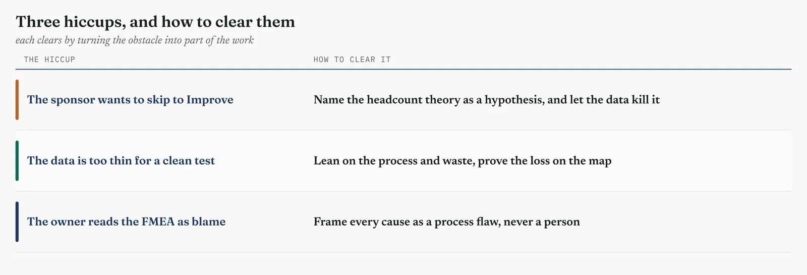
13.6.1 The sponsor wants to skip to Improve
The sponsor wants to skip to Improve. The queue is long, the answer feels obvious, more people, and the pressure to stop analysing and start fixing is real. Do not defend the method. The argument that Analyse matters and proof takes time loses every time, because it sounds like a belt protecting his own process against a leader who wants results.
Understand why the pull is there before you meet it. It is structural, not personal. Improve produces visible action, Analyse produces proof, and in an impatient firm action reads as progress while proof reads as delay. The sponsor is responding to a real pressure to show movement, and the belt who forgets that loses him. You do not clear this hiccup by wanting the sponsor to be more patient. You clear it by giving him movement he can show, which is the test itself.
So keep the theory rather than fight it, and do three things with it. Name the headcount theory out loud, in the words the sponsor used. Write it as a hypothesis, that if staffing drives the delay, cases slow when the team is short and speed when it is full. And attach a date, so the test has an end the sponsor can see. You have now turned that certainty into a question with a deadline, and you have done it by taking the theory seriously rather than dismissing it. A sponsor who agreed to test the theory, by a date, cannot object when the test settles it. Let the data kill the theory or confirm it. Either way the phase has done its job.
Watch for the softer form of the same hiccup, the sponsor who wants to hire and analyse at once, to be safe. Refuse it, and explain why in one line. Hiring while you test contaminates the test, because the process changes under the data and you lose the very answer you were buying. Hold the process still while the question is open. If the pressure to act is too great to hold, run the test fast and narrow rather than run it alongside a change that will spoil it.
This is the headcount champion pressing to fund handlers before the analysis is done, and it is where the project can be lost. Skip to Improve here and the firm hires, the queue does not clear because the delay was never a capacity problem, and the method takes the blame for a theory that was never tested. Name the theory as a hypothesis and you protect the project and the sponsor both, because the answer, when it comes, is one the sponsor helped set up and cannot disown.
The tell. You have cleared it when the sponsor stops asking why you are still analysing and starts asking when the test reports. That is the moment the headcount theory became a shared question rather than a standing order.
13.6.2 The data is too thin for a clean test
The data is too thin for a clean test. The firm logs a start date, an end date, and little else, the categories are loose, and the sample is whatever survived. Do not freeze, and do not force a test the data cannot support. Both reactions fail, and the second fails worse, because it produces a number that looks like proof and is not.
Understand that thin data is the normal state of an immature firm, not the exception. The systems were built to run the work, not to measure it, so the gaps are structural. A belt trained on rich data reads this as a blocked project. It is not blocked. It is a different project, run on the process rather than the numbers, and the process is always available to be walked.
So work the process and the waste, which need no large sample. The map shows where a case sits idle and needs no sample at all. The waste count needs a handful of observed cases. The value stream needs one walk of the line. A Pareto of failure types needs only the failures you can see. Reach for these first. A case waiting four days with no one working it is a loss whether or not a result comes back significant, and the map proves it. Hold the statistical tools for the narrow claims the data can carry, a single handoff timing that happens to be well recorded, and prove the rest on the process.
Guard hard against the opposite move, the formal test run on a thin sample and reported as though it were sound. A result from twelve dirty cases has the look of proof and none of the substance, and it is worse than no test, because the gate will accept it and Improve will build on it. When the data cannot carry a test, say so plainly, and prove the loss another way. A thin sample is a reason to change tools. It is never a licence to guess, and never a licence to dress a guess as a finding.
At Crestline the fifty-eight cases are too few to test the whole resolution time cleanly, but the handoff timings between the three teams are recorded well enough to carry a narrow claim, and the map shows the waits regardless of sample size. So you work both. You prove the loss on the process, you test the one claim the data supports, and the two views agree. Agreement across a weak test and a strong map is far harder to dismiss than either standing alone.
The tell. You have cleared it when the finding rests on the process where the data is thin and on the data where it is sound, and the two point the same way.
13.6.3 The owner reads the FMEA as blame
The owner reads the FMEA as blame. A list of the ways a process can fail lands as a charge against the team that runs it, the owner goes defensive, and the session stalls. Section 13.5.4 worked this on the floor. Here is the move, and why it is a rule you apply without exception.
Understand that the reaction is not thin skin. An FMEA names failures, and in a firm that has always answered failure by finding who is responsible, a named failure is a named person waiting to happen. The owner has watched this before. He is defending his team against a process he expects to end in blame, and he is often right about the firm, if wrong about you. Meet the fear he actually has, not the one you wish he had.
So do the reframing before the room, not in it. In preparation, write every failure mode as a condition of the process, the handoff with no owner, the step that leans on memory, the check with no prompt. Bring that version to the session. The owner never hears the accusing form, so there is nothing to defend against. Frame every cause as a process flaw, never a person. The case is dropped because the handoff has no owner, not because someone dropped it. State it as a process flaw and the owner helps you fix it. State it as the fault of a person and you have lost the room.
If the defensiveness rises anyway, do not argue it down. Pick the failure the owner is most stung by, reframe it live, out loud, from the person to the process, and show him the fix that follows from the process form. One worked reframing in the room usually turns him, because he sees the finding aimed at the process he can change rather than the people he has to protect.
The rule is not only tactics. A cause pinned on a person is usually wrong as analysis, because the flaw that let one person err will let the next one err too, and a fix aimed at the person leaves the flaw in place for the next person to fall into. Framing the cause as a process flaw is both what keeps the owner on side and what keeps the finding true. The two are the same move, which is why you never trade one against the other.
The tell. You have cleared it when the owner starts naming failure modes himself, because he has understood the list attacks the process, not his people, and he knows the process better than you do.
Table 13.27 The wrong move and the right one, for each hiccup.
| DO NOT | DO INSTEAD |
|---|---|
| Defend the method to an impatient sponsor | Name the headcount theory as a hypothesis, and test it first |
| Hire and analyse at once to be safe | Hold the process still, or the test is contaminated |
| Force a formal test on a thin sample | Prove the loss on the process, test only the narrow claims |
| Freeze because the data will not carry a test | Reach for the map, the waste count, the value stream |
| Let a failure mode name a person | Write every failure mode as a process condition |
| Reframe the FMEA live under pressure | Reframe it in the preparation, before the room |
The three hiccups share a shape. Each is a point where the phase can stall, and each clears by turning the obstacle into the work rather than fighting it. The impatient sponsor becomes the first test. The thin data becomes a reason to prove the loss on the process. The defensive owner becomes a partner once the finding is framed as a process flaw. Expect all three. Meet each with the move and not the argument, and the phase keeps moving where one that argues stalls.
13.7 The Analyse tollgate
The Analyse tollgate is the gate the phase must pass before Improve begins. It confirms the mandatory tools are done, puts the proven cause in front of the sponsor, and takes a decision. The 13.3.16 project-review tool carries the full method for running it. This section states what the Analyse gate must confirm, and gives the checklist to run it against.
13.7.1 The mandatory tools confirmed done
Confirm the mandatory tools before you call the sponsor. ISO 13053 makes two tools mandatory in Analyse, the process FMEA and the project review. The FMEA must have ranked the causes by risk. The verification must have tested the ranked causes, against the data where the data allows and against the process where it does not. The Six Sigma indicators must be refreshed on the proven cause. A gate that opens without these is not a gate, because it has nothing to confirm. Check them off first, then convene.
13.7.2 The ISO 13053 gate review with the sponsor
Run the review with the sponsor in the chair. The standard is plain. The sponsor decides, and the decision is one of three. Go, proceed to Improve. Conditional go, proceed with named conditions and dates. No-go, return for more work. Present the cause as a stack of converging evidence, show the headcount theory tested and closed, state the baseline and the prize, and confirm the team is ready. Then take the decision and record it, with its reasons.
Do not rebuild the method here. The 13.3.16 tool sets out how to run each move, the evidence stack that proves the cause, the rejected causes that close the alternative, the baseline that sizes the prize, and the readiness check that makes a go a go you can act on. Bring that work to the gate. The gate reads it and decides. What this section adds is only the reminder that the Analyse gate is where the whole chapter is weighed, and that the weight sits on two findings, the cause proven and the headcount theory settled.
13.7.3 The checklist
Run the gate against a checklist, so nothing is confirmed by memory. Figure 13.140 gives it. Every item must be true before the gate opens, and the sponsor is entitled to see each one. Two items carry the weight of the chapter, the cause proven rather than asserted, and the headcount theory tested and settled. The rest support them. Walk the checklist before the meeting, so the gate confirms what you already know holds rather than discovering a gap in front of the sponsor.
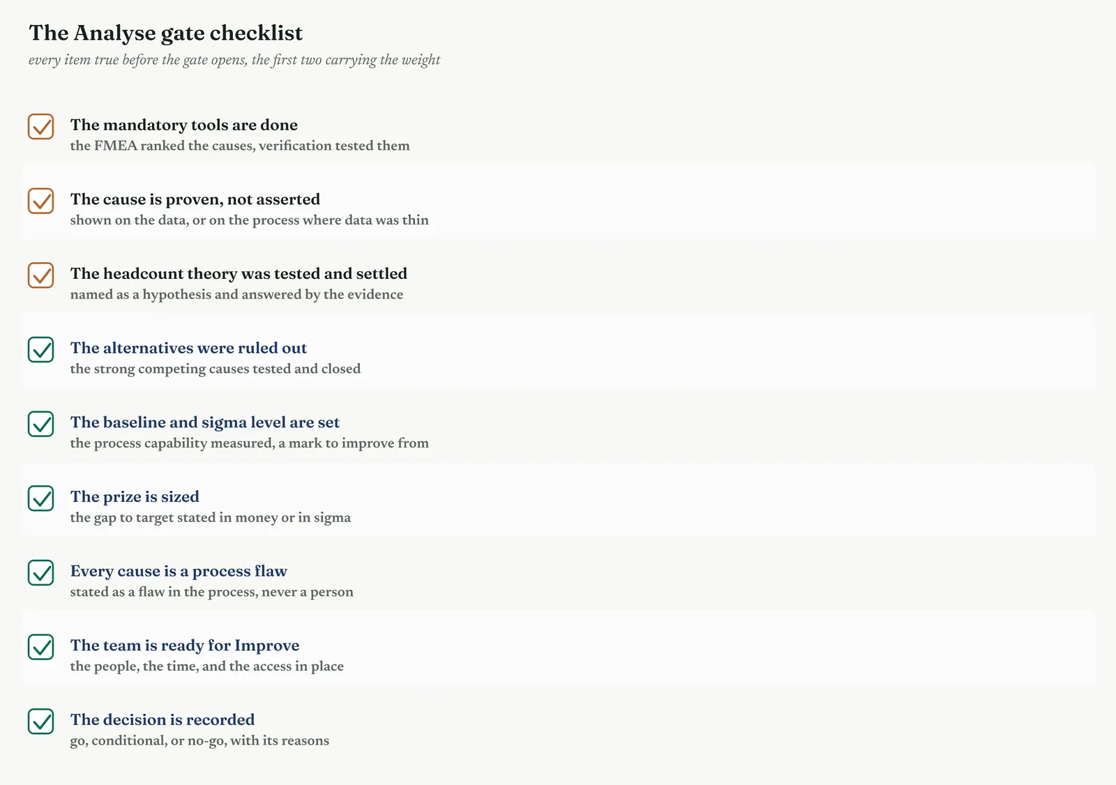
Pass the gate and Analyse is done. The project carries a proven cause, a baseline, and a mandate into Improve. Fail it, and you have caught, cheaply, an error that would have cost far more in the next phase. Either outcome is the gate working. The only failure is a gate that waves the project through without confirming the chapter did its job.