

PART 5 · DMAIC, RUN TO ISO 13053 WITH LEAN
Chapter 14
Improve
AIM Generate, pilot, and prove a solution, lead the change through resistance, and run the Improve tools ISO 13053 places in the phase.
Analyse handed you a proven cause. Improve turns that cause into a working change and a gain you can show. The work is to leave the phase with a redesign the team will keep and a number that proves it beat the old way.
14.1 What Improve does
14.1.1 The purpose of the phase and what it must produce
Improve turns a proven cause into a working change and a proven gain. Five things must leave the phase. A redesigned process with an owner at every handoff. A change piloted on real cases, not argued on a slide. A gain measured against the baseline, not asserted. The mandatory evidence the gate needs. And a rollout plan that names who does what and by when. Figure 14.1 shows what comes in and what must go out.
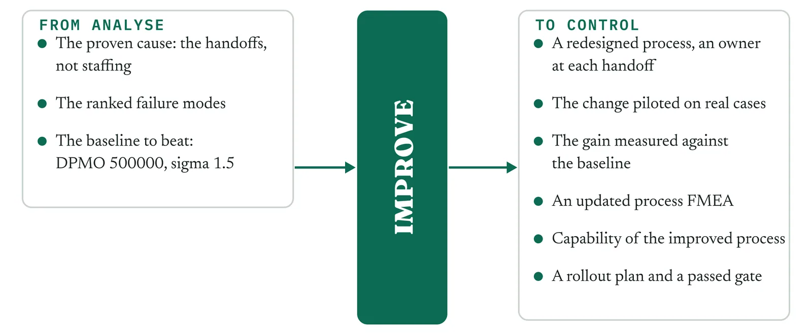
Notice what is not on that list. Holding the gain is not here. You will design the controls and hand them over, but making them hold after you step back is the job of Control. What Improve owes Control is a process that already works on real cases and a clear read on the few things that must be watched.
14.1.2 What changes when the team prefers the old way
In Analyse the resistance was to the finding. Martin wanted more people, and the data closed that theory. In Improve the resistance moves to the change itself. Geoff defended the process, and now he has to run a redesigned version of it. Asha is capable, but she has never held a standard she wrote. The team has years of muscle memory for the old handoffs. That changes the phase. You cannot mandate a new way from the front of a room. You design it with the people who do the work, pilot it small, and let the pilot carry the argument.
The change has to be easier to do right than wrong. That is why standard work and mistake proofing sit in the kit, not tuning for its own sake. And you plan for the drop in attention after the pilot, because the old way returns the moment you stop watching. A gain that survives only while you stand over it is not a gain the firm gets to keep.
14.1.3 The ISO 13053 Improve objectives and the mandatory minimum
ISO 13053 sets the Improve work out in steps, from determining the target process, to generating and redesigning the solution, to testing it, assessing its risk, selecting it, and putting it in. The purpose across those steps is one thing. Establish a robust improvement to the process, and find and clear the road blocks before the change goes live, not after.
The tools you run on every project, whatever the type, are the updated process FMEA, the capability or performance study on the improved process, and the project review. Those three are the floor. ISO marks only the process FMEA mandatory at Improve, and its clause on phase outputs calls for the capability indices and the review as well. Everything else is chosen by the project in front of you.
14 · Improve
14.2 Choosing the tools for your project
14.2.1 The rule
ISO status sets the floor you must run. The project in front of you chooses the rest. Improve carries two temptations. The first is to reach for a designed experiment because it is the most advanced tool in the phase, on a problem a process redesign would answer faster. The second is to roll the change out wide before a pilot has proved it holds. Both teach the firm the wrong lesson. Run the mandatory three always. Choose the others on evidence.
Build one habit now. For every optional tool, write down the one reason you ran it or skipped it. In a firm with no improvement history, that short record is what turns your choices into a method the next belt can follow when you are not in the room.
14.2.2 The three readings that settle most of the choice
Three readings decide most of the kit. Whether the fix is a flow redesign, where work waits and stalls between steps, or a parameter tune, where one step gives different results and has settings you can move, decides whether the Lean redesign leads or the designed experiment leads. Whether one solution is obvious or several compete decides whether you skip the selection matrix and go, or score the options in front of the sponsor. And whether the team can carry a statistical optimisation, or needs the change built into standard work and mistake proofing before it will hold, decides how much of the kit is Lean and how much is Six Sigma.
14.2.3 The worked selection for Crestline
The Crestline complaint project is a flow problem, crosses three teams, holds thin data, and lands on a team that has never run to a standard. Read that way, it runs the tools in Table 14.1. Notice the designed experiment sitting in the skip column. There is no continuous factor to tune here. The days are lost in the handoffs, not in a setting, so a redesign answers what an experiment could not. On a variation problem with a tunable process that row would flip, which shows the menu doing its job.
| Tool | ISO status | Run or skip | Why, for Crestline |
|---|---|---|---|
| Brainstorming and creativity tools | Suggested | Run | Force at least three redesign options before the team fixes on one. |
| Flow and pull redesign | Lean | Run | A flow problem, so redraw how work passes and give each handoff an owner. |
| Standard work for the new handoff | Lean | Run | The redesign holds only if the three desks run the handoff the same way. |
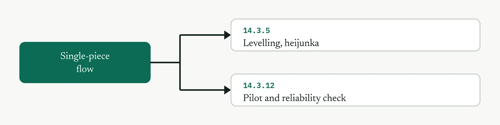
| Single-piece flow where it applies | Lean | Light | Batching adds delay, so move cases one at a time where the desks allow. |
| Levelling the workload | Lean | Light | Demand is uneven. Level enough to protect the new standard from surges. |
| Mistake proofing | Recommended | Run | The first-response error repeats, so build the check into the step. |
| Solution selection matrix | Recommended | Run | Several redesigns survive, so score them in front of Renu. |
| Prioritisation matrix | Recommended | Run | The redesign has parts, so sequence what lands first. |
| Design of experiments | Recommended | Skip | No continuous factor to tune. The delay is in the handoffs, not a setting. |
| ANOVA | Recommended | Light | Used once, to confirm the pilot beats the baseline, not to hunt factors. |
| A kaizen event to land the change | Lean | Run | Put the three desks in one room and land the change in days. |
| Pilot and reliability check | Suggested | Run | Prove the change on real cases before the rollout is argued. |
| Updated process FMEA | Mandatory | Run | Always. Re-score the failure modes on the redesigned process. |
| Capability of the improved process | Mandatory | Run | Always. Show the new sigma and DPMO against the baseline. |
| RACI matrix | Recommended | Run | Three teams, so every step of the new process needs one owner. |
| QFD | Recommended | Light | One reduced grid to keep the redesign tied to what the customer values. |
| Gantt chart | Recommended | Run | A light rollout plan the sponsor can read, with the go gate marked. |
| Project review | Mandatory | Run | Always. The signed close of the phase. |
Table 14.1 The Crestline Improve tool selection. Three mandatory tools plus the ones the project type calls for.
14 · Improve
14.3 The toolkit, in the order you reach for it
Improve holds the widest toolkit of any phase, because the work spans two crafts. Lean redraws how the work flows. Six Sigma proves the change with data. This chapter runs both, in the order a real project reaches for them, not in the order a reference lists them. You will not run every tool on every project. You run the three the standard makes mandatory, and you choose the rest against the readings in 14.2. What follows is the full kit, so you can see the whole field before you pick from it.
Each tool is set out the same way, so you can move through it quickly and find the part you need without rereading the whole entry.
What it is and why you reach for it. The tool in a few sentences, its purpose, and the trigger that tells you to reach for it rather than something else.
Setting it up. Who is in the room, what you need in hand, and the one setup judgement that decides whether the tool works or wastes an afternoon.
Running it, step by step. The run as a short sequence, with the judgement carried inside each step, not just the instruction.
Crestline, worked. The tool run on the complaint process, with the tension left in, ending in a filled artefact you could hand to the sponsor.
Reading the output. What a strong result looks like, what a weak one looks like, and the tell that separates them.
Matching it to the ground. How the tool changes across the four grounds from Chapter 1, because the same tool is run differently in a calm firm and a cynical one.
When it goes wrong. The one or two failure modes that actually kill the tool, and the move that saves it.
What it feeds. Where the output hands off, to the next tool inside Improve or across the gate into Control.
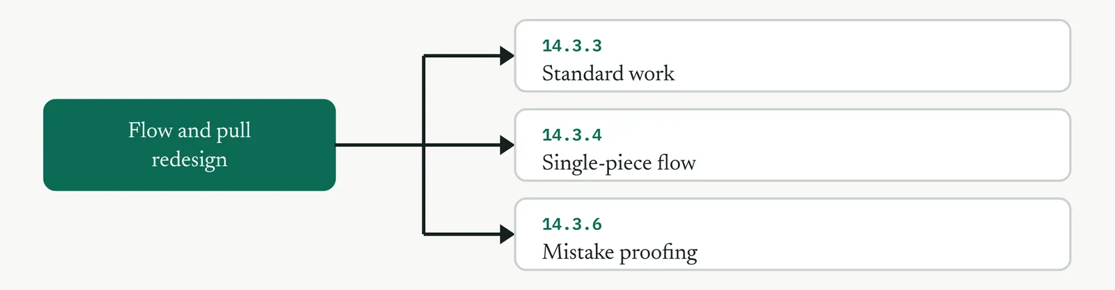
The tools sit in four movements. Each movement is a job, and the tools inside it are the ways you do that job. You do not always finish one movement before the next begins, but the order holds on most projects. Figure 14.2 lays out the whole kit, with the mandatory tools marked.
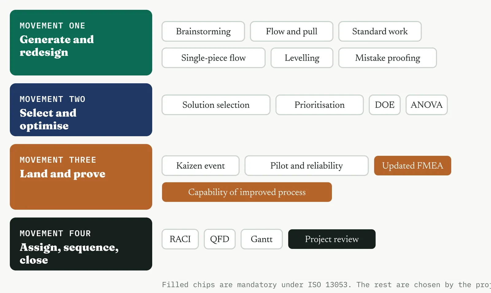
MOVEMENT ONE Generate and redesign
This is where you build the new process. You open the option space so the room is not trapped by its first idea, then you redraw the flow so work moves on demand with an owner at every handoff, and you fix the new way in standard work and mistake proofing so it holds without you standing over it. On a flow problem, most of the gain is made here, in brainstorming, flow and pull redesign, standard work, single-piece flow, levelling, and mistake proofing.
MOVEMENT TWO Select and optimise
When more than one redesign survives, you choose on evidence rather than preference, and you sequence the parts. Where the process has settings you can move, the designed experiment and ANOVA tune them. On a pure flow problem these two stay light, and the solution selection matrix and the prioritisation matrix do most of the work.
MOVEMENT THREE Land and prove
A redesign on paper changes nothing. You run a kaizen event to make it real with the people who do the work, pilot it on real cases, re-score the risk on the new process, and measure the gain against the baseline. This movement carries the two mandatory studies, the updated process FMEA and the capability of the improved process, so the phase cannot close without them.
MOVEMENT FOUR Assign, sequence and close
The change is proven, so now you make it stick past the pilot. You name an owner for every step of the new process, tie the design back to what the customer values, sequence the rollout with dates the sponsor can read, and close the phase at the gate. This is where Improve hands a working process to Control.
The matching part in every tool uses the four grounds from Chapter 1. You meet them at each tool, so Table 14.2 recalls them here before you start.
| Ground, and its level | What it feels like | What it asks of you |
|---|---|---|
| The blank page, Level 1 | Never tried structured improvement, calm, with no scar tissue from a past attempt | Care with the first project, because it sets the firm idea of what good looks like |
| The firefight, Level 1 | Busy and reactive, running on heroic saves, all motion and no method | The pause it never allows itself, a structured look rather than another pair of hands |
| The false start, Level 1 | Tried once, failed, and remembers it, so it meets you with cynicism | Proof that this time is different, delivered early and visibly |
| The quiet achiever, Level 2 | Quietly better than it lets on, with something real built by one good manager | Adopt and sharpen what already exists rather than reinvent it |
Table 14.2 The four grounds from Chapter 1, recalled. Each tool shows how it changes across them.
MOVEMENT ONE GENERATE AND REDESIGN
14 · Improve
14.3.1 Brainstorming and creativity tools SUGGESTED
ISO 13053-2, Factsheet 13. Improve step 2, generate solution ideas.
01 What it is and why you reach for it
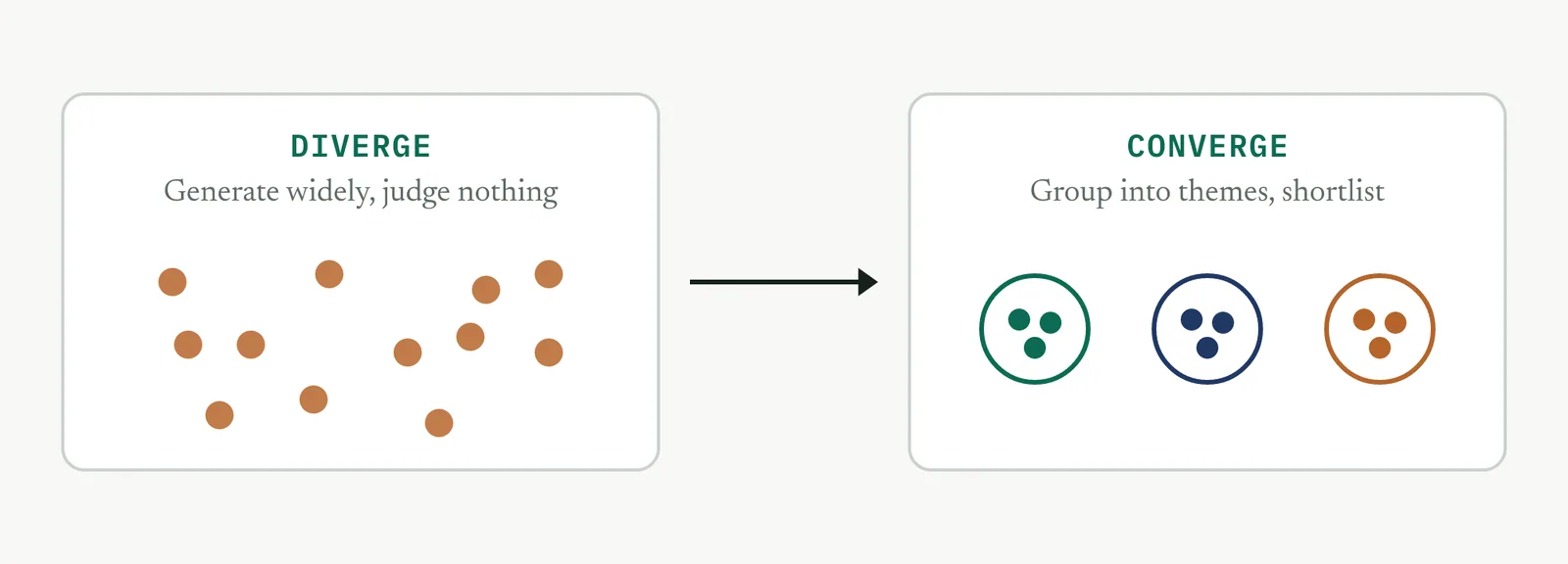
Brainstorming is the deliberate generation of many candidate solutions before you judge any of them, so that you can choose from a real field of options rather than the first idea that clears the room. Use structured brainstorming when the team has fixed on one obvious fix and you need at least three genuine redesigns on the table before the selection matrix. On a firm with no improvement history the value is not novelty. It is breaking the reflex that the answer is more people, longer hours, or a new system, and forcing the process itself into the frame.
THE FAMILY The techniques worth carrying
Brainstorming is a family, not a single method. Every technique in it does the same two jobs, generate a wide field then group it into themes, but they generate in different ways, and the way matters. Table 14.3 lists the ones worth carrying. Each one below has its purpose and the blank template you run it on, so you can lift the template straight onto a whiteboard or a sheet.
| Technique | What it does | Reach for it when |
|---|---|---|
| Open brainstorming | A facilitated verbal round, ideas called out and captured | The room is senior-flat and already talks freely |
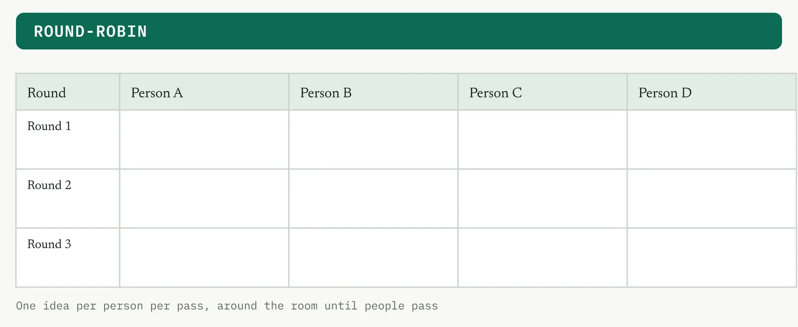
| Round-robin | Each person contributes in turn, one idea per pass | You want every voice, not only the loudest |
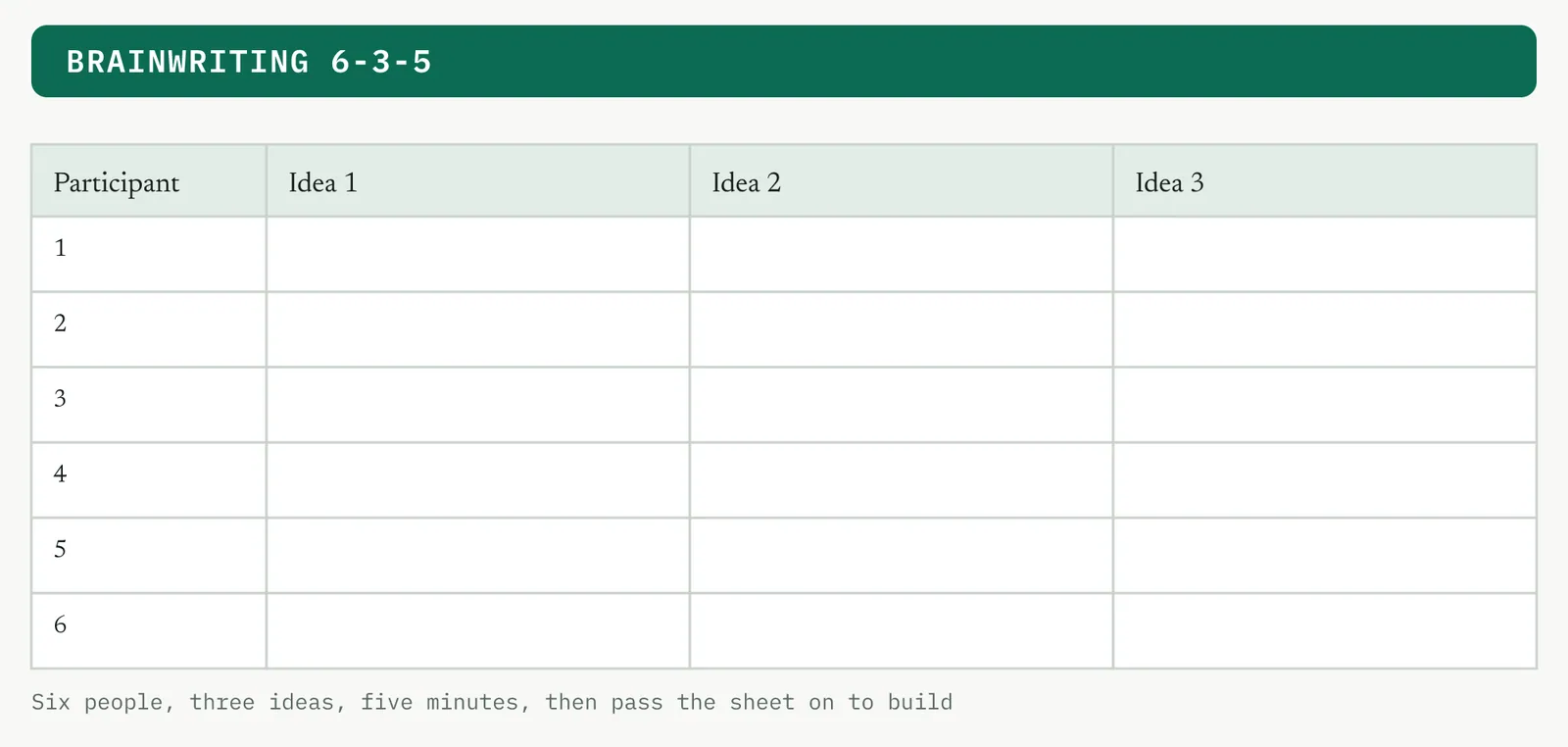
| Brainwriting, 6-3-5 | Silent written generation, sheets passed on to build on others | Seniority would anchor a verbal round |
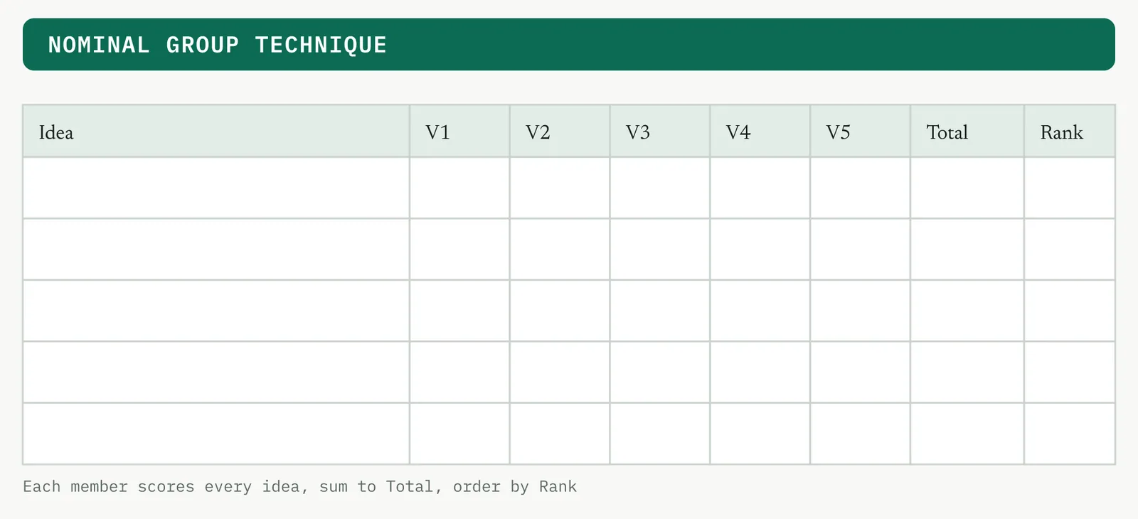
| Nominal group technique | Silent generation, capture, then a structured vote | You need a ranked shortlist in the session |
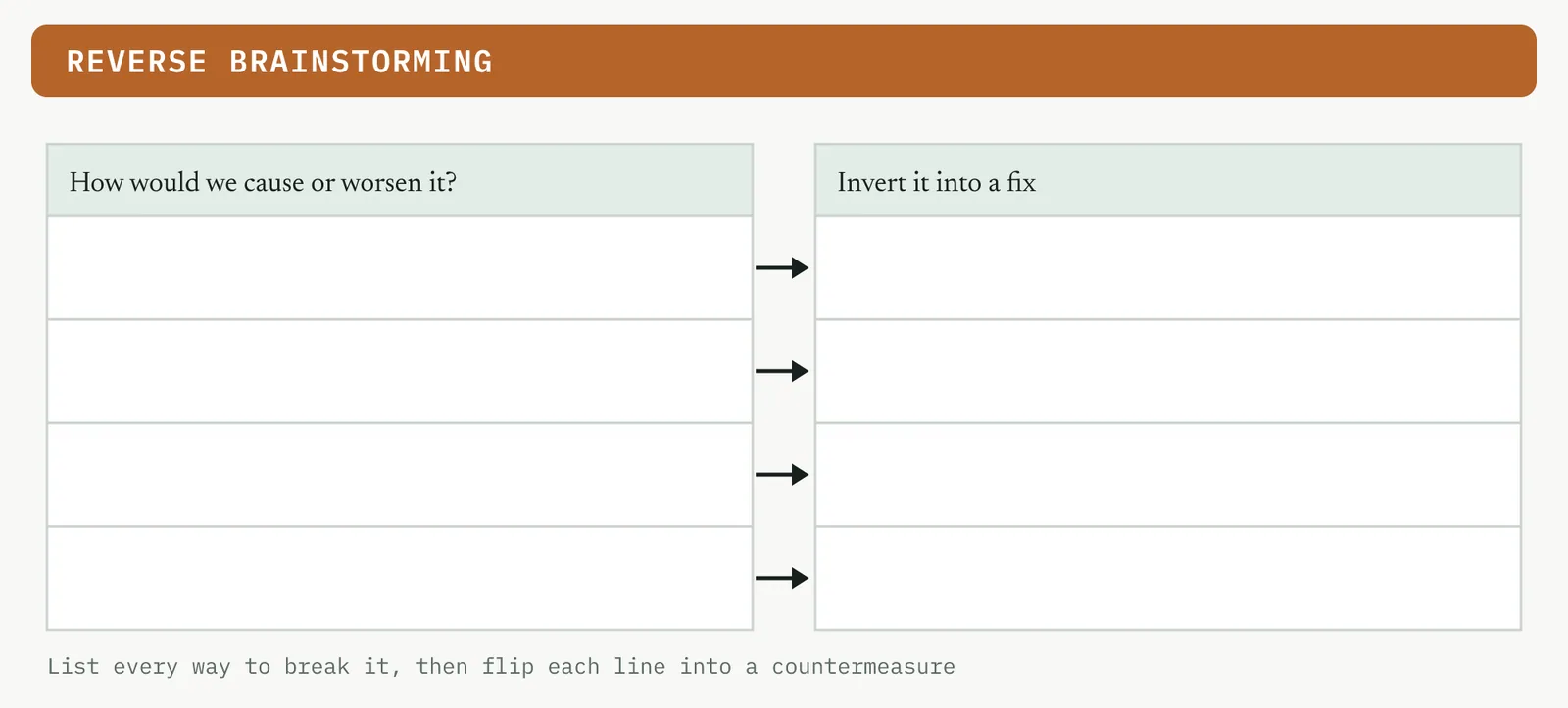
| Reverse brainstorming | Ask how to worsen the problem, then invert each answer | The room is stuck or too polite to name faults |
| SCAMPER | Prompts through seven creative lenses | The first pass gave variations on one idea |
| Random stimulus, analogy | Force a link to an unrelated word or field | You need a different angle, not a tweak |
| Mind mapping | Branch ideas outward from the problem | Mapping a broad space before you narrow |
| Six Thinking Hats | Separates modes of thinking, one at a time | A mixed group argues past each other |
| Affinity grouping, KJ | Clusters a wide field into a few themes | Convergence, at the close of any method |
Table 14.3 The techniques worth carrying into Improve, each with its template below.
EACH ONE, IN TURN The techniques and their templates
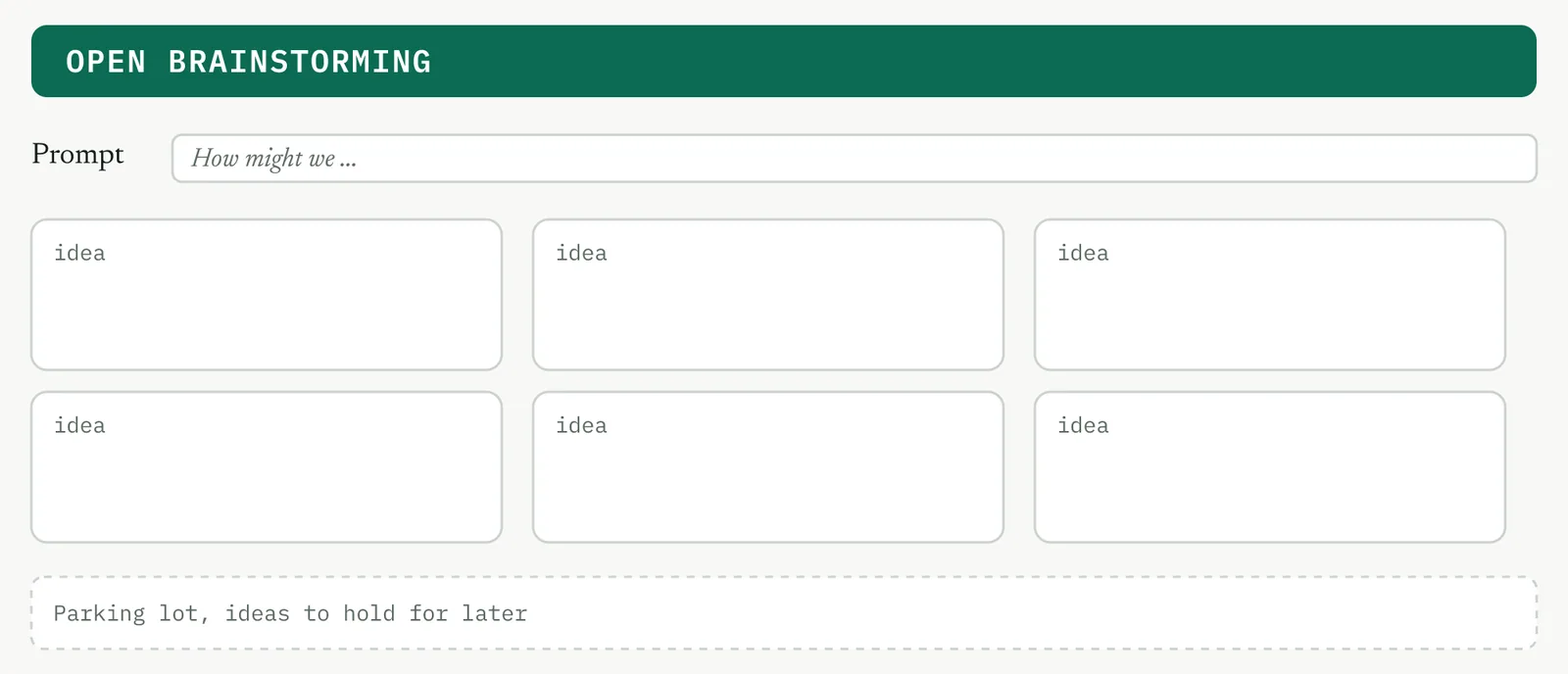
Open brainstorming. The classic verbal round. The facilitator poses the prompt and the room calls out ideas, captured where all can see them. It is fast and builds energy in a flat room, but the first or most senior voice anchors it, so it is the wrong opening for a room with a defensive owner.
Round-robin. The same verbal generation, disciplined. The facilitator takes one idea from each person in turn until people pass. It buys what matters in an immature firm, every desk heard, not only the confident ones.
Brainwriting, 6-3-5. Silent, written generation. Six people each write three ideas in five minutes, then pass their sheet on to build on. It removes the anchor entirely and produces more ideas per minute, because everyone writes at once. This is the default opening where hierarchy is part of the problem.
Nominal group technique. A full generate-and-decide method in one sitting. The room generates in silence, the facilitator captures round-robin, the room clarifies, then everyone scores the list to a ranked shortlist. Reach for it when you will not get the room back together.
Reverse brainstorming. Instead of asking how to fix the problem, ask how to cause or worsen it. A room that will not criticise the process to the owner face will list every way to lose a case, and you invert each answer into a fix. The move for a stuck or cynical room.
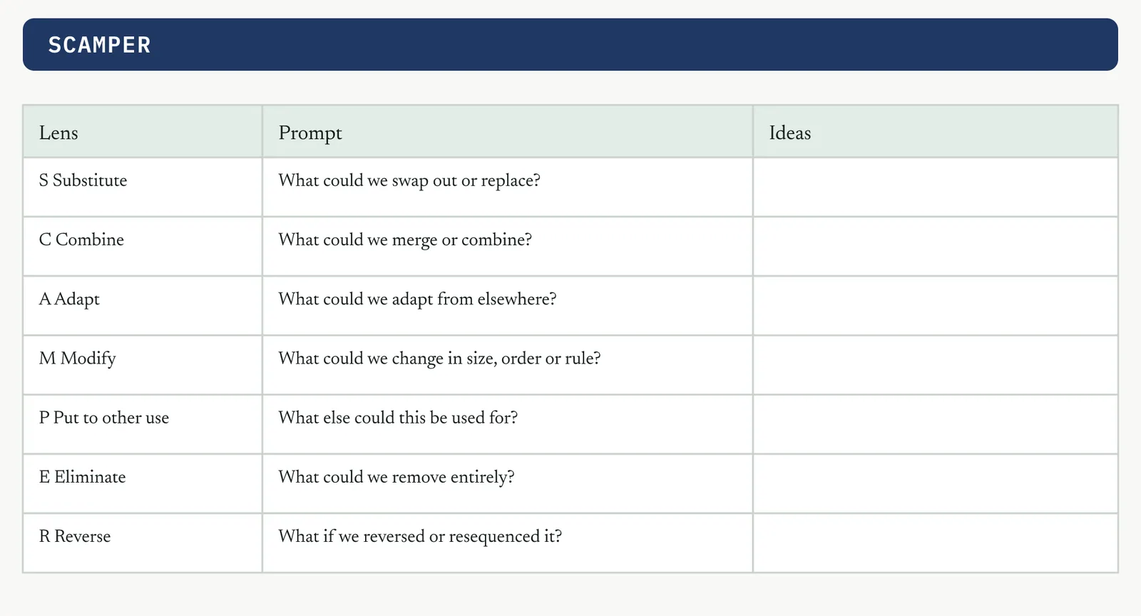
SCAMPER. A prompt list that forces a redesign through seven lenses, substitute, combine, adapt, modify, put to other use, eliminate and reverse. You apply each verb to the process in turn. Use it when the first pass came back as variations on one idea.
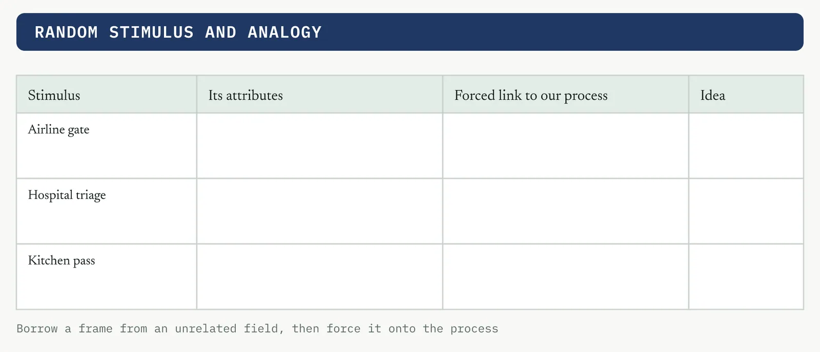
Random stimulus and analogy. Force a link between the problem and something unrelated, a random word or how another industry handles the same job. The unrelated frame breaks the room out of its own assumptions and reaches angles an incremental discussion never does.
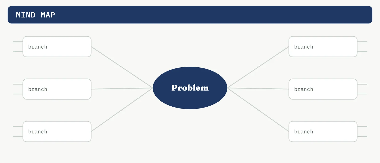
Mind mapping. Put the problem at the centre and branch ideas outward, each branch spawning its own. It suits the early, broad phase where you are mapping the whole space, and it keeps related ideas visibly connected. A structuring aid more than a generator.
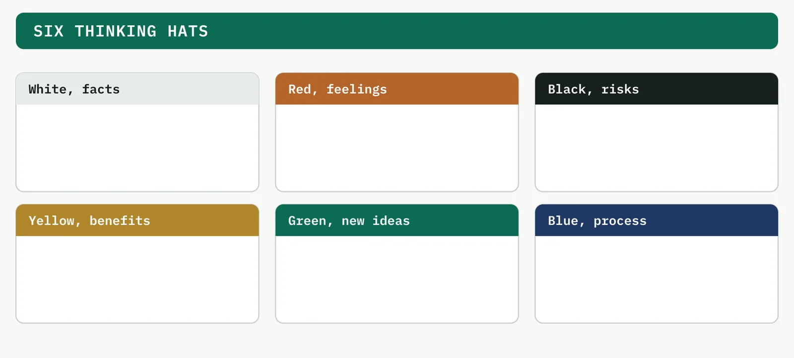
Six Thinking Hats. Parallel thinking. The room does one kind of thinking at a time, facts, feelings, risks, benefits, new ideas, then process, rather than arguing across all at once. Reach for it when a mixed group with different stakes argues past each other.
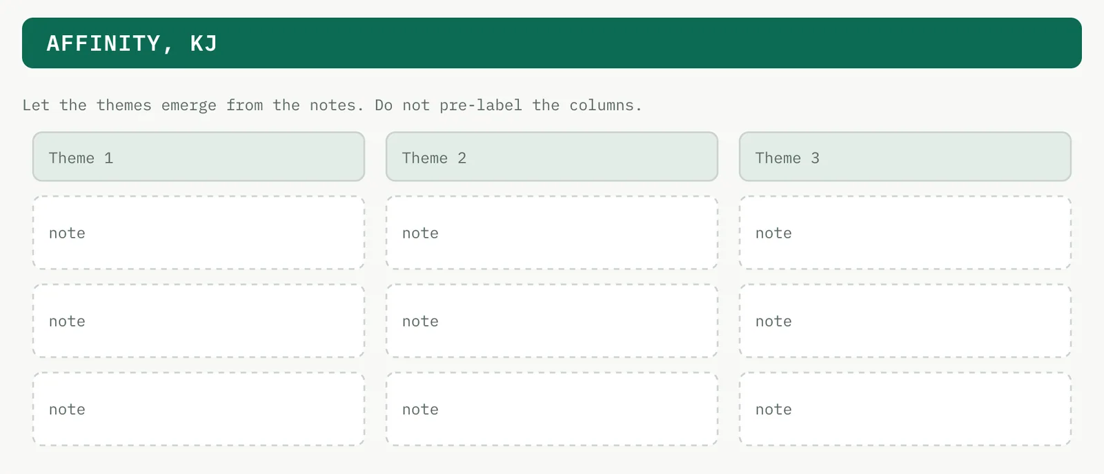
Affinity grouping, KJ. The convergence step, not a generator. You cluster the whole field by natural theme, letting the groups emerge from the ideas rather than forcing them into pre-set buckets. Every method above ends here.
WHEN TO USE WHAT Choosing and combining the techniques
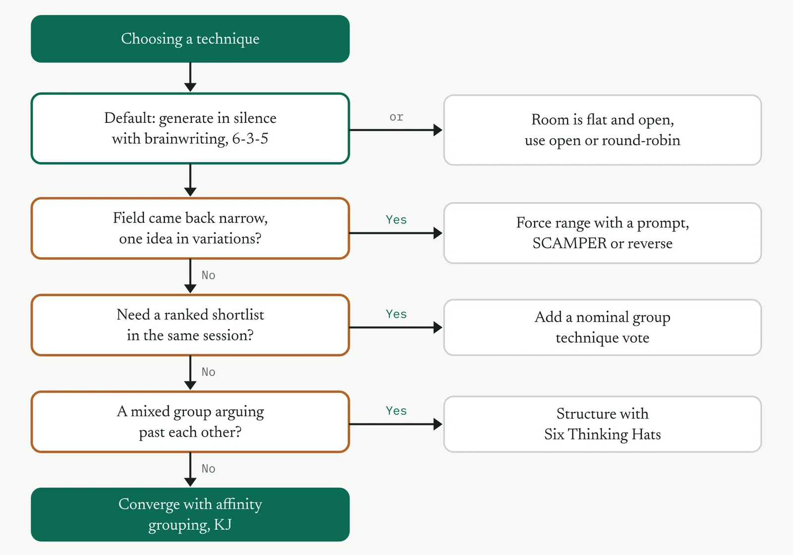
The first choice is verbal or silent. Verbal suits a flat, talkative room. Silent generation, brainwriting, protects the quiet desk and removes the anchor of the senior voice, so in an immature firm you start silent and open the floor only once every idea is on paper. From there a few questions settle the rest. Figure 14.14 runs the selector.
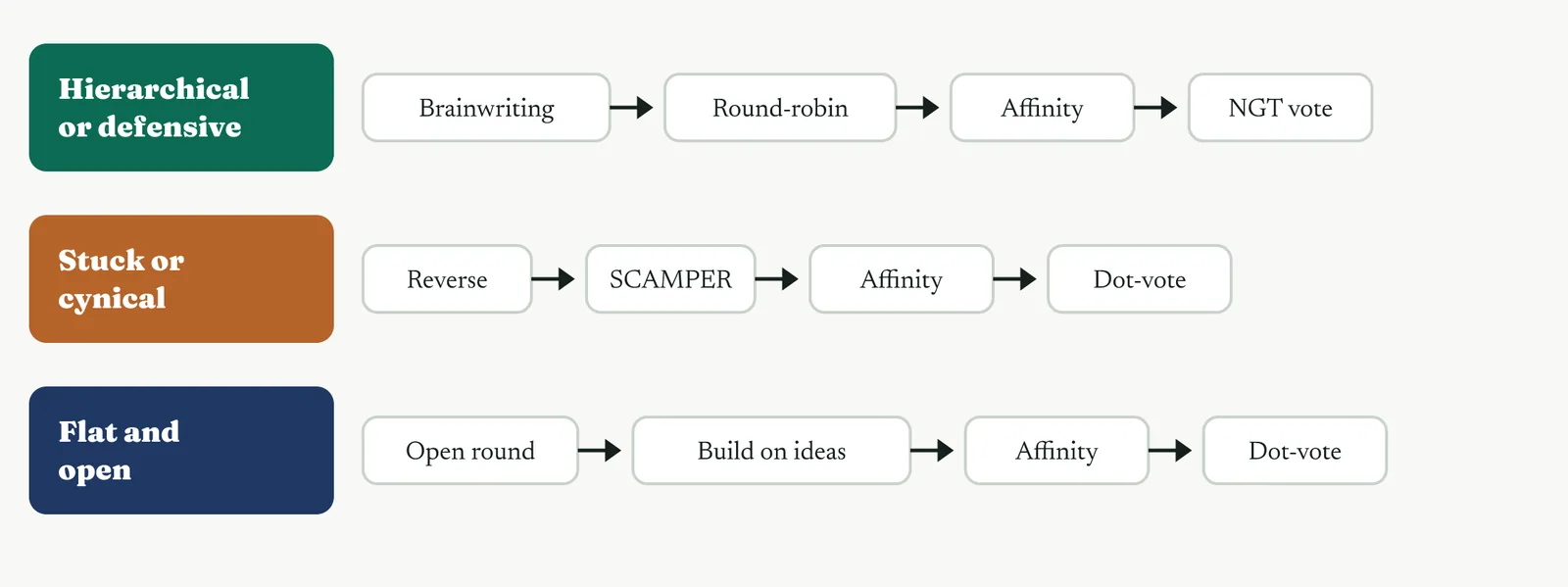
No serious session runs a single technique. You chain them. You open with a generator that suits the room, add a prompt if the field comes back thin, converge with affinity, and rank in the room if you need a shortlist there and then. Figure 14.15 shows three combinations, one for each kind of room.
02 Setting it up
Put the people who do the work in the room. For Crestline that is Intake, the account managers, and case handling, with Asha leading the session and the proven cause, the ranked failure modes and the baseline on the wall. Keep the process owner from chairing it, because a room that watches Geoff for approval will generate what Geoff already believes. The one setup judgement is to separate generation from judgement and to stop the most senior voice from anchoring the room.
03 Running it, step by step
The run below is the default combination, the top lane of Figure 14.15, silent generation into affinity, with a prompt held in reserve. Adjust it to the room using the selector in Figure 14.14. Whatever the chain, the facilitator protects the one rule that holds all of these together, that nothing is judged until everything is captured.
1 Reframe the proven cause as an open prompt. How might we stop a case waiting between desks is a prompt. How do we hire faster is not.
2 Generate in silence first, by brainwriting on the 6-3-5 sheet, so no one waits on the senior voice.
3 Capture round-robin, one idea each, with no debate.
4 If the field is narrow, run one prompt, SCAMPER or reverse, to force range before you group.
5 Affinity group the ideas into themes on a blank KJ board.
6 Dot-vote a shortlist, or add a nominal group vote if you need it ranked in the room.
04 Crestline, worked
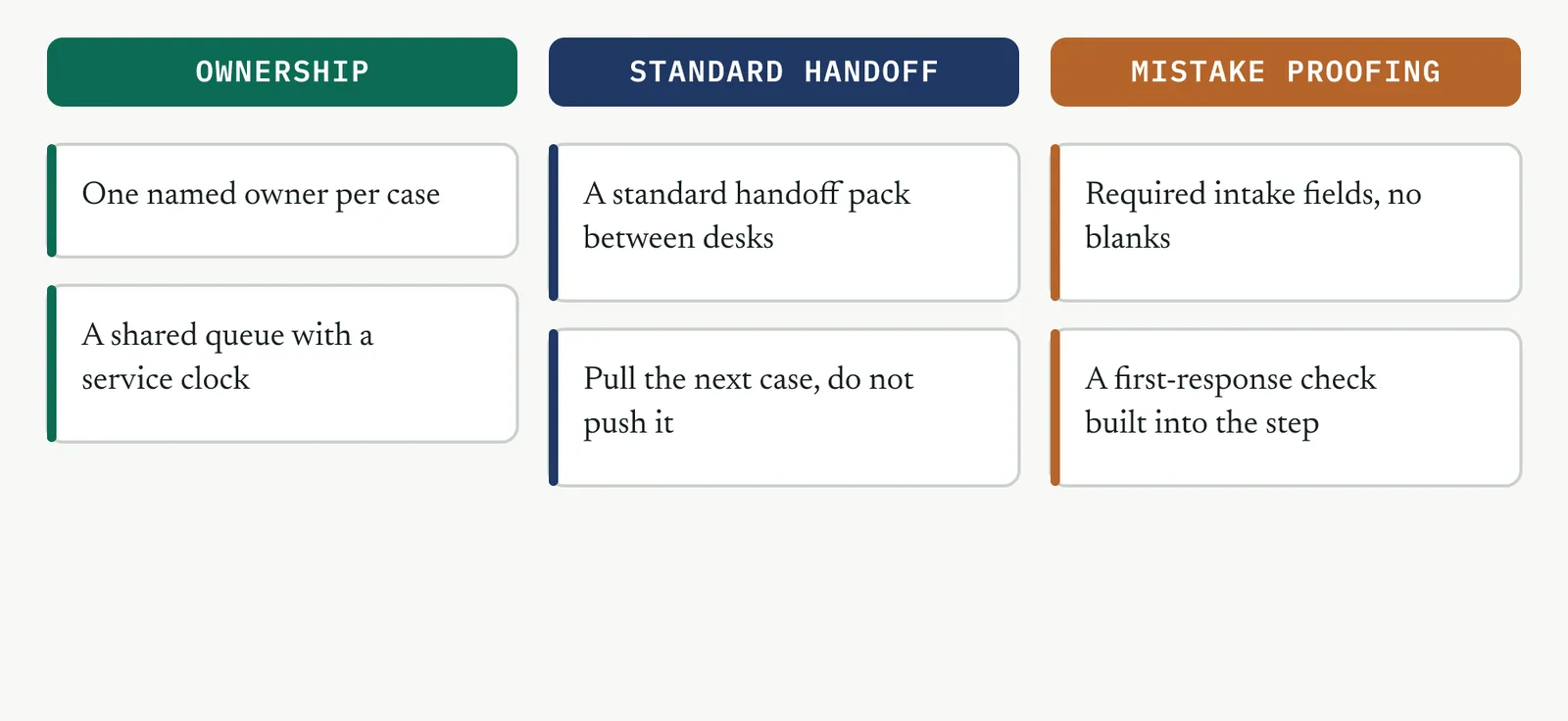
The room opens where every immature firm opens. Someone restates Martin, that the desks are simply short of people. Asha does not argue it. She writes the headcount idea on the wall as one option among many, then reframes the prompt to the waiting itself and runs the first pass as brainwriting, so no one waits to see what Geoff thinks. The silent round surfaces a wide field in ten minutes. A single named owner per case. A shared queue with a service clock the whole team can see. A standard handoff pack so nothing is re-gathered at each desk. Required intake fields so a case cannot start half-formed. A pull signal so case handling takes the next case rather than having it pushed. Grouped by affinity, the field settles into three themes, ownership, a standard handoff, and mistake proofing at intake. The headcount idea survives only as the option the later evidence will retire.
05 Reading the output
A strong session leaves you with distinct themes, not variations on one idea, and at least one that changes ownership or flow rather than adding effort. A weak one leaves a list that is all technology, or all headcount, which tells you the room judged before it generated, or that you ran a verbal round where you needed a silent one.
| Do | Do not |
|---|---|
| Match the technique to the room, silent first where hierarchy bites | Run the same verbal round every time out of habit |
| Reach for a prompt when the field comes back narrow | Accept a shortlist where every option needs budget or headcount |
| Group before you shortlist, so the list is themes not noise | Debate an idea the moment it is spoken |
The tell. If every option on the shortlist costs money or people, the room judged before it generated. Send it back to the prompt.
06 Matching it to the ground
The blank page. This is the first structured session the firm has run, so it sets the idea of what improvement looks like. Protect it. A calm, well-run brainwriting session that produces real options teaches the firm that method finds answers it did not already have.
The firefight. The room wants to act, not sit. Hold it in silent generation for the first ten minutes anyway. The pause is the point, and the payoff is a redesign rather than another heroic save.
The false start. Cynicism sits in the room because the last attempt went nowhere. Reverse brainstorming works well here, because a room that will not offer fixes will happily list what is broken. Invert the list, make the output visibly theirs, and carry the shortlist straight into the selection matrix.
The quiet achiever. One manager already has a fix that half works. Use the session to broaden and sharpen it against other options, not to replace it. Put their idea on the wall as one theme among several and let it compete.
07 When it goes wrong
Two failure modes kill this tool. The first is anchoring, where the senior voice speaks first and the room generates variations on it. The move that saves it is brainwriting, silent and on paper, before anyone talks. The second is early judgement, where ideas are argued as they are spoken and the quiet ones never surface. The move is a hard rule the facilitator holds, no evaluation until every idea is on the wall, enforced without exception for the first round.
08 What it feeds
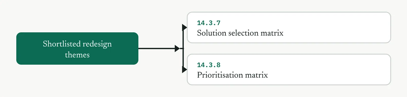
The shortlisted themes are the input the next two tools need. They carry into the solution selection matrix, where they are scored against weighted criteria, and into the prioritisation matrix, where the chosen parts are sequenced.
14 · Improve
14.3.2 Flow and pull redesign LEAN
Lean stream, outside ISO 13053 by design. Improve step 2, generate and redesign.
01 What it is and why you reach for it
Flow and pull redesign redraws how work moves through the process, so that a case advances on demand with an owner at every handoff, so that you can remove the queues that turn a two-day job into a two-week one. Reach for it when the problem is delay between the steps rather than defects inside them, which on a service process is most of the time. This is the Lean core of Improve. Where a defect problem sends you to mistake proofing and a variation problem sends you to a designed experiment, a waiting problem sends you here.
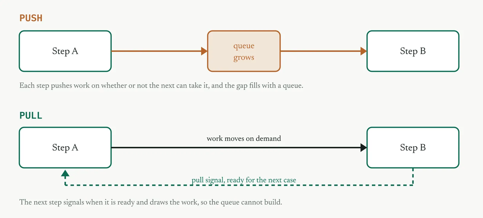
The redesign turns a push process into a pull process. In a push process each step finishes its work and shoves it to the next whether or not the next can take it, and the gap fills with a queue. In a pull process the next step signals when it is ready and draws the work, so the queue cannot build. Figure 14.18 shows the difference, and it is the whole idea in one picture.
02 Setting it up
In the room you need the people at each desk and whoever owns the end-to-end result, not only the desk owners. In hand you need the current-state map and the timed data from Measure, the median of six days, the range of two to fifteen, and the failure modes. The one setup judgement is to map the process as it actually runs, not as the procedure says. The queues live in the gap between the official steps, and a tidy diagram of the official steps hides them. Walk the process and time the waiting before you draw anything.
03 Running it, step by step
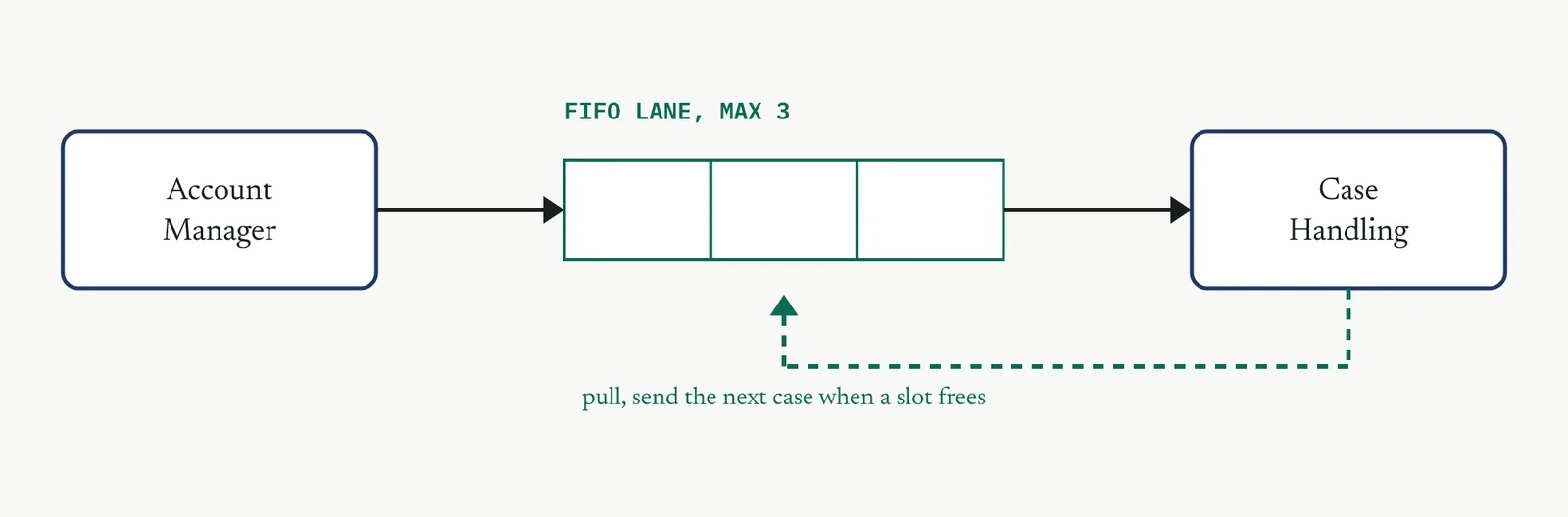
The redesign works from the waiting outward. You find where a case waits, decide where flow is possible, and put a signal on every buffer you cannot remove. The pattern you are building at each buffer is the one in Figure 14.19, a capped lane with a pull signal, not an open queue.
1 Map the current state as it runs, with the queues drawn as what they are, waiting, not as clean arrows between boxes.
2 Mark where a case waits and for how long. The waiting, not the work, is the target.
3 Decide where continuous flow is possible and where a buffer is unavoidable. Put a pull signal and a work-in-progress cap on every buffer that stays.
4 Give the case a single owner across the handoffs, so no case falls into the gap between desks.
5 Mistake-proof the entry so a case cannot start half-formed and stall downstream.
6 Draw the future state and size the target lead time against the baseline. The pilot proves it later.
04 Crestline, worked
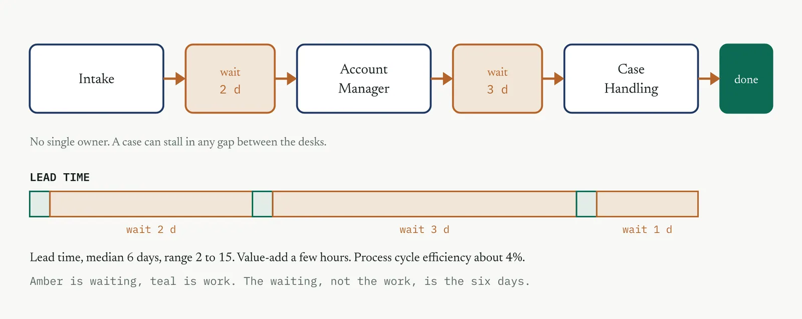
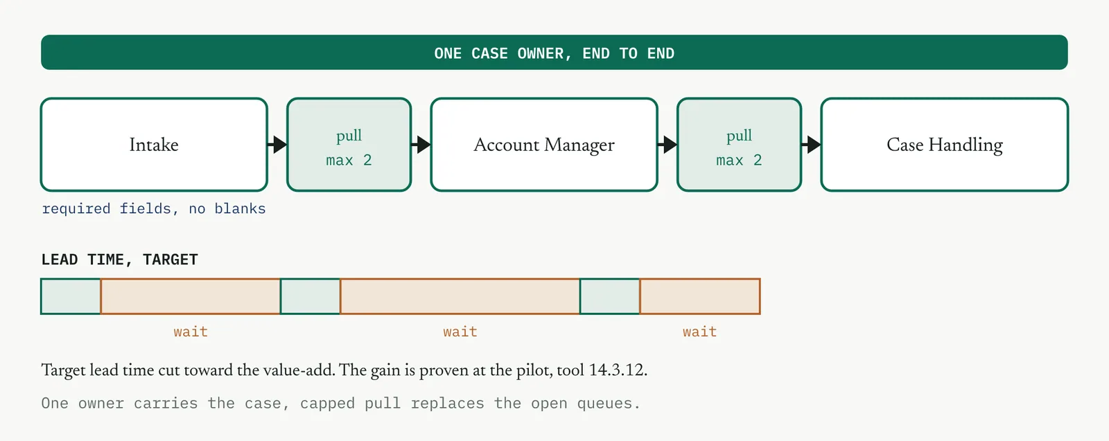
The current state is three desks and two gaps. Intake takes the complaint and pushes it to an account manager. The account manager works it and pushes it to case handling. Nobody owns the case from end to end, so when it stalls in a gap, no one is accountable for the wait. Timed, the picture is stark. The work is a few hours. The waiting is the rest of the six days. Figure 14.20 maps it.
The redesign gives the case one owner from intake to resolution, replaces each open queue with a capped pull lane, and mistake-proofs the intake so a case cannot start with fields missing. The owner carries the case across the desks, the caps stop any desk being flooded, and the pull signals mean the next case moves only when there is room for it. The design target is a lead time cut hard toward the value-add time. It is a target, not a result, until the pilot in tool 14.3.12 proves it on real cases. Figure 14.21 shows the future state.
05 Reading the output
A strong future state has a pull signal and a work-in-progress cap on every buffer, one owner for every case end to end, and a mapped lead time that falls toward the value-add time. A weak one has tidier boxes but the same queues, or an owner that is a committee. If the map has no cap anywhere, you drew a wish, not a pull system.
| Do | Do not |
|---|---|
| Cap the work in progress at every buffer you cannot remove | Redraw the boxes and leave the queues untouched |
| Name one owner accountable for each case end to end | Spread ownership across a committee so no one holds it |
| Design in signals and owners before any new software | Reach for a new system as the first move |
The tell. If the future-state map has no work-in-progress cap anywhere, it is a wish, not a pull system. Add the caps or the queues come back.
06 Matching it to the ground
The blank page. The first redesign teaches the firm that flow beats effort. Keep the future state simple enough that the desks can run it without you, because a scheme they cannot hold is worse than the queue it replaced.
The firefight. This firm equates motion with progress, so a work-in-progress cap will feel like a brake on people who pride themselves on always being busy. Hold it. The cap is the one thing that stops the firefight, because it forces the backlog into the open instead of hiding it in every inbox.
The false start. A past redesign that bought a system and failed is why the room is wary. Keep this one to signals and owners, drawn on a wall, with no new software until the flow works on paper. Proof first, tools second.
The quiet achiever. One desk already pulls informally, taking the next case only when it has room. Formalise and extend what that desk does rather than impose a new scheme over the top of it.
07 When it goes wrong
Two failure modes kill this tool. The first is a redraw that changes the diagram but not the flow, tidier boxes with the same queues between them. The move that saves it is a work-in-progress cap and an explicit pull signal on every buffer, because a cap is a change you can see working. The second is a nominal owner, where the case is assigned to a team and so belongs to no one. The move is to name a single person accountable for each case from intake to resolution.
08 What it feeds
The future state defines the new handoff, and three tools make it hold. Standard work fixes the handoff as a repeatable method, single-piece flow tightens it where batching still adds delay, and mistake proofing protects the entry so a case cannot start half-formed.
14 · Improve
14.3.3 Standard work for the new handoff LEAN shown in this section
Lean stream, outside ISO 13053 by design. Improve step 2, and the basis of the control plan.
01 What it is and why you reach for it
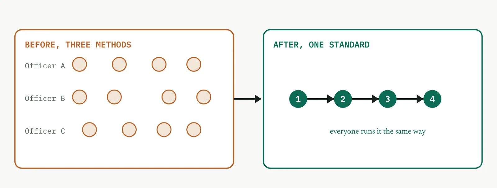
Standard work is the documented best known method for a task, the agreed sequence, the standard timing, and the key point at each step, so that you can make the redesigned handoff repeatable across everyone who runs it. Reach for it when the redesign depends on people doing the same steps the same way and you need to remove the variation between operators, not the variation inside the process. Standard work is not a straitjacket. It is the current best way, written down so it can be improved on purpose rather than drifting by accident. Without it, a good redesign lasts exactly as long as the person who invented it stays at the desk.
02 Setting it up
In the room you need the people who run the handoff, led by whoever does it best, with the process owner present but not dictating. In hand you need the future-state handoff from the flow redesign, the timing, and the failure modes. The one setup judgement is to write the standard with the people who do the work, not for them. A standard handed down from above is ignored. A standard the desk wrote is followed. Capture the current best method, not an idealised one no one can hit at the pace the work arrives.
03 Running it, step by step
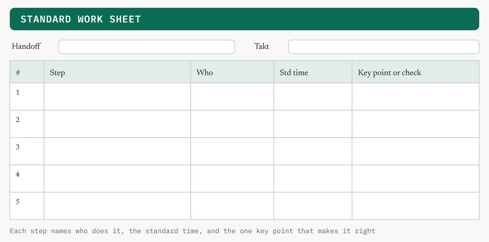
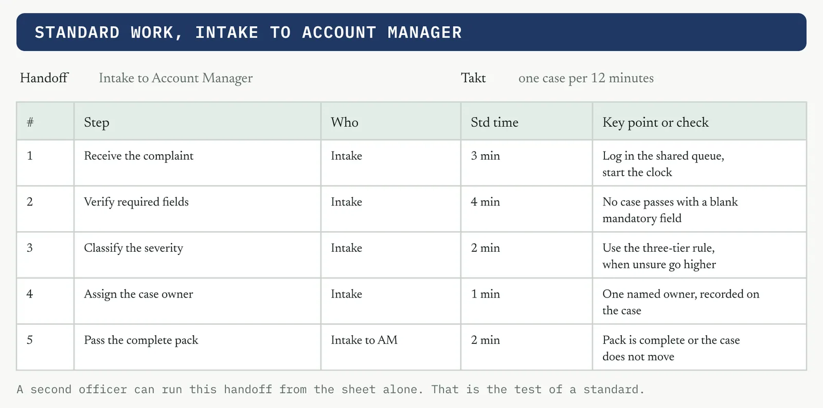
You build the sheet in Figure 14.24 one row at a time. The value is in the key point column, not the step column, because the steps are usually obvious and the key points are where the handoff actually fails.
1 Break the handoff into its actual steps, in the order they happen.
2 For each step, name who does it and the standard time it should take.
3 For each step, write the one key point that makes it right, the thing that goes wrong when it is skipped.
4 Time the whole sequence against takt, the rate the work arrives, so the standard is achievable and not a fantasy.
5 Test it by having a second person run the handoff from the sheet alone, and fix what does not work.
6 Post it at the point of use and train to it. A standard in a drive is not a standard.
04 Crestline, worked
The Intake to Account Manager handoff had no standard, so three intake officers did it three ways, and the account managers received three different qualities of pack. The team wrote one standard together. Receive the complaint, verify the required fields, classify the severity, assign the case owner, and pass a complete pack. Each step got a standard time and a key point, and two of those key points do double duty as the mistake-proofing hooks, no case passing with a blank mandatory field and no pack moving unless it is complete. Figure 14.25 shows the filled sheet.
05 Reading the output
A strong standard has a who, a time, and a key point on every step, and a second person can run the handoff from the sheet alone. A weak one is a list of steps with no times and no key points, which is a procedure, not standard work. If you cannot hand the sheet to a new starter and have them run the handoff, it is not finished.
| Do | Do not |
|---|---|
| Write a key point for every step, the thing that fails when skipped | Write a bare list of steps and call it standard work |
| Time it against takt so the desk can actually hold it | Set a standard time no one can meet at the real pace |
| Post it at the point of use and train to it | File it in a drive where no one will look again |
The tell. If a new starter cannot run the handoff from the sheet alone, it is not standard work yet, whatever the header says.
06 Matching it to the ground
The same sheet lands differently in each firm. Figure 14.26 works the four grounds, and the paragraphs below say how you change your approach in each.
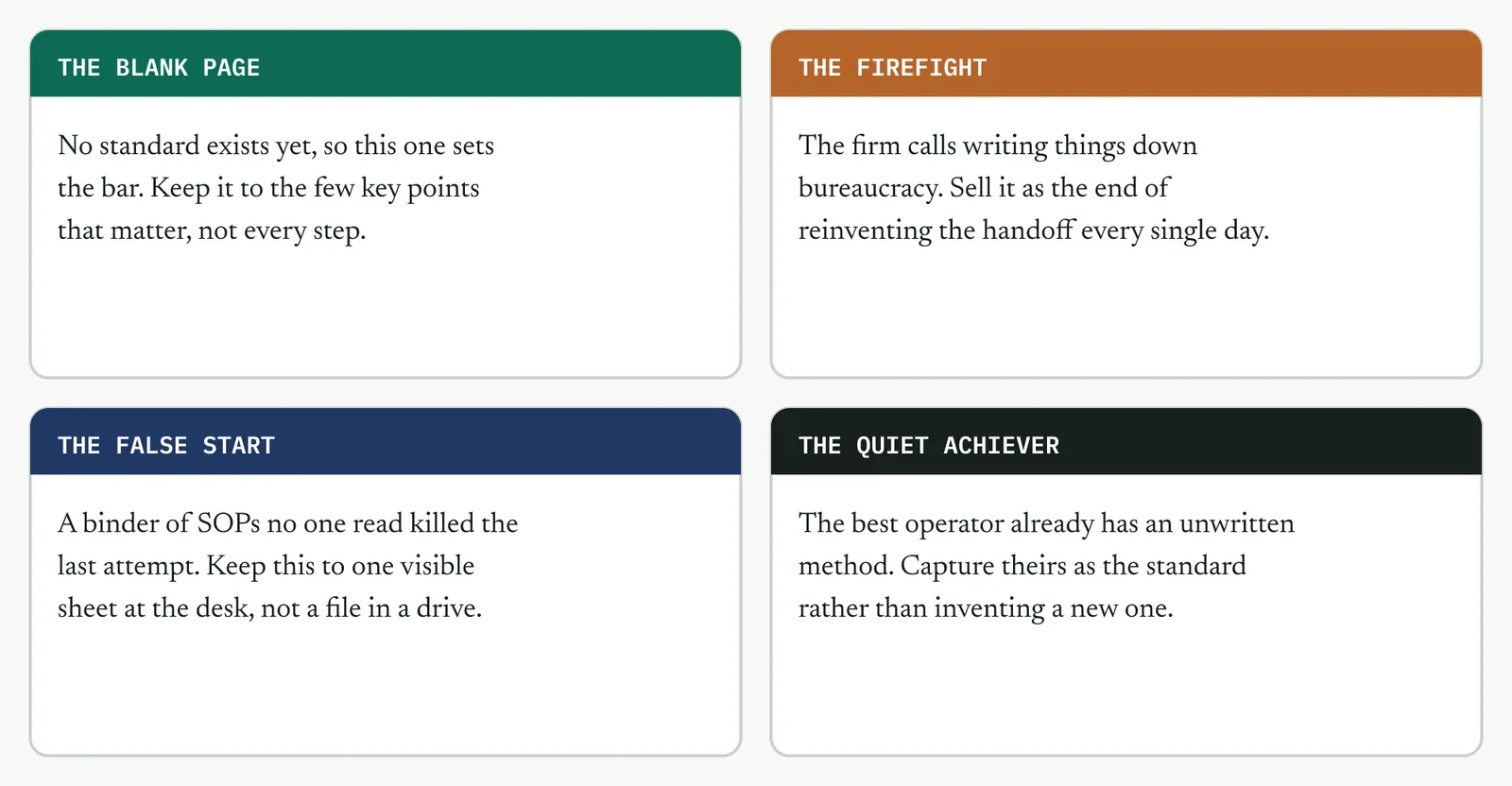
The blank page. No standard exists yet, so this one sets the bar for what a standard is in this firm. Keep it to the few key points that matter. A first standard that is too heavy teaches the firm that standard work is a burden.
The firefight. This firm calls writing anything down bureaucracy, and it is proud of improvising. Sell the sheet as the end of reinventing the handoff every day, not as paperwork. The pitch is less rework, not more control.
The false start. A binder of SOPs no one read is why the room is wary. Keep this to a single visible sheet at the point of use, not a document in a drive. One page they can see beats fifty they cannot.
The quiet achiever. The best operator already runs an unwritten method that works. Capture theirs as the standard rather than inventing a new one over the top of it. You are writing down what already works, not replacing it.
07 When it goes wrong
Two failure modes kill this tool. The first is a standard written by someone who does not do the job, so it is subtly wrong and the desk quietly ignores it. The move that saves it is to write it with the people at the desk and test it with a second operator. The second is a standard that is filed rather than posted, which no one can see and so no one follows. The move is to put it at the point of use and train to it, and to treat drift from it as a signal to improve the standard, not to punish the operator.
08 What it feeds
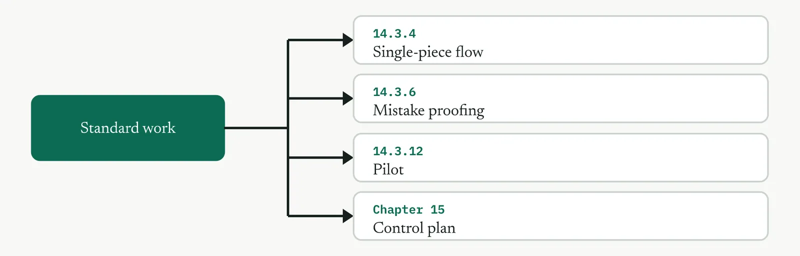
Standard work makes the redesigned handoff repeatable, and four things build on it. Single-piece flow tightens it, mistake proofing protects the key points that must not be skipped, the pilot tests whether the desk can hold it, and it becomes the basis of the control plan and the standard operating procedure in Control.
14 · Improve
14.3.4 Single-piece flow where it applies LEAN
Lean stream, outside ISO 13053 by design. Improve step 2, generate and redesign.
01 What it is and why you reach for it
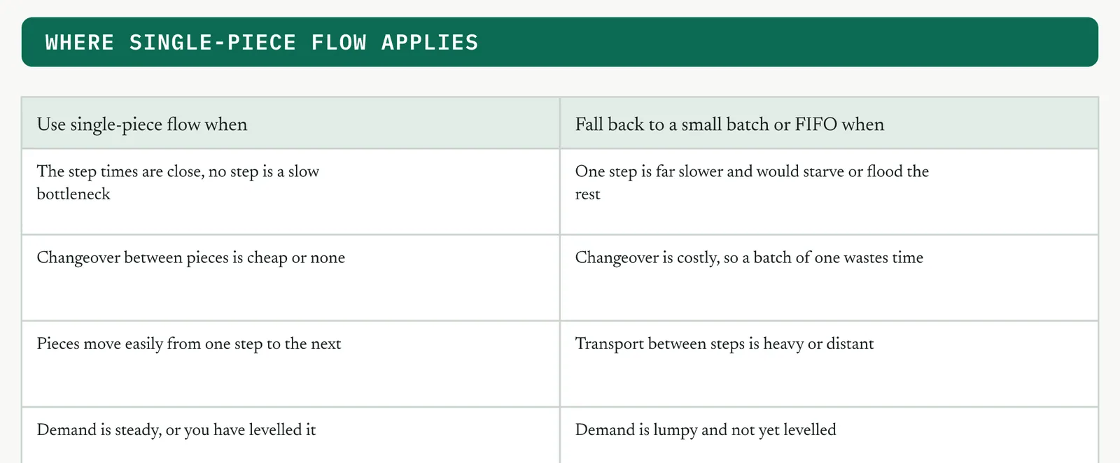
Single-piece flow moves one case at a time through the redesigned steps, so that you can cut the batching delay and surface a defect at the step where it happens rather than a batch later. Reach for it where batching is inflating lead time and the steps can genuinely take work one at a time. The qualifier, where it applies, is the whole judgement. One-piece flow is the ideal, but it is not free everywhere. Force it onto a step with a heavy changeover or a slow bottleneck and you make things worse, not better. Know where it wins and where a small batch or a capped FIFO lane is the honest answer.
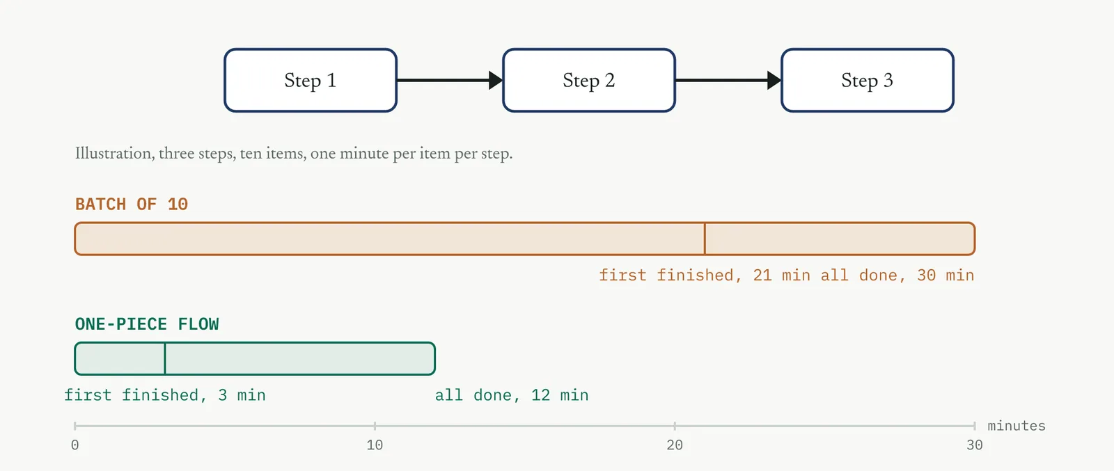
The illustration is the whole argument. Ten items through three one-minute steps take thirty minutes either way, but in a batch the first finished item does not appear until minute twenty-one, and in one-piece flow it appears at minute three. On a complaint process, that gap is the difference between a same-day answer and a week.
02 Setting it up
In the room you need the desk that batches and whoever set the batch rule, which is often a schedule no one has questioned in years. In hand you need the step times, the changeover cost between pieces, and the transport between steps. The one setup judgement is to measure why the batch exists before you break it. Sometimes a batch hides a real constraint, a slow shared system or a single resource, and if you remove it blindly the constraint bites harder. Break the batch only where the step can honestly take one at a time.
03 Running it, step by step
You work batch by batch, and the decision at each one is the selector in Figure 14.29, whether the step can take single pieces or needs a small batch or a buffer.
1 Find the batches. A batch is anywhere work waits for more of its kind before it moves.
2 For each batch, ask why it exists. Habit, a schedule, a changeover cost, or a real constraint.
3 Where the reason is habit or a schedule, move to one at a time on the pull signal.
4 Where a changeover cost forces batching, shrink to the smallest batch that is still economic. Do not chase a batch of one.
5 Where a slow step forces it, fix the bottleneck first, or buffer it with a capped FIFO lane rather than a pile.
6 Re-time the lead time and confirm the batching delay is gone, not merely moved upstream.
04 Crestline, worked
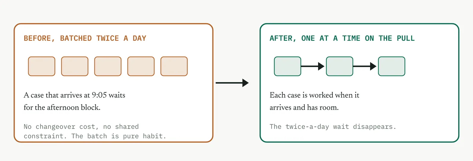
Case handling worked cases in blocks, twice a day, because that was the shift rhythm, not because the work needed it. A case that arrived at five past nine waited for the afternoon block. There was no changeover cost and no shared constraint, so the batch was pure habit. Moved to one at a time on the pull signal from the flow redesign, a case is worked when it arrives and has room, and the twice-a-day wait disappears. Figure 14.30 shows the before and after.
05 Reading the output
A strong result is a batching delay that is gone and did not reappear as a bigger queue somewhere else. A weak one is a batch you broke that existed for a real reason, so the bottleneck now thrashes and the pile has simply moved. If breaking the batch made an upstream or downstream step worse, the batch was load-bearing. Put a capped buffer back and fix the constraint instead.
| Do | Do not |
|---|---|
| Measure why a batch exists before you break it | Break every batch on sight as though batching were always waste |
| Shrink to the smallest economic batch where changeover is costly | Chase a literal batch of one and add more changeover than you save |
| Buffer a real constraint with a capped FIFO lane | Push single pieces onto a bottleneck and let it thrash |
The tell. If breaking a batch made another step worse, the batch was load-bearing. Restore a capped buffer and fix the constraint, do not force the flow.
06 Matching it to the ground
The blank page. There are no entrenched batch rules to fight, so single-piece flow is easy to set as the default from the start. Establish it now, before the firm invents batches to feel efficient.
The firefight. Batches feel efficient to a busy firm, because doing them all at once looks like progress. Show that batching is exactly what makes the day lumpy, a flood in the block and a lull between, and that one-piece flow is what smooths it.
The false start. A past efficiency drive that pushed bigger batches to chase utilisation is why the piles exist. This reverses that, so name it plainly. You are trading a busy-looking desk for a fast one.
The quiet achiever. One desk already works one case at a time without being told. Hold it up as the model and copy it across, rather than importing a scheme from outside.
07 When it goes wrong
Two failure modes kill this tool. The first is breaking a load-bearing batch, where the batch was hiding a real constraint and one-piece flow makes that constraint thrash. The move that saves it is to measure why the batch exists first, and to buffer a genuine constraint with a capped FIFO lane rather than remove it. The second is chasing a batch of one where changeover is costly, so you add more changeover time than you save in flow. The move is the smallest economic batch, not a literal one.
08 What it feeds
Single-piece flow only holds if demand is smooth enough to feed it, so it leans on levelling, which protects it from surges. It also feeds the pilot, which tests whether the desk can hold one at a time at the real arrival rate rather than a quiet demonstration rate.
14 · Improve
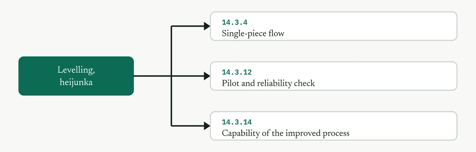
14.3.5 Levelling the workload, heijunka LEAN
Lean stream, outside ISO 13053 by design. Improve step 2, generate and redesign.
01 What it is and why you reach for it
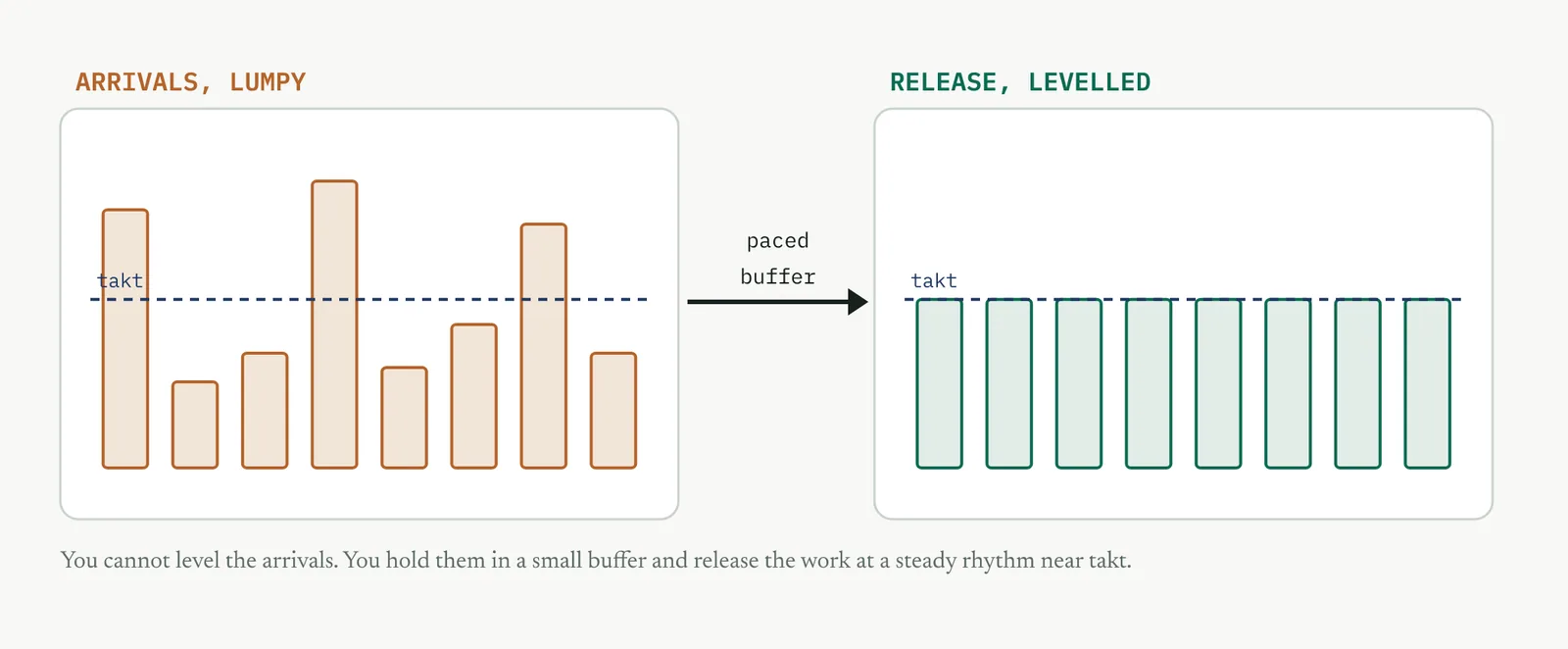
Levelling, heijunka, smooths the volume and the mix of work released into the process, so that you can stop the peaks that overload the desks and cause the rework and delay a surge always brings. Reach for it when demand is lumpy and you need to protect the new standard work and single-piece flow from surges. The honest point for a service is that you usually cannot level the demand itself, because complaints arrive when they arrive. What you level is the release. You hold arrivals in a small controlled buffer and feed the process at a steady rhythm, so the desk sees a smooth stream even when the world sends a flood.
Levelling attacks one of the three enemies Lean names. Muda is waste, the obvious one. But waste usually comes from muri, overburden, and overburden comes from mura, unevenness. A levelled process removes the mura, which relieves the muri, which removes the muda it was causing. That is why levelling sits under the redesign and not the housekeeping. It is a cause, not a tidy-up, and it is the thing that lets standard work and single-piece flow survive a real week.
THE FORMS The three forms of levelling
Levelling is done in three ways, and a real plan uses all of them together. Figure 14.33 shows them, and the paragraphs below say what each one does.
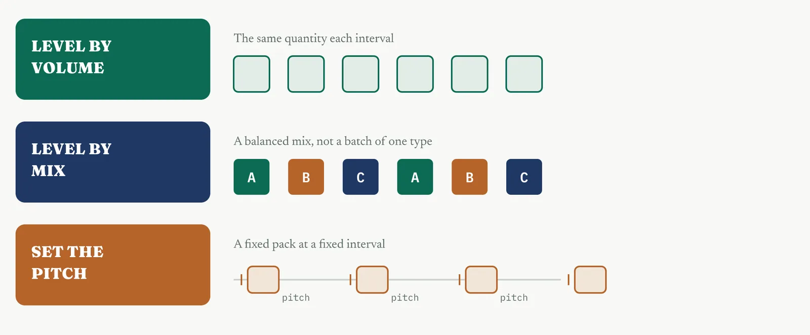
Level by volume. Release the same quantity of work each interval, so the desk sees a steady count rather than a flood and a lull. This is the first and simplest form. On its own it smooths how much work arrives, but not what kind.
Level by mix. Release a balanced mix of case types each interval, rather than a batch of one type followed by a batch of another. A steady count is still a flood if it is all the hardest case type at once, so mix levelling is what makes volume levelling safe.
Set the pitch. Pick a consistent interval, the pitch, at which a fixed pack of work is released, and pace the whole process to it. The pitch is the heartbeat that turns levelling from an idea into a routine the desk can run without you standing over it.
02 Setting it up
In the room you need the desk that feels the surges and whoever controls the release point, which for Crestline is intake. In hand you need the arrival pattern by hour and by day, the case mix, the available working time, and the demand. The one setup judgement is to level the release, not the promise. Levelling adds a small deliberate wait in the buffer, which is fine so long as the total lead time still beats the target. If the buffer grows faster than you can release, demand genuinely exceeds capacity, and no amount of smoothing will save you. That is a capacity problem, not a levelling one.
03 Running it, step by step
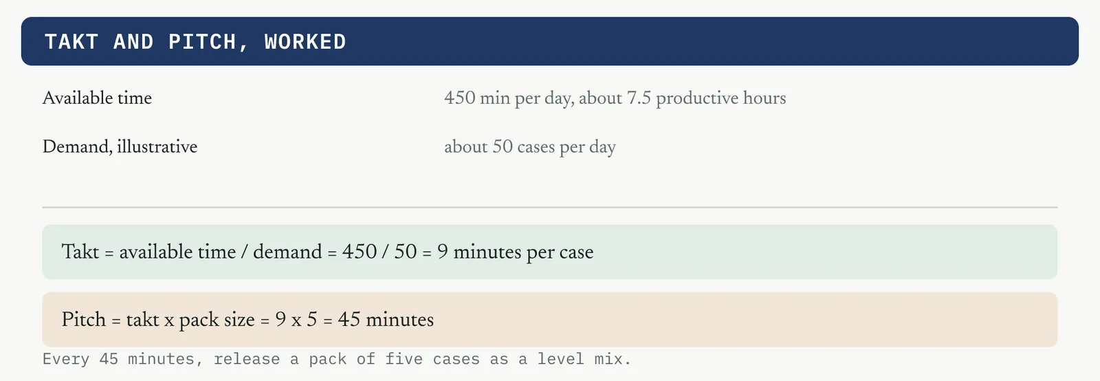
The rhythm comes from two numbers, takt and pitch. Takt is the average interval between releases you must hold to keep pace with demand. Pitch is the pack of work you release at each interval. Figure 14.34 works both for Crestline.
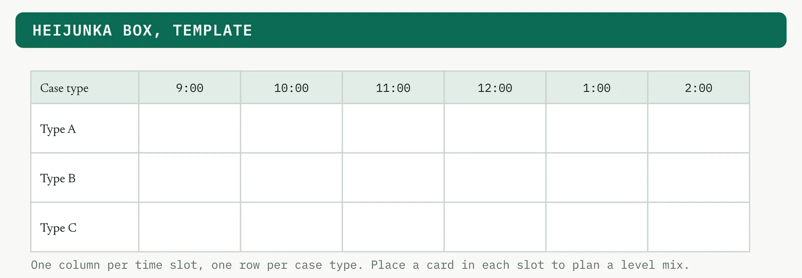
With the numbers in hand, you build the release pattern on a heijunka box so each pitch carries a level mix. Figure 14.35 is the blank box to fill.
1 Measure the arrival pattern by hour and by day, and the case mix.
2 Compute the takt from the demand and the available time, the interval you must hold to keep pace.
3 Choose a pitch, a pack of work released at a fixed interval, so the release is a steady heartbeat rather than a trickle you cannot manage.
4 Set the release point, usually the shared queue, and build the pattern on the heijunka box so each pitch carries a level mix.
5 Size the buffer to absorb the normal peaks, and set a trigger for when it overflows.
6 Watch the buffer trend. Stable means levelling is working. Growing means demand exceeds capacity.
04 Crestline, worked
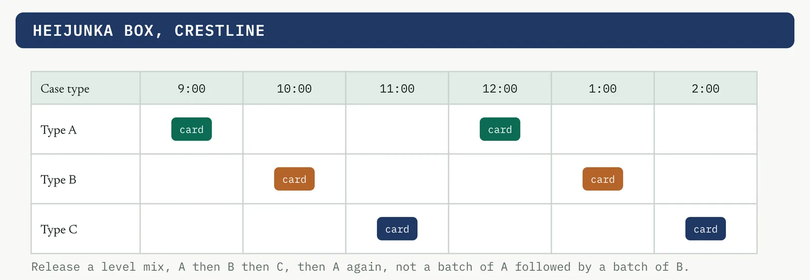
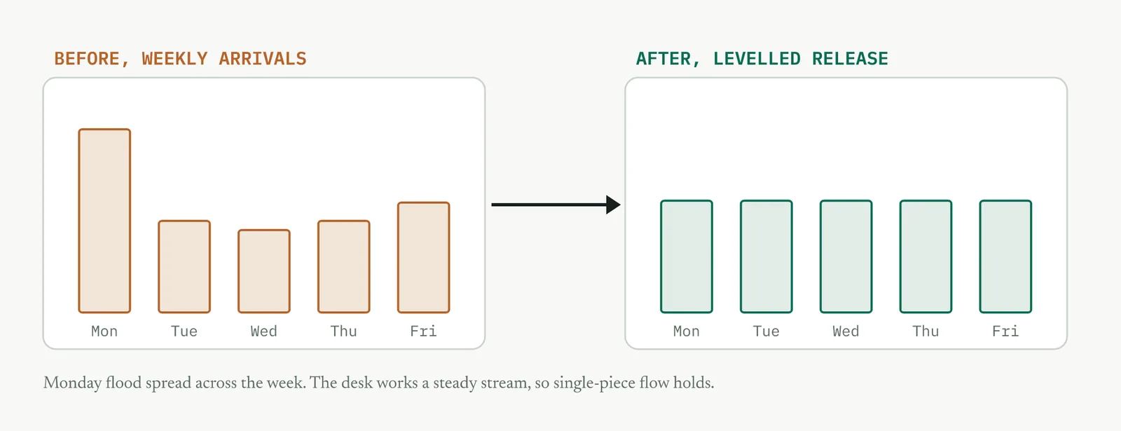
Crestline arrivals spike on Monday mornings and again at month-end. The desks used to swing between a flood and a lull, and the flood is where the defects came from, rushed first responses and cases lost in the pile. Working the takt and pitch from Figure 14.34, intake holds arrivals in the shared queue and releases a level mix to case handling every pitch, so Monday flood is spread across the week and the desk works a steady stream. Figure 14.36 shows the release pattern on the box, and Figure 14.37 shows the effect across the week.
05 Reading the output
A strong result is a steady release, a stable buffer, and a desk whose workload no longer swings from flood to lull. A weak one is a release you have levelled while the buffer grows week on week, which means demand exceeds capacity and smoothing only delays the reckoning. A buffer that keeps growing is a capacity problem wearing a levelling costume.
| Do | Do not |
|---|---|
| Level the release and watch the buffer trend | Level the arrivals, which you do not control |
| Level the mix as well as the volume | Release a steady count of all one hard case type |
| Escalate a growing buffer as a capacity gap | Keep smoothing a buffer that grows without bound |
The tell. A buffer that keeps growing is not a levelling problem, it is a capacity problem. Smoothing will not fix a shortfall, so escalate it as capacity.
06 Matching it to the ground
The blank page. There is no release discipline yet, so set a simple steady release from the start. A firm that learns to pace itself early never develops the surge habit in the first place.
The firefight. This firm runs on the adrenaline of the surge and mistakes it for productivity. Levelling will feel like it slows them down. Show that the surge is precisely what causes the rework, and that a steady pace clears more, not less.
The false start. A past attempt to manage peaks with overtime that burned people out is why the room is tired. Levelling fixes the cause, the unevenness, rather than the symptom, so make that difference explicit.
The quiet achiever. One team already paces itself and rarely floods. Extend its rhythm to the others rather than imposing a new schedule from outside, and let that team explain how it holds the pace.
07 When it goes wrong
Two failure modes kill this tool. The first is levelling a genuine capacity shortfall, where the buffer grows without bound and smoothing merely delays the reckoning. The move that saves it is to watch the buffer trend and escalate a real gap as capacity, not flow. The second is levelling the volume but not the mix, where you release a steady count but all of one hard case type clumps and the desk drowns anyway. The move is to level the mix as well, which is exactly what the heijunka box is for.
08 What it feeds
Levelling protects single-piece flow and standard work from the surges that would break them, so they hold. It also feeds the pilot, which must run at a realistic levelled demand rather than a quiet one, and it makes the capability study meaningful, because capability measured during a firefight is not the capability of the process.
14 · Improve
14.3.6 Mistake proofing, poka-yoke RECOMMENDED
ISO 13053-1, clause 10.5(b). Table 6 status, Recommended.
01 What it is and why you reach for it
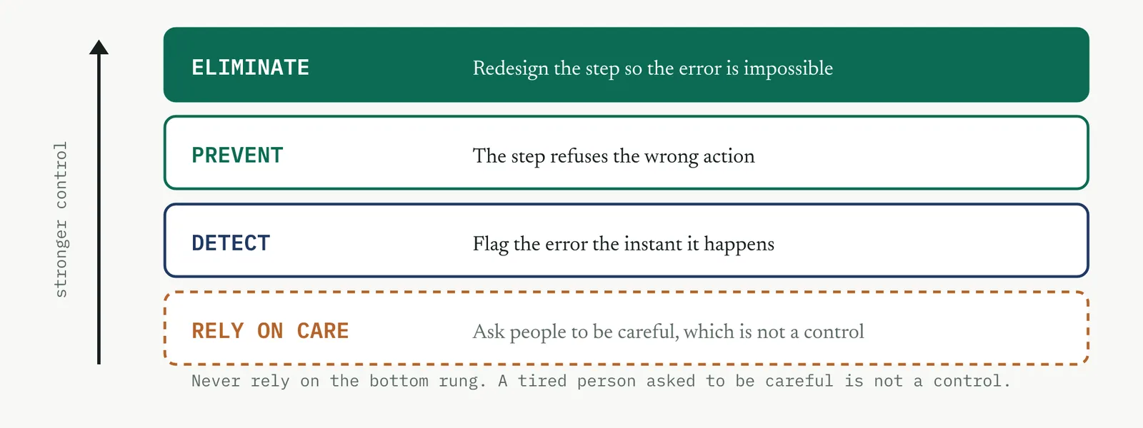
Mistake proofing, poka-yoke, builds the correct action into the step so that the error cannot happen, or is caught the instant it does, so that you can stop a defect at its source rather than inspecting for it later. Reach for it when a specific error keeps recurring and you need the process to prevent it rather than rely on people to catch it. The principle is a hierarchy. Best is to eliminate the error, to redesign the step so the mistake is impossible. Next is to prevent it, to make the step refuse the wrong action. Last is to detect it, to flag the error at once before it passes on. What you never rely on is human care, because asking a tired person to be careful is not a control.
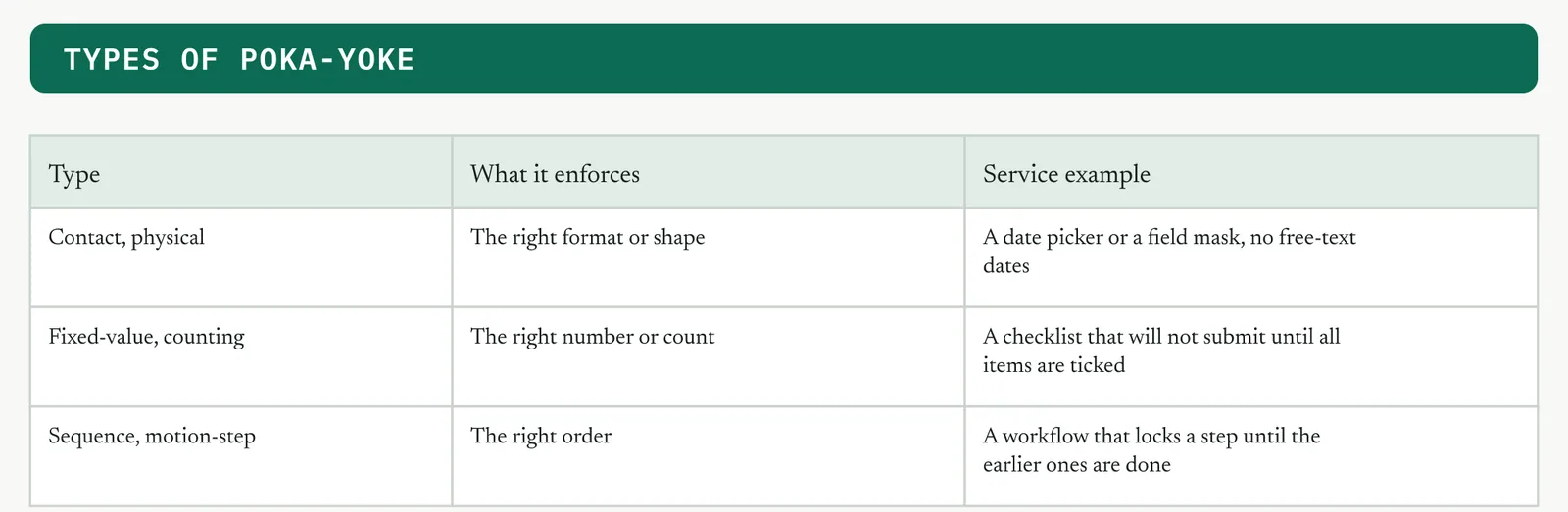
The types of device follow the type of error. A format error wants a contact check, a wrong count wants a counting check, and a wrong order wants a sequence check. Figure 14.40 sets out the three with a service example of each.
02 Setting it up
In the room you need the people who make the error, not to blame them but to design with them, plus whoever can change the form or the system. In hand you need the failure modes from the FMEA, the standard work key points, and the specific errors that recur. The one setup judgement is to mistake-proof the process, never the person. If your device is a reminder, a warning, or a training session, you have not mistake-proofed anything. You have added a request. A real poka-yoke changes what the step will allow.
03 Running it, step by step
You work down the recurring errors and climb the hierarchy for each one, using the worksheet in Figure 14.41.
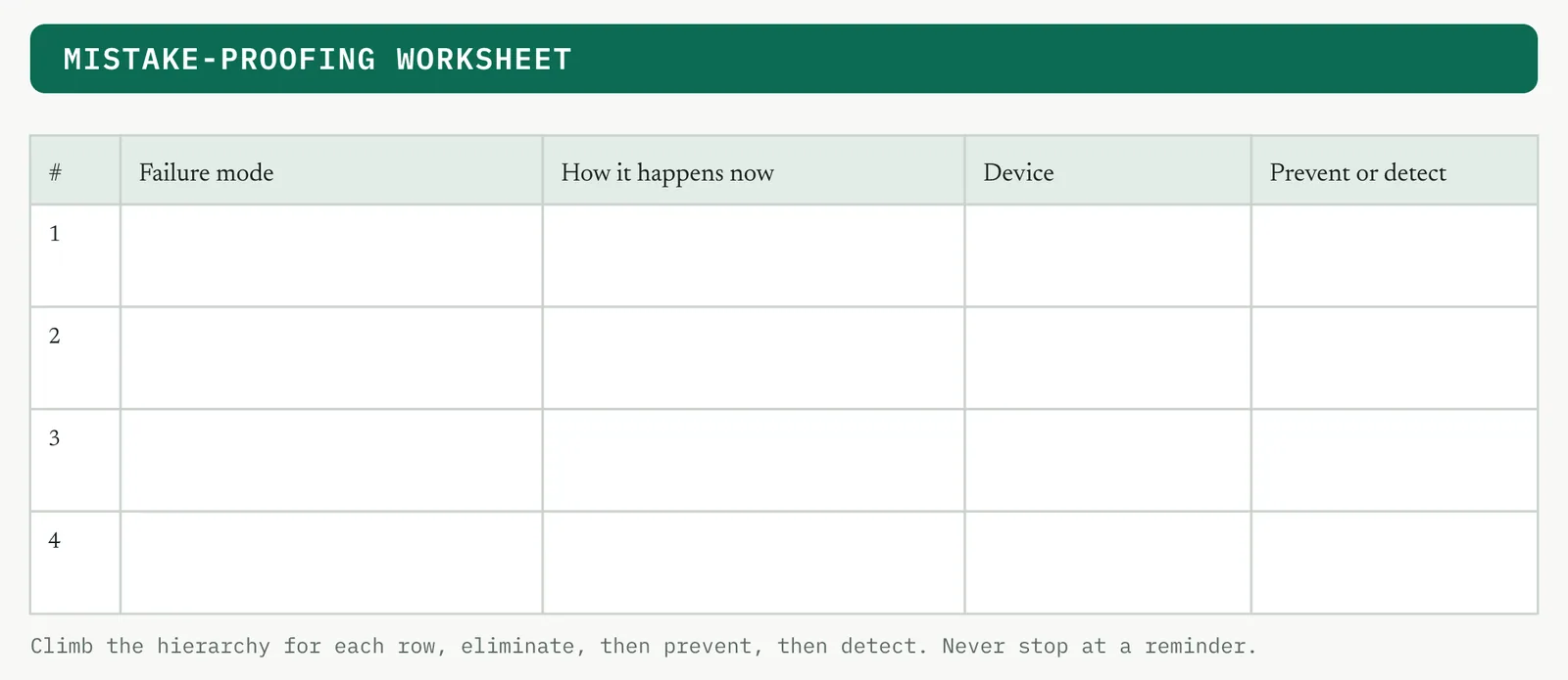
1 List the recurring errors, from the FMEA and the standard work key points.
2 For each, climb the hierarchy. Can you eliminate it? If not, can you prevent it at the step? If not, can you detect it at once?
3 Choose a device that fits the error, a contact check, a counting check, or a sequence check.
4 Prefer prevention over detection, and detection over inspection by a person.
5 Build the device into the step, so the wrong action is refused or flagged, not merely discouraged.
6 Test it by trying to make the error. If you can still make it, the device is a suggestion, not a control.
04 Crestline, worked
The FMEA put two failure modes at the top, a case passing with a blank mandatory field, and an incomplete pack moving to the account manager. The team did not add a reminder. They changed the form. Required fields refuse to submit while blank, severity is a dropdown that defaults to the higher tier, the workflow locks the pass until an owner is set, and the pack cannot move unless every item is ticked. Each one is prevention, not detection, and each was tested by trying to break it. Figure 14.42 shows the worked sheet.
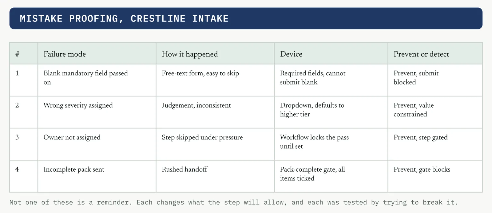
05 Reading the output
A strong device means you cannot make the error even when you try, because the step refuses the wrong action. A weak one is a warning you can click past or a training note, which is a request, not a control. If a determined, tired person can still make the error at the end of a long day, it is not mistake-proofed.
| Do | Do not |
|---|---|
| Change what the step will allow, so the wrong action is refused | Add a warning the operator can dismiss and carry on |
| Climb the hierarchy, eliminate before prevent before detect | Reach for a training session as the fix for a design flaw |
| Test the device by trying to make the error | Assume the device works because it looks sensible |
The tell. If a tired person can still make the error at the end of a long day, it is not mistake-proofed, whatever the device is called.
06 Matching it to the ground
The blank page. There is no error data yet, so start with the one or two errors the standard work key points already name. A first device that visibly stops a real error teaches the firm what mistake proofing is.
The firefight. This firm blames people for errors made under pressure it created. Reframe the conversation from who erred to what let the error happen. The device removes the blame by removing the possibility.
The false start. A past be-more-careful campaign that failed is the exact anti-pattern here. Name it plainly, then show a device that makes the error impossible so no one has to remember anything.
The quiet achiever. One form or system already blocks an error well, quietly. Hold it up and copy the pattern to the others, rather than designing new devices from scratch.
07 When it goes wrong
Two failure modes kill this tool. The first is a device that only warns, so the warning is dismissed under pressure and the error passes anyway. The move that saves it is to make the step refuse the action, not warn about it. The second is mistake-proofing the person with training, which decays the moment pressure returns. The move is to change what the step allows so the error is impossible regardless of who is at the desk or how tired they are.
08 What it feeds
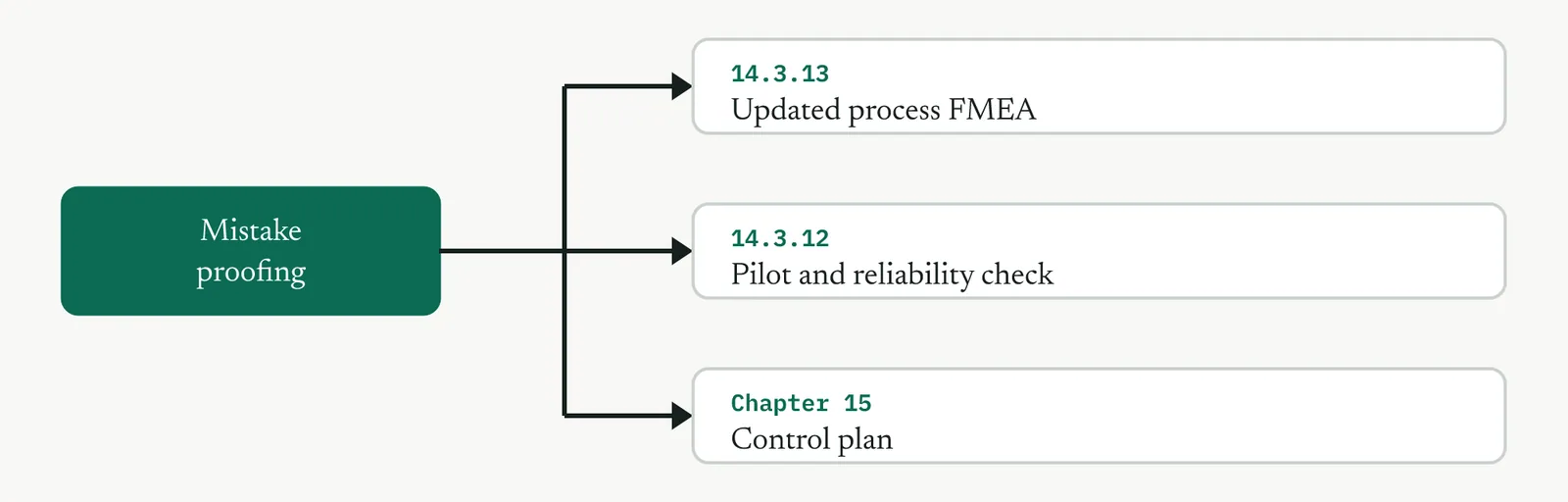
Mistake proofing protects the key points in standard work and drives the failure risk down, which the updated FMEA re-scores to prove the high-risk modes are now controlled. It feeds the pilot, which tests the devices under real pressure, and each device becomes a line in the control plan in Control.
14 · Improve
14.3.7 Solution selection matrix RECOMMENDED shown in this section
ISO 13053-1, clause 10.5(a). ISO 13053-2, Improve step 5. Table 6 status, Recommended.
01 What it is and why you reach for it
The solution selection matrix scores the surviving options against weighted criteria, so that you can choose the solution on evidence rather than the loudest preference in the room. Reach for it when more than one viable option survives the brainstorm and you need a defensible choice to put in front of the sponsor. Its real job in an immature firm is as much political as analytical. It turns I think into a number everyone watched you build, so the decision holds when someone challenges it later, and the option that always wins by seniority has to win on the criteria instead.
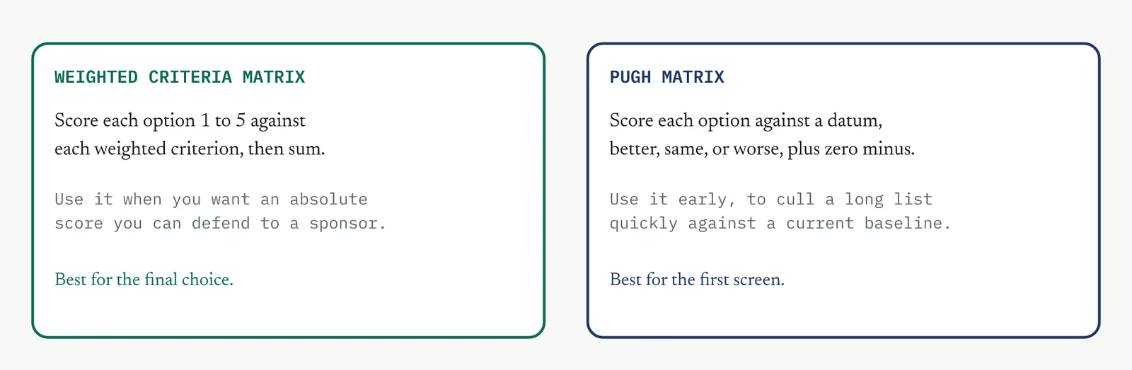
There are two forms, and you choose by where you are in the decision. Figure 14.45 sets them out. A weighted criteria matrix gives an absolute score you can defend, and suits the final choice. A Pugh matrix scores each option against a datum as better, the same, or worse, and suits a quick first screen of a long list.
02 Setting it up
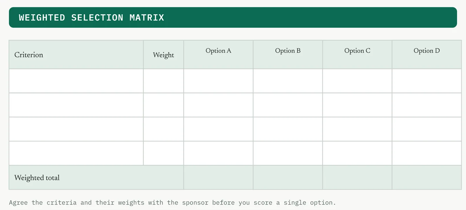
In the room you need the people who generated the options and the sponsor, because the sponsor owns the criteria and their weights, not the belt. The belt runs the method, but what matters is the sponsor call. In hand you need the shortlisted options from the brainstorm, the CTQs, and the baseline. The one setup judgement is to agree the criteria and their weights before you score any option. If you weight after you see the scores, you will tune the weights to the answer you already wanted, and the matrix becomes theatre.
03 Running it, step by step
You build the matrix in the order of Figure 14.46, columns first, then criteria and weights, then scores. Locking the weights before the scores is the step that keeps it honest.
1 List the surviving options as the columns.
2 Agree the criteria that matter, tied to the CTQs and the sponsor goals.
3 Weight the criteria by importance, with the sponsor, before any scoring.
4 Score each option against each criterion on a fixed scale, with the people who know the work.
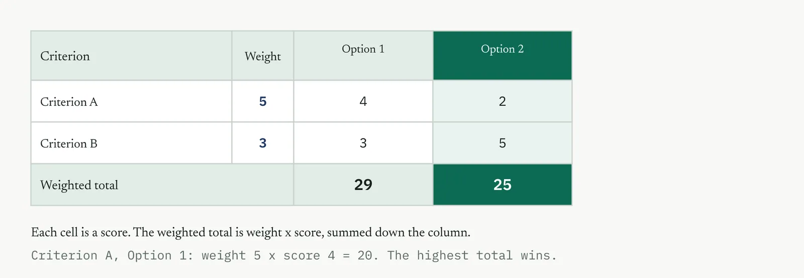
5 Compute the weighted total for each option, weight times score, summed down the column.
6 Read the result and sanity-check it. If the winner surprises the room, find out why before you trust it.
04 Crestline, worked
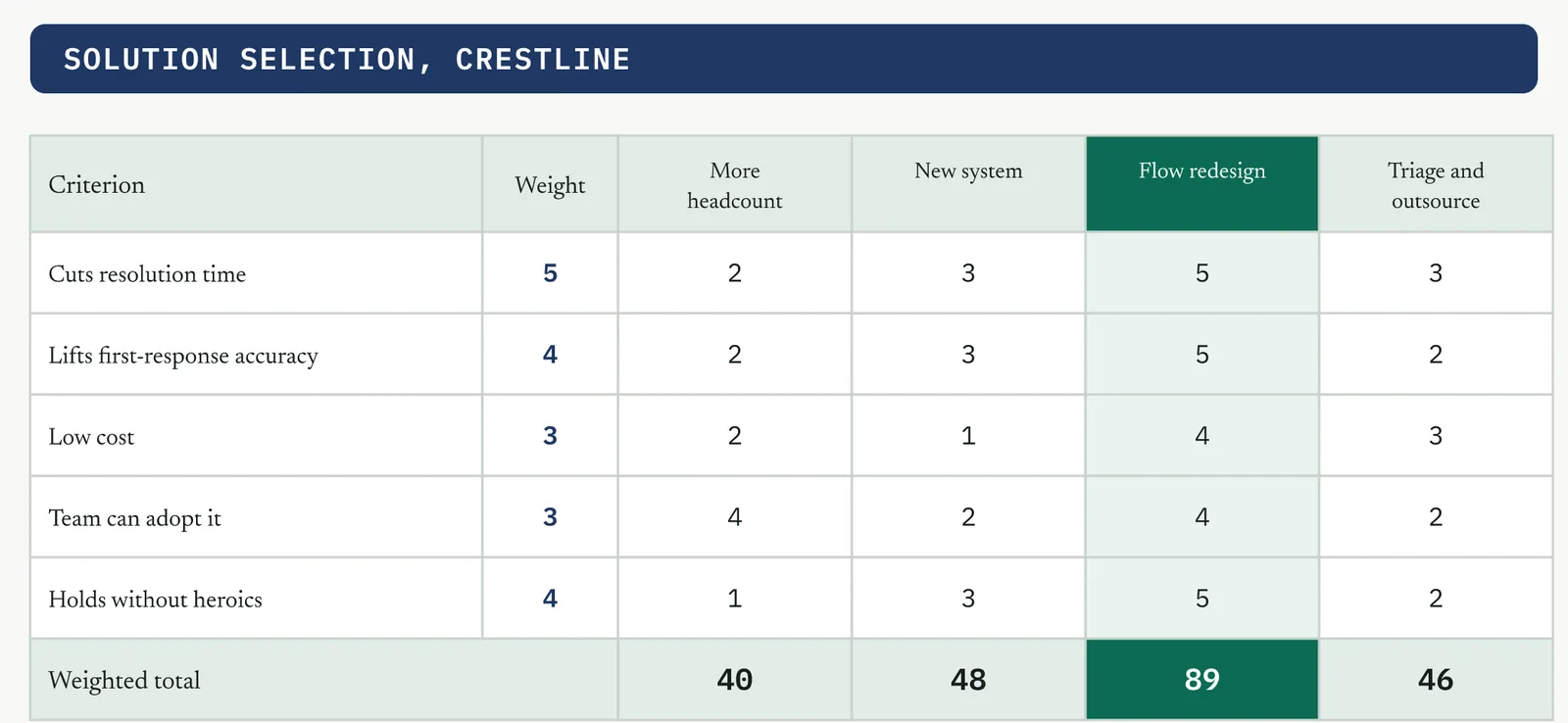
Four solutions survived the brainstorm. More headcount, which was Martin idea, a new case-management system, the flow redesign that bundles the owner, the standard handoff and the mistake proofing, and a triage-and-outsource of the simple cases. Renu set the criteria and their weights, with resolution time and first-response accuracy weighted highest because those are the CTQs. Scored with the desks, the flow redesign won at 89 out of 95, and headcount came last. This time headcount did not lose to an opinion. It lost to a number Renu helped build, which is why it stayed lost. Figure 14.47 shows the matrix.
05 Reading the output
A strong result is a clear winner, weights agreed before scoring, and a total the room can defend. A weak one is a near-tie the matrix cannot separate, which means your criteria do not discriminate, or weights that were tuned after the scores were in. If the winner flips when one person re-scores one cell, the matrix is too fragile to decide anything, which tells you the options are effectively equal and you should choose on another ground.
| Do | Do not |
|---|---|
| Lock the criteria and weights with the sponsor before scoring | Set or tune the weights after you have seen the scores |
| Score with the people who actually do the work | Let one senior voice score every cell alone |
| Treat a near-tie as the options being equal | Read a 47 against a 46 as a real difference |
The tell. If the winner changes when one cell is re-scored, the options are effectively equal. Decide on cost, speed, or risk, not on the total.
06 Matching it to the ground
The matrix is run differently in each firm. Figure 14.48 works the four grounds, and the paragraphs below say how you adjust.
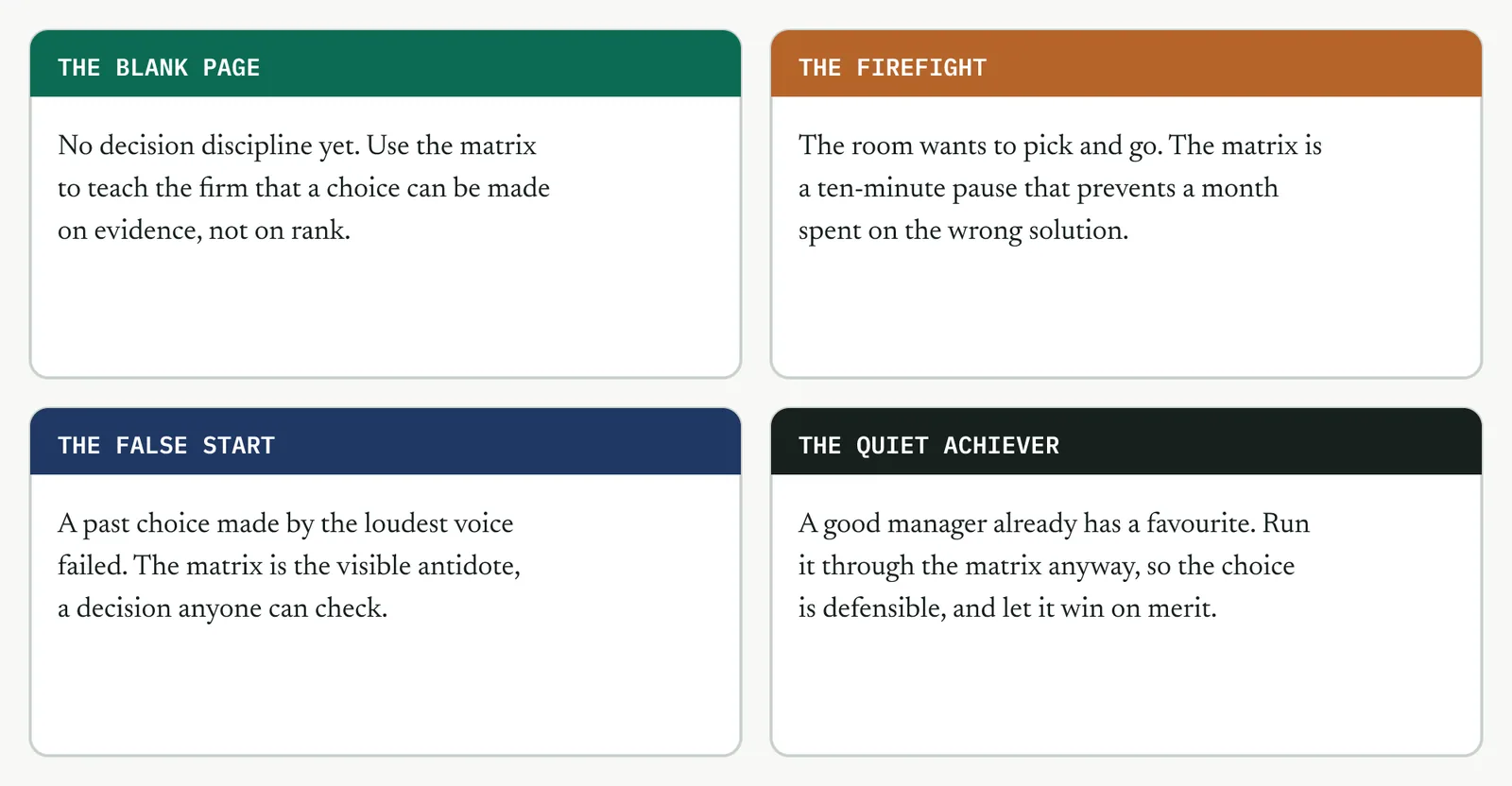
The blank page. There is no decision discipline yet, so use the matrix to teach the firm that a choice can be made on evidence rather than on rank. A first decision made this way sets the expectation for the next.
The firefight. The room wants to pick something and move. The matrix is a deliberate ten-minute pause that prevents a month spent building the wrong solution, so sell it as speed, not process.
The false start. A past choice made by the loudest voice, which then failed, is why the room is wary. The matrix is the visible antidote, a decision anyone in the room can check and challenge.
The quiet achiever. A good manager already has a preferred solution. Run it through the matrix anyway, so the choice is defensible to the rest of the firm, and let it win on the criteria rather than on trust.
07 When it goes wrong
Two failure modes kill this tool. The first is weighting after scoring, where the weights are quietly tuned to the answer someone already wanted, which turns the matrix into a justification rather than a decision. The move that saves it is to lock the weights with the sponsor before any option is scored. The second is false precision, treating a total of 47 against 46 as a real difference. The move is to accept that a close result means the options are equal on your criteria, and to decide on cost, speed, or risk instead.
08 What it feeds
The chosen solution feeds the prioritisation matrix, which sequences its parts, and the pilot, which tests it on real cases. The weighted matrix itself is the evidence the sponsor signs off, so it also feeds the mandate and the gate review, where a decision built on agreed criteria is far harder to unpick than an opinion.
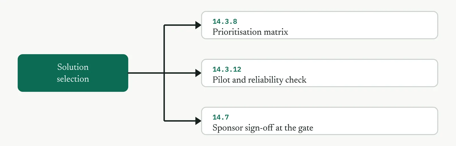
14 · Improve
14.3.8 Prioritisation matrix RECOMMENDED
ISO 13053-2, Improve step 5, prioritisation and decision methods.
01 What it is and why you reach for it
The prioritisation matrix ranks the parts of the chosen solution by effort against impact, so that you can sequence what to do first rather than trying to land everything at once. Reach for it when the solution has several parts and you need an order of attack, which a redesign almost always does. Selection chose the solution. Prioritisation decides the order you build it, and the order matters, because a quick win early buys the credibility and the momentum you need to land the harder parts later.
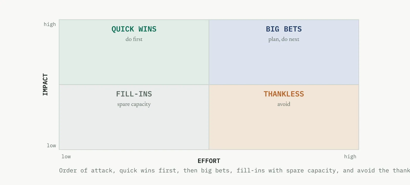
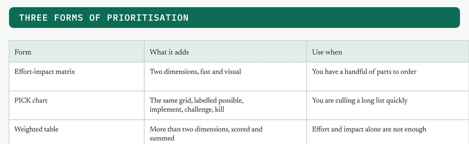
The grid has two dimensions, but there are three common forms of the tool, and you pick by the job. Figure 14.51 sets them out. The effort-impact matrix is fast and visual for a handful of parts, a PICK chart relabels the same grid to cull a long list, and a weighted table earns its place only when effort and impact alone are not enough.
02 Setting it up
In the room you need the people who will do the work, because they know the real effort, and the sponsor, who knows the real impact. In hand you need the parts of the chosen solution, broken down small enough to place separately. The one setup judgement is to judge effort and impact honestly, not optimistically. A team underestimates the effort of things it wants to do and overestimates the impact of things it finds interesting. Anchor both to evidence where you can, the baseline for impact and a rough count of days for effort.
03 Running it, step by step
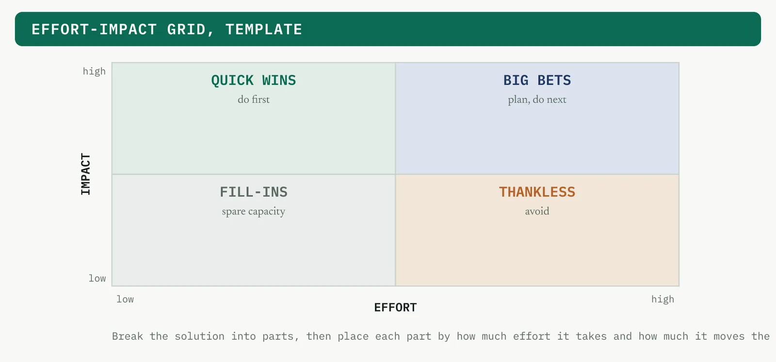
You break the solution down, place each part on the grid in Figure 14.52, and read the order off the quadrants.
1 Break the chosen solution into parts small enough to place separately.
2 Rate each part on impact, tied to the CTQs and the baseline.
3 Rate each part on effort, in rough days or a simple scale.
4 Place each part on the effort-impact grid.
5 Sequence it, quick wins first, then big bets, fill-ins as capacity allows, and drop the thankless.
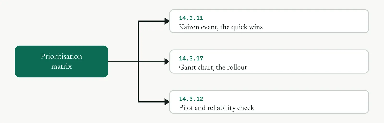
6 Feed the sequence into the plan. The kaizen event takes the quick wins, the Gantt takes the rest.
04 Crestline, worked
The flow redesign broke into six parts. A single case owner, required intake fields, and the severity dropdown all landed as quick wins, low effort and high impact, so they went first, in the kaizen week. The standard handoff pack and the capped pull lanes were more effort but still high impact, so they came next. Levelling was the biggest effort, high impact, a big bet planned for after the pilot. Placing them made the order obvious, and it gave Renu two visible wins in week one to protect the harder work that followed. Figure 14.53 shows the plot.
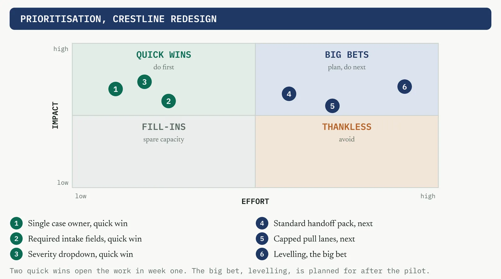
05 Reading the output
A strong result is a clear order with at least one quick win to open on and nothing important stranded in the thankless corner. A weak one is a grid where everything is rated high impact, which means the team cannot prioritise, or everything is rated low effort, which is optimism. If every part is a quick win you have not been honest about effort, and if nothing is, you have no way to build the momentum the harder parts need.
| Do | Do not |
|---|---|
| Open on a quick win to earn credibility for the harder parts | Start with the biggest, hardest part to look ambitious |
| Rate effort in real days, not in optimism | Rate every part as low effort because you want to do it |
| Force a rank when everything looks high impact | Leave a dozen parts all tied at the top |
The tell. If every part is a quick win, the effort ratings are optimistic. If none is, you have nothing to open with. Re-rate until the grid discriminates.
06 Matching it to the ground
The blank page. There is no track record yet, so a quick win first is doubly important. It is the proof the firm has never seen that the method delivers, and it earns the room for the bigger parts.
The firefight. This firm wants to do the big dramatic thing. Steer it to a quick win that shows the method works before the big bet, so the drama comes after the evidence, not instead of it.
The false start. Burned by a big project that failed, the room fears another. Sequence so the first delivery is small, fast and visible, and let a run of quick wins rebuild the trust the last attempt spent.
The quiet achiever. This firm has already done the obvious quick wins informally. Prioritise the harder parts it has not reached, rather than re-scoring work that is effectively done.
07 When it goes wrong
Two failure modes kill this tool. The first is a grid where everything is high impact, so the team will not choose. The move that saves it is to force a rank with no ties, or to weight impact against the CTQs so the differences show. The second is sequencing by enthusiasm rather than evidence, doing the interesting part first because the team wants to. The move is to hold the line that quick wins are chosen by effort and impact, not by what the room enjoys building.
08 What it feeds
The sequence feeds the kaizen event, which lands the quick wins in a focused week, and the Gantt chart, which schedules the bigger parts across the rollout. It also shapes the pilot, which tests a sequenced change rolled out in order rather than a big-bang that hits everything at once.
14 · Improve
14.3.9 Design of experiments RECOMMENDED
ISO 13053-1, clause 10.5(d) response surface and (e) parameter design. Table 6 status, Recommended.
01 What it is and why you reach for it
Design of experiments tests several factors together and measures how each one, and the interactions between them, move the output, so that you can find the settings that optimise a process on evidence rather than one change at a time. Reach for it when the solution has adjustable factors and you need to know which settings and which interactions matter. Its power over changing one factor at a time is that it finds interactions, where two factors together do something neither does alone, which one-factor-at-a-time testing can never see. It also does it in fewer runs.
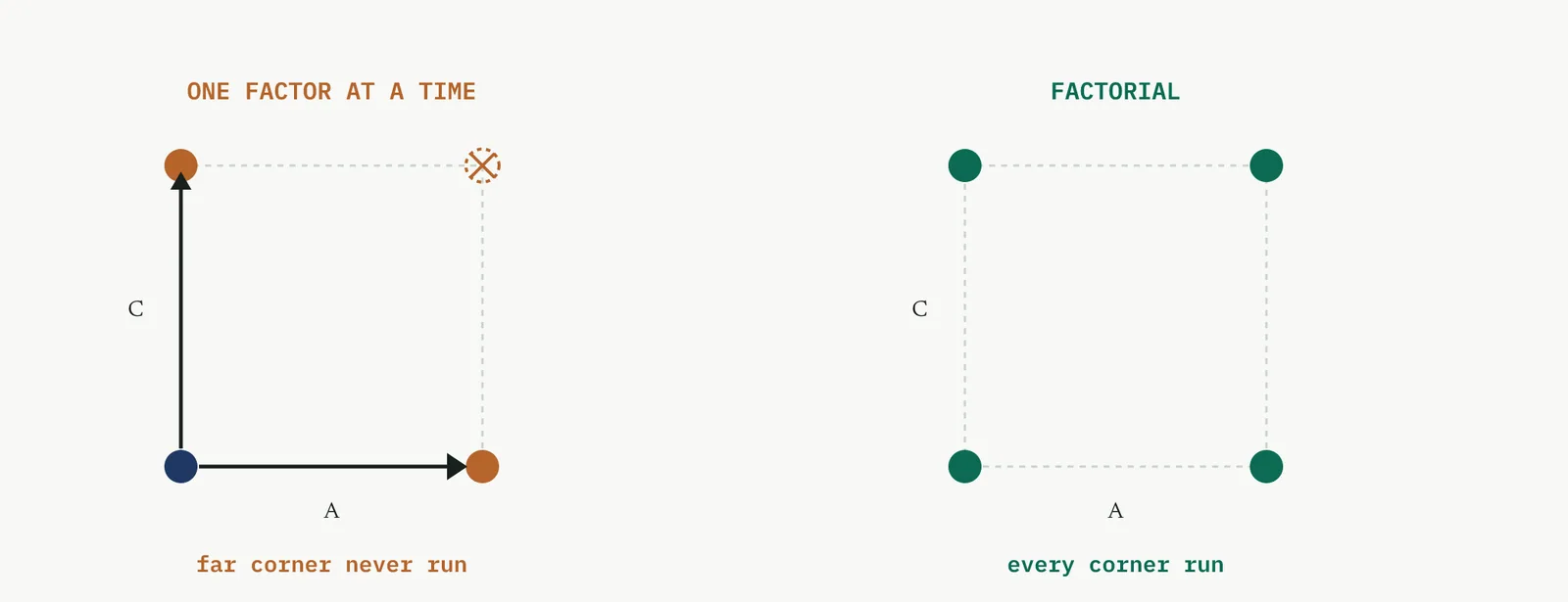
The contrast is not only about interactions. A factorial reuses every run to estimate every effect, so it is more efficient as well as more complete. The table sets the two approaches side by side.
| One factor at a time | Factorial |
|---|---|
| Runs for k factors | A baseline plus one per factor |
| Interactions | Never seen |
| Use of each run | Each run informs one factor |
| Finding the optimum | Can miss it, off the tested lines |
A caution before the families. A designed experiment is powerful only where the process has genuine, adjustable, continuous factors and a measurable response. On a flow problem, where the trouble is handoffs and queues rather than settings, there is nothing to tune, and a designed experiment is the wrong tool no matter how well you run it. The first judgement is not which design, it is whether a design belongs here at all. A word on where this sits for Crestline. The complaint process is a flow problem, so there is no continuous factor to tune, and the selection in 14.2 put the designed experiment in the skip column. This section explains the whole method on problems that do need it, using illustrative processes, and the wrong-tool trap of reaching for it on a flow problem returns in the scenarios at 14.5.
THE VOCABULARY Factors, levels, responses, effects
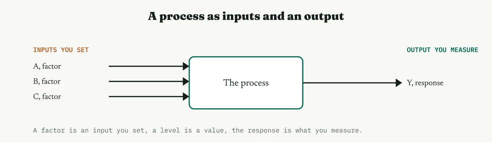
Everything in a designed experiment is built from a few words. A factor is an input you deliberately set. A level is a value you set it to, usually a low and a high. The response is the output you measure. The figure below shows the frame.
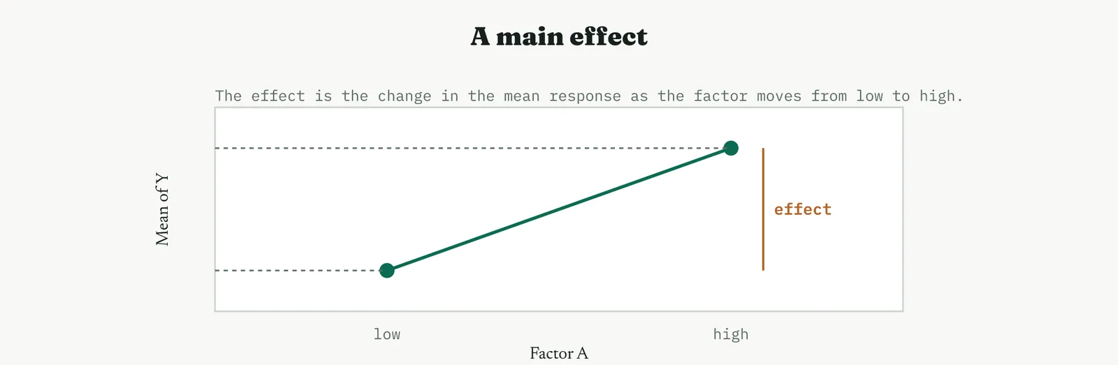
An effect is the change in the response as a factor moves from its low level to its high level. A main effect is that change for one factor on its own. The diagram below shows it as the slope of the line from low to high.
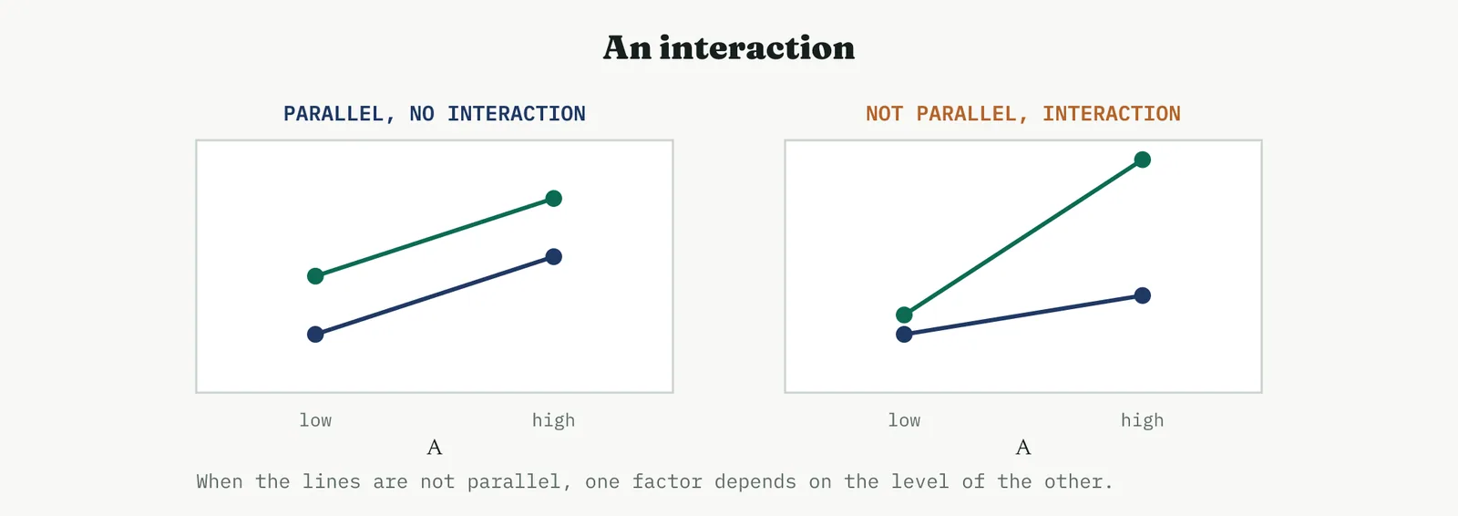
An interaction is present when the effect of one factor depends on the level of another. On a plot, parallel lines mean no interaction, and lines that are not parallel mean there is one. The plot below shows both. The interaction is the reason a factorial beats one factor at a time, because it is the one thing the single-factor approach can never measure.
Underneath the plots is a fitted model, an equation that predicts the response from the factor settings, with a term for each main effect and each interaction the design can estimate. The plots are that model made visible. When you read a designed experiment you are reading the model, one question at a time.
THE PRINCIPLES What keeps a design valid
A design is only as good as the principles underneath it. The chart below collects the ones that decide whether the result can be trusted.
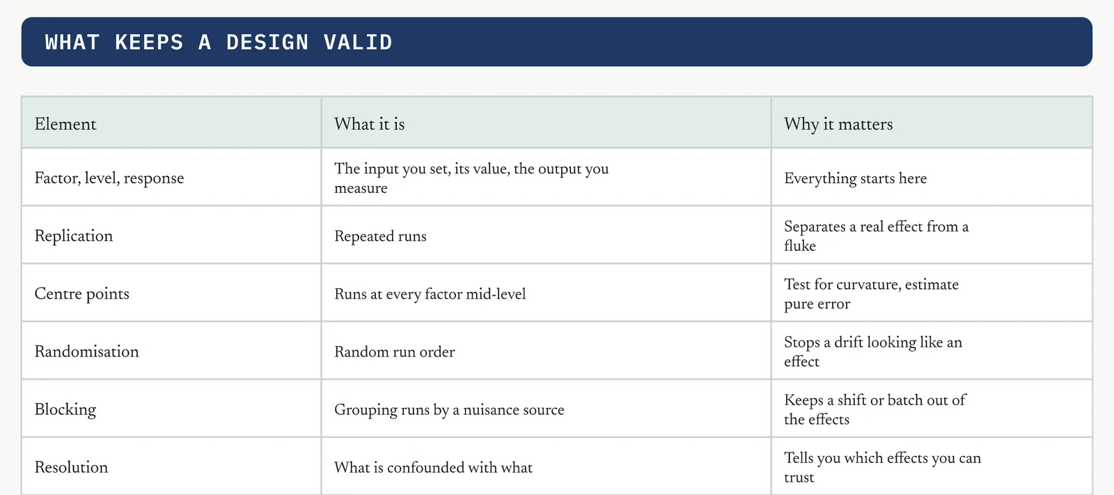
Two of these decide most of the trouble. Randomisation is the cheapest insurance in the method, because without it a slow drift across the afternoon can look exactly like a factor effect. Resolution is the one to understand before you fractionate, because a low-resolution design tangles main effects with two-factor interactions, and you can chase an effect that is really an interaction wearing its clothes. Replication and centre points earn their place by giving you an honest estimate of the noise and an early warning of curvature. Blocking earns its place when a known nuisance, a shift or a batch or a machine, would otherwise contaminate the effects.
One more piece of housekeeping runs through every design, the coded units. You do the arithmetic in coded levels, minus one for the low setting and plus one for the high, rather than in real engineering units, because coded units make the effects directly comparable and keep the model clean. The centre point is zero. You convert back to real units only when you act. The table shows a worked conversion for two factors.
| Factor | Low, coded −1 | Centre, coded 0 | High, coded +1 |
|---|---|---|---|
| A, temperature | 60 C | 70 C | 80 C |
| B, time | 20 min | 30 min | 40 min |
With that convention a coefficient reads as the change in the response for a one-unit move in coded space, which is a move of half the full range in real units. It is why a coefficient is half its effect, and why you can rank factors by their coefficients even when their real units are nothing alike.
One more setup decision hides in the response itself. If the response is a count, a proportion, or a time to failure, its spread often grows with its level, which breaks the assumption of constant variance that the analysis rests on. The fix is a transformation, a log or a square root, chosen so the residuals settle into an even band. You do the modelling on the transformed response and translate the answer back at the end. A Black Belt checks the residuals first and reaches for a transformation before forcing a model onto a response that was never going to behave.
Blocking earns a worked word of its own. Suppose a study needs sixteen runs but only eight can be run in a day, and the two days differ in ways you cannot control. Run day as a block, eight runs each day balanced so every factor appears equally in both, and the analysis absorbs the day-to-day shift into the block rather than letting it smear the factor effects. The cost is one degree of freedom for the block, and the return is effects that are clean of a nuisance you could not otherwise remove.
Sample size follows the same logic as everywhere else in the method. More runs buy more power to detect a small effect, and replication is how you buy it. If the effect you care about is small next to the noise, a single replicate will not see it, and the honest move is to replicate or to narrow the noise before you run, not to over-read a design that was never powered for the question.
HOW TO USE IT Choosing the design in the Improve phase
The design you run depends on where you are. The figure that follows is the decision path for the Improve phase. It turns on three questions, how many factors you are carrying, whether you need the optimum or only a direction, and whether the extreme corner runs are safe. In Analyse the designed experiment was used to confirm a cause. In Improve it is used to find the best settings, which is the optimisation end of this same road.
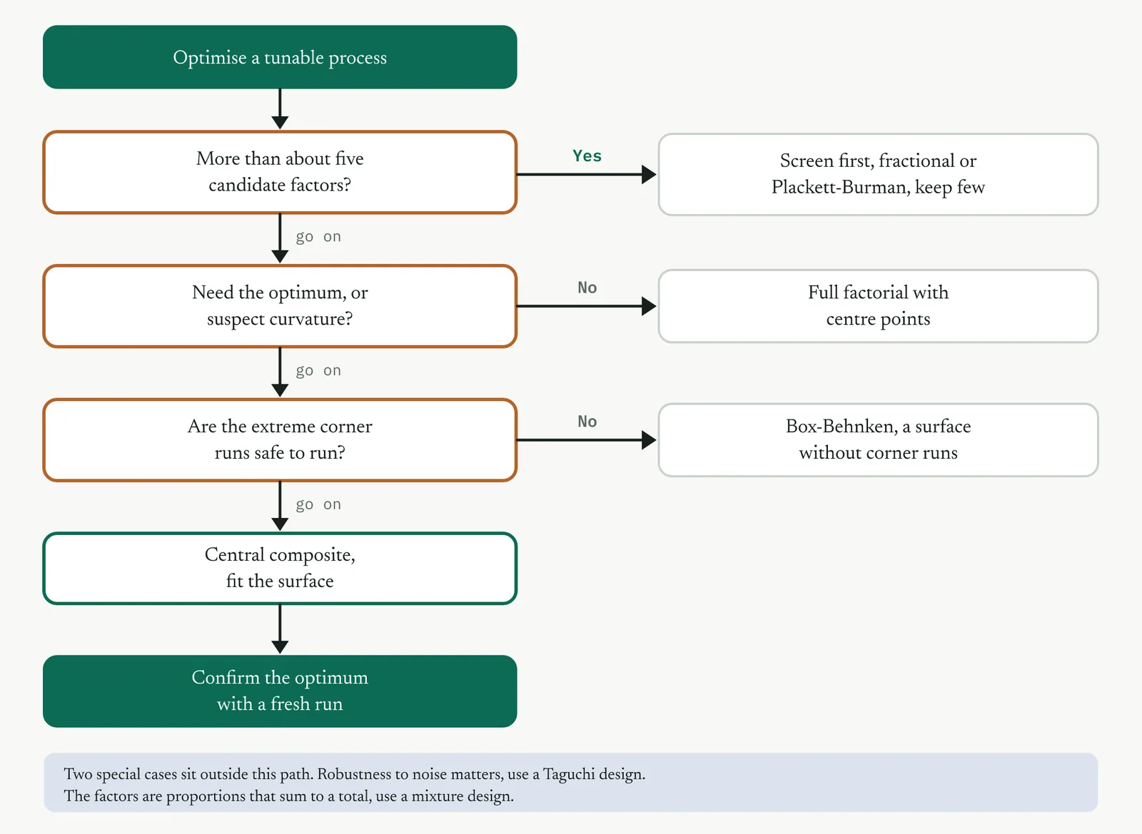
Screening sifts a long list of candidate factors down to the vital few. Characterising measures the effects and interactions of those few and tests for curvature. Optimising fits the curved surface and locates the best settings. The families below map onto these three jobs, and each has designs that suit it. The panel below lists them, and the paragraphs that follow treat each one in detail with its own design and output.
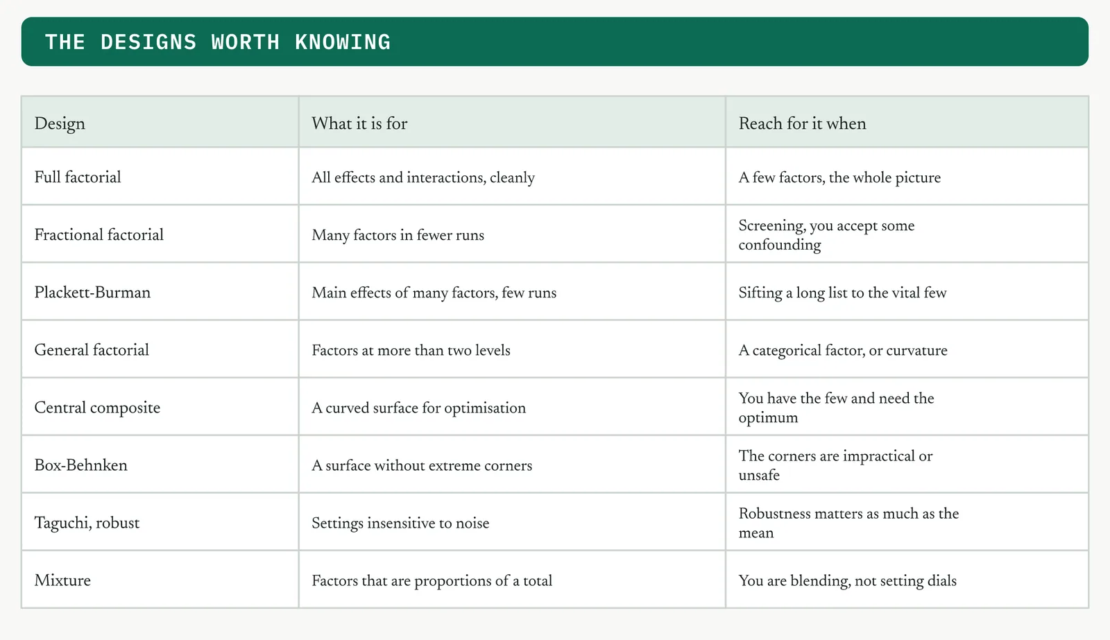
The families differ sharply in how many runs they cost, and the cost is the first thing that decides which one you can afford. The table gives the run counts for a common range of factors, so you can see at a glance why you screen before you characterise, and characterise before you optimise.
| Design | Factors | Runs | What you get |
|---|---|---|---|
| Full factorial | 3 | 8 | all effects and interactions |
| Full factorial | 5 | 32 | all effects and interactions |
| Half fraction | 5 | 16 | main effects, some interactions |
| Plackett-Burman | 11 | 12 | main effects only |
| Central composite | 2 | 13 | a full quadratic surface |
| Central composite | 3 | 20 | a full quadratic surface |
| Box-Behnken | 3 | 15 | a quadratic surface, no corners |
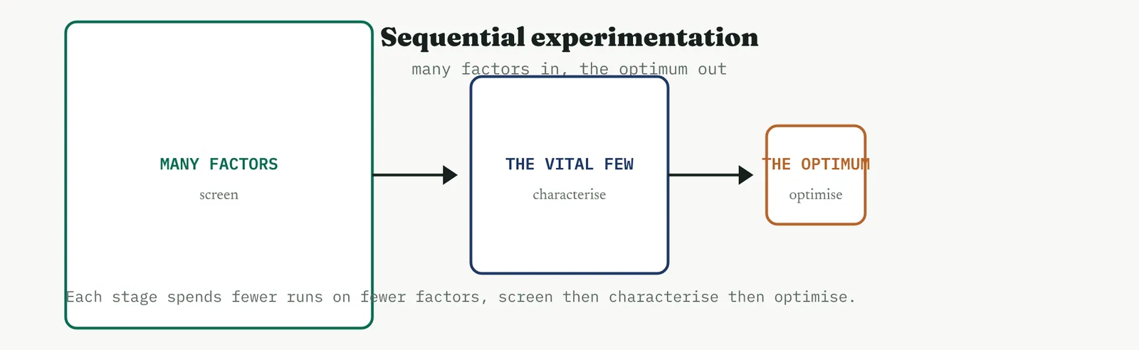
Read the decision flowchart as a triage rather than a rulebook. The first question, how many factors, decides whether you are screening or characterising, and it is the one people skip when they fall in love with a design before they have counted their factors. The second, whether curvature or an optimum is in play, decides whether two levels will do or whether you need the three-level and surface designs. Answer those two honestly and the design almost chooses itself, which is the whole point of settling them before you reach for a tool. Held together, the three jobs are one sequence, and the panel below shows it as a funnel. Many factors go in, a cheap screen keeps the vital few, a full factorial characterises them, and a response surface design optimises the survivors. You never optimise what you have not first screened and characterised, because tuning a factor that does not matter is the most expensive mistake in the method.
02 The screening designs
Screening is the first move when you carry more factors than you can afford to study in full. The aim is not to optimise anything, it is to cut a long list of suspects down to the few that actually move the response, so the runs you spend later are spent on the factors that matter.
FRACTIONAL FACTORIAL A deliberate fraction of the full design
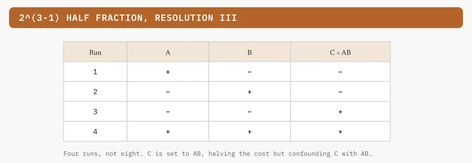
The fractional factorial is the first design most Black Belts reach for on a real problem, because real problems arrive with too many candidate factors to study in full. It trades completeness for economy in a controlled way, and the whole craft of using it well is knowing exactly what you gave up. A fractional factorial runs a chosen half, quarter, or smaller slice of the full factorial, written two to the power of k minus p. It buys a large cut in runs by giving up the ability to separate some effects, which become aliased, estimated together. A half fraction of five factors is sixteen runs rather than thirty-two, and the reduction grows as you fractionate harder. The figure below shows a half fraction of three factors, four runs instead of eight, built by setting the third factor equal to the product of the first two.
The cost is confounding, and you need to know exactly what it costs. The diagram below is the alias structure of that half fraction. Each estimate you compute is really the sum of two effects, so the estimate of A also carries the BC interaction, and you cannot tell them apart from this design alone.
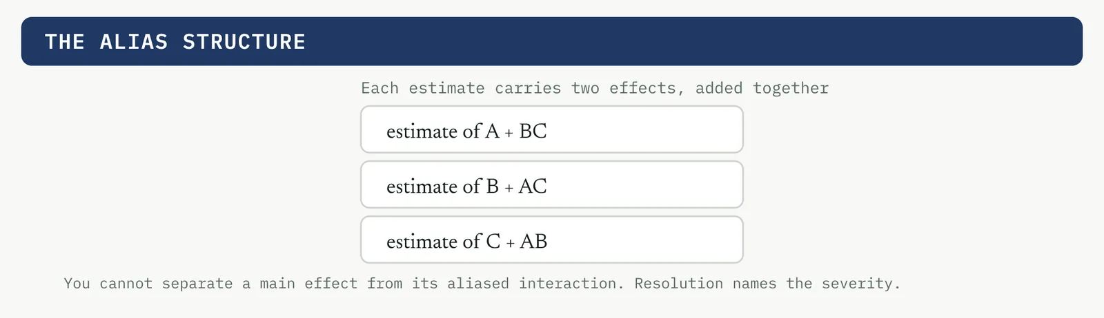
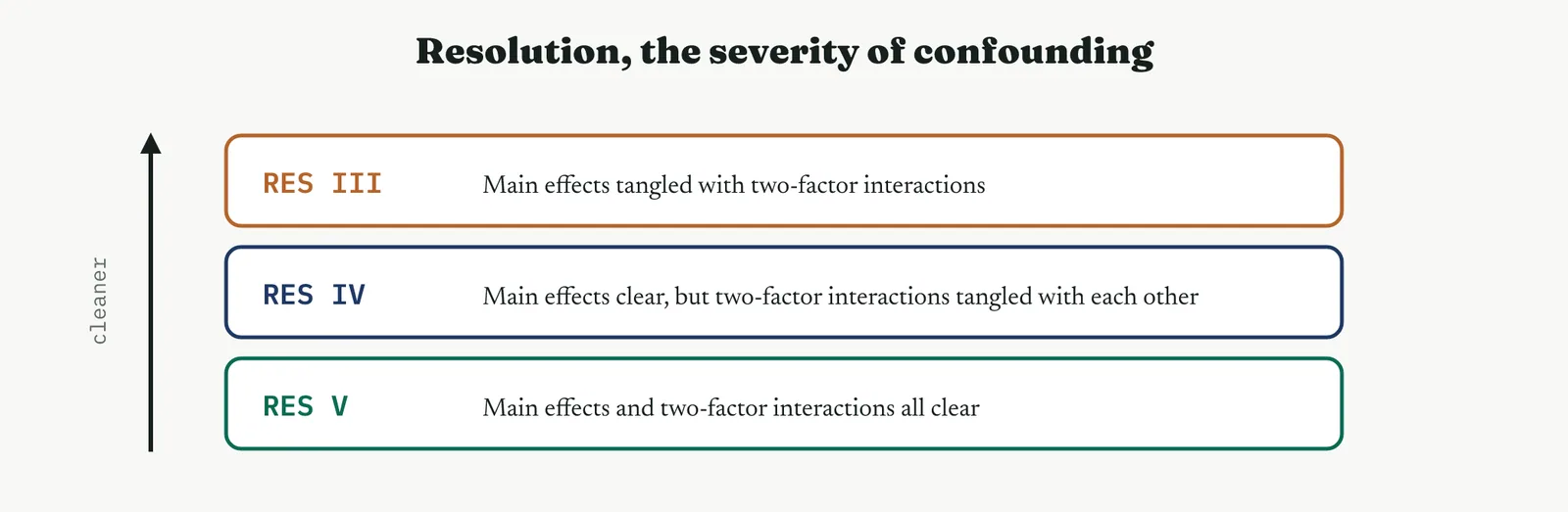
How badly a design confounds is named by its resolution. The plot below sets out the ladder. A resolution III design tangles main effects with two-factor interactions, which is fine for a first screen where you assume interactions are small. A resolution IV design keeps main effects clear but tangles the two-factor interactions with each other. A resolution V design keeps both clear. You choose the resolution you can afford to confuse, and you spend runs to buy your way up the ladder when you need to.
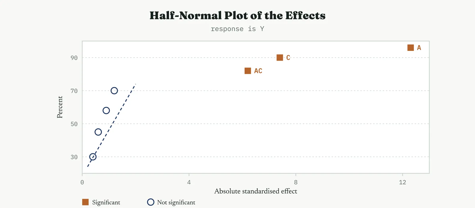
The analysis of a screen leans on the half-normal plot in the figure below, which plots the size of every effect against a half-normal score. The trivial effects fall on the line, the real ones stand off to the right, and those are the factors you carry forward. It is the same logic as the normal plot used later, read on the absolute size of the effect rather than its sign.
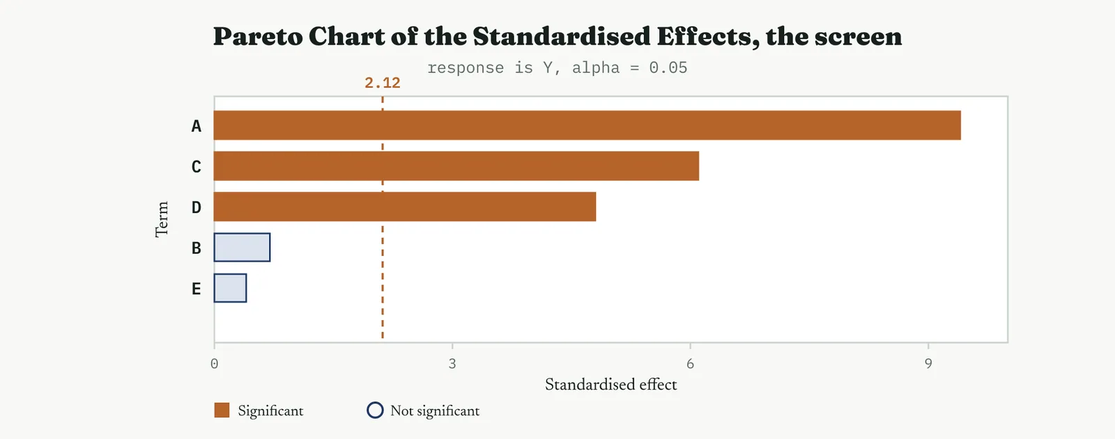
Worked, a screen runs like this. Suppose you carry five suspected factors, A to E, and run a sixteen-run half fraction at resolution five, so main effects are clear of the two-factor interactions. The effect estimates come back as the table shows. Three factors stand well clear of the noise, two are inert. You carry A, C and D forward to a full characterising design and drop B and E, having spent sixteen runs to retire two factors and focus the study.
| Term | Effect | Verdict |
|---|---|---|
| A | 9.4 | carry forward |
| C | 6.1 | carry forward |
| D | 4.8 | carry forward |
| B | 0.7 | drop |
| E | 0.4 | drop |
The discipline in a screen is to resist reading too much into it. You are not measuring anything precisely, you are sorting. A factor that scrapes the line stays in for one more round rather than being trusted or dismissed on a design that was never built to be precise.
Before you read anything you settle the alias structure, because it tells you what each estimate really is. In this resolution five screen the main effects are clean and only high-order interactions are confounded, which is why a resolution five design is a comfortable place to sort main effects. The table shows the confounding for the first few terms.
| Estimate | Really measures |
|---|---|
| A | A, cleanly |
| B | B, cleanly |
| AB | AB plus a four-factor interaction |
| ABC | ABC plus a two-factor interaction |
Read on a Pareto, the same screen looks like the diagram below. The three surviving factors clear the line and the two inert ones do not, and this is the picture you take to the sponsor as the case for narrowing the study.
When it goes wrong. The failure that ruins a fractional design is choosing too low a resolution and then reading a main effect that is really its aliased interaction. The guard is to know the alias structure before you run, and to raise the resolution when the interactions are plausible rather than assuming them away.
PLACKETT-BURMAN Many factors, very few runs
The Plackett-Burman design is the bluntest and cheapest tool in the kit, and it is built for one job only, sorting a very long list of suspects fast. It makes no attempt at interactions and offers no path to an optimum. What it offers is reach, the ability to look at many factors in barely more runs than there are factors, which is exactly what you want when the list is long and the budget is small. When the list is very long and you are willing to ignore interactions entirely, a Plackett-Burman design screens the main effects of many factors in a number of runs just above the factor count. Twelve runs screen up to eleven factors. The chart below shows the twelve-run design. It is the bluntest of the screening tools and the cheapest, and its only job is to tell you which handful of factors deserve a proper study.
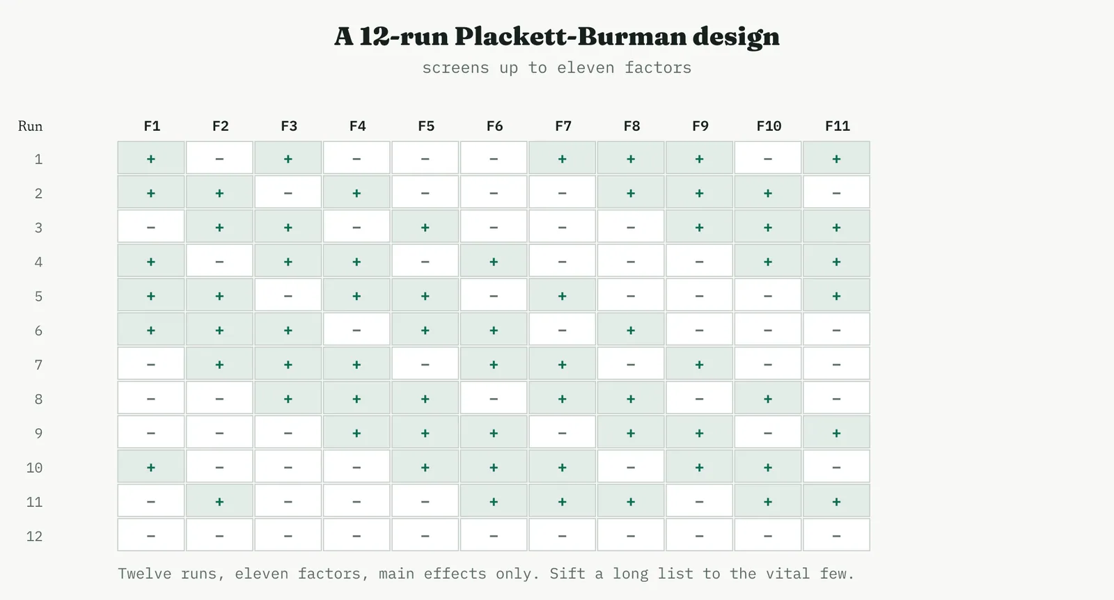
Worked, take eleven suspected causes of a recurring paint defect, screened in twelve runs. The main effect estimates came back with three factors standing clear and the other eight close to zero. You carry the three forward and drop the eight, having spent a dozen runs to turn a wall of suspects into a short list. That is the whole ambition of a Plackett-Burman design, and asking it to do more, to resolve an interaction or estimate a curve, is asking the wrong tool.
| Factor | Effect | Verdict |
|---|---|---|
| F1 | 8.1 | carry forward |
| F3 | 5.9 | carry forward |
| F7 | 4.2 | carry forward |
| others (8) | under 1.0 | drop |
The economy is the point. Eleven factors would take a great many runs in any factorial, and a Plackett-Burman sorts them in twelve, at the price of learning nothing about interactions. You spend that economy deliberately, at the very front of a study, to earn the right to run something more careful on the few that survive. The chart below is the same result on a Pareto. Reach for a Plackett-Burman only at the very start, when the list is long and you have no budget for interactions. Ask it to resolve an interaction and it will mislead you, because its whole economy comes from assuming interactions away.
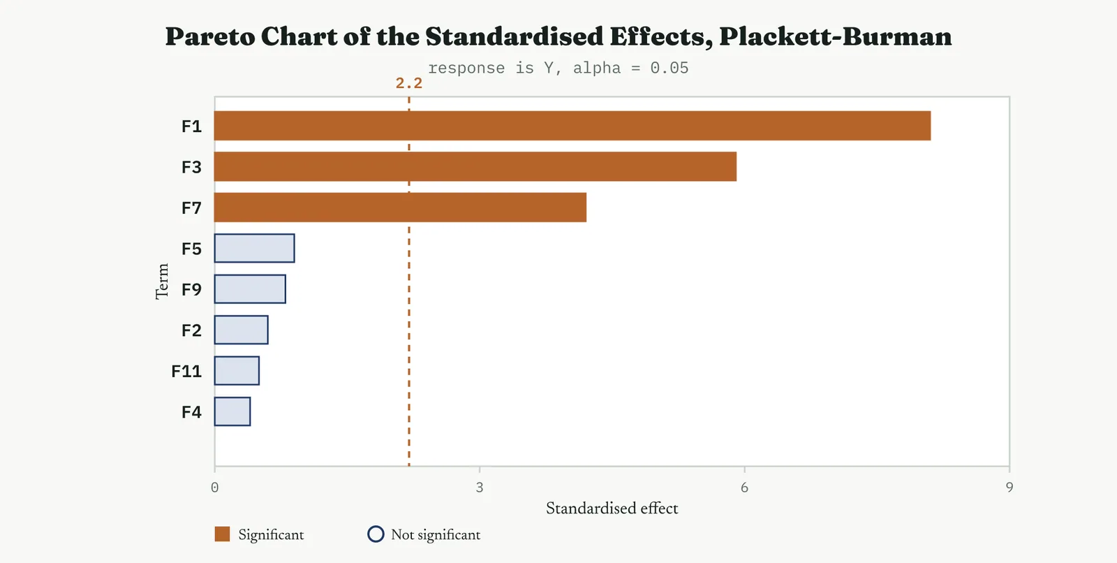
03 The characterising designs
Once the list is short, you characterise. Characterising measures the real size and direction of each surviving effect, and the interactions between them, cleanly enough to build a model you can act on. The full factorial is the tool, and its analysis is a fixed sequence of plots, each answering one question.
FULL FACTORIAL The complete picture, worked end to end
The full factorial is the reference design, the one every other two-level design is measured against, because it alone estimates everything with nothing confounded. It is what you run once the list of factors is short enough to afford it, and its analysis is the template for reading every other design in this section. Take a concrete case. A coating line has three settings a team can adjust, the cure temperature as factor A, the dwell time as factor B, and the roller pressure as factor C, and the response is the bond strength of the finished coat. A full factorial runs every combination of every factor at two levels, so three factors take eight runs. It estimates every main effect and every interaction with no confounding, which is why it gives the complete picture. The figure that follows is the design, an eight-run two-level design in three factors.
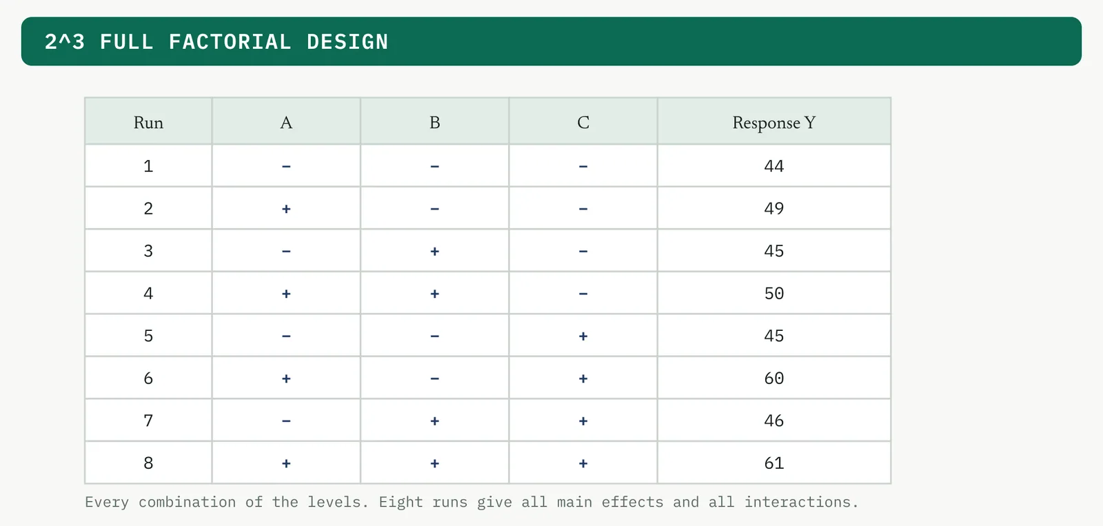
The cube plot in the plot below places the response at every corner of the design space, which is the fastest way to see where the good results sit before any modelling. Here the high corner, A high and C high, holds the best result.
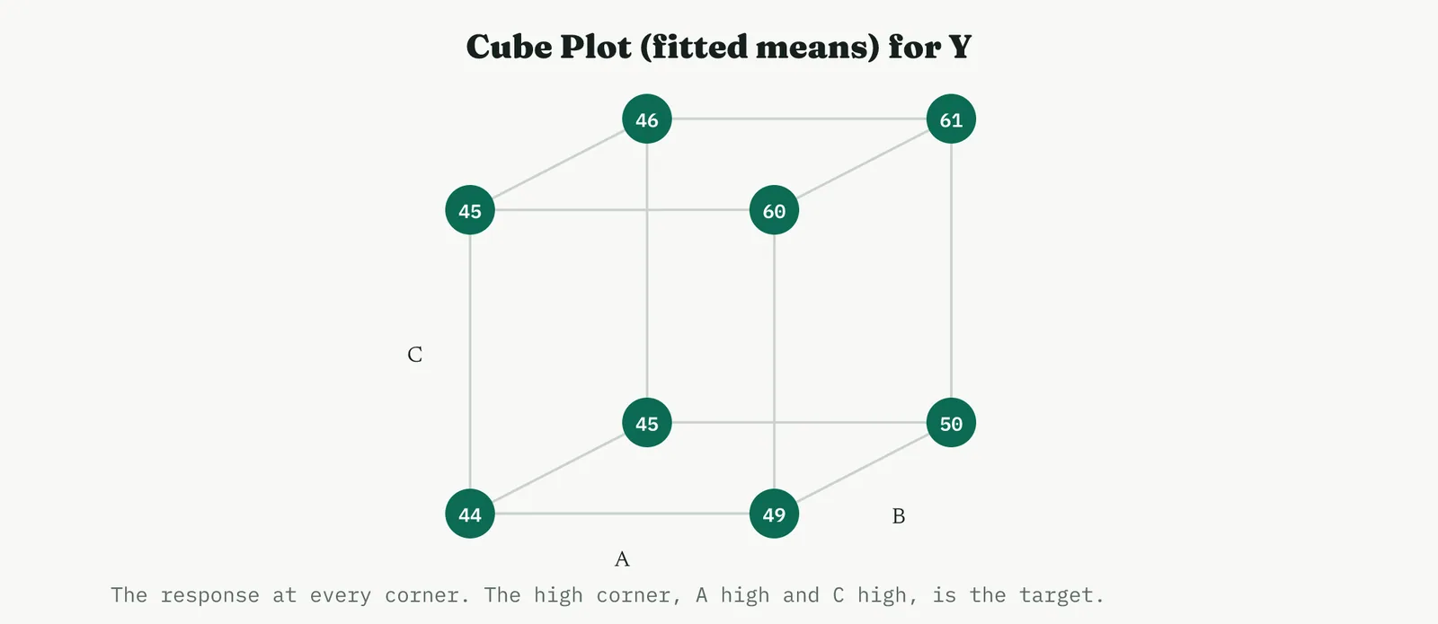
The cube plot is the first thing to read, before any modelling, because it shows the raw shape of the result. A glance tells you the good corner, and whether the response climbs smoothly or jumps, which is often enough to form a hypothesis the formal analysis then confirms or overturns.
Which effects are real is answered first, by the main effects and interaction plots. The panel below shows that A and C move the mean and B is flat. The figure below shows the A and C lines are not parallel, the signature of a real interaction, so the effect of C depends on the level of A.
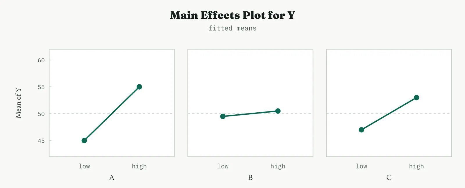
Read the steepness, not just the direction. A steep line is a strong lever and a flat line is a factor you can set for convenience or cost. Here A is the steepest, so it is where the leverage is, and B is flat enough to hold wherever it is cheapest to run.
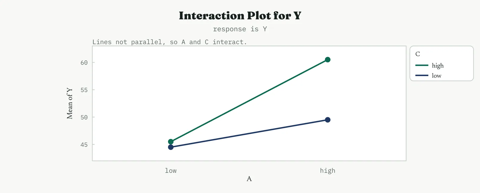
How sure you are is answered by the Pareto and normal plots of the standardised effects. In the chart below, A, C and the AC interaction clear the significance line at 2.31, and the rest do not. The diagram below says the same a different way, with the real effects standing off the straight line and the noise sitting on it.
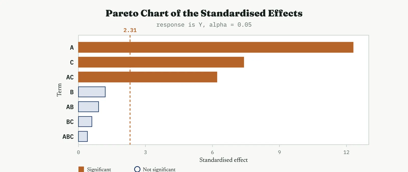
The Pareto is the plot to show a sceptical room, because the line makes the verdict visual. Anything past the line is real, anything short of it is noise, and there is no arguing with a bar that plainly clears or plainly does not. It is the fastest way to end a debate about whether a factor matters.
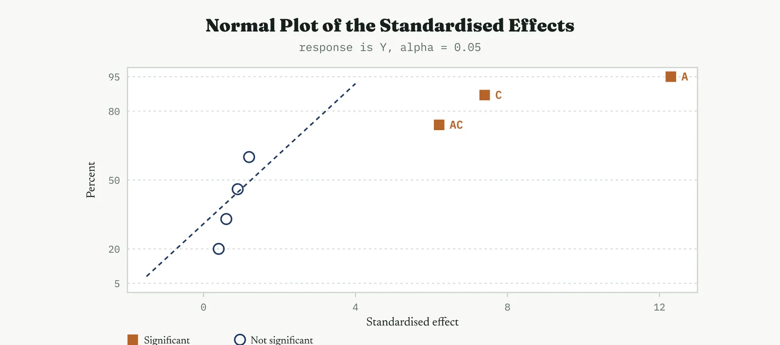
Behind the plots is the arithmetic. Each effect is the difference between the mean response at the high level of a term and the mean at its low level, and each coefficient is half the effect, because the model runs in coded units from minus one to plus one. The table lists them.
| Term | Effect | Coefficient |
|---|---|---|
| Constant | 50.0 | |
| A | 10.0 | 5.0 |
| B | 1.0 | 0.5 |
| C | 6.0 | 3.0 |
| A C | 5.0 | 2.5 |
| A B | 0.0 | 0.0 |
| B C | 0.0 | 0.0 |
| A B C | 0.0 | 0.0 |
Dropping the terms that are effectively zero leaves the fitted model in coded units, Y equals 50 plus 5 A plus 3 C plus 2.5 A C, with B carrying a negligible half unit. That equation is the whole result of the characterising step. It says A is the strongest lever, C matters in its own right, and the two work together, which is exactly what the plots showed. You now have a model to optimise, and everything after this is about locating and confirming its best point.
Run in two replicates, the design also yields a proper analysis of variance, which is how you attach significance to each term. The table below is that analysis, with a pure-error estimate from the replicated runs. The large F ratios on A, C and the AC interaction, and their small p values, are the formal statement of what the Pareto already showed by eye. B does not clear the bar.
| Source | DF | Seq SS | MS | F | P |
|---|---|---|---|---|---|
| A | 1 | 400.0 | 400.0 | 400.0 | 0.000 |
| C | 1 | 144.0 | 144.0 | 144.0 | 0.000 |
| A C | 1 | 100.0 | 100.0 | 100.0 | 0.000 |
| B | 1 | 4.0 | 4.0 | 4.0 | 0.081 |
| Error | 8 | 8.0 | 1.0 | ||
| Total | 15 | 656.0 |
The analysis of variance and the plots are two views of one result. The plots are how you read it quickly, the table is how you defend it. A Black Belt reports both, because a sponsor who will not read a normal plot will still read a p value.
Whether the model can be trusted is answered by the residual plots in the figure that follows. The residuals should fall on the line of the normal plot, scatter without pattern against the fitted values, and show no drift against the run order. A pattern here means the model is missing something, and no effect estimate is safe until the residuals are clean.
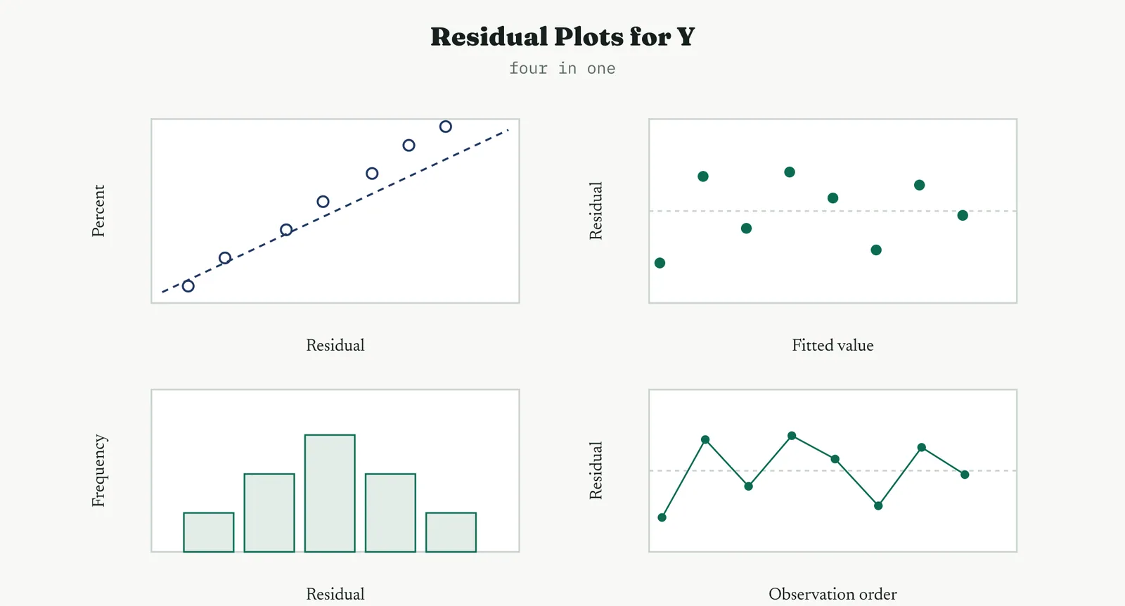
Spend a minute here before you trust anything. Points hugging the line on the normal plot, a shapeless cloud against the fitted values, and no drift against order together say the model is sound. Any pattern is the model telling you it is missing something, and the honest response is to fix the model, not to look away.
Where to go next is answered by the contour plot in the panel below, which maps the fitted response across the two active factors and points toward the high corner. A two-level factorial can only point a direction, because it fits straight lines and cannot see curvature. To find a true optimum you move to a response surface design, which is the next family.
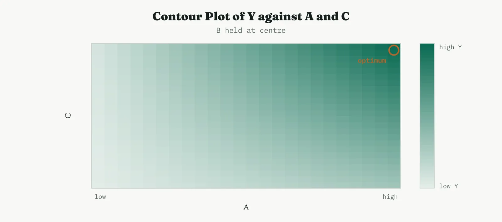
It helps to see the factorial as a regression, because that is what the software fits. Each factor enters as a coded variable at minus one and plus one, each interaction as the product of its parents, and the least-squares fit returns exactly the effects and coefficients you would compute by hand from the corner averages. Seeing it this way is what lets you move smoothly from a factorial to a response surface, since the surface is the same regression with squared terms added, and nothing about the reading changes. The coefficients follow from the effects by halving, because a coefficient is the change per one-unit coded move and an effect spans two units, low to high. The table converts the significant effects into the model coefficients, which is the form the software reports and the form you carry into the equation.
| Term | Effect | Coefficient |
|---|---|---|
| constant | 50.0 | |
| A | 10.0 | 5.0 |
| C | 6.0 | 3.0 |
| A times C | 5.0 | 2.5 |
Reading it as a whole, the full factorial gave you three things a screen could not, the size of every effect, the interaction between A and C, and a model you can trust because the residuals were clean. That is the complete characterising picture in eight runs.
When it goes wrong. The classic failure is treating a two-level factorial as if it could find an optimum. It cannot, because it fits straight lines and a straight line has no peak. If the centre points warn of curvature, the honest move is to stop reading the factorial as an answer and add the axial points that turn it into a response surface design. The second failure is skipping the residual check and reporting effects from a model that never fit. Diagnose before you conclude.
GENERAL FACTORIAL More than two levels
The general factorial breaks the two-level habit. Most designs in this section hold each factor at just a low and a high setting, which is efficient but blind to curvature and unable to handle a factor whose settings are categories rather than points on a scale. The general factorial lifts that restriction at the cost of runs, and it is the right choice precisely when two levels would lie to you. A general factorial runs factors at more than two levels. Reach for it when a factor is categorical with several settings that are not on a scale, or when two levels cannot capture a curved response. The plot below makes the case, a three-level factor whose middle level sits above a straight line between its ends. Two levels would draw that straight line and miss the peak entirely.
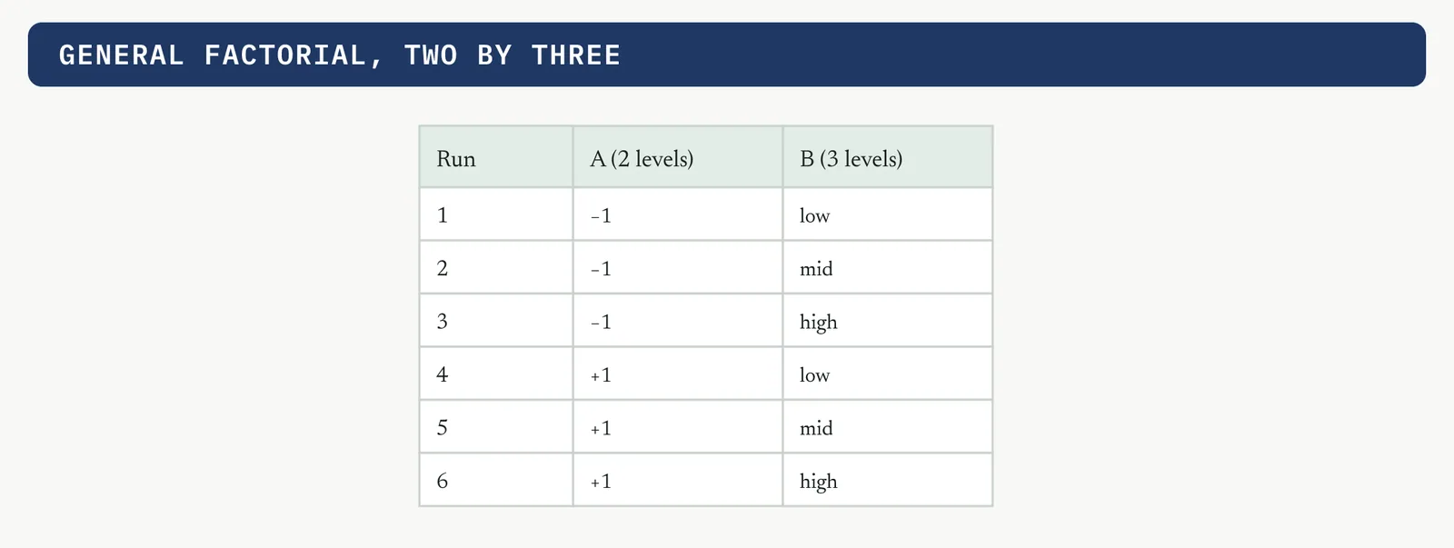
Run every combination of the levels and plot the response against the three-level factor, and the curvature shows directly, as in the figure below.
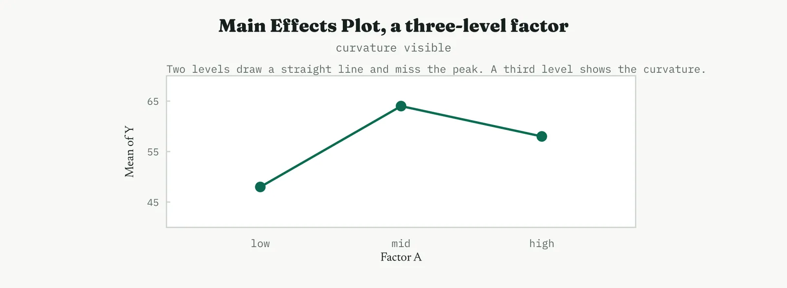
Worked, the three means came out at 48 at the low level, 64 at the middle, and 58 at the high. A two-level design would have joined 48 and 58 with a straight line and predicted the best result at the high end, missing the real peak in the middle by a wide margin. The third level is what turns a straight-line guess into a curve you can trust, and it is why a categorical factor or a suspected optimum in the interior is worth the extra runs.
| Level | Mean of Y |
|---|---|
| low | 48 |
| mid | 64 |
| high | 58 |
A last caution on levels. Choosing the two levels of a factor is a real decision, not a formality, because they set the lever you are pulling. Place them too close and the effect hides inside the noise, place them too far apart and you leave the region where the process behaves, and either way the experiment answers a question you did not mean to ask. The levels should straddle the range you actually operate in, wide enough to move the response and narrow enough to stay sensible. You read a general factorial through its means rather than a single slope, because with three levels a factor no longer has one effect, it has a shape. A response that rises then falls says the best setting is in the middle, which two levels would have missed entirely by drawing a straight line between the ends. That middle-level information is the whole reason to pay for the extra runs, so read the shape, not just the endpoints. When it goes wrong. The cost of a general factorial is runs, because three levels of several factors multiply fast, three factors at three levels each is already twenty-seven runs. Reach for the extra levels only on the factors where you genuinely suspect curvature or where the setting is categorical, and hold the rest at two levels. Adding a third level everywhere out of caution is how a study that should have taken sixteen runs balloons to eighty.
04 The optimising designs, response surface methods
Optimising is the last move, and it needs a design that can fit curvature. Response surface methods add points that let you fit a full quadratic model, so the fitted surface can bend and hold an interior peak rather than only slope. You reach this family once screening and characterising have found the vital few and confirmed that the optimum lies somewhere inside the region you are working in.
CENTRAL COMPOSITE The workhorse of optimisation
The central composite is the design you reach for when the goal changes from understanding a process to optimising it, when you no longer want to know which factors matter but exactly where to set them. It is the most used response surface design in practice, because it builds naturally on a factorial you may already have run. A central composite design takes a two-level factorial or fraction as its core and adds centre points and axial star points set outside the factorial box. Together they let you fit every term of a full quadratic model. The chart below shows the geometry for two factors, the four corners, the centre, and the four axial points that reach beyond the corners to estimate curvature.
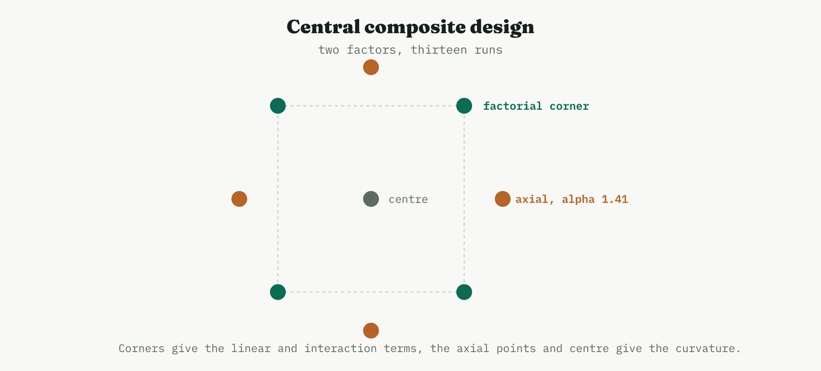
The figure that follows is the design matrix, thirteen runs for two factors, the four factorial corners, four axial runs at plus and minus one point four one, and repeated centre runs that estimate pure error. The repeated centres are what let you separate genuine curvature from noise.
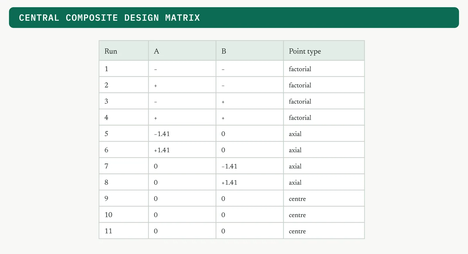
Worked, take a filling process where two settings are tuned to maximise fill accuracy. The thirteen runs returned the responses in the table, with the four centre runs clustered near eighty, which is the signal that the surface is curving away from the corners.
| Run | A | B | Type | Y |
|---|---|---|---|---|
| 1 | −1 | −1 | factorial | 67 |
| 2 | +1 | −1 | factorial | 73 |
| 3 | −1 | +1 | factorial | 69 |
| 4 | +1 | +1 | factorial | 83 |
| 5 | −1.41 | 0 | axial | 65 |
| 6 | +1.41 | 0 | axial | 79 |
| 7 | 0 | −1.41 | axial | 70 |
| 8 | 0 | +1.41 | axial | 78 |
| 9 to 13 | 0 | 0 | centre | 80, 79, 81, 80, 80 |
Fitting the quadratic and testing it gives the analysis of variance below. The model is strongly significant, the square terms confirm the curvature, and the point that matters most is the lack-of-fit test, which is not significant. A non-significant lack-of-fit means the quadratic is an adequate description of the surface, so you can trust the optimum it predicts.
| Source | DF | Adj SS | Adj MS | F | P |
|---|---|---|---|---|---|
| Model | 5 | 252.0 | 50.4 | 50.4 | 0.000 |
| Linear | 2 | 128.0 | 64.0 | 64.0 | 0.000 |
| Square | 2 | 114.0 | 57.0 | 57.0 | 0.000 |
| 2-way interaction | 1 | 10.0 | 10.0 | 10.0 | 0.016 |
| Error | 7 | 7.0 | 1.0 | ||
| Lack-of-fit | 3 | 3.2 | 1.07 | 1.13 | 0.436 |
| Pure error | 4 | 3.8 | 0.95 | ||
| Total | 12 | 259.0 |
The run count of a central composite breaks into three purposes, and it helps to see where the runs go. The factorial points estimate the linear and interaction terms, the axial points estimate the curvature, and the repeated centres estimate pure error so the lack-of-fit test has something to test against. The table shows the breakdown for two and three factors.
| Factors | Factorial | Axial | Centre | Total |
|---|---|---|---|---|
| 2 | 4 | 4 | 5 | 13 |
| 3 | 8 | 6 | 6 | 20 |
The Pareto in the diagram below confirms which terms carry the surface, the linear A, the two square terms, and the interaction, with the curvature terms as prominent as the linear ones, which is the signature of a genuine response surface.
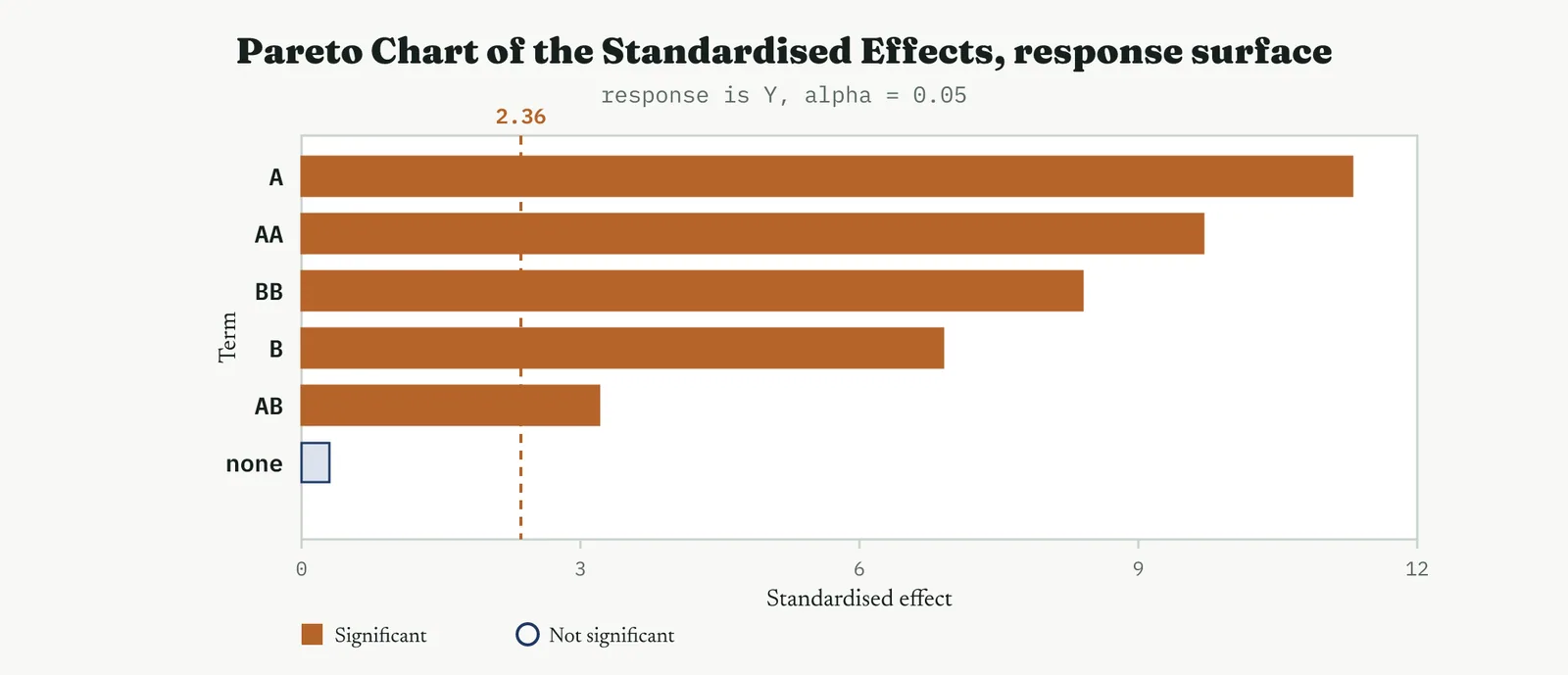
The payoff is a fitted surface you can optimise. The figure that follows is the contour of the fitted quadratic, with the optimum marked inside the region rather than at an edge. The panel below is the same surface drawn in three dimensions, where the interior peak is plain. This is what a two-level design could not give you, a located optimum rather than a direction of travel.
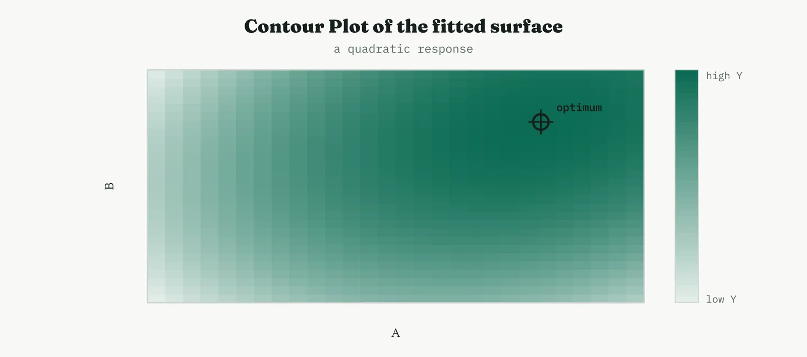
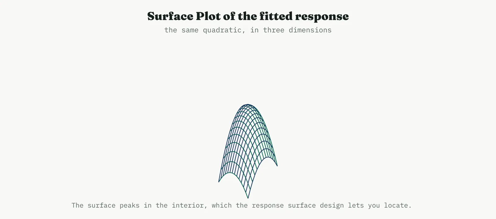
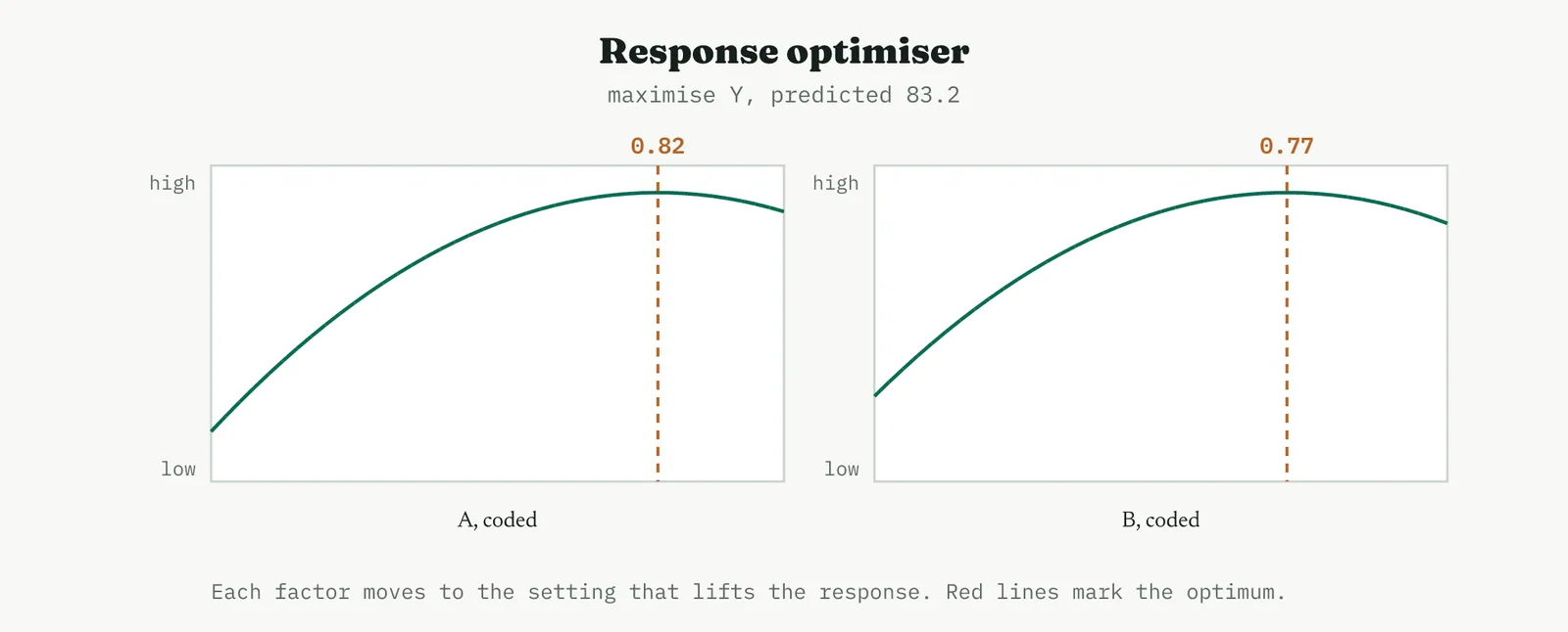
The fitted quadratic behind those pictures is Y equals 80 plus 5 A plus 3 B minus 4 A squared minus 3 B squared plus 2 A B. The squared terms are what bend the surface, and their negative signs are what make it a peak rather than a valley. To find the optimum you set the two partial derivatives to zero and solve, which places the stationary point at A equals 0.82 and B equals 0.77, with a predicted response of about 83.2. That is a located optimum inside the region, not a direction toward an edge, and it is the reason you spent the extra runs on axial points. The confirmation run then tests whether the process actually delivers 83.2 at those settings before anyone changes the standard.
There is a finer reading of the stationary point worth knowing. Solving the fitted quadratic gives a point where the surface is flat, but flat can mean a peak, a valley, or a saddle, and the signs of the curvature terms tell you which. Two negative curvatures make a peak, two positive make a valley, and one of each makes a saddle, a rising ridge you can keep climbing rather than a true optimum. When the analysis reports a saddle, the honest move is not to sit at the stationary point but to follow the rising ridge, because the best accessible setting is out along it, not at the flat centre. Reading the curvature signs before trusting the optimum is the difference between stopping at a real peak and stopping on a slope. When it goes wrong. The two failures with a central composite are optimising before you have screened, and trusting a stationary point that sits outside the region you actually studied. If the maths places the optimum far beyond the axial points, you have extrapolated, and the surface is a guess out there rather than a fit. The honest move is to shift the region toward the predicted optimum and run again, walking the design uphill rather than believing a peak you never sampled near.
BOX-BEHNKEN A surface without the corners
The Box-Behnken design solves a practical problem the central composite creates. A central composite reaches beyond the factorial corners to its axial points, and sometimes those extreme settings, or the corners themselves, are simply not safe or sensible to run. The Box-Behnken buys the same quadratic surface while keeping every run away from the extremes, which is often the difference between an experiment you can actually run and one you cannot. A Box-Behnken design fits the same quadratic model as a central composite, but it places its runs at the midpoints of the edges and the centre, and never at the extreme corners. The figure below shows the pattern for three factors. Reach for it when the corner combinations are impractical, expensive, or unsafe to run, which is common when several factors would sit at their extremes at once. It buys a response surface without ever asking the process to run every factor hard at the same time.
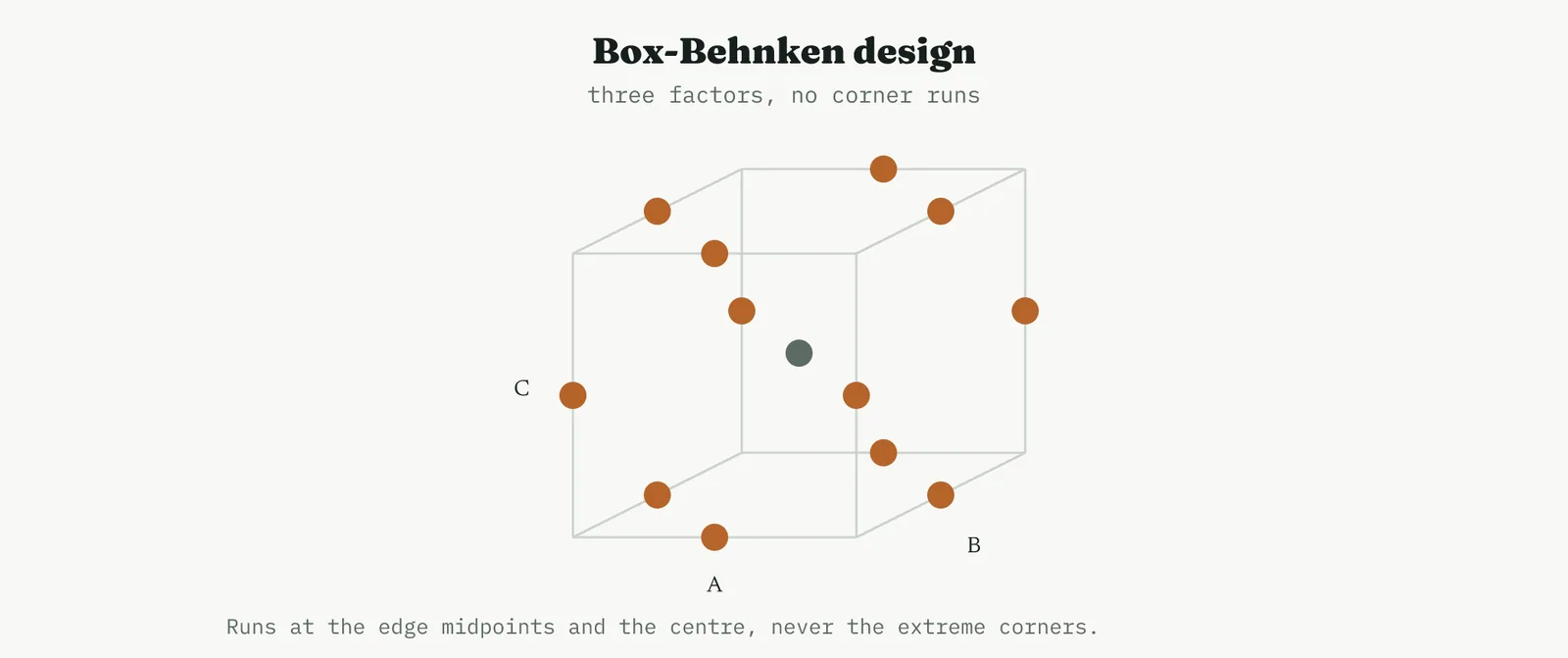
Worked, three factors take fifteen runs in a Box-Behnken, twelve at the edge midpoints and three at the centre. You read the result exactly as you read a central composite, a fitted quadratic, an analysis of variance with a lack-of-fit test, a contour and a surface. The only difference is that no run ever asked all three factors to sit at their extremes at once, which is precisely why you chose it. When running the corners would mean maximum temperature at maximum pressure at maximum speed, and that is a fire risk or a scrap risk, the Box-Behnken buys the same surface without ever going there.
| Point type | Runs |
|---|---|
| Edge midpoints | 12 |
| Centre | 3 |
| Total | 15 |
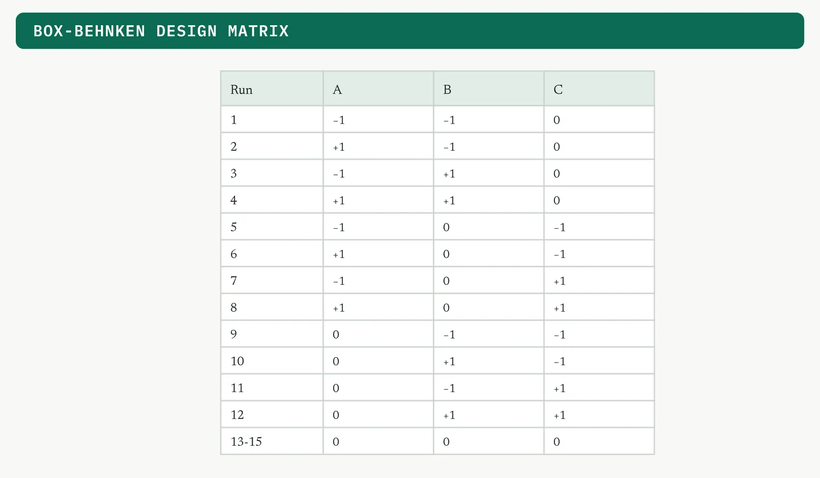
Fitted and read, the Box-Behnken gives the same contour a central composite would, the plot below, with an optimum located inside the region. The only thing you gave up is the extreme corners, and in return you never ran the process at all three limits at once.
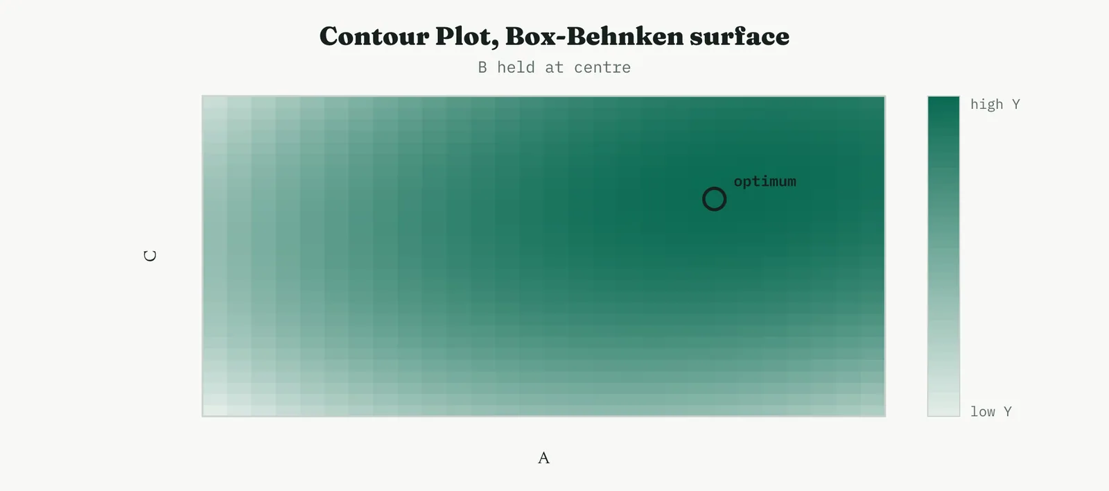
When it goes wrong. Because a Box-Behnken never runs the corners, it says nothing reliable about the corners, so do not read its surface out at the extreme combinations it never sampled. Its estimates are trustworthy in the middle of the region and soft at the edges. If the optimum you care about is likely to sit in a corner, a central composite is the better choice, and you accept the corner runs rather than pretend a Box-Behnken covered them.
05 The robustness and mixture designs
Two families sit outside the screen, characterise, optimise road, because they answer a different question. One is about robustness to noise, the other is about factors that are proportions rather than independent dials.
TAGUCHI Robust parameter design
The Taguchi approach reframes the goal of an experiment. Where the other designs ask which settings make the response best on average, a robust parameter design asks which settings make the response least sensitive to the things you cannot control, the ambient conditions, the raw-material variation, the human differences. That shift, from the mean to the variation, is the whole contribution of the method, and it is why it belongs in a services improvement toolkit where noise is everywhere. A Taguchi robust parameter design separates the factors you control from the noise you cannot, and searches for control settings that make the response insensitive to the noise rather than only optimal on average. The diagram below shows the structure, an inner array of control settings crossed with an outer array of noise levels, so every control setting is run against every noise condition.
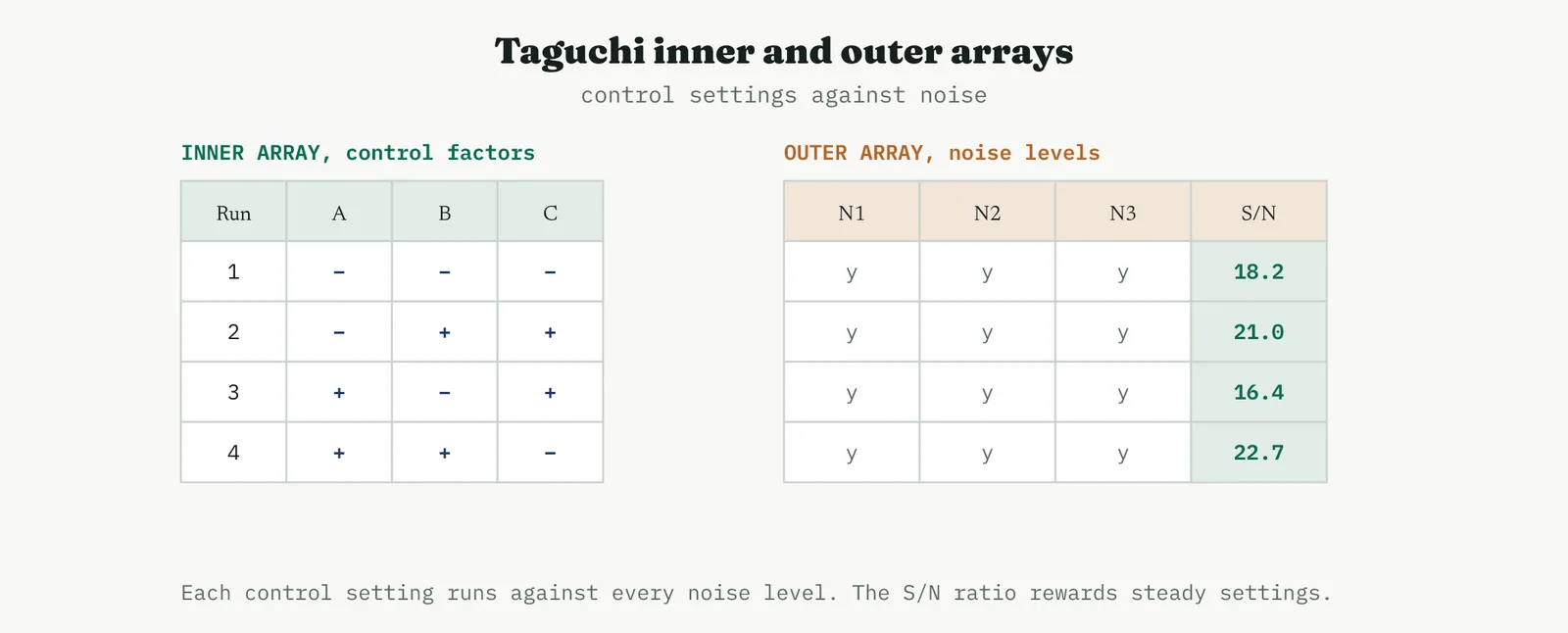
The control settings themselves sit in an orthogonal array, the chart below, which spreads a handful of runs evenly across the factor combinations so every factor is estimated fairly in far fewer runs than a full factorial would need.
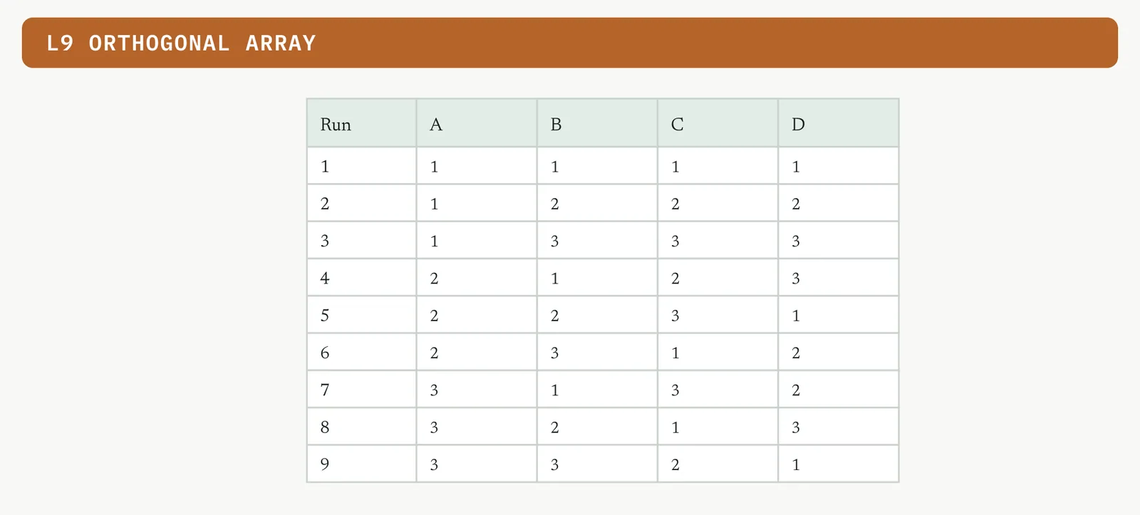
The result is read on the signal-to-noise ratio, which rewards settings that stay steady across the noise. The plot below is the main effects plot for that ratio, and you choose the level of each control factor that lifts it. Reach for this family when robustness matters as much as the mean, when the goal is a process that holds up under real-world variation rather than one that only shines in the lab.
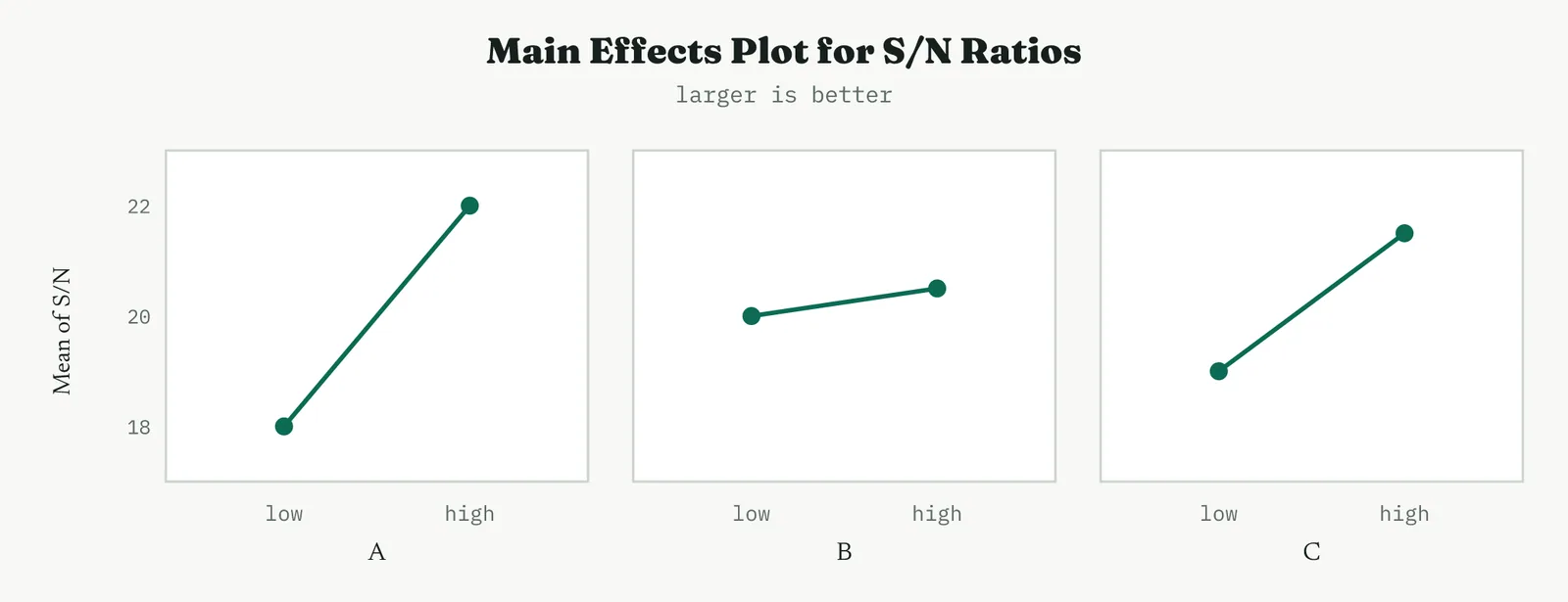
Worked, the signal-to-noise ratio for a larger-is-better response is minus ten times the log of the mean of one over the squared responses, computed across the noise runs for each control setting. The four inner-array rows returned the ratios in the table. Run four, with A high, B high and C low, holds up best under the noise, so those are the robust settings, even if another setting nudged the average higher. Robustness is chosen on the ratio, not on the mean.
| Run | A | B | C | S/N |
|---|---|---|---|---|
| 1 | − | − | − | 18.2 |
| 2 | − | + | + | 21.0 |
| 3 | + | − | + | 16.4 |
| 4 | + | + | − | 22.7 |
The signal-to-noise ratio is computed for each row of the inner array across its outer-array runs, and for a larger-is-better response it rewards a high mean and a low spread together. The table shows the calculation for three inner-array settings, and the winner is the row with the highest ratio, not the highest mean.
| Setting | Mean | Std dev | S/N (larger-better) |
|---|---|---|---|
| 1 | 58 | 6.1 | 19.2 |
| 2 | 61 | 2.4 | 27.9 |
| 3 | 60 | 5.0 | 21.1 |
Setting two wins on the signal-to-noise ratio despite a mean barely above the others, because its spread is less than half theirs. That is the whole point of a robust design in one table, choose the setting that holds steady, not the one with the best average on a good day. You also read the ordinary means, the figure that follows, and set any factor that does not affect the signal-to-noise ratio to its cheapest or most convenient level. The art of a robust design is to use the noise-sensitive factors for robustness and the rest for cost.
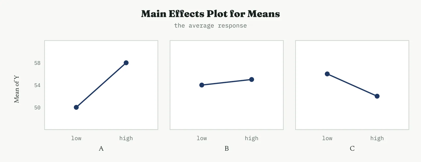
The move that separates a robust design from an ordinary one is holding the nerve to accept a slightly lower average in exchange for a response that does not swing when the world does. In a service, where the noise is people and volumes and days of the week, that trade is usually the right one.
When it goes wrong. The common criticism of Taguchi designs is that their inner arrays are heavily fractionated, so they confound interactions among the control factors, and a real control-factor interaction can be misread as a main effect. The guard is the same as for any fraction, know what is aliased, and confirm the chosen settings with a proper run before you trust them. Used for what it is good at, robustness to noise, the method is powerful. Stretched to resolve control-factor interactions, it misleads.
MIXTURE Factors that are proportions
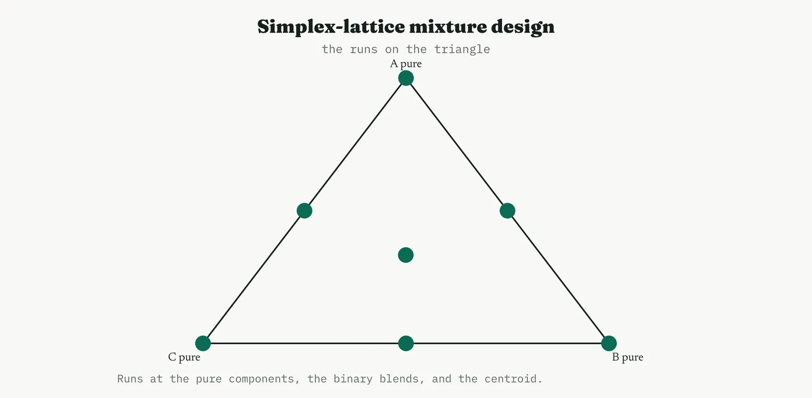
The mixture design is the odd one out, because its factors are not independent. When the inputs are ingredients in a formulation, their proportions must add to the whole, so you cannot turn one up without turning another down. That single constraint changes everything about the geometry and the analysis, and it is why a mixture problem needs its own family rather than a factorial with the proportions treated as ordinary factors. A mixture design is for factors that are proportions of a blend and must sum to a fixed total, so they cannot be varied independently. Turning one proportion up forces the others down. That constraint changes the shape of the design space from a square to a triangle, and the panel below shows the response mapped across it, with the best blend marked. Reach for this family whenever you are formulating or blending, where an ordinary factorial would propose impossible combinations that do not sum to the whole.
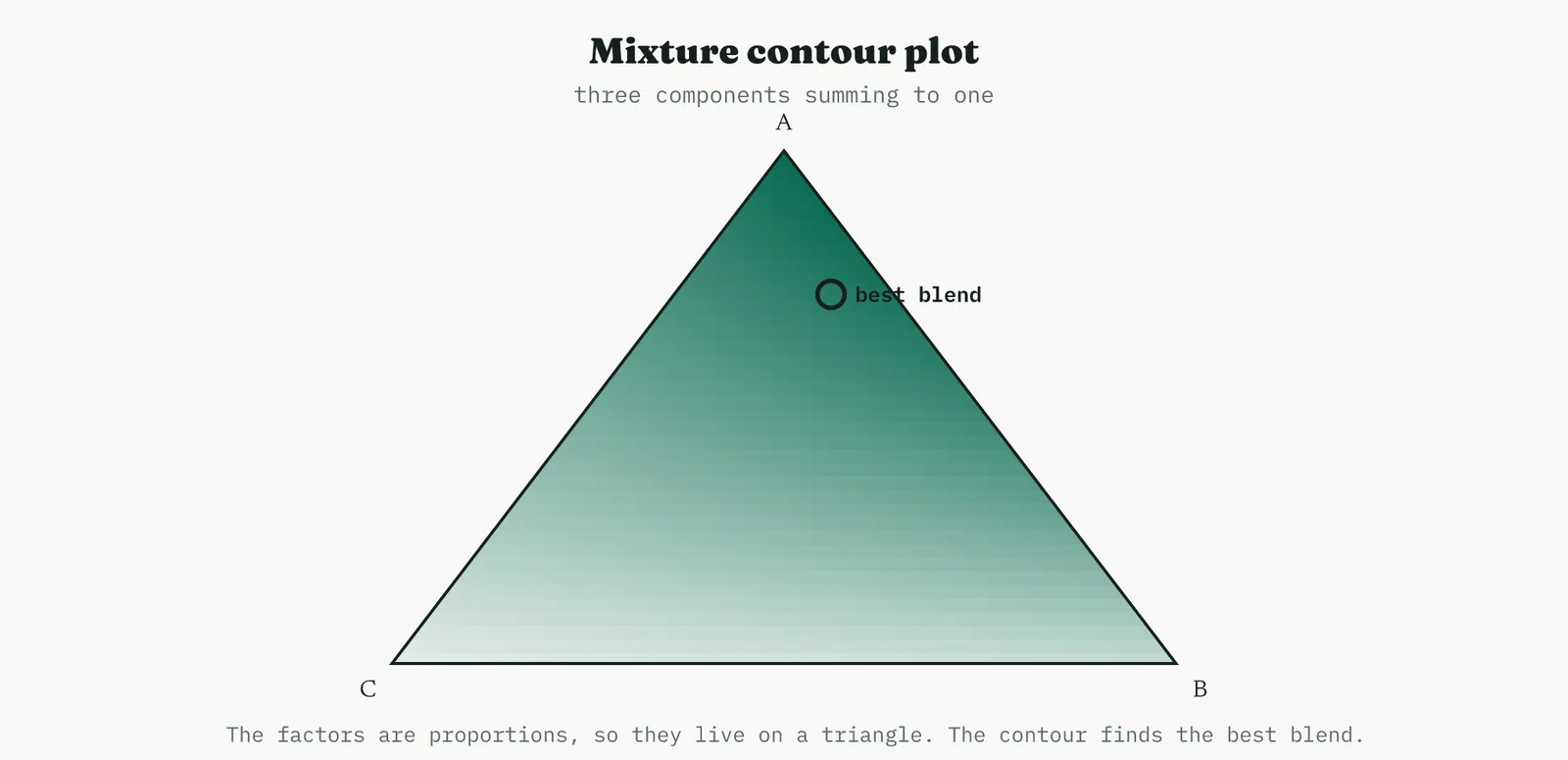
Worked, the best blend sat at roughly seventy-two parts A, twenty parts B and eight parts C, out of a hundred. Read that off the triangle and you have a formulation, not a set of independent settings. The constraint that the three must sum to the whole is exactly what an ordinary factorial ignores, which is why it would propose a blend of high A and high B and high C that cannot physically exist. On the triangle every point is a real blend, and the contour points straight at the best one.
| Component | Best proportion |
|---|---|
| A | 72% |
| B | 20% |
| C | 8% |
The model for a mixture is not the ordinary one, because there is no intercept, the proportions already sum to a constant. The fitted terms are the pure-component responses at the corners and the blending terms along the edges, and you read a positive blending term as synergy, two components that do better together than apart, and a negative one as antagonism. Reading the ternary contour, you look for the region of best response inside the triangle and check whether it sits near a vertex, an edge, or the centre, which tells you whether the best blend is nearly pure, a two-way mix, or a true three-way formulation. When it goes wrong. The trap in a mixture study is forgetting the constraint and interpreting a component effect on its own, as if you could raise it without lowering the others. You cannot. Every effect in a mixture is relative to the whole, and the honest reading is always in terms of the blend, this proportion of A at the expense of that proportion of C, never A in isolation. Read a mixture like a factorial and you will draw conclusions the triangle does not support.
06 Reading and trusting the output
A word on the software, since you will read this output on a screen rather than by hand. Every package, the common statistical tools among them, reports the same core, an effects or coefficients table, an analysis of variance with p values, the residual plots, and a contour or surface for a fitted model. The labels differ and the defaults differ, but the reading is identical, and a Black Belt who understands the analysis is not captive to any one tool. Coding matters here too, because most packages report coefficients in coded units by default, and reading a coded coefficient as if it were in real units is a common and quiet error. Check which space the output is in before you interpret a number.
There is a rhythm to running a designed experiment well, and it is worth naming. You plan the design on paper before you touch the process, you fix the measurement system first, you randomise, you run, you diagnose the residuals, you read the effects, and only then do you act, after a confirmation run. Skip a step and the whole thing wobbles. The tools in this section are only as good as that discipline around them. Across every family the analysis follows the same logic, and it helps to hold the sequence in mind. The Pareto and normal plots answer which effects are real. The main effects and interaction plots answer which way and how much. The cube, contour and surface plots answer where the optimum sits. The residual plots answer whether the model can be trusted at all. Read them in that order and you rarely go wrong.
The residual plots deserve their own discipline. A model can fit the trial data beautifully and still be wrong, and the residuals are where that shows. Points that curve off the normal line, a fan or a bend in the residuals against the fitted values, or a drift against the run order all say the model is missing a term or the process was not stable. Fix that before you read any effect.
And no result is a result until it is confirmed. A designed experiment predicts an optimum, and the confirmation run tests that prediction against reality with fresh trials at the winning settings. If the confirmation lands where the model said, you have a finding. If it does not, you have found noise, or missed curvature, and you go back rather than forward.
Worked, the central composite predicted a response of 83.2 at the optimum. Three confirmation runs at those settings returned 82.6, 83.4 and 83.0, a mean of 83.0, comfortably inside the prediction interval. That is a confirmed result, and only now does the change earn its way into the pilot. Had the confirmation come back at 78, the honest conclusion would be that the surface was wrong somewhere, and the next move would be more runs, not a rollout.
| Do | Do not |
|---|---|
| Vary the factors together in a planned design | Change one factor at a time and miss every interaction |
| Randomise the run order | Run in a tidy order that lets drift look like an effect |
| Check the residuals before trusting a model | Read effects off a model you never diagnosed |
| Confirm the predicted optimum with fresh runs | Trust the model on the trial data alone |
The tell. If the model was never checked with a fresh confirmation run, you have a hypothesis dressed as a result. Run the confirmation before you act.
THE PRINCIPLES BEHIND IT Why the method works
One idea underlies the analysis and deserves stating plainly, the difference between a factor you set and a covariate you merely record. A designed experiment earns its power by setting the factors deliberately, which is what lets it claim cause rather than correlation. When something matters but cannot be set, a temperature you can only measure, a volume you cannot control, you record it and adjust for it in the analysis, but you do not pretend you experimented on it. Keeping that line clear, between what you manipulated and what you only observed, separates a causal finding from an observational one dressed up as an experiment.
A handful of empirical principles explain why designed experiments work as well as they do, and knowing them changes how you read a result. The first is the sparsity of effects. In most processes only a few of the many possible effects are large, which is why a screen can afford to assume the rest away and why a Pareto of effects almost always shows a short head and a long flat tail.
The second is heredity, and the third is hierarchy. Heredity says that an interaction is unlikely to matter unless at least one of its parent factors matters on its own, which is why you rarely chase an AB interaction when neither A nor B has an effect. Hierarchy says that low-order terms, main effects and two-factor interactions, tend to dominate high-order ones, which is the assumption that lets a fractional design confound the three-way and higher interactions without much loss. Together they are the reason a fraction is a reasonable gamble rather than a reckless one.
The fourth is projection. A fractional design, if a couple of its factors turn out to be inert, collapses onto a full factorial in the factors that remain, so a screen that retires two of five factors leaves you with a clean full factorial in the other three at no extra cost. It is one of the quiet economies of the method, and it rewards choosing a design with projection in mind.
When a two-level design points a direction rather than a peak, the method of steepest ascent turns that direction into progress. You step the factors along the path the model points uphill, run a few confirming points as you go, and stop when the response stops improving, then plant a new response surface design around the better region. It is how you walk a process from wherever it starts to the neighbourhood of its optimum before spending the runs to map the peak.
Real problems rarely have a single response. When several responses matter at once, faster and cheaper and stronger, you fit a model to each and combine them with a desirability function, a weighted score that is high only where every response is acceptable. The optimiser then maximises the desirability rather than any one response, which is how you find the settings that are good enough on all fronts rather than best on one and poor on the rest.
When a screen leaves an ambiguous alias, a foldover breaks it. You run a second small block with some or all of the signs reversed, and the combined design separates the effects that the first block had confounded. It is the disciplined way to resolve a specific ambiguity without paying for a full design, and it is why screening is best thought of as the first block of a sequence rather than a one-shot answer.
TWO WORKED MOVES Steepest ascent and foldover
Two moves come up often enough to be worth working through. The first is steepest ascent. Suppose a two-level factorial in two factors returns the model Y equals 60 plus 8 A plus 4 B, with no significant curvature, so the surface near the current settings is a tilted plane. The path of steepest ascent moves in the ratio of the coefficients, two steps of A for every one step of B, and you run a handful of points along it. The table shows the climb, and you stop at the point where the response peaks and turns down, then plant a new design around it.
| Step | A (coded) | B (coded) | Y observed |
|---|---|---|---|
| base | 0 | 0 | 60 |
| 1 | 2 | 1 | 72 |
| 2 | 4 | 2 | 83 |
| 3 | 6 | 3 | 89 |
| 4 | 8 | 4 | 87 |
The response climbs to step three and falls at step four, so the better region is around step three, and that is where the next response surface design goes. Steepest ascent is how you cover ground cheaply between a first screen and a final optimisation, rather than mapping a surface everywhere.
The second move is a foldover. A resolution three screen aliases main effects with two-factor interactions, so if factor A looks large you cannot tell whether it is A or a BC interaction wearing A as a mask. A foldover runs a second block with all the signs reversed, and combining the two blocks separates every main effect from the two-factor interactions that had been confounding it. The table shows the effect before and after.
| Effect | From first block | After foldover |
|---|---|---|
| A | A + BC | A alone |
| B | B + AC | B alone |
| C | C + AB | C alone |
Eight extra runs turned an ambiguous screen into clean main effects, which is why a low-resolution design is best treated as the first half of a plan rather than a finished study. You fold over only the ambiguities that matter, not the whole thing.
POWER AND REPLICATION How many runs is enough
Runs buy power, and power is the chance of seeing an effect that is really there. The size you can detect depends on how many runs you have and how noisy the response is, and the table gives the rough shape of it for a two-level design, expressed as the smallest effect you can reliably detect relative to the run-to-run standard deviation.
| Runs | Replicates | Smallest detectable effect |
|---|---|---|
| 8 | 1 | about 2.0 sigma |
| 16 | 2 | about 1.2 sigma |
| 32 | 4 | about 0.8 sigma |
| 64 | 8 | about 0.6 sigma |
The lesson is not to chase a small effect with a small design. If the effect that matters is smaller than the noise, a single replicate will miss it, and the honest choices are to replicate, to reduce the noise, or to accept that the effect is not worth chasing. Deciding this before you run, not after, is what separates a designed experiment from an expensive guess.
One distinction matters here. A replicate is a fresh run of a setting, reset and re-run from scratch, and it captures the full run-to-run variation. A repeat is two measurements of the same run, and it captures only measurement noise. Only replicates buy the power in the table, so when runs are counted, count replicates, and do not let repeated measurements masquerade as replication.
Two habits protect every experiment regardless of design. Fix the measurement system first, because an experiment built on a measurement that cannot tell good from bad measures nothing, and the effects it reports are noise dressed as signal. And randomise the run order, because a process drifts over a day, and an unrandomised design lets that drift load onto whichever factor happened to change in step with it. Randomisation is the cheapest insurance in the method, and skipping it is the most common way a technically sound design still produces a wrong answer.
THE ASSUMPTIONS What the analysis rests on
Every effect estimate and every p value rests on three assumptions about the residuals, and each has a plot that checks it. The residuals should be roughly normal, which the normal probability plot checks, because the significance tests borrow from the normal distribution. They should have constant variance, which the plot of residuals against fitted values checks, because a fan or a funnel there means the noise grows with the response and the tests are no longer honest. And they should be independent, which the plot of residuals against run order checks, because a drift or a run of same-signed residuals means the trials were not independent and randomisation failed or was skipped.
When an assumption fails, you do not abandon the method, you fix the model. A curved normal plot or a fanning variance usually means the response needs a transformation, a log or a square root, after which the residuals settle and the analysis holds. A pattern against run order means you must randomise next time, or block the nuisance you can name. The residual plots are not a formality at the end, they are the gate the result has to pass before it is a result at all.
A Black Belt reads the residuals before reading the effects, every time, because an effect from a model that does not fit is worse than no effect, it is a confident wrong answer. The discipline is cheap, four plots and a minute of judgement, and it is the difference between a finding you can defend and a number you merely hope is true.
READING THE ANALYSIS OF VARIANCE What the table is telling you
The analysis of variance table is where most people stop reading too soon, taking the model p value and moving on. It repays a closer look, because each row answers a different question and the answers only mean something together.
Start with the model row. A small p value there says the design as a whole explains real variation in the response, which is permission to read the individual terms, not a conclusion in itself. Then read the term rows, the linear effects, the interactions, and in a surface design the square terms, each with its own p value, and keep the ones that clear your threshold while being ready to drop the ones that do not. A term that fails is not a disappointment, it is information, a factor or interaction you can stop worrying about.
The error rows are where the honesty lives. In a design with centre points or replicates, the error splits into lack-of-fit and pure error, and the lack-of-fit test is the one that matters most in a surface design. A significant lack-of-fit means the model you fitted does not match the data even after accounting for pure noise, so the straight lines or the quadratic you chose are the wrong shape, and you must add terms or transform the response before trusting anything. A non-significant lack-of-fit is the green light, the signal that the model is an adequate description of the surface. It is the single most important number in a response surface analysis, and it is the one people skip.
Finally the summary statistics, the R-squared and its adjusted and predicted versions. A high R-squared says the model fits the data you have, but the predicted R-squared is the honest one, because it estimates how well the model will predict data you have not yet seen, and a large gap between the two is the warning sign of an overfitted model carrying terms it should not. Read the predicted R-squared before you promise anyone the model will hold at new settings, because that promise is exactly what it measures.
BEYOND THE EIGHT Designs an MBB should recognise
The eight families in this section cover almost every experiment a services or manufacturing improvement will need, but a Master Black Belt should recognise the specialised designs that sit beyond them, if only to know when to send a problem to someone who runs them routinely. Four are worth naming.
The definitive screening design is a newer three-level screen that estimates main effects clean of two-factor interactions and detects curvature, in barely more runs than a Plackett-Burman. It is a strong first choice when you suspect curvature but cannot yet afford a response surface, and it has quietly displaced some traditional screens for exactly that reason.
The optimal design, often called D-optimal, is what you reach for when the classical designs do not fit the situation, when the region is irregular, when some factor combinations are forbidden, or when you have a fixed and awkward run budget. An algorithm chooses the runs that extract the most information for the model you specify, rather than taking them from a textbook pattern. It trades the elegance of a standard design for the flexibility to handle a constraint the standard designs cannot.
The split-plot design handles the common practical nuisance of a factor that is hard to change. When one factor can only be reset occasionally, an oven temperature that takes an hour to settle while other factors change run to run, a fully randomised design is impossible, and a split-plot structures the runs to respect the hard-to-change factor while still analysing everything correctly. Many industrial experiments are secretly split-plots run as if they were not, which is a quiet and common error.
Evolutionary operation is the last, and it is less a design than a philosophy. It runs tiny deliberate perturbations on the live process during normal production, accumulating evidence slowly without ever disrupting output, and nudges the settings toward the optimum over many cycles. It is how you keep improving a process that cannot be taken offline for a formal study, and it closes the loop between experimentation and everyday operation.
BEFORE YOU RUN The discipline that decides the result
More experiments are won or lost in the planning than in the running, and a Black Belt spends the effort there deliberately. The first decision is the response. Name exactly what you will measure, in what units, and confirm the measurement system can tell a good result from a bad one before anything else happens, because every effect the design reports is only as trustworthy as the gauge that recorded it.
The second decision is the factors and their ranges. List the factors you will set, the levels you will set them to, and satisfy yourself that the range is wide enough to move the response but not so wide that it leaves the region where the process behaves sensibly. Too narrow a range hides a real effect in the noise, too wide a range collapses a smooth curve into apparent chaos, and the range is a judgement you make on knowledge of the process, not a default.
The third decision is the design itself, which the rest of this section exists to inform, followed by the run order and the replication. Randomise the order against drift, decide how many replicates the effect you care about will need to show itself, and distinguish replicates from repeats so you do not fool yourself about the power you actually have. The last decision is the confirmation criterion, agreed before the runs, so that when the model predicts an optimum everyone already knows what a successful confirmation looks like.
Written down, these decisions are a one-page plan the sponsor and the process owner can read and approve before a single run happens. That page is what turns an experiment from a private exercise into a shared commitment, and it is the difference between a result the organisation adopts and a result it argues with.
AFTER YOU RUN From result to standard
The runs are the middle of the work, not the end. When they are in, you diagnose before you read, checking the residuals for normality, constant variance and independence, and you fix the model with a transformation or a block before you trust a single effect. Only once the diagnostics pass do you read the effects, rank them, and write the fitted model in the form the next person can use.
Then you confirm. The predicted optimum is a claim about runs you have not yet made, so you make them, a small set of fresh runs at the chosen settings, and you compare what the process actually delivers against what the model promised. A confirmation that lands is your licence to change the standard. A confirmation that misses is the model telling you the region has more to teach, and the honest response is another short cycle, not a quiet decision to change the standard anyway.
Finally you hand off. The confirmed settings, the evidence behind them, and the residual diagnostics that earned them trust all flow into the Control phase, where they become part of the control plan, the updated risk assessment and the capability study at the new settings. An experiment that ends in a report nobody operationalises has produced knowledge and no improvement. The work is finished when the process runs at the settings you proved and holds there, not when the analysis is done.
AUGMENTING A DESIGN Growing a factorial into a surface
The designs in this section are not islands, and the most efficient way to reach an optimum is rarely to run one large design from cold. You augment. You start with a two-level factorial, and if its centre points warn of curvature you add the axial and extra centre runs that turn it into a central composite, reusing every run you already made. The factorial you ran to characterise the process becomes the core of the surface you run to optimise it, and nothing is wasted.
The mechanics matter because the two sets of runs happen on different days. You run the axial block as a second block and let the analysis absorb any shift between the two occasions, exactly as blocking absorbs any other nuisance. That is why a central composite is built to be blocked, the factorial core and the axial star can each stand as a block, and the design stays valid even though it was assembled in two sittings rather than one.
The judgement is when to augment and when to restart. If the factorial pointed clearly and the region still looks promising, augment, because you keep the runs and the momentum. If the factorial pointed toward an edge, do not augment in place, walk the region toward the better ground by steepest ascent first, and only augment once you are near the peak. Augmenting a design centred on the wrong region spends good runs mapping a surface you do not care about.
A WORKED READING The output, one plot at a time
It is worth walking a full analysis in the order you actually read it, because the sequence is the discipline. Take the coating-line factorial from earlier, and read its output plot by plot.
First the cube. Before any statistics, the raw corners show the good region, A high and C high, and show that the response climbs rather than jumps, which suggests a smooth surface and a model worth fitting. That is a hypothesis, not a conclusion, but it frames everything that follows.
Then the main effects and the interaction. A and C have steep lines and B is flat, so B is a factor you can set for cost. The interaction plot shows non-parallel lines for A and C, which is the visual signature of a real interaction, the reason a one-factor-at-a-time study would have missed the best corner. Already you know the shape of the answer.
Then the Pareto and the analysis of variance. The Pareto puts A, C and the AC interaction past the line and leaves B short of it, and the analysis of variance attaches p values that agree, a significant model, significant A, C and AC, and a non-significant B. The numbers confirm what the pictures suggested, which is exactly the order you want, see it, then test it.
Then the residuals, and only then the model. The residual plots come back clean, a straight normal plot, a shapeless cloud against the fitted values, no drift against order, so the model has earned trust. Now the fitted equation and the contour mean something, and you read the contour for the direction of improvement and the settings to confirm. Read in this order, the analysis is almost impossible to misuse, because every conclusion has been checked before it is believed.
WHERE IT SITS IN IMPROVE Sequencing it among the other tools
A designed experiment does not open the Improve phase, it resolves it. The phase begins with generation, the brainstorming and the flow analysis that surface candidate changes, and much of the time those changes are structural, a handoff removed, a step levelled, a mistake proofed, and no experiment is needed at all. The experiment earns its place only when the improvement depends on a setting, a continuous factor whose best value is genuinely unknown and worth the runs to find.
When it does belong, it sits late in the phase, after the process has been made stable enough to experiment on and before the pilot that proves the chosen settings at scale. Running it too early, on a process still lurching between states, wastes runs on noise. Running it too late, after the standard has already been rewritten on a hunch, wastes the evidence. The right position is the hinge between deciding what to change and hardening the change, which is precisely where the confirmed settings flow into the pilot, the updated risk assessment and the capability study.
For a services problem like the one running through this book, the honest answer is usually that a designed experiment is not the tool, because the trouble lives in flow and handoffs rather than in a dial anyone can turn. Knowing that, and saying so, is itself the judgement the phase asks for. The experiment is the most powerful tool in Improve and the most often reached for by mistake, and a Black Belt is worth as much for knowing when to leave it in the box as for knowing how to run it.
CHOOSING BETWEEN THEM A side-by-side comparison
Held together, the families answer different questions, and the table lines them up on the terms that decide which one you run. Read it as the quick reference, and the detail behind each entry is in the sub-section above.
| Design | Best for | Runs, k=3 | Curvature | Interactions |
|---|---|---|---|---|
| Full factorial | the complete picture | 8 | no | all, clean |
| Fractional | screening many | 4 to 16 | no | some, aliased |
| Plackett-Burman | screening many | 12 | no | none |
| General factorial | curvature, categories | 27 | yes | all |
| Central composite | optimisation | 20 | yes | all |
| Box-Behnken | optimisation, no corners | 15 | yes | all |
| Taguchi | robustness to noise | 9 to 18 | limited | limited |
| Mixture | proportions of a blend | varies | yes | yes |
THE VOCABULARY IN ONE PLACE A glossary for the section
The section uses a compact vocabulary throughout, and it helps to have it in one place. The terms below are the ones a designed experiment turns on.
| Term | Meaning |
|---|---|
| Factor | an input you deliberately set |
| Level | a value a factor is set to |
| Response | the output you measure |
| Effect | the change in the response as a factor moves from low to high |
| Interaction | when the effect of one factor depends on the level of another |
| Confounding, alias | two effects estimated together and inseparable in a fraction |
| Resolution | the severity of confounding in a fractional design |
| Centre point | a run at the mid-level of every factor, used to test for curvature |
| Axial point | a run outside the factorial box, used to fit curvature |
| Coded units | levels expressed as minus one, zero and plus one |
| Signal-to-noise | a ratio that rewards a response insensitive to noise |
| Randomisation | running trials in random order to defeat drift |
WORKED END TO END The three stages in one story
One worked narrative ties the whole method together. A team suspects eight settings drive a recurring coating defect. They cannot study eight in full, so they screen in a twelve-run Plackett-Burman, and three factors stand clear while five fall away. They characterise the three in an eight-run full factorial with centre points, and find two strong main effects, one interaction, and centre points that sit high, a warning of curvature. Rather than trust a straight line, they add axial points to turn the factorial into a central composite, fit the quadratic surface, and locate an optimum inside the region. Three confirmation runs land within a whisker of the prediction, so the settings are adopted. Around forty runs across three stages, spent in the right order, turned eight suspects into one confirmed answer. That sequence, screen, characterise, optimise, confirm, is the method in a sentence, and every design in this section is a tool for one of its stages.
07 Matching it to the ground
The blank page. It is rare to need a designed experiment this early, and if you do, keep it small, a screening design, to teach the method without a large commitment before the firm trusts it. A dozen runs that visibly sort real causes from suspected ones buys the credibility to run something larger later. Spend the first experiment proving the method as much as solving the problem, because on a blank page the audience is deciding whether structured improvement is worth their time, and a clean screen answers that question in their favour.
The firefight. A firm in constant firefight has neither the time nor the stability for trials. Stabilise the process first, because in a firefight the noise swamps the effects and the experiment proves nothing. There is a deeper reason to wait. An experiment run on an unstable process measures the instability as much as the factors, and its residuals will fail every diagnostic you throw at them. The honest sequence is control before curiosity, get the process to hold a steady mean and variance, and only then ask it which settings are best. Reaching for a designed experiment mid-firefight is a common and expensive way to prove nothing at all.
The false start. A past experiment that changed several things at once and proved nothing is why the room is sceptical. The discipline of a planned design and a randomised run order is the exact fix, so make that discipline visible. Show the design matrix before you run it, so everyone can see that only the planned things change and that the order is randomised against drift. When the result lands, walk the room through the residual plots as well as the effects, because the false start failed on discipline and the way to bury it is to let everyone watch the discipline hold. The credibility you win here is worth as much as the answer.
The quiet achiever. A stable, quietly competent process is where a designed experiment pays best, because the noise is low enough for real effects to show. This is the ground the tool was made for. On a quiet achiever you can afford the full sequence, screen then characterise then optimise, and trust each stage because the process holds still between runs. This is also where the response surface designs earn their keep, since a stable process rewards the effort of mapping a surface and locating an optimum you can actually hold once you find it. If you have a quiet achiever and a continuous response, this is the tool to reach for first.
08 When it goes wrong
Two failure modes kill this tool outright. The first is one factor at a time in disguise, running the factors separately and missing every interaction, which defeats the entire purpose. The move is to run the factorial, because the interactions are the reason you are here. The second is no confirmation run, trusting the fitted model on the trial data alone. The move is to always confirm the predicted optimum with fresh runs, because a model can fit every point you gave it and still be wrong about the next one.
Beyond those two, a handful of quieter failures spoil more experiments than they should. Skipping the measurement check comes first, because a gauge that cannot tell good from bad turns every effect into noise dressed as signal, and no design survives a broken measurement. Not randomising the run order comes next, because a process drifts across a day and an unrandomised design lets that drift masquerade as a factor effect. Studying too wide a range collapses a real curve into apparent noise, and studying too narrow a range hides a real effect inside the measurement error, so the range you choose is itself a design decision, not an afterthought.
Two more failures are about reading rather than running. Reading effects from a model whose residuals failed the diagnostics is a confident wrong answer, worse than no answer at all, so the residual plots come before the effects every time. And extrapolating past the region you studied, believing a surface out where you never sampled, turns a fitted model into a guess. The rule is simple, trust the model inside the box you ran and nowhere else, and if the optimum sits outside the box, move the box and run again rather than believing a peak you never approached.
The last failure is organisational, not technical. An experiment run without the process owner in the room produces a correct answer nobody will adopt, because the people who run the process were not part of proving it. Bring the owner into the design, let them see the matrix and the randomisation, and walk them through the residuals and the confirmation. The experiment that changes the standard is the one its owners helped run, not the one that arrived as a verdict from outside.
09 What it feeds
Set in the arc of the Improve phase, the designed experiment is the tool that turns a promising direction into a proven setting. Everything before it in Improve generates and narrows ideas, and everything after it hardens the winner into a standard. The experiment is the hinge, the point where judgement gives way to evidence about exactly where to run the process. The confirmed optimal settings feed the pilot, which runs them at scale, and the updated FMEA and the capability study, which re-score the risk and the capability at the new settings. On a variation problem with a tunable process, the designed experiment is what makes the improvement precise rather than approximate.
There is also a feed backwards, into the Analyse phase that sent the problem here. A designed experiment sometimes proves that a factor everyone believed mattered does not, and that finding belongs back in the analysis as a closed door, so the team stops chasing it. The experiment is not only a source of settings for Control, it is also the final arbiter of the hypotheses Analyse raised, and its verdicts, positive and negative alike, are what let the project close the causal story rather than leave it open.
Held in one line, the designed experiment is where the Improve phase stops arguing and starts knowing. It is the most demanding tool in the phase and the most conclusive, and a Black Belt earns the room the right to run it by having done everything else well enough that the process is stable, the measurement is sound, and the question is worth the runs. Used there, on the right ground, it is the difference between a process that was adjusted and a process that was understood.
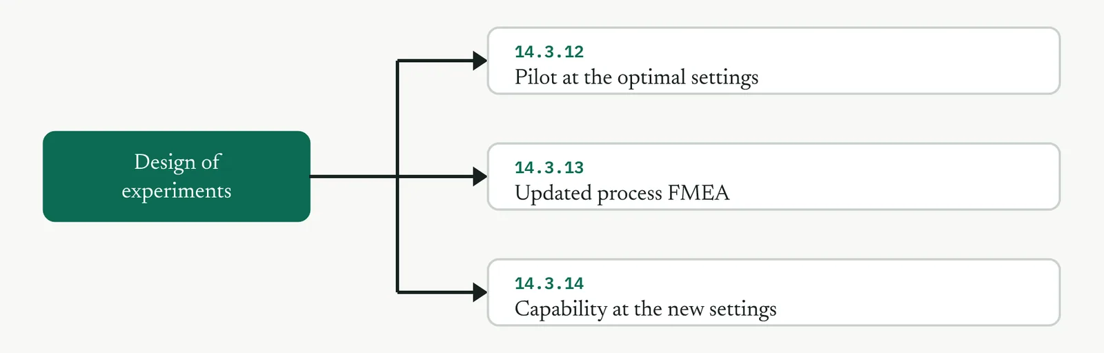
14 · Improve
14.3.10 Analysis of variance RECOMMENDED
ISO 13053-1, clause 9. Hypothesis testing of means. Table 6 status, Recommended.
01 What it is and why you reach for it
Analysis of variance tests whether the means of three or more groups differ by more than chance would explain. It does it by a move that sounds backwards, it studies the variation rather than the means directly, splitting the total variation in the response into the part that sits between the groups and the part that sits within them, and asking whether the between part is large enough, next to the within part, to be real. Reach for it in the Improve phase when a change has a categorical factor with several levels, a method, a team, a supplier, a shift, and you need to know whether that factor genuinely moves the response or whether the differences you see are noise.
The reason it earns its own place, rather than a handful of two-sample tests, is error control. Compare three groups with three separate t-tests and you run three chances to be fooled, and the odds of a false positive somewhere climb with every extra comparison. Analysis of variance asks the whole question once, with one test at one error rate, and only if that test finds a real difference do you go looking for which groups drive it. That discipline, one omnibus test first and targeted comparisons second, is what keeps the conclusion honest.
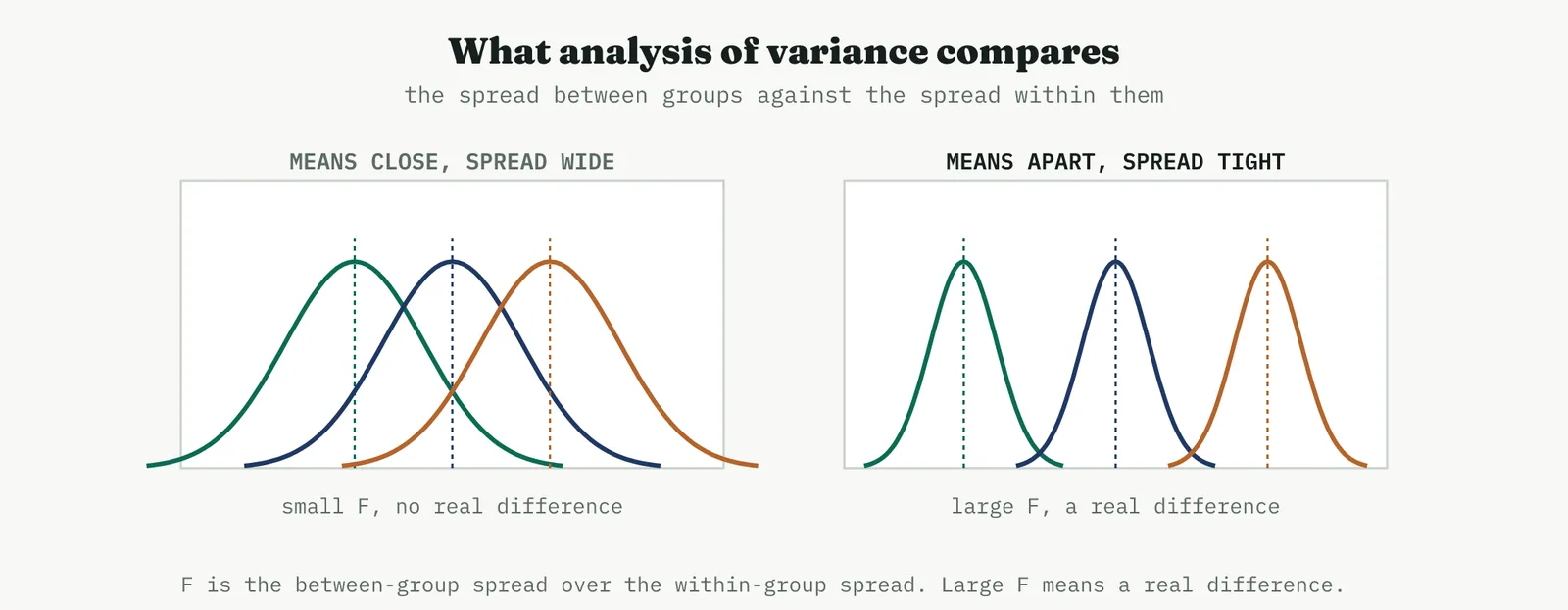
The engine is the F ratio, the between-group variation divided by the within-group variation. When the groups genuinely differ, the between part is large and the within part is small, so F is large. When the groups are really the same, both parts measure the same noise, so F sits near one. Everything else in the method, the table, the p value, the post-hoc, is bookkeeping around that single ratio.
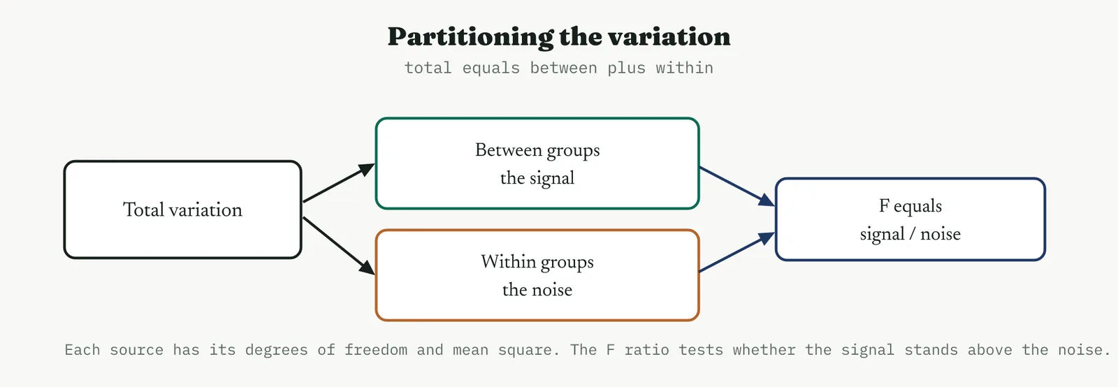
02 Setting up the test
THE HYPOTHESES What you are actually testing
The null hypothesis is that every group has the same mean, and the alternative is that at least one group differs. Note the modesty of the alternative, it does not say which group, or how many, only that the groups are not all alike. That is why a significant result is a beginning, not an end, it tells you a difference exists and sends you to the post-hoc comparison to find it. Framing the question this way before you run keeps you from reading a single significant p value as if it named a winner, which it does not.
ONE-WAY AND TWO-WAY How many factors are in play
A one-way analysis studies a single factor, one method against another against a third. A two-way analysis studies two factors at once, method and team say, and it does something a pair of one-way tests cannot, it tests the interaction between them, whether the effect of the method depends on the team running it. In the Improve phase the two-way form is what you reach for when you suspect a solution works differently in different hands, and its interaction test is the reason to run it rather than two separate analyses.
THE ASSUMPTIONS What the test rests on
Three assumptions carry the result, and each has a check. The observations must be independent, which is a matter of how the data was collected rather than a plot, so you assure it by sampling cleanly rather than testing for it after the fact. The residuals must be roughly normal, which the normal probability plot checks. And the groups must have roughly equal variance, which a test for equal variances checks directly. The method is forgiving of mild departures, particularly with balanced groups of similar size, but a badly skewed response or wildly unequal spreads will mislead it, and the honest move is to transform the response or to use a test that does not assume equal variance rather than to press on.
Balance helps more than people expect. Equal group sizes make the test robust to modest violations of the assumptions and make the comparisons that follow cleaner to read, so where you can choose the sample, choose it balanced. Where you cannot, the analysis still runs, but you lean harder on the diagnostic plots before you trust it.
03 Running it
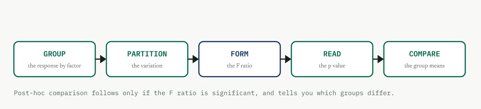
1 Group the response by the factor, and confirm the groups are what you meant them to be, cleanly defined and independently sampled.
2 Partition the total variation into the between-groups sum of squares and the within-groups sum of squares, each with its degrees of freedom.
3 Divide each sum of squares by its degrees of freedom to get the mean squares, then form F as the between mean square over the within mean square.
4 Read the p value against your chosen alpha. A small p rejects the null and says at least one group differs.
5 Only if F is significant, run the post-hoc comparison to find which groups differ, and by how much.
The degrees of freedom are worth understanding rather than memorising. The between-groups figure is the number of groups minus one, because once you know the grand mean and all but one group mean the last is fixed. The within-groups figure is the total number of observations minus the number of groups, the information left over after each group has spent one degree of freedom locating its own mean. The mean squares are variances, the sums of squares made comparable by dividing out those degrees of freedom, and F compares them on equal footing.
The critical value, or equivalently the p value the software reports, is where the noise alone would rarely reach. If the F you observe sits past it, the between-groups signal is larger than within-groups noise could plausibly produce, and you reject the null. The whole apparatus reduces to that comparison, is the signal larger than the noise by more than chance allows.
04 Crestline worked example
Crestline piloted two standard methods for case handling against the old ad hoc approach, and needed to know whether either standard genuinely cut resolution time before rewriting the way the team worked. Thirty cases from the pilot were split evenly, ten worked the old way, ten under standard A, ten under standard B, with the same staff throughout. That last point matters, because it turns the analysis into another test of Martin theory that the delays are a headcount problem. If the same people, differing only in method, produce different resolution times, then method, not headcount, is the lever.
The response is days to resolution. The group summaries came back as below, three means clearly apart with similar spreads.
| Group | n | Mean, days | StDev |
|---|---|---|---|
| Old method | 10 | 6.2 | 1.35 |
| Standard A | 10 | 4.6 | 1.28 |
| Standard B | 10 | 3.9 | 1.22 |
The analysis of variance partitions the total variation and forms the F ratio.
| Source | DF | SS | MS | F | P |
|---|---|---|---|---|---|
| Method | 2 | 27.80 | 13.90 | 8.18 | 0.002 |
| Error | 27 | 45.87 | 1.70 | ||
| Total | 29 | 73.67 |
F is 8.18 with a p value of 0.002, well past any reasonable alpha, so you reject the null and conclude the method genuinely moves resolution time. The factor explains a little under 40% of the variation in the response, an R-squared of 37.7%, which is a strong result for a single factor in a service where much of the variation comes from the cases themselves. The boxplot and the interval plot tell the same story to the eye.
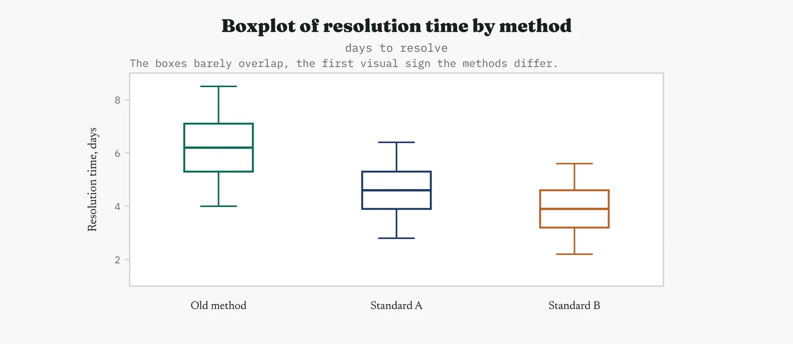
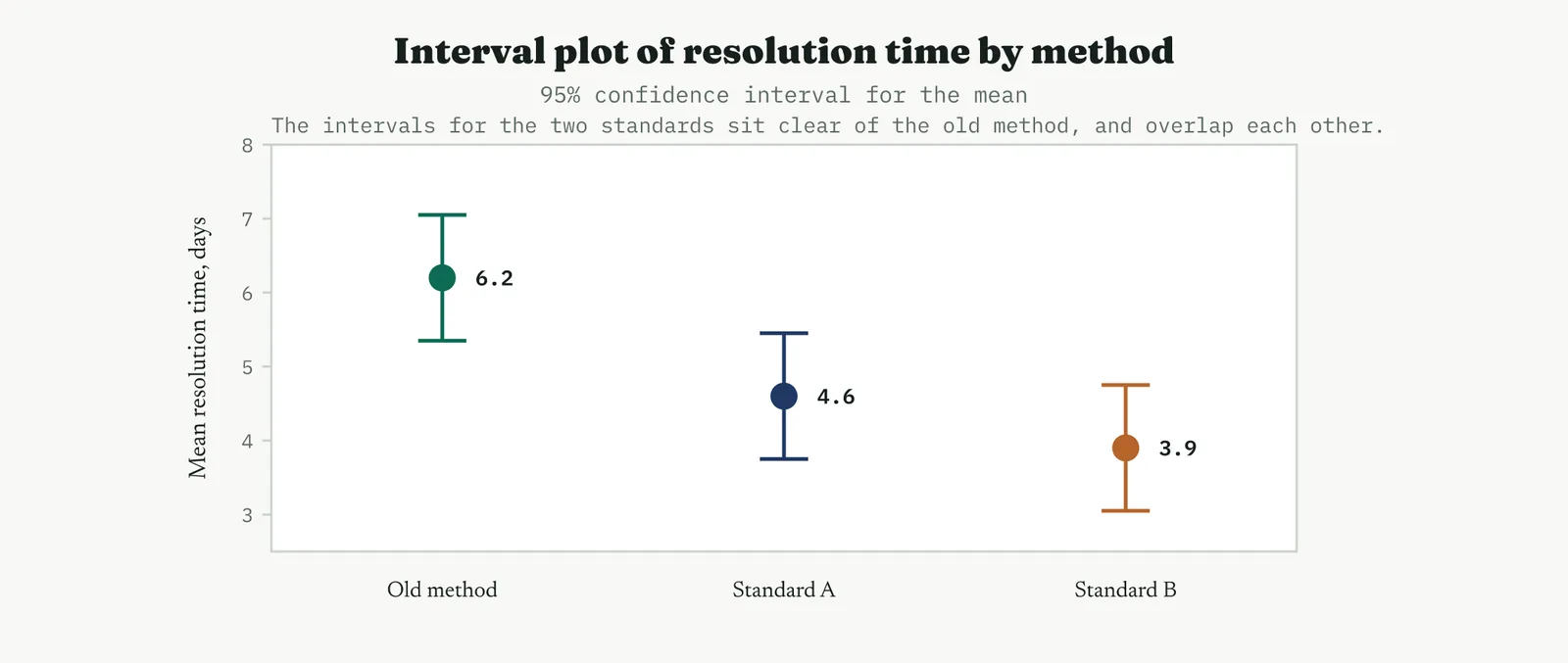
A significant omnibus test says a difference exists but not where, so the Tukey comparison finds it. It groups the methods and reports which pairs truly differ, controlling the error across all three comparisons at once.
| Comparison | Difference | 95% interval | Verdict |
|---|---|---|---|
| B minus Old | -2.3 | -3.5 to -1.1 | differs |
| A minus Old | -1.6 | -2.8 to -0.4 | differs |
| B minus A | -0.7 | -1.9 to 0.5 | no difference |
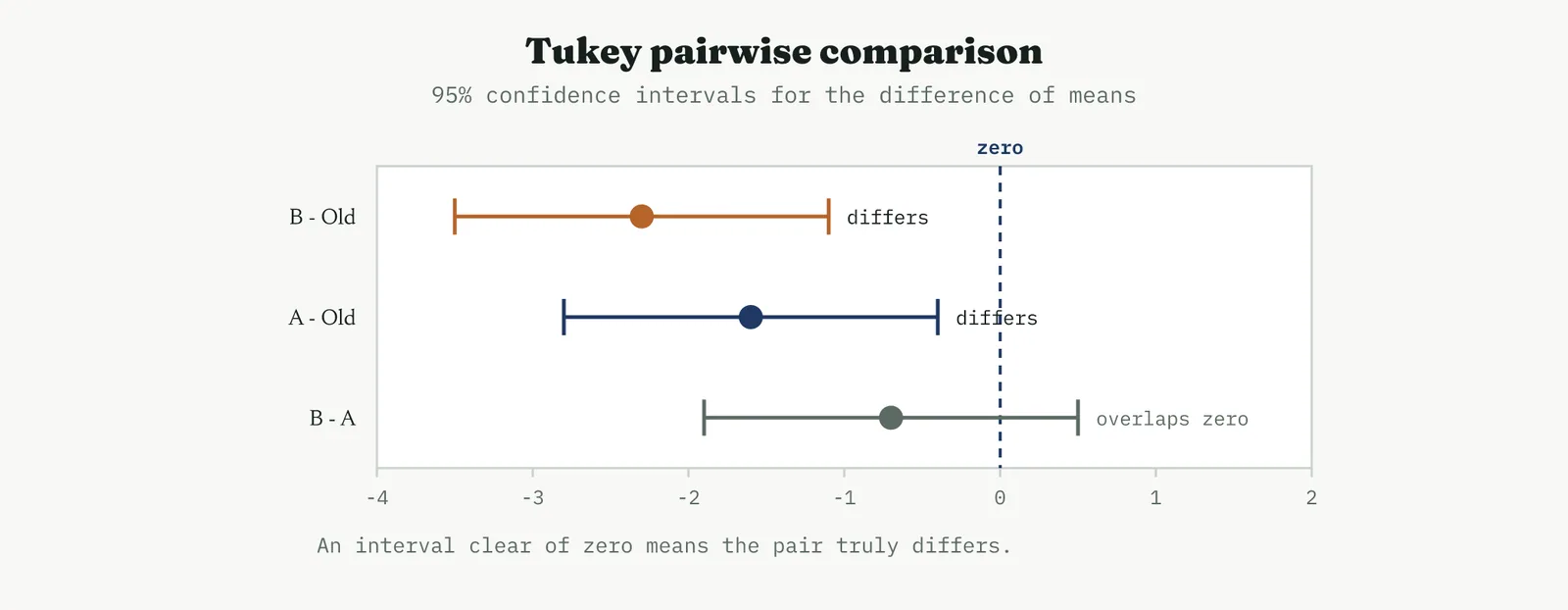
Both standards beat the old method, and they do not differ from each other, so on resolution time alone either is a defensible choice and the decision falls to other grounds, simplicity, training cost, fit with the rest of the work. Standard B holds the lower point estimate, so it is the natural default unless something else argues for A. The result that matters most for the project is the one that closes Martin theory again, the same staff produced a two-day improvement by changing method, which no amount of extra headcount would have delivered.
Before trusting any of this you check the assumptions. The test for equal variances shows the three spreads are statistically indistinguishable, so the equal-variance assumption holds.
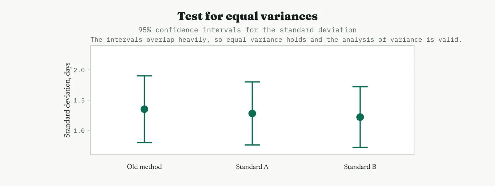
The residuals confirm the rest. They sit close to the line on the normal plot, scatter shapelessly against the fitted values, and show no drift against order, so the model is sound and the p value can be believed.
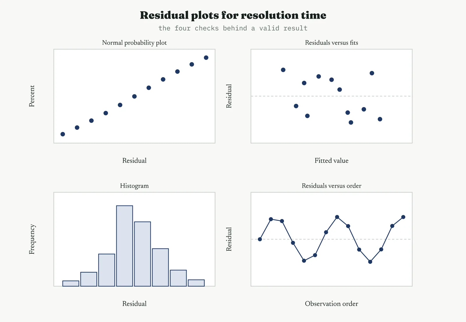
05 Reading the output
THE TABLE F and p first
Read the F ratio and its p value before anything else, because they decide whether the rest is worth reading. A significant p says a real difference exists somewhere among the groups. The sums of squares and mean squares behind it are how the figure was reached, and the ratio of the between sum of squares to the total, the R-squared, tells you how much of the variation the factor explains, which is the difference between a difference that is real and a difference that is large. A factor can be significant and still explain little, so read both.
THE PLOTS Boxplot and interval plot
The boxplot shows the raw shape, the medians, the spread, the outliers, and whether the groups overlap. The interval plot shows the means with their confidence intervals, and it is the plot to take to a decision, because intervals that fail to overlap are the visual form of a real difference. Read them together, the boxplot for the data and the interval plot for the conclusion.
THE POST-HOC Which groups differ
The Tukey comparison is where the answer actually lives once the omnibus test has cleared the way. Read each interval against zero, an interval clear of zero means that pair truly differs, an interval straddling zero means it does not. The grouping is what you carry into the decision, because it tells you not just that the methods differ but exactly which ones you can treat as the same and which you cannot.
THE RESIDUALS Whether to trust it
The residuals are the gate, not a formality. A curved normal plot or a fan against the fitted values means the assumptions failed and the p value is not trustworthy, so you transform the response or change the test before you conclude. Clean residuals are what turn a low p value from a hope into a result.
TWO-WAY, IN BRIEF Reading an interaction
When a second factor is in play, the two-way analysis adds a row for it and a row for the interaction. Read the interaction row first, because it changes how you read everything else. A significant interaction means the effect of one factor depends on the level of the other, so you cannot state a clean main effect and must read the factors together. A non-significant interaction, near-parallel lines on the interaction plot, means the two factors act independently and each main effect stands on its own.
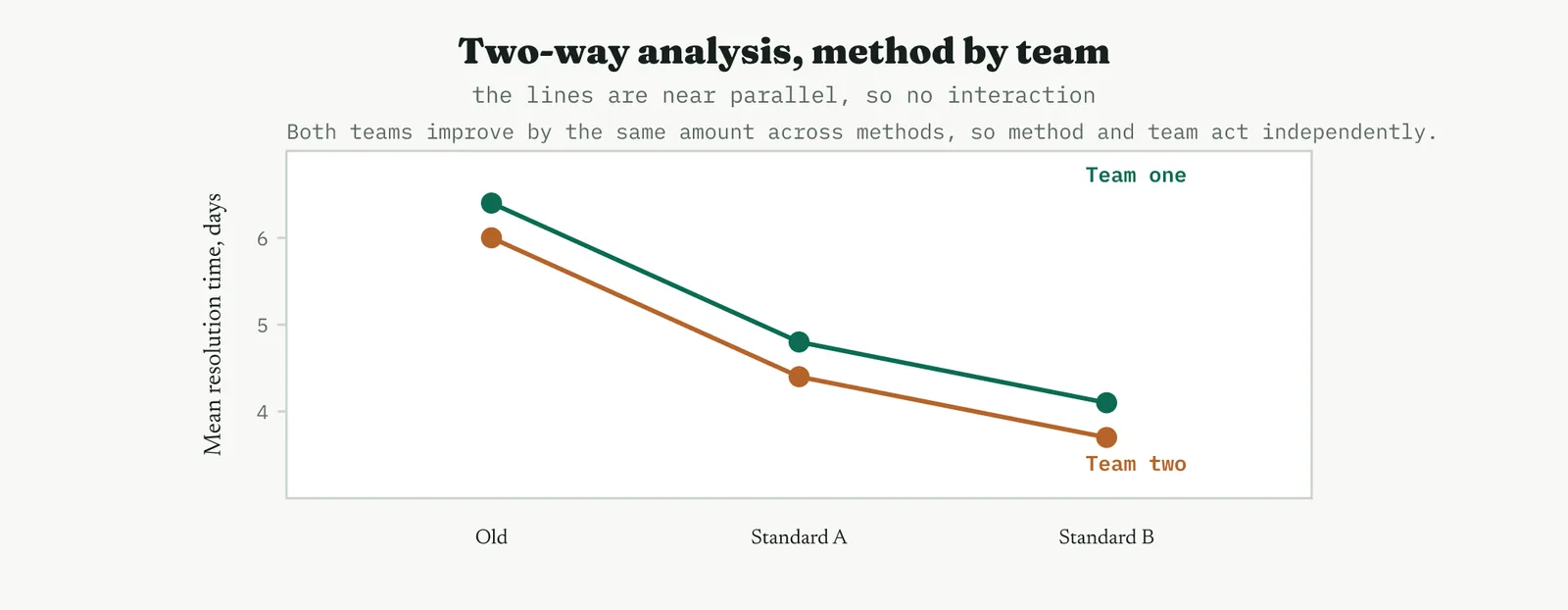
THE DISCIPLINE What to do and not do
| Do | Do not |
|---|---|
| Run the omnibus test first, then post-hoc only if it is significant | Read a single group as the winner from the omnibus p value alone |
| Check equal variance and residual normality before concluding | Trust a low p value from a model whose residuals failed the checks |
| Report the effect size, the R-squared, alongside the p value | Treat statistical significance as the same thing as practical size |
| Prefer balanced groups of similar size | Compare wildly unequal groups and assume the test still holds |
The tell. A significant F with clean residuals and a Tukey grouping that separates the groups is the finding you can defend. If the F is significant but the residuals show a pattern, or the groups are badly unbalanced with unequal spreads, treat the result as a lead rather than a conclusion, and fix the model before you act on it.
06 Matching it to the ground
The blank page. Early on, analysis of variance is a quiet way to prove a point without a large commitment. A single clean comparison of three groups, shown with an interval plot, teaches the room that structured testing settles arguments the eye cannot. Keep it small and let the plot do the persuading, because on a blank page you are proving the method as much as the difference.
The firefight. In a firefight the groups you compare are rarely stable, and the within-group noise is so large that no between-group signal can rise above it. Stabilise first, because analysis of variance run on a lurching process reports the lurching, not the factor. When the process holds still enough that the within-group spread is genuinely noise, the test becomes trustworthy.
The false start. A room burned by a past comparison that changed several things at once is exactly where a clean one-factor analysis earns credibility. Show the groups, show that only the factor differs, show the residual checks, and let the discipline be visible. The error control that analysis of variance provides, one test at one error rate, is the direct answer to a false start built on a pile of unguarded comparisons.
The quiet achiever. A stable, well-run process is where the test pays best, because the within-group noise is low and even a modest real difference shows clearly. This is the ground where a two-day improvement lands with a p value of 0.002 rather than drowning in variation, and where the interval plot separates the groups cleanly enough to decide on.
07 When it goes wrong
The commonest failure is reading the omnibus result as a verdict on a single group. A significant F says the groups are not all alike, nothing more, and jumping from there to a named winner without the post-hoc is how people claim differences the data does not support. Always run the comparison, and read its intervals against zero, before you name anything.
The second failure is ignoring the assumptions. A skewed response or badly unequal variances quietly breaks the test, and the p value it returns is not the p value you think you have. The residual plots and the equal-variance test are cheap, and skipping them to reach a conclusion faster is the surest way to reach a wrong one. When the checks fail, transform the response or use a test built for unequal variance rather than pressing on.
The third failure is confusing significance with size. With enough data a trivial difference becomes statistically significant, and a p value says nothing about whether the difference is worth acting on. Read the effect size and the interval plot alongside the p value, and let the practical size of the gap, not the smallness of the p value, decide whether the finding changes anything.
The last failure is comparing groups that were never comparable, differing in more than the factor you meant to study. If the old-method cases were also the hard ones, the analysis measures difficulty, not method, and no amount of clean arithmetic rescues a confounded comparison. The guard is in the sampling, not the analysis, assign cases to groups so that only the factor differs.
08 What it feeds
Analysis of variance is the confirmation engine of the Improve phase, the tool that turns a believed difference into a proven one. Its verdict feeds the solution selection, because a difference that clears the test is a difference you can build on, and one that does not clears an option off the table. Where it confirms a winning method, that method flows into the pilot and the standard work, and where it disproves a suspected cause, that finding flows back into the Analyse phase as a closed door.
It also underwrites the numbers everyone else relies on. The same partition of variation sits inside the designed experiment and inside regression, so a Black Belt who reads an analysis of variance table fluently reads the heart of both. In the arc of the project, it is the tool that lets you say, with a stated confidence rather than a hopeful tone, that the change you are about to standardise genuinely does what you claim.
For Crestline, its contribution was decisive and specific. It proved that method moves resolution time and that headcount is not the lever, closing Martin theory with a p value rather than an argument, and it did so with the same staff working the same cases. That is the kind of evidence that ends a debate, and ending the debate is what lets the phase move from choosing a solution to hardening it.
14 · Improve
14.3.11 The Kaizen event LEAN
Lean stream, outside ISO 13053 by design. Improve delivery, implement the selected changes.
01 What it is and why you reach for it
A Kaizen event is a time-boxed, cross-functional push that designs and delivers a bounded improvement in days rather than months, with the people who actually run the process in the room for the whole of it. It takes the arc you would otherwise spread across weeks of meetings, understand the problem, design the fix, put it in place, and compresses it into a single dedicated week aimed at one clear target. Reach for it when the change is bounded enough to finish in a week, the process sits in one place, and the room holds the authority to make the change stick.
Its power is not analytical, it is human and it is speed. Because the people who do the work build the change themselves, they own it, and a change its owners built survives in a way a change handed to them never does. Because it finishes in a week, it beats the slow decay that kills long projects, where momentum leaks away between meetings and the problem outlives the will to fix it. And because it ends with something visibly different on the floor, it builds the belief that improvement is real, which is worth as much to a programme as any single fix.
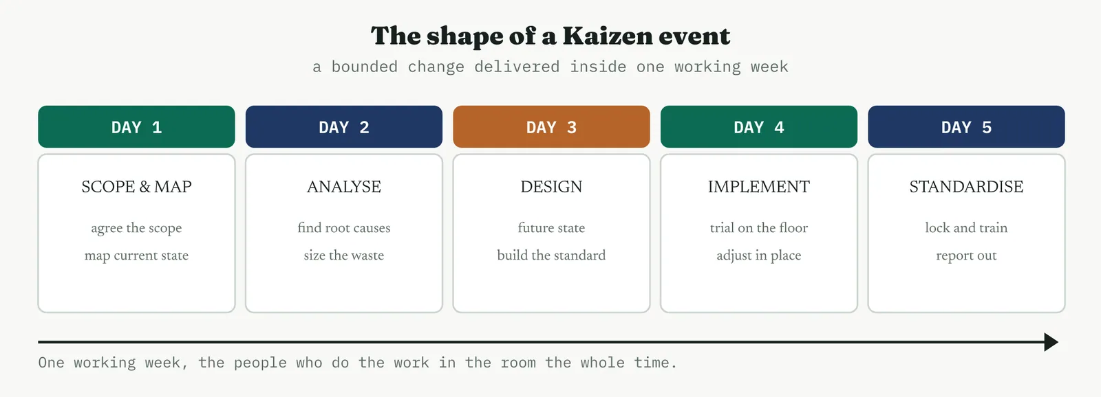
Underneath, the event is one full plan-do-check-act cycle run at speed. You plan by scoping and mapping, you do by building and trialling the new way, you check by measuring the trial on the floor, and you act by standardising what worked. The discipline that separates a real event from a workshop is that all four happen inside the week, so the room leaves with a change in place, not a plan to make one.
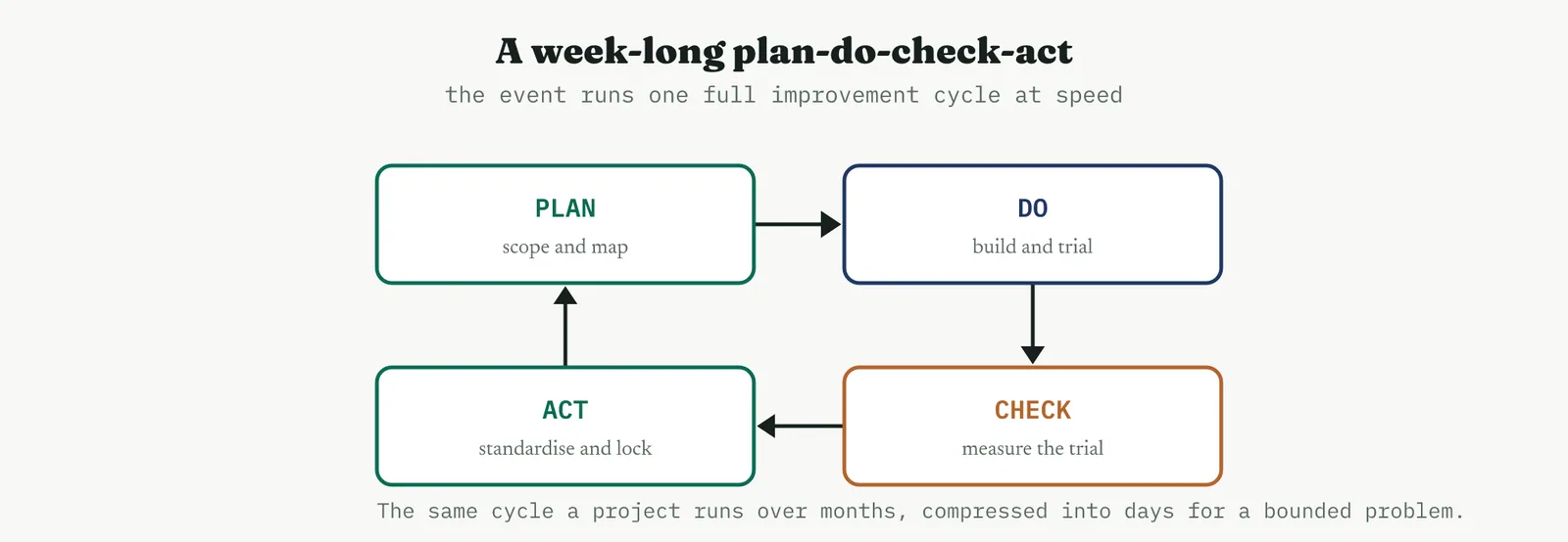
02 Setting up the event
SCOPING A tight boundary is what makes a week enough
Everything about a Kaizen event depends on scope, because the week is fixed and only the boundary is yours to set. Draw it tight. The target should be one process, one handoff, one bounded piece of work that a room can genuinely change in five days, and everything outside that, the system rebuilds, the staffing decisions, the cross-organisation changes, gets named and parked rather than dragged in. An event that tries to fix everything fixes nothing, and the single most common reason a week fails is a scope that was never a week-sized problem to begin with.
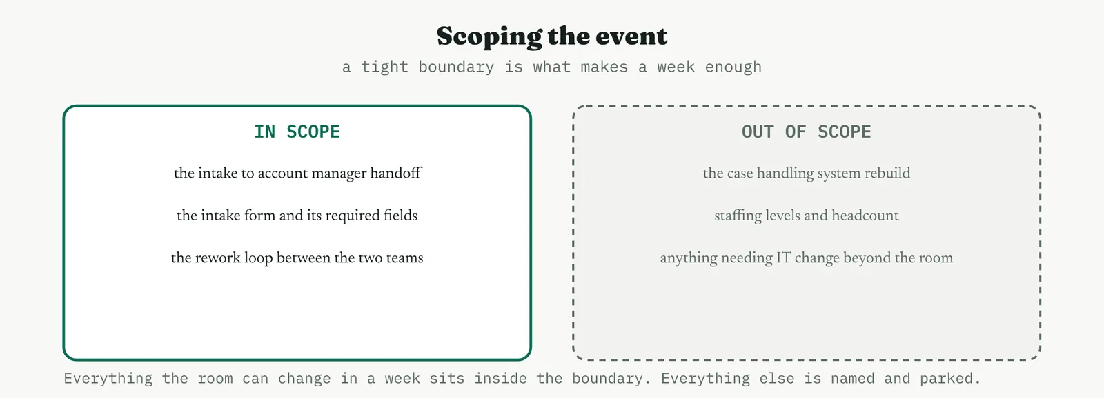
THE ROOM Who needs to be there
The team is the people who do the work, not their managers standing in for them. The intake officer and the account manager who live the handoff know where it breaks in ways no map will show, and putting them in the room is what makes the design real and the ownership genuine. Around them sit the process owner, who will hold the result after the week, and a facilitator, usually the belt, who runs the event and keeps it moving. The sponsor does not sit in the room but must be on call, because the value of an event is that decisions get made in the week, and a decision that needs a signature nobody can give stalls the whole thing.
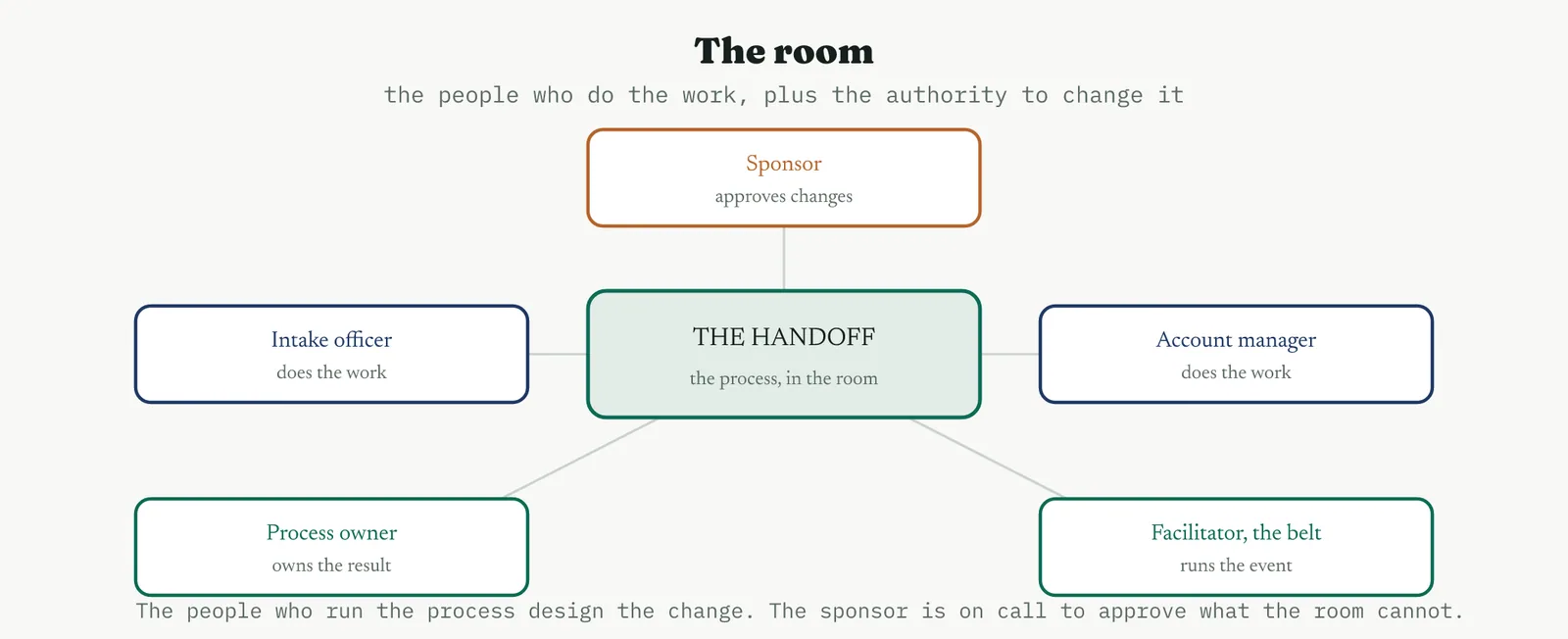
THE PRE-WORK An event is won before it starts
A week is too short to spend gathering data, so the data comes ready. Before the room sits down, the current state is understood, the measures are in hand, the process is mapped well enough to argue about, the sponsor has agreed the scope and the mandate, and the logistics, the room, the access, the cover for the people attending, are all arranged. An event that spends its first two days assembling what should have arrived on day one has already lost, because the week does not stretch. The preparation is not overhead, it is the event.
WHEN IT FITS And when to run a project instead
The judgement an experienced belt brings is knowing which problems suit a week and which do not. The test is scope, location, data and authority.
| Reach for a Kaizen event when | Run a full project when |
|---|---|
| The problem is bounded and finishable in a week | The problem is broad or spans many processes |
| The process sits in one place with its people | The process is spread across sites or systems |
| The data is already in hand | New data must be collected and studied first |
| The changes sit within the authority in the room | The changes need a designed experiment or long study |
| Momentum and ownership are what is needed | Sign-off is needed well beyond the room |
03 Running it
The week has a rhythm, and holding to it is most of the skill.
1 Day one, scope and map. Agree the boundary out loud, map the current state with the people who run it, and let the measures show where the pain sits.
2 Day two, analyse. Find the root causes of the waste, size them, and settle on the few changes worth building. Resist designing before you have understood.
3 Day three, design and build. Design the future state and build the standard, the form, the checklist, the pack, whatever the change needs to exist in the world.
4 Day four, implement and trial. Put the change on the floor, run real work through it, and adjust in place. This is the day that separates an event from a workshop.
5 Day five, standardise and hand off. Lock the standard, train the team, and report out to the sponsor with a dated list of what remains.
The single rule that matters most is that the change goes in during the week, not after it. An event that ends with a plan to implement later has produced a document, not an improvement, and the document will age on a shelf like every other. What leaves the room is a change already running, plus a short list of the things that could not be finished in five days.
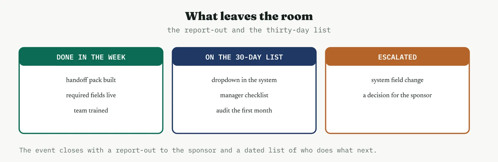
That list is the honest tail of the event. Some things get done in the week. Some need thirty days, a system tweak, a checklist to embed, a first month to audit, and they go on a dated follow-up list with an owner against each. A few need more authority than the room had, and they get escalated to the sponsor as named decisions. The follow-up list is where most events quietly die, so a named owner and a date against every item is not bureaucracy, it is the difference between a change that holds and a week that felt good and faded.
04 Crestline worked example
Crestline had already chosen its changes. The prioritisation had put a single case owner, required intake fields, and a standard handoff pack at the top of the list, quick wins that the analysis said would cut the rework between Intake and the account managers. What it did not have was a way to make them real without another quarter of meetings, so it ran a four-day Kaizen event on the Intake to account manager handoff, with two intake officers, two account managers, the process owner, and the belt facilitating.
The current state was familiar once the room mapped it. Intake passed a case on with an informal note, the account manager found fields missing, and the case bounced back for the missing information before it could move, a rework loop that ate days and explained a good part of the 82% first-response accuracy. The room designed the loop out.
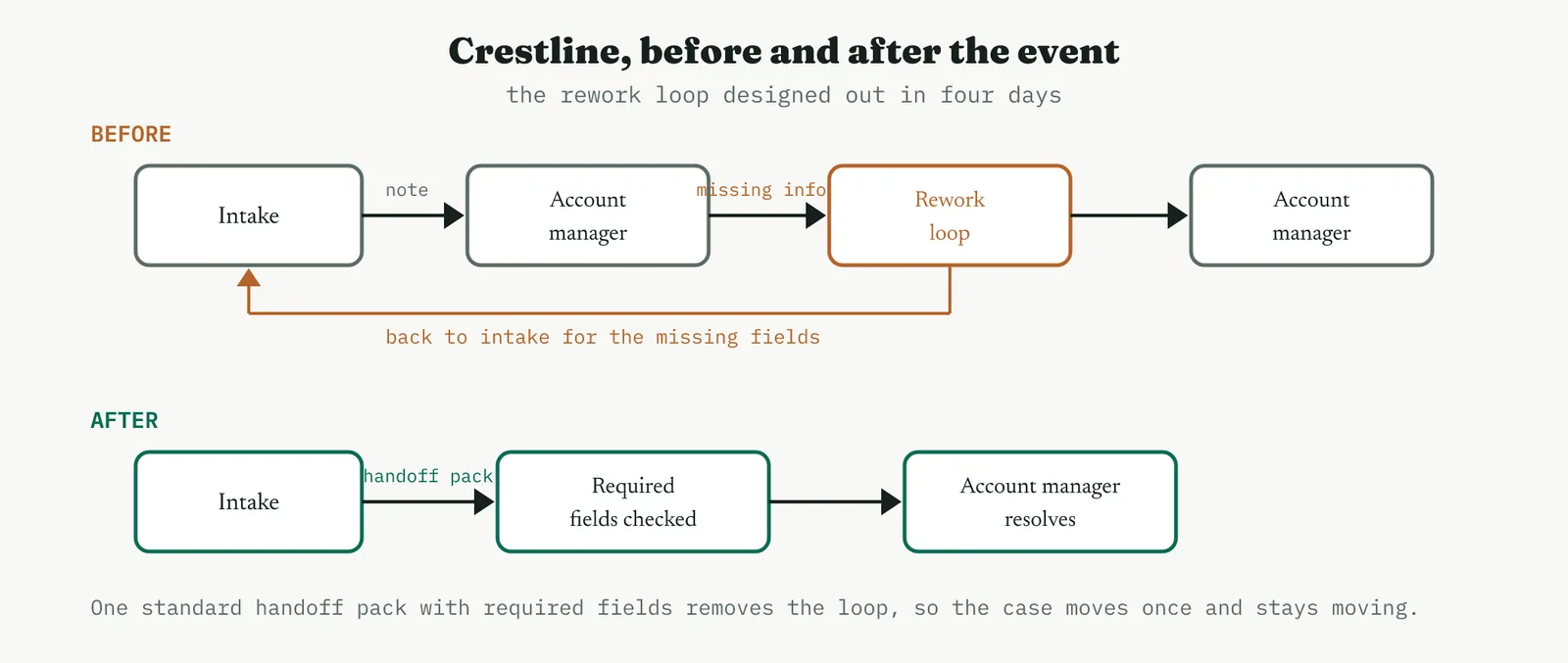
By the end of day four the change was running. The room built a standard handoff pack with a required-fields check, trialled it on live cases, adjusted the fields twice on the floor, trained both teams, and handed the standard to the process owner. Three items went on the thirty-day list, a dropdown to enforce the fields in the system, a manager checklist, and an audit of the first month, each with an owner and a date. One item, a change to a locked system field, was escalated to the sponsor as a decision the room could not make. The event delivered in four days what the meeting calendar would have carried into the next quarter, and it delivered it owned by the people who now run it.
05 Reading the output
A good event is read by what physically leaves the room, not by how the week felt. Five things should be true at the end.
WHAT A GOOD EVENT PRODUCES The five tests
There is an implemented change running on the floor, not a plan to implement one. There is standard work that captures the new way, so it can be trained and audited rather than living in memory. There is a measured trial, real work run through the change during the week, so the improvement is evidence rather than hope. There is a dated follow-up list with an owner against every item. And there is a trained team who built the change and therefore own it. Miss any of the five and you have run a workshop, not a Kaizen event.
THE DISCIPLINE What to do and not do
| Do | Do not |
|---|---|
| Put the change in place during the week | Leave the room with a plan to implement later |
| Scope tight enough to finish in five days | Take on a problem no week could close |
| Prepare the data and the mandate before day one | Spend the first days gathering what should have arrived |
| Give every follow-up item an owner and a date | Let the thirty-day list drift without owners |
| Put the people who do the work in the room | Send managers to stand in for the people who do the work |
The tell. A month after the event, walk the floor. If the change is still running and the team describes it as theirs, the event worked. If the standard has quietly reverted and the follow-up list stalled, the week was theatre, and the fault is almost always thin pre-work, a scope too big, or a follow-up list with no owners.
06 Matching it to the ground
The blank page. An event is a strong first move on a blank page, because it produces a visible win fast and teaches a sceptical firm that improvement is real. Choose a small, safe, bounded problem, deliver it in a week, and let the result argue for the method. The point of the first event is belief as much as the fix itself, so pick something you are confident the room can finish.
The firefight. A firefight is where events are most tempting and most dangerous. The temptation is to blitz the fire, the danger is that a process still lurching cannot hold a new standard, and the event becomes another thing that did not stick. Stabilise the immediate chaos first, then run a tightly scoped event on one bounded piece once the ground will hold a change.
The false start. A firm burned by a past improvement that faded is exactly where the discipline of an event pays. Its short cycle, its visible implementation in the week, and its dated follow-up list are the direct answer to a false start that produced plans and no change. Make the implementation and the follow-up visible, because the room needs to see that this time something actually held.
The quiet achiever. A stable, well-run process is where an event runs cleanest, because the pre-work is easy, the measures are trustworthy, and the change holds once it goes in. This is the ground where a week delivers exactly what it promised, and where a run of successful events builds the capability to take on harder ground later.
07 When it goes wrong
The commonest failure is the event that produces a plan instead of a change. The week fills with mapping and designing, day four arrives, and the room agrees to implement later, which means never. The fix is to protect the implementation day fiercely and to treat any event that does not put a change on the floor as unfinished, not as a success with a tail.
The second failure is scope. A problem too big for a week cannot be closed in a week, and the room either overruns or declares a hollow win. The guard is in the setup, scope to what five days can genuinely deliver, and split a big problem into several bounded events rather than one that cannot land.
The third failure is thin pre-work. An event that opens without its data, its mandate, or its people spends the scarce week assembling what should have been ready, and finishes having designed but not delivered. The preparation is not a preliminary to the event, it is the larger half of it, and skimping there is the surest way to waste the week.
The last failure is the follow-up that dies. The change goes in, the week ends on a high, and the thirty-day list drifts without owners until the standard quietly reverts. A named owner and a date against every item, and a sponsor who checks at thirty days, are what turn a good week into a change that holds. Without them the event was a morale exercise that faded.
08 What it feeds
A Kaizen event is a delivery vehicle, so its output feeds the phases on either side of it. The standard work it builds becomes the backbone of the Control phase, the thing the control plan monitors and the audit checks, which is why an event that produces proper standard work has already written half of Control. The measured trial it runs feeds the evidence the project needs to close, a real before and after on live work rather than a projection.
It also feeds the improvement register and the next event. The escalated items and the thirty-day follow-ups become entries the programme tracks, so nothing the room could not finish is simply lost. And the capability the event builds, a team that has now designed and owned a change, is what makes the next event easier and the one after that easier still. In that sense the event feeds the programme itself, not just the process it fixed.
For Crestline the event turned three chosen changes into a running standard in four days, owned by the two teams that had been bouncing cases between them. It fed the control plan a ready-made standard, fed the project the trial evidence it needed, and fed the sponsor one clean decision rather than a quarter of meetings. That is the case for the tool in one line, it is how a decision to change becomes a change, fast, and owned by the people who have to live with it.
14 · Improve
14.3.12 The pilot and reliability run RECOMMENDED
ISO 13053-1, Improve. Pilot and confirm the solution before full deployment.
01 What it is and why you reach for it
A pilot runs the chosen solution on a limited scale under real conditions, so the decision to commit the whole organisation rests on evidence rather than expectation. The reliability run is the part people skip, and it is the part that matters most, running the change long enough, across enough conditions, to prove the gain repeats rather than showing up once and fading. Reach for a pilot whenever a change is about to be rolled out wide, which is to say almost always, because a solution that has not been proven in the real flow is a hypothesis wearing the clothes of a decision.
The reason it earns its place is that everything before it happened in controlled conditions. A solution chosen on a matrix, tuned in a designed experiment, or built in a Kaizen room has been proven where the noise was low and the attention was high. The real process is neither. A pilot is where the change meets ordinary volumes, ordinary people, and an ordinary bad week, and either holds or does not. It de-risks the rollout, it catches what the design could not see, and it earns the confidence, and the political cover, to commit the organisation to the change.
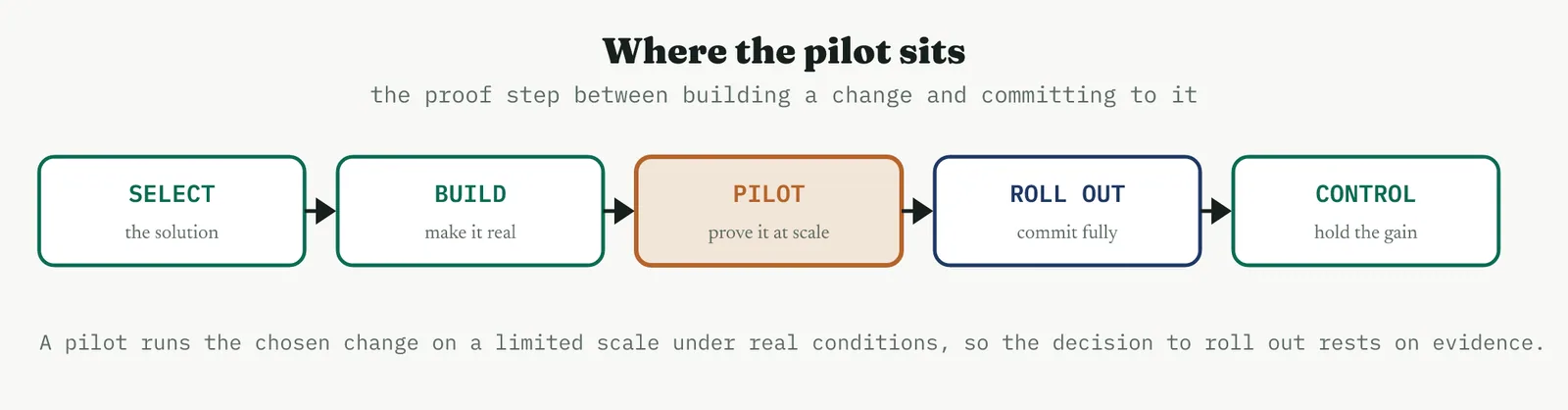
02 Setting up the pilot
THE THREE DECISIONS Slice, duration, criteria
A pilot is set up before it is run, and three decisions carry it. The first is the slice, which team or segment carries the pilot. Choose one that is representative rather than the easiest, because a pilot run on your best people in your quietest queue proves only that the change works when nothing is hard, which is not the question. The second is the duration, long enough to see the change hold across the conditions the process actually faces, the busy days, the different shifts, the awkward cases, not a single good morning. The third is the success criteria, and these are agreed with the sponsor before the pilot starts.
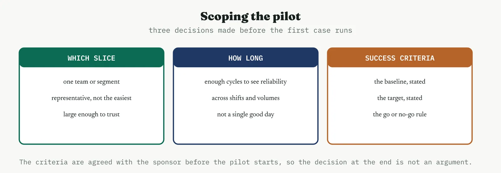
The criteria deserve their own emphasis, because a pilot without a pre-agreed rule ends in an argument. Before you start, you write down the baseline the process runs at now, the target the change is meant to reach, and the rule that decides go or no-go. Settle these in advance and the decision at the end is read off the evidence. Leave them until after and the pilot becomes a Rorschach test, where everyone sees what they wanted to see.
THE BASELINE AND THE ROLLBACK Two things to fix first
Two more things are fixed before the pilot runs. The baseline, because you cannot judge a change without the number it started from, and a baseline reconstructed after the fact is a baseline chosen to flatter the result. And the rollback, the decision, made calmly in advance, of how you will pull the change if it fails, so that a pilot going wrong is a controlled stop rather than a scramble. A pilot with a clear baseline and a ready rollback is a safe experiment. Without them it is a gamble with the live process.
03 Running it
The pilot has a simple discipline, and the discipline is the point.
1 Lock the baseline and the criteria, agreed with the sponsor, before the change goes live on the slice.
2 Run the change on the chosen slice under real conditions, and resist the urge to smooth its path with extra attention it will not get at scale.
3 Measure continuously against the baseline, and watch the failure modes you were worried about as closely as the headline metric.
4 Run long enough to see reliability, across the shifts, volumes and case types the real process faces, not just until the first good result.
5 Compare against the pre-agreed criteria and decide, go, adjust, or stop, reading the rule rather than negotiating it.
The reliability run is the step that separates a real pilot from a demonstration. A change that works for a day, or for the easy cases, or while everyone is watching, has proven nothing durable. What you are looking for is a gain that holds when the attention moves on, which is why the pilot runs across weeks rather than days and across the full range of conditions rather than a favourable slice. A one-off improvement is not a result, it is a coincidence you have not yet ruled out.
04 Crestline worked example
Crestline had a change to prove. The Kaizen event had delivered a standard handoff pack with required fields, and the early signs were good, but good signs in a four-day event are not evidence at scale. So the team piloted the pack on one account-management team for three weeks, measuring resolution time and first-response accuracy against the locked baseline, a median of six days and first-response accuracy of 82%.
The run chart told the first part of the story. Resolution time dropped when the pack went live and stayed down, rather than dipping and drifting back.
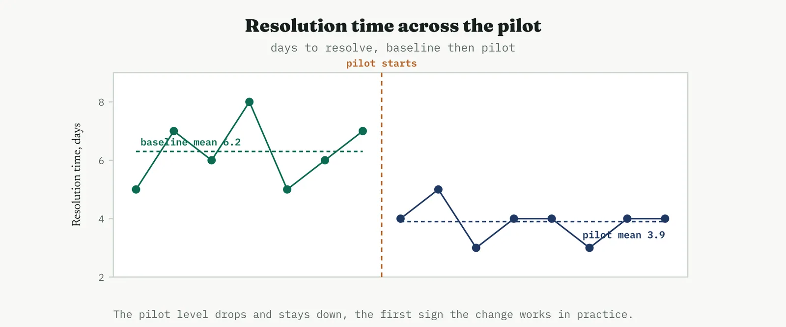
Measured against the baseline, both metrics moved and both moved the right way, resolution time from six days to four, first-response accuracy from 82% to 95%.
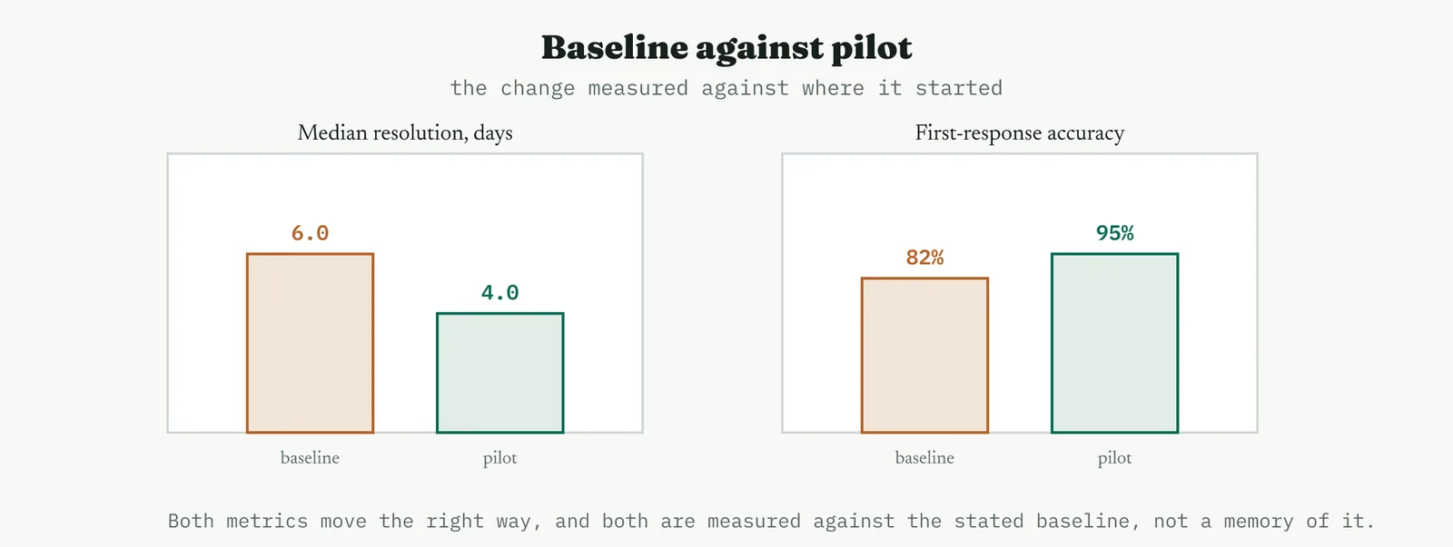
The reliability run was what made the result trustworthy. Across three weeks, through a busy spell and a quiet one, with different people working the queue, resolution time stayed inside a tight band around four days. The gain was not a good week, it was the new normal.
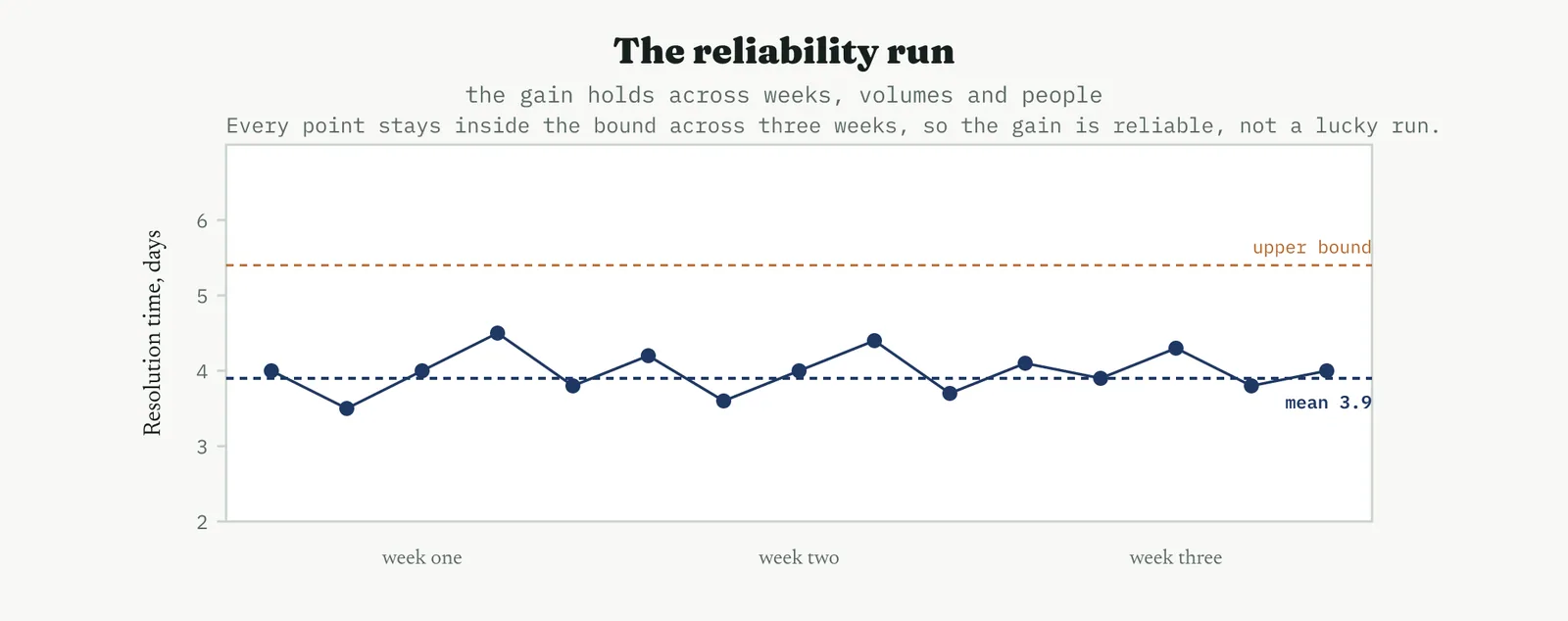
With the criteria met, the decision was straightforward, and because the rule had been agreed before the pilot, it was read off the evidence rather than argued.
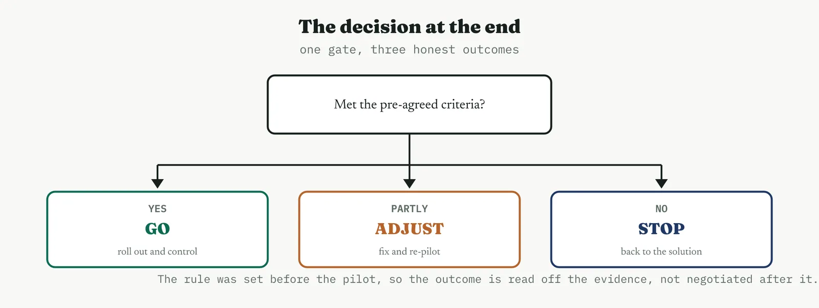
The pilot also closed Martin theory one last time. The two-day improvement held for three weeks with the same staff and no extra headcount, across busy and quiet spells alike. Whatever case remained for more people, the resolution problem was not it, and the pilot proved it under exactly the conditions Martin said would break the change.
05 Reading the output
THE RUN CHART A level that holds
Read the run chart for the shape, not just the average. What you want is a level that drops and then holds, because a change that improves the mean and then drifts back has not fixed anything, it has borrowed against attention that will move on. A clean step down that stays down is the signature of a real change. A dip that recovers is the signature of a change that worked only while it was watched.
THE RELIABILITY RUN A gain that repeats
The reliability run is read for consistency. Points that stay inside a tight band across weeks, volumes and people say the gain is dependable, which is the only kind of gain worth rolling out. A wide scatter, or a good first week followed by a slide, says the change is fragile, and rolling out a fragile change is how a promising pilot becomes a disappointing programme.
THE DECISION Read the rule
The decision is read off the pre-agreed rule, and its honesty depends on that rule having been set in advance. Met the criteria, go. Missed them in a way you understand and can fix, adjust and re-pilot. Missed them fundamentally, stop and return to the solution. The discipline is to accept the outcome the evidence gives, including the two outcomes nobody wants, because a pilot that can only ever say go is not a pilot, it is a launch with a delay.
THE DISCIPLINE What to do and not do
| Do | Do not |
|---|---|
| Agree the baseline, target and rule before you start | Decide what counts as success after seeing the result |
| Pilot a representative slice under real conditions | Pilot your best people in your quietest week |
| Run across weeks and conditions for reliability | Stop the moment the first good result appears |
| Keep a rollback ready before you go live | Go live wide with no way to pull the change back |
| Accept go, adjust or stop as the evidence dictates | Treat the pilot as a formality on the way to rollout |
The tell. A pilot you can trust shows a level that dropped and held, a reliability run that stayed inside its band across real conditions, and a decision read straight off a rule set in advance. If the improvement faded as attention moved on, or the criteria were written after the data arrived, treat the result as unproven and run it again properly, because a rollout built on a soft pilot fails at the worst possible scale.
06 Matching it to the ground
The blank page. Early on, a pilot is how you prove the method as much as the change. A small, clean pilot with a stated baseline and a visible reliability run shows a sceptical firm that improvement can be demonstrated rather than asserted. Keep it modest and let the run chart do the arguing, because the first pilot is teaching the organisation what evidence looks like.
The firefight. In a firefight the temptation is to skip the pilot and roll the fix out everywhere at once, because the fire is hot and waiting feels like weakness. It is exactly the wrong move, because an unproven change deployed wide during a crisis multiplies the risk rather than containing it. Pilot on one slice even under pressure, because the faster you want to roll out, the more you need the proof that the change holds.
The false start. A firm burned by a past change that was rolled out and then failed is precisely where a disciplined pilot rebuilds trust. Show the baseline, run the reliability step in the open, and let the decision follow a rule set in advance. The false start almost always came from committing wide on a hope, and a visible pilot is the direct answer, evidence before commitment, in a form everyone can watch.
The quiet achiever. A stable process is where a pilot reads cleanest, because the baseline is trustworthy and the reliability run is easy to interpret against low background noise. This is the ground where a pilot delivers exactly what it promises and where a clean result rolls out smoothly, and it is where the habit of piloting before committing becomes part of how the place works.
07 When it goes wrong
The commonest failure is the pilot that is too short or too small to mean anything. A few good days on a handful of easy cases proves nothing about the real process, and a change waved through on that basis fails at scale, where the conditions the pilot never tested finally arrive. Run long enough and broad enough that the pilot has actually been tested, or do not call it a pilot.
The second failure is criteria written after the fact. When the rule for success is settled once the data is in, the pilot cannot fail, because the bar moves to wherever the result landed. That is not evidence, it is theatre, and everyone in the room knows it even when nobody says so. Agree the baseline, the target and the rule before the first case runs, and hold to them.
The third failure is the artificial pilot, run under conditions the rollout will never enjoy. Your best people, extra attention, a quiet week, a hand-picked queue, each of these flatters the result and none of them will be there at scale. A pilot is worth exactly as much as it resembles the real thing, so resist every instinct to smooth its path, because the roughness is the test.
The last failure is confusing the pilot with the rollout, and stopping the reliability run the moment the result looks good. A single strong week is where the discipline is hardest and matters most, because it is so tempting to declare victory and scale. Hold the line until the gain has proven it repeats, because the difference between a pilot and a coincidence is only visible over time.
08 What it feeds
A pilot feeds the Control phase directly. The proven change, the baseline it beat, and the reliability data it generated become the backbone of the control plan and the reference the process is monitored against, so a pilot done well has already written much of what Control needs. The data at the new level feeds the capability study, which restates the process capability now that the change has landed, and the pilot evidence feeds the rollout plan, turning a leap of faith into a staged, de-risked deployment.
It also feeds the project close and the improvement register. A pilot that confirmed the change gives the project the before-and-after evidence it needs to close honestly, and a pilot that failed feeds the register a documented no-go, which is a real result rather than a wasted effort, because it stops the organisation rolling out something that would not have held. Either way the pilot converts a decision into knowledge the programme can act on.
For Crestline the pilot was the moment the whole Improve phase came good. It took a change designed in a room and proved it held for three weeks in the real flow, with the same staff, across busy and quiet alike. It handed Control a proven standard and a fresh baseline, handed the project its evidence, and handed the sponsor a clean decision. That is the case for the pilot in one line, it is where an improvement stops being something you believe and becomes something you can show.
14 · Improve
14.3.13 The updated FMEA RECOMMENDED
ISO 13053-2, risk assessment tool. Improve, re-score the risk after the change.
01 What it is and why you reach for it
A failure mode and effects analysis is a structured way of ranking what can go wrong. You list the ways a process can fail, and for each you score three things, how bad the effect would be, how often the cause occurs, and how likely the failure is to be caught before it does harm. Those three numbers, severity, occurrence and detection, multiply into a risk priority number that sorts the failure modes so the worst rise to the top. The updated version is the one that belongs in Improve, and the word that matters is updated. You do not build a fresh analysis, you revise the one made back in Analyse, because the whole point is to measure what your change did to the risk.
The reason it earns a place after the change rather than only before it is that improvement cuts both ways. A fix lowers the risks it targeted, and it can raise others or create entirely new ones, a required field that people learn to bypass, a new step that can itself be skipped. The updated analysis is how you prove the net risk actually fell, not just the part you were looking at, and how you hand the risks that remain to the Control phase deliberately rather than by accident. Skip it and you claim a win on the failures you fixed while staying blind to the ones you introduced.
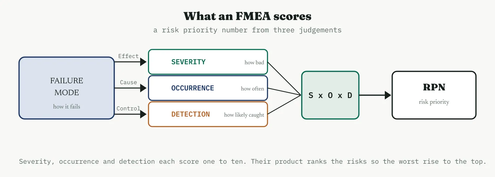
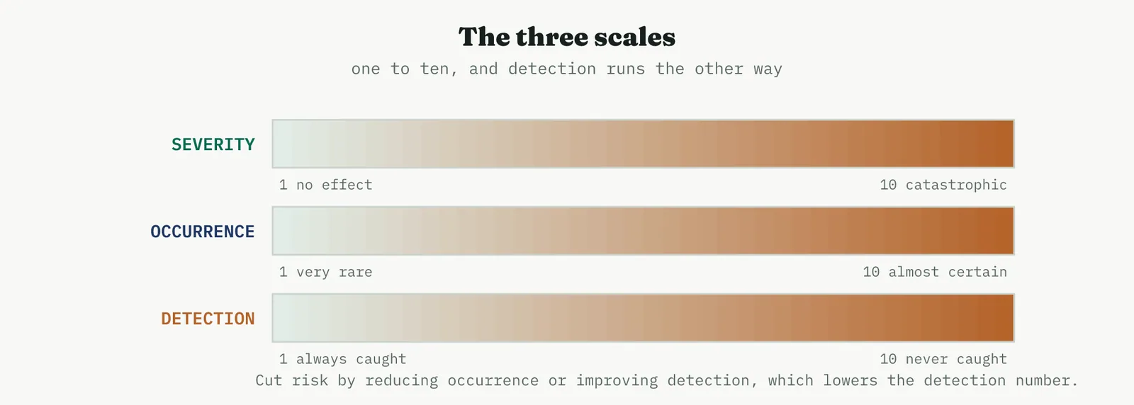
02 Setting up the update
START FROM THE OLD ONE Not a blank sheet
The update begins with the existing analysis open in front of you, because the value is in the comparison. You are looking for what moved, and you cannot see movement from a standing start. Pull up the modes, the scores, and the risk numbers as they stood before the change, and treat them as the baseline the update is measured against, exactly as a pilot is measured against its baseline.
WHAT MOVES AND WHAT DOES NOT Re-score with care
Occurrence and detection are the scores a change usually moves. You made the cause rarer, so occurrence falls. You made the failure easier to catch, so detection improves, which lowers its number. Severity, by contrast, usually holds, because the effect of a failure is the same however rare you have made it, a missed case still causes the same harm when it slips through. Only lower severity when you have genuinely redesigned the effect out, and be suspicious of any update where severity drops without a real change to what a failure would cause, because that is usually a number moved to flatter the result.
HUNT THE NEW MODES The step people skip
Budget time explicitly for the question nobody enjoys, what did this change break or add. Put the people who ran the pilot in the room, because they have seen the change in the real flow and know where it strains. A required-fields check invites someone to type a placeholder to get past it. A new standard invites a new way to not follow it. These are not reasons to avoid the change, they are risks to score and to control, and an update that only re-scores the wins is not an update, it is a victory lap.
03 Running it
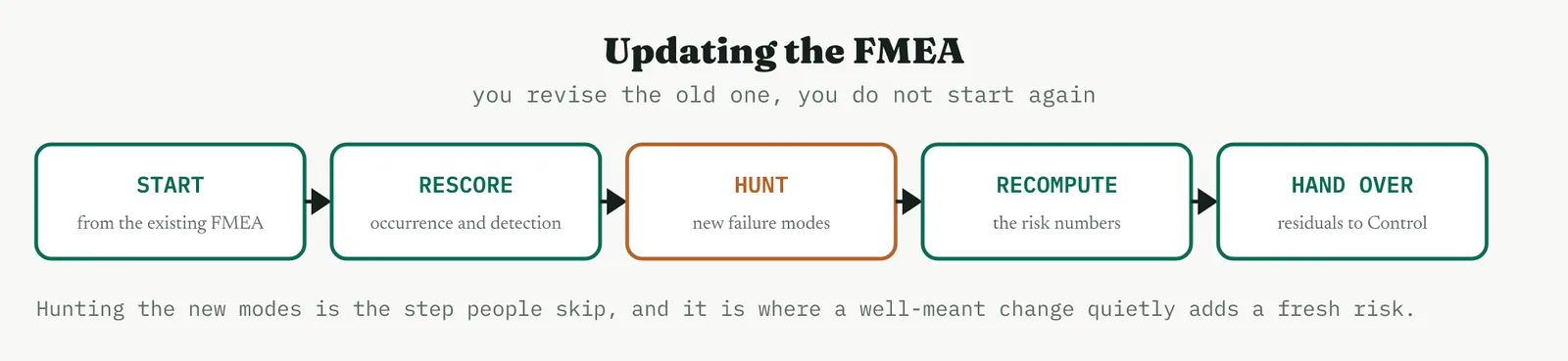
1 Open the existing analysis and confirm the before scores, the baseline the update is measured against.
2 Walk the process as it now runs, with the people who worked the pilot, and see what actually changed.
3 Re-score occurrence and detection for the modes you targeted, and leave severity unless the effect itself was redesigned.
4 Hunt for new failure modes the change introduced, score them, and add them to the analysis.
5 Recompute the risk numbers, compare before against after, and pass the residual high-risk modes to the control plan.
The comparison is the deliverable, not the individual scores. A single risk number in isolation means little, because the scales are judgements and the numbers are ordinal. What carries weight is the movement, this mode fell from the top of the list to the bottom, that one barely moved, this new one arrived in the middle. The update earns its keep by showing the shape of the risk before and after in one view, so the decision about what Control must watch is obvious.
04 Crestline worked example
Crestline updated the handoff analysis after the standard pack, the single-owner rule and the levelling had all gone in. Before the change, three modes dominated the handoff risk, and the numbers show why the process felt broken.
| Failure mode | S | O | D | RPN |
|---|---|---|---|---|
| Missing fields on handoff | 6 | 8 | 7 | 336 |
| Wrong owner assigned | 5 | 5 | 6 | 150 |
| Case stalls unseen in queue | 7 | 4 | 8 | 224 |
After the change, the team re-scored occurrence and detection for each mode, held severity where the effect was unchanged, and added the one new mode the change had created, a required field cleared with a placeholder to get past the check.
| Failure mode | S | O | D | RPN |
|---|---|---|---|---|
| Missing fields on handoff | 6 | 2 | 2 | 24 |
| Wrong owner assigned | 5 | 2 | 3 | 30 |
| Case stalls unseen in queue | 7 | 3 | 4 | 84 |
| Required field bypassed (new) | 6 | 3 | 6 | 108 |
Read side by side, the change reads as risk removed. The missing-fields mode, the worst on the board, fell from 336 to 24 because the pack made the cause rare and caught it at intake. Wrong-owner fell from 150 to 30. Case-stalls fell from 224 to 84, better but not solved, and now the highest of the original modes.
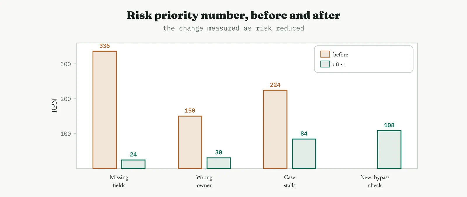
The net view is what the sponsor needs, because it counts the new mode inside the total rather than hiding it.
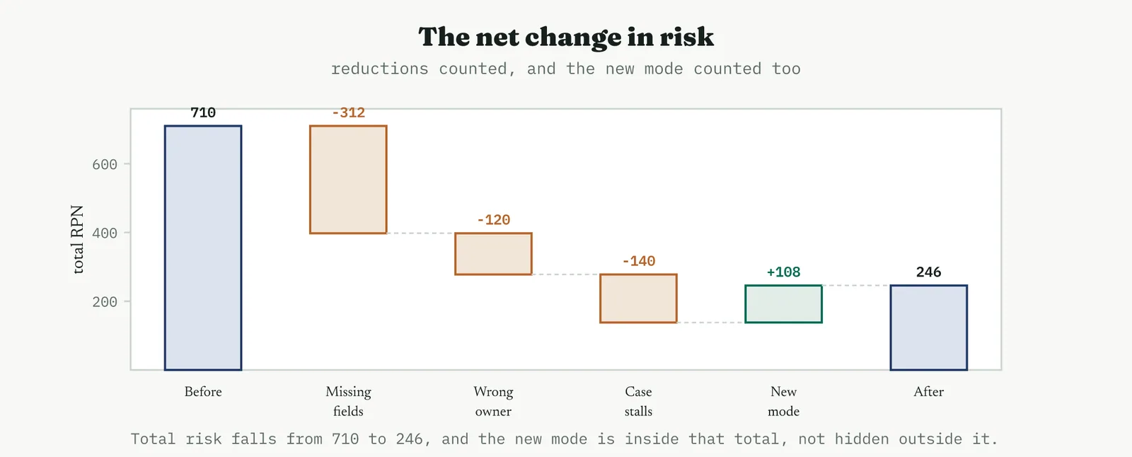
Two modes now sit at the top of a much shorter list, the case-stalls mode at 84 and the new bypass mode at 108, and both go to Control as points to monitor rather than problems to solve here. The honest headline is that total handoff risk fell from 710 to 246, a real reduction, achieved with the same staff, and that the change created one new risk which the update caught rather than buried.
05 Reading the output
THE BEFORE AND AFTER Movement, not level
Read the two analyses as a pair. The individual numbers are ordinal judgements and mean little alone, but the movement between them is the story, which modes fell, by how much, and which barely moved. A mode that dropped from the top of the list to the bottom is a solved problem. A mode that barely moved is a problem you did not actually address, whatever else the project achieved, and it needs to be named as such rather than lost in the good news.
THE NEW MODES The change is side effects
Read the new entries as closely as the reductions, because they are what an ordinary review misses. Every one of them is a risk your improvement created, and each needs a real score and a home in the control plan. A change that reduced three risks and added one it never noticed has not reduced risk by three, it has reduced it by three and added an unknown, and unknowns are exactly what fail at scale.
THE RESIDUALS What Control inherits
Read the top of the updated list as Control work, not Improve work. The modes that remain high after the change are not failures of the project, they are the honest residual that every improvement leaves, and their job now is to be monitored rather than solved in this phase. A clean handover names each residual, its score, and the detection method that will catch it, so Control starts with a list rather than a surprise.
THE DISCIPLINE What to do and not do
| Do | Do not |
|---|---|
| Re-score occurrence and detection against the real change | Lower severity to flatter the result without redesigning the effect |
| Hunt for and score the modes the change introduced | Re-score only the wins and skip the new risks |
| Read the before and after as movement | Read a single risk number as if it were absolute |
| Hand the residual high-risk modes to Control | Leave residual risks unnamed and unmonitored |
| Use judgement on high-severity modes below any threshold | Worship a risk-number threshold and miss a severe rare failure |
The tell. A trustworthy update shows occurrence and detection moving where the change touched them, severity steady where the effect is unchanged, at least one honestly scored new mode, and a residual list handed to Control. If every score improved and no new mode appeared, the update was a victory lap, not an analysis, and the risks it missed are still live.
06 Matching it to the ground
The blank page. With no prior analysis to update, the honest move is to build the first one now and treat this pass as the baseline for the next. Keep it small and real, a handful of genuine modes scored by the people who run the process, because a first analysis full of imagined failures scored by a committee teaches the organisation to distrust the tool. The point on a blank page is to establish the habit of scoring risk before and after a change.
The firefight. In a firefight the analysis is often skipped because there is no time, which is precisely when a new mode introduced by a hurried fix does the most damage. You do not need a full re-score under pressure, but you do need the new-mode question asked out loud, what did this fix just add, before the fix goes wide. A single deliberate risk question is cheap and catches the change that makes the fire worse.
The false start. A firm burned by a change that fixed one thing and broke another is exactly where the updated analysis rebuilds trust, because its whole purpose is to catch the second effect. Show the new mode you found and the score you gave it, because a team that has been bitten by side effects believes an analysis that admits them far more than one that reports only good news.
The quiet achiever. A stable process with a maintained analysis is where the update is cleanest, because the before scores are trustworthy and the movement is easy to read against a quiet background. This is the ground where the tool does exactly what it should, quantifying a real reduction and passing a short, honest residual list to Control.
07 When it goes wrong
The commonest failure is the victory-lap update, where every score improves and no new mode appears. Real changes have side effects, and an analysis that finds none has not looked. The guard is to make the new-mode hunt a required step with its own time and its own people, so that finding a new risk is treated as the analysis working rather than the project failing.
The second failure is gaming the scores, and the usual tell is a severity that dropped without the effect being redesigned. Occurrence and detection are fair to re-score because the change genuinely moved them, but severity is about what a failure does when it happens, and that is unchanged by making the failure rarer. A severity quietly lowered to pull a risk number under a threshold is a number managed rather than a risk reduced.
The third failure is threshold worship, treating the risk number as a hard gate and ignoring anything below it. A high-severity failure that is rare and usually caught can sit below any threshold and still be the one that ends up in the newspaper. The number is a way to sort attention, not a rule that excuses judgement, and a severe mode deserves a look however low its product.
The last failure is the residual that goes nowhere. An update that identifies the risks Control must watch and then files itself has done the analysis and skipped the point. Every residual high-risk mode needs to arrive in the control plan with a detection method attached, or the update was an exercise in scoring rather than a step in reducing risk.
08 What it feeds
The updated analysis feeds the control plan most directly. Every residual high-risk mode becomes a control point, and the detection score points straight at what kind of control it needs, a mode that is hard to catch needs a better detection method, not just a reminder to be careful. A control plan built from the updated analysis is targeted at the risks that actually remain, rather than monitoring everything equally and so monitoring nothing well.
It also feeds the pilot and the project close. The new modes it surfaces are things the pilot should watch for as it runs, and the before-and-after risk picture is part of the evidence the project needs to close honestly, a statement of risk reduced rather than a claim of risk removed. And the residuals it names feed the improvement register, so the risks this project chose not to solve are tracked rather than forgotten.
For Crestline the update did two jobs at once. It proved the handoff changes cut total risk from 710 to 246, real evidence for the project, and it caught the one new risk the change had created and handed it to Control with a score and a reason. That is the case for the updated analysis in one line, it is how you prove a change reduced risk without pretending it reduced only risk.
14 · Improve
14.3.14 The capability study RECOMMENDED
ISO 13053-2, capability indices. Improve, restate capability at the new level.
01 What it is and why you reach for it
A capability study asks one question in the customer language, does the process fit inside the specification. It sets the natural spread of the process, the voice of the process, against the width the customer will accept, the voice of the customer, and reports how comfortably one sits inside the other. The answer comes as a pair of indices, Cp for the spread alone and Cpk for the spread and the centring together, and as a sigma level or a defect rate for those who prefer their capability in parts per million. In Improve you run it not for the first time but again, restating the capability at the new settings against the baseline you measured before the project, so the improvement is stated in the terms the customer and the business actually use.
It earns its place because the pilot proved the change works and the capability study says how well, in a currency everyone recognises. A run chart that dropped is convincing to the team. A Cpk that rose from below zero to above one, or a defect rate that fell from one in two to one in a thousand, is convincing to the customer and the board. The study is where an internal improvement becomes an external promise, a statement about how often the process will now meet what the customer was told to expect.
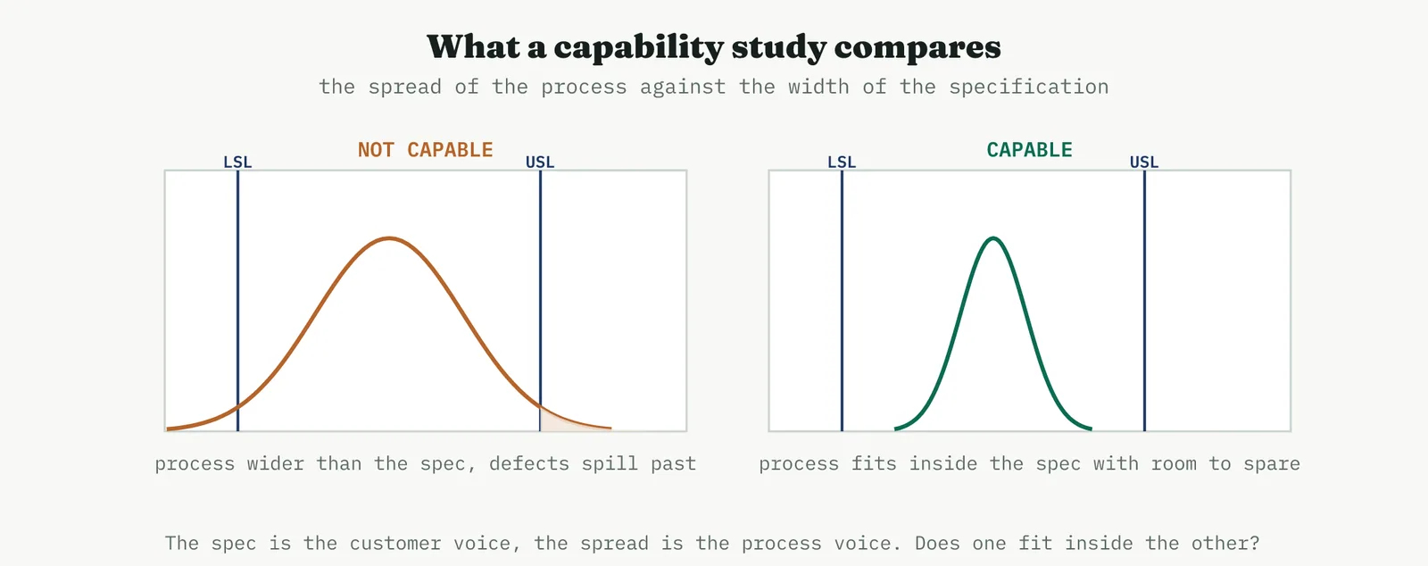
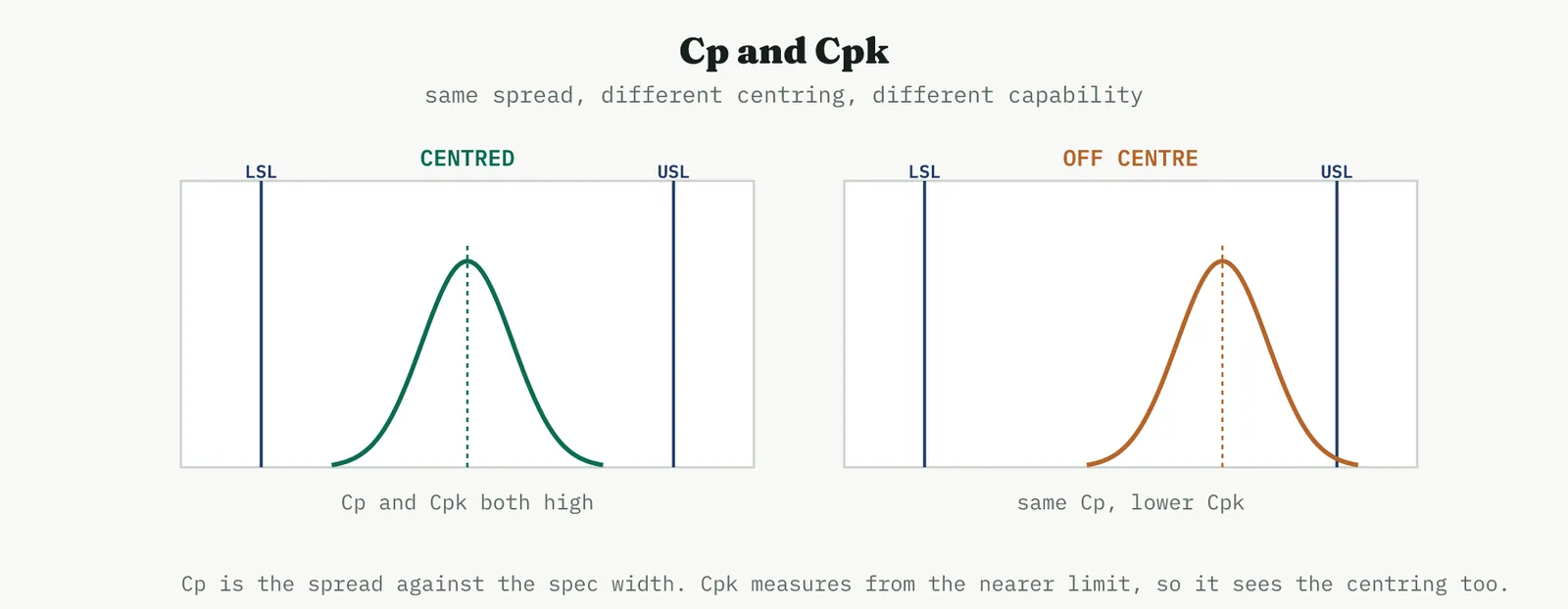
02 The arithmetic, from the ground up
The indices are simple arithmetic, a spec width divided by a spread, and the only thing that trips people, Black Belts included, is which spread goes on the bottom of the fraction. Get that one choice straight and everything else is division. So it is worth slowing right down here, because a capability number quoted without knowing which sigma is underneath it is a number nobody should trust.
THE TWO SIGMAS The one idea everything rests on
There are two honest ways to measure the spread of a process, and capability uses both. The first is the within-subgroup sigma, the short-term spread. You take small rational subgroups, a handful of consecutive cases, and measure the spread inside each one, then average those. Because the cases in a subgroup were produced close together, that spread captures only the noise present at one moment, not the drift from one day to the next. It is usually estimated from the average subgroup range divided by a constant, the familiar R-bar over d-two, and it represents the process entitlement, what the process could do if it never wandered.
The second is the overall sigma, the long-term spread. You ignore the subgroups and take the ordinary standard deviation of every point together. Because that pools cases produced hours or weeks apart, it captures every source of variation, the moment-to-moment noise and the drift and the shifts between subgroups as well. It represents the performance, what the process actually delivered over the whole study rather than what it could do on its best short run.
The within sigma is always smaller than or equal to the overall sigma, because the overall one contains a drift the within one cannot see. That single fact is the whole of what confuses people. Cp and Cpk are built on the within sigma, so they describe the short-term entitlement. Pp and Ppk are built on the overall sigma, so they describe the long-term performance. Same formulas, different sigma, different meaning.
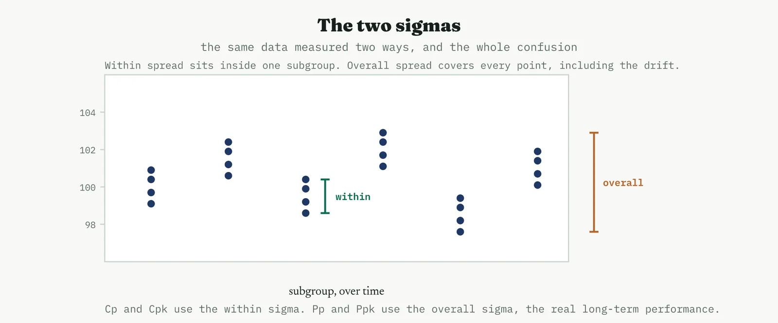
THE FOUR INDICES Two pairs, two questions
With the sigma settled, the four indices fall into two pairs asking two questions. The first question is whether the spread fits, ignoring where it sits, and that is Cp and Pp, the spec width over six sigma, which counts how many process-widths fit inside the specification. The second question is whether the spread fits and the process is centred, and that is Cpk and Ppk, the distance from the mean to the nearer limit over three sigma. The nearer limit is the point, because the customer feels the side the process is drifting towards, so an off-centre process scores lower even with the same spread.
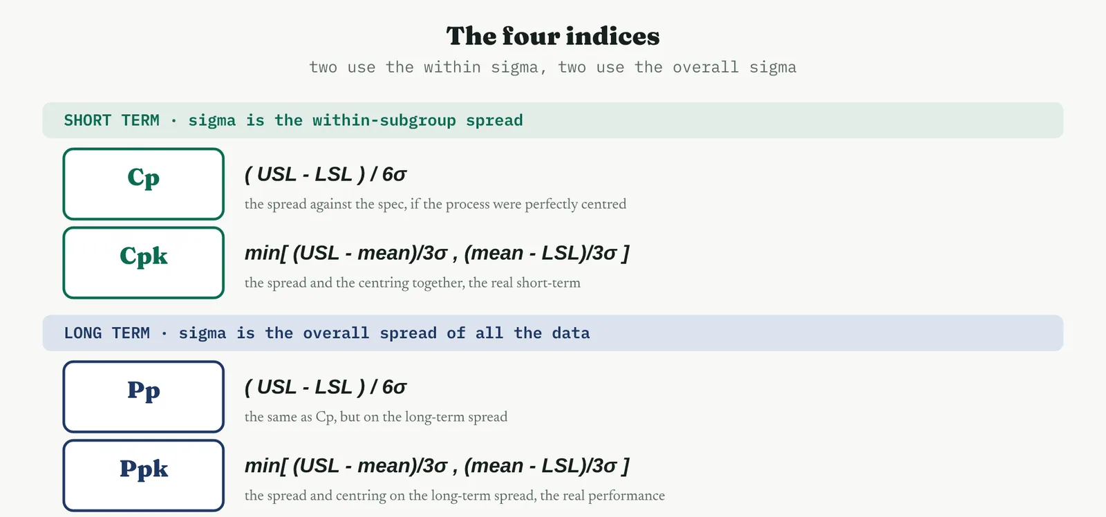
The word min in the centred versions is what makes them honest. Cpk and Ppk compute the margin to the upper limit and the margin to the lower limit and report the smaller of the two, because a process is only as capable as its worse side. When there is just one limit, as with Crestline resolution time and its five-day window, Cp and Pp are not defined at all, since there is no width to divide, and Cpk collapses to its one-sided form, the upper limit minus the mean over three sigma. A one-sided process has a Cpk and no meaningful Cp, which is worth saying because people reach for Cp out of habit and then wonder why it will not compute.
A WORKED CALCULATION Once with real numbers
Work it once with numbers and the mystery goes. Take a two-sided process, a fill weight with a lower limit of 90 and an upper limit of 110, running at a mean of 102, with a within sigma of 2.5 and an overall sigma of 3.0. All four indices come from those five numbers.
| Index | Substitution | Result |
|---|---|---|
| Cp | ( 110 - 90 ) / ( 6 x 2.5 ) = 20 / 15 | 1.33 |
| Cpk | min[ ( 110 - 102 ) / 7.5 , ( 102 - 90 ) / 7.5 ] = min[ 1.07 , 1.60 ] | 1.07 |
| Pp | ( 110 - 90 ) / ( 6 x 3.0 ) = 20 / 18 | 1.11 |
| Ppk | min[ ( 110 - 102 ) / 9.0 , ( 102 - 90 ) / 9.0 ] = min[ 0.89 , 1.33 ] | 0.89 |
Now read the four together, because separately they mislead. Cp at 1.33 says the spread would fit comfortably inside the spec if the process were centred. Cpk at 1.07 says it is not centred, it sits high, so the upper limit is the nearer one and the real short-term margin is smaller than the spread alone suggested. Pp at 1.11 and Ppk at 0.89 are both lower than their within counterparts, because the overall sigma is larger, and that tells you the process drifts over time. The honest headline is the Ppk of 0.89, below one, which says that as actually operated over the long run, this process is not capable, however good its short-term entitlement looks.
WHAT THE GAPS MEAN The diagnosis lives in the differences
The single indices matter less than the gaps between them, because each gap is a diagnosis. The gap between Cp and Cpk is centring, a large gap means the spread is fine and the process is simply off centre, which is usually the cheapest fix there is, a setting moved rather than variation reduced. The gap between Cpk and Ppk, equivalently between Cp and Pp, is stability, a large gap means the process drifts between subgroups so the long-term spread is wider than the short-term, and the within-based numbers are flattering it.
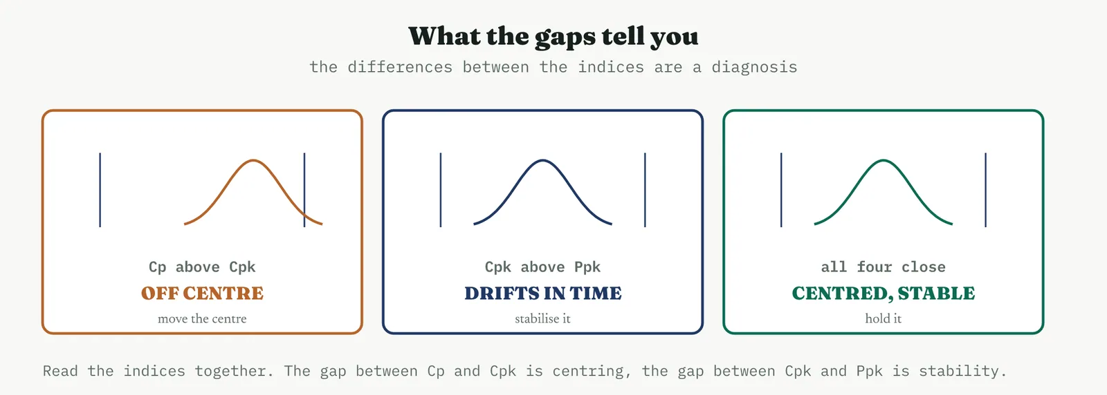
When all four indices sit close together, the process is centred and stable, and you can let a single index speak for it. When they spread apart, no single number is safe, and the shape of the spread tells you what to fix first, the centre if the Cp to Cpk gap is the wide one, the stability if the Cpk to Ppk gap is. This is why a report that quotes only Cpk is hiding half the story, and why a serious capability study reports all four.
THE LINK TO SIGMA LEVEL Where the sigma number comes from
The sigma level people quote is the same fact in another currency. The short-term capability relates to it directly, the benchmark Z is three times Cpk, so a Cpk of one is a three-sigma process in the short term and a Cpk of two is the six-sigma process the method is named for. The familiar shift of one and a half sigma is the rule of thumb that converts that short-term Z into the long-term sigma level usually quoted, acknowledging that a process drifts by about that much over time. You do not need the algebra to use the indices, but knowing the link stops the Cpk and the sigma level feeling like two unrelated numbers, when they are two views of one thing.
03 Setting up the study
THE CHECKS FIRST Stable and normal, or nothing
A capability index is only meaningful on a process that is stable and roughly normal, and both must be confirmed before the number is calculated, not after. Capability on an unstable process is a fiction, because the spread you measure is not the spread the process will show tomorrow, and an index built on it predicts nothing. Non-normal data breaks the arithmetic that turns a spread into a defect rate, so a skewed response is either transformed or handled with a method built for its shape. These are not formalities to rush through, they are the difference between a capability number that means something and one that merely looks precise.
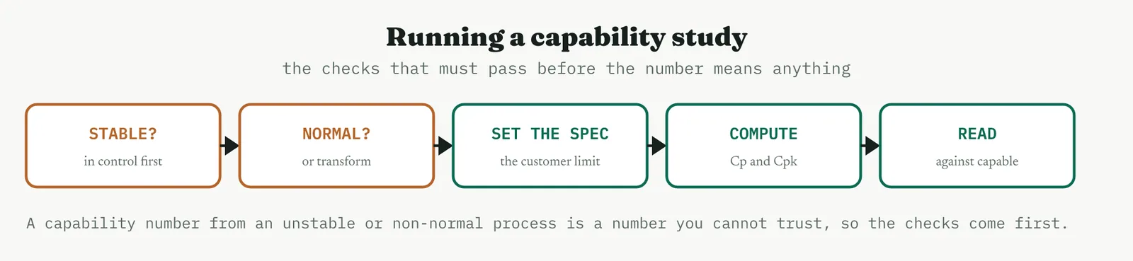
THE SPECIFICATION The real customer limit
The specification is the customer requirement, not an internal target dressed up as one, and getting it right is half the study. A process can be a fixed upper limit, a fixed lower limit, or both, and Crestline resolution time has just one, an upper limit of five business days, because a customer cares that a case is resolved quickly and not that it took at least so long. Set the limit to what the customer actually requires, because a capability number is only as honest as the specification behind it, and a flattering limit produces a flattering index that the customer will not recognise.
04 Running it and reading the index
With the checks passed and the specification set, the study is quick.
1 Confirm the process is in control, using the same control logic Control will use to hold it.
2 Confirm the data is roughly normal, or transform it, so the spread converts honestly to a defect rate.
3 Set the specification limits to the real customer requirement, upper, lower, or both.
4 Compute Cp and Cpk from the process spread and its distance from the nearer limit.
5 Read the index against the capability bands, and translate it to a sigma level or defect rate for the business.
Reading the index is a matter of knowing the bands. A Cpk below one is not capable, the process spread reaches past the limit and defects are routine. Between one and about one and a third is marginal, capable on paper but with no room for the process to drift. Above one and a third is capable with a margin, and above about one and two-thirds is excellent. Cp and Cpk read together tell you where to act, because a good Cp with a poor Cpk means the spread is fine and the process is simply off centre, which is often the cheapest improvement there is, a setting moved rather than a variation reduced.
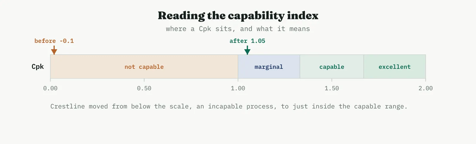
05 Crestline worked example
Crestline ran the study on resolution time against the customer window of five business days, the single upper limit that matters to a client waiting on a complaint. The baseline was stark. With a mean of six days and a wide spread, the process mean sat beyond the limit itself, so the capability index was negative, and well over half of all cases breached the five-day window. This is what a sigma level of one and a half looks like in the customer language, a process that misses more often than it meets.
After the change, the same study on the piloted process told a different story. The mean had moved to under four days and the spread had tightened, so the distribution now sat inside the window with a small tail crossing it. The histograms show the shift directly.
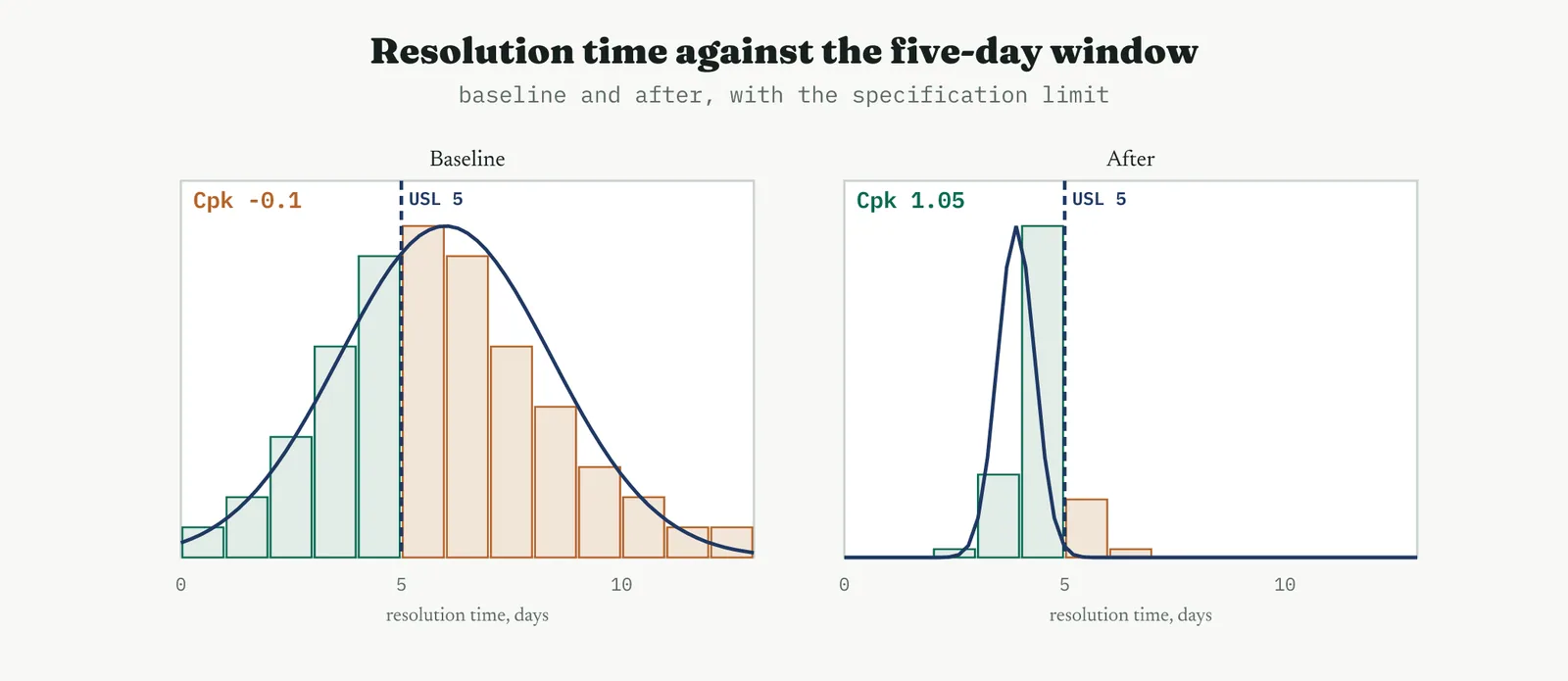
In numbers, the study read as follows, and it is the after column that goes to the customer.
| Measure | Baseline | After |
|---|---|---|
| Mean resolution, days | 6.0 | 3.9 |
| Capability, Cpk (within) | -0.1 | 1.05 |
| Performance, Ppk (overall) | -0.1 | 0.92 |
| Cases beyond five days | about 65% | under 0.1% |
| Process sigma | about 1.5 | about 4.5 |
The honest reading is a large gain with a caveat. Cpk moved from below zero to just above one, which is a process that went from missing routinely to meeting reliably, and the breach rate fell from roughly two cases in three to fewer than one in a thousand. But a Cpk of about one is only marginally capable, capable on paper with no room to drift. The gap between the Cpk of 1.05 and the Ppk of about 0.9 is itself a finding, it says the process still drifts a little from week to week, exactly what the reliability run hinted, so the long-term performance is just under capable. That is precisely why the process now goes to Control to be held there, and why there is honest room to improve it further rather than declare it finished.
06 Reading the output
THE HISTOGRAM The picture against the limit
Read the histogram against the specification line first, before any index, because the picture tells you what the number will say. A distribution sitting well inside the limits with the tails clear is a capable process, and no index will contradict a clean picture. A distribution whose tail crosses a limit is where the defects live, and the shape of that crossing, a fat tail or a whole distribution shifted across, tells you whether your problem is spread or centring before you compute a thing.
Cp AGAINST Cpk Spread or centring
Read the two indices together, because their gap is a diagnosis. When Cp is healthy but Cpk is poor, the spread is fine and the process is merely off centre, and the fix is to move the centre, often a single setting, which is the cheapest capability gain available. When Cp and Cpk are both poor, the spread itself is too wide, and no amount of centring will save it, the variation has to come down. Reporting only Cpk hides this distinction and with it the cheapest improvement on the table.
THE SIGMA LEVEL The business currency
Translate the index to a sigma level or a defect rate when you take it upward, because a Cpk means little to a board and a defect rate means everything. Moving from one and a half sigma to four and a half, or from a defect rate of one in two to one in a thousand, is the same fact as a Cpk rising from below zero to one, said in the language the business rewards. Keep the index for the engineers and the sigma for the sponsor, and do not confuse the audiences.
THE DISCIPLINE What to do and not do
| Do | Do not |
|---|---|
| Confirm stability and normality before computing anything | Compute a capability index on an unstable or skewed process |
| Set the specification to the real customer requirement | Use a flattering internal target as the specification |
| Read Cp and Cpk together to separate spread from centring | Report Cpk alone and miss a cheap centring fix |
| Treat marginal capability as a reason for tight control | Treat a Cpk threshold as a finish line and stop improving |
| Report the sigma or defect rate to the business | Hand a board a bare index it cannot interpret |
The tell. A capability number you can trust comes from a process shown to be stable and normal, against a specification the customer would recognise, with Cp and Cpk reported together. If the index was computed on an unstable process, or the specification was an internal target, or only Cpk was shown, treat the capability as unproven, because a capability claim is a promise to the customer and a soft one fails in public.
07 Matching it to the ground
The blank page. With no prior study, the first capability number is the baseline everything later is measured against, so compute it honestly even when it is embarrassing. A capability of one and a half sigma stated plainly is not a failure of the study, it is the starting line, and a firm that sees its real capability written down is a firm ready to improve it. The point on a blank page is to establish the number, not to flatter it.
The firefight. In a firefight the process is by definition unstable, so a capability index computed now is meaningless, and reporting one is worse than saying nothing because it invites a false sense of control. Stabilise first, then measure capability, because the whole method rests on a spread that will still be there tomorrow, and a firefight has no such spread. The honest move is to say the process is not yet stable enough to have a capability.
The false start. A firm that was once shown a flattering capability number that reality then contradicted is exactly where a disciplined study rebuilds trust. Show the stability check, show the real specification, and report the sigma alongside the index. The false start almost always came from a number computed on a process that was not ready, and the answer is to make the readiness checks visible before the number appears.
The quiet achiever. A stable, well-measured process is where capability reads cleanest and where the study delivers exactly what it promises, a trustworthy index against a real limit. This is the ground where a marginal capability can be pushed to a comfortable one through ordinary improvement, and where the habit of restating capability after every change becomes part of how the place runs.
08 When it goes wrong
The commonest failure is capability computed on an unstable process. The index looks precise, but it describes a spread that will not hold, so it predicts nothing and misleads everyone who trusts it. The guard is absolute, confirm control before you compute capability, every time, and if the process is not stable, say so rather than reporting a number that cannot mean what it appears to mean.
The second failure is ignoring the shape of the data. The arithmetic that turns a spread into a defect rate assumes a roughly normal distribution, and a skewed process, common in service times that cannot go below zero but can run long, breaks that arithmetic quietly. A capability index on untransformed skewed data can be badly wrong in either direction, so the normality check is not optional, it is part of the calculation.
The third failure is the flattering specification. When the limit used is an internal target rather than the real customer requirement, the resulting index describes how well the process meets a bar the customer never set. It reads well internally and fails the moment a customer applies their own limit, so the specification must be the real one, even when the real one makes the number worse.
The last failure is the threshold as a finish line. Treating a Cpk of one, or one and a third, as the end of improvement stops the work at the point where it was merely acceptable. Capability is a scale, not a gate, and a marginally capable process is one drift away from incapable, so it deserves tight control and, usually, further improvement rather than a declaration of victory.
09 What it feeds
The capability study feeds Control most directly, because the capability it measures becomes the baseline the control plan is built to hold, and a marginal capability is itself an instruction, it tells Control that this process has no room to drift and must be watched closely. The stability check the study depends on is the same control logic Control will use, so a capability study done properly has already specified much of how the process must be monitored.
It also feeds the project close and any further improvement. The before-and-after capability, stated as a sigma level or a defect rate, is the headline result the project reports, the improvement in the customer language rather than the team language. And where the capability landed only at marginal, the study feeds the improvement register a clear next target, because a process proven capable but with no margin is a candidate for the next cycle rather than a closed case.
For Crestline the study turned a proven pilot into a stated promise. It showed a process that had missed the five-day window more often than it met it now meeting it all but always, a move from one and a half sigma to about four and a half, and it did so against the customer real limit rather than a friendly internal one. It also said, honestly, that the new capability is only marginal, which handed Control a clear brief and the programme a clear next target. That is the case for the study in one line, it is where an improvement becomes a capability the customer can be promised.
14 · Improve
14.3.15 The RACI for the rollout SUGGESTED
ISO 13053 deployment aid. Improve, assign responsibility for the rollout.
01 What it is and why you reach for it
A RACI is a responsibility assignment matrix, a grid with the tasks down one side and the people across the top, and in each cell one of four letters that says how that person relates to that task. Responsible means they do the work. Accountable means they own the outcome, and there is one and only one of these on every task. Consulted means they are asked before the work, in a two-way conversation. Informed means they are told after it, in a one-way notice. Reach for it at the rollout, the moment a proven change stops being a project and starts being spread across teams who were not in the room when it was built.
It earns its place because rollouts rarely fail on the merits of the change. They fail on ownership. A task that everyone assumed someone else had, a system field nobody was clearly asked to update, a team that was informed when it should have been consulted, these are how a change that worked in the pilot dies in the deployment. The RACI is a cheap, blunt instrument against exactly that failure, because it forces the question every rollout needs answered out loud, for each task, who owns it, who does it, who is asked, and who is merely told.
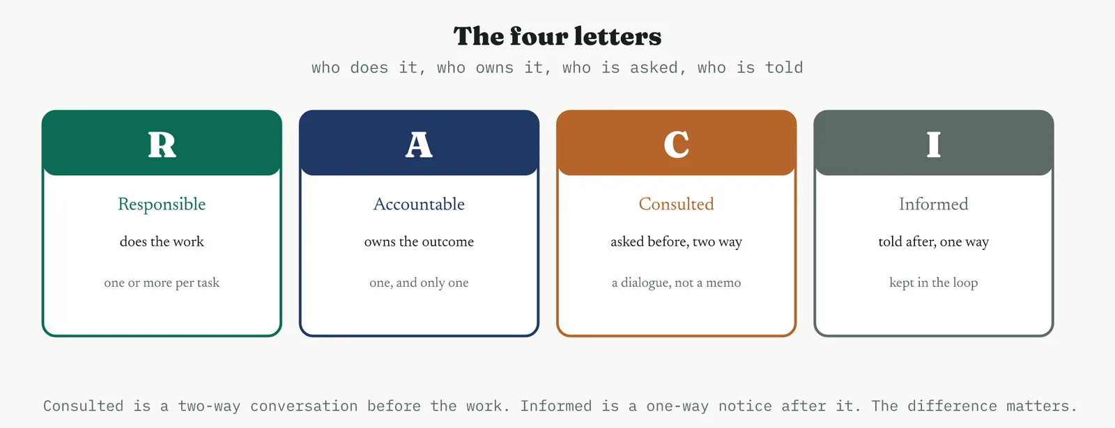
02 Setting up the matrix
THE ROWS AND COLUMNS Tasks and people
The rows are the rollout activities, and the right grain matters. Too coarse, a single row for roll it out, and the matrix says nothing. Too fine, a row for every email, and nobody reads it. The useful grain is the handful of activities that actually need an owner, train the teams, update the system, embed the check, monitor the first month, sign it off. The columns are the roles or people who touch those activities, named specifically enough that a real person can be pointed to, because a matrix that assigns a task to a department assigns it to no one.
THE RULES What makes a matrix valid
A RACI that breaks its own rules is worse than none, because it looks like clarity while delivering confusion. The rules are few and they are not negotiable.

The rule that carries the most weight is the single A. Two people accountable for one task means neither is, because each can point at the other when it slips, and no one accountable means the task belongs to the gaps between people, which is where rollouts go to die. Before anything else, every row gets exactly one A, and that discipline alone prevents most rollout failures.
03 Running it
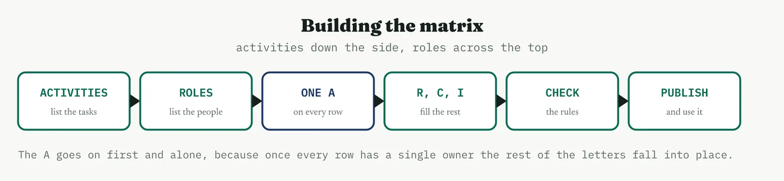
1 List the rollout activities as rows, at the grain where each genuinely needs an owner.
2 List the roles or named people who touch those activities as columns.
3 Assign the single A on every row first, and alone, before any other letter goes down.
4 Fill in the R, the C and the I, keeping consulted for real two-way input and informed for genuine notice.
5 Check the rules, one A and at least one R per row, no all-I row, no all-A column, then publish it and actually use it.
The order matters more than it looks. Assigning the accountable person first, row by row, before the responsible and the consulted, forces the hard conversation to the front, where it belongs. Once every task has a clear owner, the rest of the letters tend to fall into place, because the owner knows who does the work and who needs asking. Fill the grid in any other order and you end up negotiating ownership last, after the easy letters have already muddied the picture.
04 Crestline worked example
Crestline built a RACI to take the standard handoff pack wide, across all the account-management teams rather than the one that piloted it. Five activities needed owners, and five roles touched them, the sponsor Renu, the process owner Geoff, the team lead Asha, the belt, and IT.
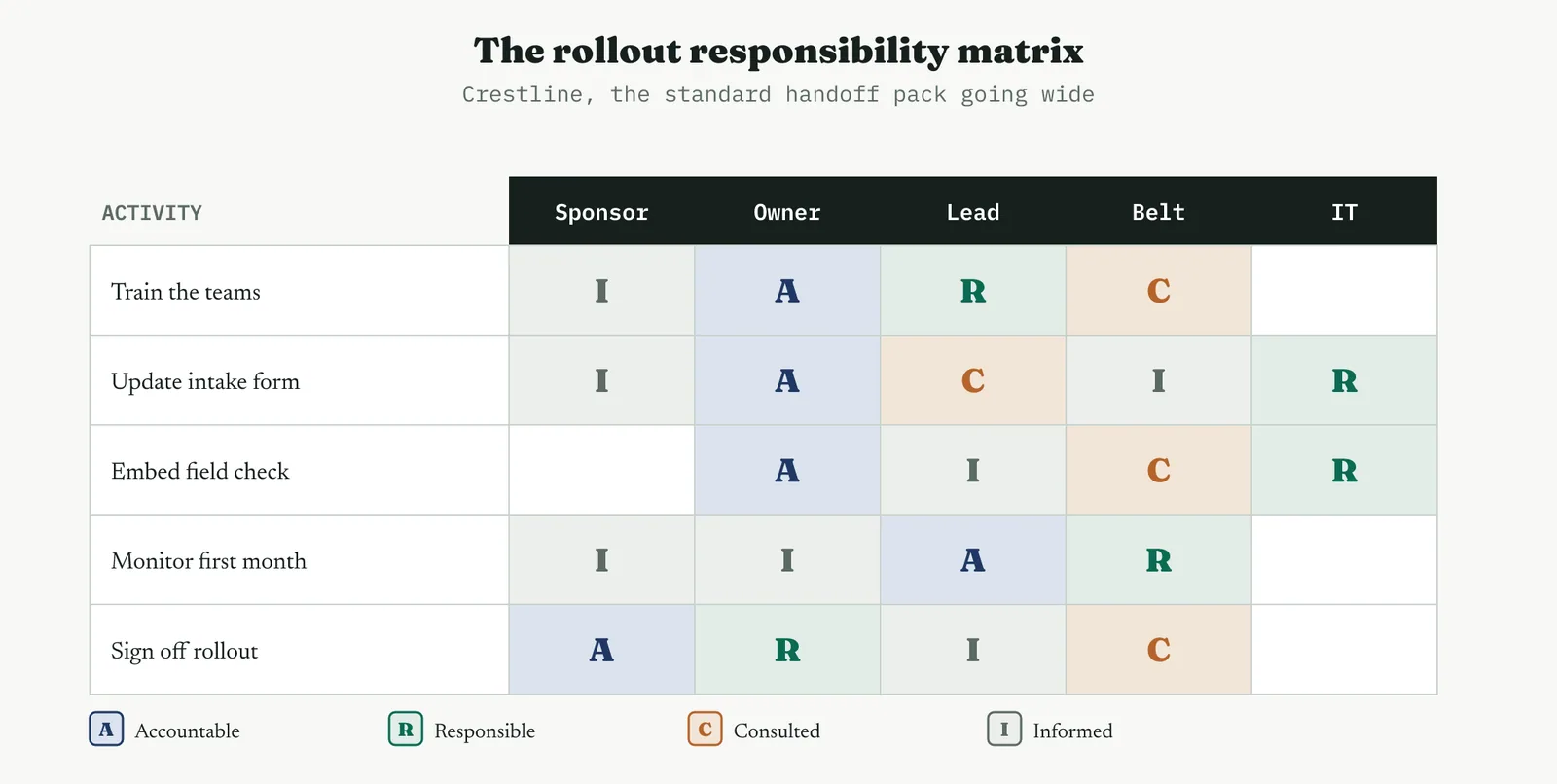
Read across the rows and the ownership is clear. Geoff, the process owner, is accountable for the three build activities, training, the form, and the system check, which is appropriate because he owns the process they change. Asha runs the training as the responsible party and is accountable for the first-month monitoring, the task closest to the teams she leads. IT is responsible where the system is touched. The belt is consulted throughout but accountable for nothing, which is right, because the belt advises the rollout rather than owning it. Renu signs the rollout off, the single decision that belongs to the sponsor.
Read down the columns and the load is sensible. Geoff carries three of the five accountabilities, which the column scan flags for a look, and here it is the correct concentration because he owns the process, but on a larger rollout that same pattern would be the warning of a bottleneck to spread. No column is all informed, so no one is a spectator, and no task sits without an owner. The matrix took twenty minutes to build and settled the questions that otherwise surface, expensively, halfway through a rollout.
05 Reading the output
THE TWO SCANS Rows then columns
A RACI is read in two passes. Scan every row first for exactly one A, because a row with none or with two is the fault that matters most, and it is invisible until you look for it. Then scan every column for a person buried in accountabilities, because one name against a stack of A letters is a bottleneck who will become the rollout single point of failure. Those two passes, across then down, catch almost every problem a matrix can have.
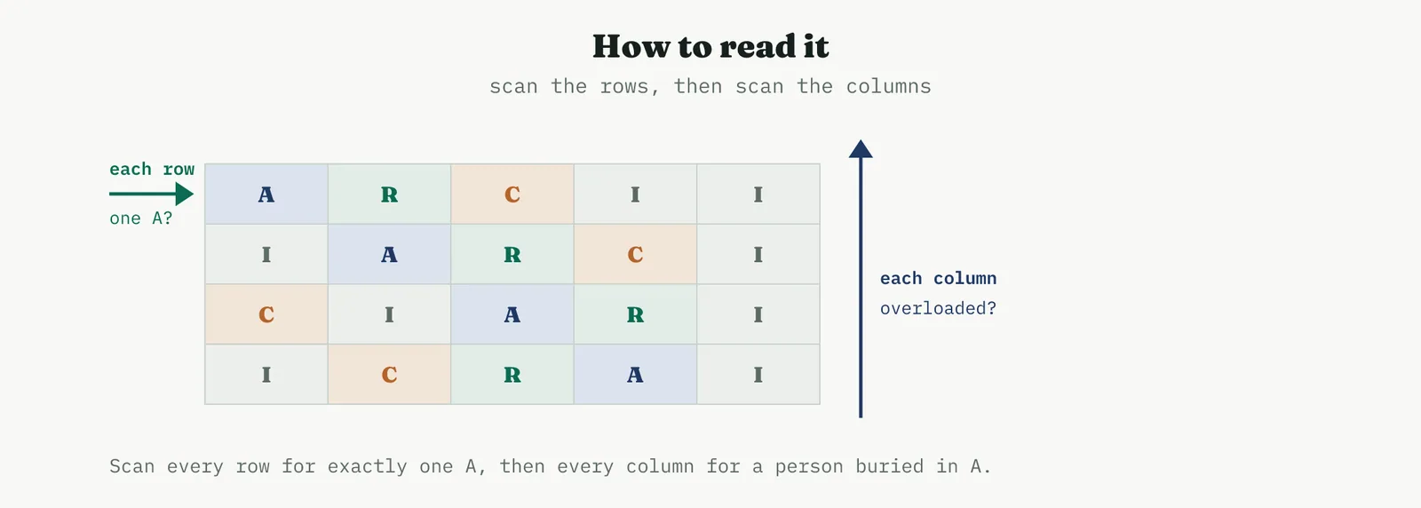
THE FAILURE PATTERNS What the scans reveal
Certain shapes are always trouble. A row of nothing but I means a task everyone is told about and no one owns. A row with two A letters means an accountability that will be dodged from both sides. A column of all A against one name means a person who cannot possibly own everything they have been given. And a matrix thick with C, everyone consulted on everything, means a rollout that will move at the speed of its slowest conversation. Reading for these patterns is the whole skill, and it takes a minute once you know the shapes.
THE DISCIPLINE What to do and not do
| Do | Do not |
|---|---|
| Put exactly one A on every row, and put it there first | Leave a row with no accountable owner or with two |
| Name specific people or roles a person can be pointed to | Assign a task to a whole department and call it owned |
| Keep Consulted for genuine two-way input | Consult everyone on everything and stall the rollout |
| Publish the matrix and use it to run the rollout | Build the matrix once and file it unread |
| Scan columns for anyone overloaded with accountability | Ignore a single name buried under a column of A letters |
The tell. A working RACI has exactly one A on every row, at least one R, no column of all A, and it is visibly used to run the rollout rather than filed. If a row has no clear owner, or one name carries every accountability, or the grid is a wall of C, the matrix is decoration, and the rollout it is supposed to guide will fail on the ownership it failed to settle.
06 Matching it to the ground
The blank page. Early on, a RACI is a gentle way to introduce the idea that tasks have owners, which a young improvement culture often lacks. Keep it to a handful of rows and real names, and let the single-A rule do its quiet work of ending the everyone-and-no-one ownership that blank-page organisations run on. The point is less the matrix than the habit of naming an owner for each thing that must happen.
The firefight. In a firefight ownership is usually the very thing that has collapsed, with everyone doing everything and nothing owned, so a quick RACI on the few tasks that matter can restore order faster than almost anything else. Keep it to the essential activities and assign the accountable owners out loud, because in a firefight the value is not the document but the moment where each critical task gets a single name against it.
The false start. A firm whose last rollout failed because nobody owned the follow-through is exactly where a visible RACI rebuilds confidence. Show the single owner on every row, and show that the sign-off has a name, because the false start almost always came from a change that was deployed into a fog of shared responsibility. Making the ownership explicit is the direct answer to the vagueness that sank the last attempt.
The quiet achiever. A well-run process rolling out a further improvement uses a RACI almost as a formality, because the ownership is already clear, and that is fine, the matrix simply confirms and records what everyone already knows. Its value here is in the handover, giving Control a written record of who owns each part of the changed process rather than relying on a shared understanding that fades as people move on.
07 When it goes wrong
The commonest failure is the accountability rule broken, a row with no A or with two. Both destroy the point of the matrix, because an unowned task falls through the gap and a doubly-owned one is disowned from both sides. The guard is to assign the single A on every row first and to check for it last, treating any row that fails the rule as unfinished rather than as a matter of judgement.
The second failure is consulting everyone. A matrix where every task carries a column of C letters looks thorough and moves like treacle, because nothing proceeds until everyone has been round the conversation. Consulted is expensive, a genuine two-way input that slows the work, and it should be spent only where the input is genuinely needed. Most people on most tasks are Informed, and treating them as Consulted is how a rollout stalls in meetings.
The third failure is confusing Accountable with Responsible, usually by making the most senior person accountable for everything out of deference. Accountable is not the most important person, it is the one who will answer for the task, and it belongs with whoever can actually own the outcome, which is often not the senior name. A matrix that makes the sponsor accountable for tasks they cannot influence has recorded a hierarchy, not an ownership.
The last failure is the matrix that is built and never used. A RACI made in a workshop and filed has cost the time and delivered nothing, because its value is entirely in being the thing the rollout is run against. It has to be visible, referred to when a question of ownership arises, and updated when the rollout changes, or it is an artefact rather than a tool, clarity that was written down once and then abandoned.
08 What it feeds
The RACI feeds the rollout schedule directly, because a Gantt chart of the deployment needs an owner against every scheduled task, and the matrix has already settled who that is. The two documents are complementary, the Gantt says when and the RACI says who, and a rollout planned with both is far harder to derail than one planned with either alone. Where the schedule and the matrix disagree, the disagreement is itself useful, it surfaces a task that was scheduled without an owner or owned without a slot.
It also feeds the Control phase and the handover to operations. Every ongoing control the changed process needs has an owner, and the RACI is where that ownership is recorded, so the control plan inherits a clear line of responsibility rather than a hope that someone will watch each thing. And when the project closes and the team disperses, the matrix is the record that tells the standing organisation who now owns each part of the changed process, which is the difference between a clean handover and a slow forgetting.
For Crestline the matrix did an unglamorous but decisive job. It turned a proven change into a deployment with a named owner for every task, settled in twenty minutes the questions that otherwise surface expensively mid-rollout, and handed Control a written record of who owns what. That is the case for the RACI in one line, it is how a change that worked in one team is spread to many without dying in the gaps between people.
14 · Improve
14.3.16 The house of quality RECOMMENDED
ISO 13053-2, quality function deployment. Improve, tie the changes to the voice of the customer.
01 What it is and why you reach for it
Quality function deployment is a way of making sure the changes you are about to roll out are the ones the customer actually values, and the house of quality is its central tool. It puts the voice of the customer down the left as a list of needs, the WHATs, each weighted by how much it matters. It puts the process characteristics you can change across the top, the HOWs. And in the matrix between them it scores how strongly each HOW serves each WHAT, so that when you weight the scores by the importance of the needs, a priority falls out for every change. The roof on top records how the HOWs interact, which ones reinforce each other and which pull against each other.
It earns its place in a rollout because it answers a question that is easy to skip, are we changing the things the customer cares about, or the things we found easiest to change. A house of quality forces the improvement back onto the customer voice and prioritises the changes by that voice rather than by whoever argued hardest in the room. It also exposes two failures no list of solutions can, a customer need that nothing you are doing addresses, and a change you are making that serves no stated need at all.
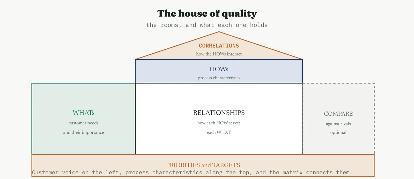
02 Setting up the house
THE ROOMS What goes where
The house has a fixed set of rooms and each holds one thing. The left wall is the WHATs, the customer needs, each with an importance weight. The top is the HOWs, the process characteristics you can set or change. The large centre is the relationship matrix, where each cell scores how strongly a HOW serves a WHAT. The triangular roof holds the correlations between the HOWs. The right wall, often left out, is the competitive assessment, how you compare with rivals on each need. And the floor is the output, the priorities and the targets. You do not need every room, but you always need the left wall, the top, and the centre.
NEEDS, NOT SOLUTIONS The commonest setup error
The single most common way a house of quality goes wrong is at the very start, by putting solutions in the WHATs. A customer need is something the customer wants, resolved quickly, kept informed. A single case owner is not a need, it is a HOW, a thing you do that might serve a need. When a solution sneaks into the left wall the whole house collapses into a tautology, because you end up scoring how well your solution serves your solution. Keep the WHATs in the customer language, wants and outcomes, and keep every mechanism on the top where it belongs.
THE SCALE Why nine, three and one
The relationship scale is deliberately non-linear, the strongest relationship scoring ten, a strong one seven, a fair one four, a weak one just one, and a blank zero. The jumps are large on purpose, so that a genuinely strong relationship dominates the priority sum and a scatter of weak ones cannot outweigh it. This is what stops the house rewarding a HOW that is vaguely related to everything over one that powerfully serves the things that matter, and it is why you resist the urge to soften the scale into a gentle one, two, three.
03 Running it
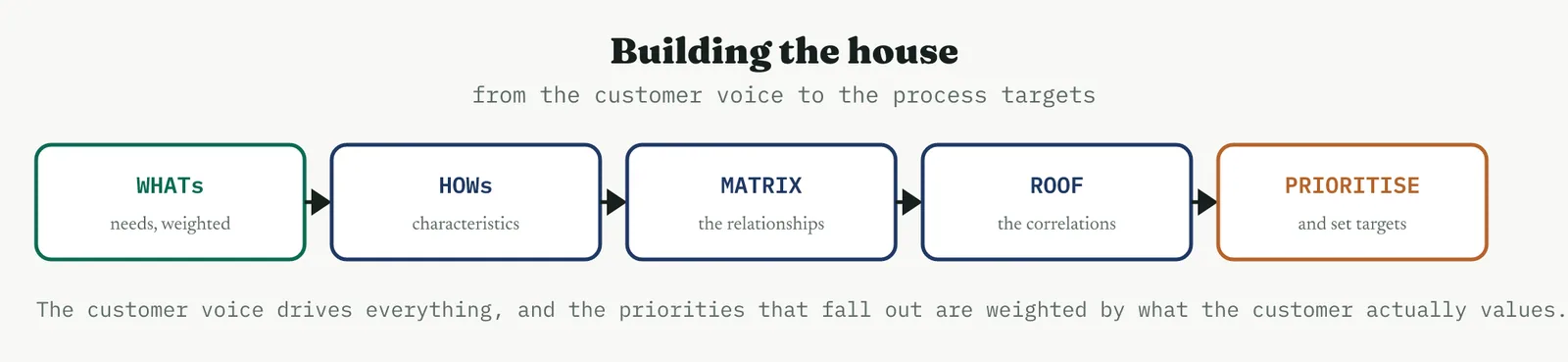
1 Gather the customer needs as WHATs, in the customer own words, and weight each by importance.
2 List the process characteristics you can change as HOWs across the top.
3 Score each cell of the matrix, strongest ten, strong seven, fair four, weak one, blank for none.
4 Fill the roof, marking which HOWs reinforce each other and which conflict.
5 Compute each HOW priority as the sum of the need weight times the relationship score, then set targets and read the result.
The arithmetic of the priority is simple and worth doing by hand once. For each HOW you run down its column, multiply each relationship score by the weight of the need on that row, and add them up. A HOW that strongly serves two heavily weighted needs will tower over one that weakly serves several light ones, which is exactly the discrimination you wanted. The result is not a precise number to be defended to a decimal, it is a ranking, a clear statement of which changes carry the most customer value.
04 Crestline worked example
Crestline built a house of quality to check that the complaint-process changes were aimed at what customers actually wanted. Five needs went down the left, weighted, resolved fast at five, right the first time at five, kept informed at three, not made to repeat myself at four, and treated with care at three. Five changes went across the top, the single owner, the required fields, the handoff pack, the status updates, and the resolution-time target.
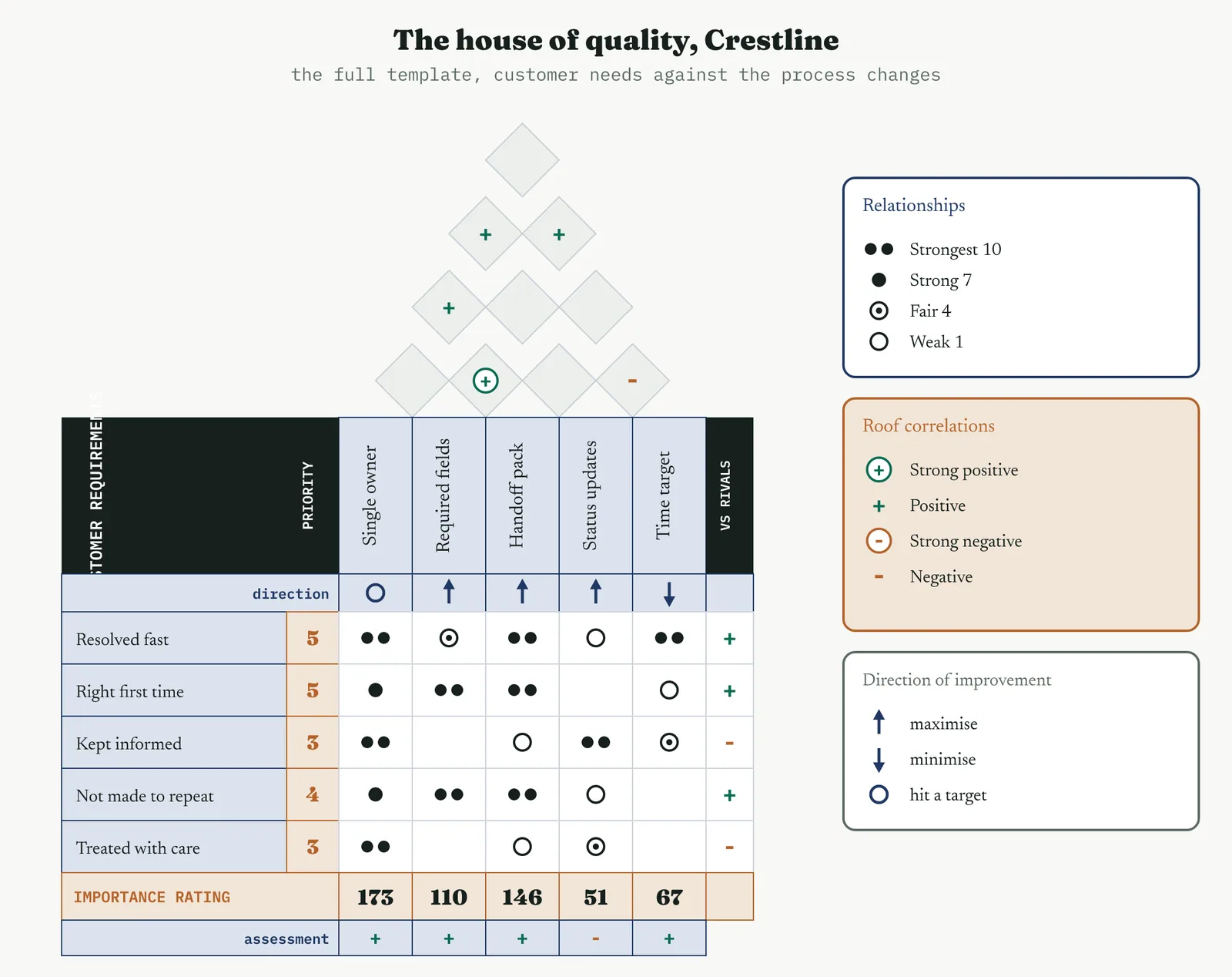
The full house carries more than the central grid. The direction-of-improvement row records whether each change should be pushed up, driven down, or held to a target, a single owner is a nominal-is-best setting while resolution time is driven down. The importance rating along the foot sums the weighted scores into a priority for each change, and the right-hand column notes how Crestline compares with rivals on each need. The roof, the relationships, and that importance rating are the rooms that do the work.
The central grid filled in much as the team expected but with the weightings made explicit. The handoff pack and the required fields strongly serve getting it right the first time and not making the customer repeat themselves. The single owner strongly serves nearly everything, including being kept informed and treated with care. The roof shows the fields and the pack reinforcing each other strongly, the owner and the status updates reinforcing, and one mild conflict, proactive updates cost a little of the time that the resolution target is trying to protect.
Weighted and summed, the priorities ranked the changes by customer value, and the order is the point.
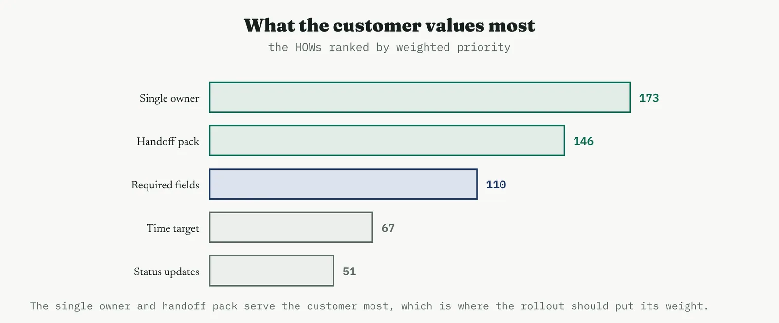
The single owner scored 173 and the handoff pack 146, clear of the required fields at 110, the resolution target at 67, and the status updates at 51. The house confirmed what the earlier prioritisation had suggested, that the owner and the pack were the changes to lead with, and it did so from the customer voice rather than from internal judgement. It also flagged the status updates as low in customer priority despite feeling important internally, a useful correction, and it showed no empty row, so every customer need was served by something.
05 Reading the output
THE GAPS Empty rows and empty columns
Read the matrix for its empty spaces first, because they are the most valuable thing in it. An empty row is a customer need that nothing you are doing addresses, a gap in the improvement that no list of solutions would have revealed, and it demands either a new HOW or an honest decision to leave that need unmet. An empty column is a change that serves no stated need, a HOW that survived on habit or politics rather than value, and it is a candidate to cut. The house earns its keep in these two readings alone.
THE ROOF Reinforcement and conflict
Read the roof for the conflicts especially. Two HOWs that reinforce each other are good news, you can push both and they help each other. Two that conflict are a trade-off you must manage rather than wish away, and naming it in the roof is what stops it ambushing you during the rollout. The Crestline conflict between status updates and the resolution target is small, but it is real, and a team that has seen it in the roof will handle it deliberately rather than be surprised when chasing one metric nudges the other.
THE PRIORITIES A ranking, not a verdict
Read the priorities as a ranking that tells you where to put your weight, not as a precise score to defend. The value is in the order and the gaps between, the pack and the owner clearly ahead, the updates clearly behind, and that shape is robust to small changes in the weights and scores. If the ranking flips every time someone nudges a weight, the needs were too close in importance to separate, and the honest reading is that those changes matter about equally.
THE DISCIPLINE What to do and not do
| Do | Do not |
|---|---|
| Keep the WHATs as customer needs in customer language | Slip a solution into the WHATs and score it against itself |
| Use the non-linear ten, seven, four, one scale | Flatten the scale so weak links outweigh strong ones |
| Read the empty rows and columns as findings | Fill every cell to avoid the discomfort of a gap |
| Name the roof conflicts and manage them | Ignore the roof and be ambushed by a trade-off later |
| Treat the priorities as a robust ranking | Defend a priority score to the decimal point |
The tell. A house that helps has customer needs on the left, a non-linear scale in the middle, at least one empty cell somewhere, and a priority ranking that is stable when you jiggle the weights. If the left wall is full of solutions, or every cell is filled, or the ranking flips at a touch, the house is decoration, and the rollout it is meant to aim will be aimed by something other than the customer voice.
06 Matching it to the ground
The blank page. Early on, a small house of quality is a powerful way to show an organisation that improvement can be driven by the customer rather than by internal opinion. Keep it to a handful of needs and changes, and let the priorities fall out of the weights, because the lesson worth teaching is that the customer voice, made explicit and weighted, settles arguments that opinion cannot. The point is the discipline of starting from the customer, not the size of the matrix.
The firefight. In a firefight there is rarely time for a full house, and forcing one is a poor use of a crisis. But the core question it asks, are we fixing what the customer actually cares about, is worth asking even at speed, because a firefight is exactly where teams reach for the change that is easiest rather than the one that matters. A quick, rough ranking of needs against fixes can redirect a panicked response toward the customer in minutes.
The false start. A firm whose last improvement solved an internal irritation that no customer had noticed is exactly where a house of quality rebuilds direction. Show the customer needs on the left and the weights against them, and let the priorities expose whether the proposed changes serve the customer or the organisation. The false start almost always came from a solution in search of a problem, and anchoring the work to the weighted customer voice is the direct cure.
The quiet achiever. A well-run process refining an already good service uses the house of quality to find the next increment of customer value, and here its power is in the fine distinctions, separating the change that customers will notice from the one that only the team will. This is the ground where the competitive wall on the right earns its place, comparing the service against rivals need by need, and where a small, well-aimed change beats a large, unfocused one.
07 When it goes wrong
The commonest failure is solutions in the WHATs, and it hollows out the whole exercise. Once a mechanism sits on the left wall, the matrix scores your solution against your solution and reports, unsurprisingly, that it works, which tells you nothing. The guard is a hard rule at setup, every item on the left is a customer want in the customer language, and anything that describes a thing you do goes on the top instead.
The second failure is filling every cell to avoid a gap. An empty row or column is the most useful signal the house produces, and a team that cannot sit with the discomfort of a blank will invent a weak relationship to fill it, erasing the very finding that mattered. Blanks are honest, they say this change does not serve this need, and forcing a score there trades a real insight for a false comfort.
The third failure is ignoring the roof. A house built without its correlations misses the trade-offs between the changes, and a rollout that pushes two conflicting HOWs at once, unaware they fight, gets a result that disappoints on both. The roof is quick to fill and it is where the interactions live, so skipping it to save time usually costs more time later, when the conflict surfaces on the floor rather than on the page.
The last failure is over-building the house. A matrix with forty needs and fifty changes is a monument, not a tool, and nobody will read it or act on it. The value is in a house small enough to hold in the head, a dozen needs at most against a dozen changes, sharp enough to rank and act on. When the house grows past that, it has stopped being an aid to decision and become a project of its own.
08 What it feeds
The house feeds the rollout priorities directly, because its ranking of the changes by customer value is exactly the order in which they should be pushed. A rollout that leads with the highest-priority changes delivers the most customer value soonest, and the house is where that order is justified, from the weighted customer voice rather than from internal preference. Where the house and the earlier prioritisation agree, as they did at Crestline, the agreement is itself reassurance that the rollout is aimed right.
It also feeds the control plan and the design of the standard. The HOWs at the top become the characteristics the standard must hold and the targets Control must monitor, so a house of quality quietly specifies much of what Control will watch, weighted by what the customer values most. And its gaps feed the improvement register, because a customer need that this project left unserved is a candidate for the next one, recorded rather than forgotten.
For Crestline the house did a confirming job rather than a surprising one, and that is a success, not a waste. It showed, from the customer voice, that the pack and the single owner were the changes to lead with, it flagged the status updates as lower in customer priority than they felt internally, and it left no customer need unserved. That is the case for the house in one line, it is how you prove that a rollout is aimed at what the customer values, rather than at what the organisation found convenient.
14 · Improve
14.3.17 The Gantt chart for the rollout SUGGESTED
ISO 13053 deployment aid. Improve, schedule the rollout in time.
01 What it is and why you reach for it
A Gantt chart puts the rollout tasks down the side and time across the top, and draws each task as a bar spanning its start to its finish. On top of that simple picture sit three things that make it a plan rather than a list. Dependencies, the links that say this task cannot start until that one finishes. Milestones, the dateless markers that flag a moment that matters, go-live, sign-off. And the critical path, the longest chain of dependent tasks running through the whole thing, which is what actually sets the finish date. A line for today completes it, showing what should be done by now against what is.
It earns its place at the rollout because it answers the question the RACI does not. The RACI settles who owns each task, and the Gantt settles when each task happens and in what order, and the two together are most of a rollout plan. A change deployed without a schedule drifts, because tasks that could have run in parallel run one after another, and a task that everything else waits on slips unnoticed until the whole rollout is late. The Gantt makes the order and the timing visible, and above all it makes the critical path visible, so you know which slips matter and which do not.
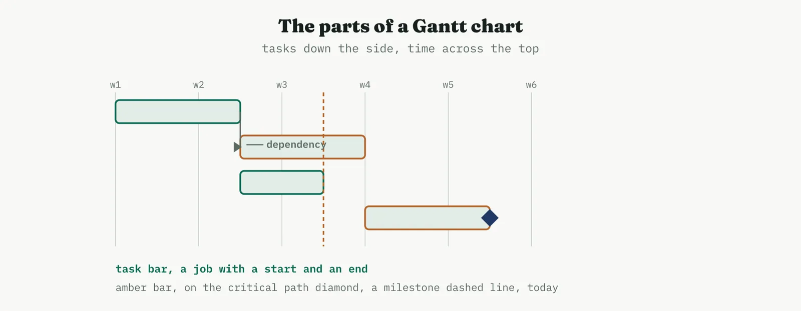
02 Setting up the schedule
TASKS AND DURATIONS The list and the honest estimate
The tasks come straight from the rollout plan, and usefully from the RACI, which has already named them and their owners. The hard part is the durations, because a schedule is only as honest as its estimates, and the instinct is to quote the time a task takes when everything goes right, which is not the time it usually takes. Estimate the realistic duration, not the heroic one, and where a task is genuinely uncertain, say so and carry a buffer rather than a single optimistic number that the whole plan then leans on.
DEPENDENCIES AND THE CRITICAL PATH What waits, and what drives the date
Dependencies are the links that turn a list into a plan. Most are finish-to-start, this cannot begin until that ends, and getting them right is what reveals which tasks can run in parallel and which must queue. Once the dependencies are in, the critical path falls out, the longest chain of dependent tasks from start to finish, and it is the single most important thing the Gantt tells you. Every task on it drives the end date directly, so a slip there slips the whole rollout, while a task off it has slack, room to slip without moving the finish at all.
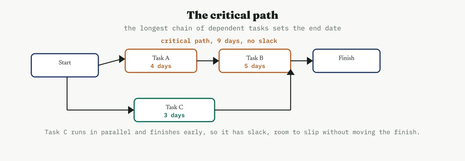
Knowing the critical path changes how you manage the rollout, because it tells you where to spend your attention. You protect the critical tasks fiercely, chase them daily, and resource them first, and you let the tasks with slack breathe, because a day lost on a task with three days of float costs nothing. A rollout managed without knowing its critical path spreads its worry evenly across everything, which means it protects the wrong things and is surprised by the right ones.
03 Running it
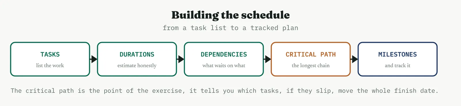
1 List the rollout tasks, taking them from the rollout plan and the RACI so the owners come with them.
2 Estimate a realistic duration for each, with a buffer where the estimate is genuinely uncertain.
3 Set the dependencies, mostly finish-to-start, so the order and the parallelism become visible.
4 Find the critical path, the longest chain of dependent tasks, and mark it so everyone knows what drives the date.
5 Add the milestones, publish the chart, and track progress against it as the rollout runs, updating rather than admiring it.
The last word, track rather than admire, is the one that matters. A Gantt is not a picture you draw once and frame, it is a plan you run the rollout against and update as reality diverges from it. The value is in the comparison, the today line against the bars, which shows at a glance whether the rollout is ahead, behind, or on the critical path in trouble. A chart that is drawn and never updated is a decoration that was briefly accurate.
04 Crestline worked example
Crestline scheduled the wide rollout of the standard handoff pack across a four-week window, with the tasks taken straight from the RACI so each already had an owner. Finalising the pack came first, then the system-field update by IT and the training materials in parallel, then training each team in turn, then the cutover to full running, a month of monitoring, and sign-off.
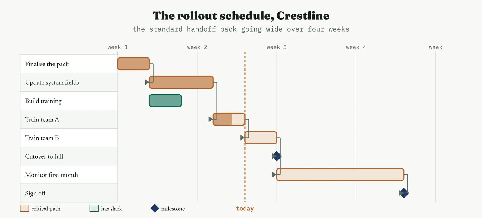
The critical path is the story the chart tells. It runs from finalising the pack, through the system-field update, through training team A and then team B, to the cutover, and on through the month of monitoring to sign-off. Every one of those tasks drives the finish date, so they are the ones to protect. The training-materials build, by contrast, runs in parallel with the longer system update and finishes with a couple of days to spare, so it carries slack, and a short slip there would not move the rollout at all.
The today line, drawn at the end of week two, shows the rollout on track. The pack is finalised, the system fields are updated, the materials are built, and training team A is under way and part done, exactly where the plan expected it. Reading the back half, the month of monitoring dominates the timeline, a reminder that the rollout is not finished at cutover but a month later at sign-off, which is the honest length of a deployment that includes proving the change held. The chart took an hour to build and turned a proven change into a dated, ordered plan the whole team could run against.
05 Reading the output
THE CRITICAL PATH What to protect
Read the critical path first, because it is where your attention belongs. The tasks on it have no slack, so any slip on any of them moves the finish date one for one, and they are the tasks to chase daily and resource first. A rollout that knows its critical path manages by exception, watching the few tasks that matter closely and letting the rest run, which is a far calmer and more effective way to run a deployment than worrying about everything equally.
THE SLACK What can breathe
Read the slack on the off-path tasks as permission, not as spare time to fill. A task with three days of float can slip three days without harm, which means you can move its resource to a critical task when one is in trouble, borrowing from where it does not matter to protect where it does. Slack is the flexibility in the plan, and a manager who can see it can shuffle effort intelligently rather than treating every task as equally urgent.
THE TODAY LINE Plan against actual
Read the today line as the health check. Bars that should be complete and are, tasks in progress where the plan expected them, means the rollout is on track. A critical task behind the today line is the alarm that matters, because it is already moving the finish, and a non-critical task behind it is a note to watch rather than a crisis. The comparison of plan against actual, week by week, is what the chart is for, and it is worthless if the actual is never filled in.
THE DISCIPLINE What to do and not do
| Do | Do not |
|---|---|
| Estimate realistic durations, with a buffer where uncertain | Quote the time a task takes when everything goes right |
| Set the real dependencies so the critical path emerges | Draw parallel bars and never link what waits on what |
| Mark and protect the critical path | Spread your worry evenly across every task |
| Update the chart as the rollout runs | Draw it once, frame it, and never look again |
| Keep it to the tasks worth tracking | Detail it into a hundred rows nobody maintains |
The tell. A Gantt that helps has honest durations, real dependencies, a marked critical path, and a today line that is actually kept up to date. If the durations are heroic, or nothing is linked, or the critical path is unmarked, or the chart has not been touched since it was drawn, it is a decoration, and the rollout it is meant to guide is being run on hope rather than on a plan.
06 Matching it to the ground
The blank page. Early on, a simple Gantt teaches an organisation that work has an order and a timeline, which a young improvement culture often runs without. Keep it to the handful of tasks that matter and mark the critical path, because the lesson worth teaching is that some tasks drive the date and others do not. A first chart that is small and kept up to date does more good than an elaborate one that is abandoned in a week.
The firefight. In a firefight a full Gantt is usually too slow to be worth building, but the critical-path question, what is the one chain of tasks that must happen in order, is worth asking even at speed, because a firefight is exactly where teams do things in the wrong order and wait on the wrong things. A rough schedule of the few critical tasks can bring order to a chaotic response faster than almost anything else.
The false start. A firm whose last rollout ran late because tasks queued that could have run in parallel, or because a task everything waited on slipped unnoticed, is exactly where a Gantt with a marked critical path rebuilds confidence. Show the parallel tasks running together and the critical path marked, because the false start almost always came from a deployment run without a visible order, and making the order and the dependencies explicit is the direct cure.
The quiet achiever. A well-run process rolling out a further change uses a Gantt almost as routine, and its value here is in the coordination across teams and the honest length it puts on the deployment, reminding everyone that the rollout finishes at sign-off a month after cutover, not at cutover itself. This is the ground where a clean schedule simply makes a smooth rollout smoother, and where the today line rarely shows a surprise.
07 When it goes wrong
The commonest failure is optimistic durations. A schedule built from best-case estimates is late before it starts, because tasks take the time they take and not the time you hoped, and the optimism compounds down the critical path until the finish date is fiction. The guard is to estimate realistically and to buffer the genuinely uncertain tasks, treating a suspiciously tidy plan where everything takes exactly the round number of days as a warning rather than a comfort.
The second failure is missing dependencies. A Gantt with unlinked bars looks like a plan but behaves like a wish, because it shows tasks running in parallel that actually wait on each other, and the hidden queue only reveals itself when a task cannot start on time. The dependencies are the difference between a bar chart and a schedule, and skipping them to save effort hides the very thing, the critical path, that the chart exists to show.
The third failure is the plan that is never updated. A Gantt drawn at the start and never touched is accurate for exactly one day, after which it drifts from reality until it actively misleads, telling everyone the rollout is on track when it is not. The chart earns its keep only as a living document, updated against actual progress, and a team that will not maintain it is better off with no chart than with a confident, stale one.
The last failure is over-detailing. A schedule broken into a hundred fine tasks is a burden nobody maintains and nobody reads, and it buries the critical path under noise. The useful Gantt is coarse enough to hold in the head, the dozen or so tasks that genuinely need scheduling, sharp on the critical path and light everywhere else. When the chart grows past what a person will actually track, it has stopped being a tool and become a second job.
08 What it feeds
The Gantt feeds the rollout execution directly, because it is the plan the deployment is run against, day by day, and the critical path it marks is what the rollout manager protects. Paired with the RACI, it is most of a rollout plan, the RACI naming who owns each task and the Gantt fixing when each happens, and a deployment run with both is far harder to derail than one run with either alone. Where the two disagree, a task scheduled without an owner or owned without a slot, the disagreement is a useful prompt to fix the plan.
It also feeds the Control phase and the project close. The schedule sets the timing of the handover to Control, the point where the monitoring begins, and it gives the project close its honest record of plan against actual, how long the rollout really took against how long it was meant to. That comparison is worth keeping, because the gap between planned and actual duration is one of the most useful things a programme can learn about its own estimating, and it feeds the next rollout a more realistic starting point.
For Crestline the Gantt did the unglamorous job of turning a proven, owned change into a dated, ordered plan. It marked the critical path through the system update and the training so the team knew what to protect, it showed the training build had slack, and it put an honest length on the deployment by carrying the month of monitoring through to sign-off. That is the case for the Gantt in one line, it is how a rollout gets an order and a date rather than drifting from cutover to whenever.
14 · Improve
14.3.18 The project review RECOMMENDED
ISO 13053-1, tollgate review. Improve, the gate before Control.
01 What it is and why you reach for it
The project review is the gate at the end of the Improve phase, a structured checkpoint that confirms the phase has actually done its job before the project is allowed to move on to Control. It is not a status meeting and it is not a celebration. It is a test, walking the phase deliverables one by one and asking of each, is this real, is it proven, and is it ready to hand over. Reach for it at the close of Improve, always, because it is the last point at which an improvement that looks finished but is not can be caught before it becomes Control problem, or worse, a benefit claimed to the business that the process never actually delivers.
It earns its place because the phases before it generate optimism, and optimism is not evidence. A pilot that felt good, a capability that looks acceptable, a rollout that is under way, all of these can be asserted in a room and all of them can be wrong. The review exists to replace every assertion with the artefact that proves it, the run chart behind the pilot, the study behind the capability, the before-and-after behind the risk. And it exists to give the sponsor a real decision, because a gate that can only ever say yes is a ceremony, and the value of a gate is entirely in its power to say no.
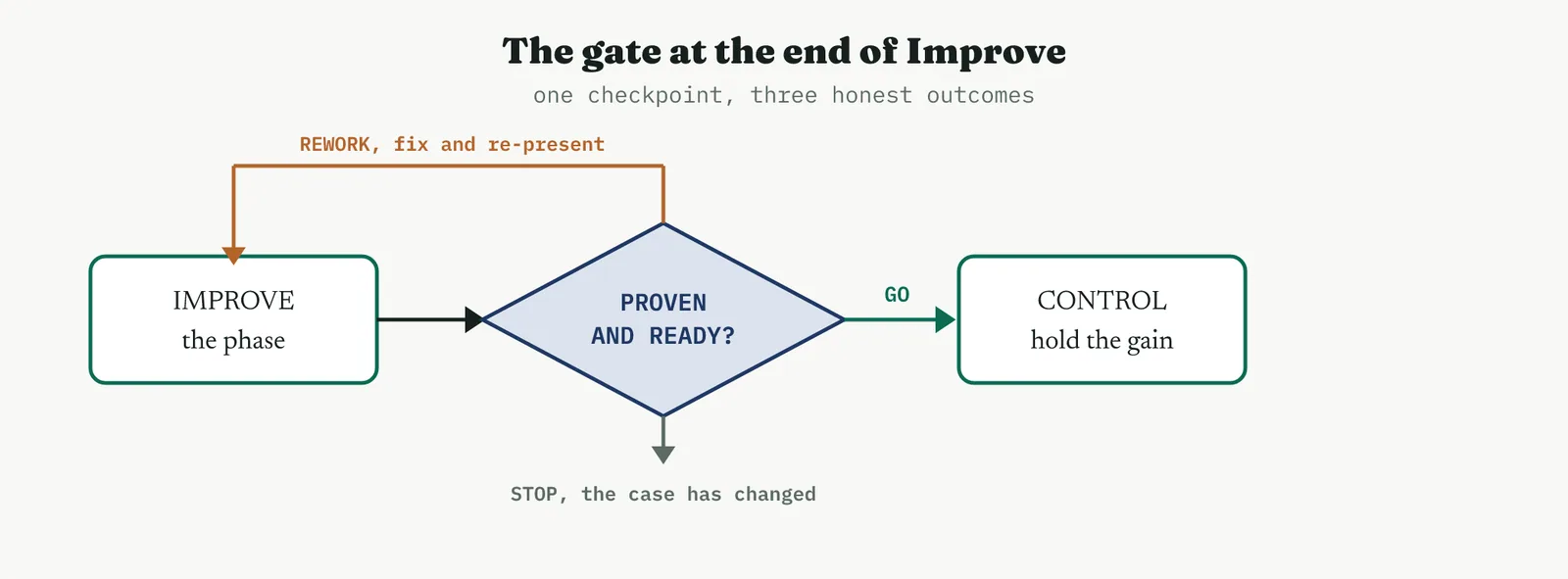
02 Setting up the review
THE EVIDENCE PACK Artefacts, not slides
The review is only as good as the evidence brought to it, so the setup is the assembly of that evidence rather than the writing of a summary. Every tool the phase used has left an artefact, the solution selection, the pilot run chart, the reliability run, the capability study, the updated FMEA, the rollout RACI and Gantt, the quantified benefits, and the pack is those artefacts, not a deck that describes them. A review run on a slide that says the pilot succeeded, without the run chart behind it, is a review of a claim, and claims are exactly what the gate exists to test.
THE CHECKLIST What must be present
The deliverables the phase owes are known in advance, so the review runs against a checklist, and the checklist is the same shape for every project. The solution built, the pilot held, the capability restated, the risk reassessed, the rollout owned and scheduled, the benefits quantified. Each is a line to be ticked, and a tick means a claim backed by an artefact, not a claim backed by confidence. A deliverable that cannot show its evidence is not ticked, it is a finding.
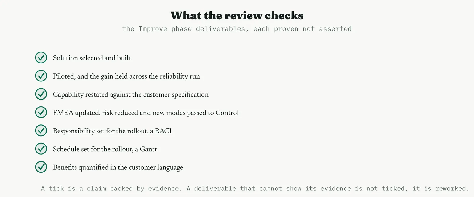
THE ROOM Someone who can say no
The one person who must be in the room is the one with the authority to decide, the sponsor, because the review produces a decision and a decision needs a decider. The owner and the belt present the evidence, key stakeholders witness it, but the go, rework or stop belongs to the sponsor, and it belongs to someone senior enough that no can actually stick. A review chaired by someone who cannot refuse is theatre, and everyone in the room knows it, which is why the composition of the room matters as much as the evidence in it.
03 Running it
The review has a simple discipline, and the discipline is that evidence beats assertion every time.
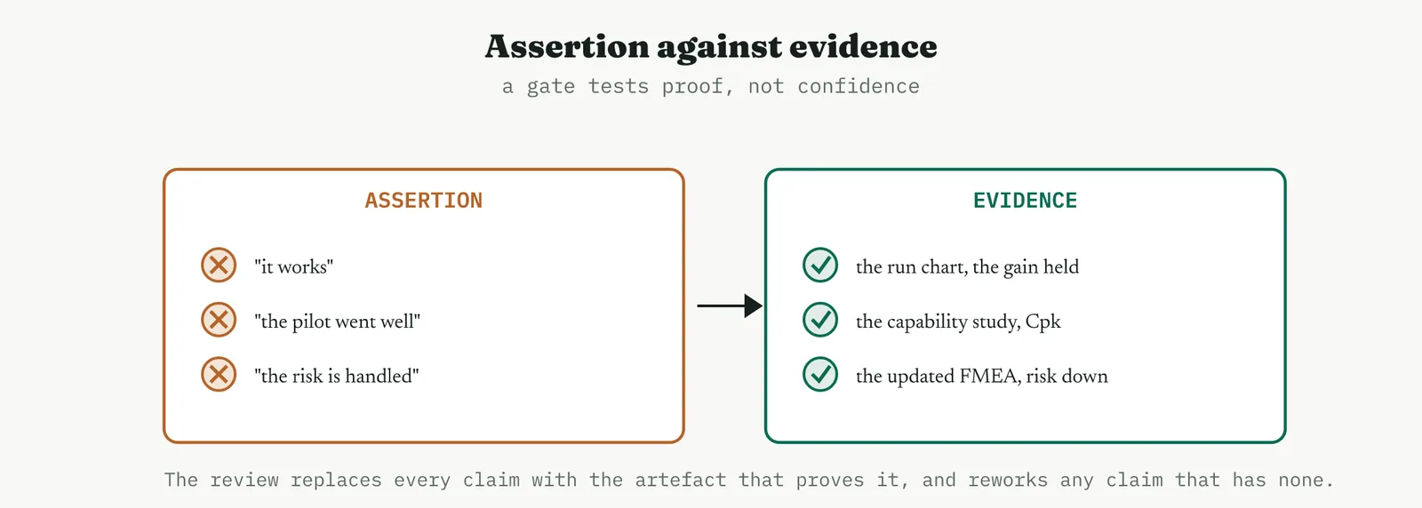
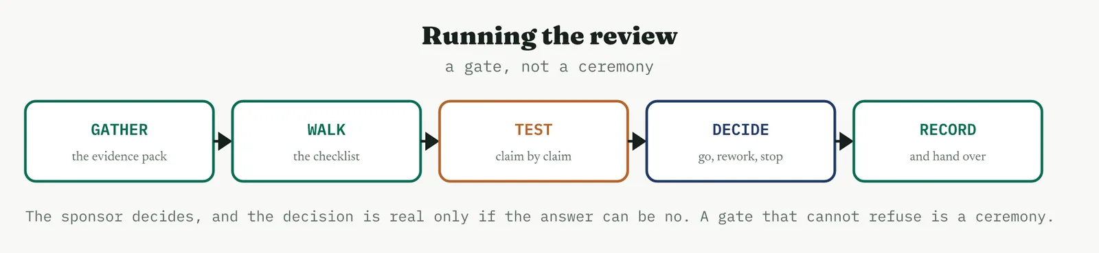
1 Gather the evidence pack, the artefacts from every tool the phase used, not a summary of them.
2 Walk the checklist of deliverables in order, so nothing owed is skipped.
3 Test each claim against its artefact, and mark any claim without evidence as a finding rather than a tick.
4 The sponsor decides, go to Control, rework and re-present, or stop, and the decision is real because no is available.
5 Record the decision, the residuals carried forward, and the actions, and hand the package to Control.
The step that people rush is the third, testing each claim against its artefact, because it is slower and less comfortable than nodding a deliverable through. But it is the whole point. A review that accepts we piloted it and it worked without seeing the run chart has tested nothing, and a review that tests nothing passes everything, which is how an unfinished phase reaches Control wearing the costume of a finished one. Slow down on the evidence, because the evidence is the review.
04 Crestline worked example
Crestline held its Improve-phase review with Renu in the chair as sponsor, Geoff and Asha presenting, and the belt walking the evidence. The pack was the artefacts the phase had produced, and the review tested each against the checklist rather than taking the team word for it.
| Deliverable | Evidence | Status |
|---|---|---|
| Solution built | handoff pack, single owner, required fields | done |
| Piloted, gain held | three weeks, resolution steady near four days | done |
| Capability restated | Cpk about 1.05, breaches under 0.1% | done, marginal |
| FMEA updated | risk 710 to 246, one new mode to Control | done |
| Rollout owned and scheduled | a RACI and a Gantt, critical path marked | done |
| Benefits quantified | median six to four days, accuracy 82 to 95% | done |
Every line carried its artefact, so every line was ticked, but two of them carried an honest qualifier that the review recorded rather than smoothed over. The capability was only marginal, a Cpk of about one, and the updated risk assessment had surfaced a new failure mode, the required field cleared with a placeholder. Neither was a reason to fail the phase, because both were known, scored, and had a home in Control, but both were written into the decision as residuals rather than allowed to disappear behind the good news.
Renu decision was go to Control, and it was a real decision because the alternative was available, the phase had the evidence to pass and would not have passed without it. The benefits were stated in the customer language, a median resolution cut from six days to four and first-response accuracy lifted from 82 to 95%, and they were stated as the pilot proved them rather than as the team hoped. The project left the review authorised to proceed, with two named residuals and a clean record of what had been proven and what remained.
05 Reading the output
THE DECISION And that it could be no
Read the decision first, and read whether it could have gone the other way. A go that was never in doubt, waved through without the evidence being tested, is not a decision, it is a formality, and it tells you nothing about whether the phase is really done. A go reached after the evidence was walked and could have been a rework is a real gate, and its yes means something. The health of a review is measured by whether its no is available and occasionally used, not by how smoothly its yes is delivered.
THE RESIDUALS What is carried forward
Read the residuals as the honest tail of the phase. No Improve phase closes with everything perfect, and the residuals, the marginal capability, the new failure mode, the need that went unserved, are what the phase is choosing to carry into Control rather than solve here. A review that records them clearly hands Control a known list, and a review that buries them to keep the record clean hands Control a set of surprises. The quality of the handover is in the honesty of the residuals.
THE BENEFITS As proven, not as hoped
Read the benefits statement for its tense. Benefits stated as the pilot proved them, in the customer language, are a result the business can rely on. Benefits stated as the change will deliver, projected rather than demonstrated, are a promise, and the gate is exactly where a promise should be challenged into a proof or marked as still unproven. The number that goes to the business from the review is the number the evidence supports, no rounder and no braver than that.
THE DISCIPLINE What to do and not do
| Do | Do not |
|---|---|
| Test every claim against its artefact | Accept a deliverable on confidence without its evidence |
| Put someone in the chair who can say no | Chair the gate with someone who cannot refuse |
| Record the residuals honestly and hand them to Control | Bury the qualifiers to keep the record clean |
| State benefits as the evidence proves them | Report projected benefits as if already delivered |
| Treat a rework as the gate working | Treat any outcome but go as a failure of the team |
The tell. A real review has an evidence pack of artefacts rather than slides, a chair who can refuse, a decision that could have gone either way, and residuals recorded rather than hidden. If the pack is a summary, the chair cannot say no, and the go was never in doubt, the gate is a ceremony, and the phase it passed may not be finished at all.
06 Matching it to the ground
The blank page. Early on, a light but real review teaches an organisation that phases end with a decision rather than a drift, which a young improvement culture rarely does. Keep the checklist short and the evidence real, and let the sponsor actually decide, because the lesson worth teaching is that a project is not done because everyone is tired of it, it is done when the evidence says so. A first review that could have said no, and did not need to, still teaches the point.
The firefight. In a firefight the temptation is to skip the gate and move on, because the fire is still warm and reviewing feels like a luxury. It is exactly the wrong instinct, because a firefight is where phases are most likely to be waved through half-finished, and a quick, honest gate on the few deliverables that matter can catch an improvement that has not actually landed before it is declared done. Even under pressure, the question the gate asks, is this proven, is worth a few minutes.
The false start. A firm whose last project was declared a success that quietly failed is exactly where a rigorous review rebuilds credibility. Test every claim against its artefact in the open, let the residuals be named, and make the decision one that could have been no. The false start almost always came from a phase passed on optimism rather than evidence, and a visible, evidence-tested gate is the direct answer to a history of hollow successes.
The quiet achiever. A well-run project reaching a well-run process uses the review as a clean confirmation, and here its value is in the record it leaves, a documented statement of what was proven and what was carried forward, which the standing organisation can rely on long after the team disperses. This is the ground where the gate is least likely to say no and most likely to produce a handover so clean that Control inherits a list rather than a mystery.
07 When it goes wrong
The commonest failure is the rubber stamp, a review that tests nothing and passes everything. It happens when the pack is a deck of assertions, the chair cannot really refuse, and everyone treats the gate as a formality on the way to a foregone conclusion. The guard is to insist on artefacts rather than summaries and to seat someone in the chair with the authority and the will to say no, because a gate that cannot refuse is not a gate, it is a signature.
The second failure is accepting assertion for evidence. It is comfortable to nod through we piloted it and it worked, and uncomfortable to ask for the run chart, and the whole discipline of the review lives in choosing the uncomfortable path every time. A claim without its artefact is a finding, not a tick, and a review that will not make that distinction has abandoned the one thing it was for.
The third failure is the review that becomes a blame session. A rework outcome is the gate working, catching a phase that is not yet done, and treating it as a failure of the team turns the gate into something to be feared and gamed rather than used honestly. The purpose is to test the work, not the people, and a review that punishes an honest rework will soon be handed only dishonest passes.
The last failure is hiding the residuals. A phase that closes by pretending everything is perfect hands Control a clean record and a set of ambushes, because the marginal capability and the new failure mode do not cease to exist when they are left off the page. The honest review records exactly what it is carrying forward, and a record that has no residuals on a real project is not a triumph, it is a warning that the review did not look hard enough.
08 What it feeds
The review feeds the Control phase a clean, tested handover. The residuals it records become Control opening agenda, the marginal capability to hold and the new failure mode to watch, and the standard and the capability baseline it confirmed become the things Control monitors. A Control phase that inherits a well-run review starts with a known list rather than a discovery process, which is the difference between holding a gain and hunting for what might undo it.
It also feeds the project close and the governance record. The decision, the evidence, and the proven benefits are the record the organisation keeps of what this project actually delivered, and it is the honest version rather than the hopeful one, which is what makes it worth keeping. And the gate feeds the programme its discipline, because an organisation whose phases end in real decisions, occasionally refused, learns to finish work rather than to drift away from it, which is a capability worth more than any single project result.
For Crestline the review closed the Improve phase as it should be closed, with a decision rather than a drift. It tested every claim against its artefact, recorded the two residuals honestly, stated the benefits as the pilot had proven them, and authorised the move to Control with a clean handover. That is the case for the review in one line, it is the gate that makes finished mean proven, and proven mean ready, before an improvement is trusted to the phase that must hold it.
14 · Improve
14.4 Choosing tools by project type
Eighteen tools is a large kit, and the skill is not knowing them all but reaching for the right few. The choice is rarely made tool by tool. It is made by answering two or three questions about the project itself, and the answers route you to a part of the kit and away from the rest.
14.4.1 When a designed experiment is warranted, and when it is not
A designed experiment is warranted when three things are true at once. There is a response you can measure, there are factors you can genuinely set rather than merely observe, and the best settings are unknown and worth the runs to find. Remove any one of those and the tool stops applying. If the factors cannot be set, you have an observational study and the honest tools are regression and analysis of variance, not a design. If the settings are already known and the problem is that people do not follow them, the answer is standard work, not an experiment.
The commonest error is running a designed experiment on a process whose trouble is structural. Where the waiting sits between the steps rather than inside them, no combination of settings inside a step will reach it, and the most elegant experiment in the world will report, correctly, that nothing much moves the response. That is a wasted study, and its cost is not just the runs but the credibility spent on them.
14.4.2 Redesigning flow against tuning a parameter
This is the first fork in the phase and it decides half the toolkit. Ask where the trouble actually lives. If it lives in the flow, the handoffs, the queues, the rework loops, the waiting between steps, you are redesigning, and the Lean stream is your kit, flow and pull, standard work, single-piece flow, levelling, mistake-proofing, delivered through a Kaizen event. If it lives in a setting, a temperature, a threshold, a batch size that someone can dial, you are tuning, and the Six Sigma stream applies, the designed experiment, the analysis of variance, the capability study.
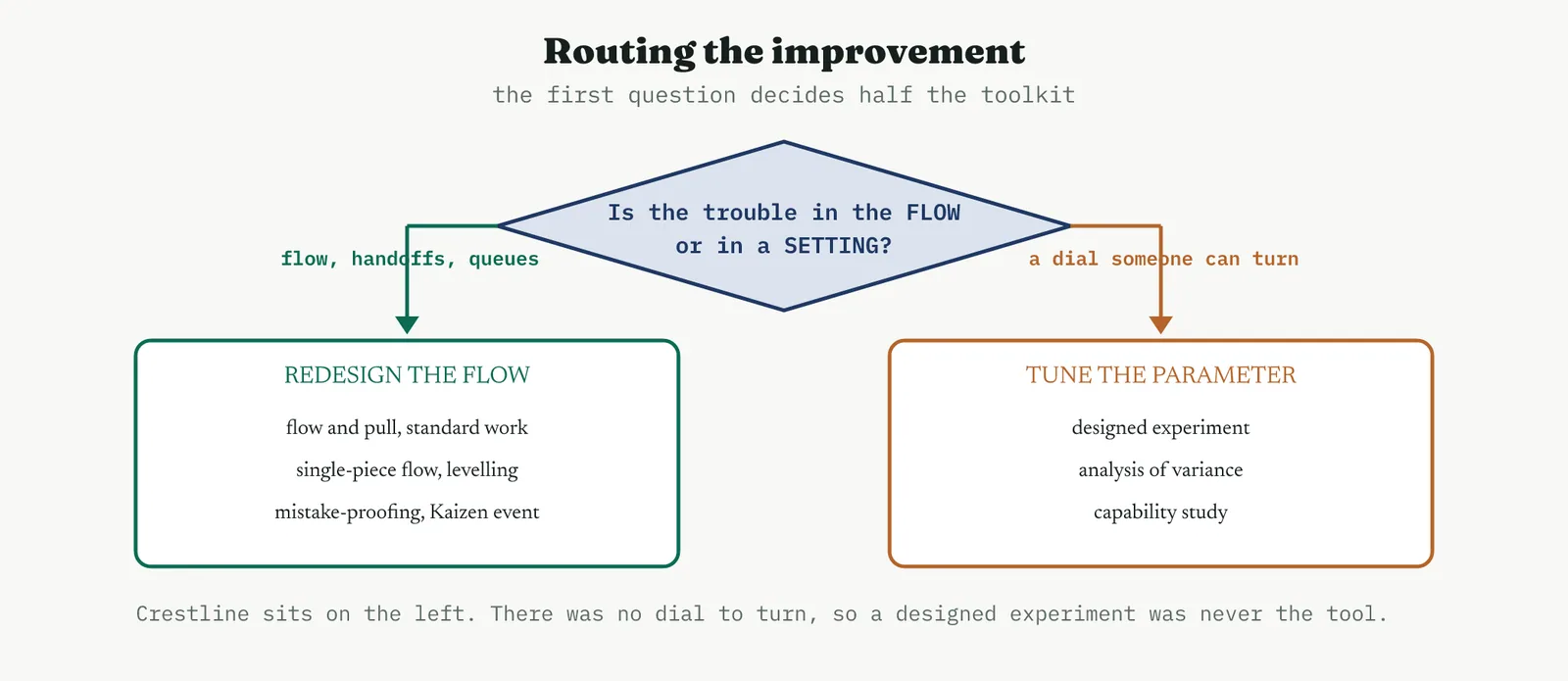
Most service problems sit on the left of that diagram, which is worth saying plainly because the statistical tools carry more prestige and attract the ambitious belt. Crestline is a case in point. The waiting was between Intake and the account managers, in a rework loop, and no parameter existed to tune. The right tools were the ones that redesigned the handoff, and reaching for a designed experiment would have been a display of technique rather than an act of judgement.
14.4.3 Solution selection when the choice is unclear
When one fix is obvious, select it and move on, because a structured selection over a foregone conclusion is theatre that costs a day. The tools earn their place when the choice is genuinely unclear, when several candidates each have a case, when the team is split, or when the change is expensive enough that being wrong matters. Then you run the solution selection to score the options against agreed criteria, and the prioritisation to sequence what survives, and where the customer voice should drive the order, the house of quality to weight it.
The test for whether you need them is simple. If you cannot say out loud why one option beats the others, or if two people in the room would give different answers, the choice is unclear and the structure will earn its keep. If everyone already agrees and the reasons are plain, skip it.
14.4.4 Matching the change to what the team can adopt
The last consideration is the one most often skipped, and it is not about the problem at all. A change the team cannot absorb will not survive the pilot, however good it is on paper. An untrained team needs a simpler change and more support than a mature one, a team already carrying three other initiatives has no capacity for a fourth, and a change that demands a new system when the team is still learning the current one is a change that will fail for reasons that have nothing to do with its merits.
So the tool choice bends to the ground. On weak ground you choose the smaller change delivered well over the larger change delivered badly, and you spend more of the phase on the standard work and the training than on the analysis. That is not a compromise of rigour, it is rigour about the thing that actually determines whether the gain survives.
14.5 Scenarios
The same phase runs very differently depending on the ground, and five scenarios cover most of what a belt meets. They recur through every phase of this book, and here is how each plays out in Improve.
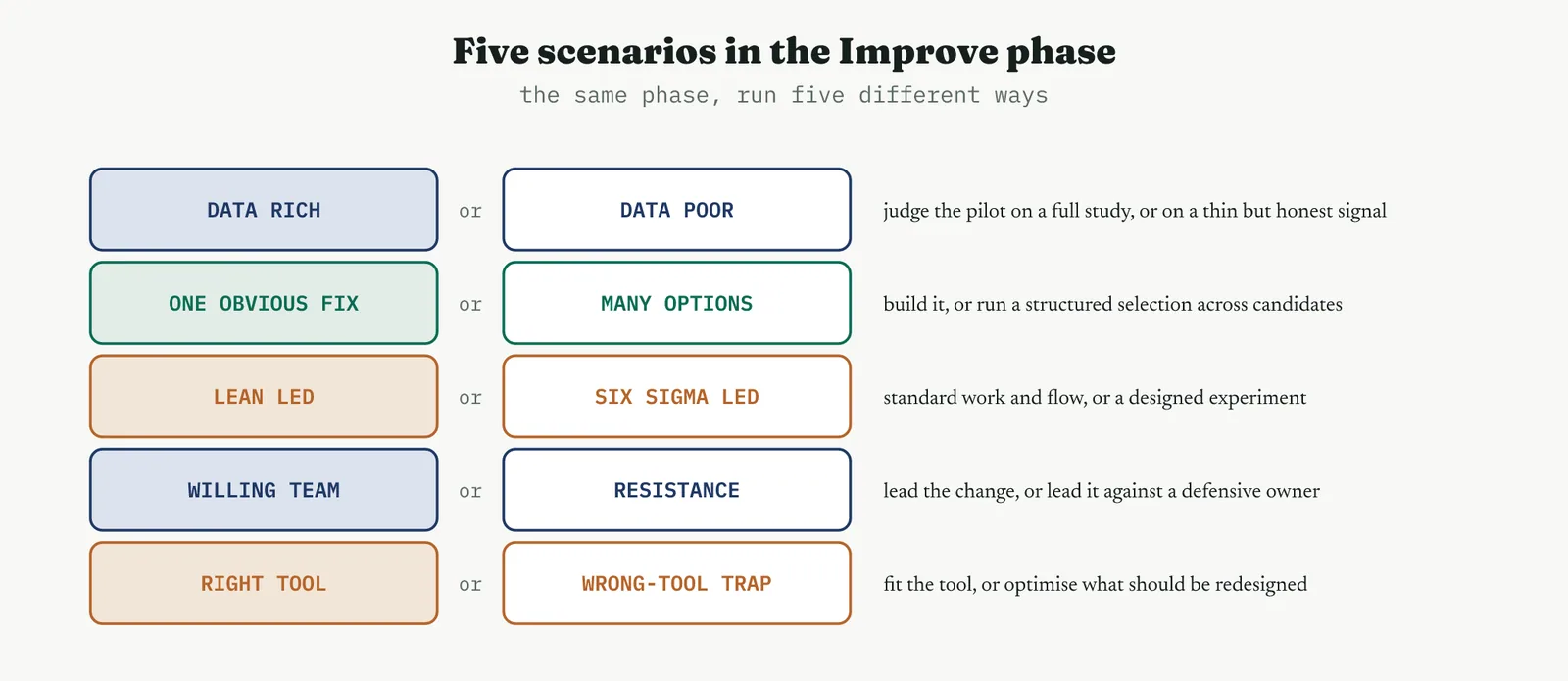
14.5.1 A pilot with rich data, and a pilot judged on a thin signal
With rich data the pilot is straightforward. You have a trustworthy baseline, enough observations to see the change clearly, and the capability study and the analysis of variance can both speak. Crestline is the comfortable case, fifty-eight sampled cases before and three weeks of pilot after.
With a thin signal the discipline changes. Where you have a handful of observations and no reliable history, the honest tools are the run chart and the plain before-and-after, read carefully, and the honest statement is directional rather than precise. What you must not do is dress a thin signal in the language of a strong one, quoting a capability index to two decimals from twelve observations. Run the pilot longer if you can, and if you cannot, say clearly that the evidence is suggestive rather than conclusive and let the sponsor decide with that in front of them.
14.5.2 A single obvious fix, and a structured selection across options
Sometimes the analysis ends with one fix so plainly right that selecting it takes a minute. Build it, pilot it, and do not manufacture a matrix to justify a decision everyone already agrees with. The phase is shorter and that is a good outcome, not a shallow one.
When several options compete, the structure earns its keep, and the sequence is the solution selection to score them, the prioritisation to sequence them, and the pilot to prove the winner. Crestline sat here, with six candidate changes and a genuine question about which to lead with, which is why the selection and the prioritisation both appear in its story and why the house of quality was worth running as a check.
14.5.3 The Lean-led improve, and the Six Sigma-led improve
A Lean-led Improve phase spends its time on flow and standard work, delivers through a Kaizen event, and its evidence is a run chart and a process cycle efficiency that moved. A Six Sigma-led phase spends its time on a designed experiment, confirms with analysis of variance, and its evidence is a fitted model, a confirmed optimum and a capability index. Both are legitimate and both live in this chapter, and the routing question decides which you are running.
The mistake is running one while pretending to run the other, dressing a flow redesign in statistical language because it sounds more rigorous, or dropping into a Kaizen event when the real question is which of three settings is best. Name which kind of phase you are in, and use the kit that belongs to it.
14.5.4 Leading the change against a defensive owner and an untrained team
Geoff was defensive because the process was his and every finding felt like a verdict on him, and Asha was capable but had never been trained in any of this. That combination is common and it changes how the phase is run. With a defensive owner you put him inside the work rather than outside it, so the changes are his to build rather than yours to impose, which is precisely what the Kaizen event did. Ownership is the antidote to defensiveness, and it is cheaper than persuasion.
With an untrained but capable lead you teach through the work, letting Asha run the training and own the monitoring, so the capability stays in the team after the belt leaves. The phase produces two things in this scenario, a changed process and a team that can change the next one, and the second matters more to the organisation than the first.
14.5.5 The wrong-tool trap
The trap is reaching for the impressive tool rather than the fitting one, and its classic form is optimising a step when the handoff was the whole problem. It is seductive because it is technically correct work, properly executed, and it produces charts and a model and a sense of rigour. It simply cannot reach the problem.
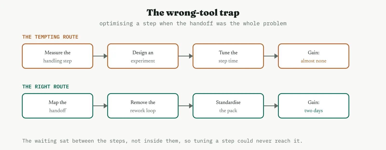
Crestline shows both routes. Measuring the handling step and designing an experiment around it would have been defensible on paper and would have delivered almost nothing, because the days were lost in the loop between two teams and not inside either team work. Mapping the handoff and removing the rework loop delivered two days. The tell is always the same, ask where the time actually goes, and if it goes between the steps, no tool that works inside a step will find it.
14.6 Hiccups and how to clear them
Three things go wrong in the Improve phase often enough to be worth naming in advance, and each is a pressure to skip a step.
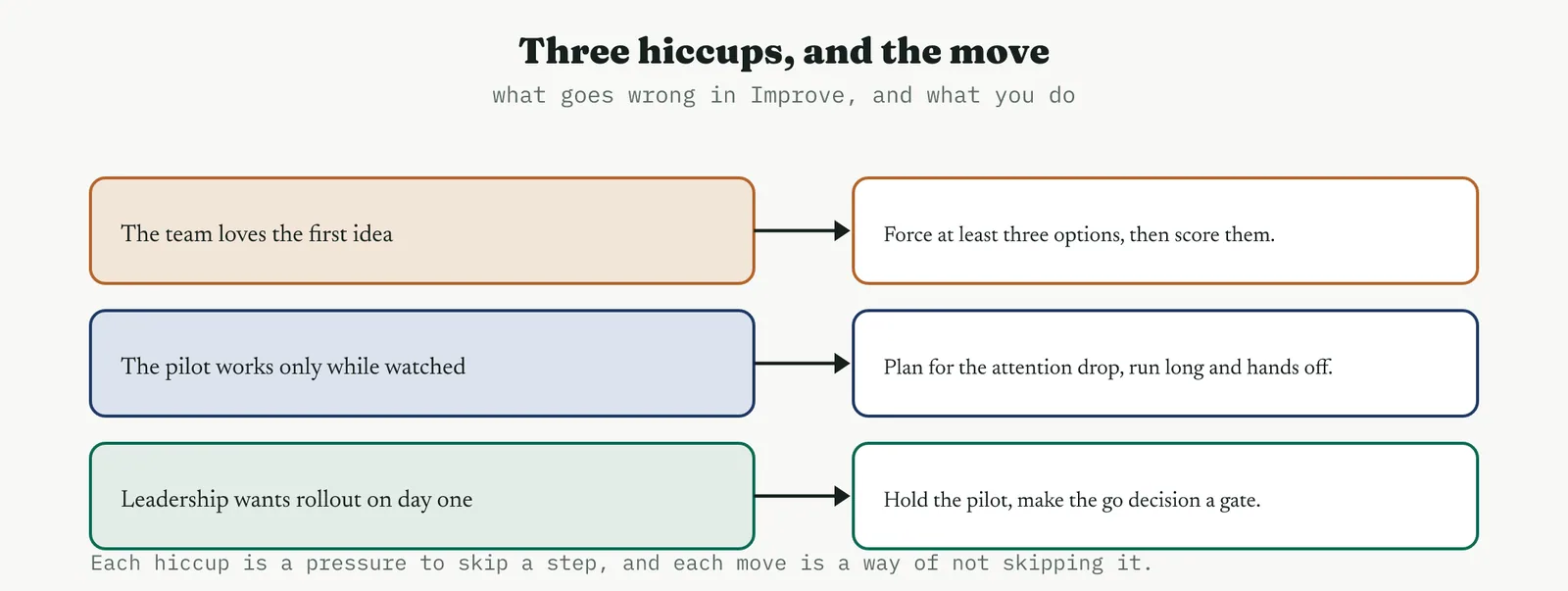
14.6.1 The team loves the first idea
The first idea arrives with energy behind it and the room converges fast, which feels like progress and is usually premature. The move is to require at least three genuine options before anything is selected, and to score them against agreed criteria rather than debate them. Often the first idea wins anyway, and that is fine, because it now wins on evidence and carries the room rather than merely the person who proposed it. Sometimes it does not win, and that is the whole point of the rule.
14.6.2 The pilot succeeds only because you were watching
A pilot run under the belt attention, with the team knowing they are being observed, improves for reasons that will not persist. The move is to plan for the attention drop, running the pilot long enough that the novelty wears off, and deliberately stepping back for part of it so the process runs on its own standard rather than on your presence. If the gain survives your absence it is real, and if it does not, you have learned something far more useful than a flattering pilot would have told you.
14.6.3 Leadership wants full rollout on day one
The pressure to skip the pilot and deploy everywhere immediately is strongest when the change is popular and the fire is hot. The move is to hold the pilot and to convert the impatience into a gate, making the go decision a formal review with pre-agreed criteria and a date. That gives leadership a definite commitment and a near horizon rather than an open-ended delay, and it protects the organisation from deploying an unproven change at full scale, which is the most expensive way to discover a flaw.
14.7 The Improve tollgate
The phase ends at a tollgate, and the tollgate has three parts, confirming the mandatory work is done, holding the review with the sponsor, and handing over to Control.
14.7.1 The mandatory tools confirmed done
Under ISO 13053-1 Table 6 the one mandatory tool in Improve is the updated process FMEA, and it is mandatory for a good reason, because it is the only tool that asks what the change itself broke. This book treats two further items as mandatory alongside it, the capability of the improved process and the project review, on the basis of the clause 10.5 outputs, capability at the new level and a reviewed and validated result. Everything else in the chapter is chosen by judgement, but these three are not optional in a phase that claims to be finished.
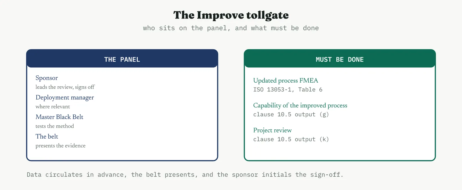
14.7.2 The gate review with the sponsor
The sponsor leads the review at the end of Improve to validate the conclusions. The panel is the deployment manager where the role exists, the sponsor, the Master Black Belt, and the belt running the project, and the data circulates in advance so the meeting tests evidence rather than absorbs it for the first time. The belt presents, the panel probe, and the sponsor initials the sign-off when they agree the work is sound.
The two details that make this a gate rather than a ceremony are the advance circulation and the availability of no. A panel reading the evidence for the first time in the room cannot test it, and a sponsor who cannot refuse is a signatory rather than a decision-maker. Get both right and the review does its job, which is to make finished mean proven.
14.7.3 The checklist and the bridge into Control
The gate closes against a checklist, and the checklist is the phase own deliverables. The solution selected and built. The pilot run and the gain held across a reliability run. The capability restated against the customer specification. The FMEA updated, with the new modes scored. The rollout owned and scheduled. The benefits quantified in the customer language. Each ticked against an artefact rather than an assertion, and any line that cannot show its evidence is a finding rather than a tick.
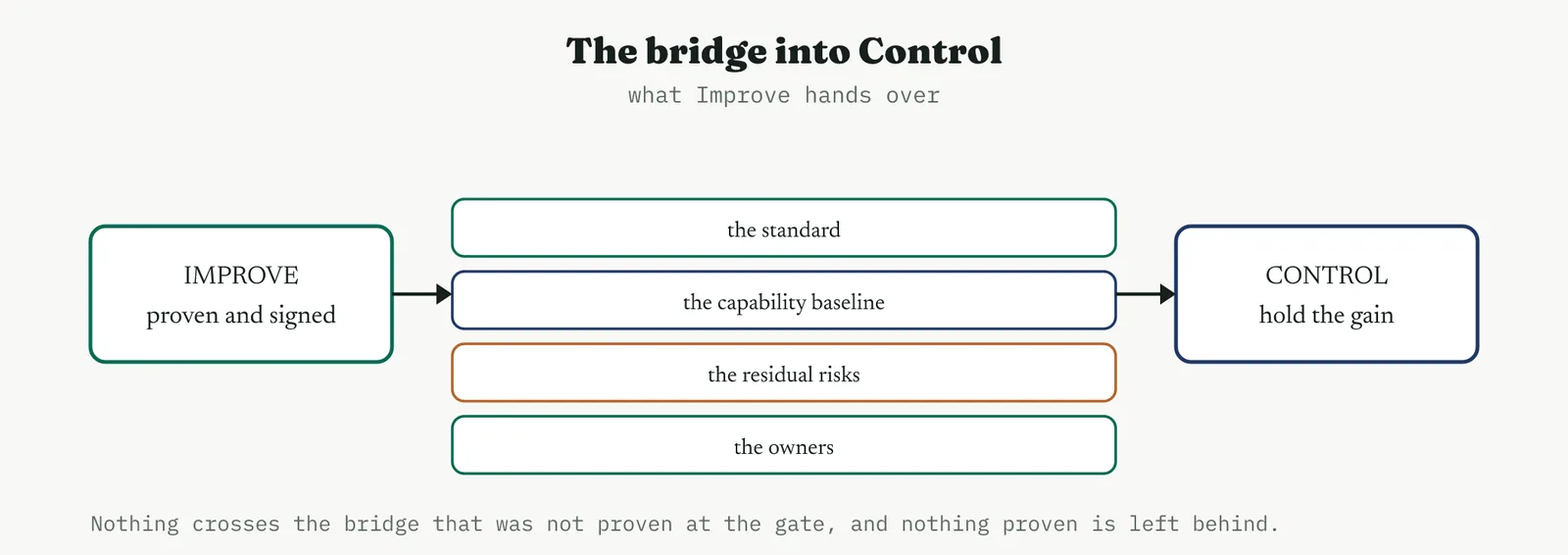
What crosses the bridge is four things. The standard, so Control knows what good looks like. The capability baseline, so Control knows the level it is holding. The residual risks, the marginal capability and the new failure mode, so Control knows what to watch. And the owners, so every control has a name against it. Improve ends when those four have crossed and the sponsor has signed, and Control begins with a known list rather than a discovery process.
That is the phase. Eighteen tools, four of them mandatory or near enough, and one question underneath all of them, is the change real and can you prove it. The Improve phase is where a project stops describing a problem and starts changing it, and the tollgate is where changing it becomes something the organisation can rely on.