
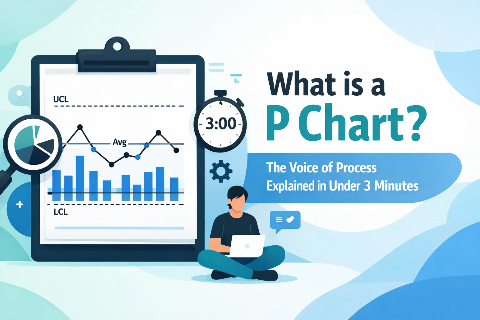
In the realm of operational excellence, the ability to distinguish between random noise and actionable signals is the hallmark of a seasoned professional. To fully appreciate the stability and capability of any business process, one must look beyond simple averages and embrace the discipline of Statistical Process Control (SPC). Among the most vital tools in the SPC arsenal is the P Chart: a specialized control chart designed to monitor the proportion of nonconforming items in a process.
While the "3-minute" explanation provides a foundational understanding, the strategic implementation of a P Chart requires a deeper technical grasp of attribute data and binomial distribution. This guide serves as a comprehensive resource for Lean Six Sigma practitioners looking to master the "Voice of the Process."
The Fundamental Purpose of the P Chart
The primary objective of a P Chart (Proportion Chart) is to track the percentage of "defective" units within a sample. In Lean Six Sigma terminology, we categorize data into two main types: Variable (continuous) and Attribute (discrete). The P Chart is strictly an attribute control chart. It is employed when the data is binary: meaning each unit of work is either "pass" or "fail," "conforming" or "nonconforming," "dead" or "alive."
Unlike a C Chart, which counts the total number of defects (where one unit could have multiple defects), the P Chart focuses on the unit as a whole. If a circuit board has three scratches but still functions, it might be "conforming." If it has one critical short circuit, the entire unit is "nonconforming." The P Chart tracks the proportion of these "bad" units over time to determine if a process is statistically stable.

Technical Anatomy: How a P Chart Communicates
To interpret a P Chart effectively, one must understand its three critical components. These horizontal lines provide the mathematical context necessary to separate "Common Cause" variation from "Special Cause" variation.
- The Center Line (CL): This represents the average proportion ($\bar{p}$) of nonconforming units across all sampled subgroups. It serves as the baseline for current process performance.
- The Upper Control Limit (UCL): Calculated typically at three standard deviations above the center line, the UCL represents the threshold of expected variation. If a data point exceeds this line, the process is no longer in statistical control.
- The Lower Control Limit (LCL): This is the threshold at three standard deviations below the center line. In high-quality processes, the LCL may often be calculated as zero. However, a point falling below a non-zero LCL suggests a significant improvement that should be investigated to identify a "positive" special cause.
The power of the P Chart lies in its flexibility regarding sample sizes. Unlike the NP Chart, which requires a constant subgroup size, the P Chart can accommodate varying sample sizes, making it ideal for real-world manufacturing and service environments where daily volumes fluctuate.
When to Deploy the P Chart in the RDMAICS Framework
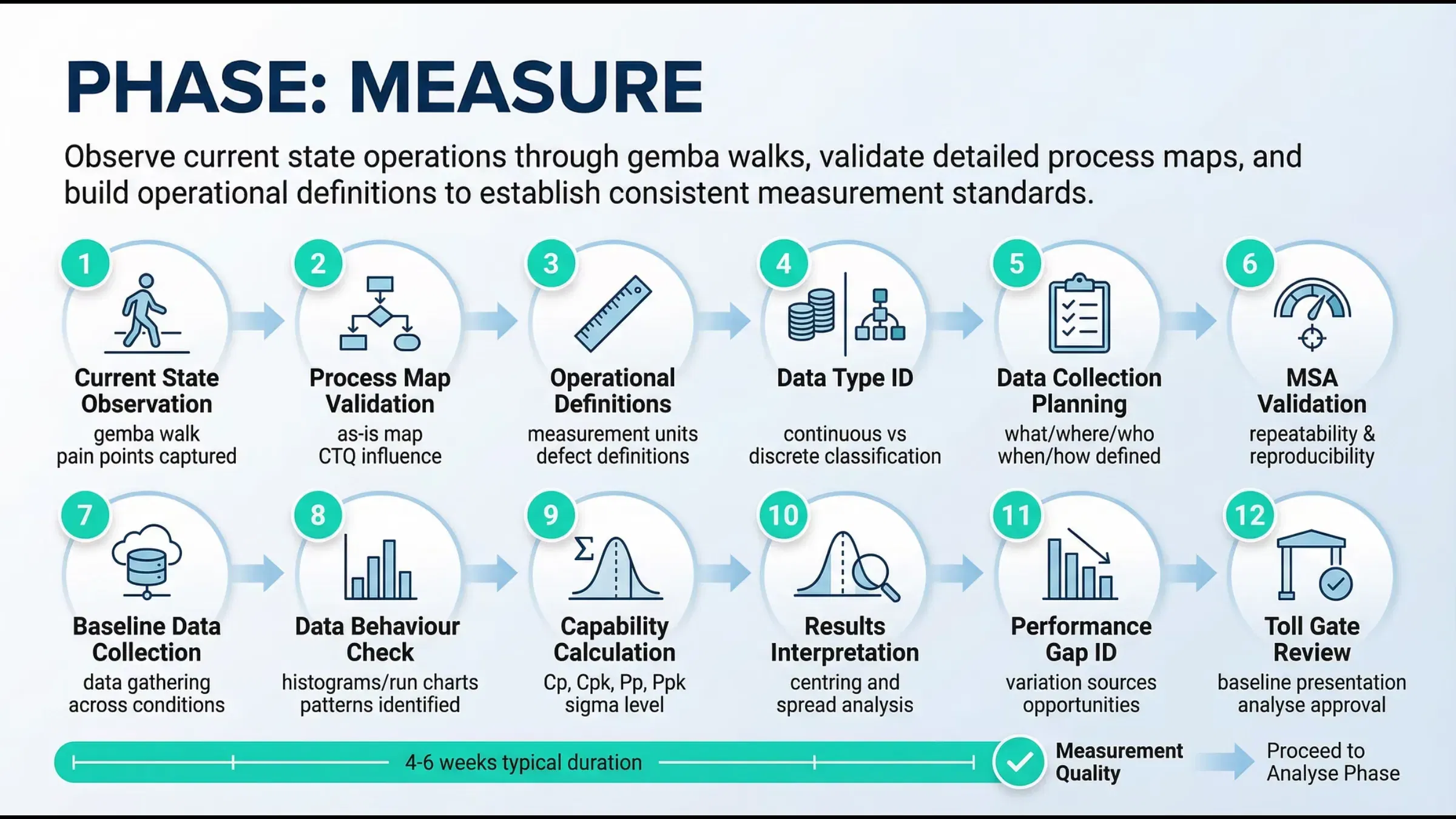
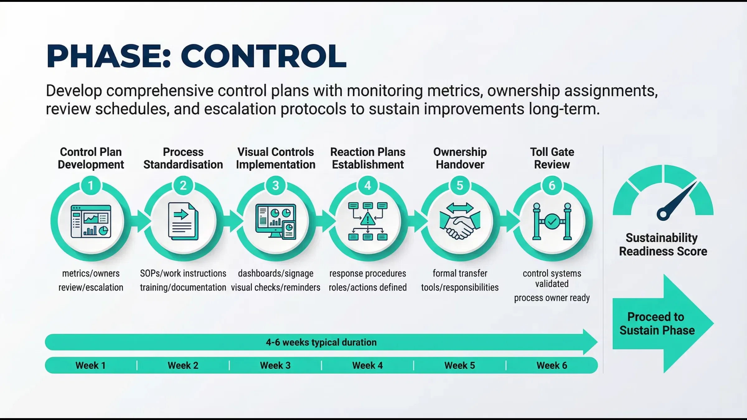
In the structured RDMAICS improvement framework, the P Chart is most frequently utilized during the Measure and Control phases.
During the Measure phase, a P Chart establishes the baseline "Voice of the Process." It tells the project team exactly how much variation currently exists before any improvements are made. Without this baseline, it is impossible to quantify the success of future interventions.
In the Control phase, the P Chart becomes a "guardian" of the new process. By plotting real-time data on a P Chart, process owners can receive immediate visual notification if a process shifts. This allows for rapid intervention before a minor fluctuation evolves into a systemic failure. For those designing high-level overviews, integrating these charts into a professional dashboard is essential for effective stakeholder communication.
A Data-Heavy Case Study: The High-Volume Electronics Scenario
To illustrate the utility of the P Chart, consider a hypothetical electronics manufacturer, "TechFlow Circuits." TechFlow produces 1,000 to 1,500 units daily. Quality inspectors perform a binary check: Does the unit power on within 3 seconds?
- Subgroup 1: 1,200 units inspected, 24 failed. ($p = 0.02$)
- Subgroup 2: 1,100 units inspected, 22 failed. ($p = 0.02$)
- Subgroup 3: 1,400 units inspected, 70 failed. ($p = 0.05$)
In this scenario, the average proportion ($\bar{p}$) might be 0.022 (2.2%). If the calculated UCL for Subgroup 3 was 0.045 based on the sample size, the value of 0.05 is a Special Cause. This indicates that something specific happened on that day: perhaps a new batch of raw materials or a shift change: that caused the process to "break" its statistical pattern.
Without a P Chart, management might view 70 failures as a "bad day." With a P Chart, they see it as a statistical anomaly requiring a formal Root Cause Analysis. This is why practitioners often pair P Charts with tools like the SIPOC diagram to trace back where the defect originated in the high-level process.
P Chart vs. U Chart vs. C Chart: Choosing the Right Tool
Choosing the wrong control chart is a common pitfall for Green Belts and Black Belts. To ensure accuracy in your analysis, follow these rules of thumb:
- Use a P Chart when you are counting defective units (Pass/Fail) and your sample size changes.
- Use an NP Chart when you are counting defective units but your sample size is constant.
- Use a C Chart when you are counting the number of defects (e.g., number of scratches on a car) and the sample size is constant.
- Use a U Chart when you are counting the number of defects per unit and the sample size varies.
Understanding these nuances is a critical component of Lean Six Sigma Black Belt training. Using a P Chart when you should have used a U Chart can lead to incorrect control limits and, ultimately, poor business decisions.
The Future of Process Monitoring in 2026
As we move further into 2026, the traditional manual plotting of P Charts is being superseded by automated, AI-driven analytics. While the underlying mathematics remain the same, modern systems can now identify patterns (like "runs" or "trends") much faster than a human analyst. However, the fundamental understanding of why the chart behaves the way it does remains a human requirement. In the ongoing debate of AI vs. Human Analysis, the professional who understands the statistical "why" will always hold the advantage over the one who simply clicks "generate report."
Strategy for Implementation: Step-by-Step
To implement a P Chart in your current project, follow this professional protocol:
- Define the Nonconformity: Clearly state what constitutes a "defective" unit to ensure data integrity among inspectors.
- Establish Subgroups: Determine the frequency of inspection (hourly, daily, or by lot).
- Collect Data: Gather at least 20 to 25 subgroups to ensure the baseline average ($\bar{p}$) is statistically significant.
- Calculate Limits: Use the binomial distribution formulas to establish your CL, UCL, and LCL.
- Plot and Analyze: Look for points outside limits or non-random patterns (e.g., 7 points in a row on one side of the center line).
- Take Action: Investigate special causes immediately. For common cause variation, you must change the process design itself (perhaps using error-proofing techniques) to lower the center line.

Conclusion: Mastering the Voice of the Process
The P Chart is more than just a graph; it is a communication tool that allows the process to speak to management. It strips away the subjectivity of "good days" and "bad days" and replaces it with the objective reality of statistical probability. Whether you are managing a manufacturing line or a service-oriented call center, the P Chart is your first line of defense against quality degradation.
To truly master these statistical tools and elevate your career to the next level, structured education is non-negotiable. At Lean 6 Sigma Hub, we provide CSSC-accredited training designed to turn theoretical knowledge into practical, bottom-line results.
Take the next step in your professional journey and enroll in our Lean Six Sigma Green Belt Online Training or Yellow Belt Online Training today to master the tools that drive global industry standards.